Blue has always had a certain pull in the bedroom—it calms the nervous system, signals rest, and looks impossibly good in morning light. But the way we’re using it in 2026 has shifted in exciting ways, moving far beyond the predictable navy accent wall or the tired coastal palette. On Pinterest, searches for blue bedroom ideas have surged as homeowners experiment with bolder contrasts, earthier companions, and more layered, editorial looks. Whether you’re redoing a primary suite, a guest room, or a compact studio, this guide covers fresh takes on blue that feel genuinely current—not trendy for the sake of it, but thoughtful and livable for real American homes.
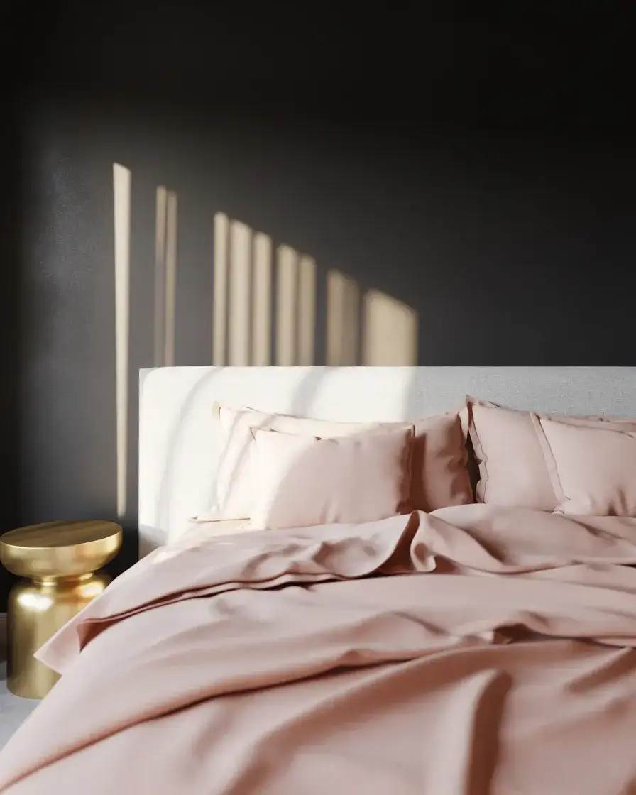
1. Dark Moody Walls with Warm Brass Accents
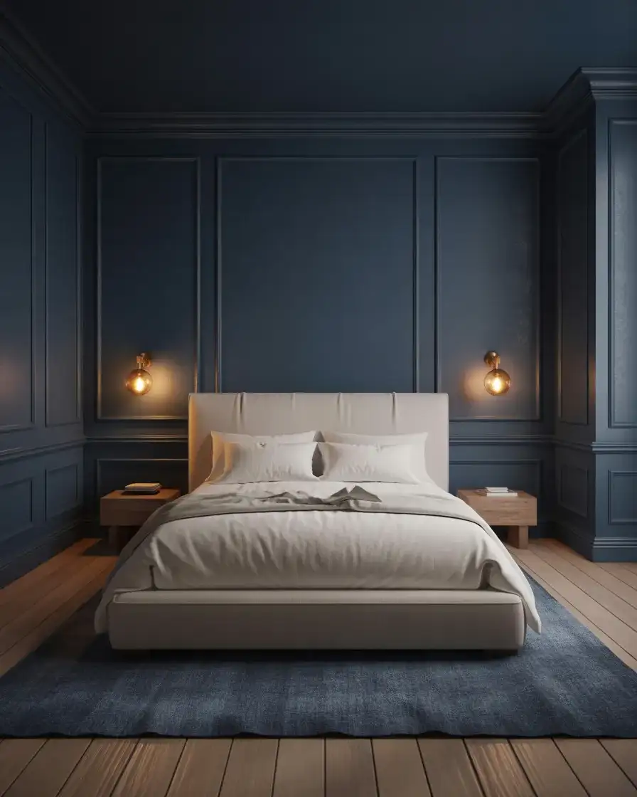
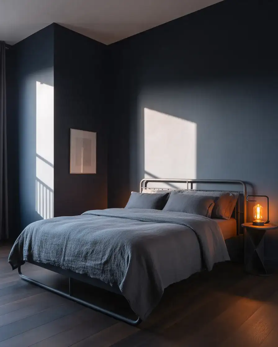
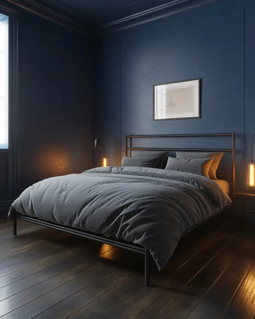
There’s something almost cinematic about a dark bedroom done right, and this idea leans all the way in. Deep inky blues—think Farrow & Ball’s Hague Blue or Benjamin Moore’s Newburyport Blue—coat all four walls for a cocooning effect that transforms a plain bedroom into something that feels curated. The midnight tone works especially well in north-facing rooms where natural light is soft and diffused, letting the color pool and deepen over the course of the day. Pair it with unlacquered brass hardware and warm-toned light fixtures to prevent the room from reading cold.
Brass is the key ingredient here—it softens the darkness without fighting it. A single unlacquered brass pendant above the bed, paired with matching hardware on a dark-stained dresser, creates a warmth that feels genuinely inviting. Interior designers consistently recommend anchoring an all-dark room with at least two warm light sources to avoid the space reading as oppressive. Keep bedding in cream, warm white, or camel to let the walls breathe, and don’t be afraid to leave one wall slightly lighter if you’re committed to the look but nervous about going full-moody.
2. Light Airy Blue with White Shiplap Walls
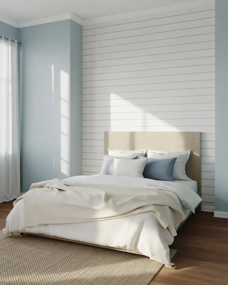
If dark bedrooms feel like too much of a commitment, the opposite end of the spectrum will be just as compelling in 2026. Light powder blues layered against white shiplap create a breezy, sun-drenched atmosphere that’s equally at home in a coastal cottage and a new-build suburban master suite. Think of colors like Sherwin-Williams’ Sleepy Blue or Valspar’s Blue Mosque—soft enough to keep things serene, but with enough personality to feel intentional. The shiplap adds architectural texture without competing with the color, and it photographs beautifully for Pinterest, which partly explains why this combo keeps trending.
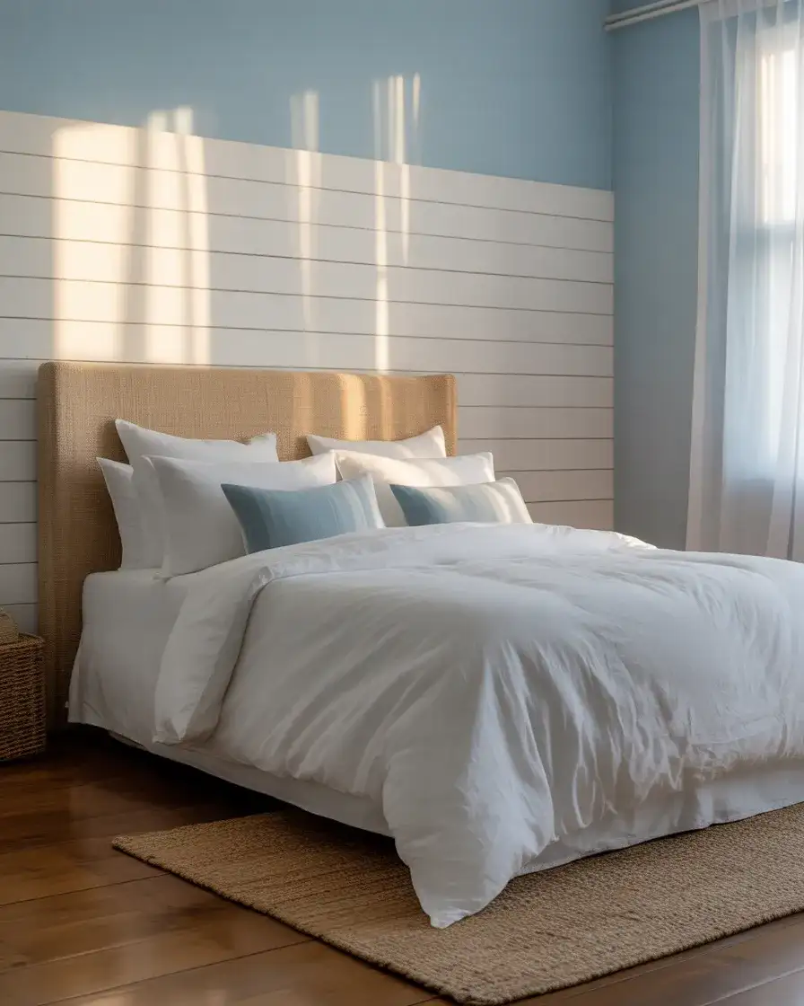
This is a look that works surprisingly well in smaller rooms—the pale blue bounces light around the space, and the horizontal lines of the shiplap visually widen a narrow bedroom. For an American home on a practical budget, shiplap boards from a big-box store run about $1.50–$2.50 per linear foot for pine, making this one of the more affordable ways to get a designer-looking result. Add a jute rug, natural wood furniture, and white bedding with minimal pattern, and the room practically decorates itself.
3. Navy Blue and Gold Luxury Bedroom
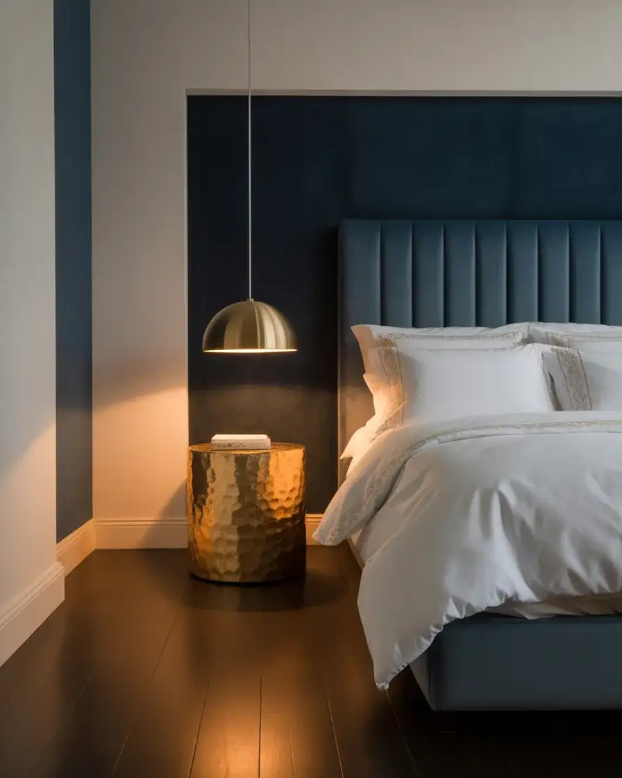
The navy and gold combination never fully goes out of style—it just evolves. In 2026, this pairing is less about the over-saturated look of the late 2010s and more about restraint: a deeply saturated navy on a single feature wall and warm gold accents in the light fixtures, frame hardware, and throw pillows, with the rest of the room kept simple and quiet. This is a bedroom that reads expensive without requiring an expensive budget. The trick is choosing gold tones that lean warm (champagne or antique gold rather than bright yellow-gold) and keeping the ratio of gold small against the navy mass.
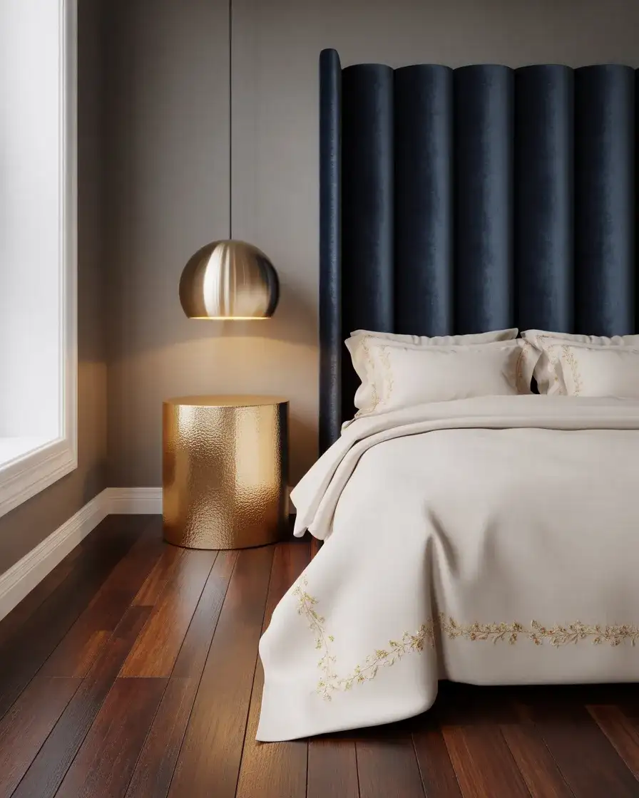
A common mistake people make with navy and gold is going too heavy on the gold. One homeowner who shared her bedroom redo on a popular decor forum noted that she initially bought gold curtain rods, gold lamp bases, gold picture frames, and gold drawer pulls—and the result looked more like a hotel lobby than a bedroom. She stripped it back to just one gold lamp and one small gold mirror, and the room finally clicked. Less is almost always more when you’re pairing a bold blue with metallic accents.
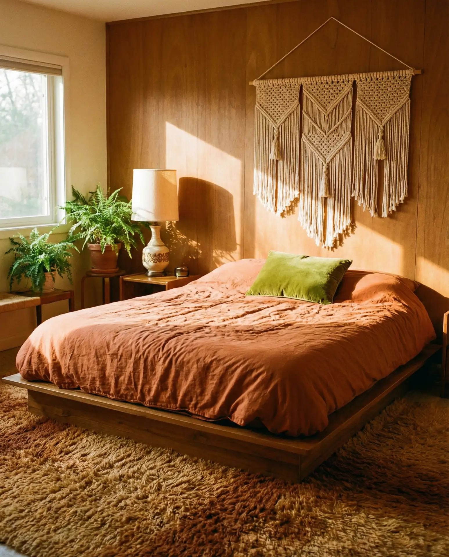
4. Dusty Blue Boho Bedroom with Macramé and Rattan
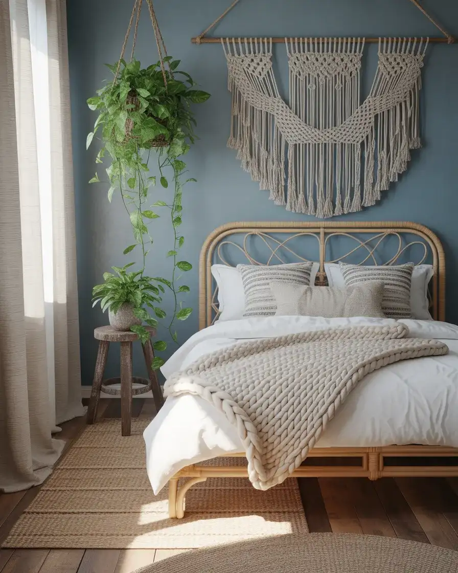
Dusty blue has quietly become one of the most versatile neutrals in the decorator’s toolkit. It reads blue without being bold, sits somewhere between sky and grey, and plays beautifully with the earthy organic materials that define bohemian style. Think of a muted, slightly desaturated hue—Benjamin Moore’s Dusty Miller or Behr’s Dusty Blue—applied to the walls or expressed through linen bedding, then layered with rattan furniture, a woven macramé wall hanging, and a chunky cotton throw. The result is relaxed and textured without feeling messy or overthought.
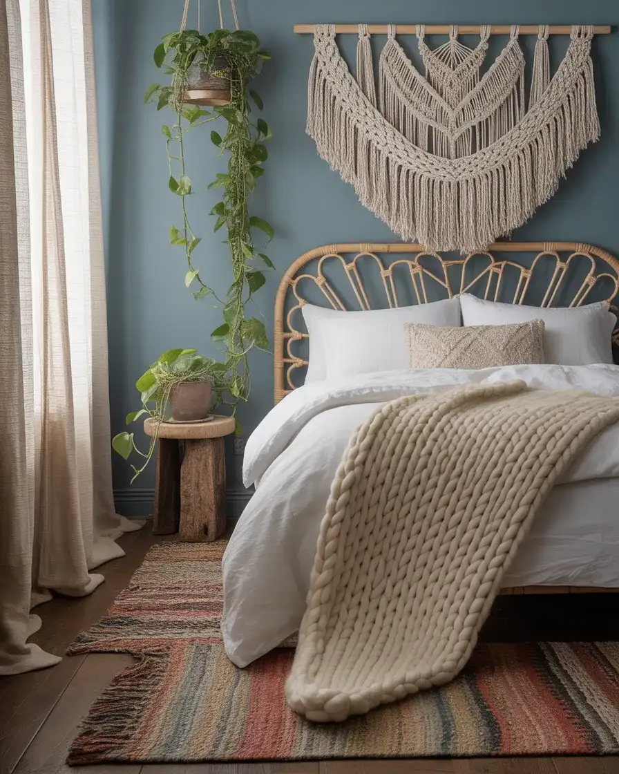
This look is particularly well-suited to apartment bedrooms in cities like Austin, Denver, and Portland, where the renter-friendly boho aesthetic has become almost a regional vernacular. The beauty of dusty blue in a boho context is that it functions as a near-neutral, so you can introduce terracotta, warm beige, dried botanicals, and natural wood without any of it clashing. If you’re renting and can’t paint, dusty blue bedding and a large jute rug will do most of the heavy lifting for the same effect at a fraction of the commitment.
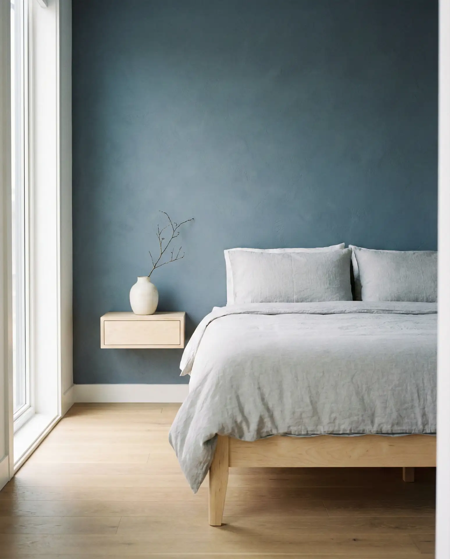
5. Grey and Blue Minimalist Master Bedroom
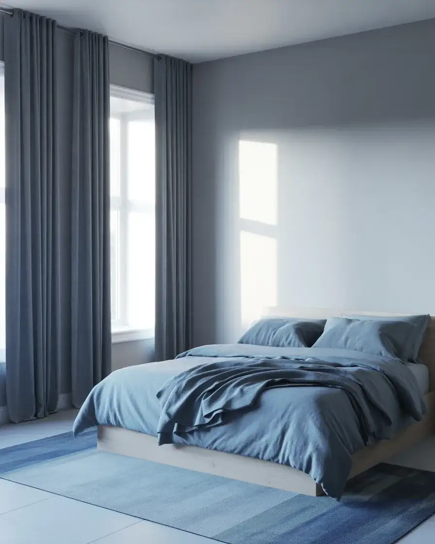
The pairing of grey and blue might be the most quietly sophisticated combination in residential interior design right now. Neither color fights for attention—they’re both cool-toned and both inherently calming, and when layered thoughtfully, they create a bedroom that feels like a deep exhale. The approach works best when one color acts as a base (typically a mid-tone grey on the walls) and blue enters through textiles—a duvet in slate blue, curtains in a slightly deeper indigo, and a geometric rug that pulls both tones together. The key is keeping the palette tight and avoiding warm materials that would disrupt the cool cohesion.
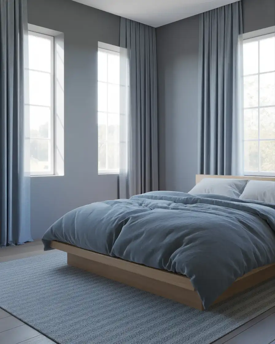
Where this look works best is in new-construction homes with taller ceilings and larger windows—the cool palette benefits enormously from generous natural light. In a room that gets morning sun, grey and blue walls take on a silvery warmth that feels almost luminous. A practical tip worth knowing: if you’re starting from a builder-grade white and want to try this palette without committing to painting, start by replacing your existing bedding with a slate or denim blue duvet cover. That single change often does more to transform the feeling of the room than any other single purchase.
6. Aesthetic Blue Bedroom with Vintage Art Posters
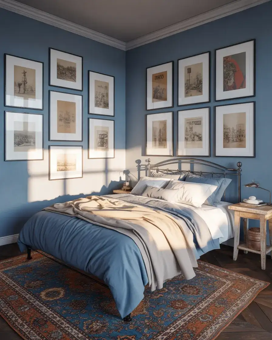
The word “aesthetic” gets thrown around a lot on social media, but when it’s applied to bedroom design, it usually means something specific: a cohesive, curated visual mood where every element contributes to a single emotional register. For blue-toned rooms, this often translates to an indigo or cornflower blue wall layered with carefully chosen vintage travel posters in thin black frames, a worn Persian rug in blues and reds, and a mix of old and new furniture that tells a personal story. The pale blue versions of this look feel more editorial and French-influenced; deeper blues push it toward something more dramatic and New York loft-adjacent.
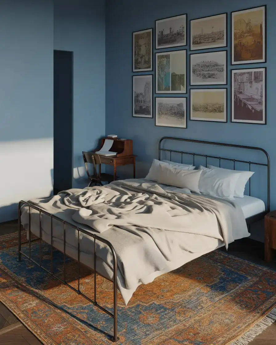
Building an aesthetic bedroom gallery wall is easier than it looks if you follow a simple rule: buy all your frames in the same finish (matte black is the most forgiving) and vary only the sizes and the artwork inside them. Vintage travel posters, old botanical prints, and abstract art prints from Etsy can be mixed freely as long as the frames match. Budget-conscious decorators will be pleased to know that digital art prints from Etsy typically cost $3–$8, and printing them at a local print shop in the right size is often cheaper than ordering framed versions online.
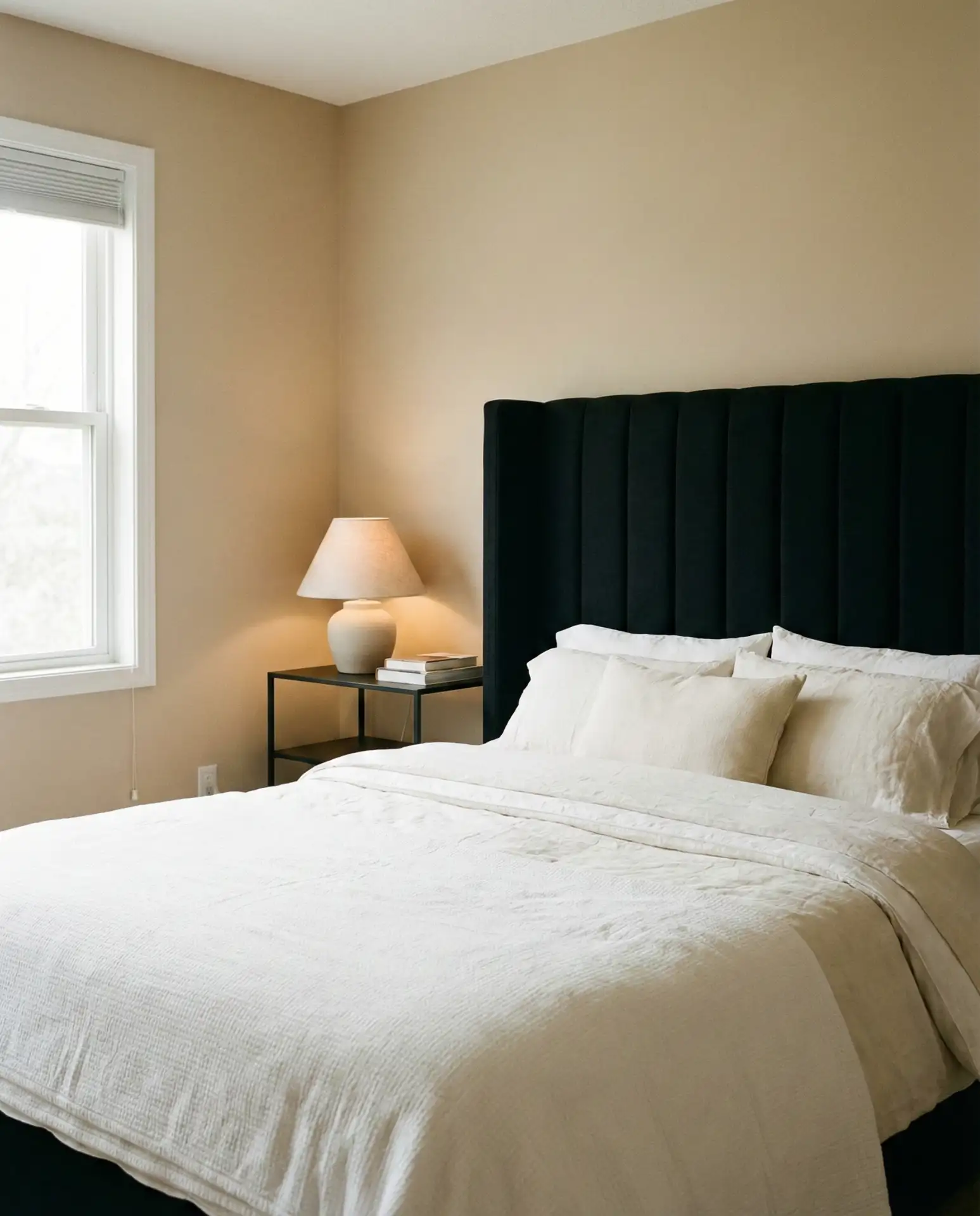
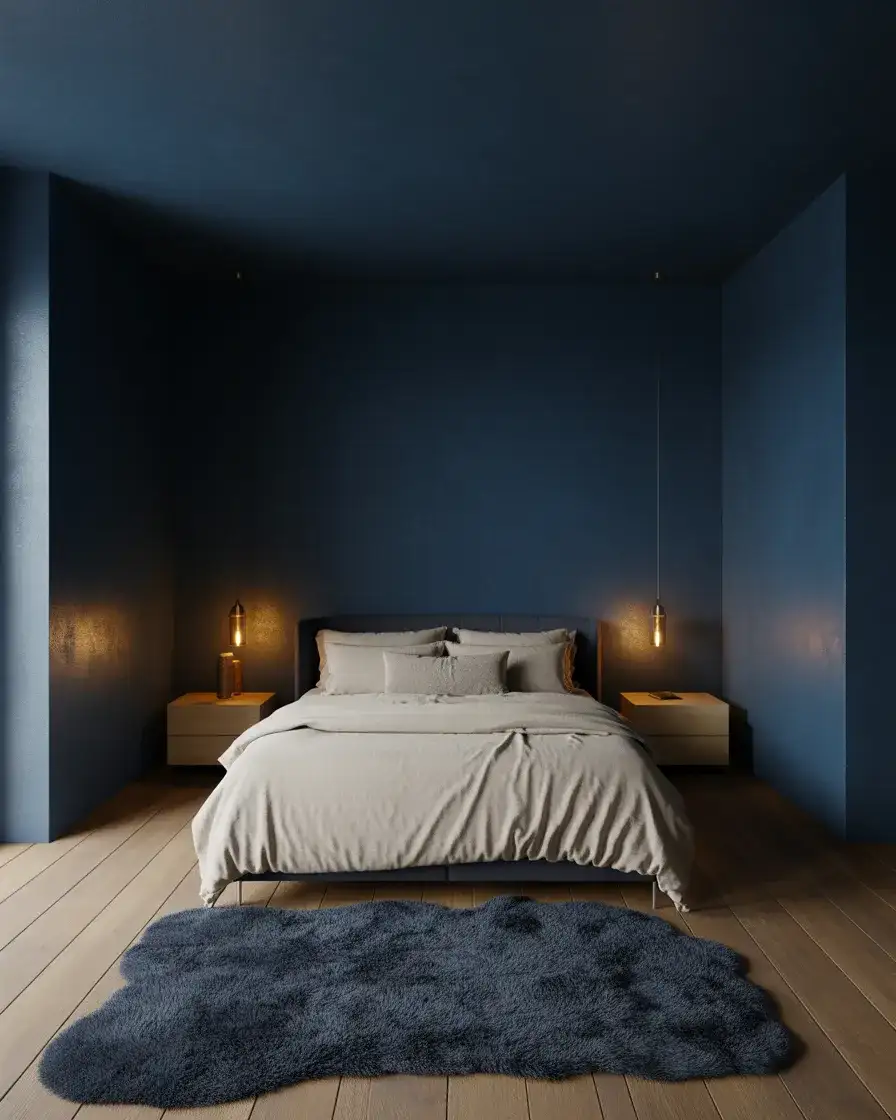
7. Black and Blue Dramatic Bedroom for Adults
Black and blue together might sound bruised, but in bedroom design the combination is genuinely striking when handled with care. The approach that’s gaining traction in 2026 involves painting the walls a very deep navy—nearly black in certain light—and introducing true black through furniture: a black platform bed frame, black nightstands, and black dresser hardware. The result reads as a monochromatic palette that’s incredibly deep and restful. This is unambiguously an adult bedroom—there’s nothing accidental or casual about it, and that confident intentionality is exactly what makes it feel sophisticated.
Expert interior stylist advice on this one is consistent: if you’re going dark and dramatic, invest in your bedding. When the walls and furniture are all deep and receding, the bed itself becomes the visual centerpiece—which means a quality duvet, well-chosen pillowcases, and a thoughtfully draped throw matter more here than in any other bedroom style. White or cream bedding creates the most striking contrast; charcoal and slate grey keep it more wrapped-in and moody. Either way, thread count and texture are more visible in a dark room than a light one.
8. White and Blue French Country Bedroom
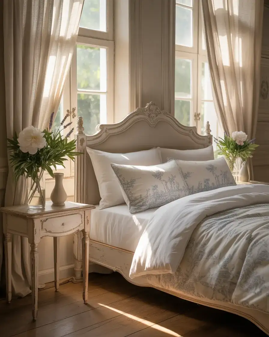
There’s a reason the French country bedroom never leaves the design conversation—it offers something no other style quite matches: the feeling of waking up in a Provence farmhouse, even if you’re in suburban Ohio. The white and blue version leans into toile de Jouy patterns, whitewashed furniture with gently curved legs, and blue that leans toward faded periwinkle or antique cornflower rather than anything modern or sharp. Linen is the textile of choice here—slightly wrinkled, slightly imperfect, and completely intentional. The overall effect is romantic and nostalgic without tipping into overdone.
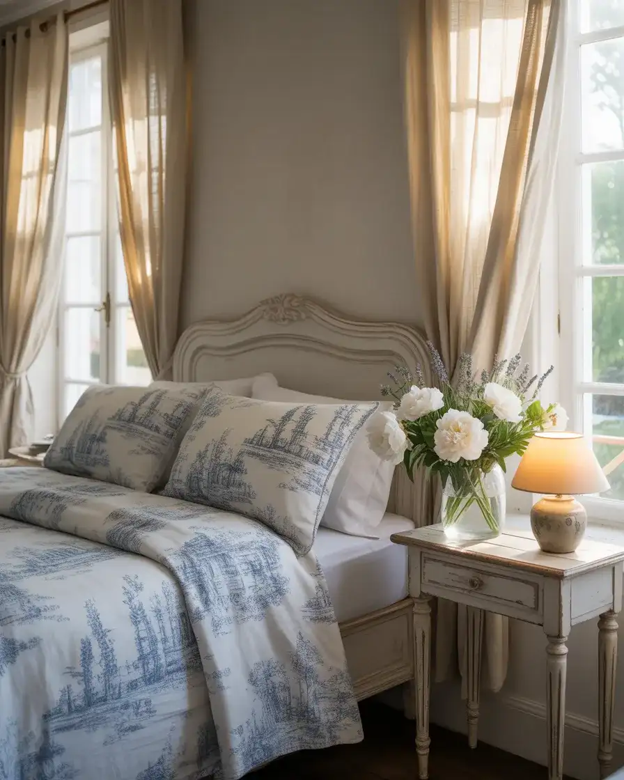
This aesthetic works especially well in the South and Midwest, where traditional home styles are common and homeowners often want something warmer and more storied than contemporary minimalism. A savvy approach to the budget here: look for whitewashed furniture at estate sales or thrift stores and repaint it yourself. A coat of chalk paint in an antique white, followed by light sanding at the edges, takes a $30 thrift-store dresser and transforms it into something that looks authentically French country. The imperfections are the point—perfection would actually undermine the aesthetic.
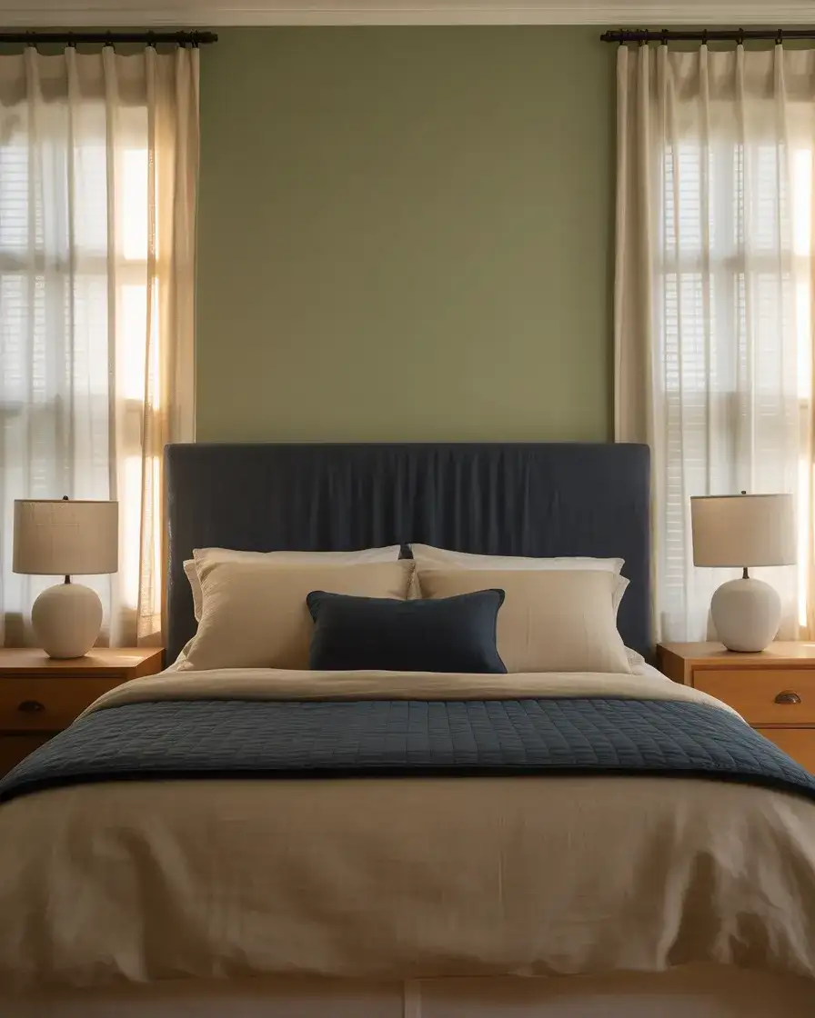
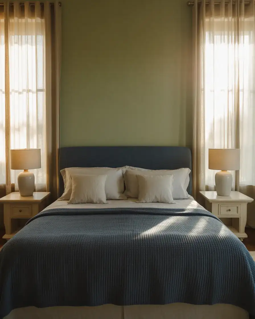
9. Green and Blue Nature-Inspired Bedroom Retreat
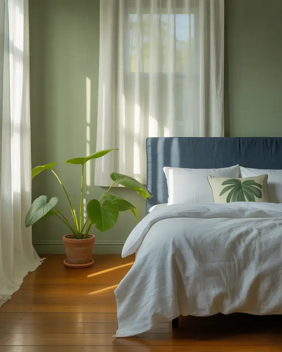
Green and blue together are probably the most naturally occurring color combination on earth—sky and leaves, ocean and hillside—which is exactly why they work so effortlessly in a bedroom. In 2026, this pairing has moved away from the jewel-toned version (emerald and royal blue) and toward something softer and more livable: sage walls with dusty blue bedding or muted teal headboard fabric against a soft eucalyptus-green wall. The sage green and navy version of this palette is particularly popular right now, offering enough contrast to feel deliberate while staying well within the calming register that bedrooms need.
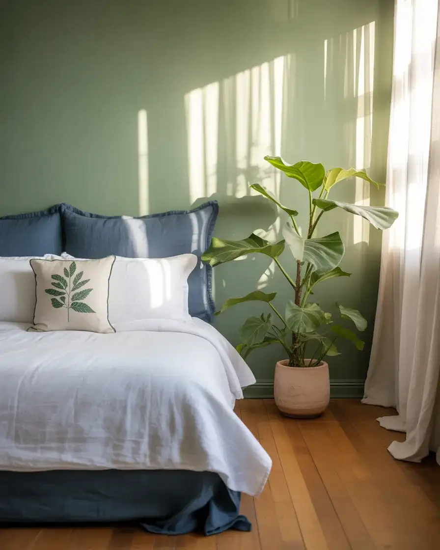
Biophilic design—the practice of connecting interior spaces to the natural world—is one of the strongest trend currents in American residential design right now, and the green-blue bedroom is almost its platonic ideal. Adding living plants to this palette isn’t just decorative: studies have consistently shown that bedroom plants improve perceived air quality and reduce pre-sleep anxiety. A mature fiddle-leaf fig in the corner or a trailing pothos on a high shelf introduces movement and organic irregularity that no fabric or paint can replicate.
10. Midnight Blue Ceiling with Neutral Walls
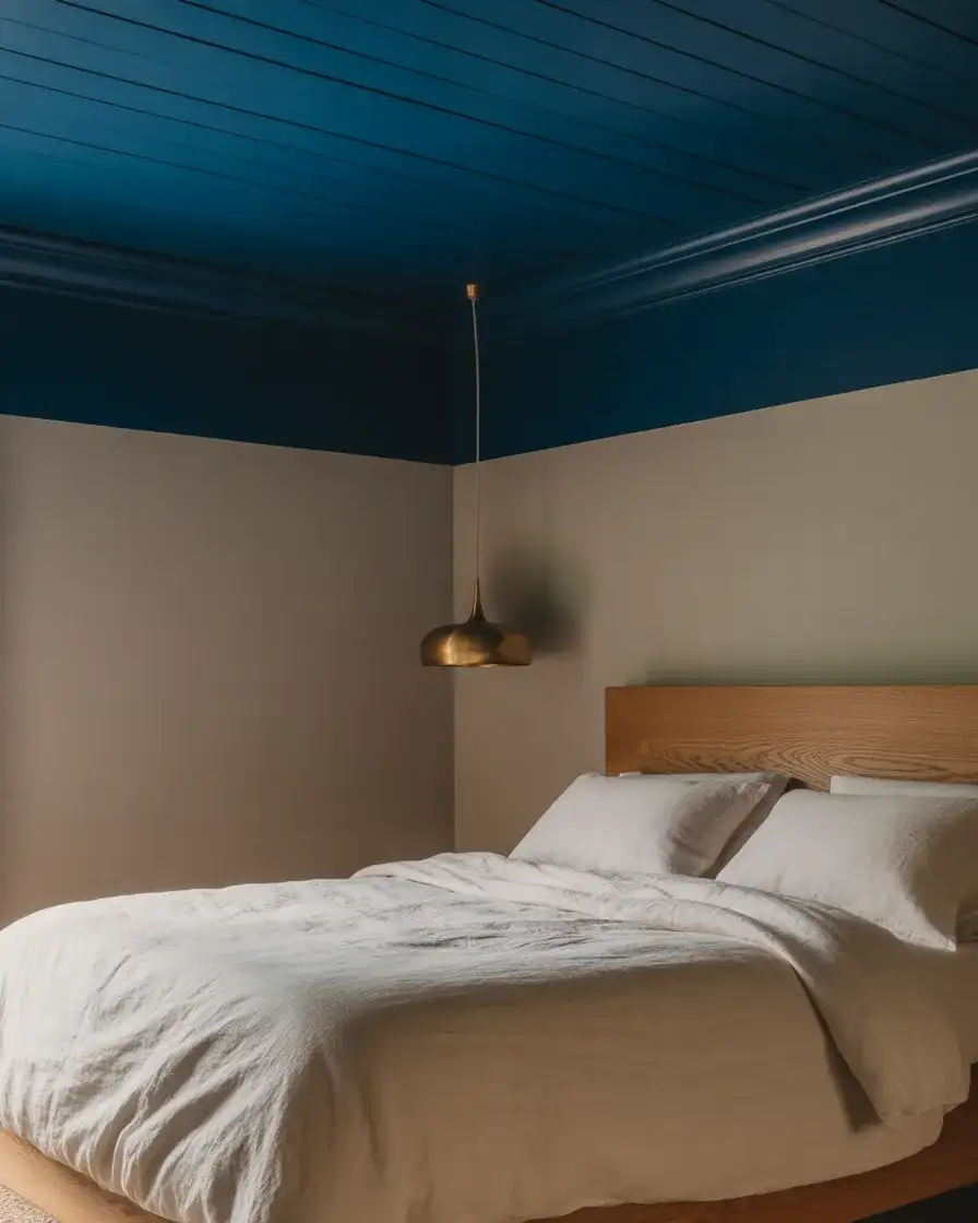
Painting the ceiling has become one of the most-talked-about bedroom design moves on Pinterest, and for good reason—it’s dramatic, unexpected, and completely reversible if you change your mind. The midnight ceiling approach keeps all four walls in a warm neutral (greige, warm white, or soft putty) and reserves the deep blue exclusively for the ceiling, creating the impression of sleeping under a night sky. The effect is surprisingly intimate without making the room feel smaller, especially when the rest of the décor stays light and airy. This is one of those ideas where photos don’t fully capture it—you have to experience it in person to understand the appeal.
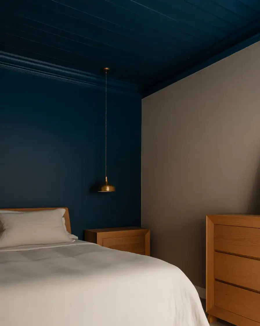
If you’re considering this and nervous about the commitment, a designer tip worth bookmarking: start by painting just the ceiling in a single weekend before doing anything else in the room. Live with it for a week. Most people who try it end up keeping it—the cocooning effect at night when the ceiling disappears into darkness is genuinely hard to replicate with any other technique. As a budget move, you only need one gallon of ceiling paint for an average master bedroom ceiling, which means this transformation typically costs under $50 in materials.
11. Pink and Blue Romantic Bedroom for Couples
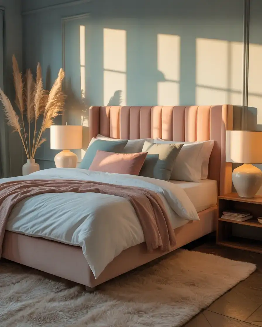
Pink and blue in a shared couple’s bedroom—hear this out, because it’s working in 2026 in a way it genuinely didn’t a decade ago. The secret is choosing the right versions of each color: blush pink and soft dusty blue rather than anything saturated or baby-toned. A blush-pink upholstered headboard against a blue-grey wall, or pale blue bedding with blush throw pillows, creates a romantic palette that feels grown-up and intentional. It’s the kind of color story you’d see in a boutique hotel in Charleston or Savannah—soft, feminine without being gendered, and deeply restful.
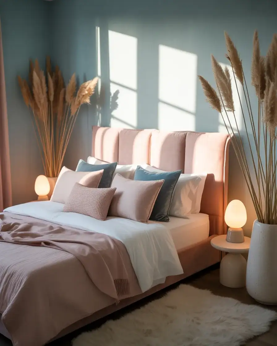
The real-world challenge with a pink and blue bedroom for two people is making it feel like it belongs to both partners rather than leaning too feminine. The solution most designers suggest: keep the dominant wall color on the cool side (blue or blue-grey), and introduce the pink exclusively through textiles and one upholstered piece. That way the room’s structure reads neutral, and the warmth is layered in softly. Adding one or two wooden elements—a walnut nightstand, a teak bench—grounds the palette and prevents it from floating into precious territory.
12. Royal Blue Velvet Maximalist Bedroom
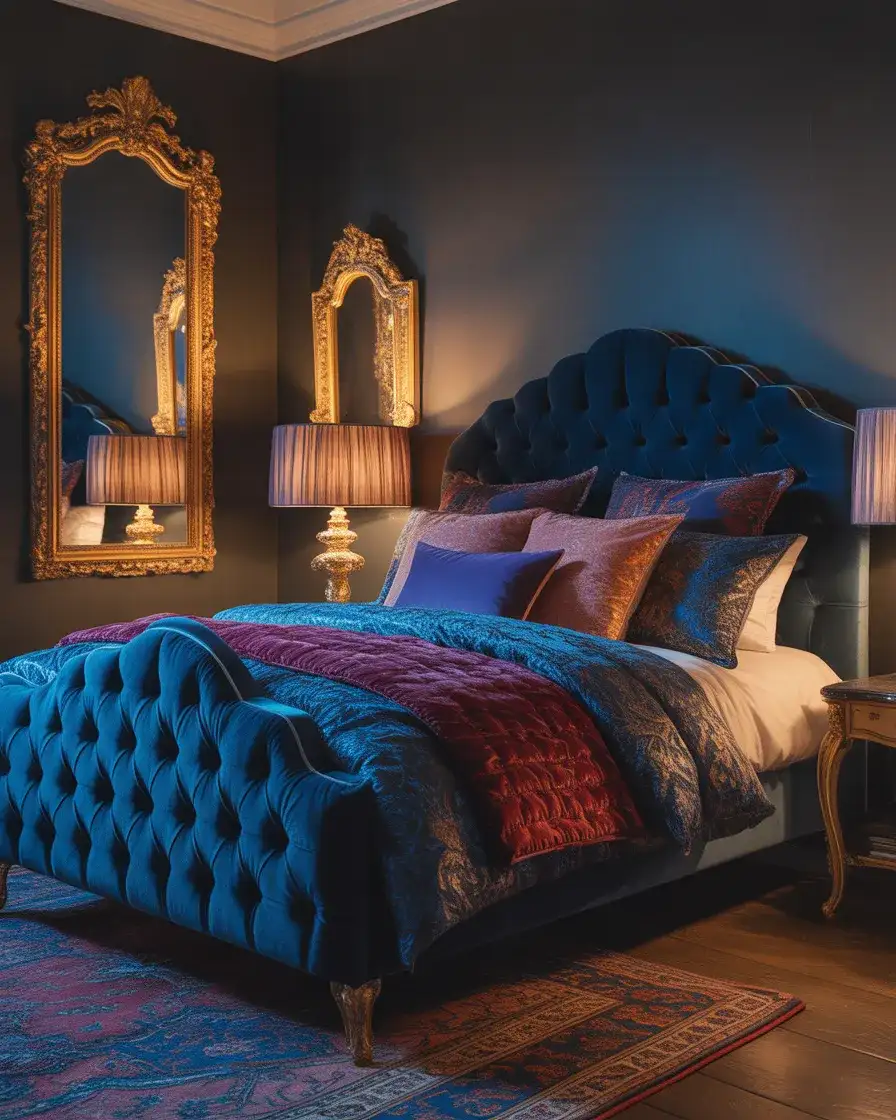
Maximalism is having a full comeback in 2026, and few expressions of it are as commanding as a royal blue velvet bedroom done with confidence. This means a tufted velvet headboard in a true cobalt or sapphire, layered with rich jewel-toned bedding—possibly mixing royal blue with deep burgundy or forest green—against walls in a complementary deep tone. Pattern mixing is not only allowed here, it’s encouraged: a floral duvet, a geometric rug, and a toile throw pillow can coexist beautifully when all the colors are held within the same saturated, jewel-toned family. This look requires commitment, but when it works, it’s unforgettable.
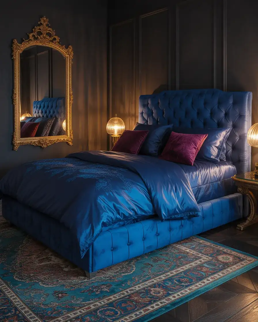
A maximalist bedroom doesn’t mean a cluttered one—the distinction worth holding onto is that every element should be chosen, not accumulated. The best maximalist rooms have an internal logic: a consistent color story, a dominant material (here, velvet and jewel tones), and clear intentionality in each piece. Where people go wrong is shopping without a plan and ending up with a room that’s visually noisy rather than richly layered. If you’re building this look, create a physical or digital mood board first, limit yourself to three dominant colors, and buy fewer, better pieces.
13. Sky Blue Kids’ Bedroom with Cloud Accents
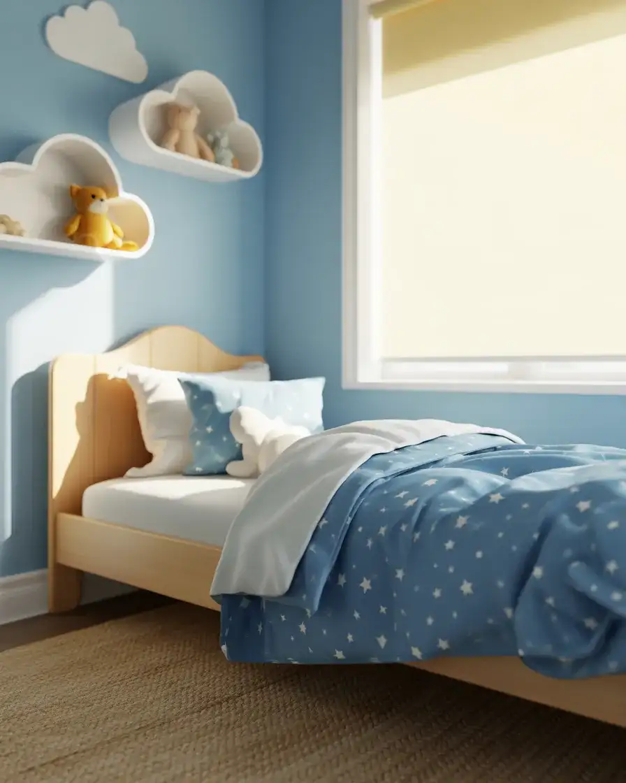
A sky blue children’s bedroom is a perennial classic, but in 2026 the approach has grown up a little—less cartoon and more considered. Instead of Disney-blue walls and plastic everything, the current iteration uses a soft sky blue (think Farrow & Ball’s Lulworth Blue or Benjamin Moore’s Breath of Fresh Air) paired with white cloud-shaped shelves, linen bedding, and soft-edged natural wood furniture that will grow with the child. The result is a room that’s playful but not cloying, and one that parents can look at without grimacing. The cloud motif stays whimsical through bedding and wall decals rather than permanent murals.
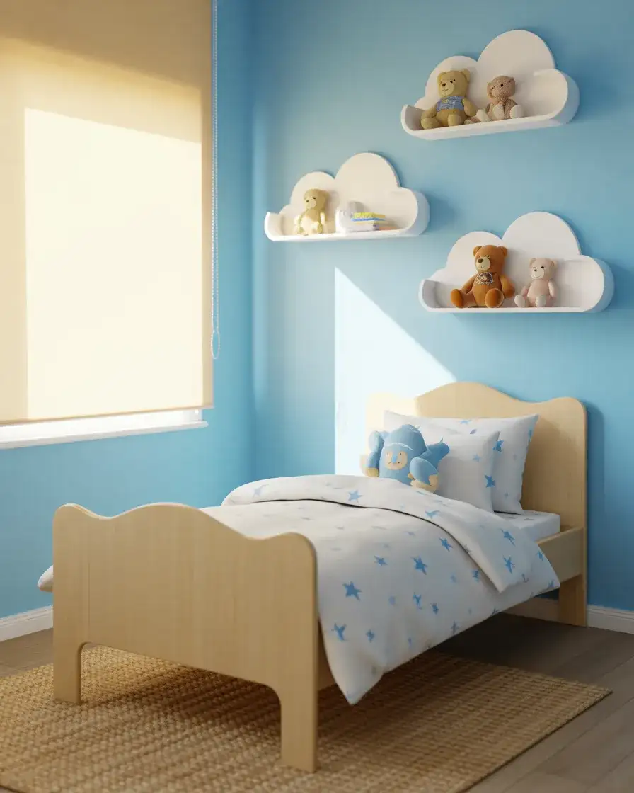
This look works best in rooms that get good natural light—sky blue can read slightly cold in a north-facing room without enough daylight. For south- or east-facing kids’ rooms, though, the pale blue walls catch the sun and practically glow. One practical note for parents: peel-and-stick cloud wall decals are removable and widely available online for $15–$30, making it easy to refresh the look as the child grows older. The underlying blue wall stays relevant far longer than any themed décor, which is a genuinely smart long-term investment.
14. Yellow and Blue Cheerful Coastal Bedroom
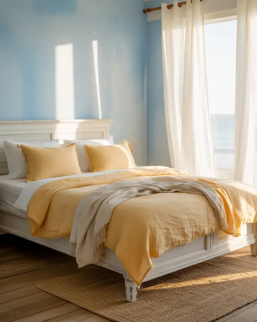
Yellow and blue is one of those combinations that has endured through decades of interior design trends because it’s so deeply rooted in nature—the colors of sun and sea. In bedroom contexts for 2026, the most successful takes on this palette reach for muted, sun-bleached versions of both: a soft butter yellow rather than citrus and a faded coastal blue rather than anything crisp or nautical. This restrained approach keeps the bedroom feeling relaxed and summery year-round, which is exactly why it tends to perform so well as vacation home or guest room décor in coastal states from the Carolinas to California.
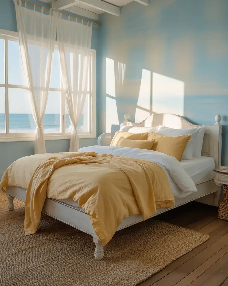
A lot of people avoid yellow in the bedroom because they’ve seen it go wrong—a too-bright yellow is energizing rather than restful, which is exactly the opposite of what a bedroom needs. The fix is simple: look for yellows with a significant white or beige base, and avoid anything that has even a hint of fluorescence or saturation. In paint terms, stay below 30% lightness value and you’ll find a yellow that functions as a genuine warm neutral. Used as an accent color against pale blue, it adds just enough warmth to prevent the room from reading clinical or cold.
15. Teal and White Modern Bedroom with Geometric Patterns
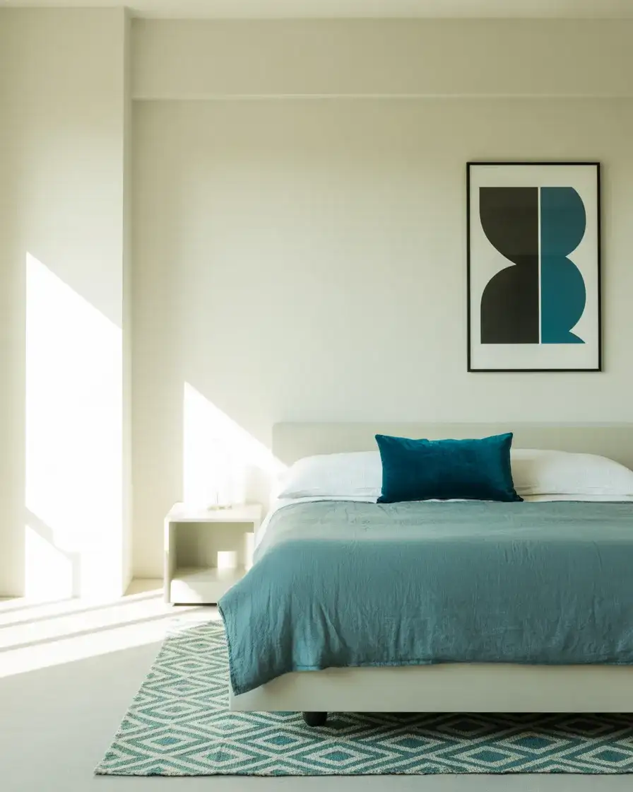
Teal occupies a particularly exciting position in the blue family—it has the depth of blue but the vitality of green, which makes it far more dynamic than either on its own. Paired with white in a modern bedroom, teal reads as graphic and confident, especially when introduced through geometric textiles—a bold hexagonal area rug, a diamond-quilted coverlet in teal and white, or a herringbone-tiled headboard accent wall. The aesthetic here is more design-forward than relaxed, which makes it well-suited to homeowners who want their bedroom to feel like an intentional design statement rather than a quiet retreat.
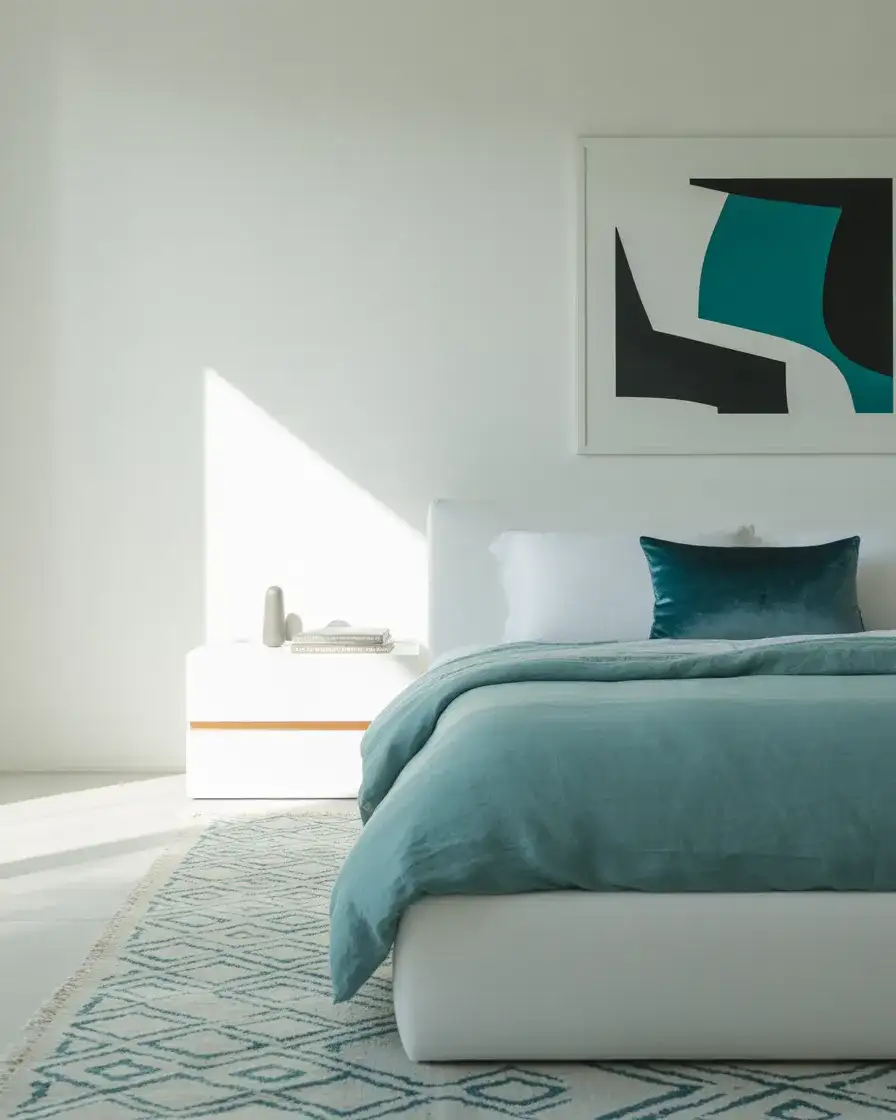
A mistake that’s easy to make with teal in the bedroom: introducing too many competing geometric patterns at the same scale. If your rug is a large bold diamond, your pillows should be solid or a micro-pattern—never another large geometric. The visual hierarchy of pattern mixing requires that at least one pattern be significantly smaller or quieter than the dominant one. This is actually the principle that separates professionally styled rooms from well-intentioned ones, and it’s something you can apply without any design background once you’re aware of it.
16. Pastel Blue Nursery Bedroom with Soft Textures
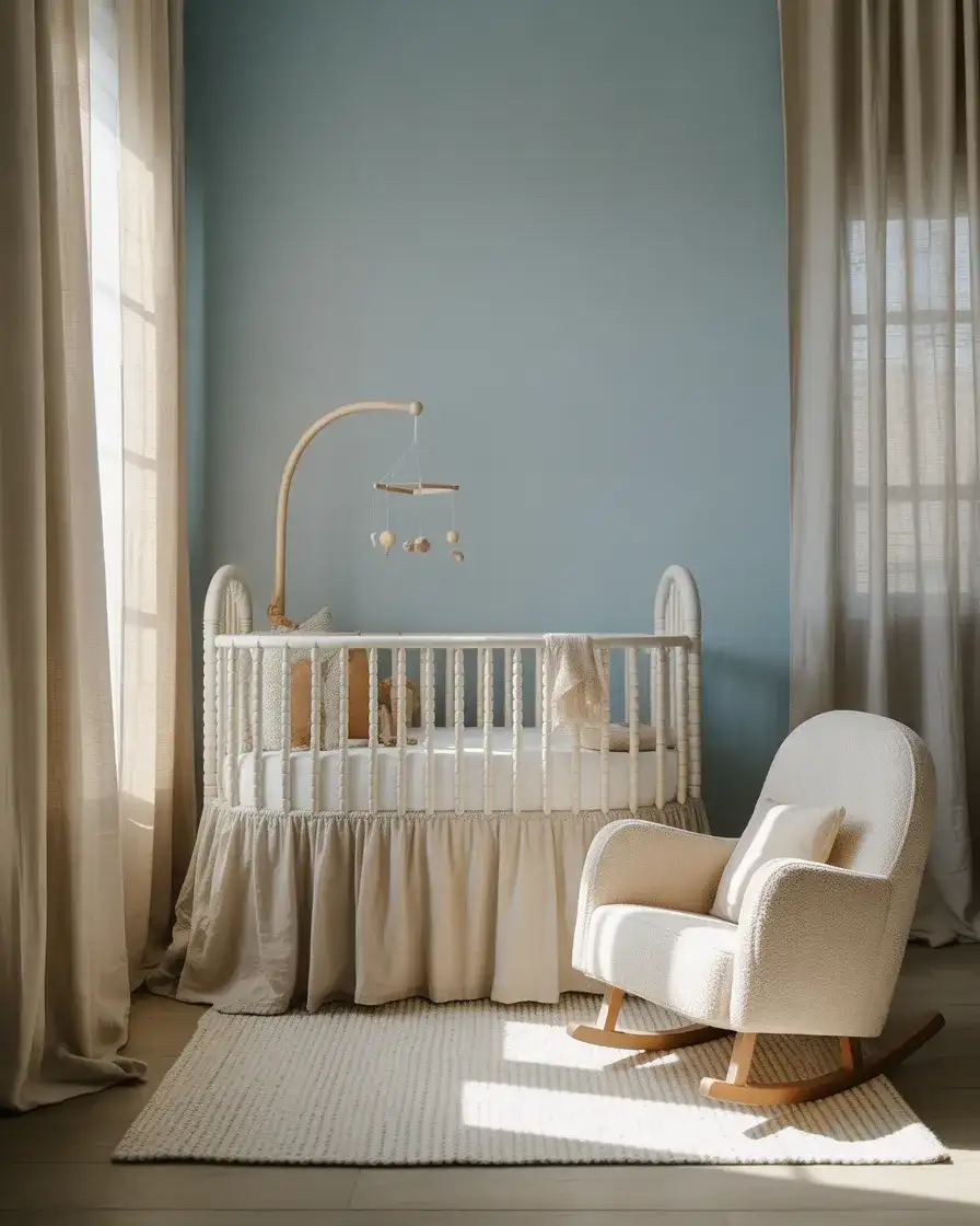
The pastel blue nursery has evolved well beyond its mid-century clichés. Today’s version is soft, layered, and designed as much for the parents who spend time in the room as for the baby who lives in it. Pale blue walls in a barely-there hue—something like Sherwin-Williams’ Misty or Benjamin Moore’s Icy Blue—anchor the room without asserting too much personality. Everything else is texture: a plush sherpa crib bumper alternative, a gathered linen skirt on the crib, a cream boucle rocker, a chunky handwoven throw, and a cloud-soft rug. The result is a room that feels genuinely soothing—which benefits newborns and sleep-deprived parents equally.
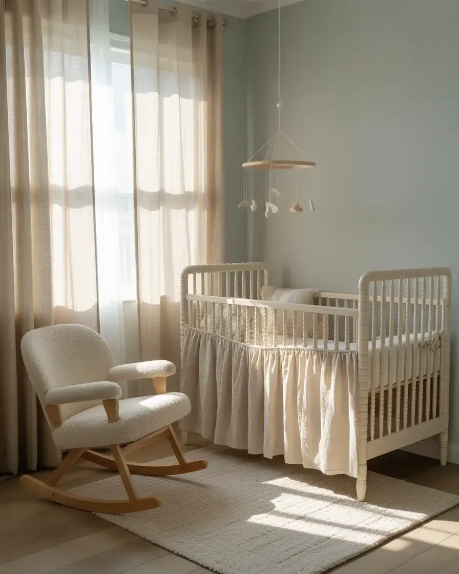
American parents spend an average of $1,500 to $3,000 furnishing a nursery from scratch, which makes this room one of the more significant decorating investments in a household. The good news with a pastel blue nursery is that the base palette is extremely adaptable as the child grows—the walls can stay as-is well into early childhood, and the visual transition from nursery to toddler room is as simple as swapping the crib for a toddler bed and the mobile for a reading lamp. The upfront investment in quality textiles pays dividends in longevity.
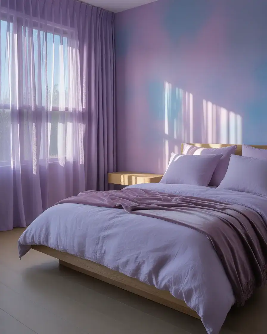
17. Purple and Blue Dreamy Bedroom Retreat
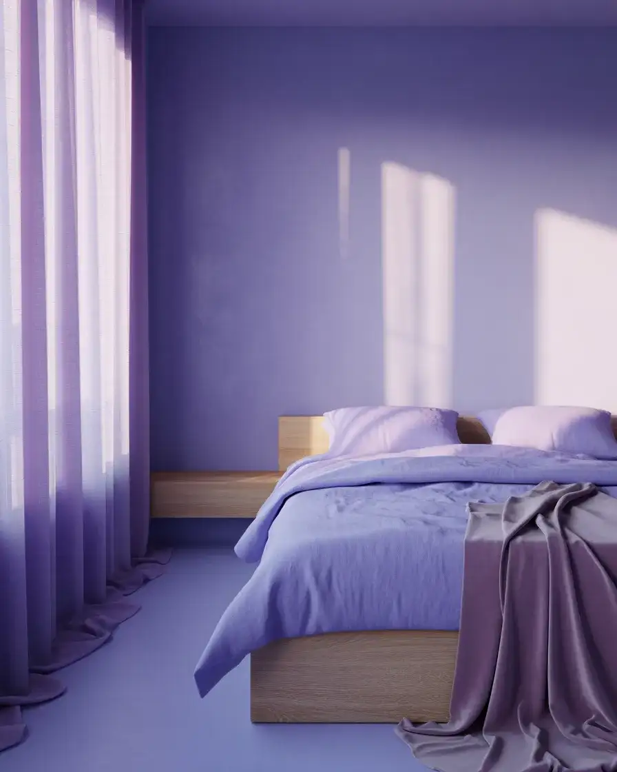
Purple and blue share so much DNA that their combination rarely looks jarring—they blend at the edges in a way that feels almost watercolor-like, especially in a bedroom with soft, diffused light. The version that’s resonating in 2026 leans into this blurred quality: lavender walls that shift toward blue in morning light, periwinkle bedding that nudges toward purple in lamplight, and a dusty mauve throw that bridges both colors. The result is a bedroom that feels slightly otherworldly and very restful—like sleeping inside a twilight sky. This is a mood-forward design choice rather than a structural one, which means textiles can do most of the work.
One place this color combination consistently performs is in teenage girl bedrooms and young adult apartment spaces where the occupant has graduated from girlhood pastels but isn’t quite ready for a full adult palette. The purple-blue overlap feels mature and personal without being stark, and it photographs in a way that’s very well-suited to Instagram and Pinterest—which are increasingly part of how young Americans think about their spaces. A full wall of lavender paint and periwinkle bedding from a budget retailer can achieve this look for well under $200.
18. Pale Blue Scandinavian Bedroom with Wood Tones
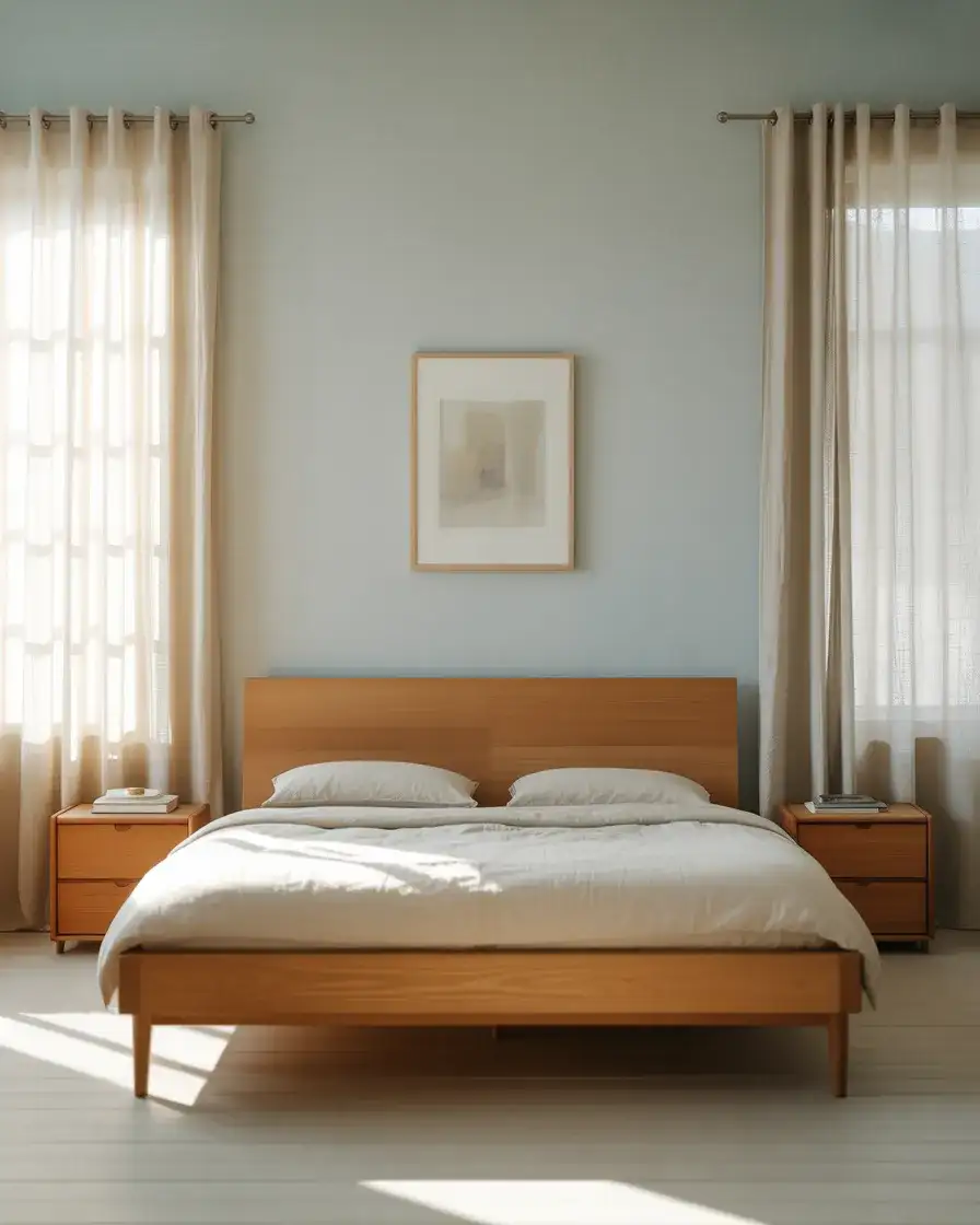
Scandinavian design has earned its enduring popularity in American homes by doing something counterintuitive: making restraint feel luxurious. In a pale blue Scandi bedroom, this manifests as very little color overall—barely blue walls, white bedding with minimal pattern, and warm honey-toned or ash wood furniture that provides just enough warmth to prevent the room from feeling austere. The light that defines these rooms is deliberately managed: linen curtains filter it without blocking it, bouncing soft illumination off pale walls and raw wood surfaces. The room feels like early morning in Helsinki—quiet, clear, and deeply considered.
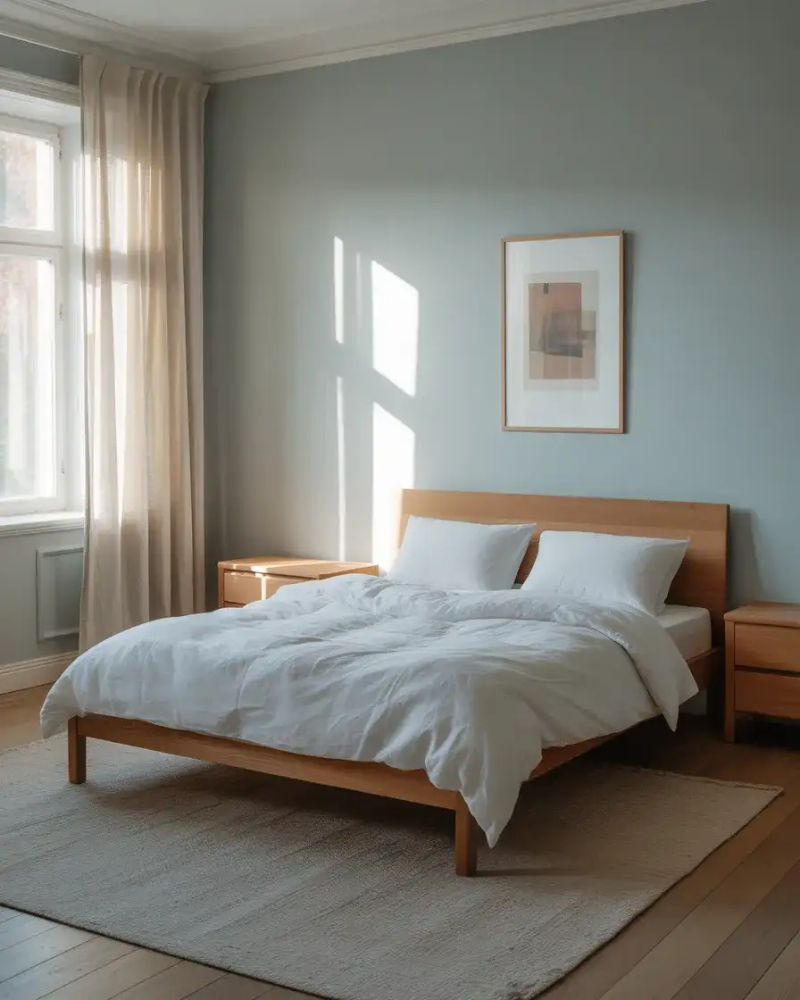
The Scandinavian approach translates beautifully to American homes in northern states—Minnesota, Michigan, Wisconsin, and the Pacific Northwest—where the long winters create a genuine appreciation for rooms that manage light thoughtfully and feel warm despite their visual restraint. The key to getting it right without it feeling sterile is the wood. A single warm-toned piece of solid wood furniture—a platform bed, a dresser, or a floating shelf—anchors the cool palette and prevents it from feeling institutional. The wood doesn’t need to match; it just needs to be warm.
19. Red and Blue Eclectic Bedroom with Global Textiles
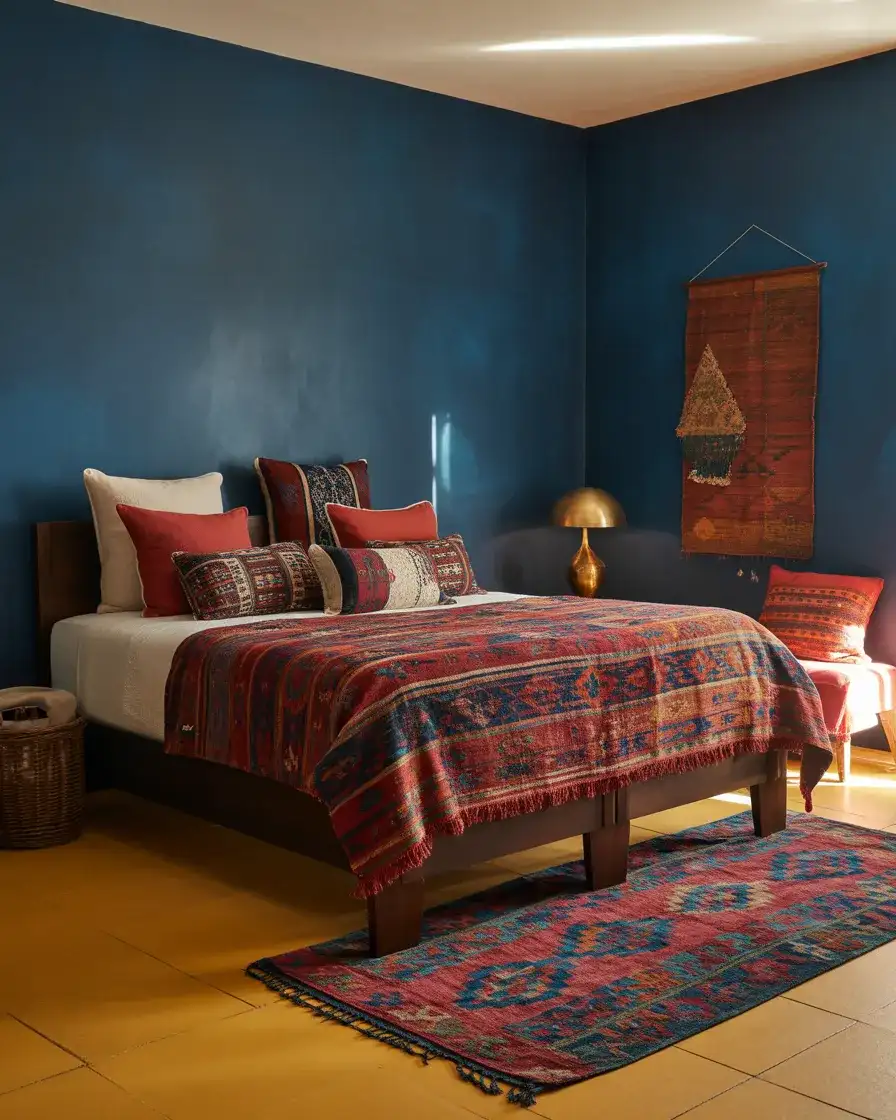
Red and blue is one of the oldest, most cross-cultural color combinations in the world—it appears in Persian rugs, American quilts, indigo-dyed African textiles, and Moroccan tilework. In a bedroom context, this global lineage is the entire point. A deep navy wall provides the structure; antique or vintage-style textiles in red, indigo, and white bring the life. Think of a well-worn kilim rug beside the bed, a patchwork quilt in traditional American red and blue patterns, or a Moroccan-inspired block-printed throw. The room tells a story of materials that have traveled, which is increasingly how Americans want their spaces to feel—personal, collected, and culturally aware.
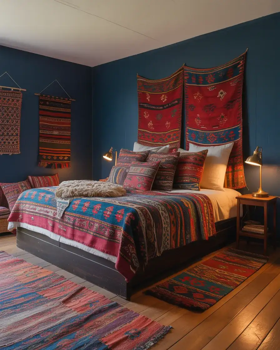
This is a bedroom style that rewards thrifting and secondhand shopping—the vintage Persian rugs, old quilts, and globally sourced textiles that anchor the look are almost always found in estate sales, antique markets, or Etsy vintage shops rather than big-box stores. A homeowner who built this look recently shared that her entire bedroom textile collection—kilim rug, vintage quilt, two throw pillows, and a wall hanging—cost less than $300 sourced entirely from secondhand shops over six months. The visual richness of this style is genuinely easier to achieve on a limited budget than on an unlimited one.
20. Gray and Blue Contemporary Bedroom with Concrete Accents
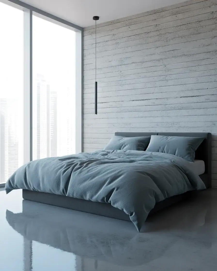
The gray and blue contemporary bedroom is for the person who lives in a loft, a converted industrial space, or a newly built home with architectural edges—and wants the bedroom to match that visual language. Here, blue is used as a warm counterpoint to otherwise cool, hard materials: a concrete accent wall or concrete nightstand surface, a polished grey floor or large-format grey tile, and a charcoal duvet. A muted steel blue on one wall, or dusty slate blue bedding, introduces the softness that concrete alone can’t provide. Together they create a room that feels both visually sophisticated and authentically modern.
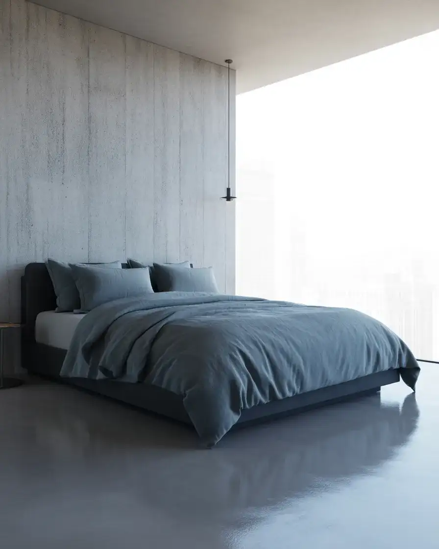
The challenge with an all-grey-and-blue palette is warmth—without any warm tones, a room can start to feel institutional or unwelcoming. The solution most designers reach for is textiles: a chunky-weave cream throw introduces warmth without disrupting the cool architecture; a leather-bound book on the nightstand, a small potted cactus, or a single warm-bulb lamp can shift the atmosphere significantly. Think of warm accents here as seasoning—you need just enough that you notice their absence if you removed them, but not so much that they compete with the palette’s defining cool restraint.
21. Brown and Blue Earthy Transitional Bedroom
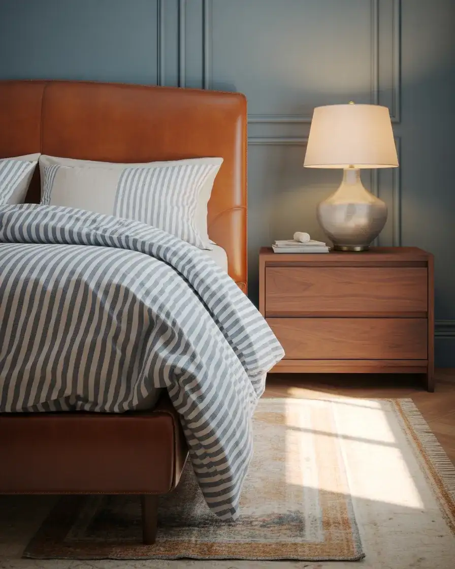
The combination of brown and blue is having a real moment in transitional interior design—the style that sits comfortably between traditional and contemporary, which is exactly how most American family homes actually want to feel. Warm brown shows up in leather headboards, walnut or mahogany dressers, and wooden frames; blue enters through bedding, an upholstered armchair, or a painted accent wall in a muted teal or slate. The warmth of the brown keeps the blue from reading too cold, and the blue keeps the brown from getting too heavy. It’s the kind of natural balance you’d find in an autumn forest—earthy, grounded, and genuinely beautiful.
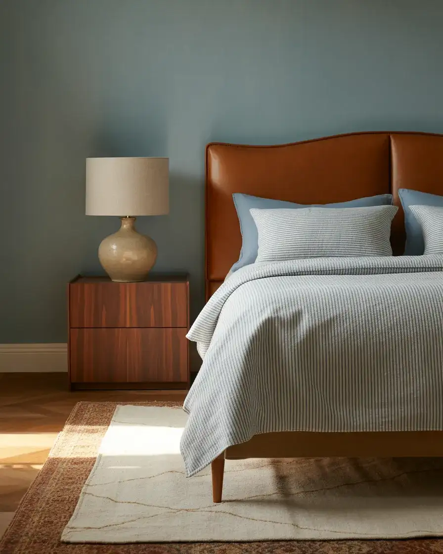
This palette is particularly well-suited to master bedrooms in traditional American home styles—craftsman, colonial revival, and colonial-inspired new builds—where the architecture already has warmth and wood is a structural material rather than just a decorating choice. The transitional quality of brown and blue means it reads as polished enough for a formal master suite but relaxed enough for a weekend cabin. An important distinction to hold: warm brown (chocolate, cognac, caramel) works in this palette; cool-toned brown (taupe, greige) reads muddier and pulls the palette toward ambivalence rather than intention.
22. Sage Green and Navy Couples’ Bedroom with Natural Linen
The sage green and navy pairing is arguably the most talked-about color combination in residential design right now, and its expression in a couple’s bedroom is one of the most compelling versions of it. Sage walls—warm and slightly grey-green—provide a backdrop that’s botanical without being bold; deep navy enters through the headboard fabric, the duvet, or a single painted accent wall on the bed wall. Natural linen ties the two together: linen curtains in undyed oatmeal, a linen duvet cover in natural white, and linen throw pillows in sage and navy. The room feels like it belongs to two adults who share a visual sensibility—calm, collected, and quietly designed.
What makes this combination so universally appealing for shared bedrooms is that it doesn’t lean toward any one aesthetic or gender—it’s neither feminine nor masculine, neither traditional nor aggressively modern. It’s simply well-considered. The natural linen is the element that does the most work here: it softens the navy without diluting it, adds tactile warmth to the sage without competing with it, and ages beautifully over time. If you start with a sage paint color and natural linen bedding and introduce navy gradually—first in a throw, then a pillow, then perhaps the headboard—you can build this palette at your own pace without a single wasted purchase.
Conclusion
Blue bedrooms are endlessly versatile—whether you’re drawn to the drama of midnight moody walls, the serenity of a pale Scandinavian palette, or the grounded warmth of sage and navy together, there’s a version of this color story that will feel genuinely right for your space, your home, and the way you want to wake up each morning. I’d love to hear which of these 22 ideas resonated most with you—drop your favorite in the comments below, and if you’re in the middle of a bedroom refresh, share a photo or describe what you’re working with. These conversations always spark ideas I haven’t thought of, and there’s nothing quite like seeing how real homeowners interpret a look in their own four walls.