Bedroom color schemes are evolving in 2026, and American homeowners are moving toward palettes that balance personal expression with calming sophistication. Whether you’re drawn to moody depth or airy neutrals, this year’s trending shades reflect a desire for spaces that feel both restorative and authentic. Pinterest boards are flooding with combinations that blend earthy warmth, soft grays, and unexpected jewel tones—proof that bedrooms are becoming more than just places to sleep. They’re sanctuaries. In this guide, you’ll find curated ideas that capture the most searched bedroom color directions of the year, each designed to inspire your next refresh.
1. Mauve and Cream Sanctuary
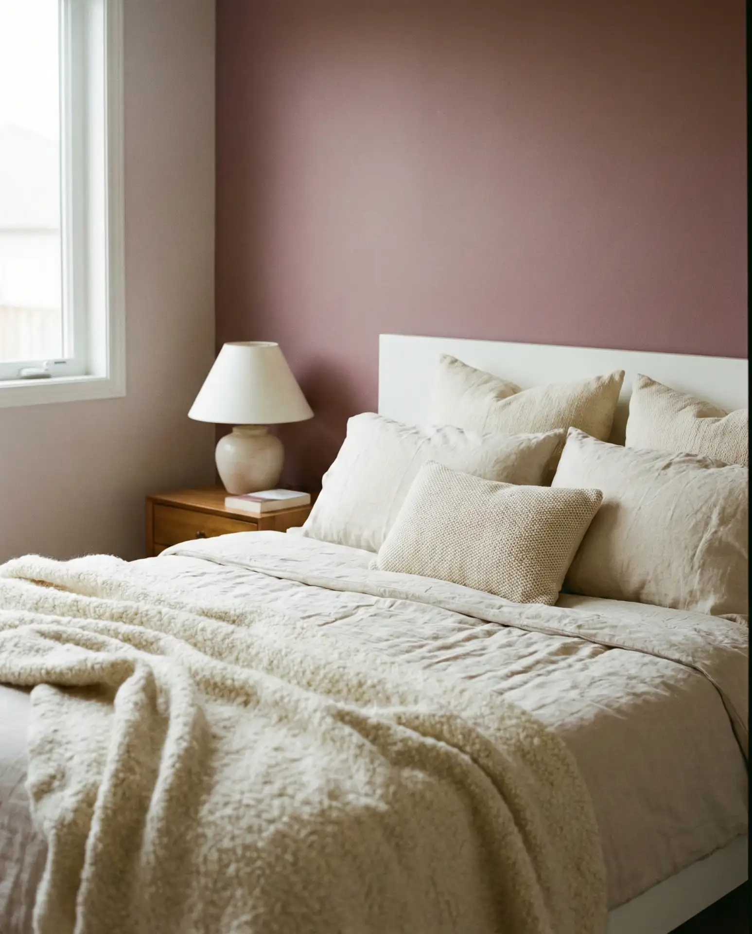
This pairing brings mauve into softer territory, layering dusty rose tones with warm cream accents. It’s a combination that feels particularly suited to bedrooms where you want understated elegance without leaning too feminine. The muted pink base works beautifully with natural wood furniture, linen bedding, and vintage brass hardware. It’s relaxing without feeling overly sweet, making it ideal for adults who want color but crave subtlety.
Where this works best is in primary bedrooms with good natural light, especially in Southern and Midwestern homes where warmth is prized year-round. The mauve reads differently depending on the time of day—cooler in morning light, warmer at dusk. Pair it with tactile fabrics like bouclé or chunky knit throws to add dimension. Avoid going too monochrome; introduce cream in varying shades to keep the palette from feeling flat or one-note.
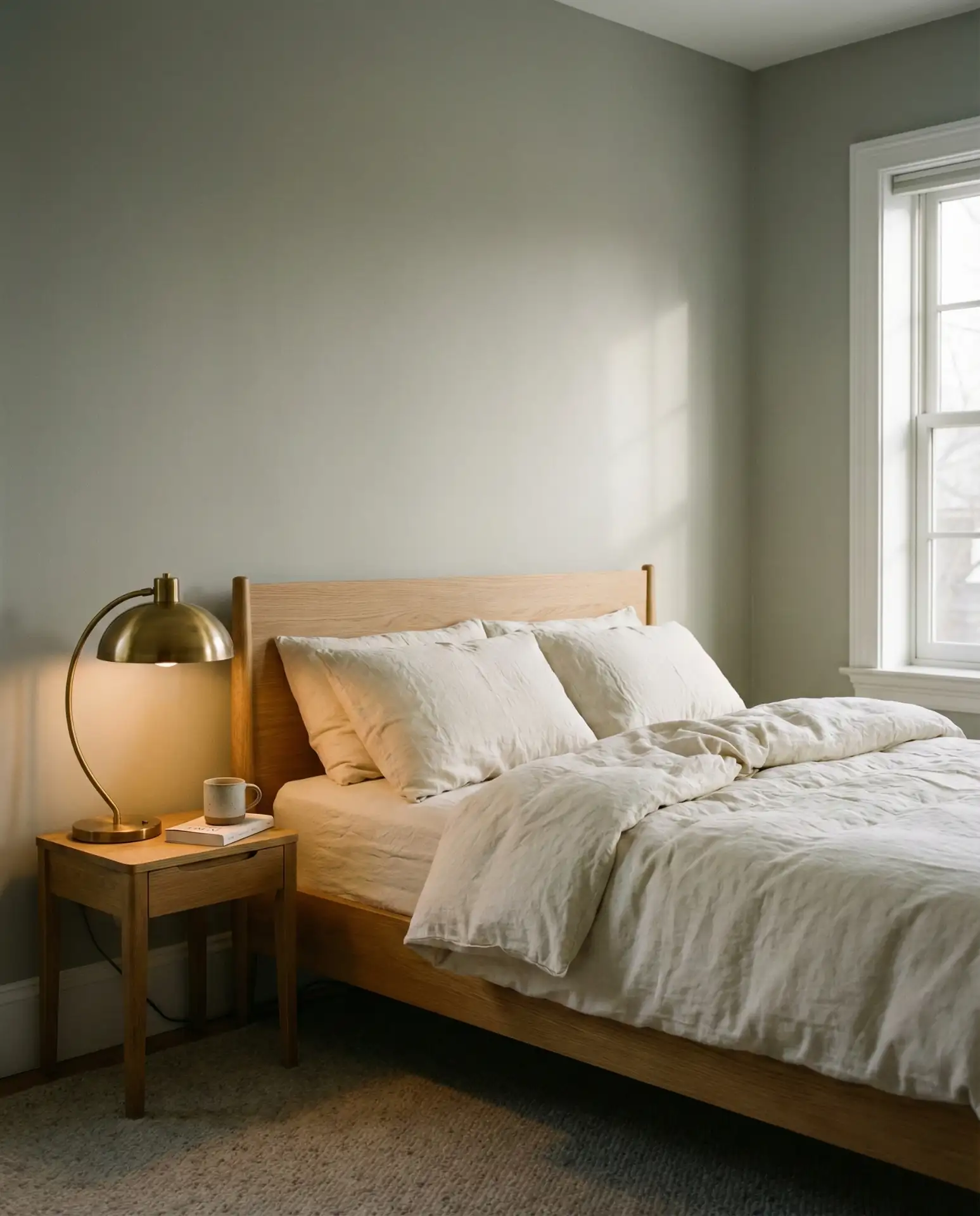
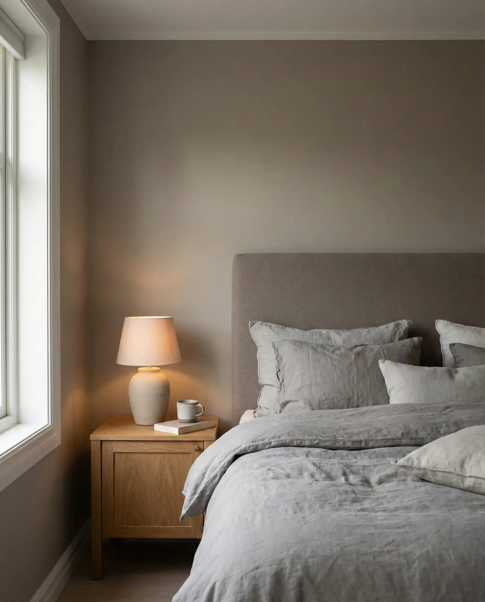
2. Grey Headboard with Soft White Walls
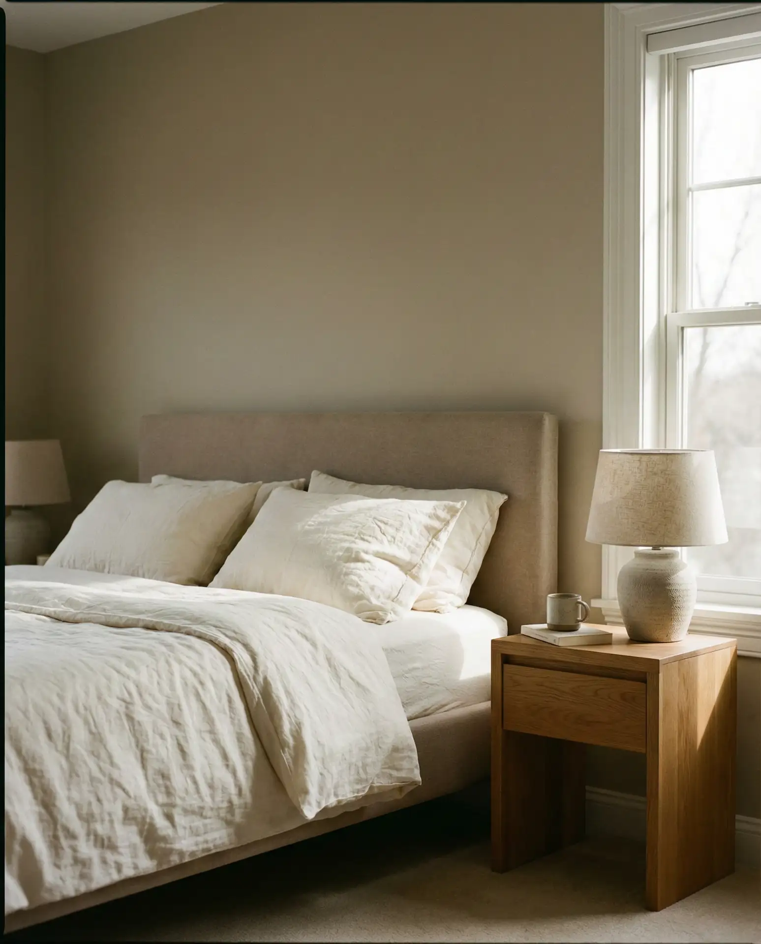
A gray headboard anchored against crisp white or off-white walls is one of the most enduring palettes in American bedrooms. It’s neutral, yes—but far from boring when styled with intention. The key is texture: a linen-upholstered headboard in charcoal or dove gray adds visual weight without overwhelming the room. This setup works across styles, from farmhouse to contemporary, and it’s especially popular in guest bedrooms where you want a universally appealing backdrop.
Real homeowners often start with this palette because it’s easy to accessorize. You can shift the mood entirely by swapping out throw pillows, art, or lighting. In coastal areas, people lean into whites and light grays. In the Midwest, warmer grays with taupe undertones are more common. The mistake to avoid: choosing a headboard that’s too cool-toned if your walls have warm undertones. Always test fabric swatches in your actual bedroom light before committing.
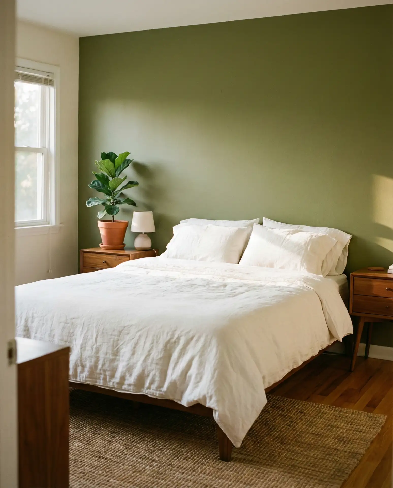
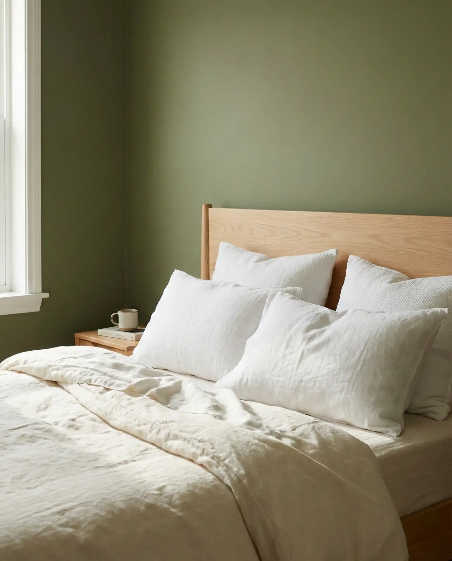
3. Olive Green Accent Wall
An olive green accent wall has become a go-to for bedrooms that need grounding without going dark. It’s earthy and sophisticated and pairs beautifully with both warm woods and cooler metals. Unlike brighter greens, olive has a muted, almost gray-green quality that reads as calm rather than energizing. It’s particularly effective behind the bed, where it creates a natural focal point. This shade is showing up everywhere from Brooklyn brownstones to Portland bungalows.
One homeowner in Seattle painted just the wall behind her bed in olive and left the rest white—suddenly the room felt twice as intentional. The trick is balancing the green with enough neutrals so it doesn’t feel heavy. Cream, ivory, and soft beige work best. Avoid pairing olive with too much black or charcoal unless you’re intentionally going for a darker, moodier vibe. It’s also worth noting that olive can look muddy in rooms with poor natural light, so test samples first.
4. Teal and Warm Oak
Deep teal walls paired with warm oak furniture create a bedroom that feels both cozy and elevated. Teal sits somewhere between blue and green, offering the calm of blue with the organic quality of green. When combined with honey-toned or natural oak, the result is a space that feels collected and thoughtful. This palette is especially popular in the Pacific Northwest and New England, where homeowners gravitate toward colors that echo the natural landscape.
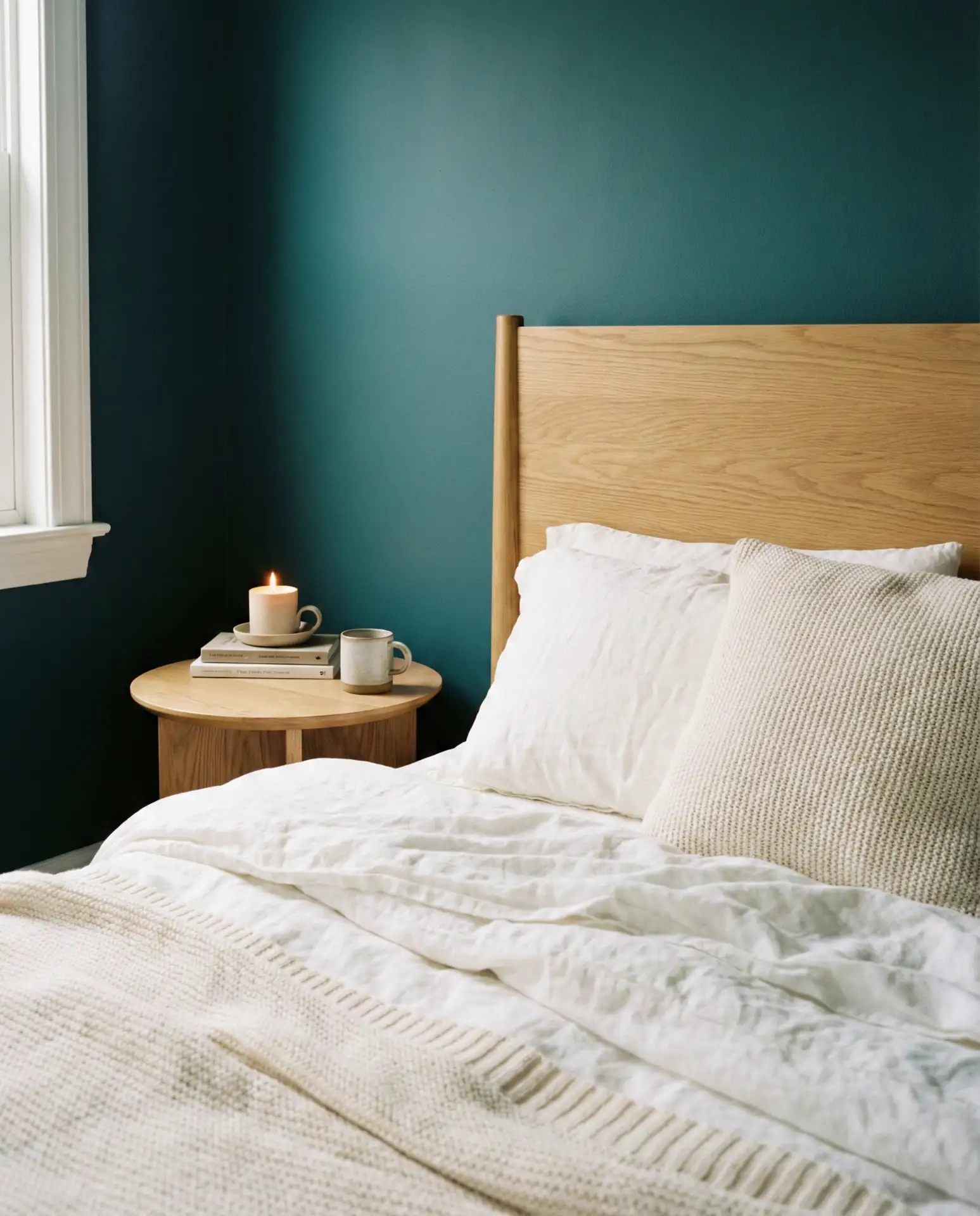
Budget-wise, teal paint is one of the most affordable ways to transform a bedroom. A gallon of quality teal can run $40–$60, and if you already have oak furniture, you’re halfway there. The key is choosing a teal that leans slightly muted rather than bright or tropical. Too vibrant, and it can feel more like a playroom than a sanctuary. Layer in cream or ivory bedding to soften the contrast, and consider brass or gold hardware to tie the warmth of the oak into the rest of the room.
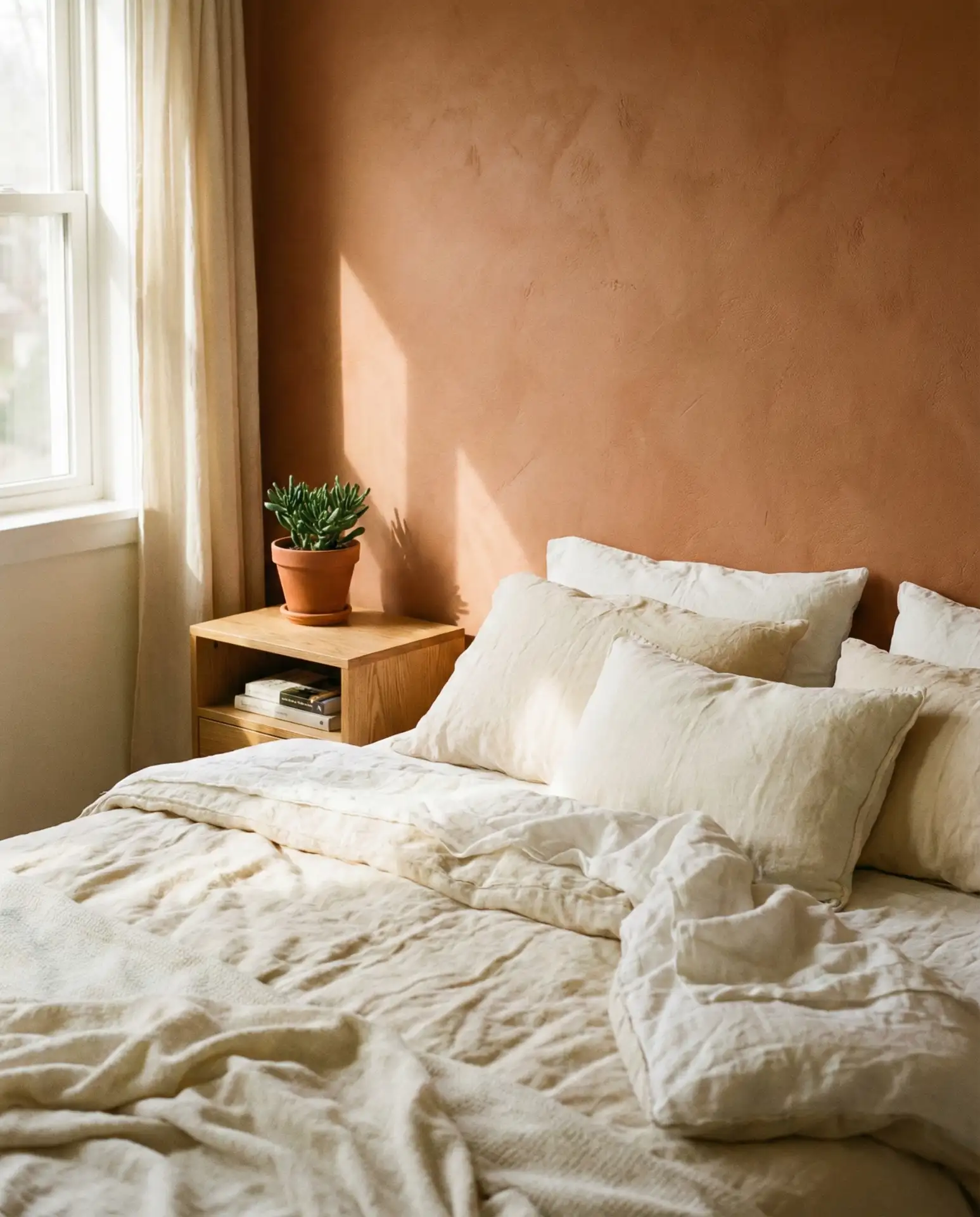
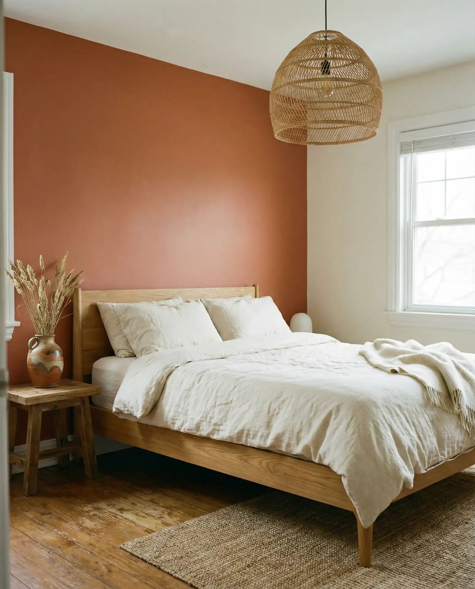
5. Earthy Terracotta and Cream
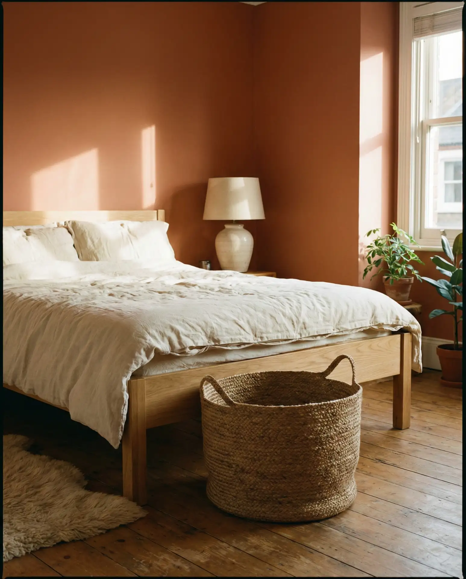
This combination brings terracotta into the bedroom in a way that feels grounded rather than Southwestern. Think muted burnt orange tones paired with creamy whites and natural textures. It’s an earthy palette that works beautifully in rooms with lots of sunlight, particularly in California, Arizona, and Texas. The warmth of terracotta creates an enveloping, cocoon-like feeling, especially when used on all four walls or as a bold accent.
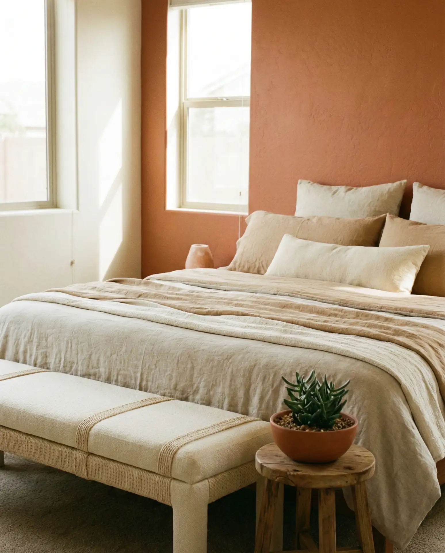
Expert designers often recommend terracotta for south-facing bedrooms where the color can be activated by natural light throughout the day. It shifts beautifully from soft coral in the morning to deeper rust by evening. Pair it with linen, jute, and unfinished wood to keep the look organic. A common mistake is introducing too many competing warm tones—stick to a narrow palette and let the terracotta be the star. Avoid pairing it with cool grays, which can make the orange feel jarring.
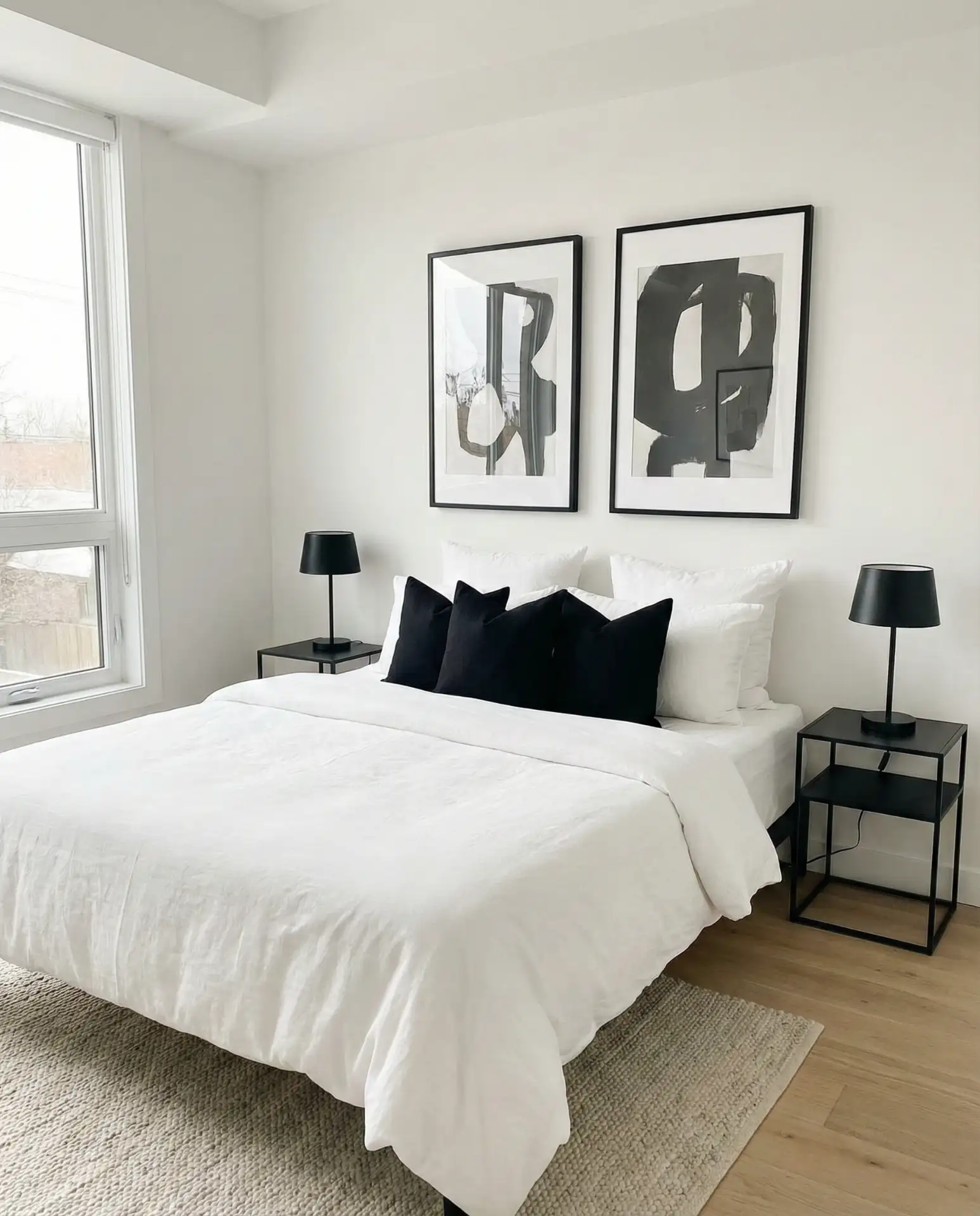
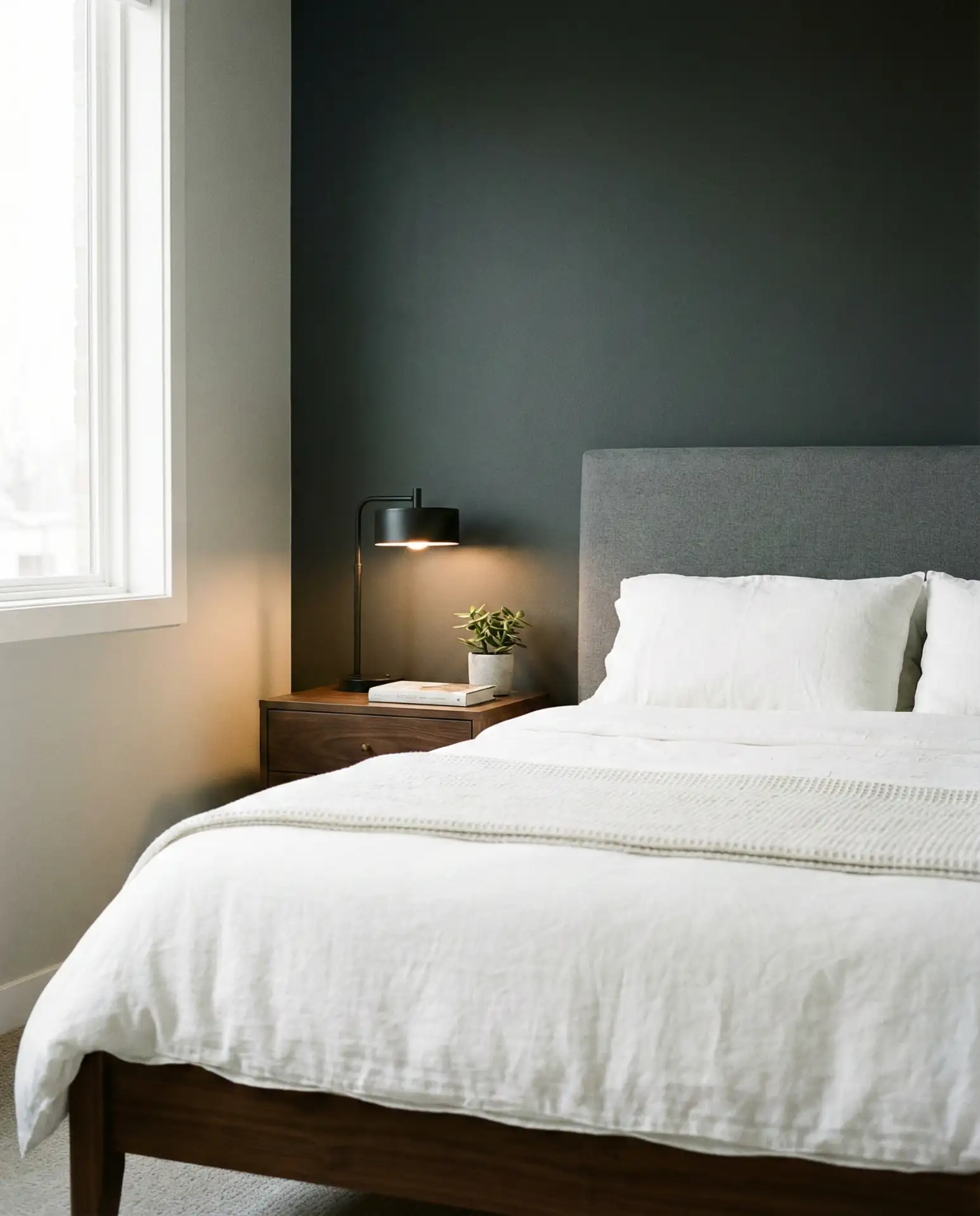
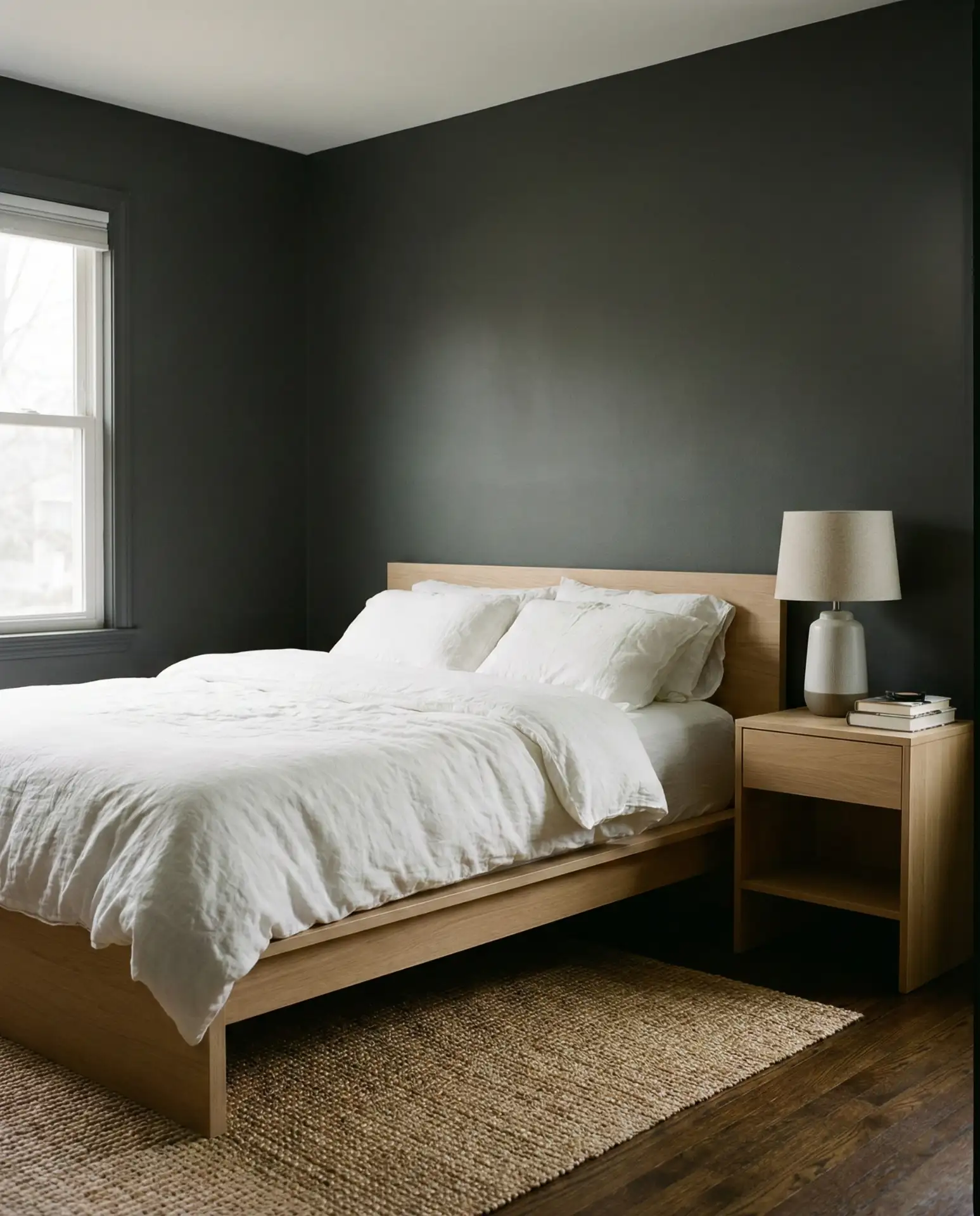
6. Black Headboard with Light Neutral Walls
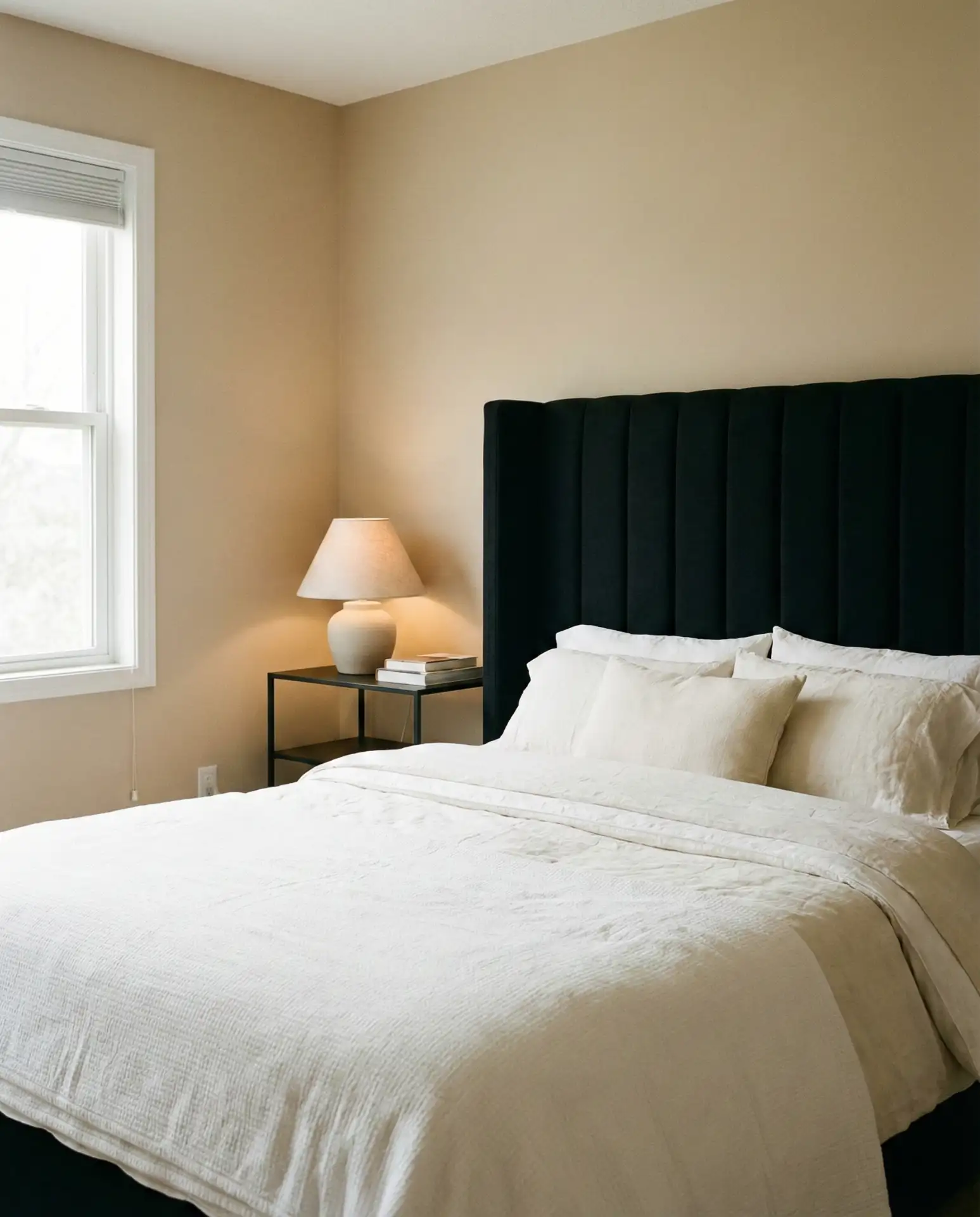
A black headboard against soft beige or greige walls creates instant drama without overwhelming the room. It’s a classy move that adds architectural presence, especially in bedrooms with high ceilings or minimal architectural detail. The contrast anchors the bed as the room’s focal point while keeping the overall palette light and breathable. This approach is especially popular in urban lofts and modern farmhouse interiors, where clean lines and contrast are key.
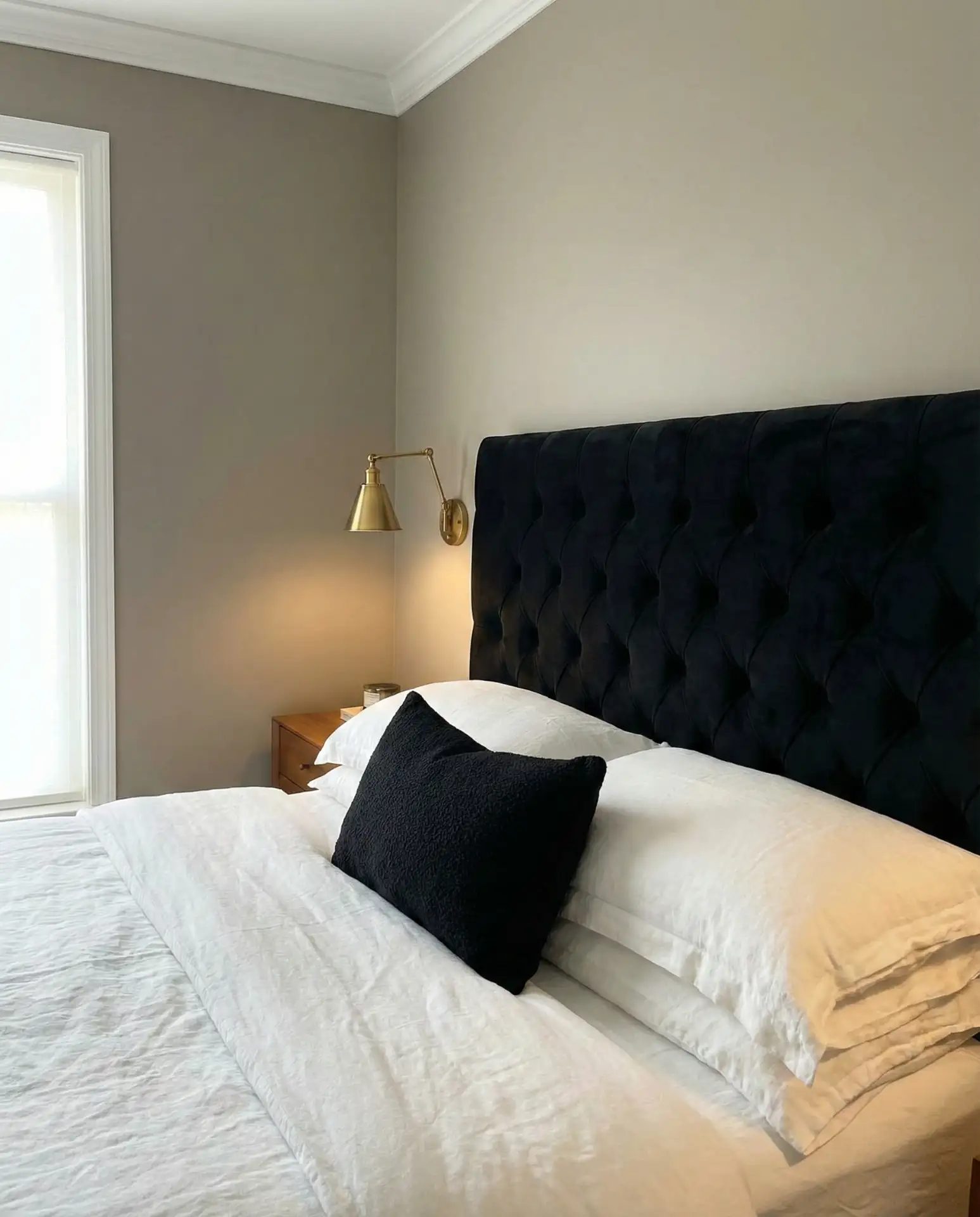
This palette works best in bedrooms that get plenty of natural light. In darker rooms, the black can feel too heavy. To avoid that, balance the headboard with lighter bedding, pale wood tones, and reflective surfaces like mirrors or glass lamps. Many homeowners in Chicago and Boston use this scheme in primary bedrooms, where the black adds weight and maturity without requiring bold color. Keep the rest of the room’s palette soft to let the headboard do the talking.
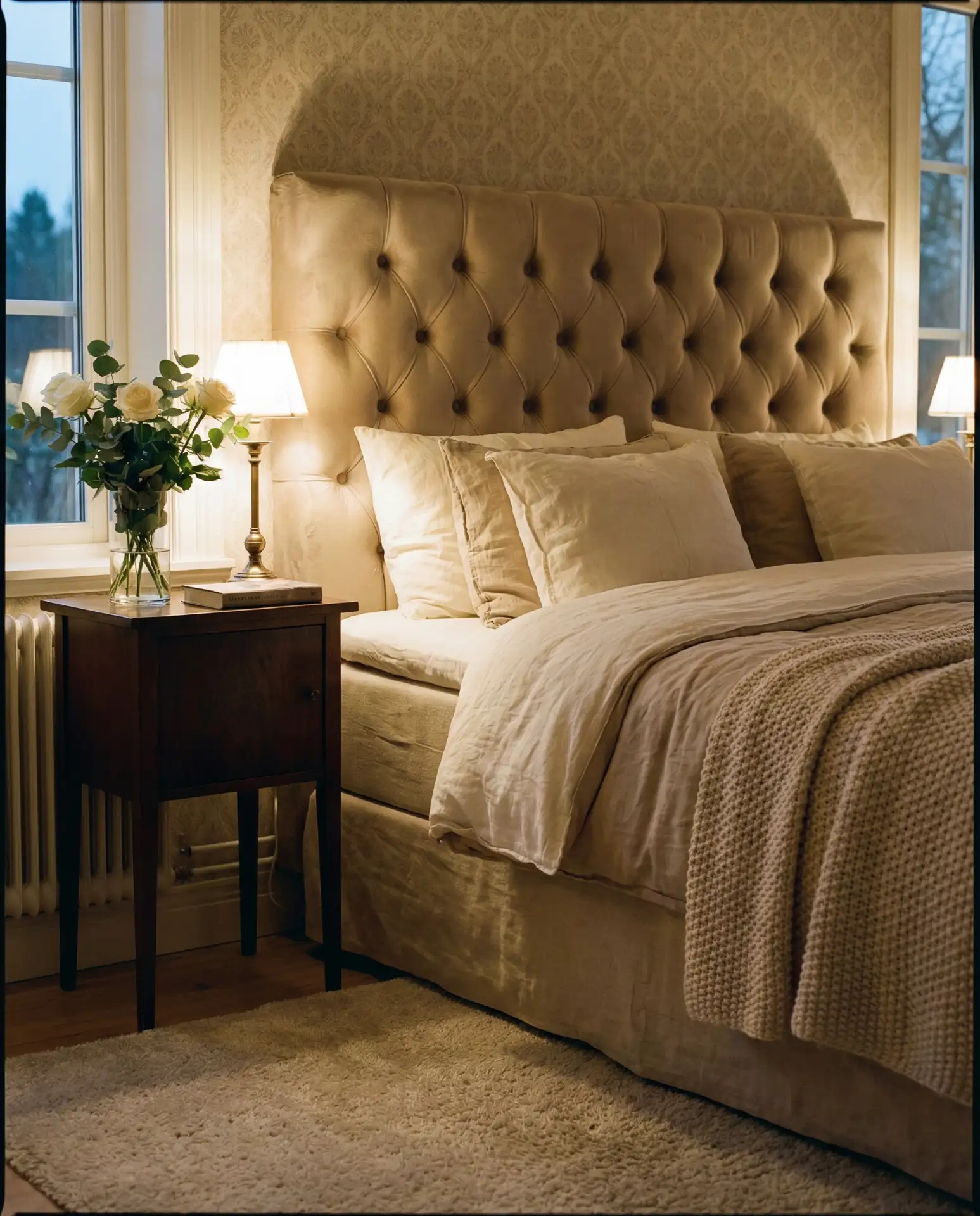
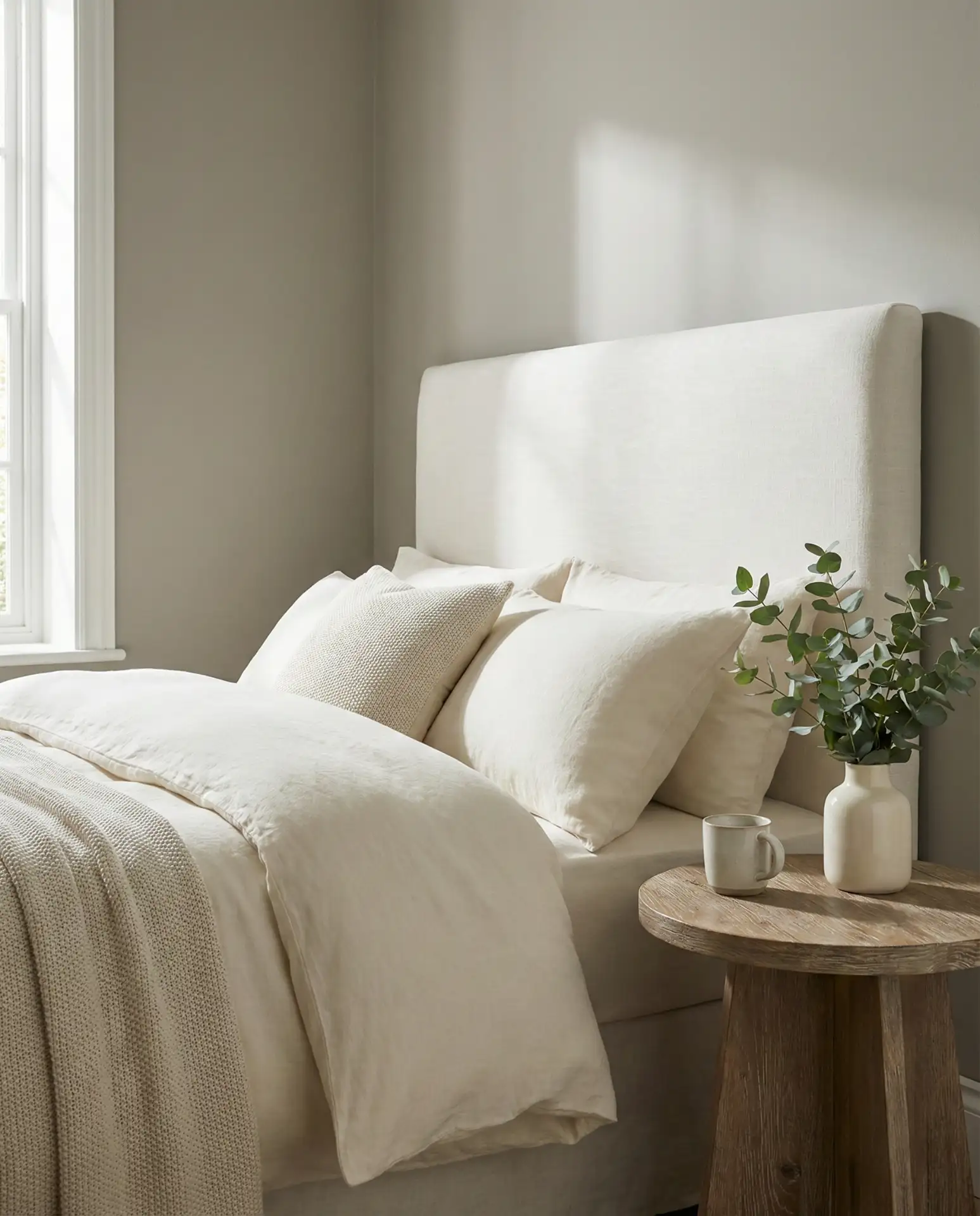
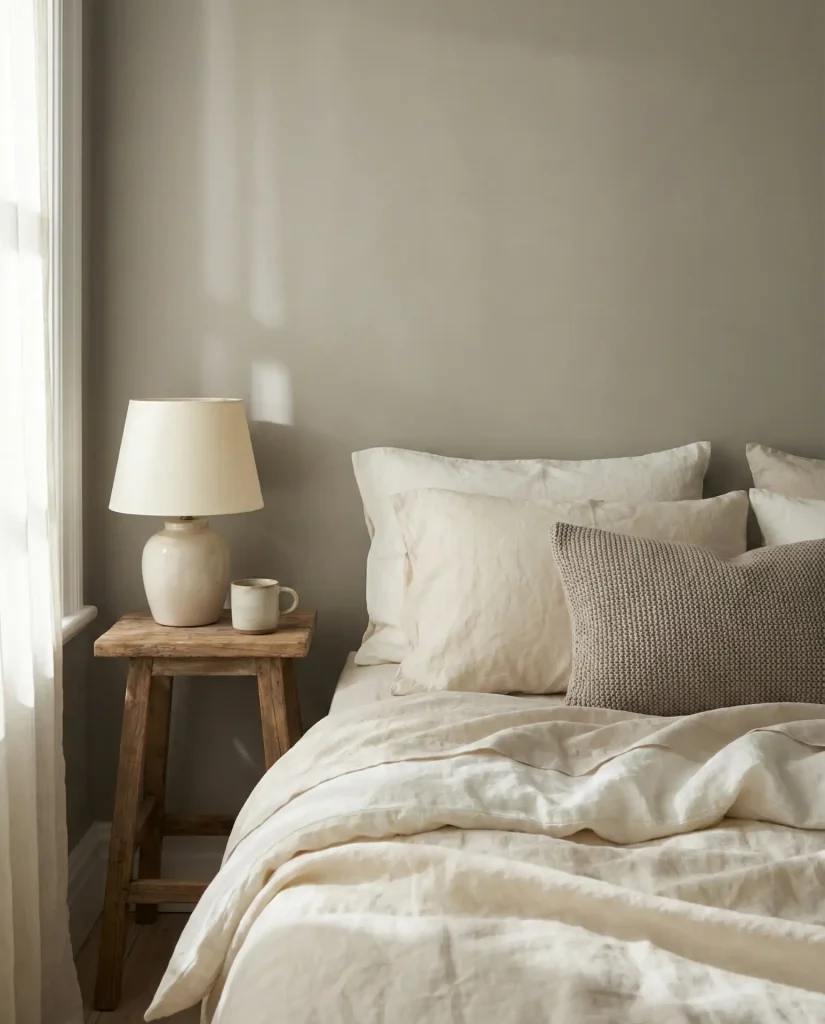
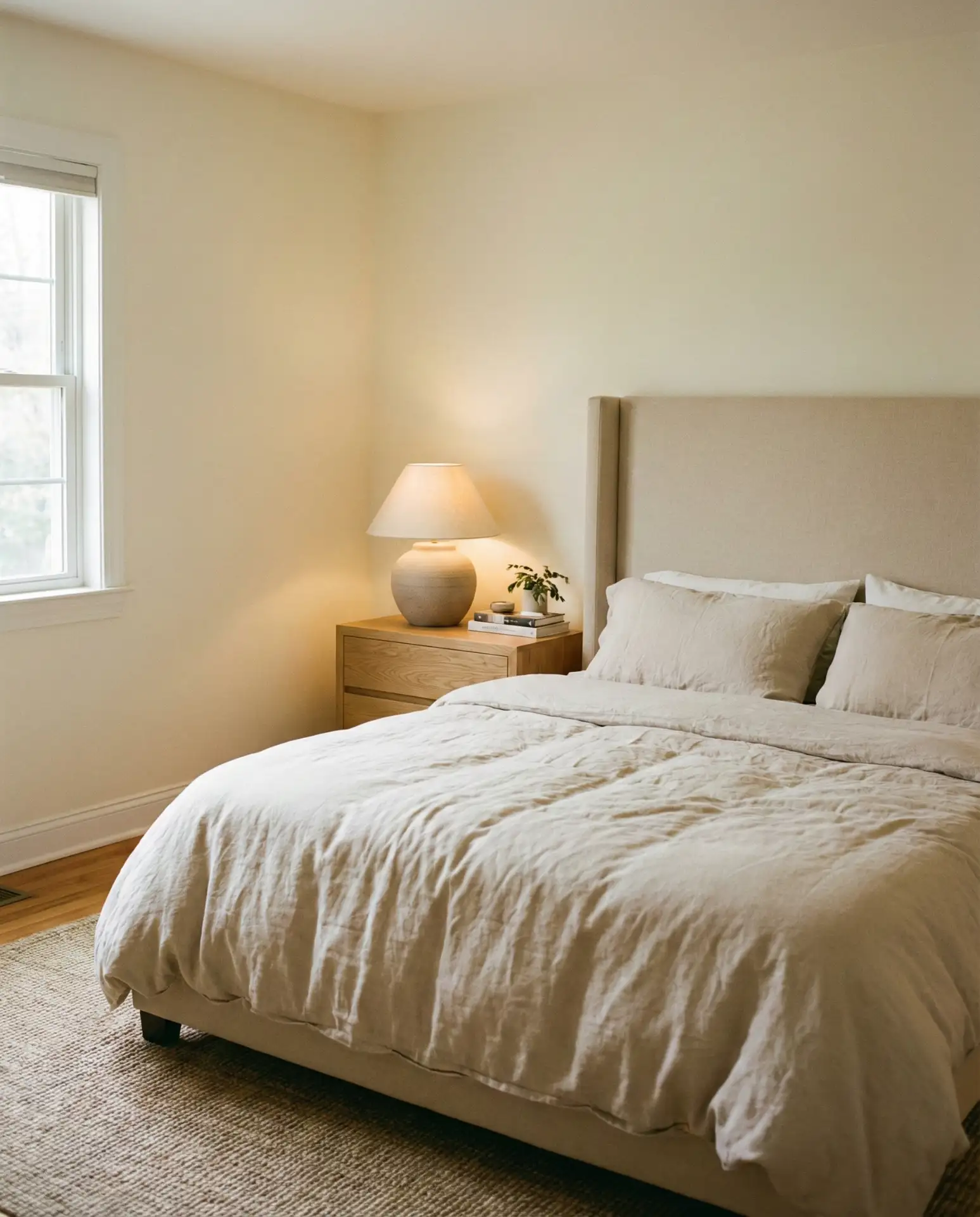
7. Beige Headboard with Warm White Walls
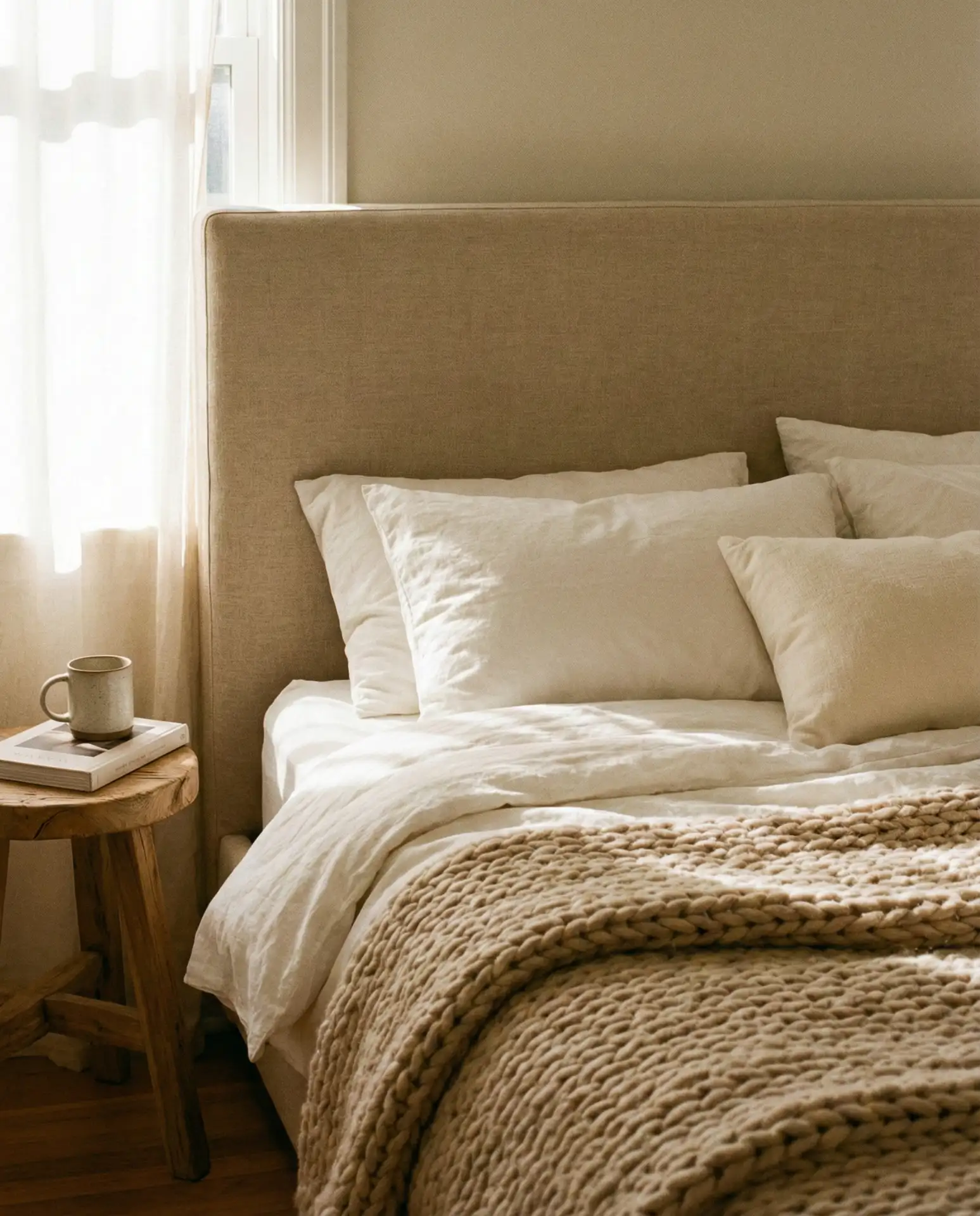
A beige headboard in linen or bouclé against warm white walls is the definition of cozy neutral. It’s soft, inviting, and endlessly adaptable. This palette is a favorite for couples who want a bedroom that feels calm and unified without skewing too masculine or feminine. The key is choosing a beige with enough depth—think camel, sand, or oatmeal—so it doesn’t disappear into the walls. Layer in ivory, cream, and taupe for a tonal look that feels intentional.
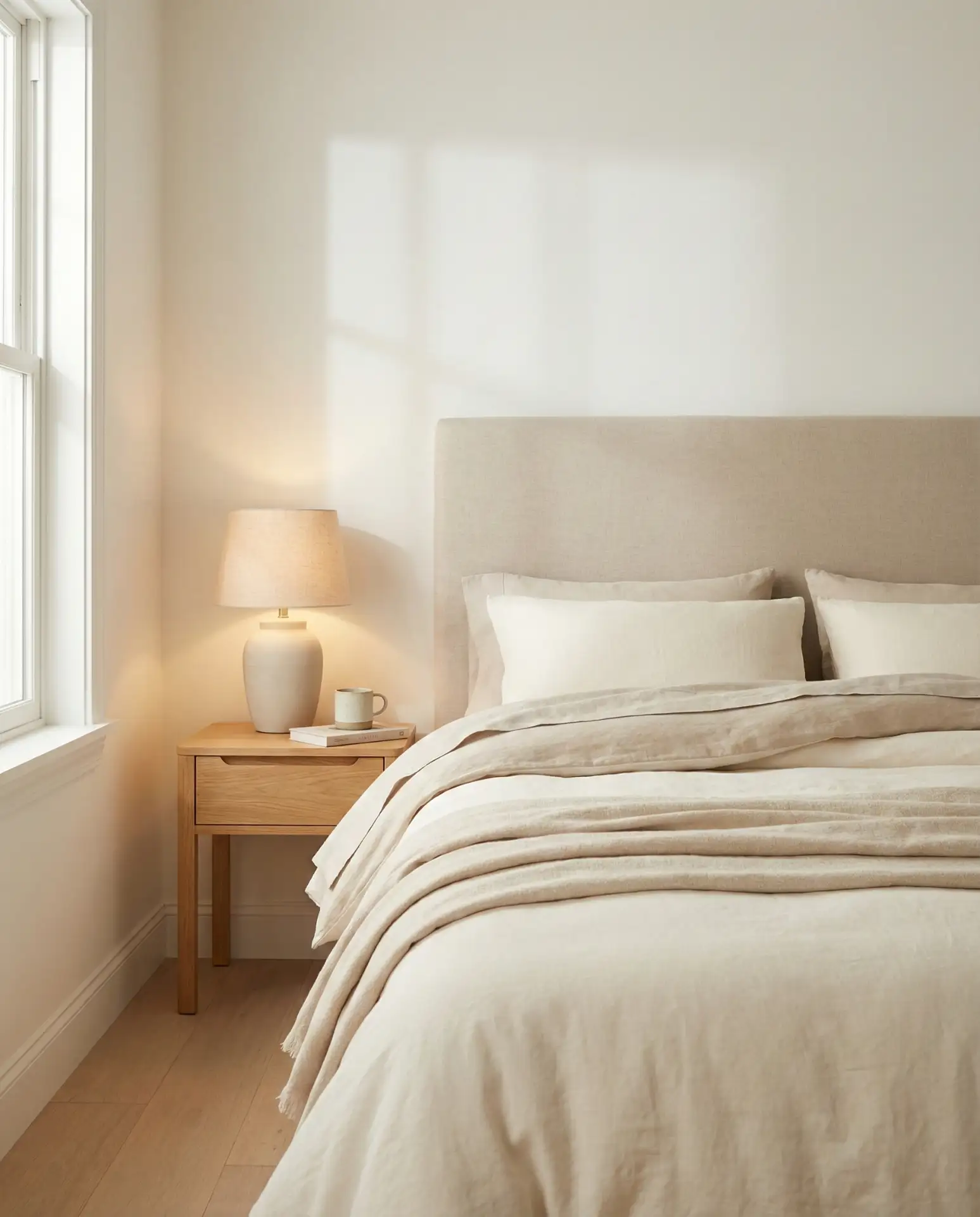
A designer I spoke with in Nashville mentioned that beige headboards are her most requested item for primary bedrooms. They’re versatile, timeless, and easy to style around. The mistake to avoid is choosing a beige that’s too yellow or too pink—test swatches in your actual bedroom light. Pair with natural fiber rugs, linen curtains, and wood accents to keep the space from feeling flat. This palette also photographs beautifully, which is why it dominates Pinterest boards for bedroom inspiration.
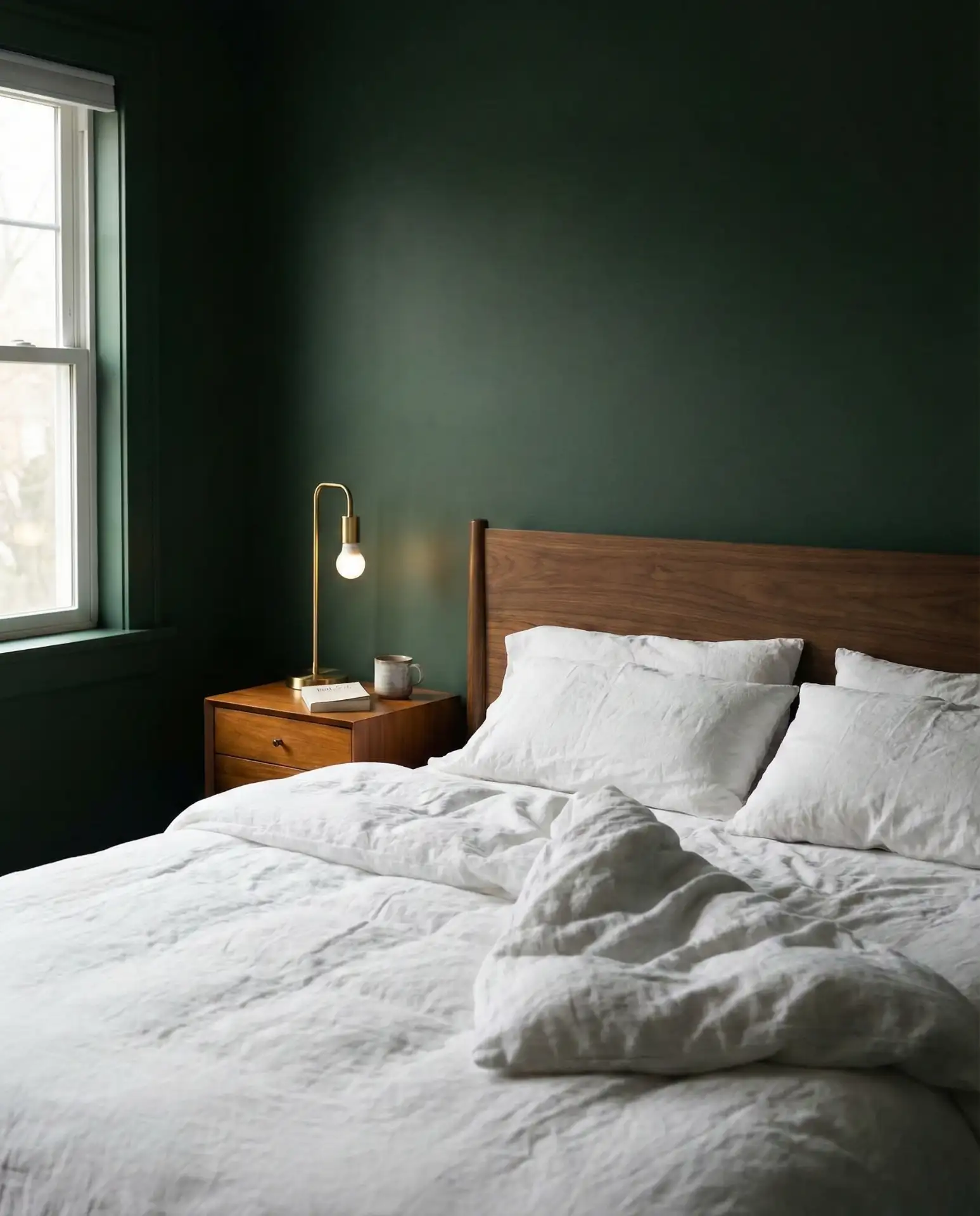
8. Forest Green and Brass Accents
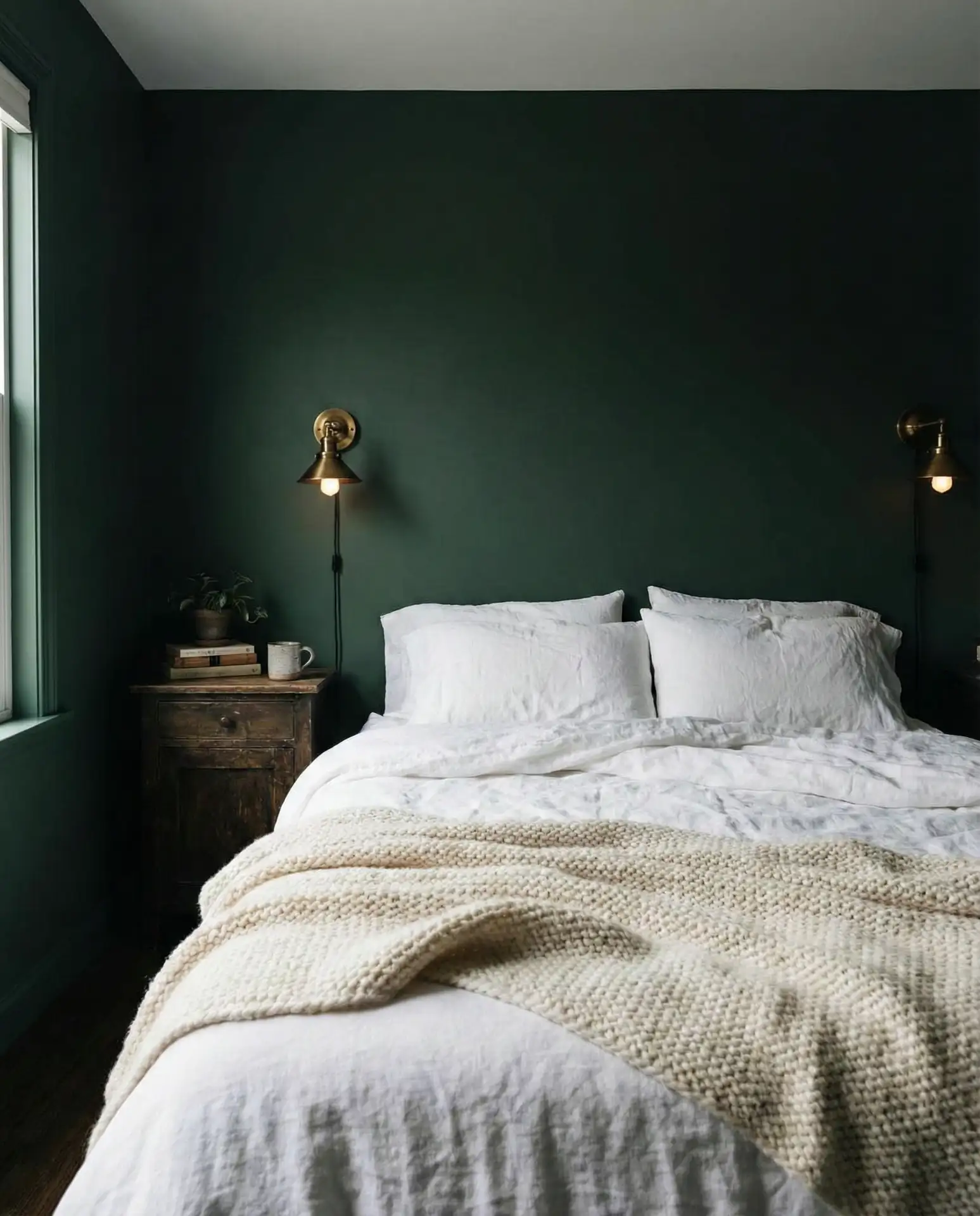
Forest green walls paired with brass hardware and lighting create a bedroom that feels rich, enveloping, and quietly luxurious. It’s a dark and moody palette that works particularly well in larger bedrooms where the depth won’t feel claustrophobic. The brass adds warmth and prevents the green from reading too cold or institutional. This combination is trending heavily in the Northeast and Pacific Northwest, where homeowners are embracing darker, more intimate bedroom palettes.
This palette is all about contrast and layering. Stick with white or cream bedding to keep the room from feeling too dark, and bring in brass through lighting, drawer pulls, and mirrors. In rooms with limited natural light, consider painting just one or two walls in forest green rather than the entire space. Real homeowners often pair this scheme with velvet or wool textures to amplify the cozy, cocoon-like feeling. Avoid mixing brass with chrome or nickel—it muddies the look.
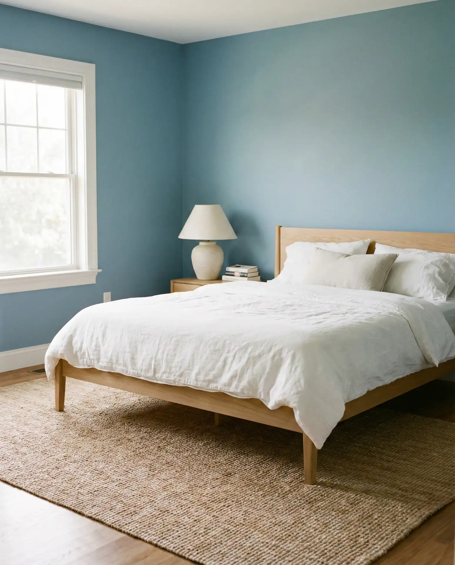
9. Soft Blue and Natural Linen
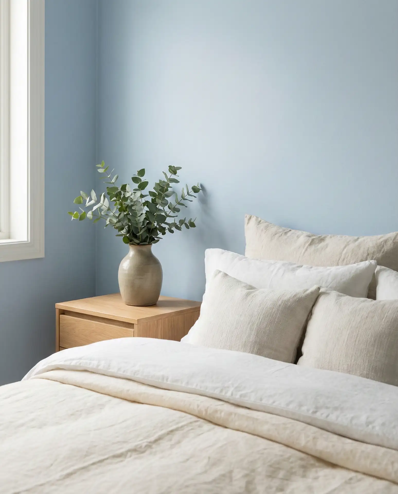
Pale blue walls paired with natural linen bedding create a bedroom that feels airy, relaxing, and effortlessly coastal. This isn’t the bold navy of years past—it’s a softer, almost grayish blue that works in both traditional and modern spaces. It’s particularly popular in beach towns and Southern states, where the color echoes skies and water. The linen adds texture and warmth, preventing the blue from feeling too cool or sterile.
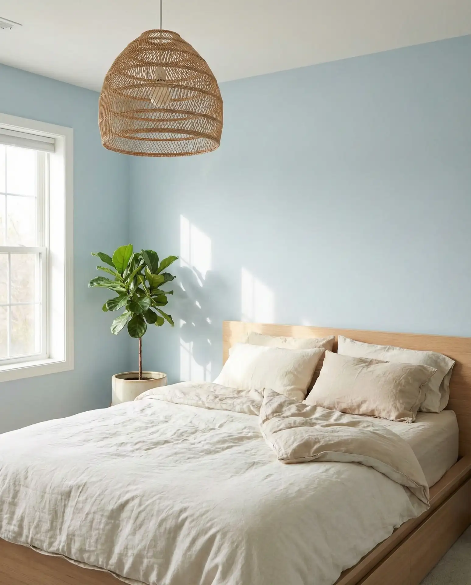
Where this works best is in bedrooms with abundant natural light, especially those facing east or south. The blue shifts beautifully throughout the day—cooler in the morning, warmer at dusk. Pair it with white or light wood furniture to keep the palette light and open. A common mistake is going too pastel—choose a blue with enough gray to feel sophisticated rather than nursery-like. Layer in jute, rattan, and natural fiber rugs to add dimension and warmth.
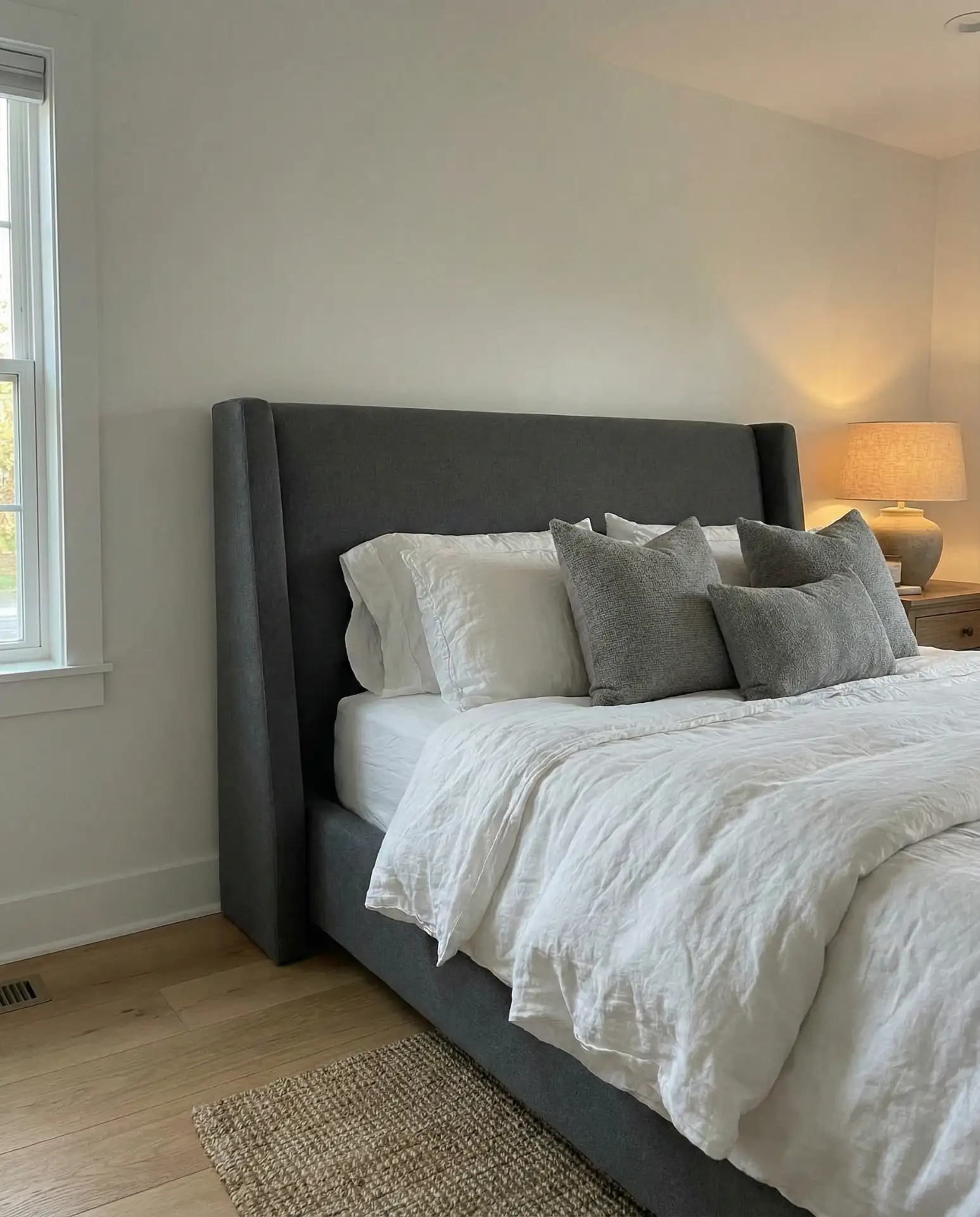
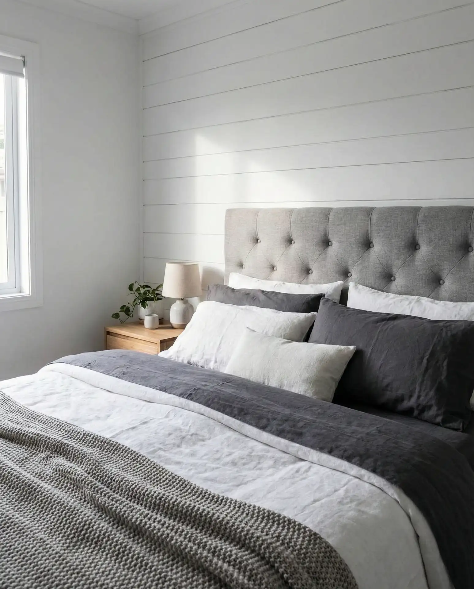
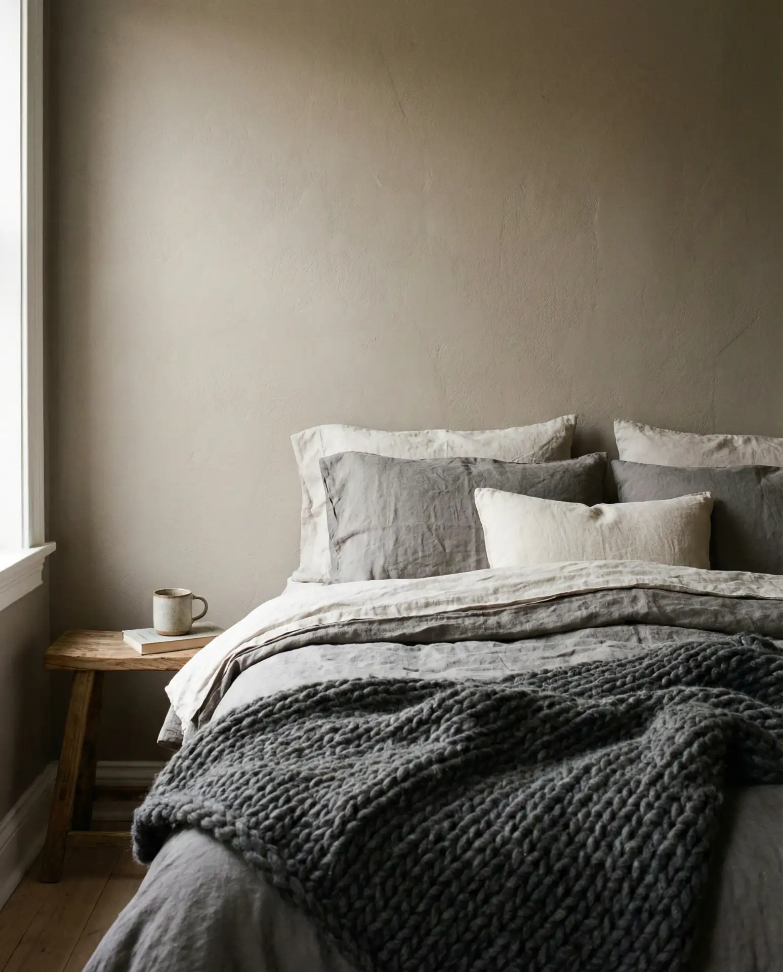
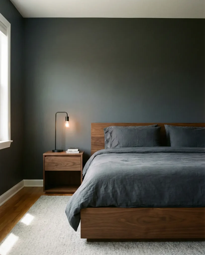
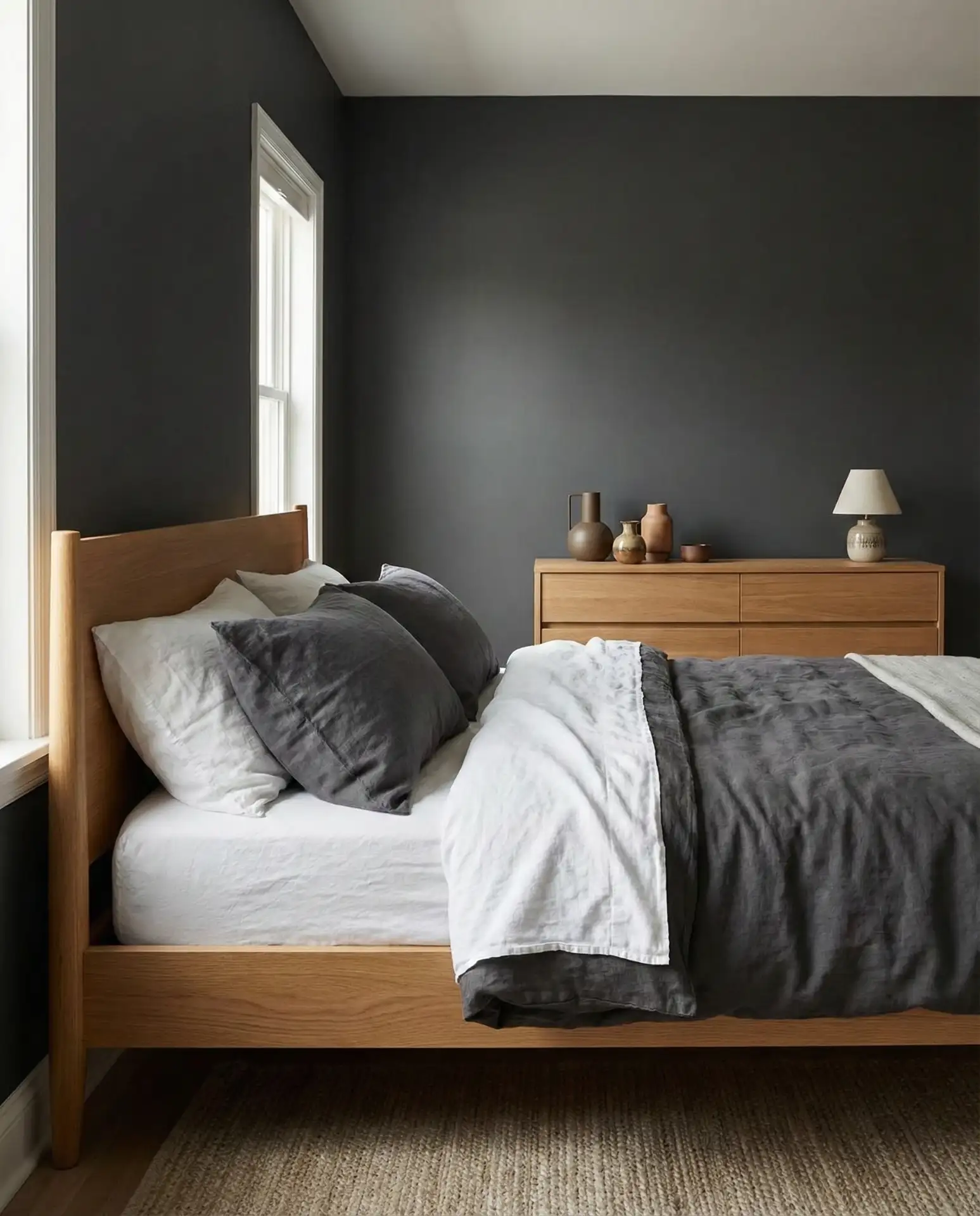
10. Gray Headboard with Charcoal Accent Wall
A gray headboard paired with a charcoal accent wall creates a tonal, sophisticated bedroom that feels modern and grounded. This is a dark palette, but when executed well, it’s anything but depressing. The key is layering multiple shades of gray—from dove to slate to charcoal—so the room has depth rather than feeling flat. It’s especially effective for men or couples who want a bedroom that feels contemporary and unfussy.
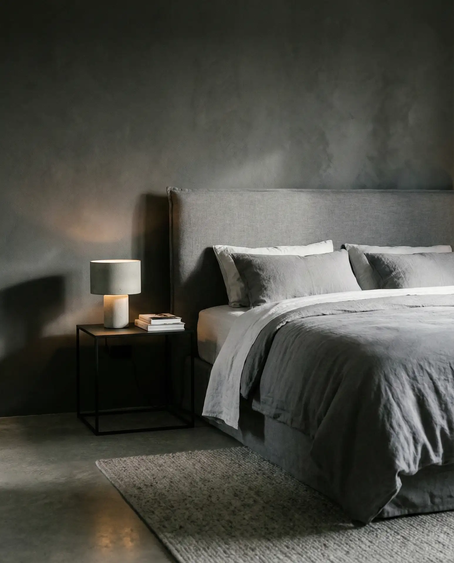
Expert tip: always paint the charcoal wall in a matte or eggshell finish to avoid it looking too flat or absorbing too much light. Add in white or cream bedding to create contrast and prevent the room from feeling too monochromatic. This palette works well in urban settings and modern homes, where clean lines and minimalism are prioritized. Avoid pairing it with too much black—stick to grays and whites with maybe one black accent piece for balance.
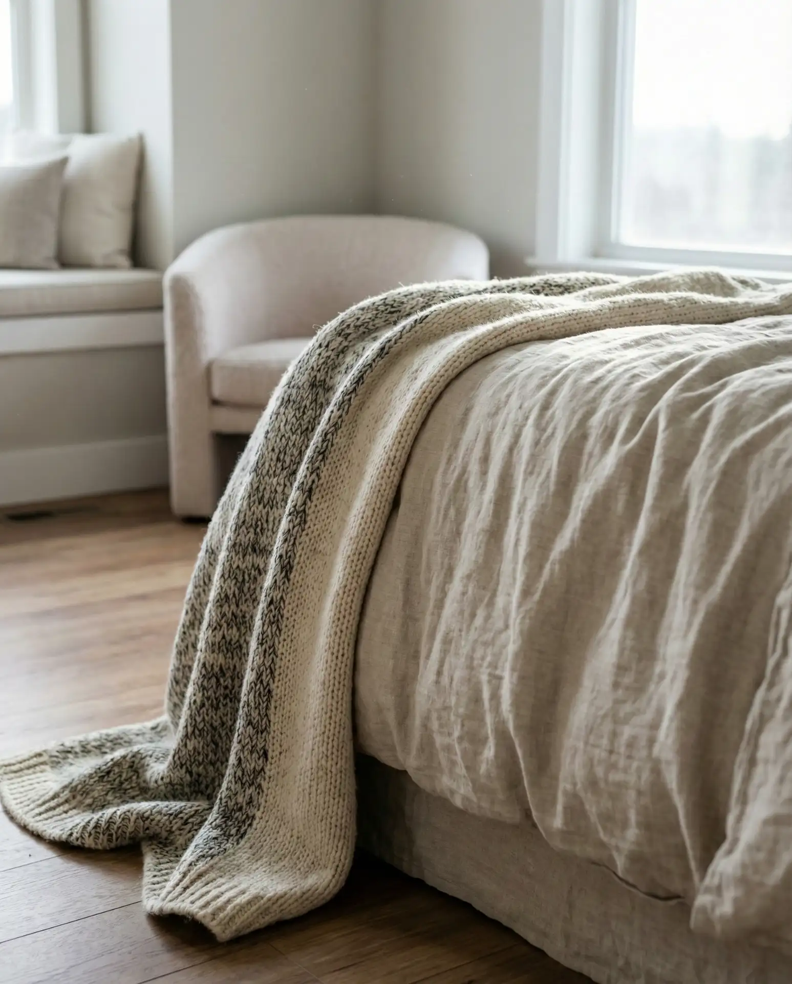
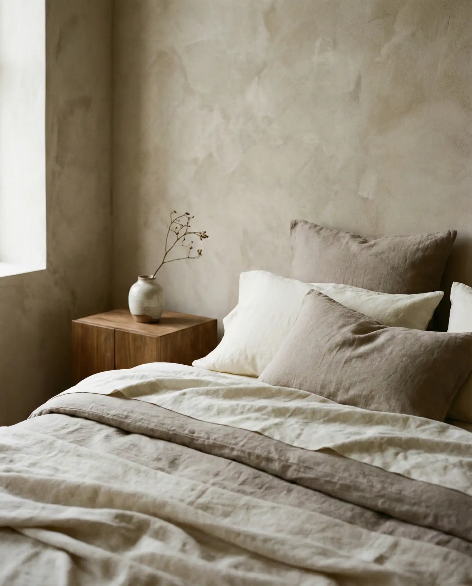
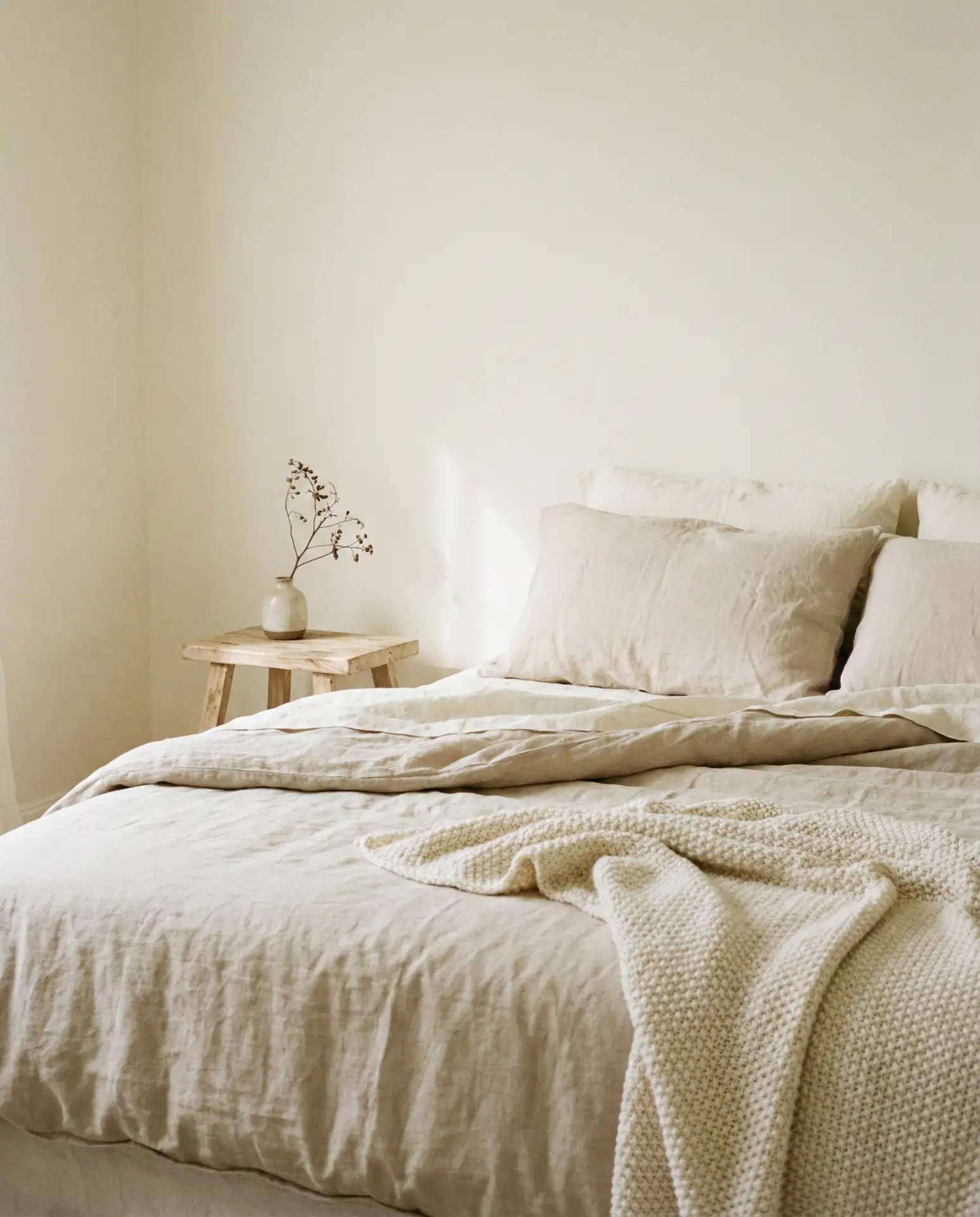
11. Cozy Neutral Layered Tones
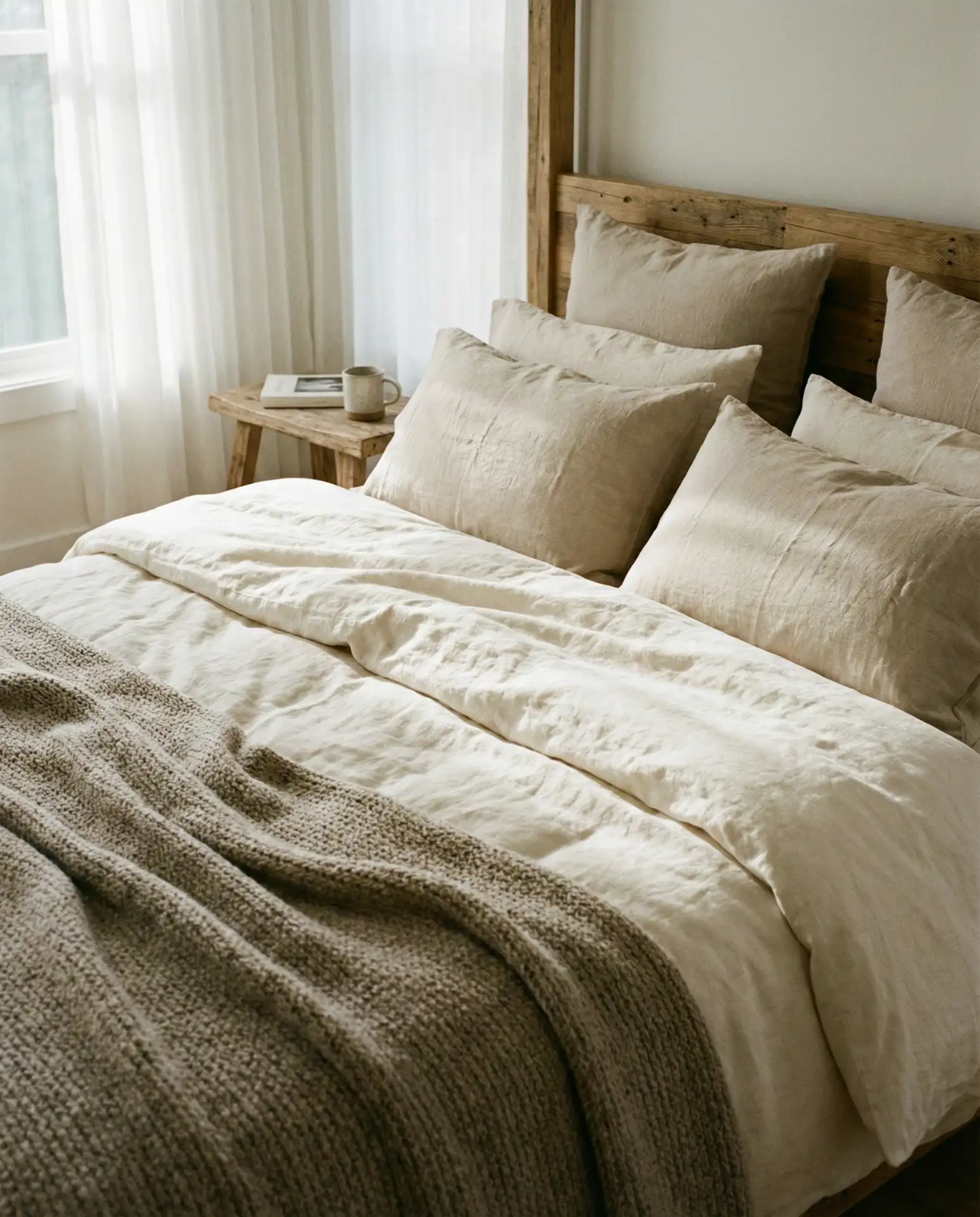
This approach is all about building a cozy neutral palette through texture and tone. Think warm whites, creams, taupes, and soft beiges layered together in varying fabrics and finishes. It’s a relaxing scheme that never feels cold or sterile, and it’s endlessly adaptable. This is the palette you see in high-end hotel rooms and Scandinavian-inspired interiors—effortlessly chic and universally calming. It works in every region and every style of home.
Real homeowners love this palette because it’s mistake-proof. You can mix and match neutrals without worrying about clashing, and it’s easy to refresh by swapping out a throw or pillow. The trick is varying the textures—combine linen, wool, cotton, and wood to keep the eye engaged. In the Midwest and South, this palette is especially popular for primary bedrooms where comfort and calm are the priorities. Just avoid going too beige-on-beige; introduce whites and taupes to add contrast.
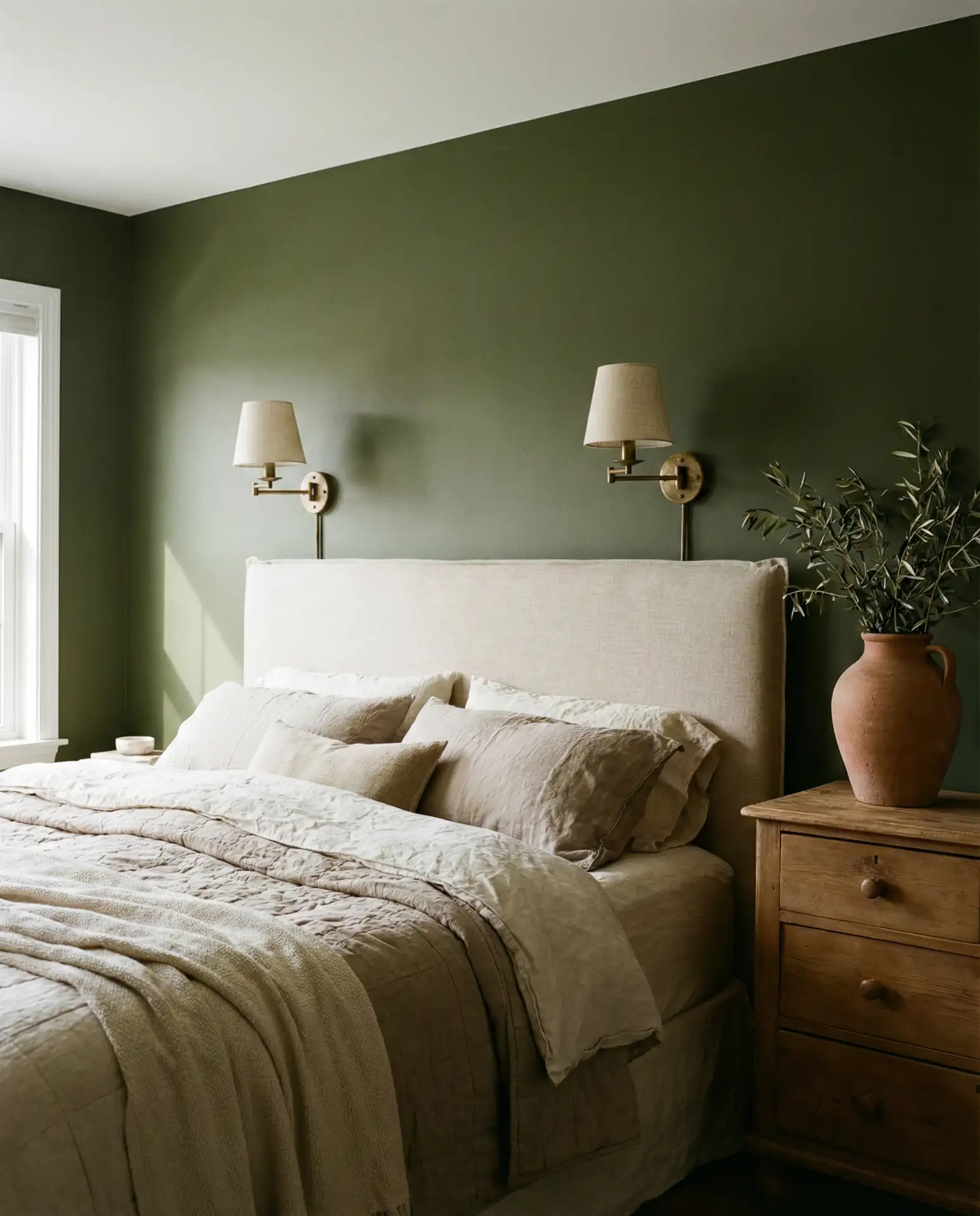
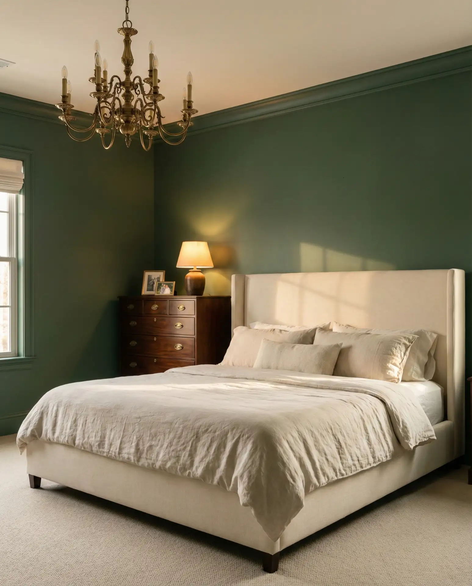
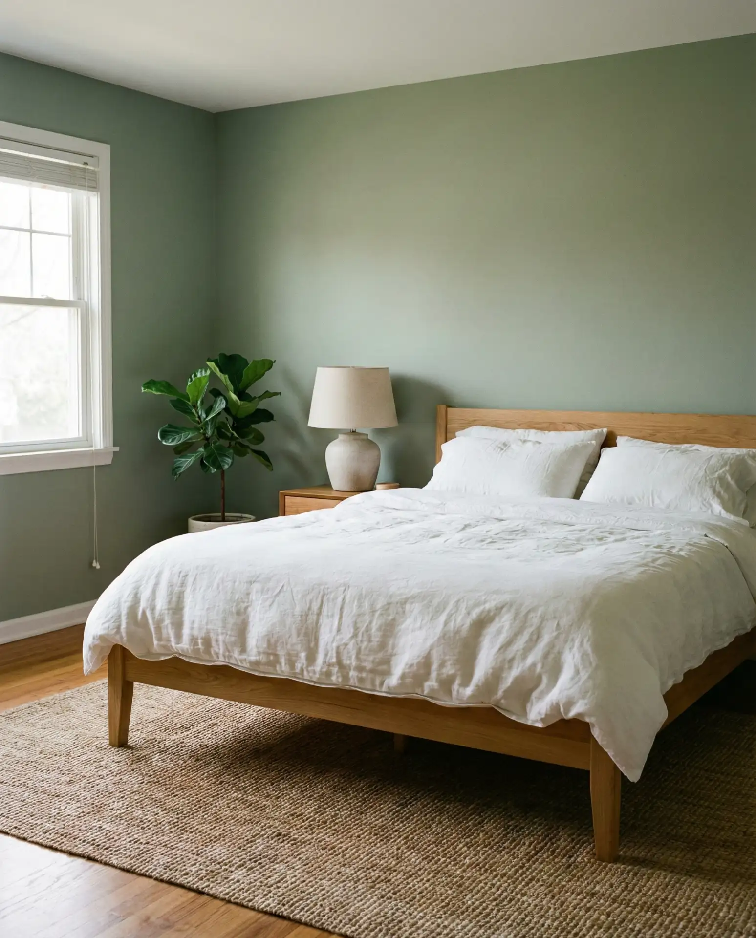
12. Dark Green Walls with Warm Wood
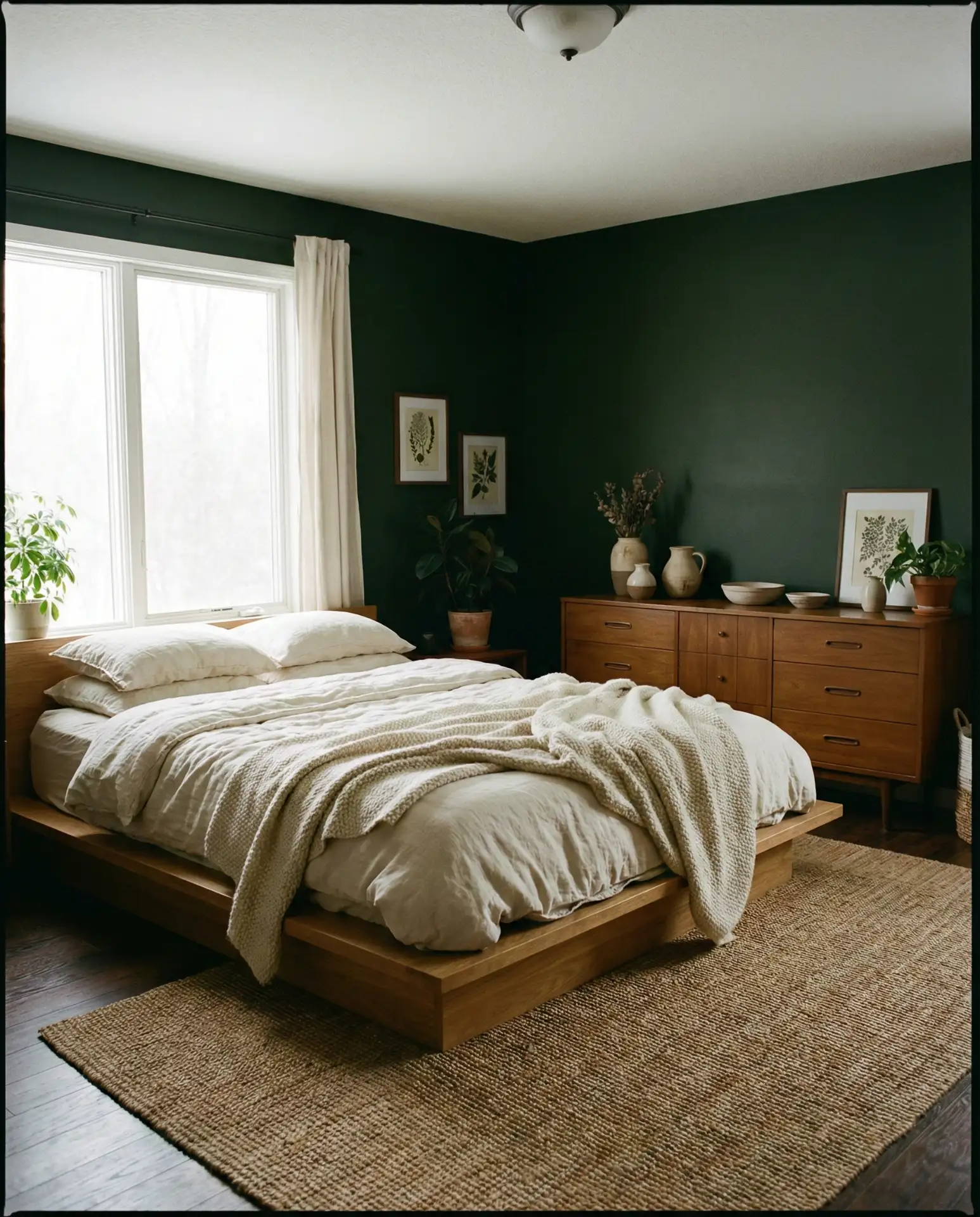
Dark green walls—think hunter or deep sage—paired with warm wood furniture create a bedroom that feels grounded, sophisticated, and slightly vintage. It’s a dark and moody palette that works beautifully in larger bedrooms with good natural light. The warmth of the wood prevents the green from feeling too cold or institutional. This combination is trending heavily in Portland, Seattle, and Brooklyn, where homeowners are leaning into richer, more saturated wall colors.
This palette requires confidence, but the payoff is huge. Stick with white or cream bedding to keep the room from feeling too enclosed, and bring in brass or gold accents to add warmth. A friend in Austin painted her bedroom a deep hunter green and said it transformed the space from generic to genuinely personal. The mistake to avoid: pairing dark green with cool-toned woods like ash or birch. Stick with walnut, oak, or cherry for the best results.
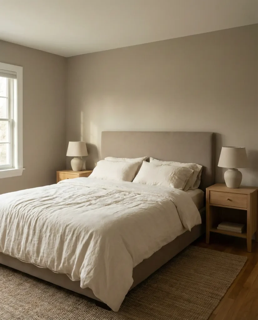
13. Classy Greige and Ivory
Greige—a perfect blend of gray and beige—paired with ivory creates a classy, timeless bedroom palette. It’s neutral without being boring, and it works across nearly every style of home, from traditional to contemporary. This combination is particularly popular in suburban homes across the Midwest and South, where homeowners want a polished, pulled-together look without committing to bold color. The greige grounds the space, while the ivory keeps it light and airy.
Where this works best is in bedrooms with moderate to good natural light. In darker rooms, greige can look muddy, so test samples before committing. Pair with warm wood tones, linen, and subtle brass or gold accents to keep the palette from feeling cold. A common mistake is choosing a greige that leans too gray or too beige—aim for a true 50/50 blend. This palette is also incredibly budget-friendly, as neutral paint and bedding are widely available and affordable.
14. Olive and Cream Guest Bedroom 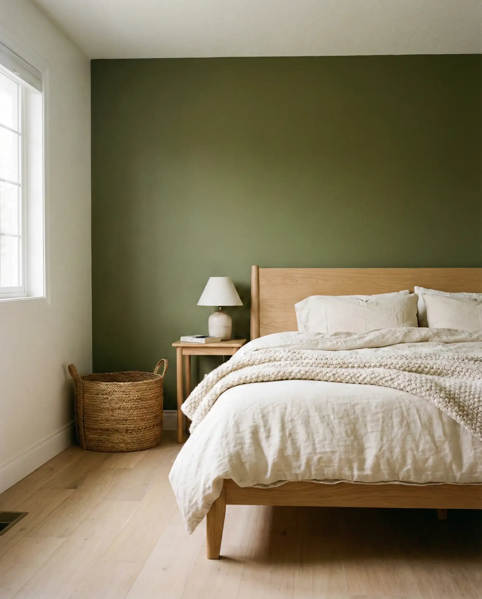
An olive and cream palette is ideal for a guest bedroom that needs to feel welcoming but not overly personal. The muted green brings warmth and character, while the cream keeps the space feeling open and neutral. It’s a combination that works across styles and appeals to a wide range of tastes, which is exactly what you want in a guest space. This palette is especially popular in homes with neutral or modern farmhouse aesthetics.
Practical insight: guest bedrooms benefit from palettes that feel calm and unfussy. Olive and cream hits that sweet spot—it’s interesting enough to feel thoughtful but not so bold that it might clash with someone’s personal taste. Keep the bedding simple and layer in a few cozy touches like a throw blanket or reading lamp. Avoid over-decorating; guests appreciate a clean, open space where they can relax without feeling like they’re in someone else’s very personal bedroom.
15. Farrow and Ball Inspired Neutrals
Colors inspired by Farrow and Ball palettes—think Elephant’s Breath, Jitney, or Skimming Stone—bring a level of sophistication and depth that standard builder-grade neutrals can’t match. These are neutral tones with complex undertones, shifting subtly in different lights. They’re favored by design-conscious homeowners who want a bedroom that feels curated and timeless. This palette works beautifully in historic homes, brownstones, and modern builds alike.
These colors are an investment—Farrow & Ball paints run $100+ per gallon—but many homeowners find dupes from brands like Benjamin Moore or Sherwin-Williams that capture the same depth. The key is choosing a neutral with subtle undertones that shift in different lights. Test swatches on all four walls and observe them at different times of day. Pair with natural linen, wool, and warm wood to let the wall color shine. Avoid bright white trim, which can clash with the complex undertones.
16. Blue and White Coastal Calm
Classic blue and white is a bedroom palette that never goes out of style, especially in coastal regions. It’s crisp, relaxing, and endlessly adaptable. The key is choosing the right shade of blue—soft powder blues feel more traditional, while deeper dusty blues lean modern. Pair with white or cream bedding, natural wood, and woven textures for a look that feels fresh and timeless. This palette is particularly popular in New England, California, and Florida.
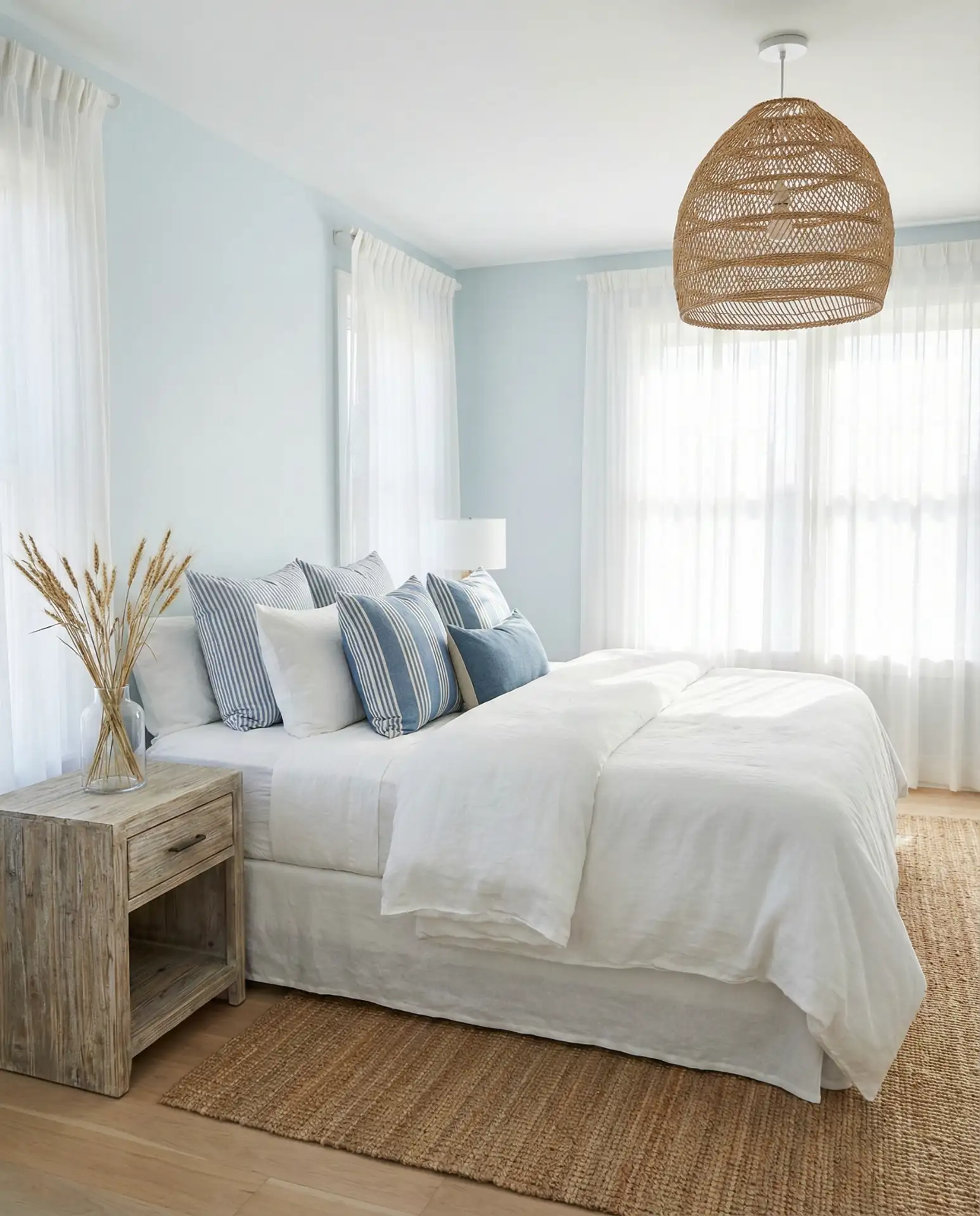
American lifestyle note: this palette is so popular in beach towns that it’s almost a cliché—but it endures because it works. The blue feels calming and promotes sleep, while the white keeps the room feeling open and fresh. To avoid the “beach house rental” look, introduce organic textures like linen, rattan, and natural fiber rugs. Skip the nautical decor and instead let the color palette speak for itself. This approach feels more sophisticated and less themed.
17. Cozy Taupe and Soft Gray
Taupe walls paired with soft grey bedding create a cozy, enveloping bedroom that feels warm but not overly saturated. This is a neutral palette with enough depth to feel intentional. It’s particularly effective for bedrooms where you want a calm, sophisticated vibe without committing to bold color. This combination works across all regions and is especially popular in the Midwest, where homeowners gravitate toward warm, inviting palettes.
Where this works best is in bedrooms with moderate to good natural light. In darker rooms, taupe can read too brown or muddy. Pair with soft gray bedding, white trim, and warm wood accents to keep the palette balanced. A common mistake is choosing a taupe that’s too pink or too yellow—aim for a true neutral taupe with balanced undertones. Layer in textured fabrics like wool, linen, and bouclé to add dimension and keep the room from feeling flat.
18. Relaxing Sage and White
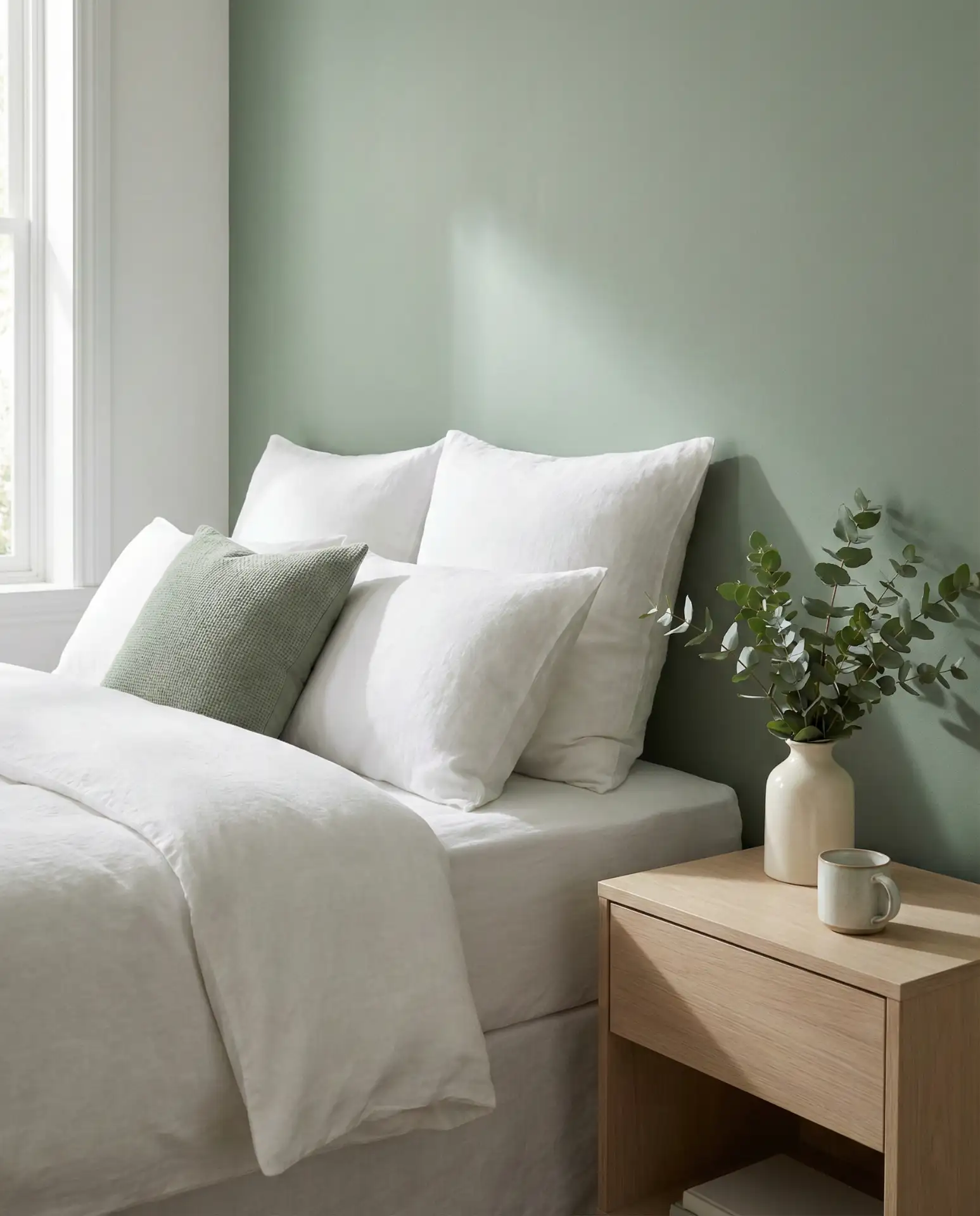
Soft sage green paired with crisp white creates a bedroom that’s inherently relaxing and fresh. It’s a cozy palette that works in both modern and traditional homes, and it’s particularly popular in the South and California, where natural, organic palettes are embraced. The sage brings a subtle hint of color without overwhelming the space, and the white keeps everything feeling light and airy. This is an ideal palette for primary bedrooms and guest rooms alike.
Real homeowner behavior: many people start with sage as an accent wall and end up painting the entire room because they love how calming it is. The key is choosing a sage that leans slightly gray rather than too green or too blue. Pair with white or cream bedding, natural wood, and plenty of plants to amplify the organic feel. Avoid pairing sage with cool grays or black—it can make the green look muddy. Stick with warm neutrals and natural materials.
19. Terracotta Accent with Neutral Base
A terracotta accent wall paired with neutral furnishings creates a bedroom that feels warm, grounded, and slightly Southwestern without veering into cliché. The burnt orange tone adds personality and warmth, while the neutral base—think cream, beige, or soft white—keeps the room feeling balanced and livable. This palette is especially popular in Arizona, New Mexico, and California, but it’s gaining traction nationwide as homeowners embrace warmer, earthier tones.
Expert designers often recommend terracotta for bedrooms with southern or western exposure, where the color can be activated by warm afternoon light. Pair with natural linen, jute, and unfinished wood to keep the look organic. A common mistake is introducing too many competing warm tones—stick to a narrow palette and let the terracotta be the star. Avoid pairing it with cool grays, which can make the orange feel jarring or out of place.
20. Men’s Bedroom: Charcoal and Walnut
Charcoal gray walls paired with rich walnut furniture create a dark and moody bedroom that’s ideal for men or anyone who wants a space that feels modern, masculine, and sophisticated. The deep gray provides a strong backdrop, while the walnut adds warmth and prevents the room from feeling too stark. This palette is especially popular in urban lofts, condos, and modern homes where clean lines and bold choices are valued.
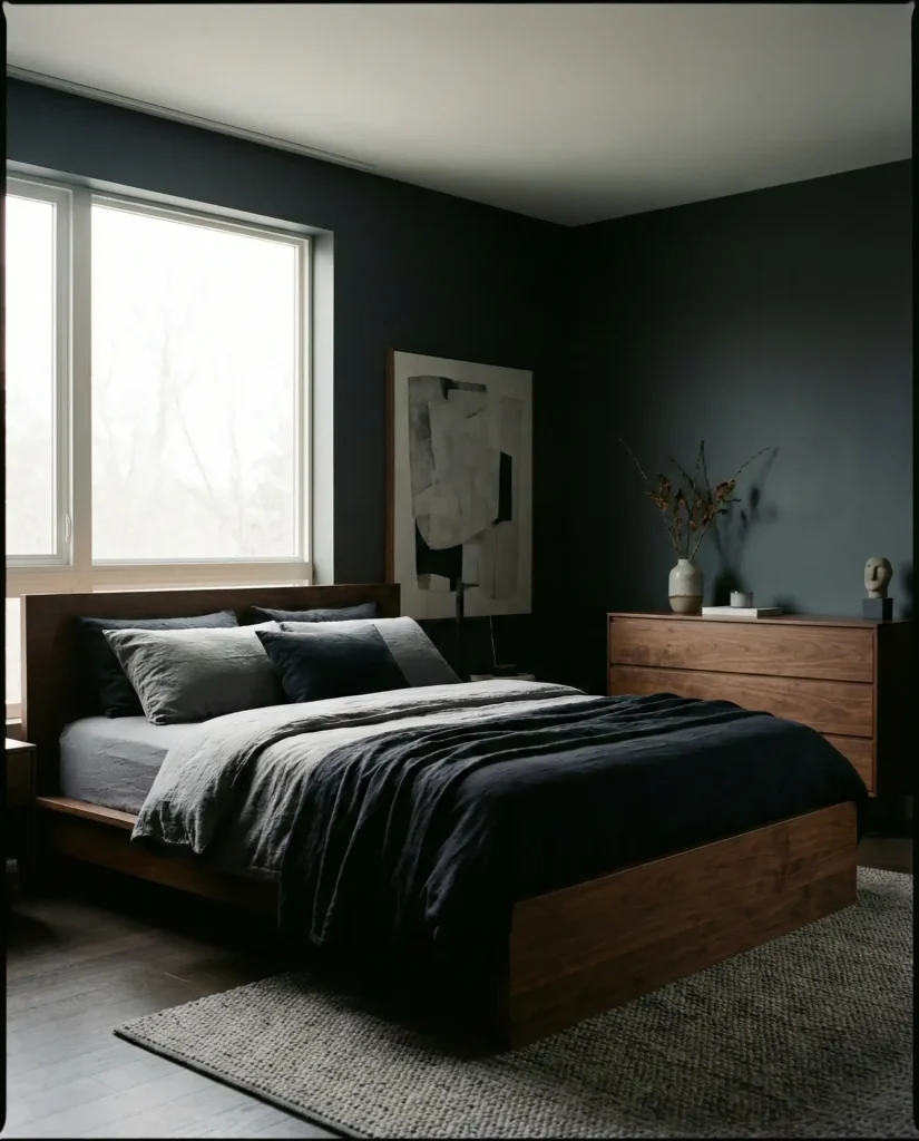
This palette requires good lighting—both natural and artificial—to avoid feeling too cave-like. Layer in white or cream bedding to create contrast, and use warm-toned lighting to balance the coolness of the charcoal. A designer in Denver mentioned this is his most requested palette for bachelor bedrooms and primary bedrooms where the homeowner wants a strong, unfussy aesthetic. Avoid mixing too many wood tones; stick with walnut throughout for a cohesive look.
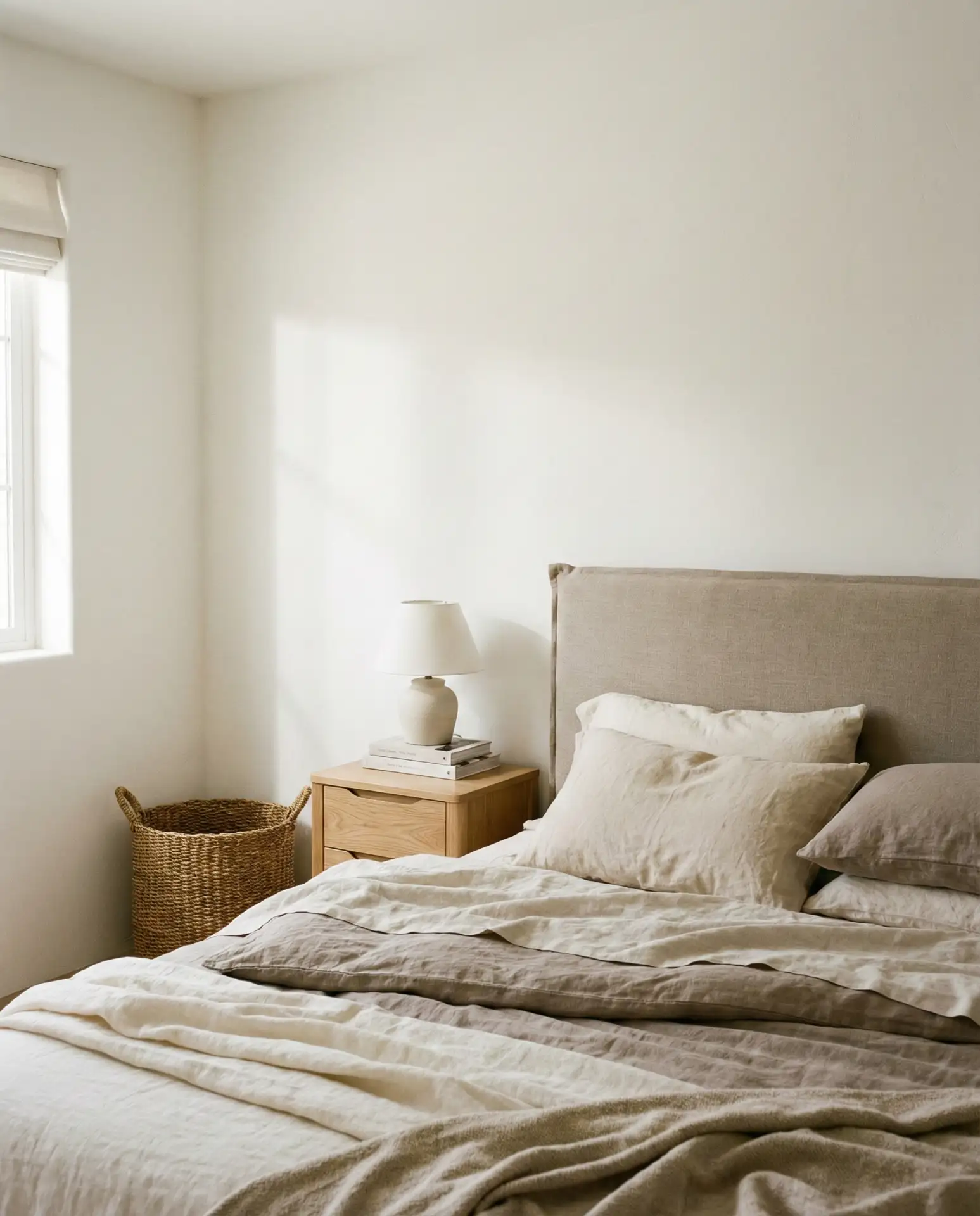
21. Neutral Couples Bedroom: Greige and Cream
Greige walls paired with cream bedding create a neutral, harmonious palette that’s ideal for couples who want a bedroom that feels balanced and universally appealing. It’s neither too masculine nor too feminine, and it provides a calm, restful backdrop for sleep. This is one of the most requested palettes for primary bedrooms across the country, from suburban homes in Texas to apartments in New York. It’s timeless, adaptable, and easy to style.
Where this works best is in bedrooms with moderate to good natural light. Greige can look muddy in low light, so test samples first. Pair with warm wood tones, linen, and subtle brass or gold accents to keep the palette from feeling cold. Many couples choose this palette because it’s easy to agree on—it doesn’t skew too bold in any direction. The mistake to avoid is choosing a greige that’s too cool or too warm; aim for a true balanced greige with both gray and beige undertones.
22. Dark and Moody Navy with Brass
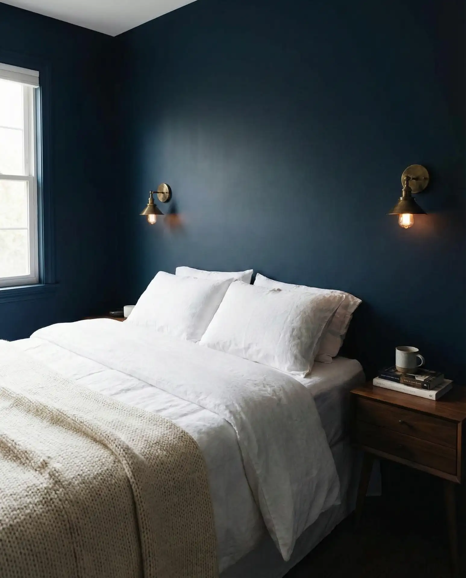
Deep navy walls paired with brass accents create a dark and moody bedroom that feels luxurious and enveloping. It’s a bold choice, but when paired with the right lighting and furnishings, it’s incredibly sophisticated. The brass adds warmth and prevents the navy from feeling too cold or heavy. This palette is trending in cities like San Francisco, Boston, and Portland, where homeowners are embracing darker, more intimate bedroom schemes.
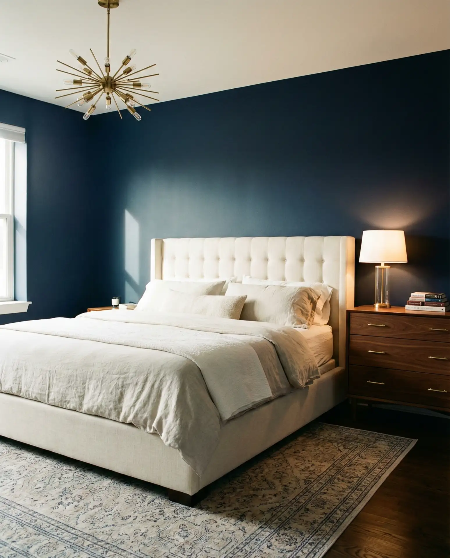
Budget angle: painting a room navy is an affordable way to make a dramatic impact. A gallon of quality navy paint runs $40–$60, and brass hardware is widely available at accessible price points. The key is layering in enough white or cream bedding to keep the room from feeling too dark and using warm-toned lighting to balance the coolness of the navy. Avoid mixing brass with chrome—it muddies the aesthetic. Stick with one metal finish throughout the room.
23. Dark Charcoal Walls with Light Wood
Dark charcoal walls paired with light wood furniture create a striking contrast that feels modern and intentional. The deep gray provides a bold backdrop, while the light wood—think white oak or ash—adds warmth and prevents the room from feeling too heavy. This palette is especially effective in bedrooms with high ceilings or abundant natural light. It’s a favorite in contemporary homes and urban lofts where bold design choices are embraced.
A homeowner in Chicago painted her primary bedroom charcoal and paired it with light oak furniture—she said it completely transformed the space from generic to striking. The key is balancing the darkness with plenty of white or cream bedding and ensuring the room has good lighting. Avoid mixing too many dark elements; let the walls be the star and keep everything else relatively light. This palette also works beautifully with black accents and matte black hardware.
24. Classy Cream and Soft Beige
Cream walls paired with a soft beige headboard and bedding create a classy, serene bedroom that feels timeless and elegant. It’s a cozy neutral palette that works in every style of home, from traditional to modern. The tonal approach—layering creams, beiges, and soft whites—creates depth without relying on bold color. This is one of the most versatile palettes for bedrooms, and it’s especially popular in the South and Midwest, where warm, inviting spaces are prized.
Common mistakes to avoid: choosing a cream that’s too yellow or a beige that’s too pink. Always test swatches in your actual bedroom light, and observe them at different times of day. Pair with natural wood, linen, and subtle brass or gold accents to keep the palette from feeling flat. This is a palette that photographs beautifully, which is why it dominates Pinterest boards for bedroom inspiration. It’s also incredibly easy to live with and adapt over time.
Conclusion
These color schemes offer a starting point for your 2026 bedroom refresh. Whether you’re drawn to dark moody tones, soft neutrals, or earthy greens, the key is choosing a palette that feels authentic to your personal style and the way you live. Don’t be afraid to test samples, layer textures, and take your time. Drop a comment below and let us know which palette resonates with you—or share your own bedroom color story.