If your Pinterest feed has been flooded with stunning home exteriors lately, you’re not alone. Americans across the country are obsessing over curb appeal right now—and the palette for 2026 is genuinely exciting. Whether you’re painting a new build, refreshing a colonial in the suburbs, or finally committing to that bold front door color you’ve been debating for years, this guide covers everything you need to feel confident about your choices. From deep moody hues to sun-warmed earth tones, here are 22 exterior house color ideas that are absolutely dominating the design conversation this year.
1. Sage Green Siding With Warm White Trim

There’s a reason sage green keeps showing up on “most-searched” lists—it hits that rare sweet spot between trendy and timeless. As a 2026 trend, this muted, dusty green reads as effortlessly sophisticated against natural stone pathways and mature landscaping. It works especially well on craftsman bungalows and farmhouse-style homes where the organic color feels like an intentional nod to the surrounding environment. Pair it with creamy white trim, and you get a combo that photographs beautifully in every season.

This palette works best in wooded or suburban settings where mature trees and natural plantings provide a soft backdrop. If you’re in the Pacific Northwest or New England, sage green siding will practically melt into the landscape in the most gorgeous way. For the trim, avoid a stark bright white—opt for a warm off-white or linen tone so the contrast feels gentle rather than jarring. It’s an investment that adds real perceived value to your home’s exterior.
2. Moody Dark Blue Craftsman

If you’ve been craving something dramatic, dark blue is having an undeniable moment in 2026 trends. Think navy, midnight, or a slightly grayed-down indigo—colors that feel rich and intentional rather than loud. On a craftsman-style home with exposed rafters and a wide front porch, this palette reads like a beautifully moody editorial shoot. The depth of dark blue plays brilliantly against natural wood accents, brass hardware, and light concrete walkways, creating the kind of curb appeal that stops people mid-scroll.

One common mistake homeowners make with dark exterior colors is choosing a paint that’s too flat in finish, which can make the surface look chalky and absorb too much heat in warmer climates. Opt for a satin or low-luster finish that reflects a little light and holds up better to UV exposure over time. In humid Southern states, also check that your paint formula includes mildew-resistant additives—darker colors can show biological growth more visibly than lighter ones.
3. Warm Greige With Chocolate Brown Accents

Greige—that perfectly balanced blend of gray and beige—has been gaining serious traction as a 2026 trend, and it’s easy to see why. It’s warm enough to feel inviting but neutral enough to work with virtually any landscape, roof color, or architectural style. When you layer in dark brown accents on shutters, doors, or wood columns, the result is a grounded, cohesive look that feels both current and classic. This is the kind of palette that real estate agents dream about—it appeals to almost everyone.

A designer friend once described greige as “the perfect handshake color—it gets along with everyone.” That rings especially true in planned communities or neighborhoods with strict HOA guidelines, where you want to feel stylish within the rules. The brown accent elements ground the palette, prevent it from reading too bland, and add a layer of visual complexity that makes the home look well-considered rather than just neutrally painted. A brown front door alone can do a tremendous amount of heavy lifting here.
4. Coastal Blue Gray With White Shiplap

The coastal exterior trend is evolving—it’s moved away from the predictable pale aqua and into something with more nuance. Enter blue gray, a complex, slightly weathered hue that captures the feeling of a seaside morning without screaming “beach house.” Layered with white shiplap detailing and natural rope or rattan accessories near the entry, this look feels current but grounded. It’s especially well-suited to Cape Cod styles, raised beach cottages, or any home where horizontal siding is a prominent architectural feature.

This palette genuinely works best within a mile or two of the coast, where the humidity, salt air, and soft natural light make the color feel like it belongs to the landscape rather than being imposed upon it. Inland, blue-gray can sometimes read a little cold—especially in north-facing homes with limited direct sunlight. If you love this palette but don’t live coastal, warm it up by adding a weathered wood front door and bronze or oil-rubbed bronze hardware to bring some depth and earthiness to the entry.
5. Earthy Olive Green With Stone Veneer Base

Olive green is one of the most compelling earth tone options in the 2026 exterior color lineup—it has the natural credibility of green with the warmth of mustard and the depth of brown all rolled into one. Combined with a stone veneer base—whether that’s actual quarried stone or a high-quality manufactured stone panel—the combination feels rugged, artisanal, and completely at home in mountain or rural settings. Think Colorado foothills, Tennessee ridge homes, or anyone who wants their house to look like it grew out of the landscape organically.

Budget-conscious homeowners will be glad to know that manufactured stone veneer has come an incredibly long way in recent years. A quality panel system can cost a fraction of natural stone installation while looking nearly indistinguishable at a conversational distance. If you’re applying it as a foundation wrap or as the lower third of your home’s exterior, you’re looking at a cost-effective way to add serious texture and architectural interest without a full masonry project. The olive green siding above it reads almost like a canopy of trees.
6. All-Over Cream With Black Accents

Sometimes the most powerful look is also the most restrained. An all-over cream exterior—not white, not ivory, but a slightly yellow-warmed cream—paired with matte black windows, gutters, and front door hardware feels strikingly modern while remaining timelessly elegant. This is a combination that interior designers have long loved for facades, and it’s finally crossing over into mainstream American homebuilding in a serious way as part of the wider 2026 trend toward refined contrast palettes.
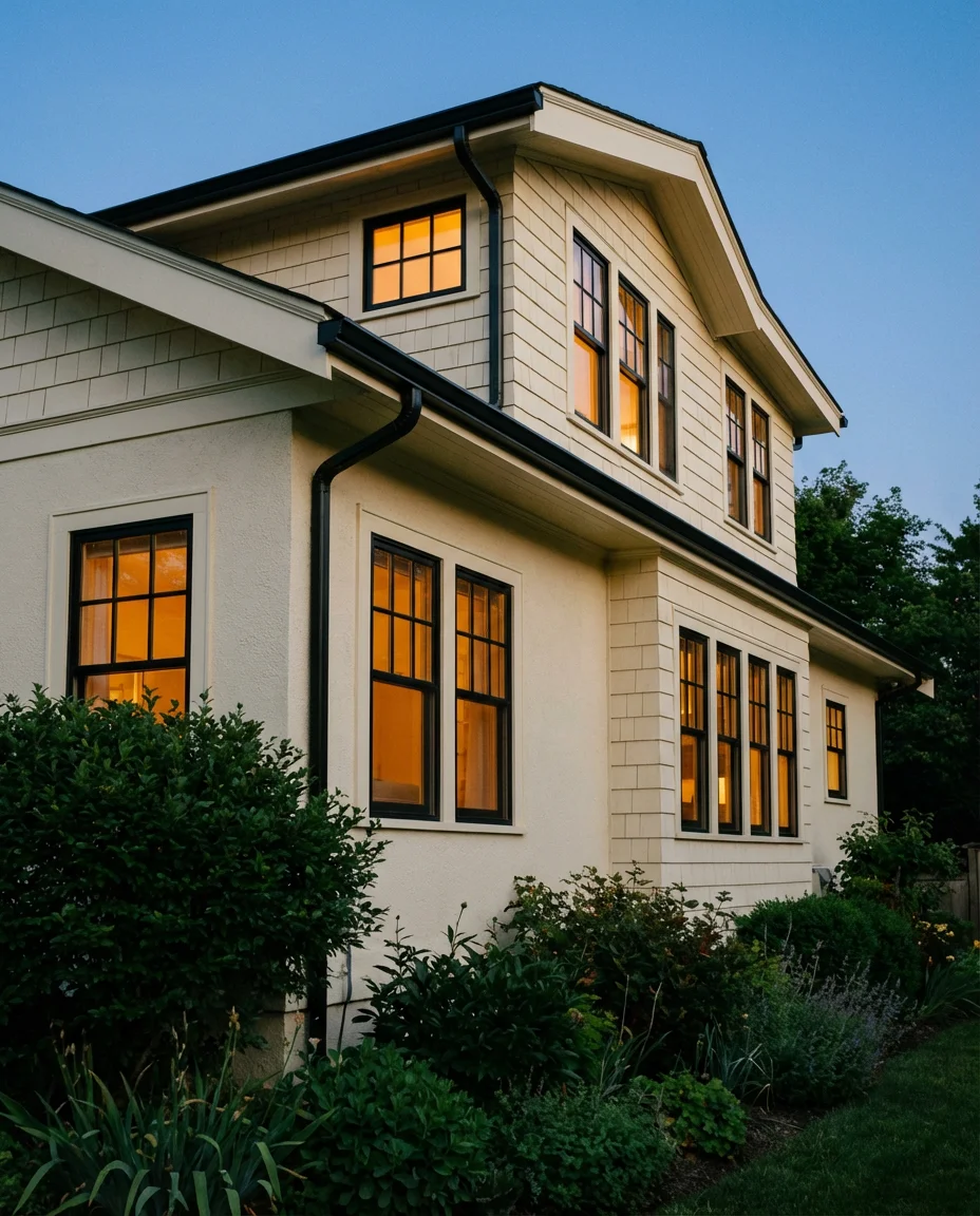
Cream exteriors photograph exceptionally well and look equally beautiful in morning and golden hour light, which makes them disproportionately popular on visual platforms like Pinterest and Instagram. For homeowners, that social visibility often translates to real resale value—people come to viewings having already fallen in love with the house online. One thing to watch: make sure your “cream” paint choice is tested in both direct sun and shade before committing, because creamy tones can shift dramatically depending on how much natural light hits the facade throughout the day.
7. Deep Forest Green With Rustic Wood Garage Door

If sage green is the approachable cousin, dark green—specifically that deep, shadowy forest green—is the moody, confident sibling who just came back from a year abroad. This color has been climbing steadily and lands firmly in the top tier of 2026 trends for anyone who wants their home to feel genuinely dramatic from the street. Paired with a rustic stained wood garage door, whether it’s real cedar or a faux-wood steel door, the combination has an organic warmth that prevents the dark tone from feeling cold or severe.

Sherwin-Williams has leaned into this demand with several deep forest green options in their exterior lineup, and a quick visit to any well-trafficked design forum will show you dozens of homeowners comparing chip samples of deep pine greens, spruce tones, and emerald-adjacent hues. The general consensus is to look for a green that reads clearly as green—not olive, not black-green—in full afternoon light. That clarity of color, even in its dark version, is what makes the palette feel intentional and confident rather than murky or undefined.
8. Warm Gray Stucco With Terracotta Tile Roof

In the Southwest and California, this combination isn’t just a trend—it’s practically a regional identity. But as gray and earth-tone palettes continue to gain national traction in 2026, the warm gray stucco paired with a traditional terracotta tile roof is reaching beyond its regional origins and showing up in Texas, Florida, and even parts of the Mountain West. The warmth of the terracotta reads beautifully against a gray that leans slightly beige—not a cold blue-gray, but a sandy, sun-bleached version that feels right for any warm-climate home.

Homeowners who live in HOA communities in Arizona or Southern California will recognize this palette as essentially the safest possible choice—it fits architectural review guidelines almost universally. But “safe” doesn’t mean boring here. The key to making this look feel elevated and current rather than generic is to layer in carefully chosen exterior details: a hand-forged iron gate, a bright turquoise or deep red front door, Mediterranean tile house numbers, and mature succulents or desert grasses in the landscaping. Those details are what separate a truly curated exterior from a cookie-cutter one.
9. Beige and Stone With Timber Frame Details

The beige exterior has undergone a genuine rehabilitation over the past few years, and in 2026 it’s arrived at a place that feels sophisticated rather than safe. The trick is pairing it with real material textures—specifically exposed stone and heavy timber framing—that give it structural and visual depth. This combination works across a wide range of architectural styles, from mountain lodges to modern farmhouses, and it has a particular resonance in the Midwest and Southeast, where traditional craft materials are deeply embedded in local building culture.

A homeowner in Tennessee described her recent exterior renovation this way: “We were terrified to commit to beige because it felt like giving up. But once we added the stone porch columns and the exposed timber gable detail, suddenly the whole thing looked intentional—like a house with a story.” That anecdote captures exactly why material layering matters so much. The beige doesn’t carry the look on its own; it’s the canvas on which everything else reads. Timber, stone, and aged metal finishes do the visual storytelling.
10. Charcoal Gray Board and Batten

Board and batten siding has been one of the defining architectural details of the modern farmhouse movement, and in 2026 it’s getting a darker, more dramatic update. Dark charcoal gray on a vertical board and batten façade creates a home that feels rooted, graphic, and completely of-the-moment. The strong vertical lines of the siding style are amplified by the dark color, creating an impression of height and intentionality that you simply can’t achieve with a lighter palette. This is especially striking on two-story homes with simple rooflines and minimal ornamentation.

From an expert design standpoint, the board and batten profile actually performs better in dark colors because the relief shadow between the boards creates natural depth and texture variation—something that gets flattened out with very pale or white paint. Interior designers who’ve worked on both sides of exterior projects consistently note that dark siding on textured profiles photographs with significantly more dimension than smooth surfaces in the same color. If you’re building new or residing, board and batten is almost always worth the modest extra cost over standard horizontal lap siding.
11. Sherwin-Williams Evergreen Fog Exterior

When it comes to named paint colors that have genuinely captured the cultural imagination, few have traveled as far as Sherwin-Williams’ Evergreen Fog. This soft, gray-green hybrid sits right at the intersection of sage, green, and gray—which is precisely why so many homeowners find it so compulsively appealing. It’s adaptable enough to feel right on a traditional colonial, a modern farmhouse, or a mid-century ranch. As a green exterior choice for 2026, it represents the grown-up, understated end of the spectrum rather than anything that reads as fresh or bright.

Evergreen Fog’s widespread popularity is partly a social media phenomenon—once enough renovated homes using the color showed up on Pinterest boards and Instagram reels, a feedback loop began that’s proven remarkably durable. But its longevity in the trend cycle suggests it’s more than just viral. It genuinely reads beautifully on camera in natural light, has enough complexity to look different at various times of day, and pairs easily with a wide range of trim colors from warm white to deep charcoal. It’s a genuinely useful color in the hands of almost any homeowner.
12. Indian-Style Exterior With Saffron and Terracotta

As American neighborhoods grow increasingly diverse, so do the exterior color palettes that feel authentic and celebratory. The Indian-style exterior—rooted in the vivid, saturated colors of traditional Indian architecture—is showing up with growing frequency in American cities, particularly in communities with a strong South Asian cultural presence. Think warm saffron yellows, deep terracotta, marigold, and spiced umber layered together in a way that reads as joyful and deeply rooted. Combined with carved wood details or ornamental metalwork near the entry, these palettes are genuinely breathtaking.

This approach to exterior color is a wonderful example of how cultural expression can transform not just an individual home but an entire streetscape. In neighborhoods where one brave homeowner commits to a vibrant, culture-forward palette, it often gives neighbors permission to be bolder with their own choices. For homeowners considering this direction, the practical tip is to let the most saturated color—the saffron or terracotta—lead on the main field of siding or stucco and use richer, darker tones for trim, doors, and architectural details to create sophisticated contrast.
13. Dark Brown Shingle Exterior With Copper Gutters

There’s something almost aristocratic about a dark brown exterior—particularly when it comes in the form of cedar shingle siding, which acquires gorgeous character as it weathers. Paired with copper gutters and downspouts that will slowly develop their signature green patina, this combination creates a home that improves aesthetically with age rather than simply deteriorating. As part of the broader brown exterior revival in 2026, this look is especially popular in New England-style homes, Shingle-style cottages, and Tudor revivals, where the historical resonance of dark browns feels architecturally correct.

Copper gutters are unquestionably a premium investment—expect to pay three to five times what standard aluminum gutters would cost. But for homeowners who plan to stay in their house long-term and care about the cumulative visual character of the property, they’re one of those decisions that pays dividends in pleasure every single day. The way new copper glows warm gold in afternoon sunlight, then slowly shifts through a hundred shades of bronze and amber before eventually reaching that classic blue-green patina, creates a living architectural detail that no painted aluminum can replicate.
14. Blue-Gray Ranch With White Picket Fence

The humble ranch home is getting a serious upgrade in 2026, and one of the most elegant ways to modernize the style is with a sophisticated blue-grey exterior paired with a classic white picket fence. This combination does something clever—the picket fence keeps the look rooted in American residential tradition, while the blue-gray paint pushes the palette into contemporary territory. It works especially well on single-story ranches with wide horizontal profiles, where the blue-gray tone emphasizes the low-slung proportions and gives the home a serene, almost Scandinavian quality from the street.

If you’re renovating a 1960s or 1970s ranch and trying to modernize without erasing its mid-century DNA, this palette is almost guaranteed to land beautifully. American homeowners in suburban markets consistently cite curb appeal as one of the top three factors in neighborhood desirability, and a well-executed blue-gray exterior on a ranch—even a modest one—can dramatically change the perception of the entire property. Add black steel planter boxes flanking the front door, and you’ve created something that looks fully intentional and Pinterest-ready on a relatively modest budget.
15. Muted Combinations—Layered Neutral Exterior

Not every beautiful exterior is built around a single statement color. The most sophisticated homes often rely on combinations of muted, closely related neutrals—soft taupes, pale stones, dusty creams, and warm whites—layered across siding, trim, shutters, and door to create a palette that reads as cohesive and curated from a distance while revealing real complexity up close. This tonal approach is particularly prevalent in 2026 among homeowners who want visual interest without the commitment of a strong color statement, and it works remarkably well on colonial, traditional, and Georgian architectural styles.

Real homeowners who’ve gone this route frequently note that the challenge isn’t choosing the colors—it’s making sure the undertones align. Mixing a warm beige siding with a cool gray trim, for instance, can create an uncomfortable visual tension that only becomes apparent after the paint is on. The practical solution is to bring all your paint chips outside at the same time and evaluate them against your actual roofing material, brick, or stone in natural daylight at multiple times of day. What harmonizes beautifully at noon may clash noticeably at dusk.
16. Moody Burgundy and Dark Green Combination

If you want your home to stop traffic, consider the unexpected power of a moody exterior palette that pairs a muted burgundy or deep wine red with dark green accents on the shutters, porch posts, and trim. This Victorian-era color sensibility has been reinterpreted for 2026 in a way that feels current and slightly theatrical without tipping into costume territory. The key is keeping both colors at the same level of saturation—deeply muted and slightly grayed—so they feel like siblings rather than opponents. On a two-story Victorian or Queen Anne, the effect is genuinely spectacular.

This is the exterior palette for homeowners who view their home as a form of creative self-expression rather than simply a financial asset to maintain. It attracts strong opinions in both directions, which is precisely its appeal. People who love it, love it passionately—and that kind of emotional resonance is actually quite valuable in real estate, because it creates memorable first impressions that linger long after a home tour is over. If you’re in a historic district, this palette is almost always sympathetic to restoration guidelines and may even earn you a commendation from the local preservation board.
17. Warm Beige Stucco With Sage Green Shutters

This is the combination for homeowners who want to dip a toe into the green trend without committing to a full exterior repaint. Warm beige stucco as a base color is nearly universally flattering across home styles and climates, while sage green shutters add a pop of botanical color that feels fresh and current without dominating the façade. The two tones play beautifully together because both carry a hint of yellow-warmth in their undertones, creating a harmony that feels natural rather than constructed. Window boxes filled with trailing herbs or lavender complete the look perfectly.

From a practical standpoint, painting only the shutters and door in an accent color is one of the most cost-effective ways to update a home’s exterior without the full expense and disruption of a complete exterior repaint. For a typical two-story colonial with eight shutters and one front door, you’re looking at a relatively modest materials and labor investment for a transformation that can genuinely refresh the entire street presence of the home. For even greater impact, match the green on the shutters to a planting scheme in the front garden—ornamental grasses, boxwood, and sage in the beds tie the whole composition together.
18. Rustic Stone and Cedar Natural Exterior

Sometimes the most powerful exterior statement comes from letting natural materials speak for themselves. The rustic combination of dry-stacked or fieldstone masonry with unstained or lightly oiled cedar siding creates a home that looks like it belongs to its land in a deep, almost primordial way. This is the exterior philosophy of the Arts and Crafts movement, the Greene and Greene brothers, and a long tradition of American vernacular building that prioritized honest materials over decoration. As a stone and natural wood expression, it’s having a notable revival in 2026 among design-forward homeowners rejecting the plasticky uniformity of vinyl and fiber cement.

Natural cedar siding does require more maintenance attention than painted or prefinished products—plan on cleaning and re-oiling or re-staining every three to five years depending on your climate and sun exposure. But the payoff in texture, warmth, and visual richness is essentially impossible to replicate with synthetic materials. In high-end mountain real estate markets like Aspen, Jackson Hole, and Lake Tahoe, natural stone and cedar exteriors can command meaningful premiums over comparable homes with conventional siding—buyers in those markets specifically seek out the authenticity of natural materials.
19. Gray and White Modern Farmhouse Exterior

The modern farmhouse aesthetic remains a dominant force in American residential design, and its most enduring exterior expression continues to be the pairing of a clean gray body color with crisp white trim and black architectural details. In 2026, this look is getting refreshed with slightly warmer gray tones—less of the cool blue-gray that dominated a few years ago and more of a greige-adjacent medium gray that reads soft and inviting even in overcast light. The white trim provides structure and definition, while black window frames, metal roof panels, and iron fixtures give the whole composition a grounded contemporary edge.

This is one of those exterior combinations that genuinely performs across all price points, which is part of why it resonates so broadly with American homeowners. Whether you’re building a custom home with black-framed Marvin windows and a standing-seam metal roof or refreshing a spec house with paint and updated hardware, the gray-and-white farmhouse palette accommodates budget variations without losing its essential appeal. The secret is always in the quality and consistency of the white trim—crisp, clean, and well-maintained white trim makes everything around it look more expensive and intentional.
20. Earthy Brown With Sage Landscaping

A brown exterior with generous sage and olive plantings in the foundation landscaping is one of those combinations that works as a genuinely complete visual composition—the architecture and the landscape design are in conversation with each other rather than existing as separate concerns. In 2026, this earth-tone approach resonates particularly strongly with homeowners interested in sustainable landscaping, native plants, and low-water garden design. The home feels embedded in its setting rather than dropped onto it, which is one of the highest compliments you can pay to any residential exterior design.

In drought-prone regions like California, Arizona, and Nevada, this approach isn’t just aesthetically appealing—it’s increasingly a practical and civic necessity. Homeowners who replace traditional grass lawns with native plantings and gravel or decomposed granite pathways can reduce outdoor water use dramatically while also significantly reducing maintenance costs. The visual bonus is a front yard that looks curated, intentional, and beautiful year-round rather than requiring constant inputs to maintain its green appearance. Brown, earth-toned homes with native plant landscapes are starting to define a new American ideal of thoughtful, sustainable curb appeal.
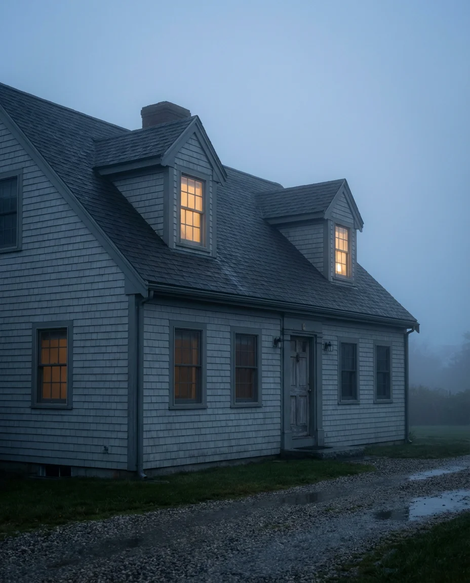
21. Dark Moody Exterior With Warm Interior Light

Few exterior experiences are as cinematically satisfying as approaching a dark, moody home at dusk when warm amber light spills from the windows and creates a striking contrast against the near-black facade. This effect—beloved on Pinterest and Instagram in equal measure—is the design logic behind choosing a very dark exterior color in the first place. Whether the body color is almost-black navy, very deep hunter green, or a near-black charcoal, the luminous quality of the warm interior light visible at dusk creates a home that looks genuinely magical from the street in the evening hours.

This is one area where exterior lighting design becomes especially important. In addition to the warm glow from interior lighting, thoughtfully placed landscape uplighting on mature trees, low-voltage path lighting, and a statement pendant or lantern at the front entry all contribute to the overall evening atmosphere of a dark-exterior home. Homeowners who’ve done this well describe it as one of the most rewarding design decisions they’ve made—the house has a completely different personality in daylight versus at night, and both personalities are beautiful. It’s a home that genuinely rewards being arrived at.
22. Coastal Sage With Driftwood Accents

The final entry in our 2026 exterior color lineup is also one of the most emotionally resonant: a soft coastal sage green exterior paired with weathered driftwood-toned accents on pergolas, fencing, and porch elements. This combination captures the feeling of early morning at a quiet beach—light, airy, unpretentious, and deeply calming. It’s the palette of a home that doesn’t try too hard, which paradoxically makes it one of the most aspirational looks on Pinterest right now. Linen-toned front doors, natural woven doormats, and salt-glazed ceramic pots complete the vignette.

What makes this palette universally appealing even for landlocked homeowners is its emphasis on texture and material warmth over bold color. The sage green is quiet enough to feel like a neutral in certain lights, which means it doesn’t demand the same neighborhood context that a vivid turquoise or deep navy might. The driftwood tones—which you can achieve with weathered gray-brown stains, naturally aging cedar, or even gray-washed reclaimed wood—add the visual roughness and organic variation that keeps the look feeling genuinely alive rather than decorator-perfect. It’s a palette that ages beautifully and never looks overdone.
Conclusion
Whether you’re drawn to the drama of a deep forest green or the gentle serenity of coastal sage, 2026 is shaping up to be a genuinely exciting year for exterior color. These ideas are meant to spark conversation as much as inspiration—we’d love to know which palette is speaking to you, what your home’s architecture looks like, and whether you’ve attempted a bold exterior color change yourself. Drop your thoughts, questions, and before-and-after stories in the comments below, and let’s keep the conversation going.