Green bedrooms are having a major moment in 2026, and it’s easy to see why. From calming sage tones to bold forest hues, green offers a versatile palette that brings nature indoors while creating spaces that feel both refreshing and restful. American homeowners are increasingly turning to Pinterest for green bedroom inspiration, searching for ways to blend color with comfort in bedrooms that reflect personal style. Whether you’re drawn to soft pastels or dramatic dark greens, this guide offers twenty-two distinct ideas that showcase how green can transform your most personal space. You’ll discover combinations with complementary colors, furniture choices, and aesthetic approaches that make green bedrooms work beautifully in real homes.
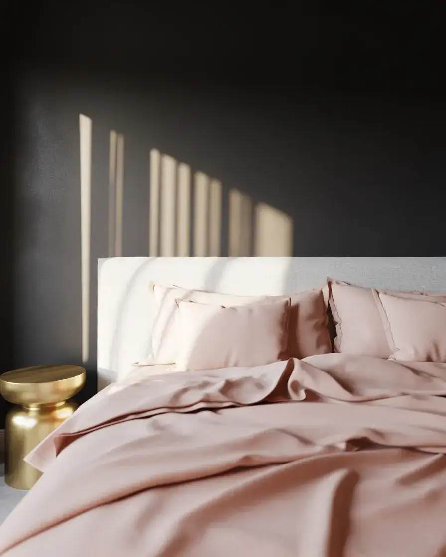
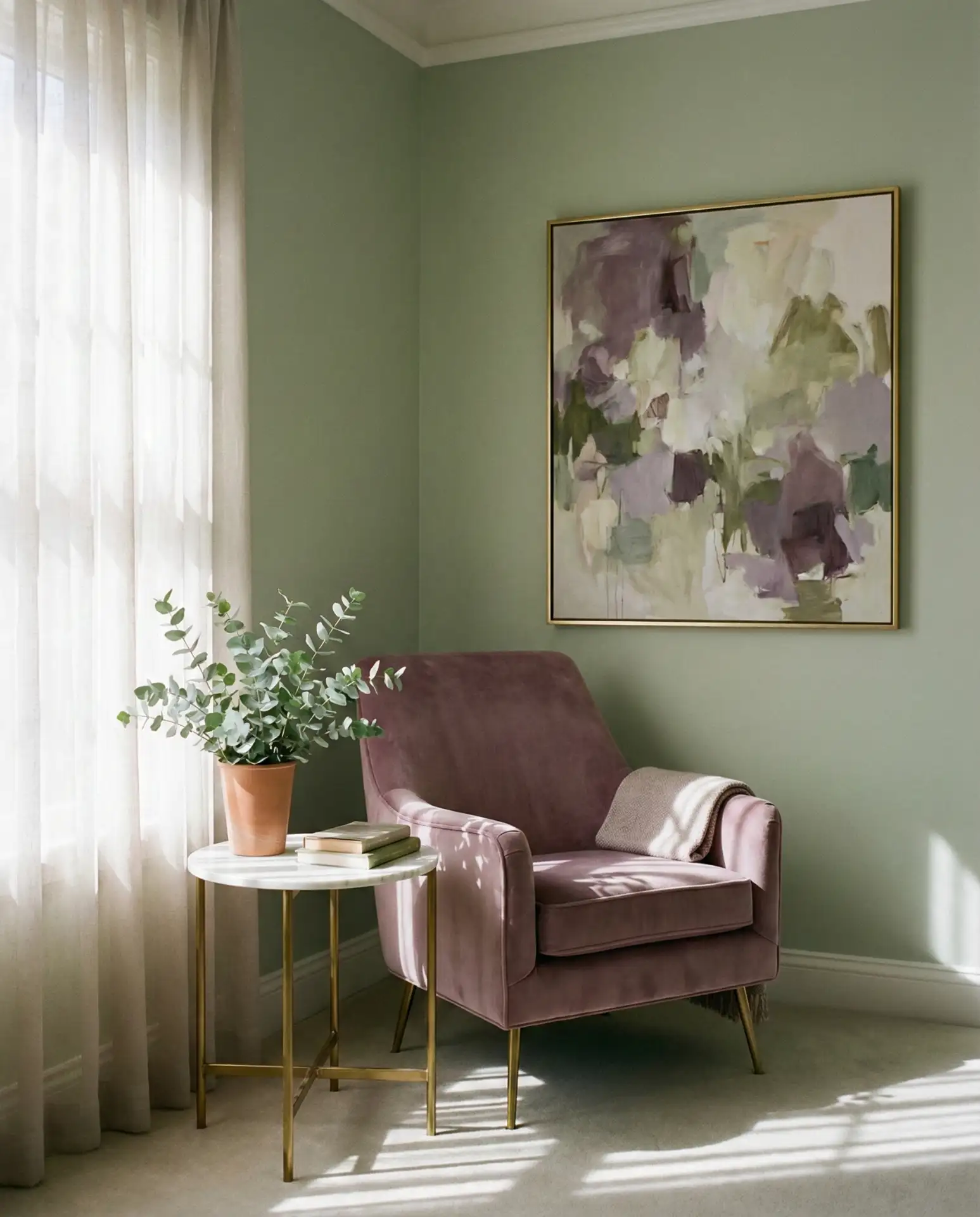
1. Sage and Pink Bedroom Serenity
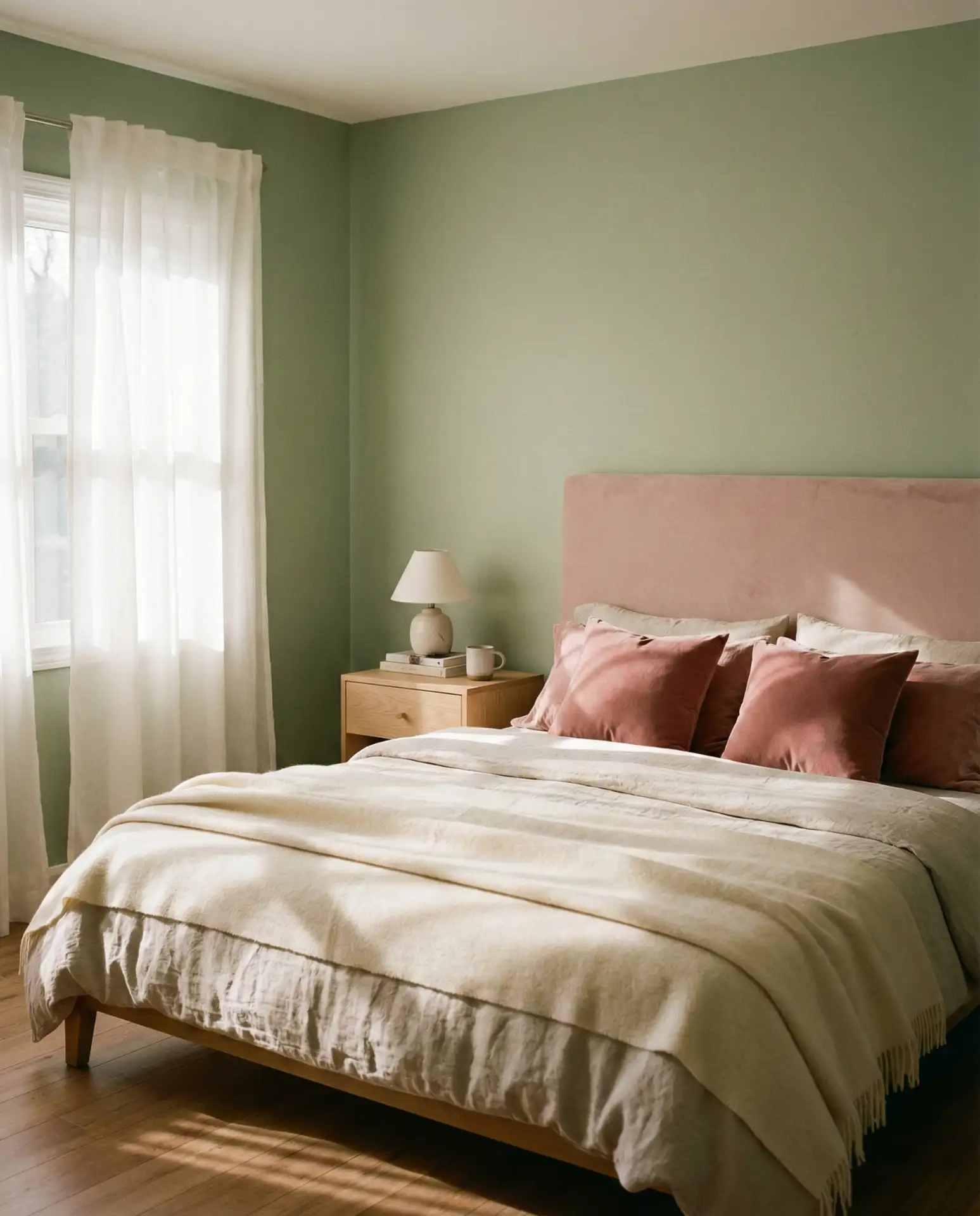
This color pairing creates an unexpectedly sophisticated atmosphere that works particularly well in primary bedrooms. Sage walls provide a neutral-cool backdrop, while pink and green accents through bedding, artwork, or upholstered pieces add warmth without overwhelming the space. The combination feels both modern and timeless, appealing to those who want color without committing to anything too bold. Layer different textures—linen duvet covers, velvet pillows, and wool throws—to keep the palette from feeling flat.
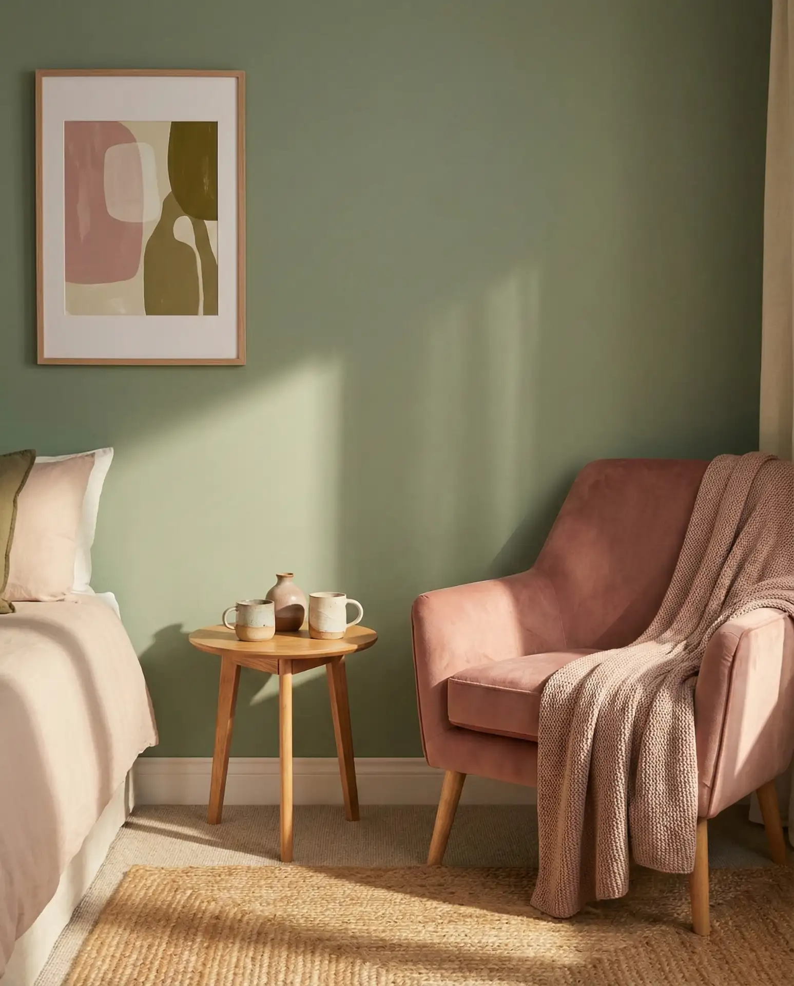
In coastal regions like California and the Pacific Northwest, this combination resonates because it mirrors the landscape—eucalyptus greens and sunset pinks. The key is balance: if your walls are sage, keep pink accents soft and scattered rather than concentrated in one area. Many homeowners make the mistake of matching shades too precisely, but slightly varied tones within each color family create more visual interest and prevent the room from looking overly coordinated or staged.
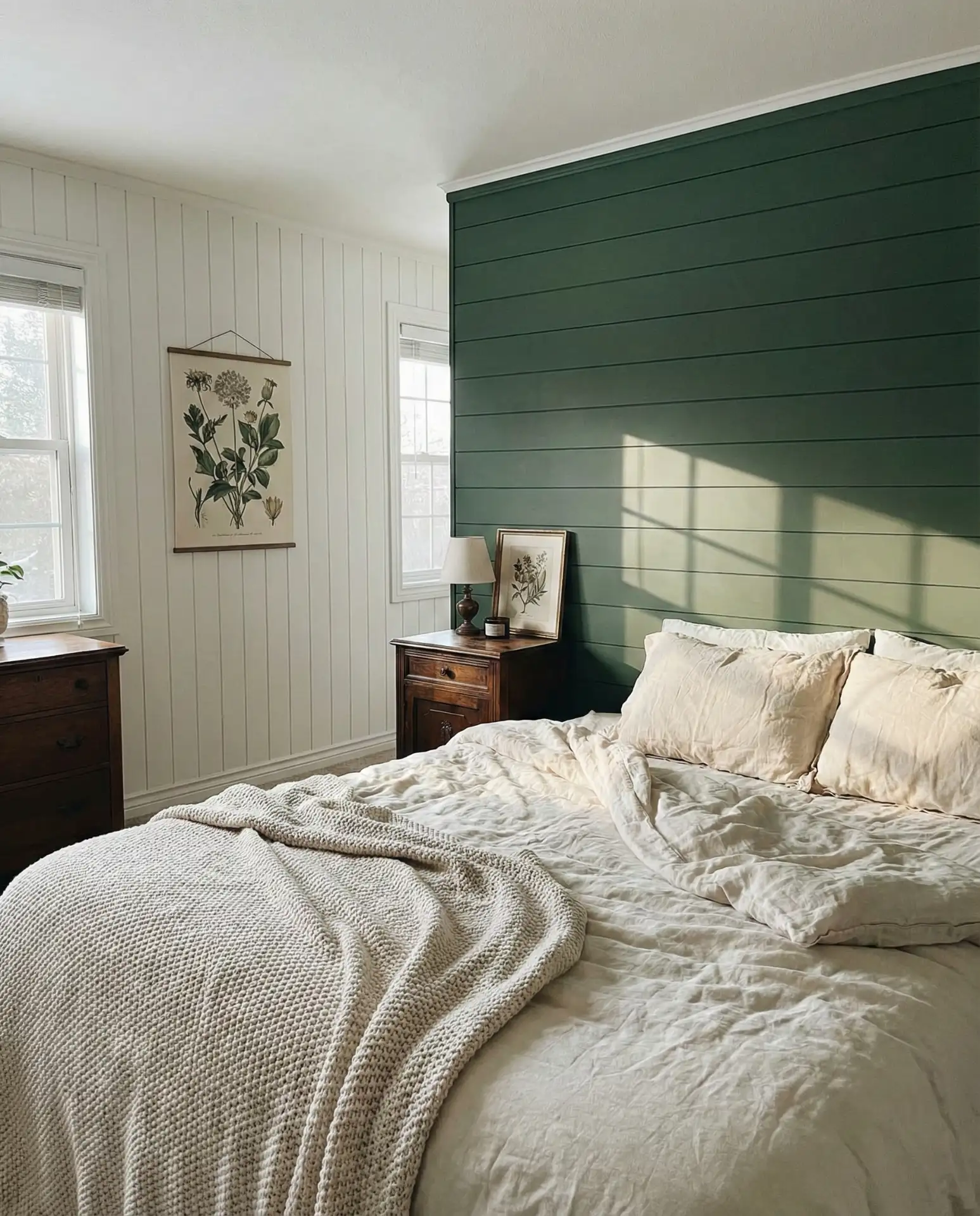
2. Forest Green Statement Wall
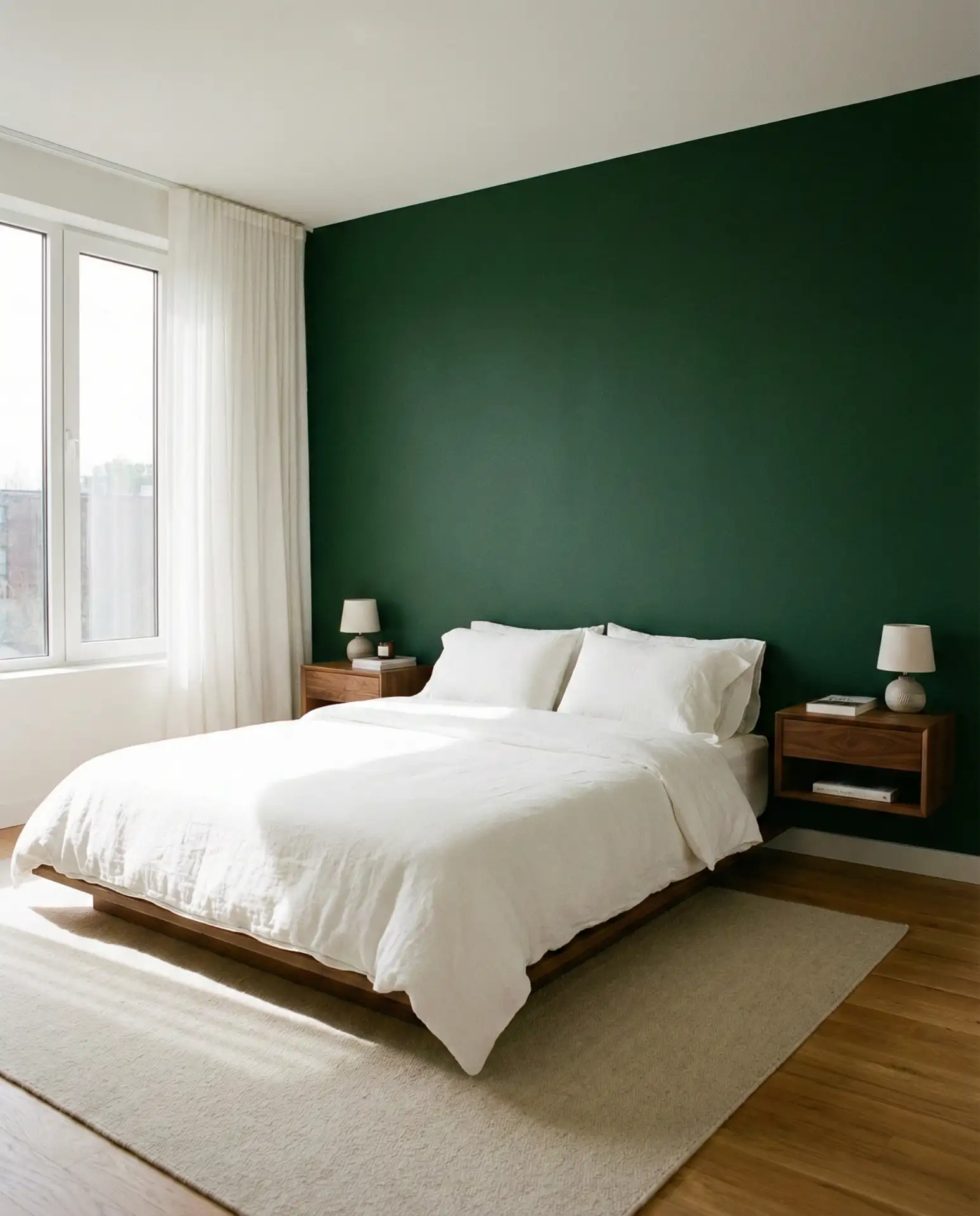
A single forest green wall behind the bed anchors the entire room without the commitment of painting all four walls. This approach works especially well in bedrooms with abundant natural light, where the deep hue won’t make the space feel smaller. Pair it with crisp white bedding and natural wood furniture to let the green take center stage. The drama of a forest accent wall creates instant architectural interest in otherwise plain bedrooms, particularly in newer construction homes that lack original character.
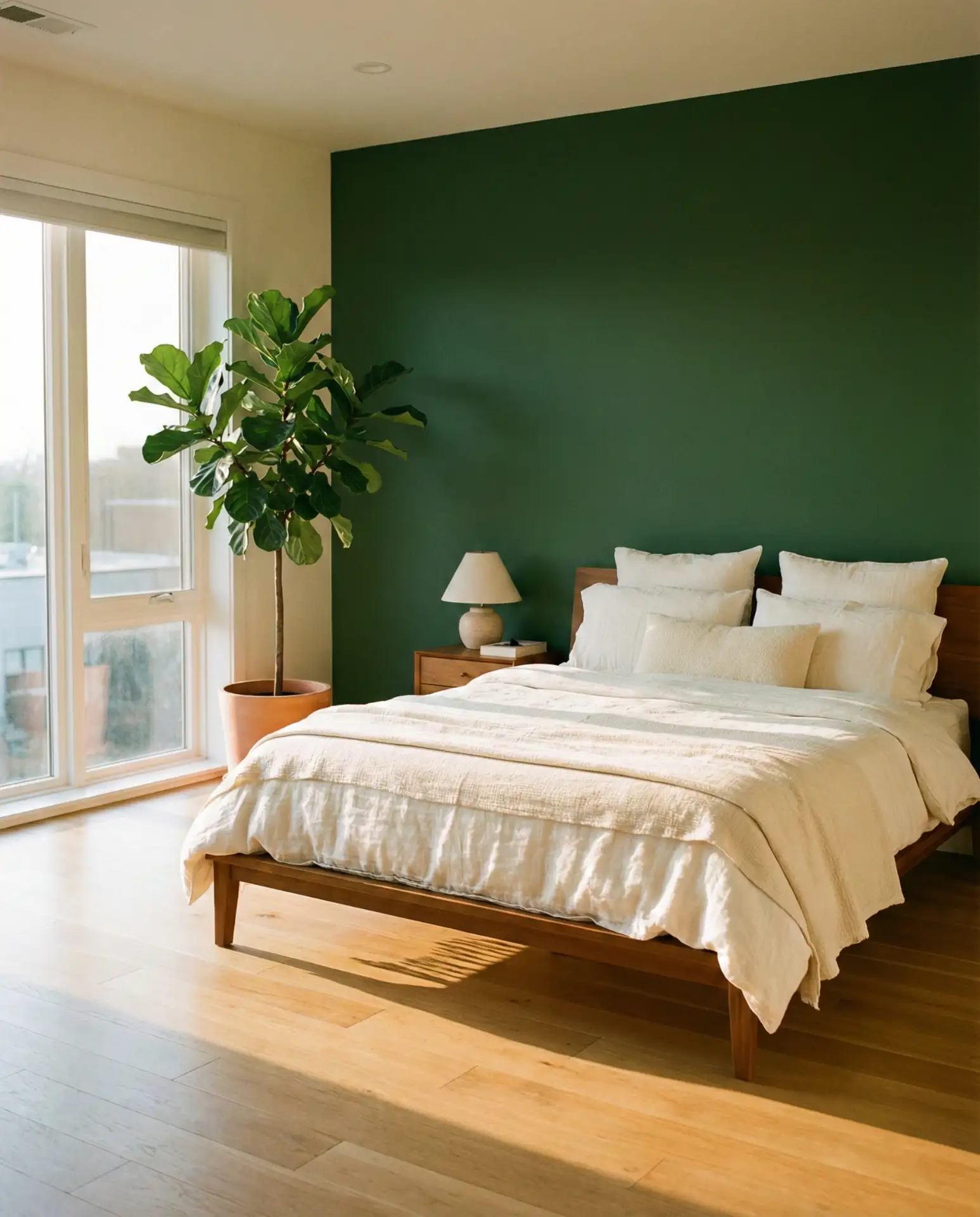
Budget-conscious decorators appreciate this strategy because it requires just one gallon of premium paint rather than four. The investment goes further when you choose a high-quality matte or eggshell finish that photographs beautifully and hides minor wall imperfections. Consider extending the green onto the ceiling above the accent wall for an even more enveloping effect that’s currently trending in design-forward homes across Brooklyn and Austin.
3. Blue and Green Coastal Retreat
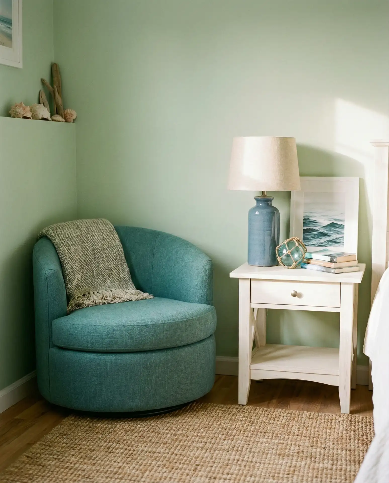
Combining blue and green creates a watery, oceanic feeling that’s particularly popular in beach communities and lakeside homes. Think seafoam bedding against sage walls or navy accents in a mint green room. The colors share a natural affinity—both are cool-toned and calming, making them ideal for sleep spaces. This palette works beautifully when you incorporate natural materials like rattan, jute, and driftwood-toned furniture that reinforce the coastal connection.
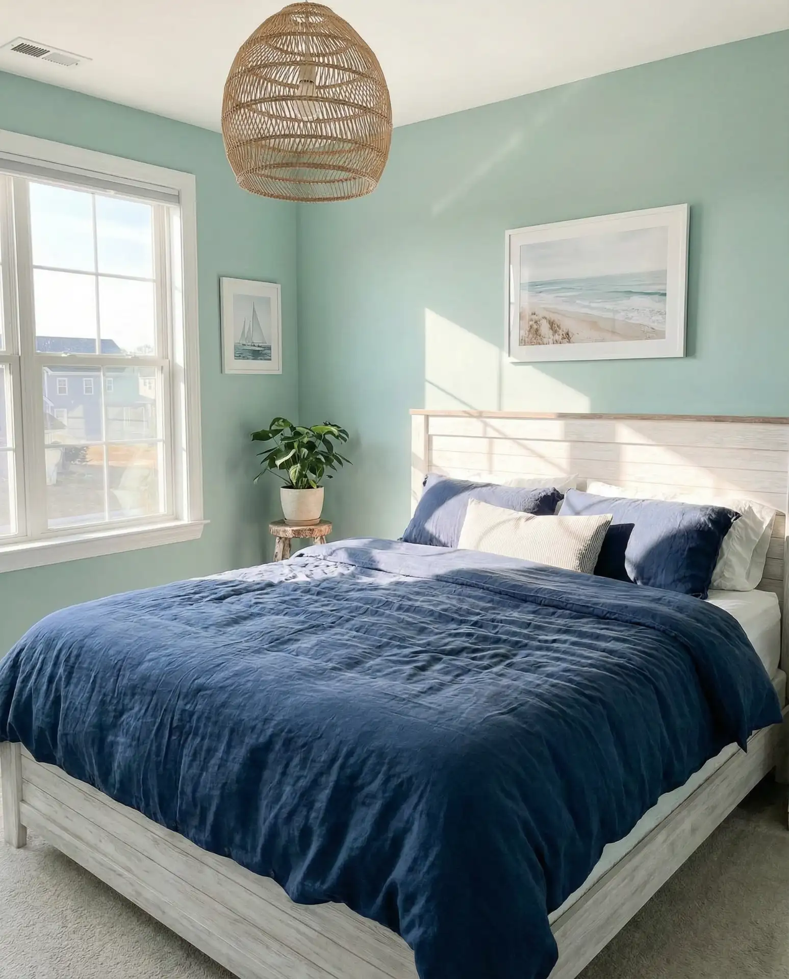
Where it works best: homes within an hour of the coastline, where the palette feels geographically authentic rather than thematic. Inland homeowners can still embrace this look by balancing the oceanic references with more universal natural elements—think botanical prints rather than explicit seashell décor. The color combination naturally encourages relaxation, which is why so many spa-inspired bedrooms lean into these particular shades.
4. Purple and Green Jewel Tones
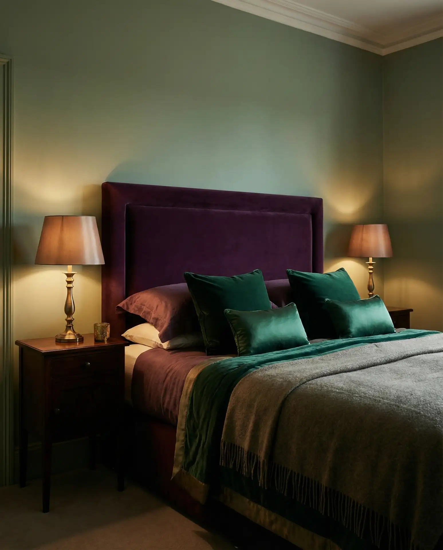
This unexpected pairing delivers rich, sophisticated drama when executed with restraint. Purple and green appear opposite each other on the color wheel, creating natural vibrancy when placed side by side. Consider deep eggplant purple bedding against sage walls or emerald green velvet pillows on a lavender upholstered bed. The key is choosing saturated versions of both colors rather than pastels, which can read as juvenile when combined.
A designer in Charleston once told me that purple and green combinations feel particularly at home in historic neighborhoods where bold color has always been celebrated. The palette works less successfully in ultra-modern minimalist spaces, where the richness can feel out of place. If you’re hesitant about commitment, start with a purple throw blanket and green curtains before painting walls—textiles are easier to change if the combination doesn’t resonate.
5. Mint Green Modern Minimalism
Fresh mint green offers a lighter alternative to deeper greens while still providing genuine color impact. This shade works particularly well in small bedrooms or those with limited natural light, where darker greens might feel oppressive. Mint pairs beautifully with white, light gray, and natural wood tones in contemporary settings. The color reads as youthful without being childish, making it appropriate for everyone from college students to retirees seeking a cheerful bedroom refresh.

Common mistake: choosing mint that’s too pastel, which can read as dated or nursery-like in adult bedrooms. Look for mint with enough saturation to feel intentional—think crème de menthe rather than baby blanket. Test paint samples in your actual bedroom lighting, as mint can shift significantly between natural daylight and evening artificial light. Many homeowners are pleasantly surprised by how mint green complements both warm-toned wood furniture and cooler metal accents.
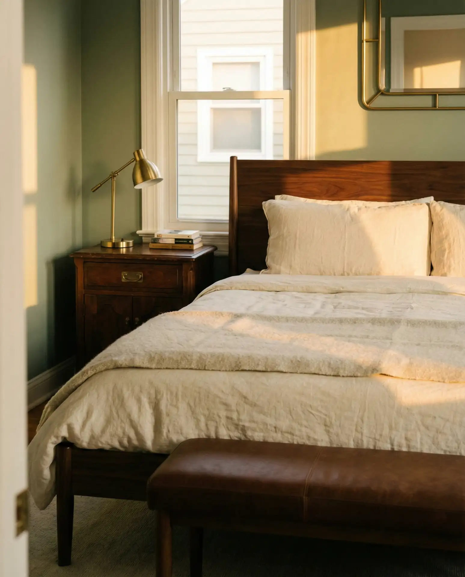
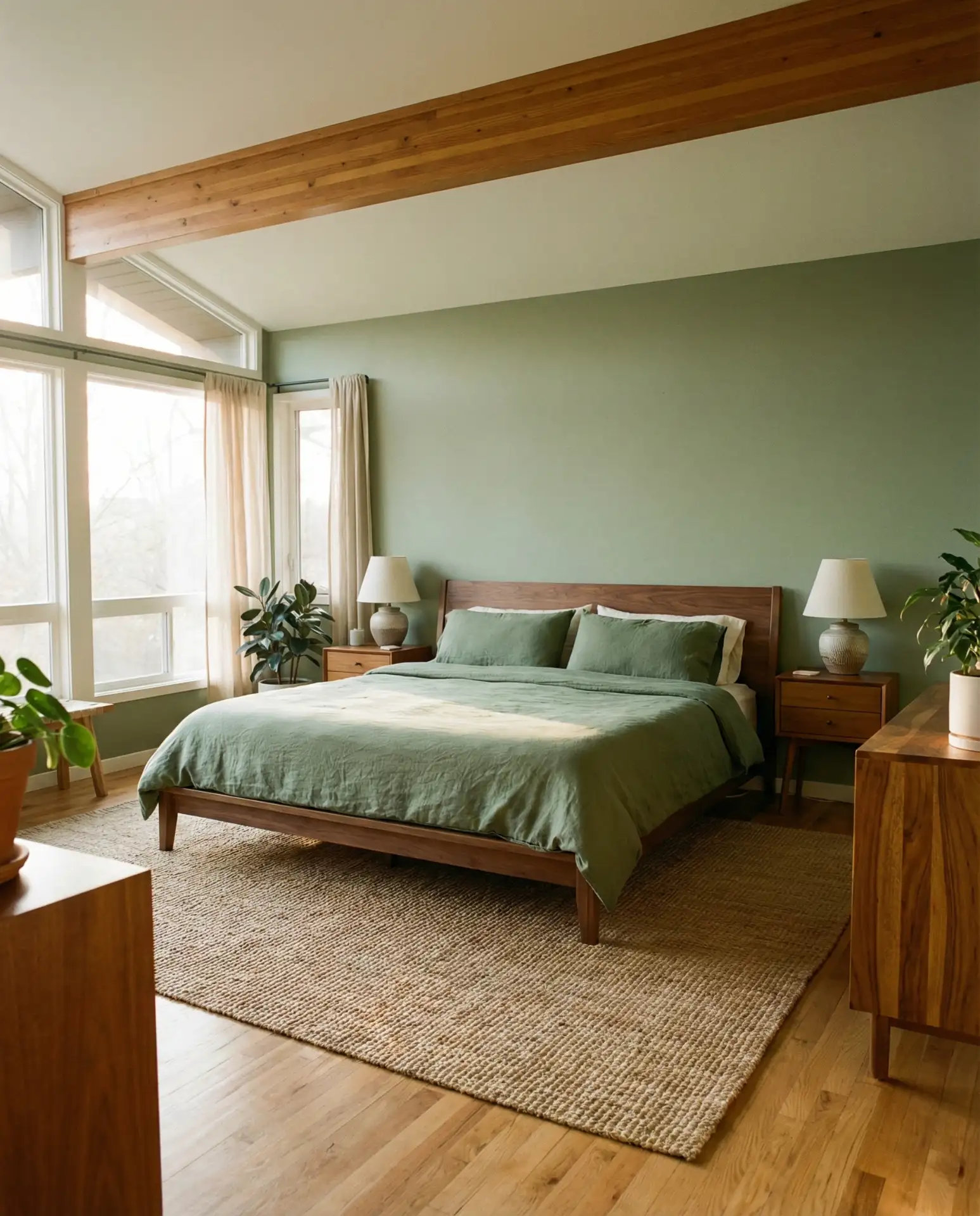
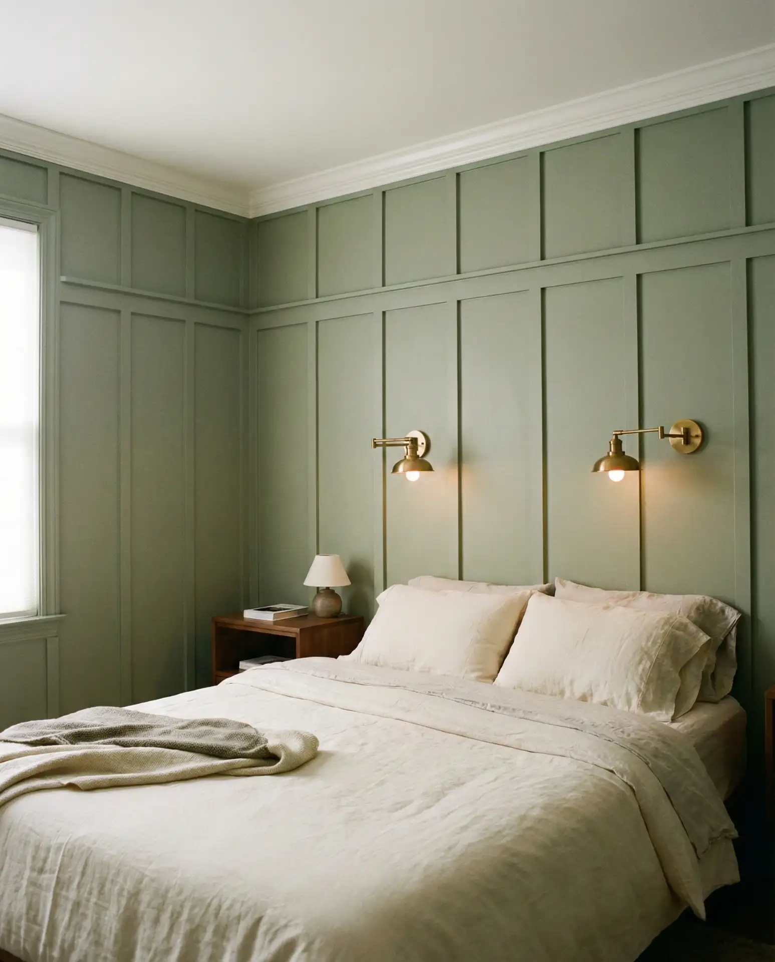
6. Beige and Sage Organic Layers
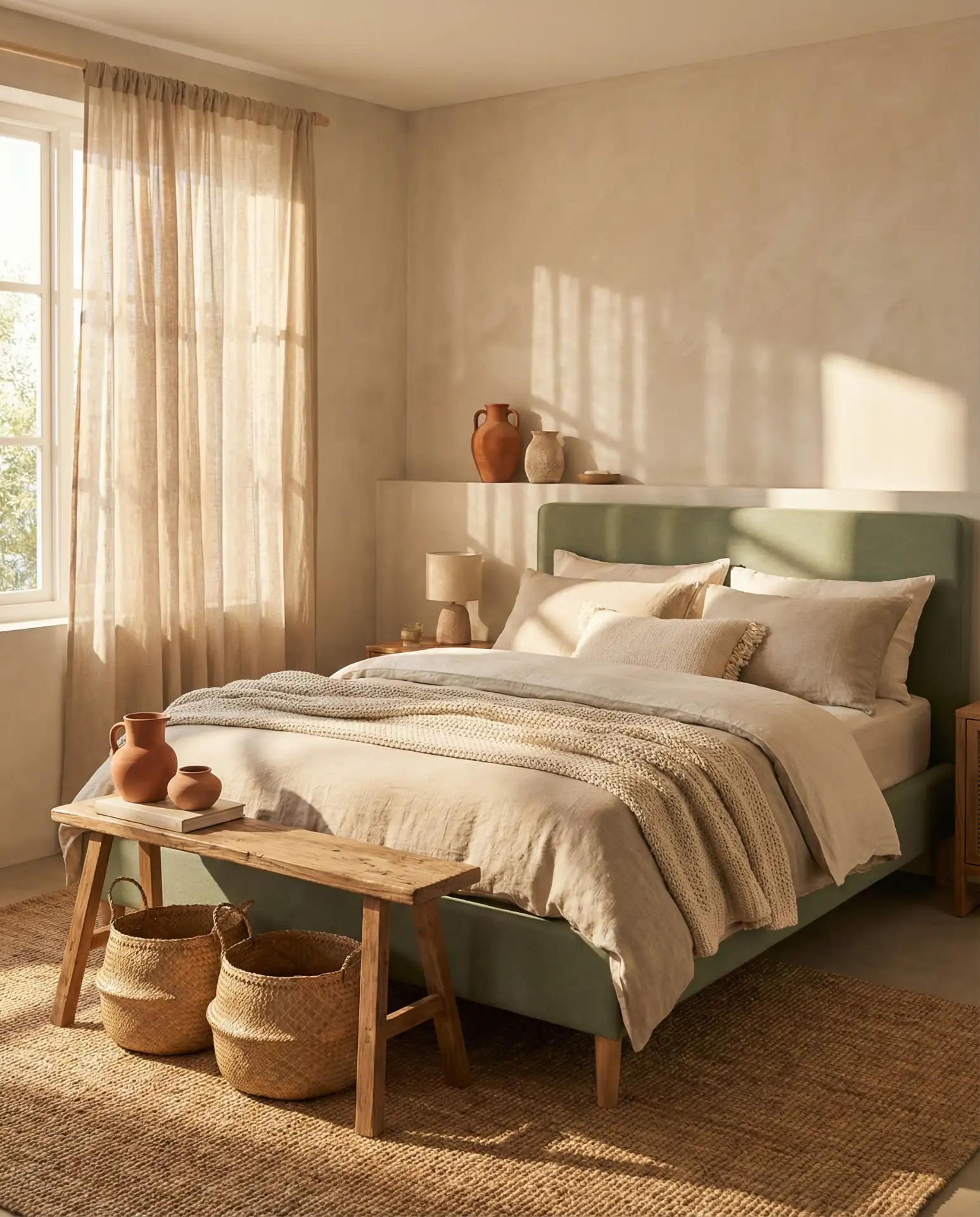
The combination of beige and sage creates an earthy, grounded aesthetic that’s dominated Pinterest searches throughout the past year. This palette works because both colors are neutral-adjacent, allowing for generous use without overwhelming the senses. Layer warm beige linens over a sage upholstered bed, or paint walls sage while incorporating beige through area rugs, curtains, and seating. The result feels inherently organic and welcoming.
Real homeowner behavior shows that people living with this palette rarely tire of it because both colors are inherently restful and easy to live with long-term. Unlike trendy accent colors that can feel dated within a year, beige and sage have staying power rooted in their connection to natural landscapes. The combination works across different design styles—from farmhouse to contemporary—making it particularly practical for those who like to evolve their décor without repainting.
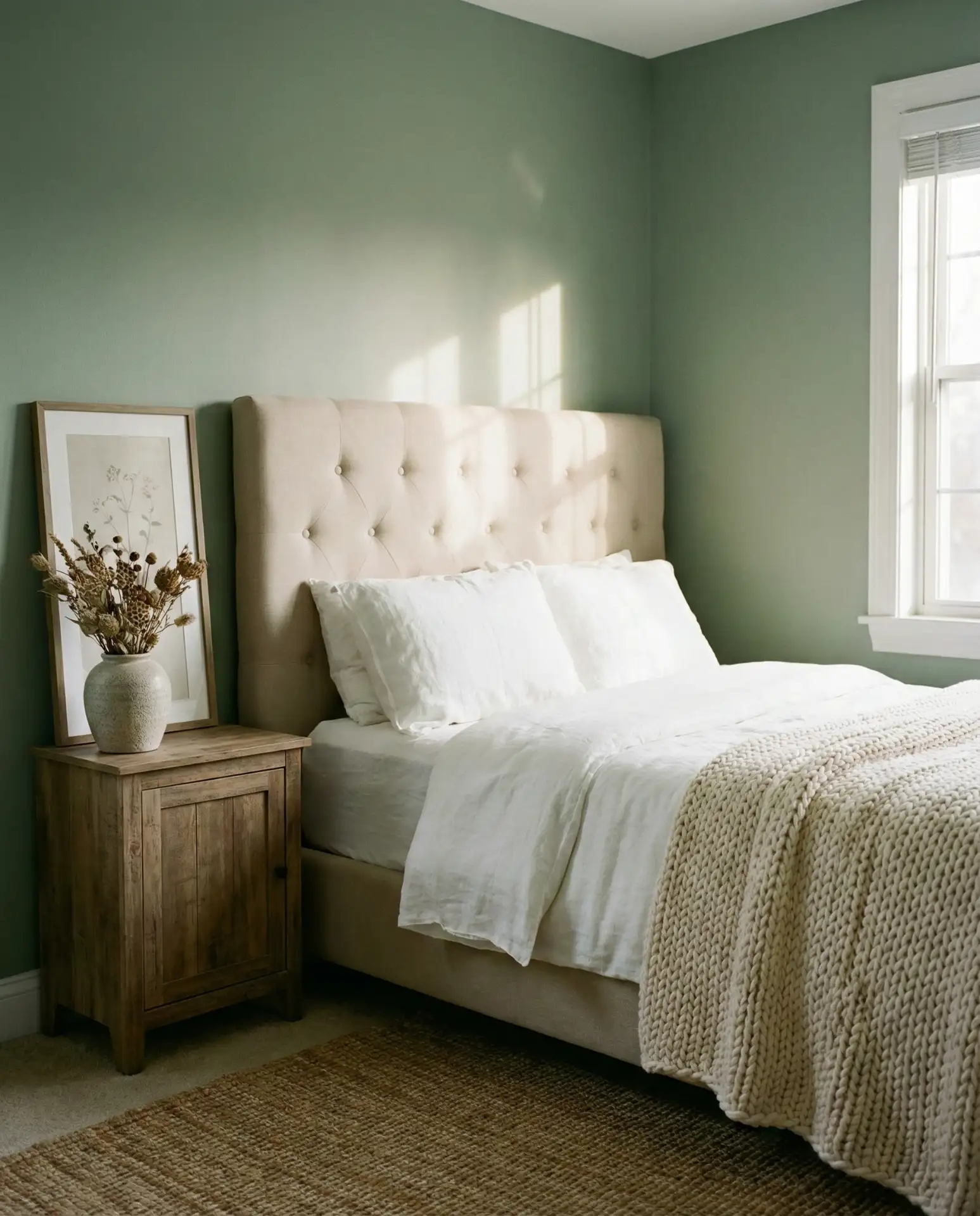
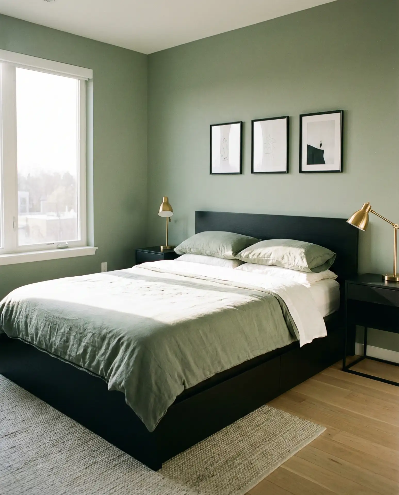
7. Grey and Green Sophisticated Balance
Pairing grey and green creates a refined, gallery-like atmosphere that appeals to those who want color without sacrificing sophistication. Charcoal gray walls with sage bedding or pale gray-green paint with darker gray furniture both work beautifully. This combination feels particularly at home in urban settings where views might include more concrete than nature. The gray grounds the green, preventing it from feeling too botanical or country-inspired.

In the Midwest and Northeast, where winters are long and gray skies are common, this palette brings nature indoors without fighting the regional light quality. The green provides life and freshness, while the gray feels honest to the local climate rather than aspirational. Expert designers often recommend this combination for north-facing bedrooms, where pure warm tones can look washed out, but gray-green partnerships maintain integrity in cooler light.
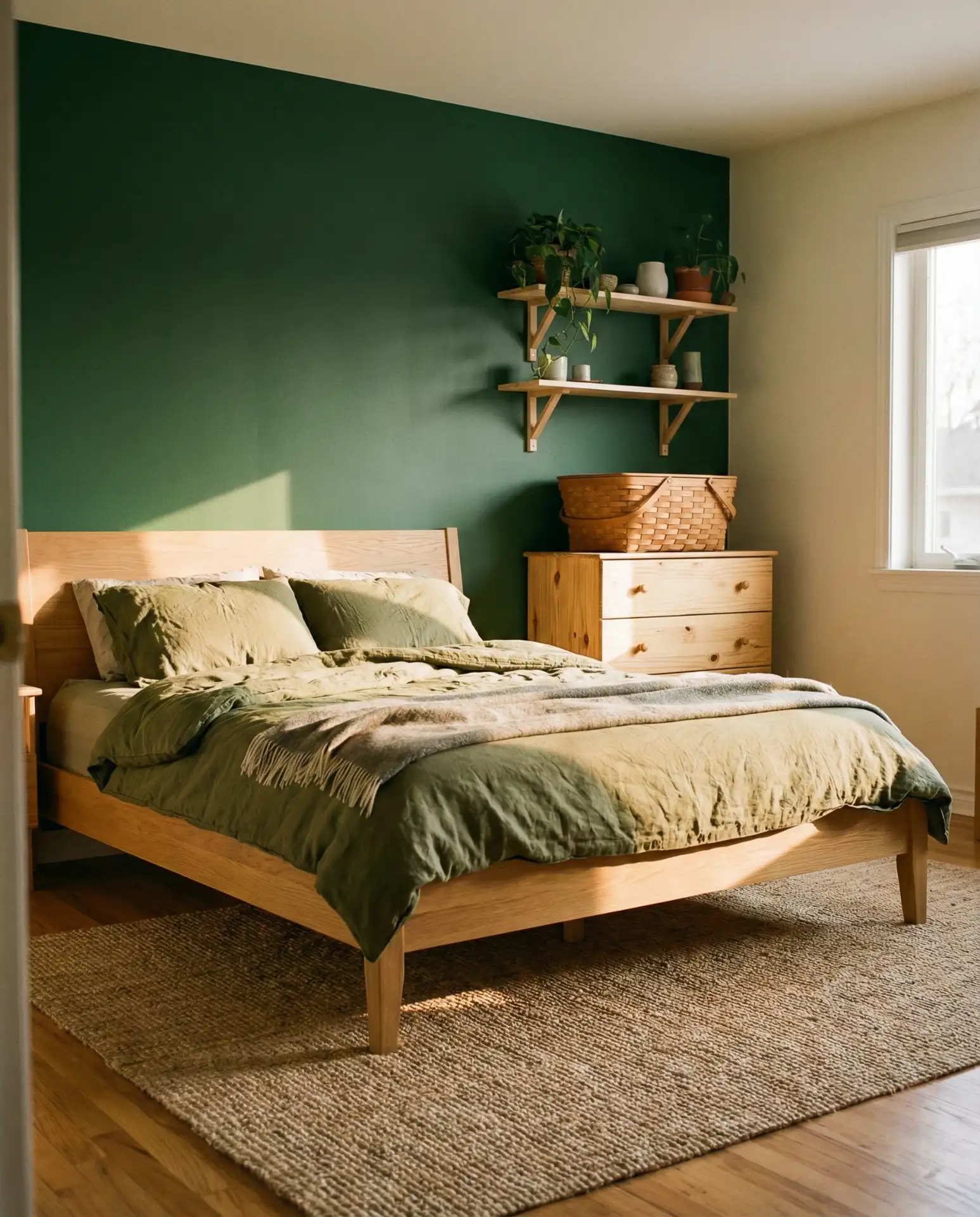
8. Brown and Green Organic Warmth
The pairing of brown and green mirrors the natural world—think tree trunks against foliage—making it one of the most inherently comfortable color combinations for bedrooms. Rich walnut furniture against sage walls or chocolate brown bedding in a mint green room both create warm, enveloping spaces. This palette has broad appeal across age groups and works particularly well when you incorporate varied textures like leather, wood, linen, and wool.
Budget considerations favor this palette because quality wood furniture represents a long-term investment that transcends trends. Unlike upholstered pieces that wear out or metal frames that go in and out of style, solid wood beds and dressers in warm brown tones work with green walls today and with whatever color you might choose five years from now. Vintage and secondhand furniture in brown tones is also abundantly available, making this an accessible look for various budget levels.
9. Orange and Green Energetic Contrast
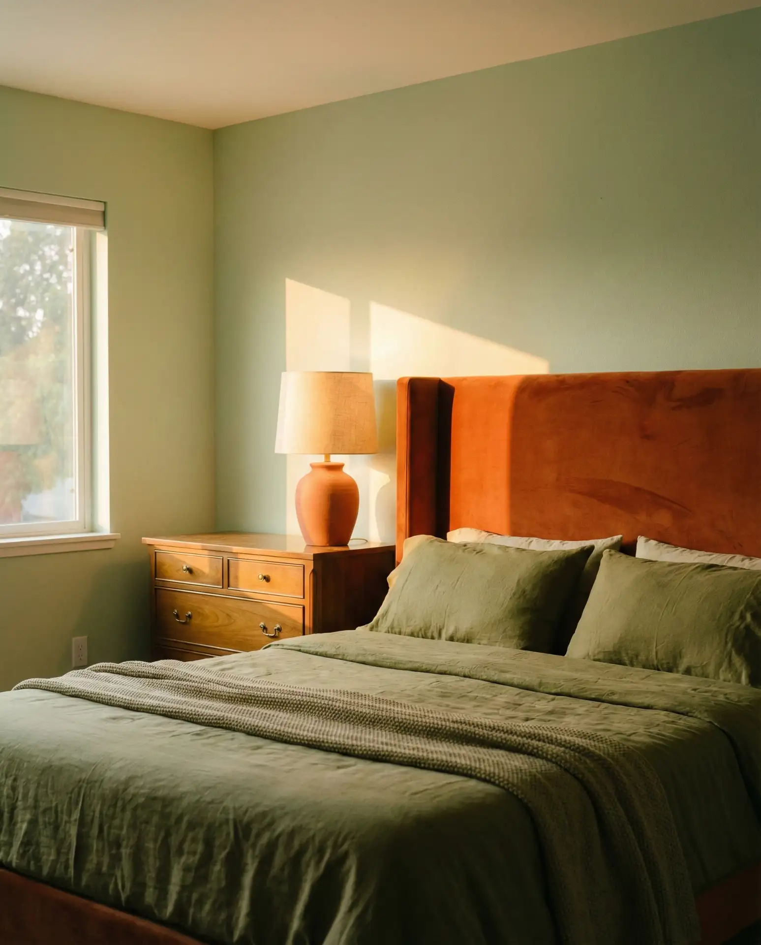
This bold combination channels 1970s confidence but feels fresh when executed with modern restraint. Orange and green work because they’re analogous on the color wheel, sharing yellow undertones that create harmony. Think burnt orange and olive bedding against pale green walls, or terracotta accessories in a sage room. The key is choosing muted, earthy versions of orange rather than bright tangerine, which can overwhelm a sleep space.

Where it works best: in creative households and homes with good natural light, where the warmth of orange prevents green from feeling too cool. This combination is less successful in formal master suites or homes decorated in strictly traditional styles, where the energy level might feel jarring. The palette particularly resonates in the Southwest, where it echoes the natural landscape of desert greens and red rock formations.
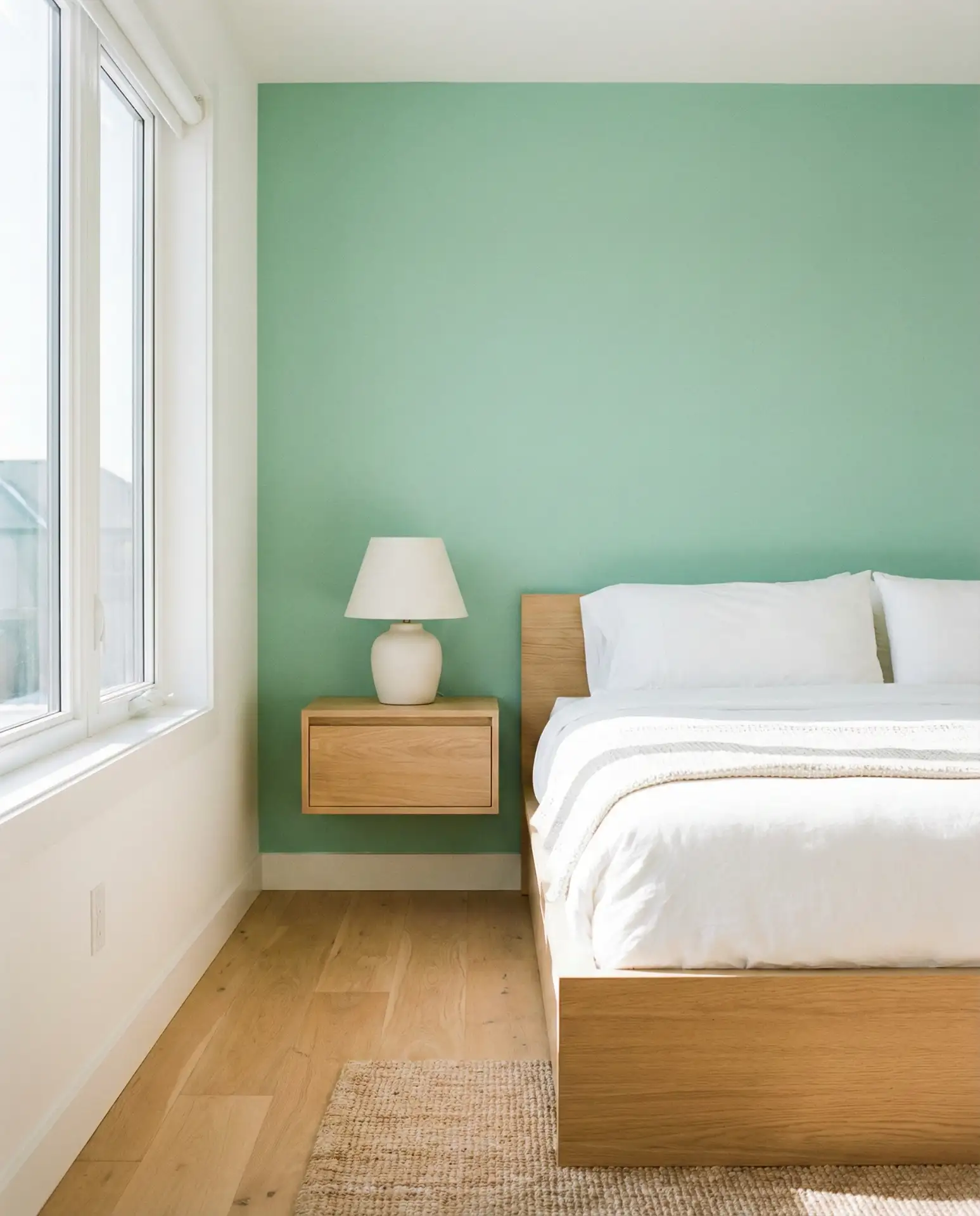
10. Pale Green Scandinavian Simplicity
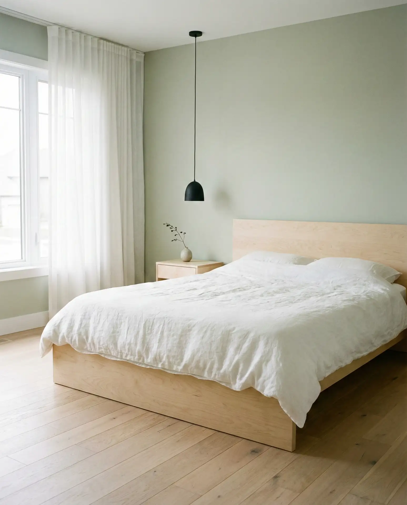
Pale green—almost white with just a whisper of color—creates Scandinavian-inspired bedrooms that feel airy and peaceful. This shade works beautifully in rooms with white trim and light wood floors, where it provides subtle warmth without competing with architectural elements. Pale green walls pair naturally with white bedding, light oak furniture, and minimal black accents. The color is forgiving in terms of décor changes because it’s so close to neutral.
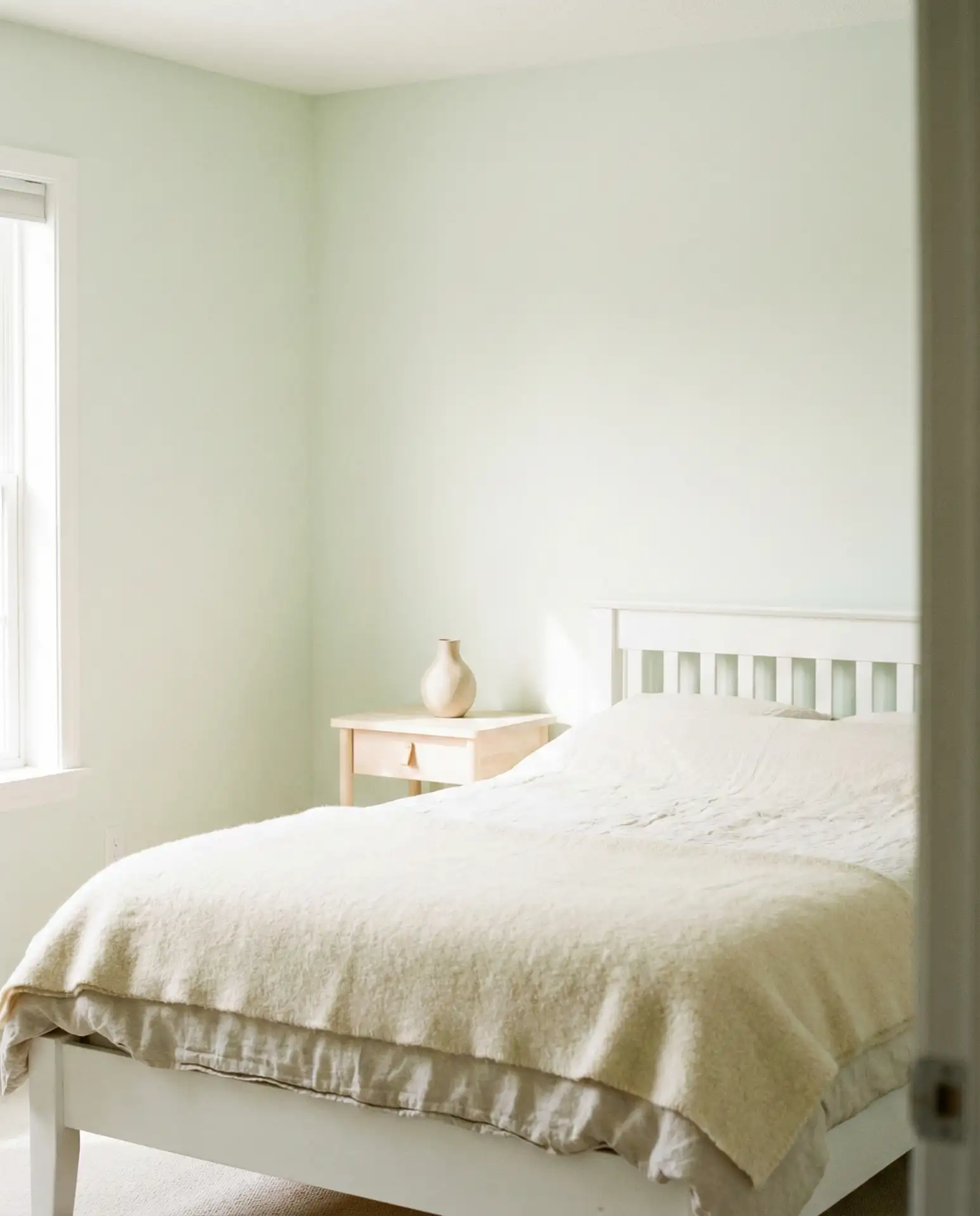
Practical insight: pale green is one of the most renter-friendly colors because it reads as nearly neutral while still providing personality. Many landlords approve it when they wouldn’t approve deeper colors, and it’s subtle enough that you won’t tire of it during a lease period. The shade also photographs exceptionally well, making it popular among those who share their homes on social media or rent out rooms on platforms like Airbnb.
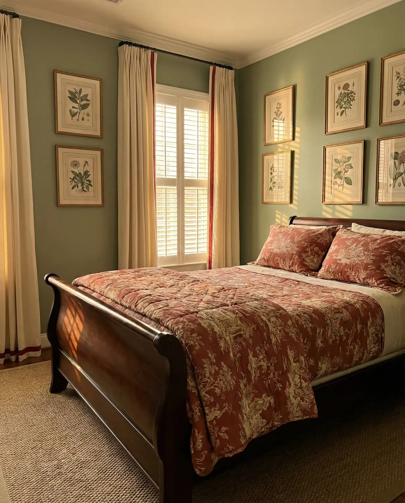
11. Rust and Green Autumn Richness
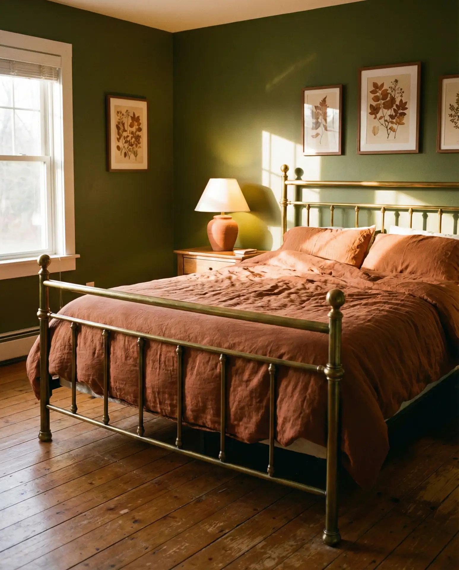
The combination of rust and green brings autumn’s warmth into the bedroom year-round. This palette works particularly well in older homes with wood floors and trim, where the rust tones complement existing woodwork. Rust and terracotta textiles against olive or forest green walls create spaces that feel collected and lived-in rather than decorated. The warmth of rust prevents green from reading as too cool, making the combination particularly appealing in northern climates.
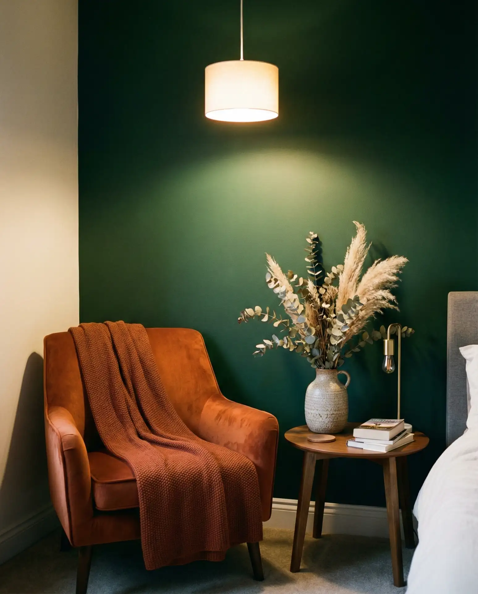
In New England and the Pacific Northwest, where fall foliage is particularly spectacular, this color combination feels geographically authentic and emotionally resonant. Homeowners often report that rust and green bedrooms feel especially cozy during colder months while remaining appropriate in warmer seasons. The palette works across different wood tones—from honey oak to dark walnut—making it practical for those working with existing furniture.
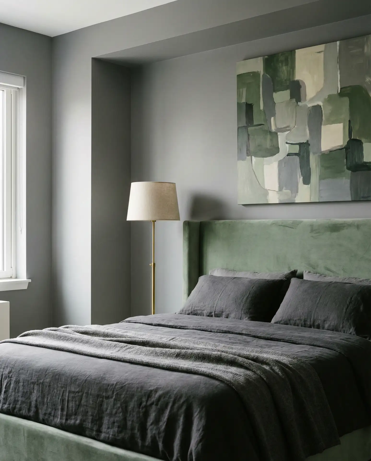
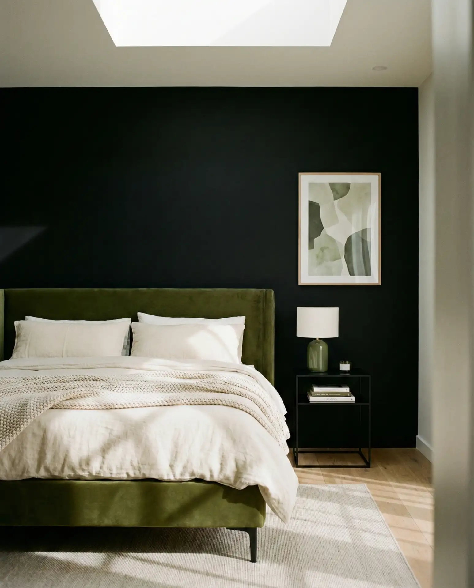
12. Black and Dark Green Moody Drama
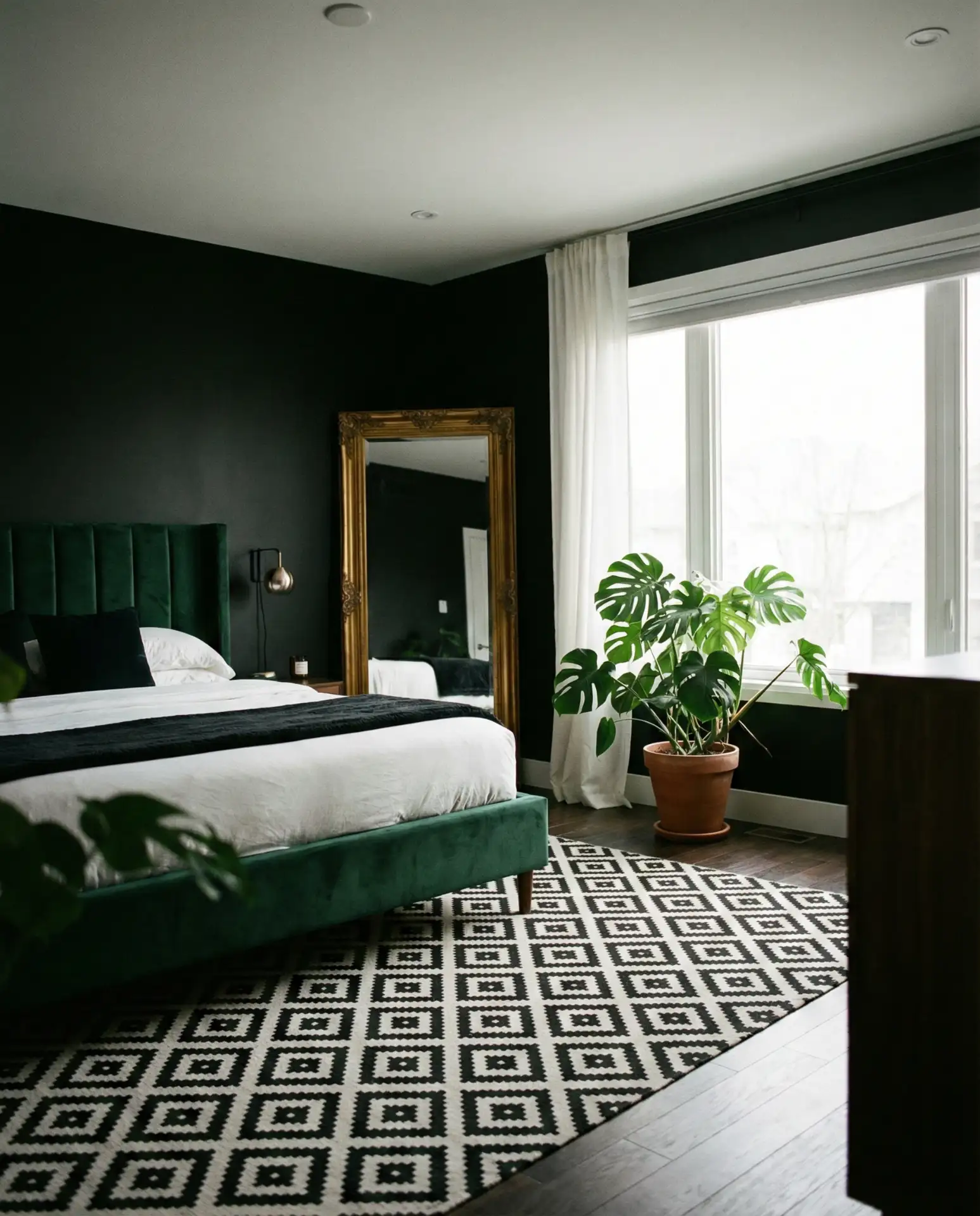
This sophisticated combination creates bedroom sanctuaries that feel cocooning and dramatic. Black and dark green—think charcoal walls with forest green bedding, or deep emerald walls with black furniture—work best in rooms with excellent lighting, either natural or carefully planned artificial sources. The palette suits those who want their bedroom to feel like an escape, distinctly different from the rest of the home. This is not a timid choice, but rather one that commits fully to atmosphere.
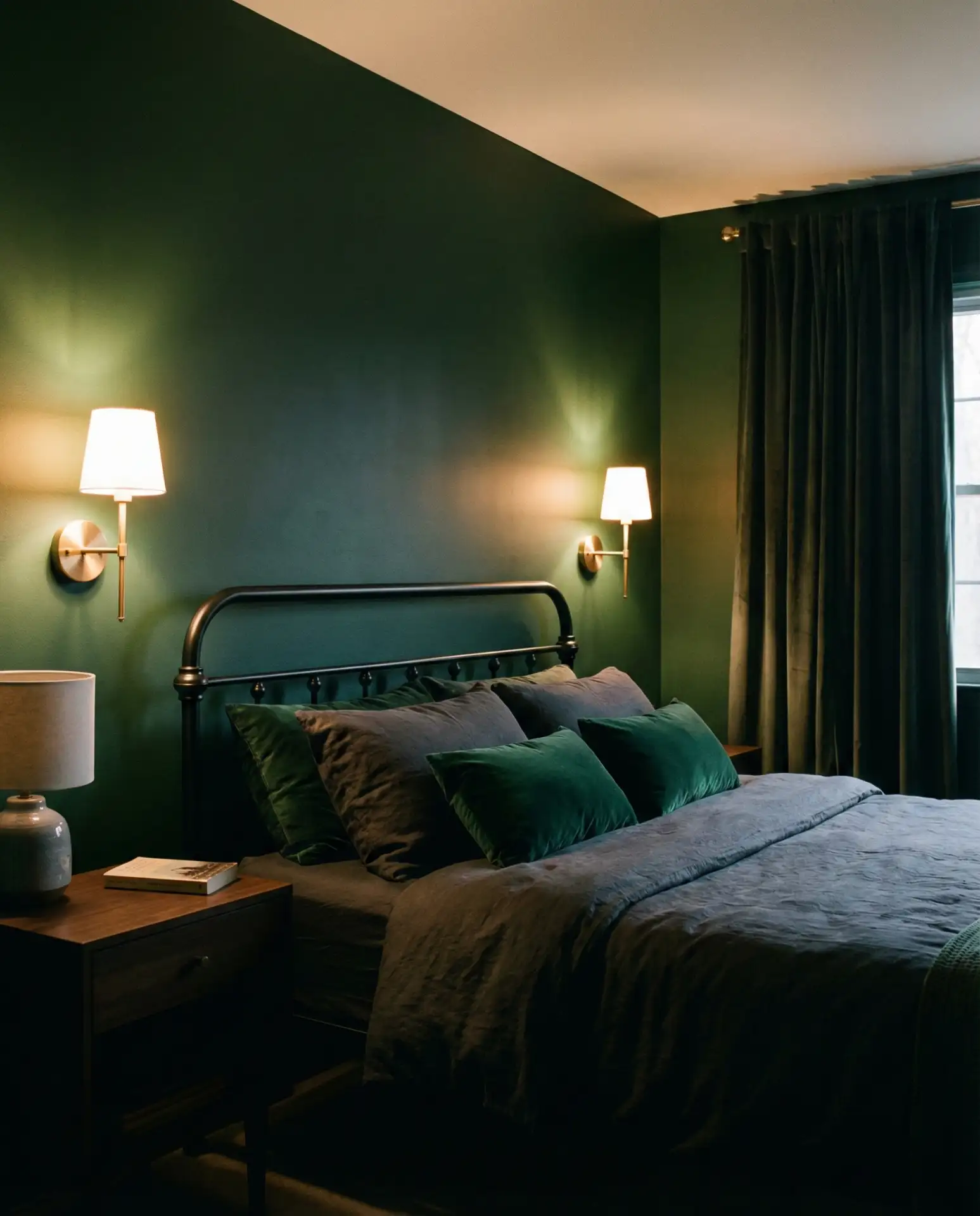
Common mistake: underestimating the amount of light needed to make dark colors work. Without sufficient lighting—both task and ambient—these rooms can feel oppressive rather than cozy. Plan for multiple light sources at different heights, including bedside lamps, overhead fixtures, and possibly wall sconces. Many homeowners successfully use dimmer switches throughout to adjust the mood from energizing morning light to relaxing evening ambiance.
13. Yellow and Green Sunny Optimism

The pairing of yellow and green creates naturally cheerful bedrooms that feel fresh and optimistic. Think soft butter yellow walls with sage bedding, or mint green walls with golden yellow accents through pillows and art. Both colors share brightness and warmth, making them ideal for rooms that lack natural light or face north. The combination works particularly well in guest bedrooms where you want to create a welcoming, energizing environment.
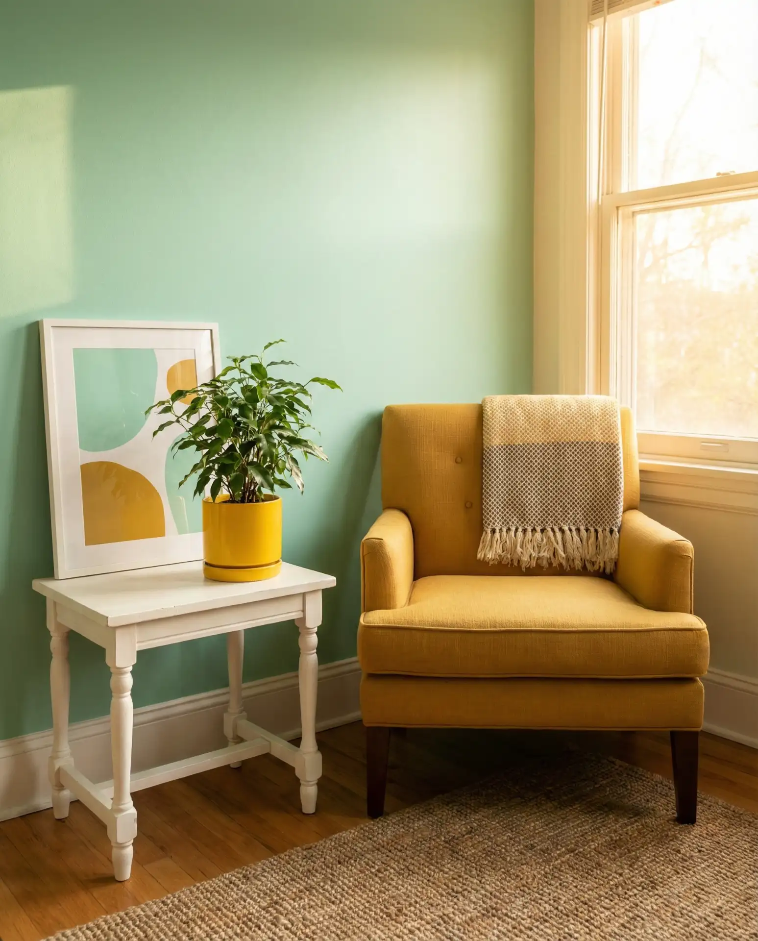
Expert designers note that yellow and green combinations work best when one color dominates and the other accents—a 70/30 ratio prevents the room from feeling too busy or childlike. In Southern states where bright sunshine is abundant, softer versions of both colors prevent glare and heat absorption. The palette has particular appeal for those seeking alternatives to the ubiquitous gray-and-white schemes, offering personality without trend-chasing.
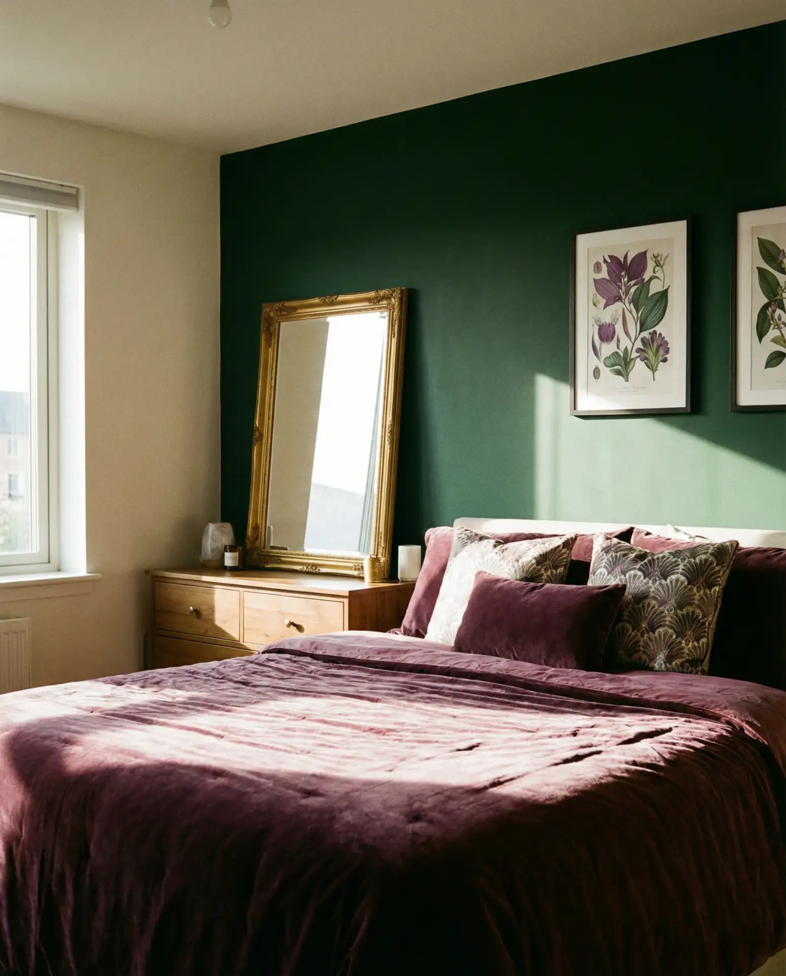
14. Burgundy and Green Jewel Box Luxury
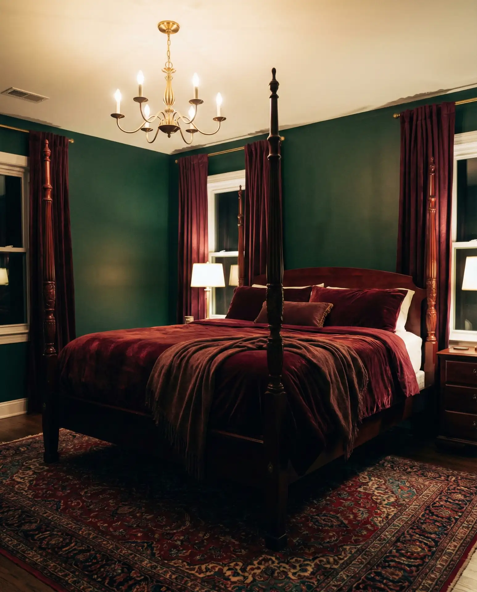
This regal combination brings depth and richness to bedrooms, particularly in traditional or transitional homes. Burgundy and wine-colored textiles against forest or hunter green walls create spaces that feel luxurious and grounded. The palette works beautifully with both brass and black metal accents, and it particularly complements dark wood furniture. This is a grown-up color story that ages well and never feels trendy or temporary.
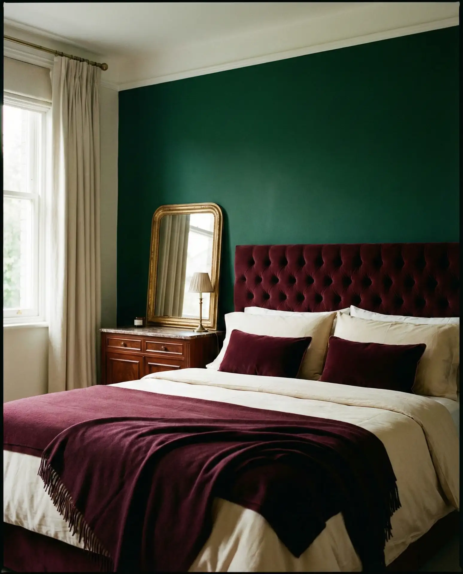
Real homeowners in historic neighborhoods—particularly in cities like Boston, Philadelphia, and San Francisco—gravitate toward this palette because it honors the architectural character of older homes while feeling fresh rather than museum-like. The combination works less successfully in modern minimalist spaces or homes with very contemporary architecture, where the traditional richness can feel out of context. If you’re drawn to this look but hesitant about commitment, start with burgundy bedding and green walls rather than the reverse, as paint is easier to change than quality linens.
15. Mauve and Green Soft Sophistication
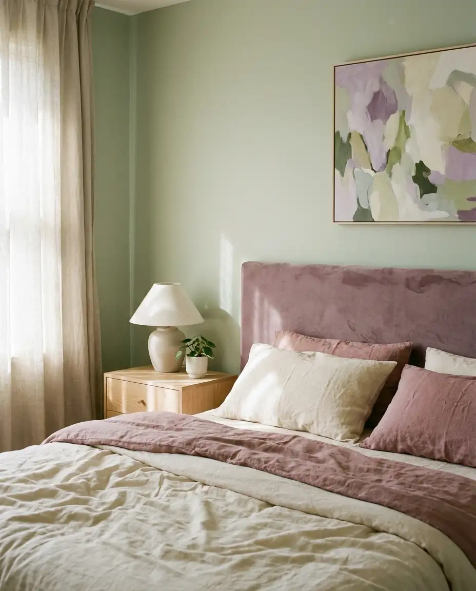
The unexpected pairing of mauve and green creates bedrooms that feel both soft and sophisticated. Mauve and dusty purple tones work beautifully with sage or pale green, creating spaces that read as feminine without being overly sweet. This combination has gained traction on Pinterest among those seeking alternatives to more predictable pairings. The muted quality of both colors makes them easy to live with long-term, and they photograph exceptionally well in natural light.
Where it works best: in bedrooms with excellent natural light and neutral flooring, where the soft colors can shine without competing with strong architectural elements. The palette is particularly popular in renovated lofts and modern condos where residents want to add warmth and personality to blank-slate spaces. Many homeowners report that mauve and green combinations feel fresh in the morning and relaxing in the evening, making them ideal for bedrooms used by people with varied schedules.
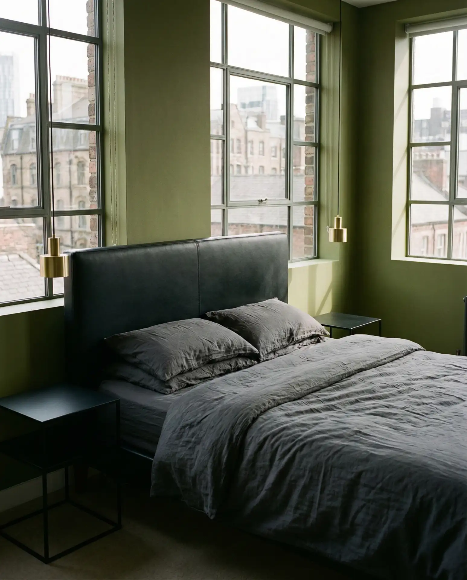
16. Black and Sage Contemporary Edge
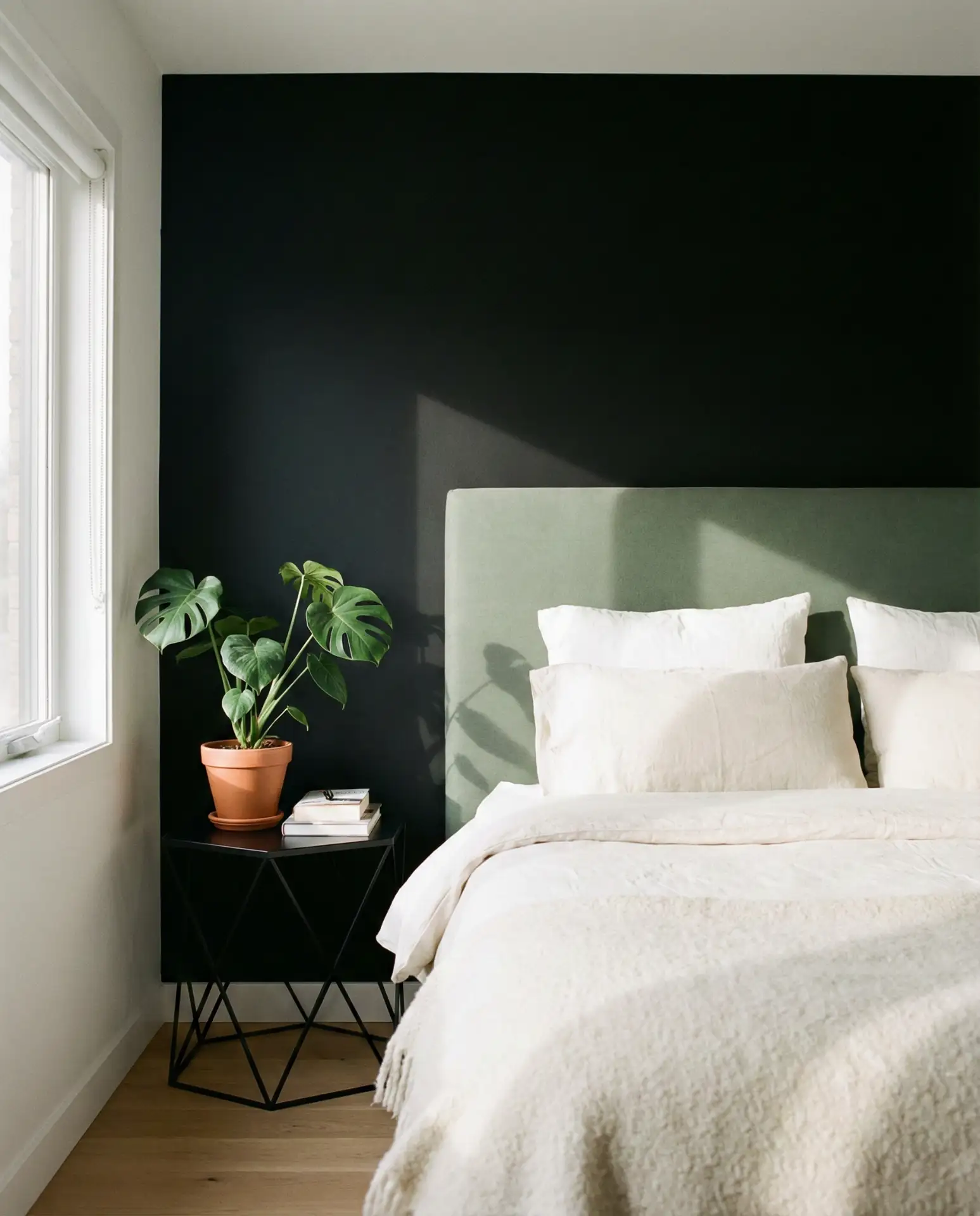
Combining black and sage creates bedrooms with a contemporary edge and surprising warmth. Black and sage work together because the softness of sage prevents black from feeling harsh, while black grounds sage and prevents it from reading as too pastoral. Consider sage walls with matte black furniture or a black accent wall with sage bedding. This pairing appeals to those seeking modern aesthetics without cold minimalism.
Budget-conscious decorators appreciate that black furniture—particularly metal bed frames and simple nightstands—is widely available at accessible price points from retailers like IKEA and West Elm. The investment in quality sage paint delivers the color impact, while affordable black pieces provide structure and contrast. This combination works across square footage, succeeding equally in compact city bedrooms and spacious suburban primary suites.
17. Red and Green Traditional Warmth

Beyond holiday associations, red and green create genuinely warm, inviting bedrooms when executed thoughtfully. The key is choosing sophisticated versions: think burgundy or brick red with sage or olive green rather than primary versions of each color. Red and green appear opposite on the color wheel, creating natural vibrancy, but muted tones prevent visual fatigue. This palette works particularly well in traditional homes with architectural detail that can handle the complexity.
A homeowner in Virginia once mentioned that she avoided red and green for years because of Christmas associations, but after seeing the combination in a historic home tour, she realized how naturally the colors work together outside of holiday contexts. The palette feels particularly authentic in colonial, craftsman, and Victorian homes where period-appropriate color combinations are valued. Contemporary homes can carry this palette successfully by keeping other elements clean and simple.
18. Black and Olive Green Urban Sophistication
The pairing of black and olive green creates bedrooms with urban sophistication and masculine energy. Black and olive work together because both are grounded, serious colors that create calm without sweetness. Think olive walls with black leather accents, or black walls with olive bedding and brass fixtures. This combination appeals particularly to those seeking alternatives to gray-based neutrals, offering more personality while maintaining versatility.
Practical insight: olive green is one of the most forgiving colors for showing wear on textiles, making it ideal for high-use items like upholstered headboards and reading chairs. The combination of black and olive also conceals dust better than lighter palettes, a consideration for busy professionals or those with limited time for constant maintenance. In loft apartments and converted industrial spaces, this palette honors the architectural bones while adding warmth.
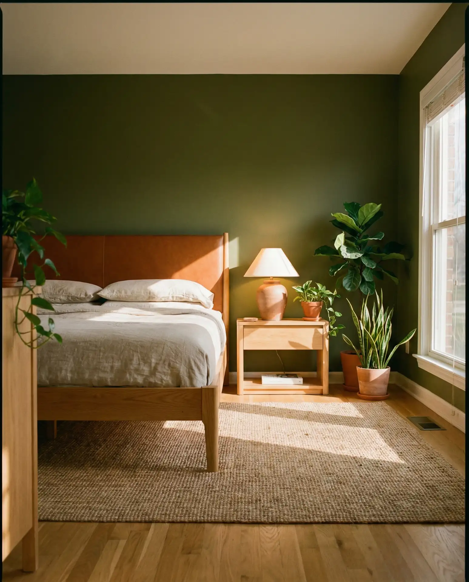
19. Wood and Green Natural Harmony
Emphasizing wood and green together creates bedrooms that feel inherently connected to nature. Wood and green is less about a specific color combination and more about material emphasis—think various wood tones throughout the room paired with green walls or textiles. This approach works beautifully in mid-century modern homes, Scandinavian-inspired spaces, and contemporary interiors seeking organic warmth. The natural variation in wood grain adds visual interest that prevents green from feeling flat.
Where it works best: homes in wooded settings or those with architectural wood elements like exposed beams or original flooring worth highlighting. The palette creates continuity between interior and exterior, making it popular in mountain homes, forest cabins, and houses with significant tree coverage on the property. Many homeowners find that mixing wood tones—rather than matching them precisely—creates more authentic, collected spaces that evolve naturally over time.
20. Green Panelling Architectural Impact
Installing panelling in green tones creates instant architectural character in plain bedrooms. Paneling painted in sage, forest, or olive adds dimension and texture that flat-painted walls can’t achieve. Board and batten, shiplap, or traditional wainscoting all work beautifully in green. This treatment particularly suits bedrooms in newer construction homes lacking original architectural detail or older homes where previous renovations removed character worth restoring.
Budget considerations: while paneling installation adds to project costs compared to simple paint, the impact per dollar is significant. DIY-friendly options like peel-and-stick panels or simple board and batten can be completed over a weekend by motivated homeowners. The architectural interest created by paneling allows you to keep furniture and décor simpler and less expensive, as the walls themselves become the focal point. This approach is particularly popular in rental properties, where permanent improvements can justify higher rent.
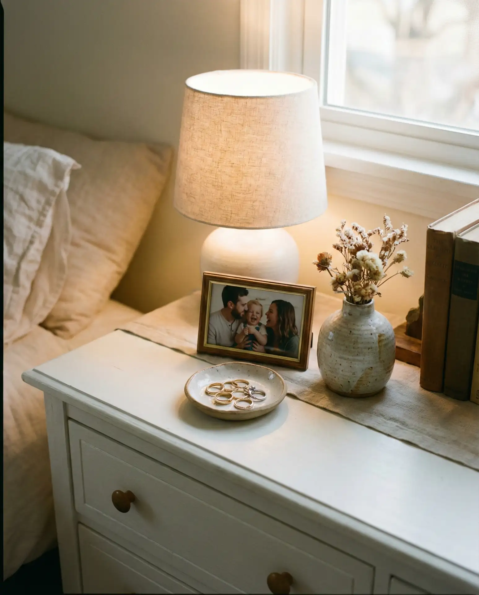
21. Green Furniture Statement Pieces
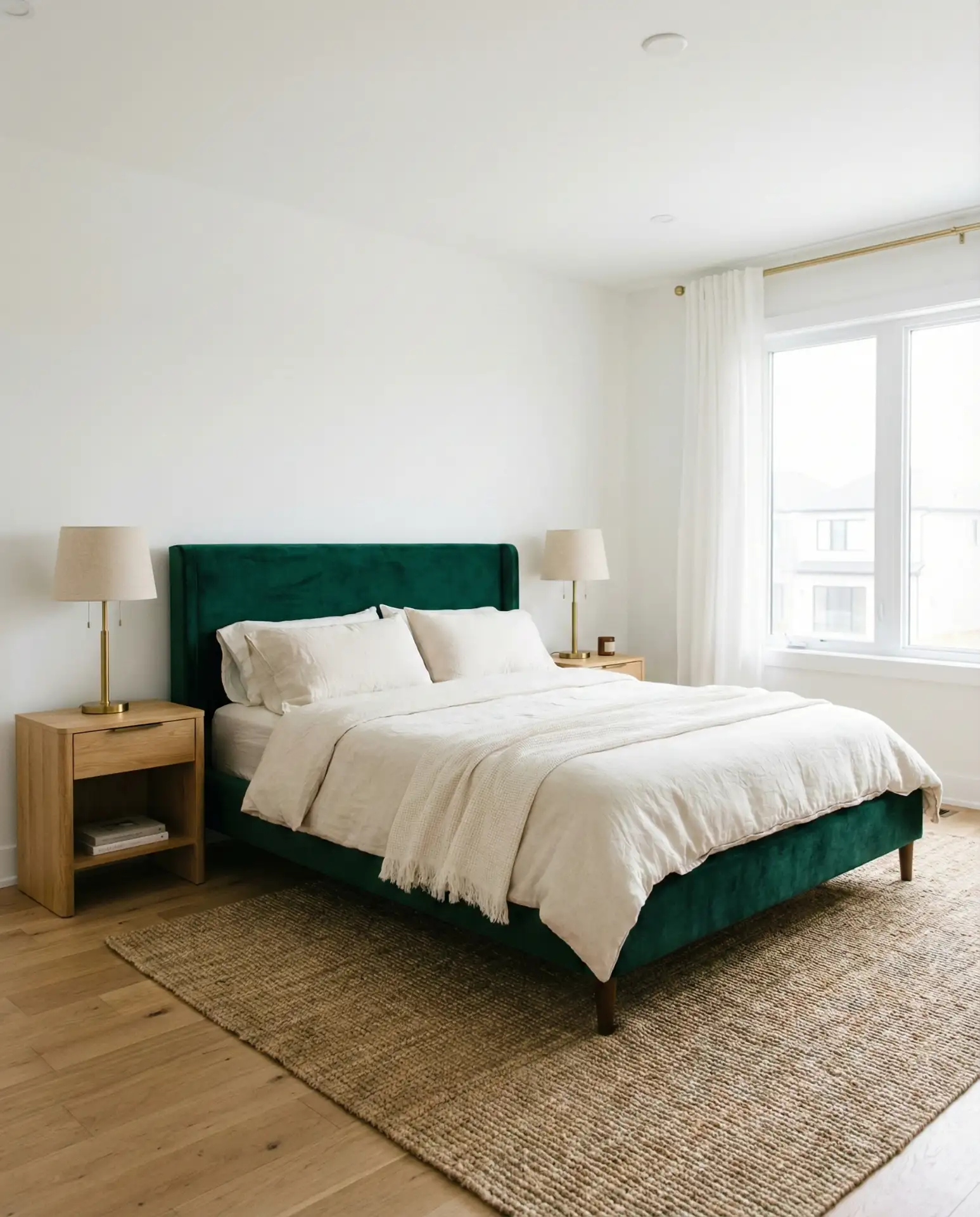
Choosing furniture in green tones—particularly upholstered beds, chairs, or storage pieces—creates flexibility that painted walls don’t offer. Furniture in sage, emerald, or olive serves as the color anchor while keeping walls neutral. This approach appeals to renters, frequent redecorators, and those hesitant about color commitment. A green velvet bed or upholstered bench can completely transform a white-walled bedroom while remaining moveable and changeable.

Real homeowner behavior shows that people who invest in quality green furniture pieces tend to keep them through multiple moves and décor changes, making them worthwhile investments despite higher upfront costs. Green upholstery works across seasons—feeling fresh in spring and summer and cozy in fall and winter. The approach also allows for easier experimentation with trendy wall colors or wallpaper patterns, knowing the green furniture will anchor whatever you choose.
22. Green Ideas Aesthetic Movement

The broader aesthetic of green bedrooms encompasses everything from grandmillennial maximalism to minimalist Japandi styles. Pink, blue, and green combinations; royal jewel tones; and earthy organic palettes all fall under the expanding umbrella of how Americans interpret green in personal spaces. What unites these varied approaches is a desire to create bedrooms that feel both current and timeless, personal yet polished. The aesthetic movement around green bedrooms reflects broader cultural interest in biophilic design and bringing nature indoors.
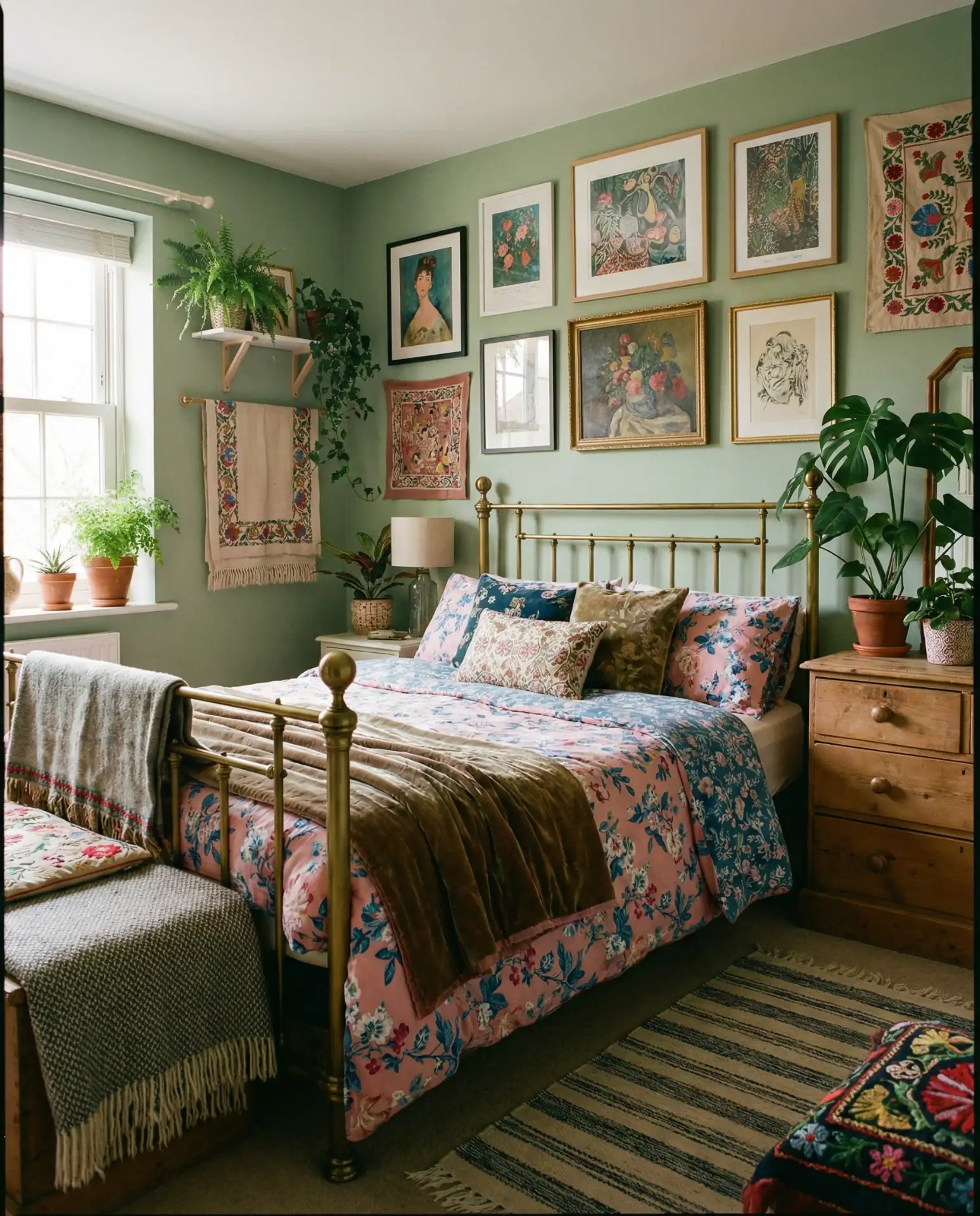
Common mistake: trying to commit to a single aesthetic rather than allowing your green bedroom to evolve naturally. The most successful green bedrooms often blend elements from multiple sources—a vintage rug with modern furniture, traditional paneling with contemporary art. Green serves as a flexible foundation that accommodates personal collections and evolving tastes better than more demanding color choices. This versatility explains why green continues dominating Pinterest searches year after year.
Conclusion
These twenty-two green bedroom ideas demonstrate the remarkable versatility of green in creating personal spaces that range from serene to dramatic and traditional to contemporary. Whether you’re drawn to soft sage tones or bold forest hues, the key to success lies in choosing combinations and approaches that reflect your personal style while respecting the practical realities of your space. We’d love to hear which green bedroom idea resonates most with you, or how you’ve incorporated green into your own sleeping space—share your thoughts and experiences in the comments below.