Kitchen cabinets are having a major moment in 2026, and it’s not just about function anymore—it’s about personality. After years of all-white everything, American homeowners are craving color, texture, and depth in their kitchens. Pinterest boards are packed with searches for warm greens, moody blues, and unexpected two-tone combinations that feel collected rather than catalog-perfect. Whether you’re renovating a cramped galley or dreaming up a sprawling open-concept space, the right cabinet color can completely transform the heart of your home. In this guide, you’ll find fresh, inspiring kitchen cabinet color ideas that reflect where design is heading this year—and how to make each one work in real life.
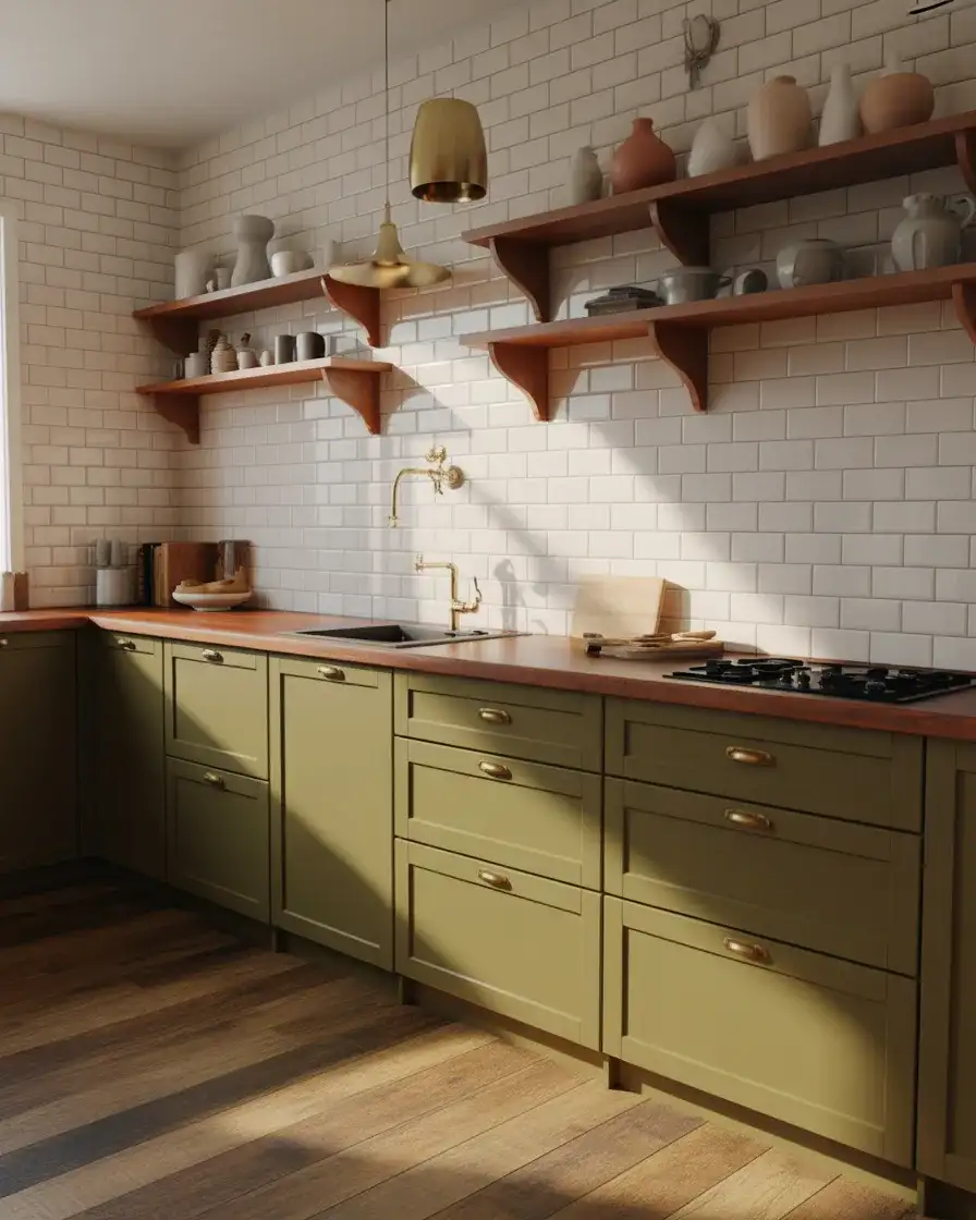
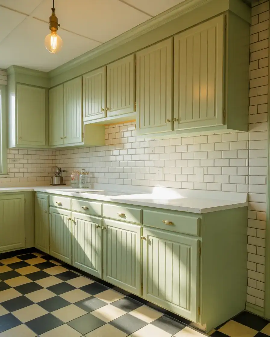
1. Sage Green Cabinets with Brass Hardware
Sage green has become the go-to for homeowners who want something softer than emerald but more interesting than white. This muted, earthy tone works beautifully in modern kitchens and transitional spaces alike, bringing warmth without overwhelming the room. It pairs especially well with natural wood countertops, white subway tile, and warm brass or gold fixtures. Sage feels fresh in the morning light and cozy by evening, making it a versatile choice for kitchens that serve as the hub of daily life.
One thing designers love about sage is how forgiving it is. Unlike stark white, it doesn’t show every fingerprint or smudge, which makes it practical for families with kids. It also works across budgets—you can achieve this look with a quality paint job on existing cabinets or invest in custom builds. If you’re in a home with limited natural light, sage can still shine when paired with under-cabinet lighting and reflective surfaces like glass or polished stone.
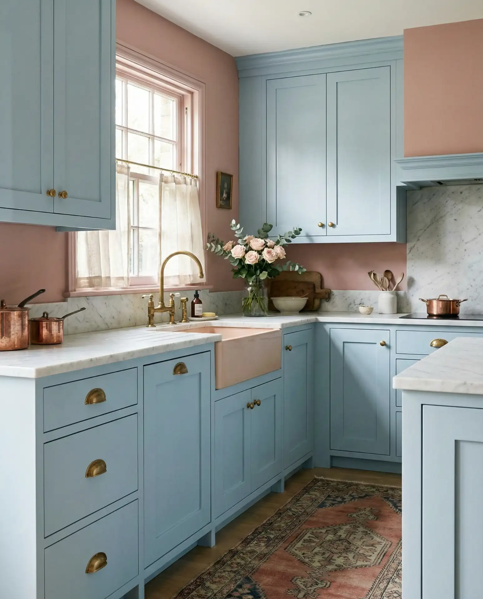
2. Deep Navy Blue Lower Cabinets
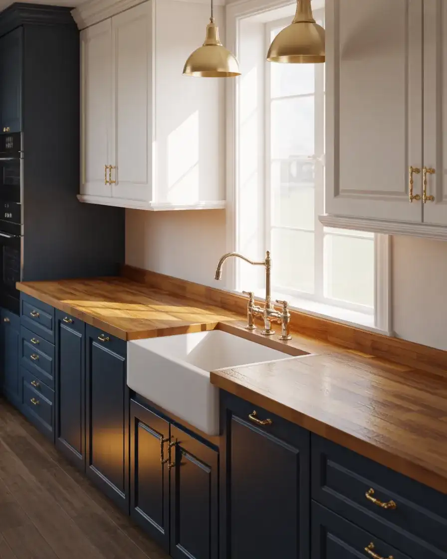
Navy blue brings a sense of sophistication and grounding to the kitchen, especially when used on lower cabinets while keeping uppers light or open. This transitional approach creates visual balance and prevents the space from feeling too heavy. Navy works particularly well in open-concept homes where the kitchen flows into the living area, offering a subtle color anchor without dominating the sightline. It’s a color that feels both traditional and contemporary, depending on the hardware and styling you choose.
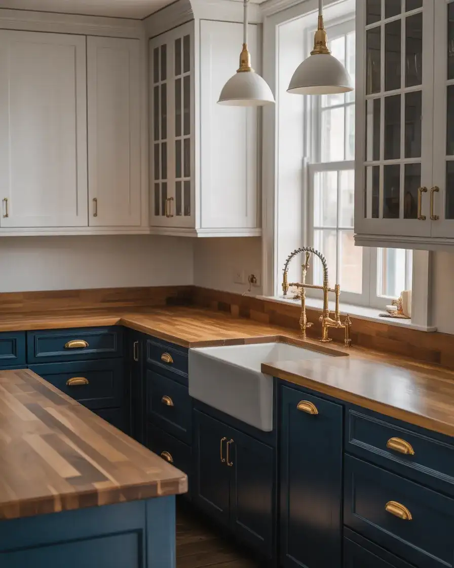
A common mistake with navy is pairing it with too many other dark tones, which can make the kitchen feel closed in. Instead, balance it with lighter countertops, white or cream walls, and plenty of natural or layered lighting. In the Pacific Northwest, where natural light can be scarce, homeowners often use navy on an island only, keeping perimeter cabinets lighter to maintain brightness. This approach works beautifully in galley kitchens too, where every design decision impacts the sense of space.
3. Warm Terracotta Orange Accents
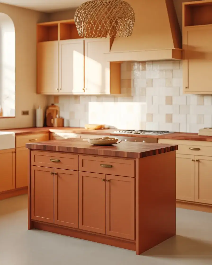
Terracotta is making a bold comeback, especially as an accent color on kitchen islands or lower cabinets. This earthy, sun-baked hue brings warmth and Mediterranean charm into American homes, working beautifully in cozy spaces that lean into natural materials like wood, stone, and clay. It’s a color that feels grounded and organic, perfect for homeowners who want something different but not jarring. Terracotta pairs wonderfully with cream, sage, or soft gray, and it looks stunning against natural wood floors and woven textures.
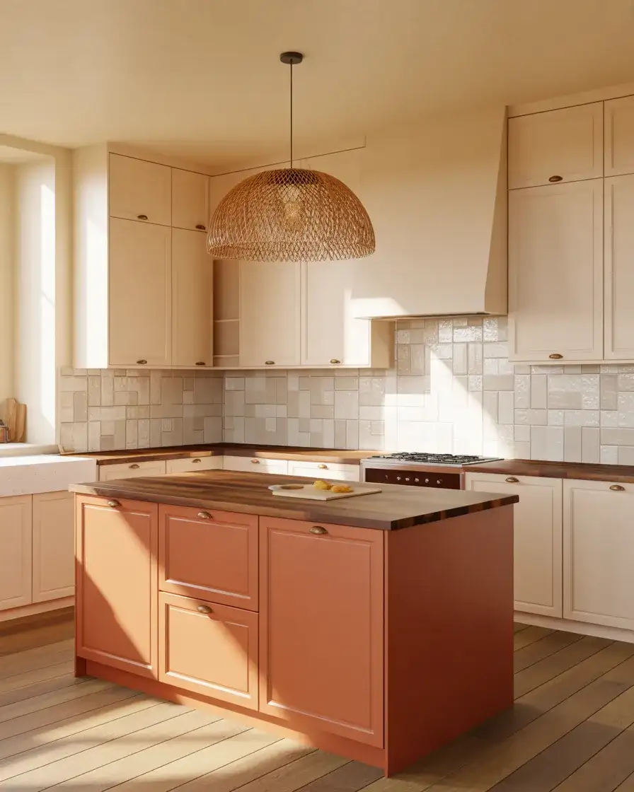
Where it works best: homes with southwestern or coastal aesthetics, or kitchens that open onto patios and outdoor living spaces. Terracotta feels especially at home in California, Arizona, and Texas, where the color echoes the landscape. It’s also surprisingly versatile in urban lofts and brownstones, where it adds warmth to industrial elements like exposed brick and steel beams. Just be mindful of undertones—some terracottas lean pink, others lean brown, so test samples in your actual lighting before committing.
4. Two-Tone Gray and White Pairing
The classic two-tone look remains a favorite for a reason: it adds dimension without overwhelming the eye. Gray lower cabinets paired with white uppers create a clean, modern aesthetic that works in both small spaces and large kitchens. This combination feels crisp and timeless, and it’s easy to personalize with hardware, backsplash choices, and countertop materials. Gray has enough depth to hide wear and tear better than white, while white uppers keep the space feeling airy and open.
Real homeowner behavior shows that gray-and-white kitchens often get accessorized with pops of color through bar stools, rugs, or small appliances. This makes the palette a safe but stylish foundation. One couple in Atlanta painted their lower cabinets a soft greige and kept the uppers bright white, then added vintage brass pulls they found at an estate sale. The result felt personal and collected, not cookie-cutter. That’s the beauty of this pairing—it’s a blank canvas that invites your personality in.
5. Forest Green Statement Island
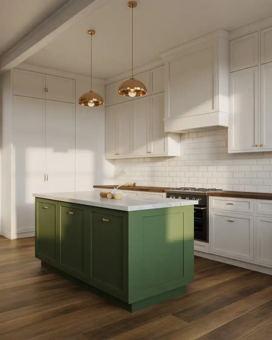
A deep forest green island anchors the kitchen with drama and elegance, especially when perimeter cabinets stay neutral. This approach is popular in transitional and cozy modern farmhouse kitchens, where the island becomes the focal point. Forest green feels richer and more grounded than sage, and it pairs beautifully with butcher block, marble, or soapstone countertops. It’s a color that reads as both classic and current, which is why it’s showing up on Pinterest boards from coast to coast.
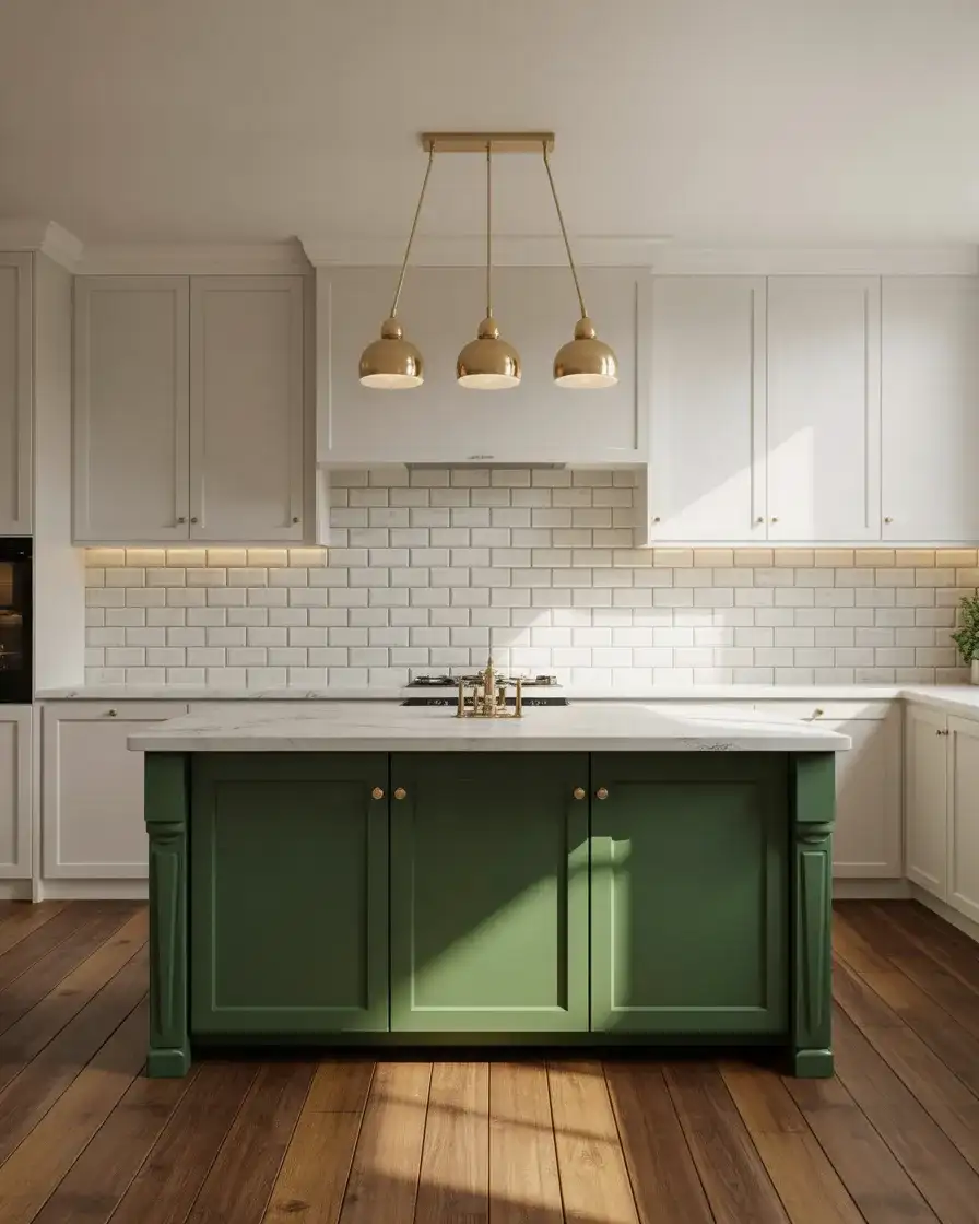
Practical insight: forest green hides scuffs and daily wear better than lighter colors, making it a smart choice for high-traffic islands that double as homework stations or prep zones. It also photographs beautifully, which matters in a resale market where listing photos are everything. If you’re nervous about committing to a bold island, start by painting a sample board and living with it propped against the island for a week. You’ll quickly know if it feels right in your space and lighting.
6. Soft Blush Pink for a Feminine Touch
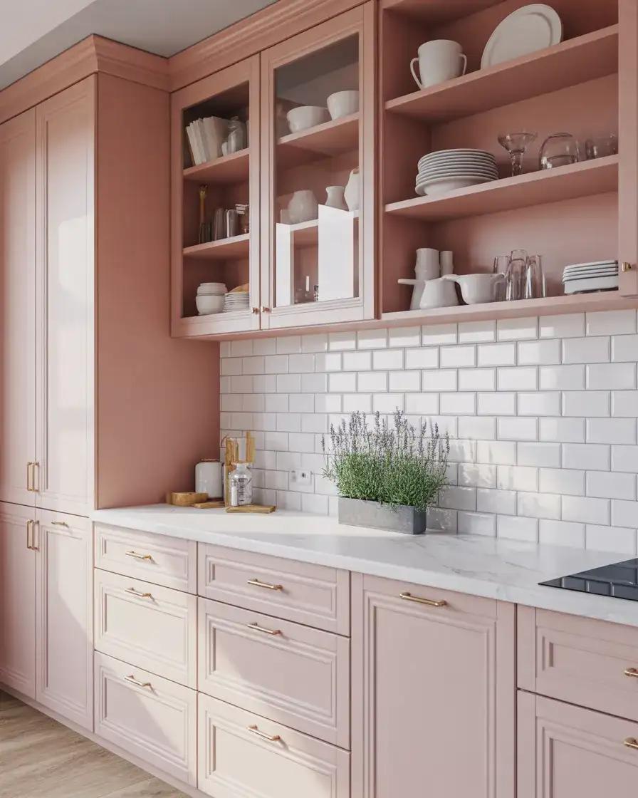
Blush pink cabinets might sound bold, but when done right, they’re surprisingly subtle and sophisticated. This soft, muted pink works beautifully in small spaces and cozy kitchens, adding warmth without feeling overly sweet. It’s a color that appeals to younger homeowners who want something fresh and Instagrammable, but it also has staying power when paired with classic materials like marble, brass, and natural wood. Blush pink reflects light beautifully, making tight galley kitchens feel more open and inviting.
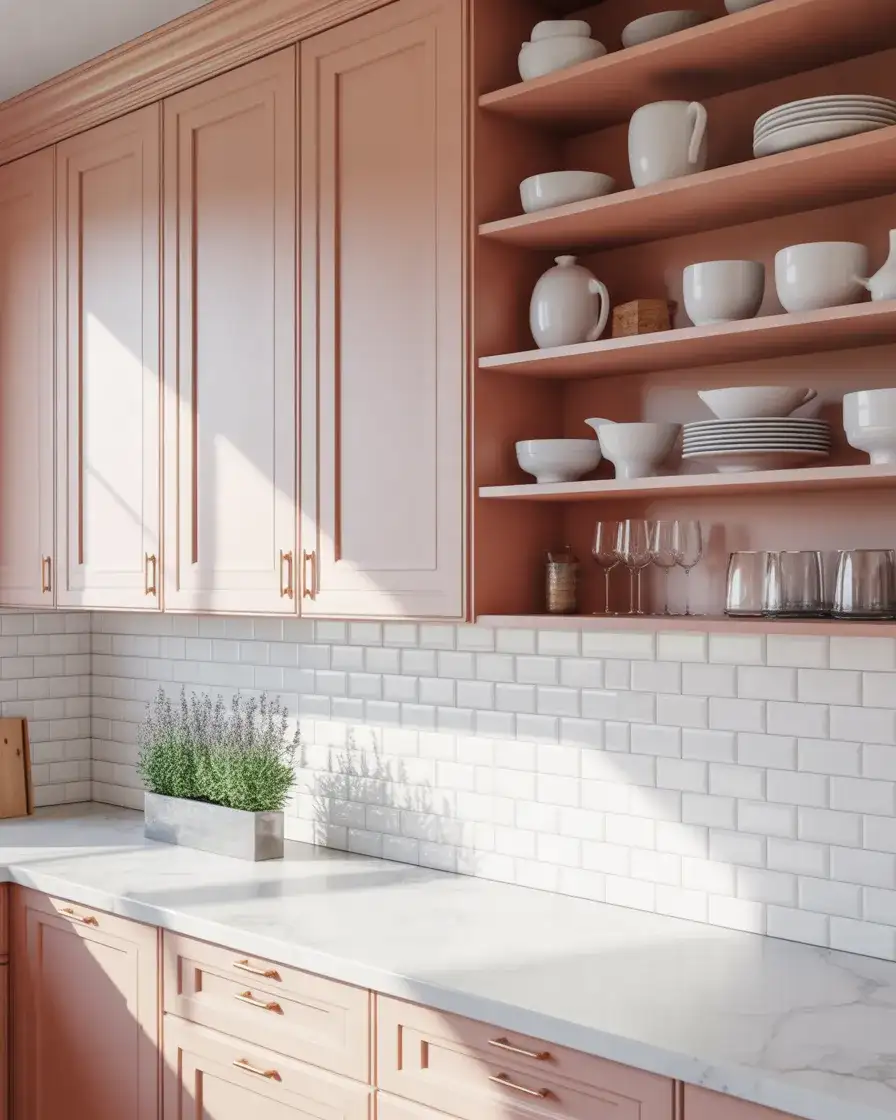
Budget-wise, blush pink is accessible. You can achieve this look with a quality cabinet paint from brands like Benjamin Moore or Sherwin-Williams, which offer several blush tones that aren’t too peachy or too mauve. The key is choosing a pink with gray or beige undertones so it doesn’t read as nursery-pink. Pair it with matte black or brushed brass hardware to ground the look, and keep countertops and backsplashes neutral to let the cabinets be the star.
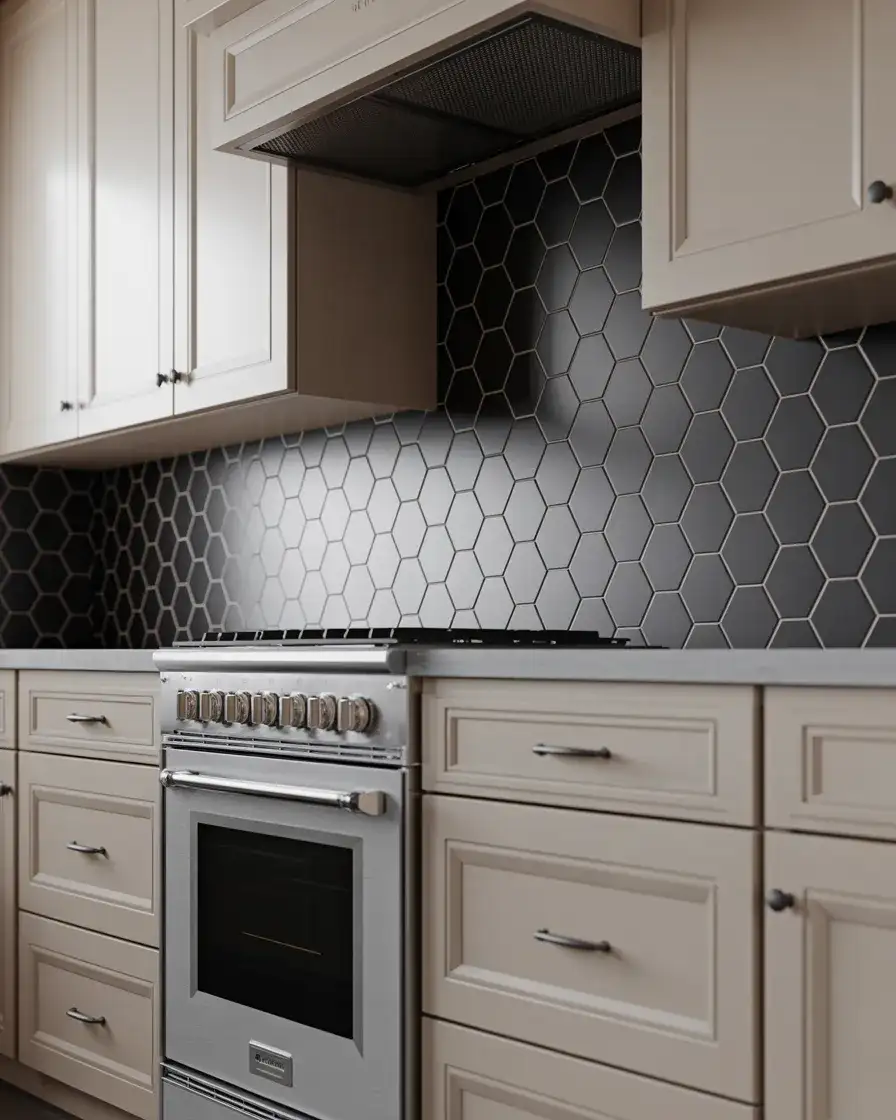
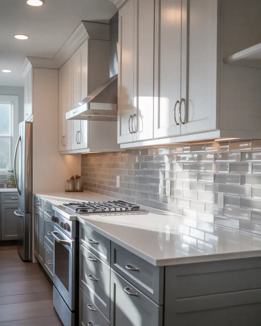
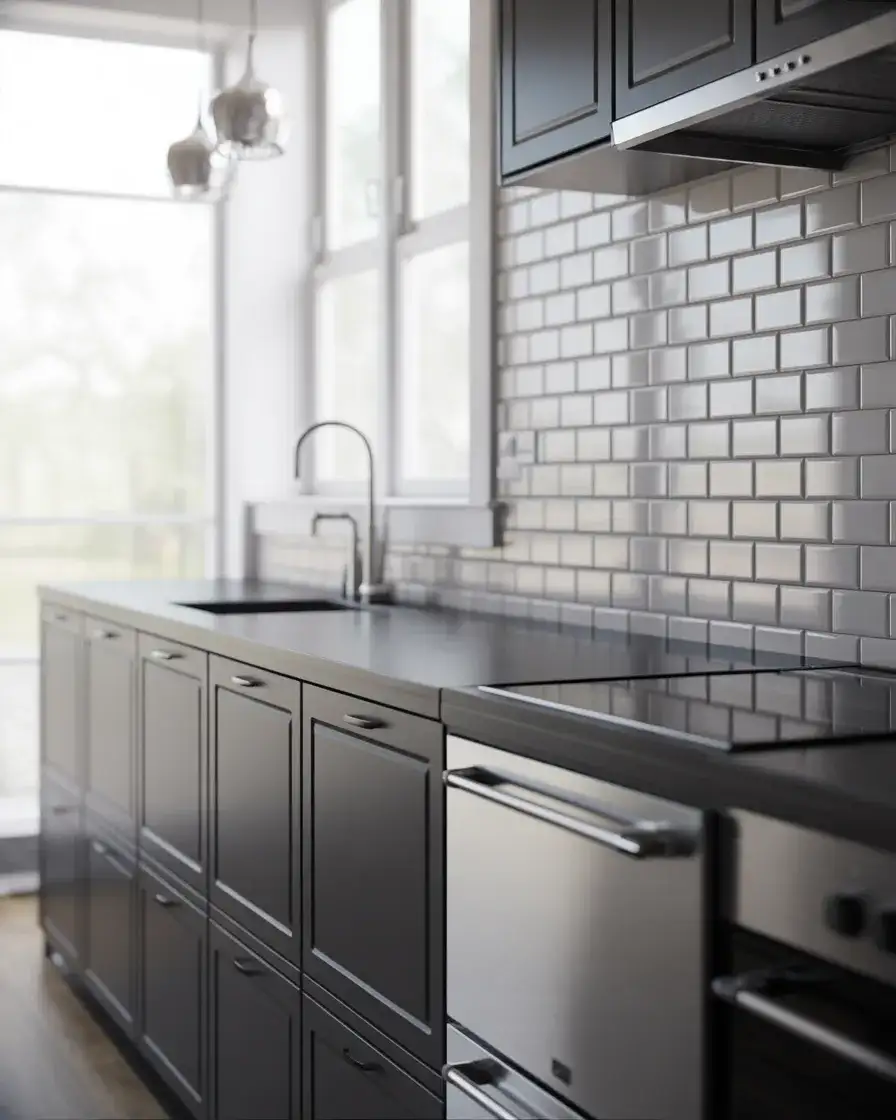
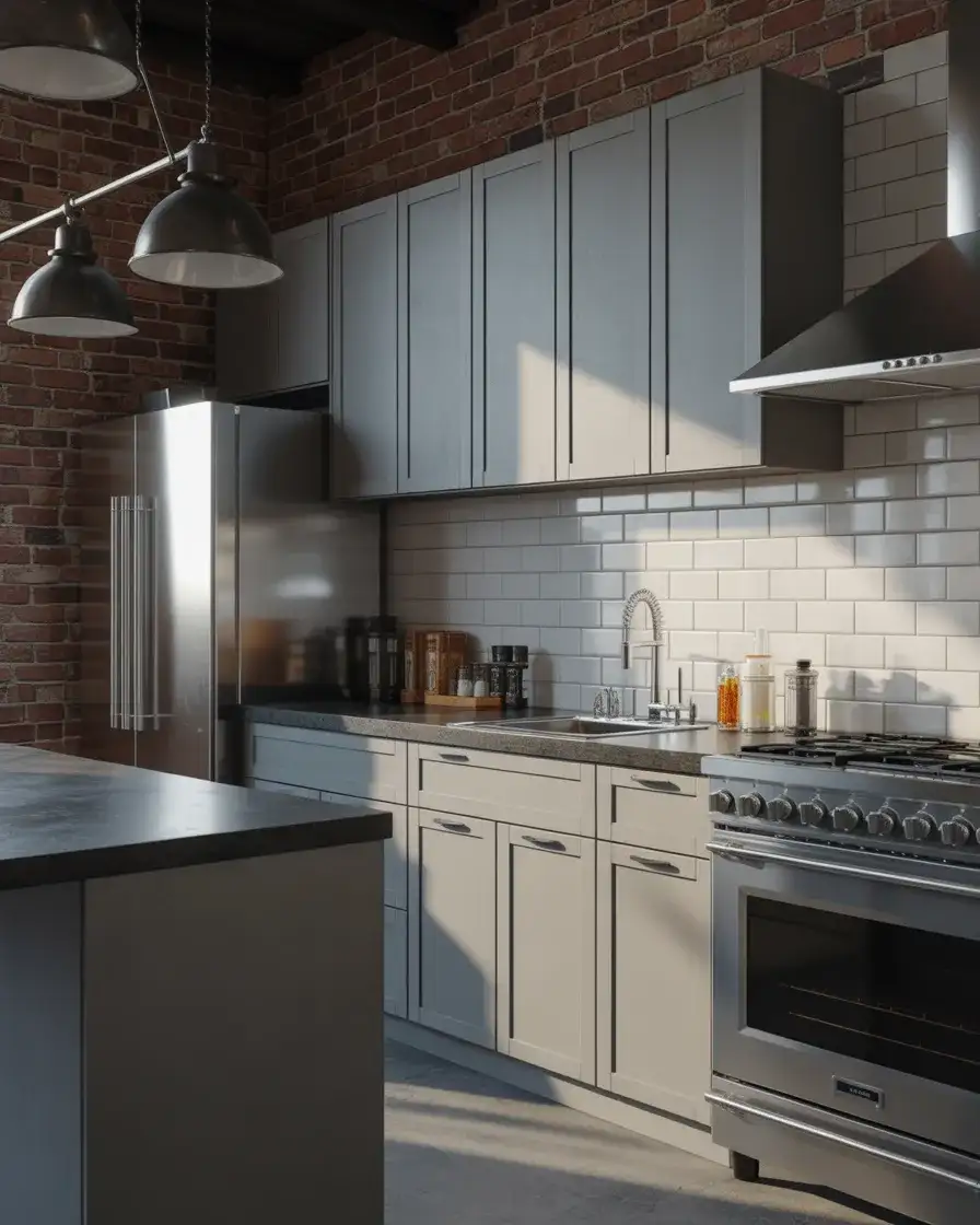
7. Charcoal Gray for Modern Drama
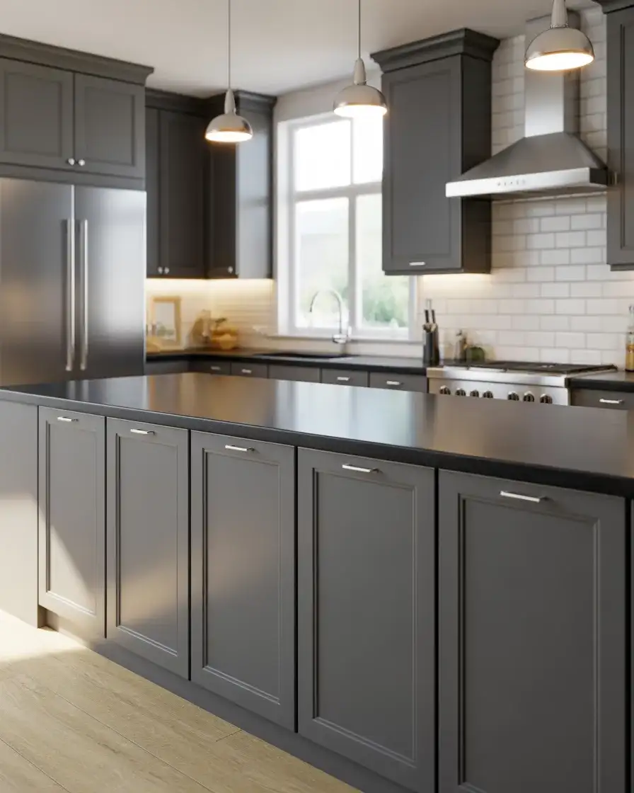
Charcoal gray cabinets bring a moody, contemporary edge to the kitchen, especially in homes with open-concept layouts where the kitchen needs to hold its own visually. This deep gray works beautifully with stainless steel appliances, black countertops, and industrial-style lighting. It’s a color that feels urban and sophisticated, popular in lofts, townhouses, and newer builds with clean lines and minimal ornamentation. Charcoal also pairs surprisingly well with warm wood tones, which softens its intensity.
In Chicago, a designer noted that charcoal kitchens are increasingly popular among clients who work from home and want a kitchen that feels like an extension of their office—polished, professional, and calm. The color doesn’t compete with Zoom backgrounds and looks sharp in natural light or evening ambiance. One thing to watch: charcoal can show dust and water spots, so it requires a bit more maintenance than lighter shades. But for those who love the look, it’s worth the extra wipe-down.
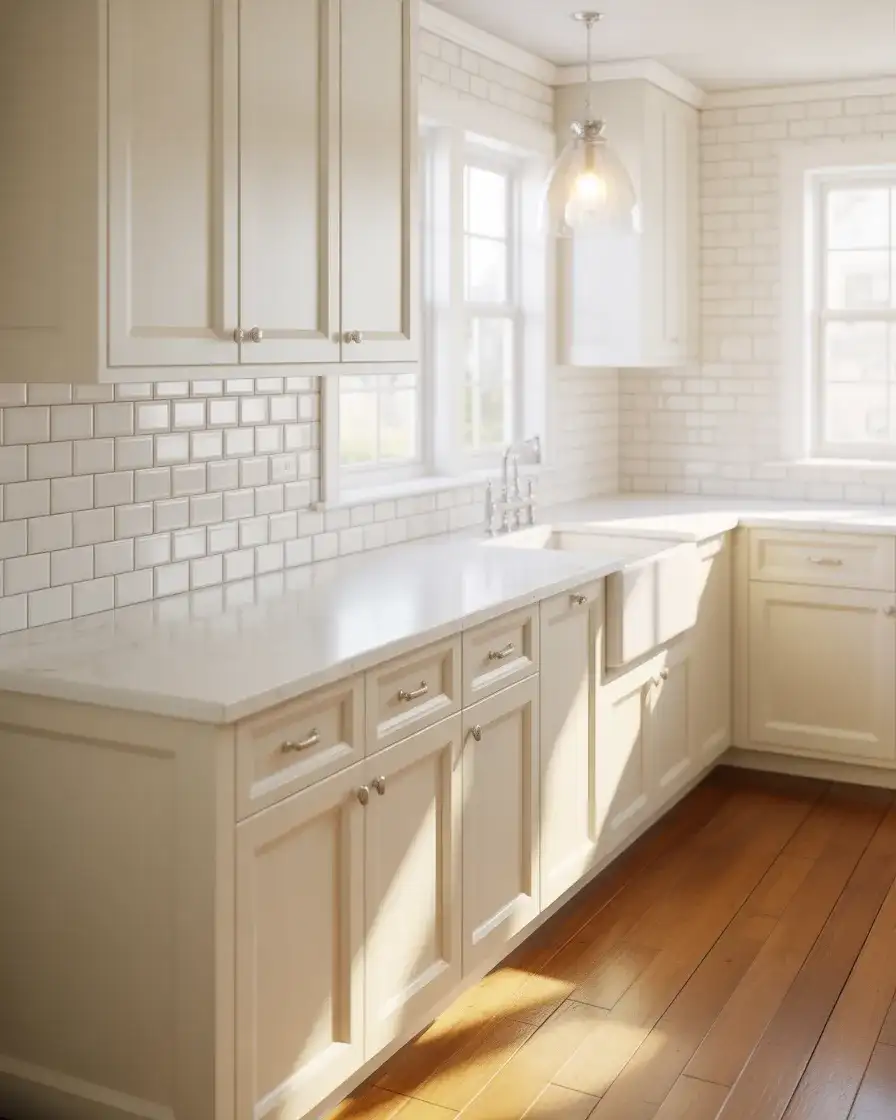
8. Creamy Off-White for Timeless Appeal
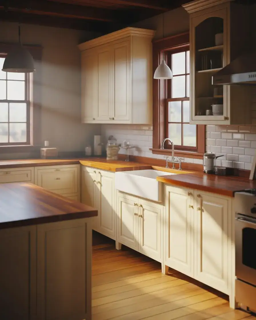
Off-white cabinets remain a classic for good reason—they’re warm, versatile, and work in virtually any kitchen style, from traditional to modern to cozy modern farmhouse. Unlike stark white, which can feel sterile, creamy off-white has depth and warmth that makes a kitchen feel lived-in and welcoming. This color is a favorite in older homes with original architectural details, where it complements crown molding, beadboard, and vintage fixtures. It’s also forgiving, aging gracefully without looking dated.
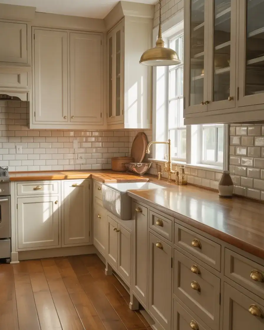
Expert-style commentary from a Vermont kitchen designer: “Off-white is the Switzerland of cabinet colors. It plays well with everything—bold backsplash tile, colorful rugs, and statement lighting. It’s the ultimate backdrop for personal style.” She recommends testing samples in different lighting conditions, because off-white can shift from warm to cool depending on your home’s light exposure. North-facing kitchens may need a warmer off-white to avoid feeling cold, while south-facing spaces can handle cooler tones without losing coziness.
9. Bold Black Cabinets with Gold Hardware
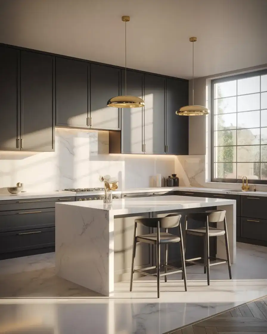
Black cabinets make a powerful statement, especially when paired with luxe gold or brass hardware. This look is all about high contrast and drama, popular in modern luxury kitchens and contemporary homes where every detail is intentional. Black works beautifully in large kitchens with plenty of natural light, and it’s a favorite in urban spaces where sophistication is the goal. Paired with white marble, light wood, or metallic accents, black cabinets feel glamorous rather than heavy.
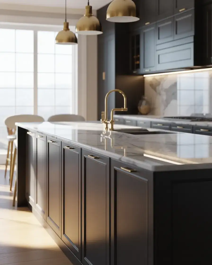
American lifestyle context: black kitchens are particularly popular in cities like New York, Los Angeles, and Miami, where homeowners want interiors that feel as polished as their wardrobes. One Manhattan homeowner chose black cabinets for a tiny kitchen, then added mirrored backsplash tile and under-cabinet lighting to bounce light around the space. The result was dramatic but not dark. The lesson: black can work in small spaces if you’re strategic with reflective surfaces and lighting layers.
10. Dusty Blue for Coastal Calm
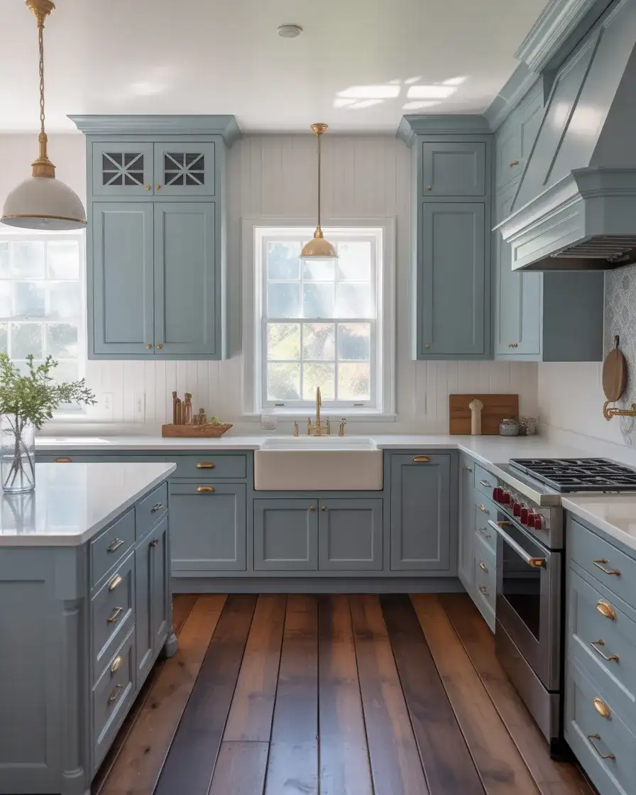
Dusty blue is softer and less intense than navy, making it a great choice for cozy kitchens with a relaxed, coastal vibe. This muted blue-gray works beautifully in beach houses, lake homes, and suburban kitchens where homeowners want a hint of color without going bold. It pairs naturally with white, cream, natural wood, and brass, and it feels calming and serene—perfect for a space where you start your day. Dusty blue also complements a range of countertop materials, from butcher block to marble to quartz.
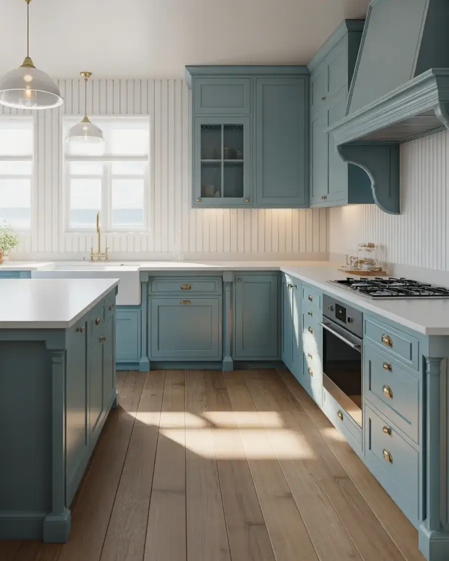
Common mistakes to avoid: pairing dusty blue with too many other colors can muddy the look. Keep it simple by sticking to a palette of blue, white, natural wood, and one metallic finish. Also, be mindful of undertones—some dusty blues lean purple, which can clash with warm wood tones. Test your paint samples next to your flooring and countertops before committing. In New England coastal homes, dusty blue cabinets have become a signature look, often paired with shiplap walls and nautical-inspired hardware.
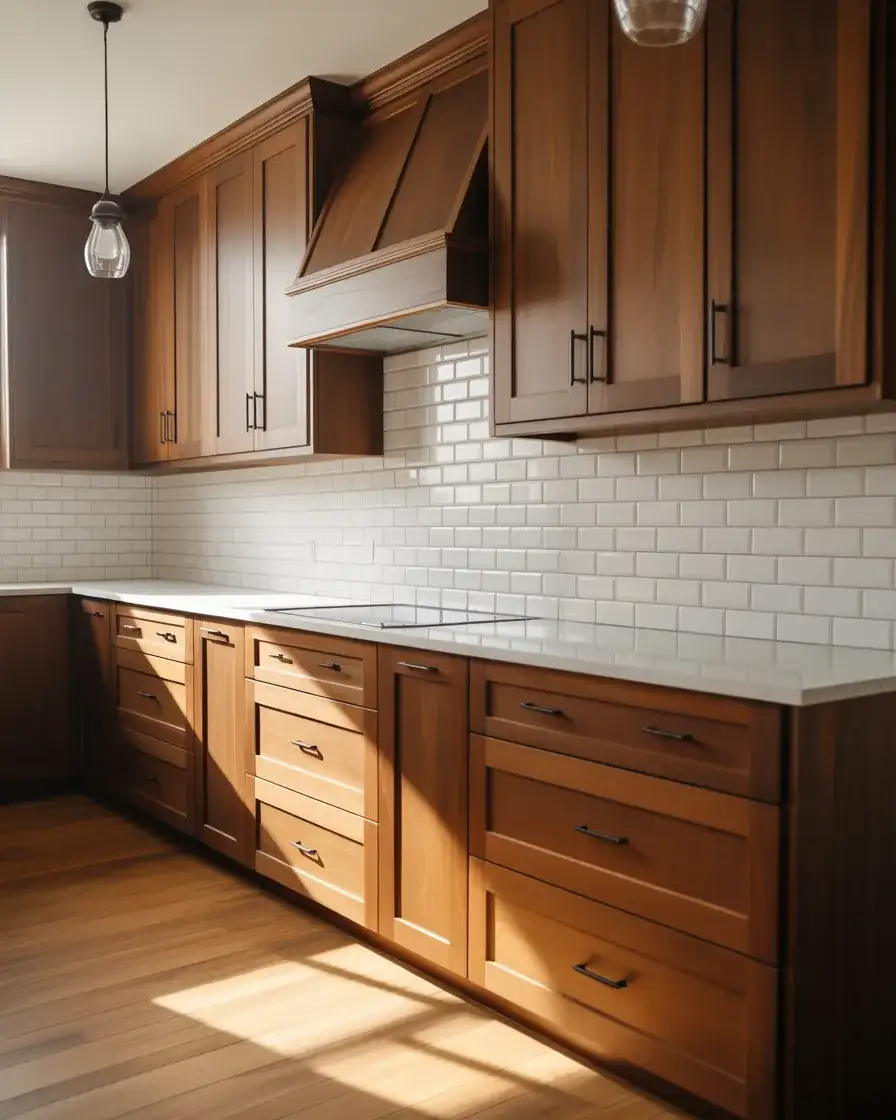
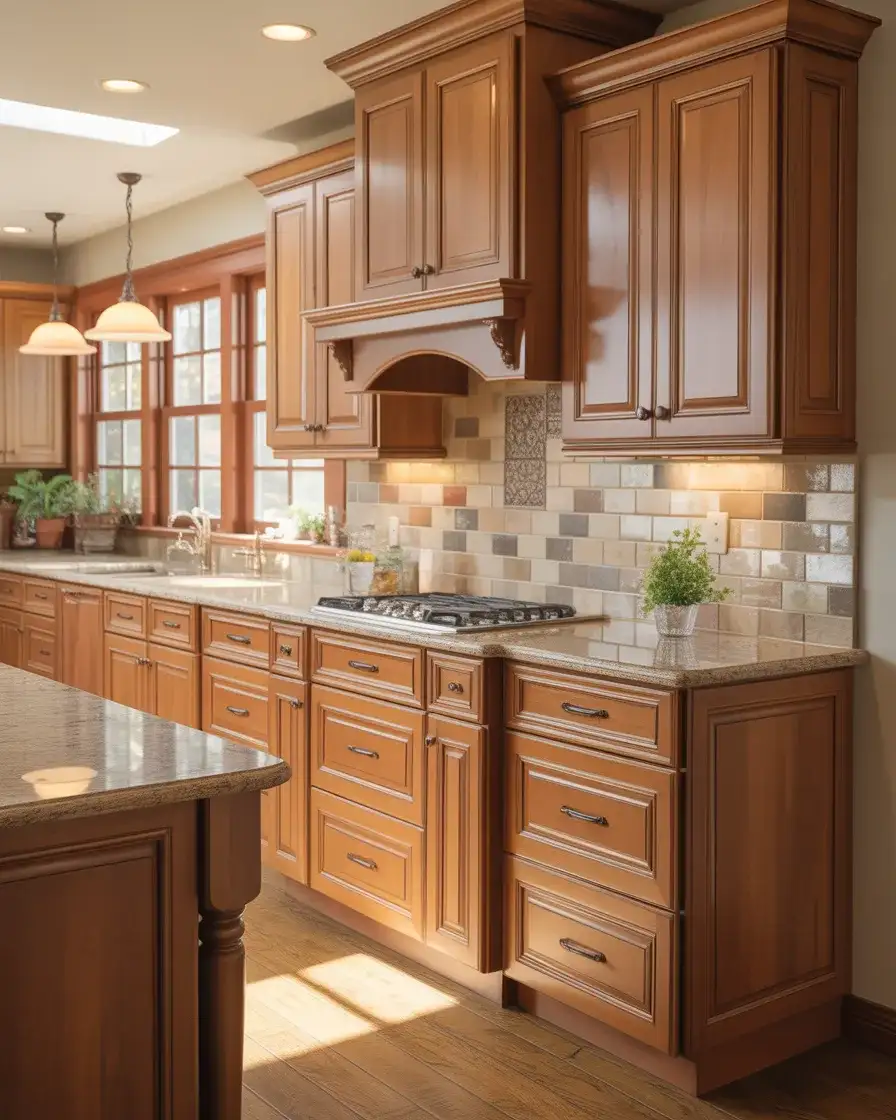
11. Warm Walnut Stain for Natural Richness
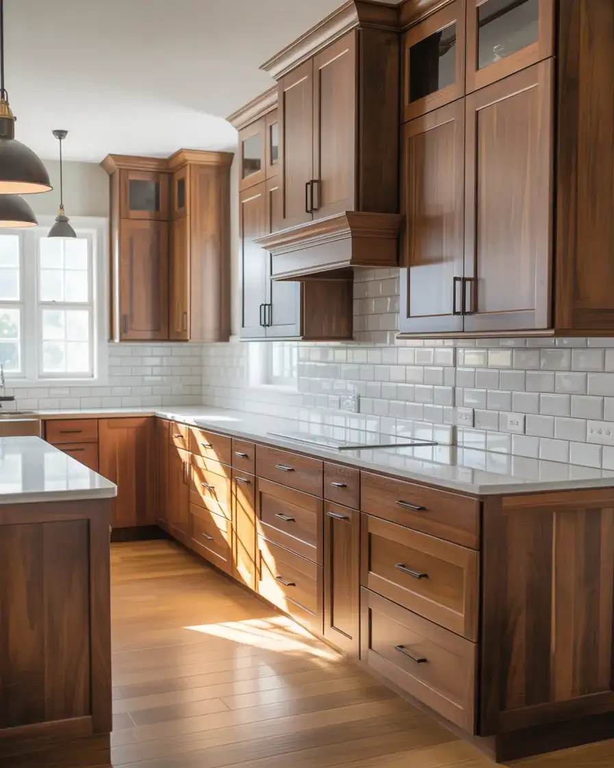
Walnut-stained cabinets bring natural warmth and richness to the kitchen, especially in cozy modern and transitional homes where wood tones are celebrated. This deep, chocolate-brown wood has beautiful grain patterns that add texture and interest, and it pairs beautifully with lighter countertops, white or cream walls, and brass or black hardware. Walnut feels both classic and current, a favorite among homeowners who appreciate craftsmanship and natural materials. It’s a color that ages beautifully and never feels trendy.
Real homeowner behavior shows that walnut kitchens often become multi-generational favorites. One family in Colorado chose walnut cabinets when they built their home in the 1980s and recently refreshed the space with new countertops and modern lighting. The cabinets still look stunning, proving that quality wood in a timeless stain holds up over decades. If you’re considering walnut, invest in solid wood or high-quality veneer rather than laminate, as the real thing develops a beautiful patina over time.
12. Light Oak for Scandinavian Simplicity
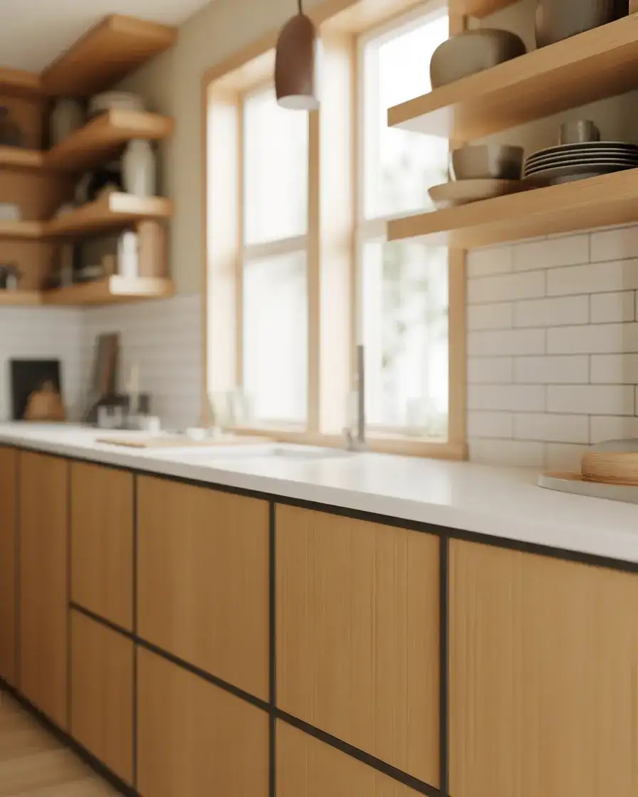
Light oak cabinets bring a Scandinavian sensibility to the kitchen, with their pale, honey-toned wood and visible grain. This look is perfect for minimalist and cozy kitchens where simplicity and natural materials are the focus. Light oak feels airy and warm at the same time, and it pairs beautifully with white countertops, matte black hardware, and clean-lined design. It’s a favorite among younger homeowners who are drawn to Nordic design principles—function, beauty, and sustainability.
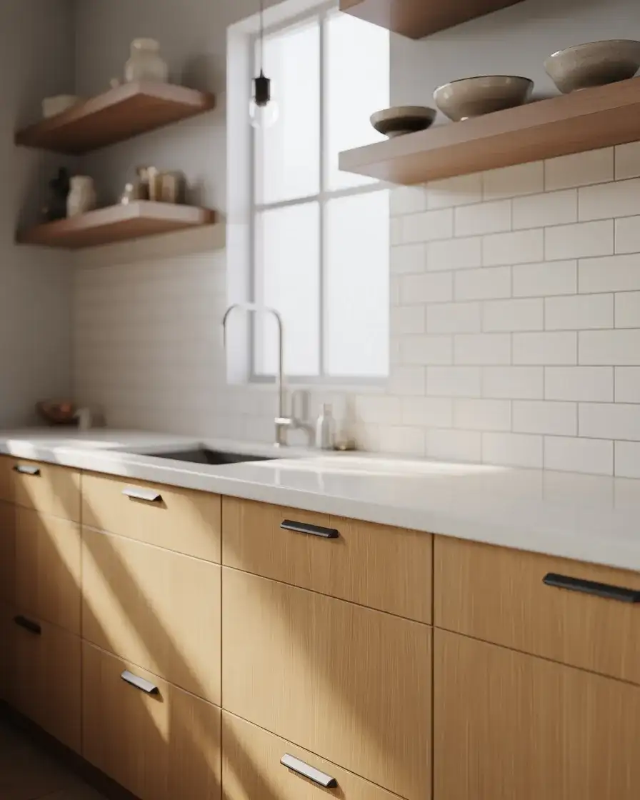
Where it works best: light oak shines in kitchens with abundant natural light, especially in the Pacific Northwest, where Scandinavian-inspired design is hugely popular. It’s also a great choice for small galley kitchens, where darker wood could make the space feel cramped. Light oak reflects light beautifully, making rooms feel larger and more open. Just be mindful of orange undertones in some oak varieties—look for cooler, more neutral-toned oaks for a true Scandi look.
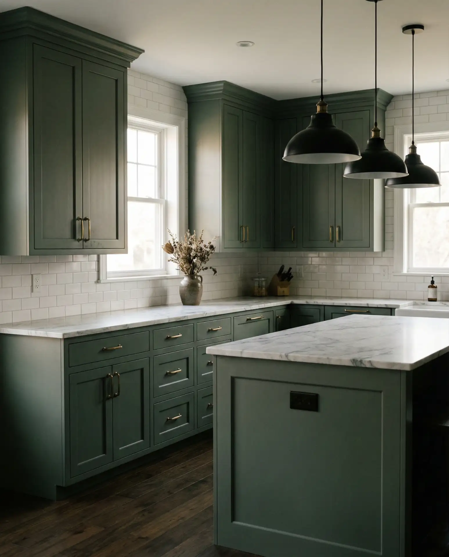
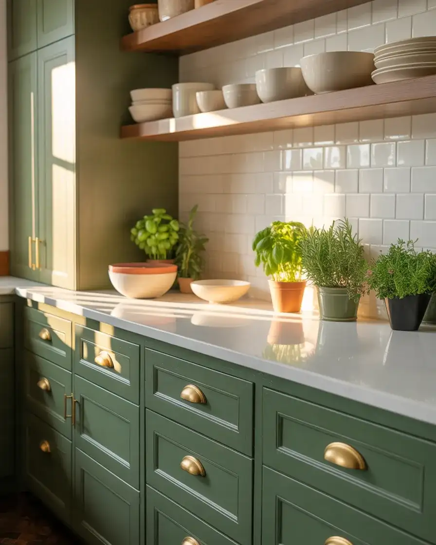
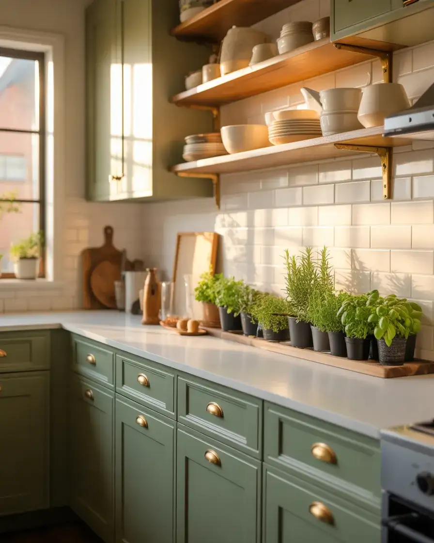
13. Matte Olive Green for Earthy Elegance
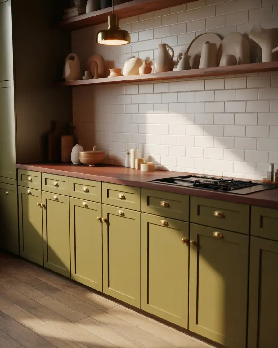
Olive green is richer and more grounded than sage, with a matte finish that feels understated and sophisticated. This earthy hue works beautifully in transitional and eclectic kitchens, where mixing textures and finishes is encouraged. Olive pairs naturally with wood, stone, brass, and cream, and it feels both vintage and current. It’s a color that brings the outdoors in, popular among homeowners who gravitate toward organic, nature-inspired palettes. Olive also hides dirt and wear remarkably well, making it practical for busy kitchens.
Practical insight: olive green is a chameleon color that shifts depending on the light. In bright daylight, it leans greener; in evening lamplight, it reads more brown. This makes it incredibly versatile but also means you should test samples throughout the day. One homeowner in Portland chose a matte olive for her lower cabinets and paired it with open wood shelving and vintage rugs. The result felt collected and personal, like the kitchen had evolved over time rather than being designed all at once.
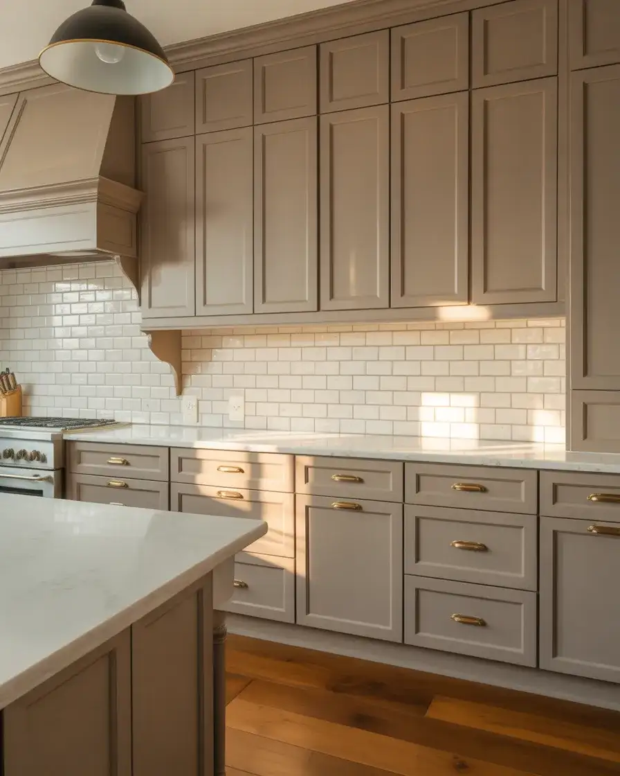
14. Soft Taupe for Understated Warmth
Taupe cabinets offer a neutral middle ground between gray and beige, bringing warmth without color commitment. This soft, earthy tone works beautifully in transitional kitchens and cozy, comfy spaces where a calm, grounding palette is desired. Taupe pairs effortlessly with virtually any countertop, backsplash, or hardware finish, making it a safe but stylish choice. It’s a color that ages well and never feels dated, popular among homeowners who want something warmer than gray but more sophisticated than beige.
A micro anecdote from a Nashville kitchen remodel: the homeowner initially wanted gray cabinets but found every sample too cold. Her designer suggested a greige-taupe blend instead, and it was exactly right—warm enough to feel welcoming but neutral enough to work with their existing tile and countertops. They added brass hardware and a vintage runner, and the kitchen instantly felt pulled together. The takeaway: taupe is incredibly forgiving and works across a wide range of styles and budgets.
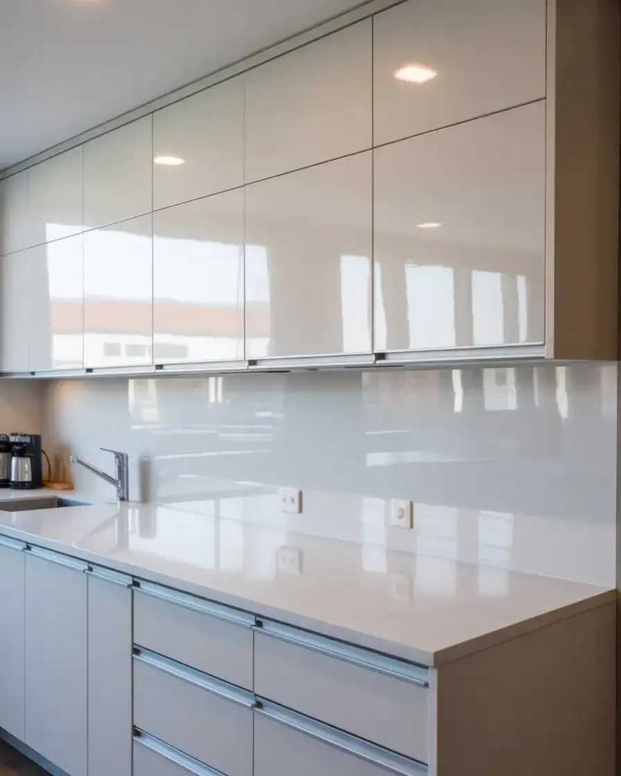
15. Glossy White for Bright and Airy Spaces
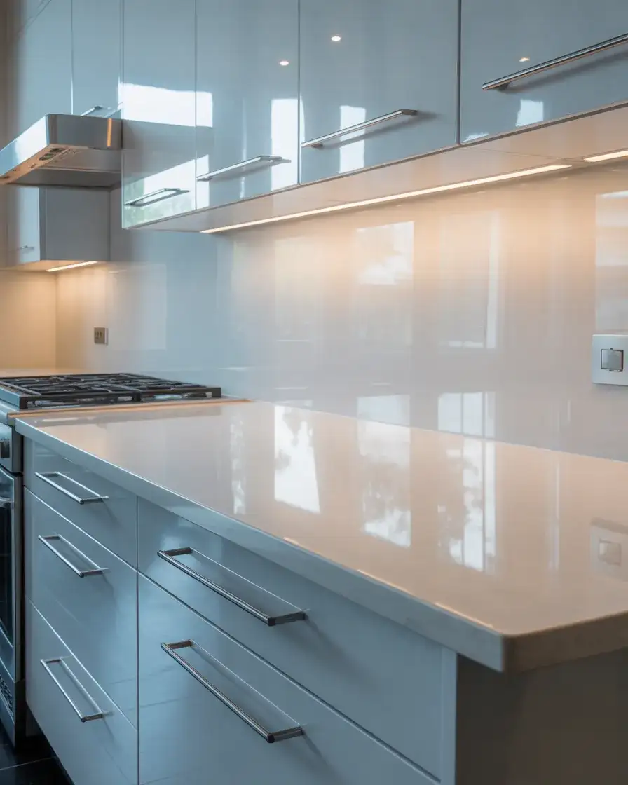
Glossy white cabinets reflect light beautifully, making them a smart choice for small spaces and kitchens with limited natural light. The high-shine finish feels polished and modern, popular in urban apartments and contemporary homes where a sleek, uncluttered look is the goal. Glossy white works particularly well in minimalist kitchens, where the cabinets themselves become a design statement through their sheen and clean lines. Paired with stainless steel appliances and minimal hardware, the look is crisp and architectural.
Budget angle: glossy finishes can be achieved with laminate or thermofoil cabinets, which are significantly less expensive than painted wood but still deliver that high-shine look. For renters or budget-conscious renovators, peel-and-stick gloss vinyl wraps can temporarily transform existing cabinets. One Brooklyn renter used glossy white vinyl to cover her outdated oak cabinets, and the transformation was dramatic. When she moved out, the vinyl peeled off cleanly, leaving the original cabinets intact.
16. Deep Plum for Unexpected Richness
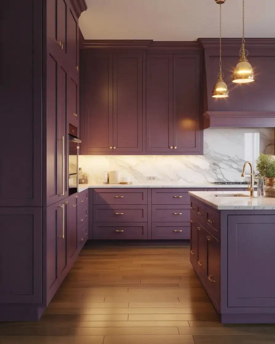
Plum cabinets are for the bold and confident, bringing a jewel-toned richness to the kitchen that feels both luxurious and unexpected. This deep purple-brown works beautifully in eclectic and luxury kitchens, especially when paired with brass hardware, marble countertops, and warm lighting. Plum reads as sophisticated rather than whimsical, a favorite among homeowners who want to make a statement without veering into trendy territory. It’s a color that feels collected and curated, perfect for kitchens that double as entertaining spaces.
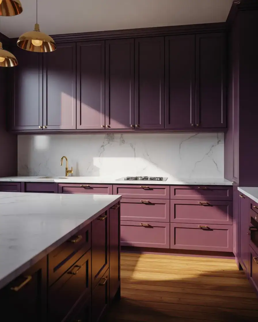
Common mistakes: pairing plum with too many other jewel tones can feel overwhelming. Instead, balance it with plenty of neutrals—white, cream, natural wood, and brass. Also, plum can read very differently depending on your lighting. In a north-facing kitchen, it might feel too dark; in a south-facing space with abundant light, it glows beautifully. One designer in Austin recommends plum for kitchen islands only, keeping perimeter cabinets lighter to maintain balance and brightness.
17. Pale Mint Green for Retro Charm
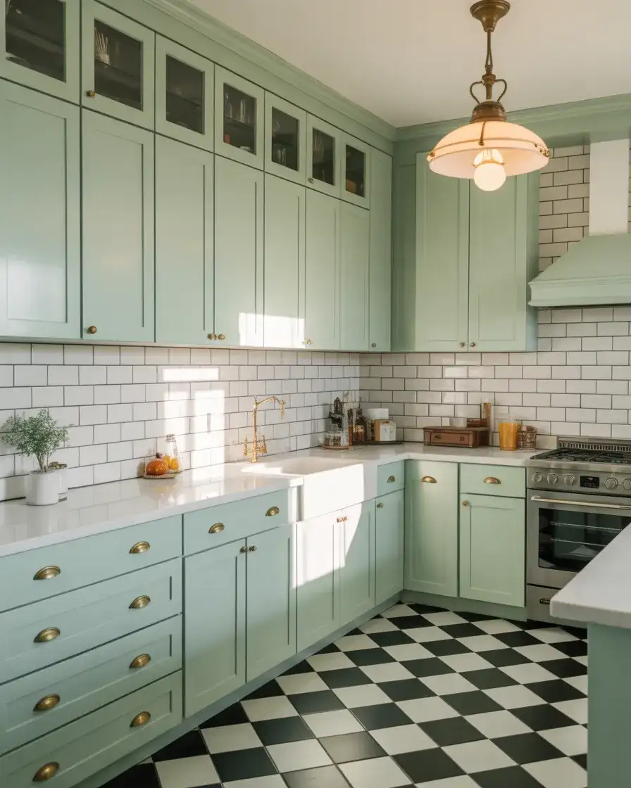
Pale mint green brings a playful, retro vibe to the kitchen, evoking mid-century diners and vintage Americana. This soft, pastel green works beautifully in eclectic and cozy kitchens, especially in older homes with original details or in newer spaces that embrace vintage style. Mint pairs naturally with white, cream, brass, and checkerboard floors, and it feels cheerful without being overly sweet. It’s a color that makes people smile, perfect for homeowners who don’t take design too seriously.
Regional context: mint green kitchens are especially popular in Florida, California, and other sunny states where bright colors feel natural and uplifting. In cooler climates, mint can feel out of place unless the home has strong southern exposure. One Miami homeowner paired mint cabinets with terrazzo countertops and vintage rattan bar stools, creating a space that felt like a perpetual vacation. The key with mint is embracing its retro roots rather than trying to make it feel too serious or modern.
18. Warm Honey Maple for Traditional Comfort
Honey maple cabinets bring warmth and traditional comfort to the kitchen, with their golden-toned wood and smooth grain. This classic look is popular in cozy family kitchens and suburban homes where a welcoming, lived-in feel is the priority. Maple is durable and affordable, making it a practical choice for busy households. It pairs beautifully with granite countertops, warm tile backsplashes, and oil-rubbed bronze or antique brass hardware. Honey maple feels timeless without being stuffy.
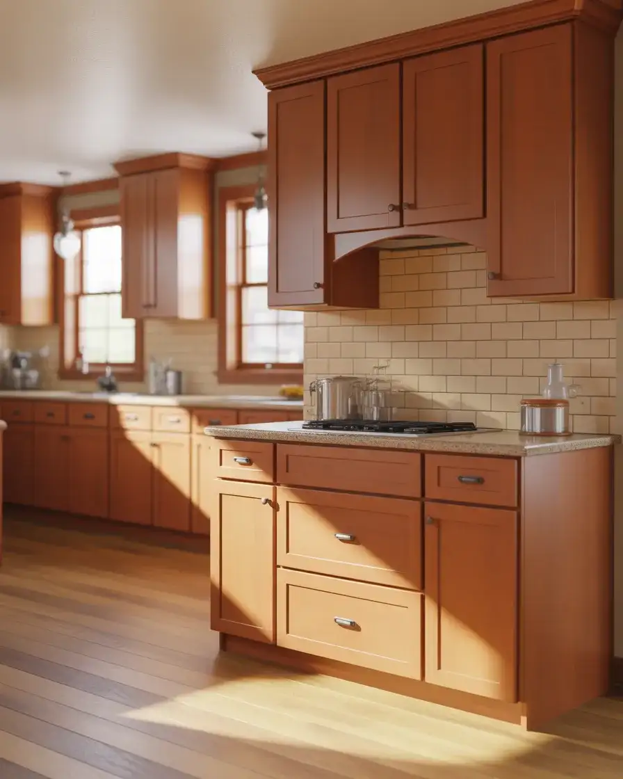
Real homeowner behavior: many families with honey maple kitchens report that the cabinets hold up beautifully to daily wear, including sticky fingers, spills, and the occasional ding from backpacks or grocery bags. Maple is a hardwood that resists denting better than softer woods like pine, which is why it’s a go-to for kid-friendly kitchens. One family in Ohio has had their maple cabinets for 15 years, and they still look warm and inviting with just occasional cleaning and oiling.
19. Cool Cement Gray for Industrial Edge
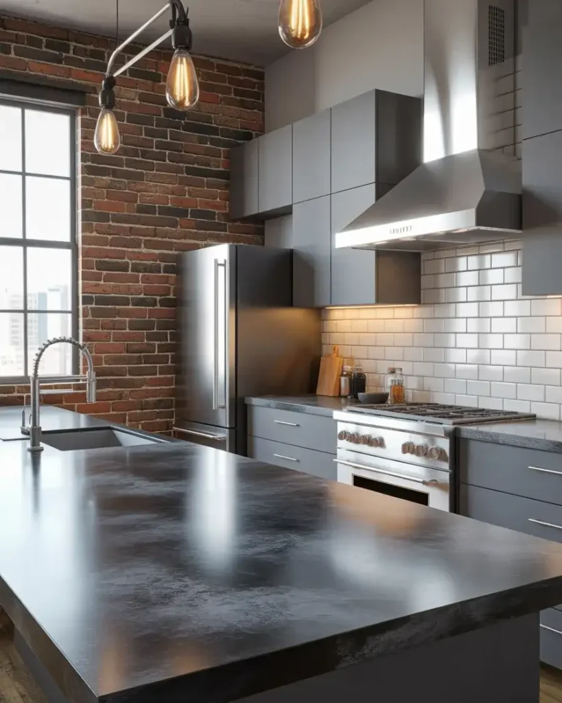
Cement gray cabinets bring an industrial edge to the kitchen, perfect for contemporary lofts and urban homes with exposed brick, concrete floors, or steel beams. This cool, neutral gray feels raw and modern, and it pairs beautifully with black countertops, stainless steel appliances, and Edison bulb lighting. Cement gray works particularly well in open-concept spaces where the kitchen flows into industrial-style living areas. It’s a color that feels unfinished in the best way—intentional and understated.
Where it works best: cement gray thrives in cities with strong industrial architecture, like Detroit, Pittsburgh, and Brooklyn, where homeowners embrace the grit and character of older buildings. It’s also a smart choice for new builds that want to inject some edge into otherwise generic spaces. One couple in Seattle chose cement gray for their condo kitchen, then added reclaimed wood open shelving and vintage factory stools. The mix of raw and refined felt perfectly curated.
20. Soft Butter Yellow for Cheerful Energy
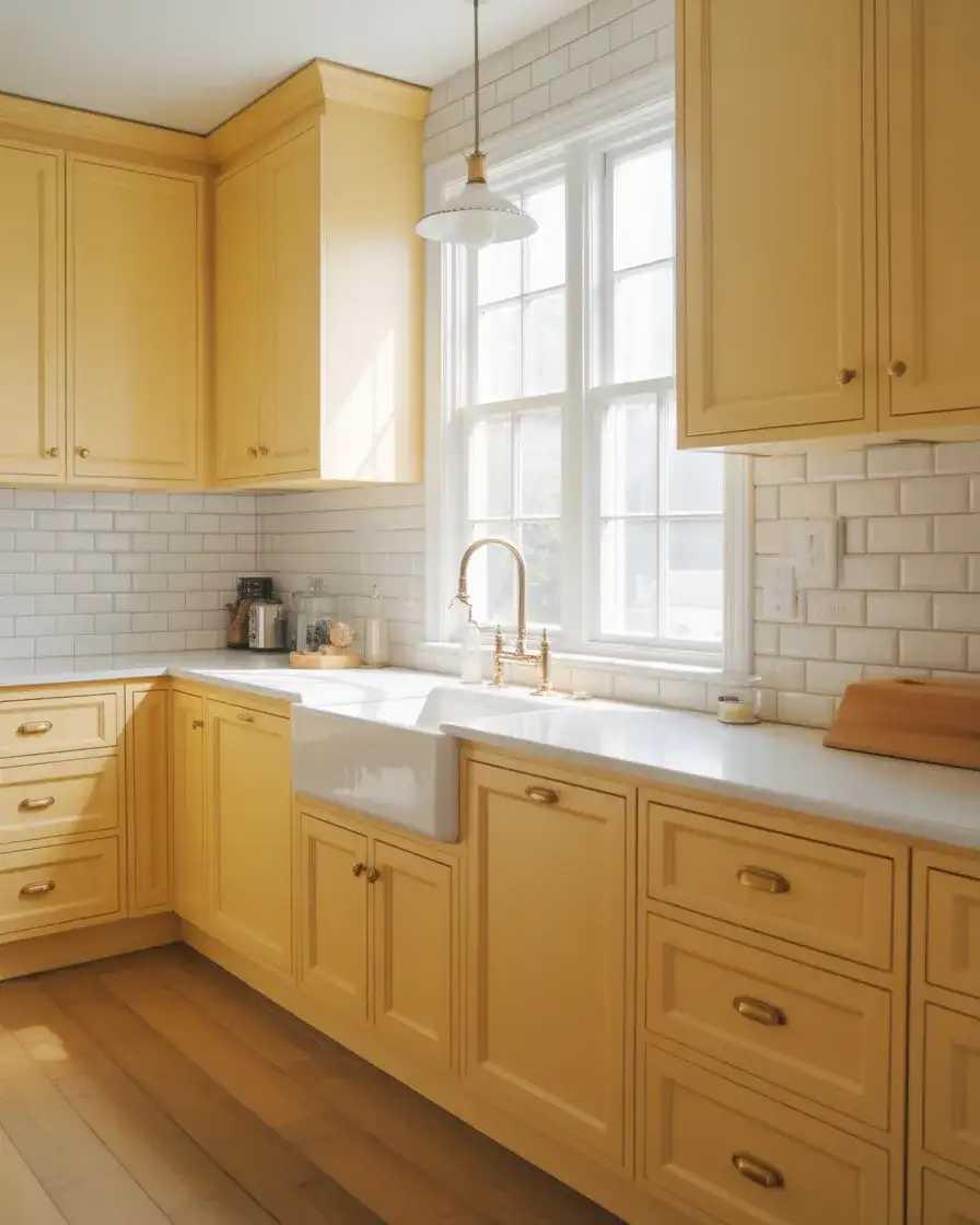
Butter yellow cabinets bring instant cheerfulness to the kitchen, evoking sunshine and warmth. This soft, creamy yellow works beautifully in cozy and traditional kitchens, especially in homes with farmhouse or cottage style. Yellow is a bold choice, but when done in a muted, buttery tone rather than a bright primary hue, it feels sophisticated and timeless. It pairs naturally with white, cream, wood, and brass, and it’s a favorite in kitchens that don’t get much natural light, as the color itself brings brightness.
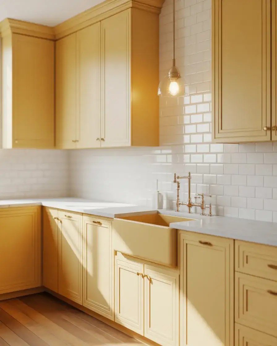
Expert-style commentary: yellow is one of those colors that can go wrong quickly if the tone is off. Too bright, and it feels like a kindergarten classroom; too pale, and it reads beige. A designer in Charleston recommends testing multiple yellows on sample boards and living with them for at least a week. The right butter yellow should feel creamy and warm, not acidic or neon. In the South, where kitchens often face inward courtyards rather than streets, yellow cabinets bring much-needed light and energy.
21. Rich Espresso for Sophisticated Depth
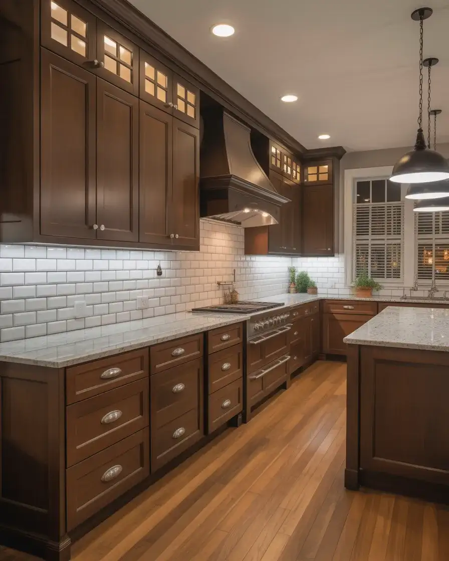
Espresso-stained cabinets bring deep, rich color to the kitchen, evoking sophistication and luxury. This dark brown stain works beautifully in traditional and contemporary kitchens, especially when paired with light countertops and backsplashes to create contrast. Espresso feels formal and polished and is popular in homes where the kitchen is a showpiece. It pairs naturally with stainless steel appliances, marble or quartz countertops, and brushed nickel or chrome hardware. The color has weight and presence, anchoring the space.
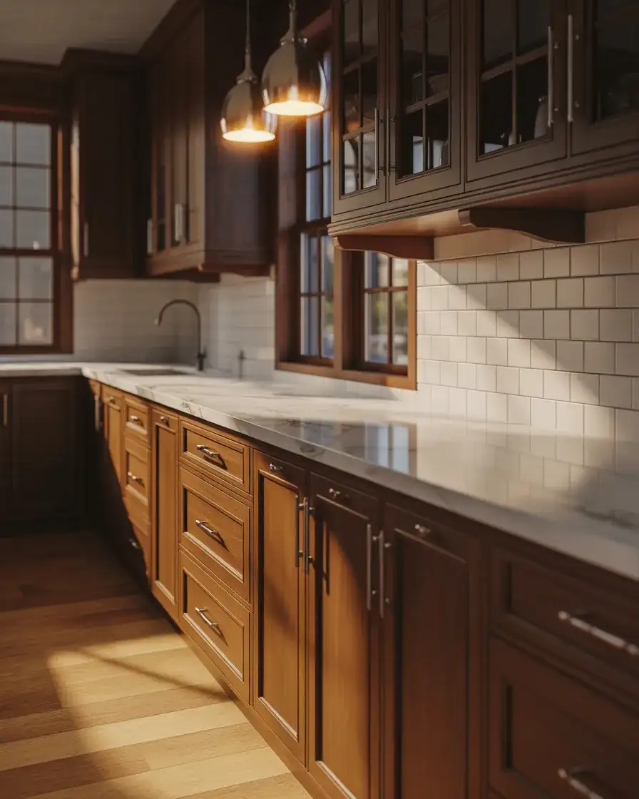
Practical insight: espresso cabinets show dust and fingerprints more than lighter colors, so they require regular wiping down. They also need plenty of light to avoid feeling cave-like. Under-cabinet lighting, pendant lights, and large windows are essential. One couple in Arizona chose espresso for their large kitchen with cathedral ceilings and massive windows, and the dark cabinets felt dramatic rather than heavy. In a smaller, north-facing kitchen, the same color might have been overwhelming.
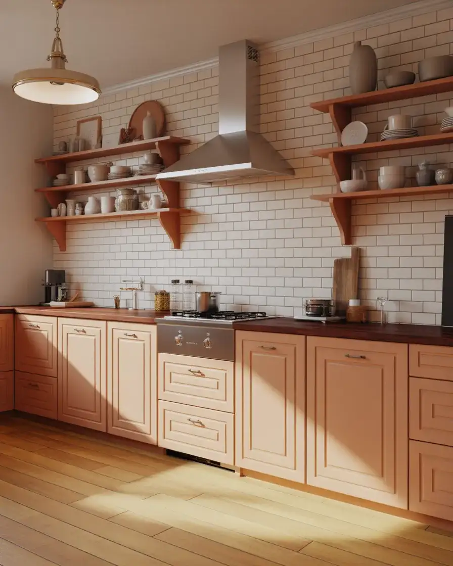
22. Soft Peach for Subtle Warmth
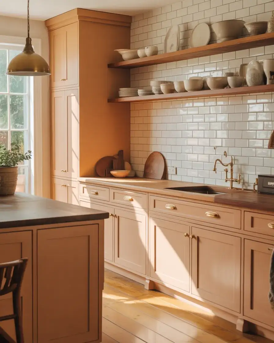
Peach cabinets bring an unexpected softness to the kitchen, offering warmth without the intensity of orange or the sweetness of pink. This muted, dusty peach works beautifully in cozy, comfy, and eclectic kitchens, especially when paired with natural materials like wood, linen, and terracotta. Peach feels collected and vintage-inspired and is popular among homeowners who love mixing old and new. It pairs naturally with brass, cream, sage green, and warm gray, and it brings a gentle, flattering glow to the space.
A micro anecdote from a designer in New Orleans: a client wanted a kitchen that felt warm and lived-in, not pristine. They chose a dusty peach for the cabinets, paired it with antique brass hardware from a salvage shop, and added a vintage Turkish runner. The space immediately felt like it had been there for decades. The designer noted that peach is incredibly forgiving—it hides imperfections and ages beautifully, developing character over time rather than looking worn.
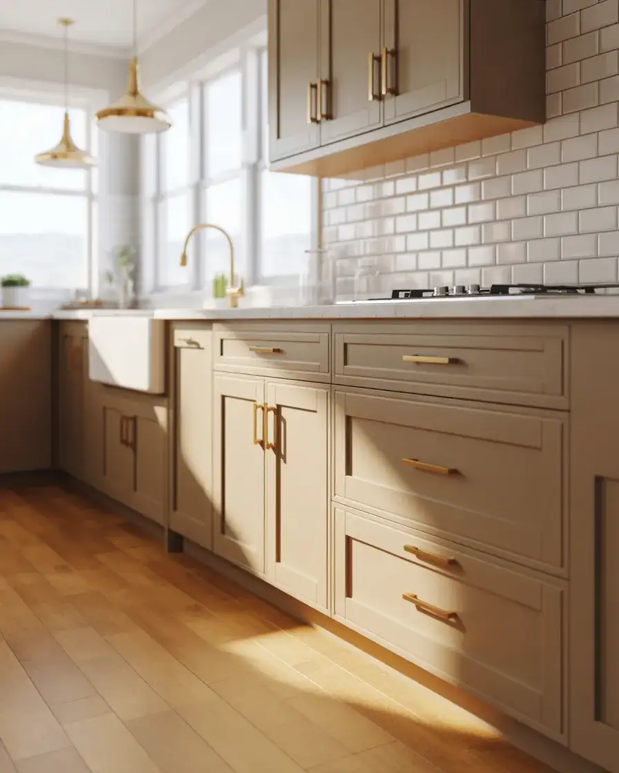
23. Pure White Shaker for Classic Simplicity
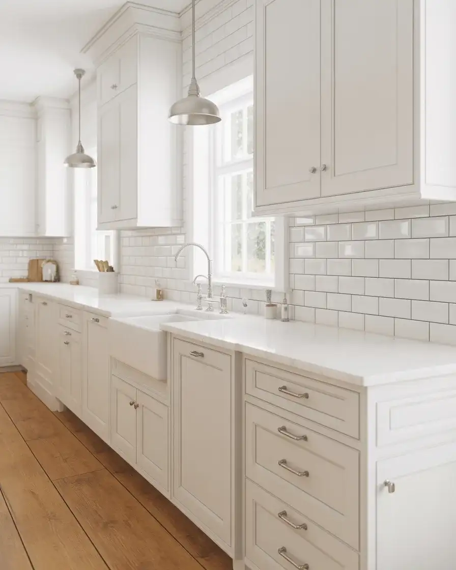
White shaker cabinets remain the ultimate classic, offering clean lines and timeless appeal that work in virtually any kitchen style. This look is popular in traditional, modern farmhouse, and cozy modern kitchens, where the goal is simplicity and versatility. White shaker cabinets are a safe investment for resale, as they appeal to the widest range of buyers. They also serve as a blank canvas, allowing homeowners to personalize with colorful backsplashes, statement lighting, or bold countertop materials. Pure white feels fresh and clean, especially when paired with natural light.
Real homeowner behavior: white shaker kitchens are the most commonly photographed and shared on Pinterest, which speaks to their universal appeal. They’re also the most flexible when it comes to switching up decor—you can go from farmhouse to modern to coastal just by swapping out hardware, lighting, and accessories. One homeowner in Texas has had white shaker cabinets for eight years and has refreshed the look three times with different backsplashes and bar stools, proving the style’s staying power and adaptability.
Conclusion
Kitchen cabinet colors in 2026 are all about personality, warmth, and moving beyond the all-white standard. Whether you’re drawn to moody blues, earthy greens, or unexpected pastels, there’s a color story that fits your home and lifestyle. The key is choosing something that feels true to you—not just what’s trending on Pinterest this week. What cabinet color are you considering for your kitchen? Share your thoughts and questions in the comments below.