As we step into 2026, kitchen color trends are shifting toward bolder self-expression, timeless sophistication, and a deeper connection to natural materials. American homeowners are moving beyond stark white minimalism, embracing rich tones, layered textures, and color schemes that reflect personality and warmth. Whether you’re planning a full remodel or a quick refresh, the right palette can transform your kitchen into a space that feels both current and enduring. From moody drama to sun-soaked simplicity, this year’s trends offer something for every style and budget. Here are 23 inspiring kitchen color ideas that capture the spirit of 2026.
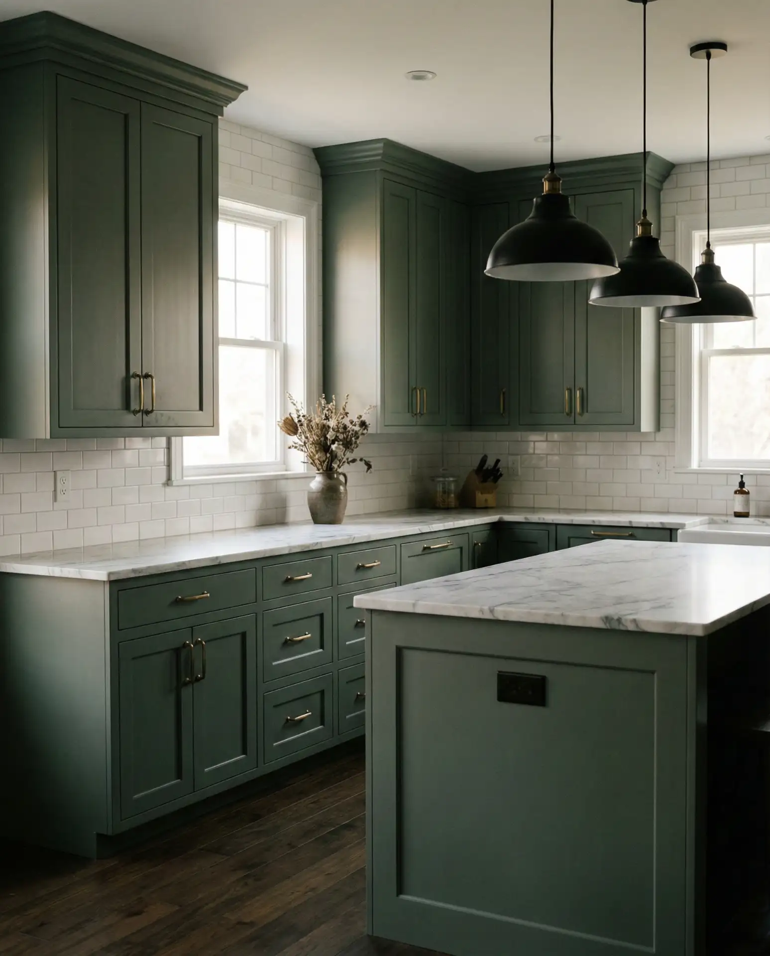
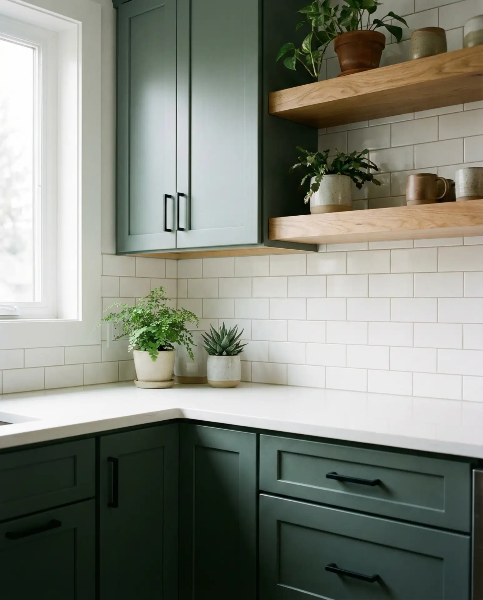
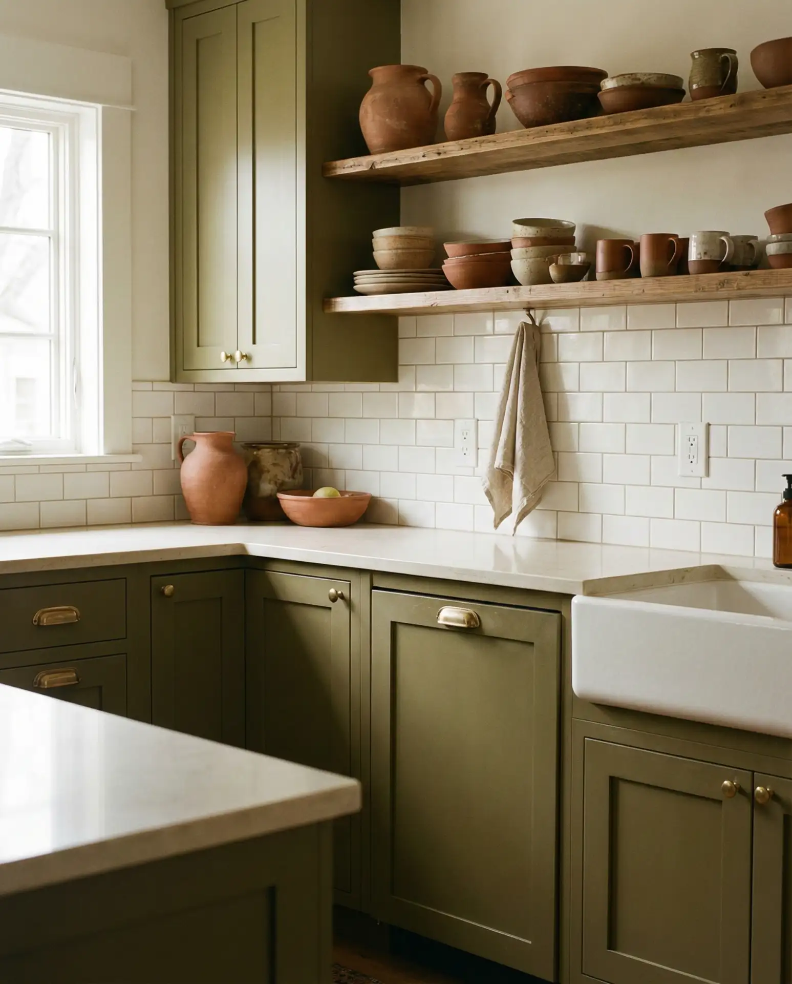
1. Deep Forest Green with Brass Accents
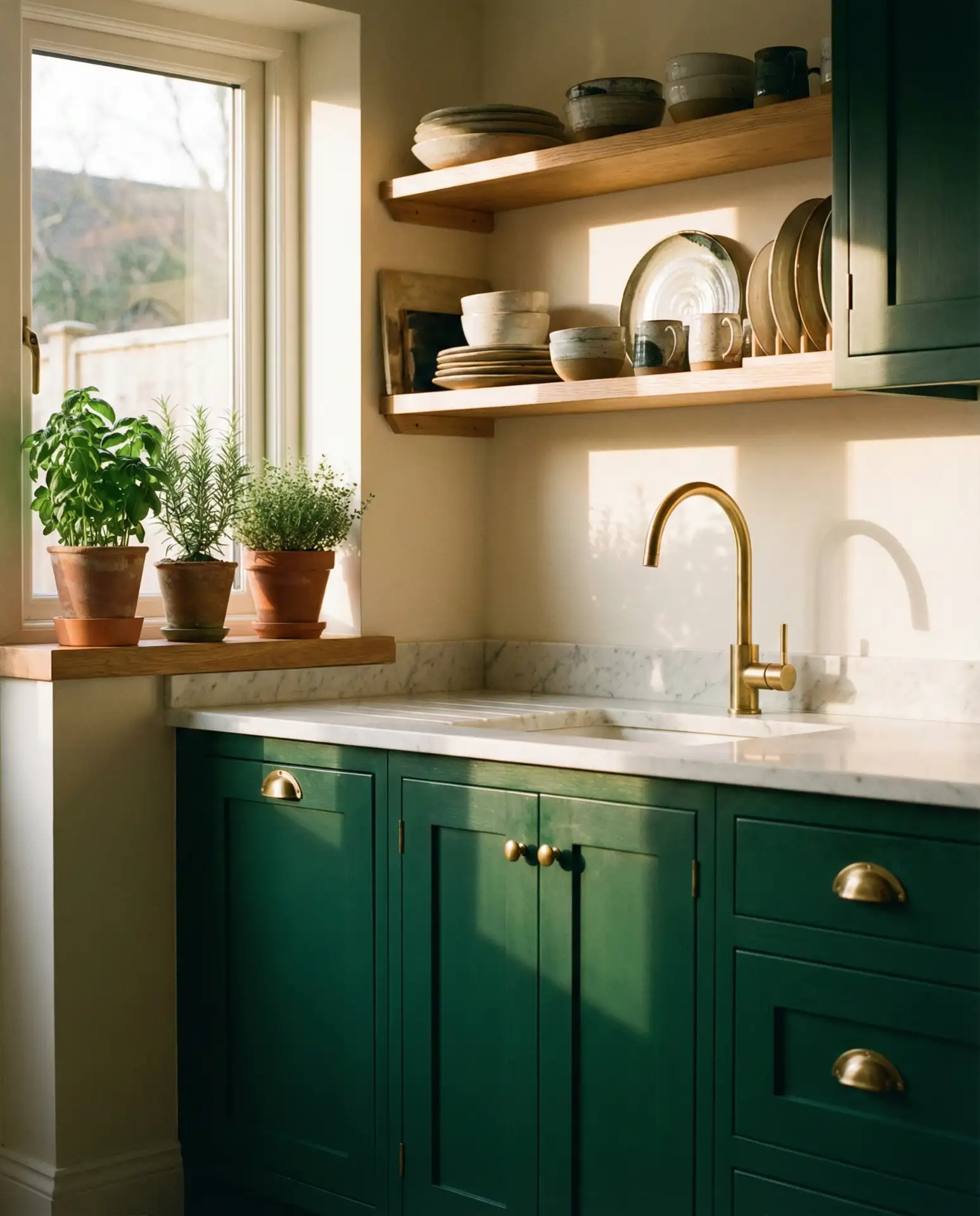
This green kitchen trend leans into nature-inspired richness, pairing deep emerald or hunter green cabinetry with warm brass hardware and fixtures. The combination feels grounded yet luxurious, perfect for homeowners seeking a timeless alternative to white cabinets. The color works beautifully in both modern and traditional spaces, adapting to subway tile backsplashes or natural stone counters with ease. It’s a choice that signals confidence without overwhelming the room.
Practical insight: Green cabinetry hides fingerprints and wear better than lighter tones, making it ideal for busy families. Pair it with open shelving to prevent the space from feeling too enclosed. If you’re worried about resale value, consider using green on a kitchen island or lower cabinets only, keeping uppers neutral. This approach lets you experiment with color while maintaining broad appeal.
2. Warm Terracotta and Cream
Terracotta brings Mediterranean warmth into American kitchens, offering a cozy alternative to cooler neutrals. This earthy tone pairs beautifully with cream-colored cabinetry, creating a sun-drenched aesthetic that feels both inviting and sophisticated. The palette works especially well in Tuscan-inspired designs, but it’s versatile enough for modern farmhouse or eclectic spaces. Consider terracotta tile backsplashes, painted walls, or even glazed pottery as accents.
Where it works best: Open-plan kitchens in Southwestern states like Arizona, New Mexico, and Southern California, where the palette complements desert landscapes and abundant sunlight. It also thrives in homes with Spanish or Mediterranean architecture. In cooler climates, terracotta adds much-needed warmth during long winters, making the kitchen feel like a retreat.
3. Charcoal Grey with White Marble
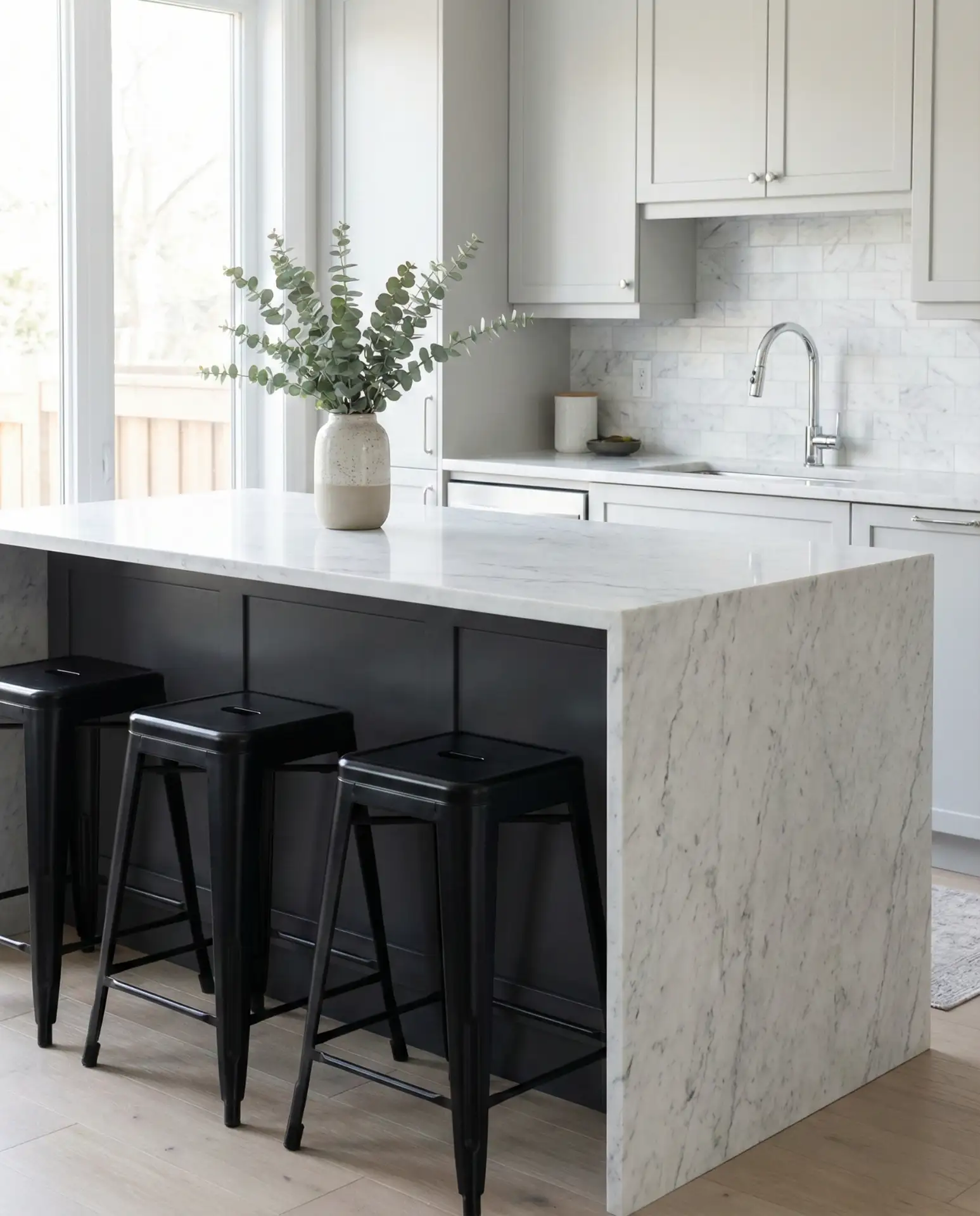
This grey and white pairing delivers timeless elegance with a modern edge. Charcoal cabinetry anchors the space, while white marble countertops add brightness and texture. The contrast is striking but never harsh, especially when balanced with natural wood floors or warm metallic accents. This palette appeals to homeowners who want a sophisticated, gallery-like kitchen that won’t feel dated in five years.
A designer I know in Chicago swears by this combo for resale value—it reads as high-end without alienating buyers who prefer neutrals. She always recommends splurging on quality marble and keeping hardware simple. The gray hides daily wear, while the marble brings just enough luxury to justify the investment.
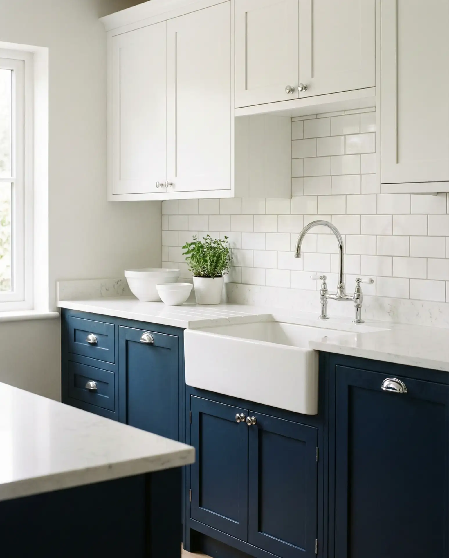
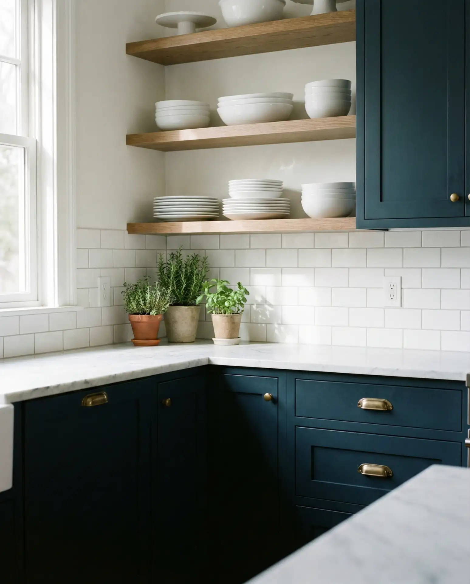
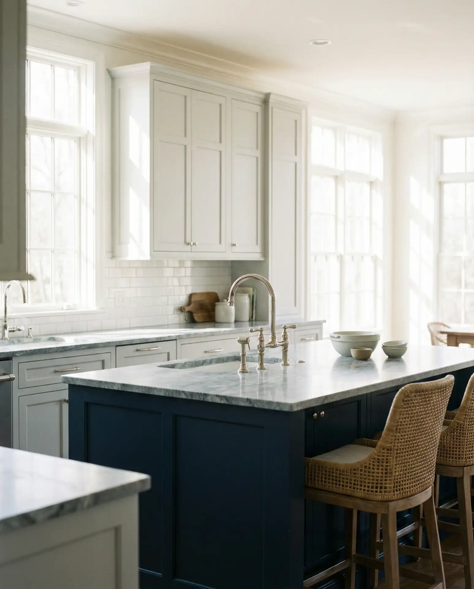
4. Navy Blue and Natural Oak
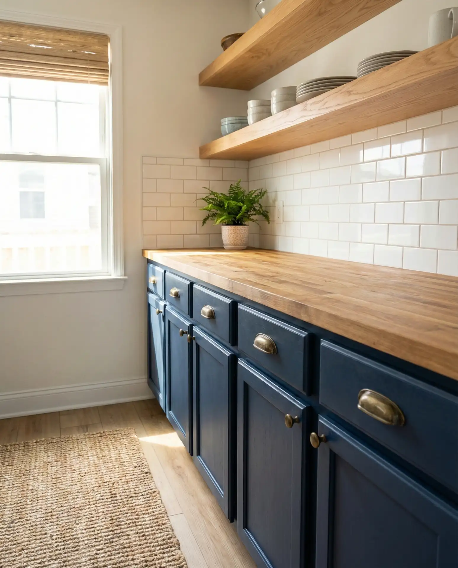
Navy cabinetry paired with wood cabinets or oak cabinets creates a grounded, coastal-inspired look that’s surging in popularity. The deep blue provides drama and depth, while natural oak adds warmth and organic texture. This combination works in both traditional and contemporary settings, adapting to shiplap walls or sleek quartz counters with equal ease. It’s a palette that feels intentional and curated.
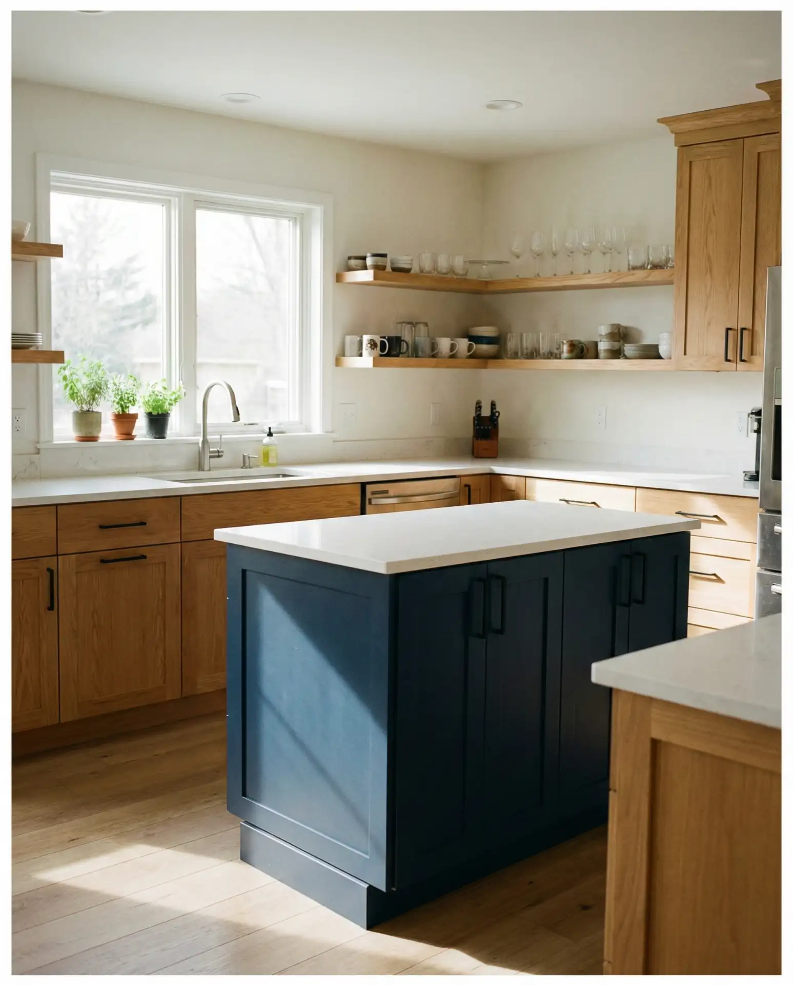
Expert-style commentary: Navy is one of the few bold colors that holds up over time because it reads as classic rather than trendy. It pairs well with both warm and cool metals, giving you flexibility as your style evolves. If you’re hesitant, start with a navy island and keep perimeter cabinets in oak or cream—you can always go bolder later.
5. Sage Green and Cream
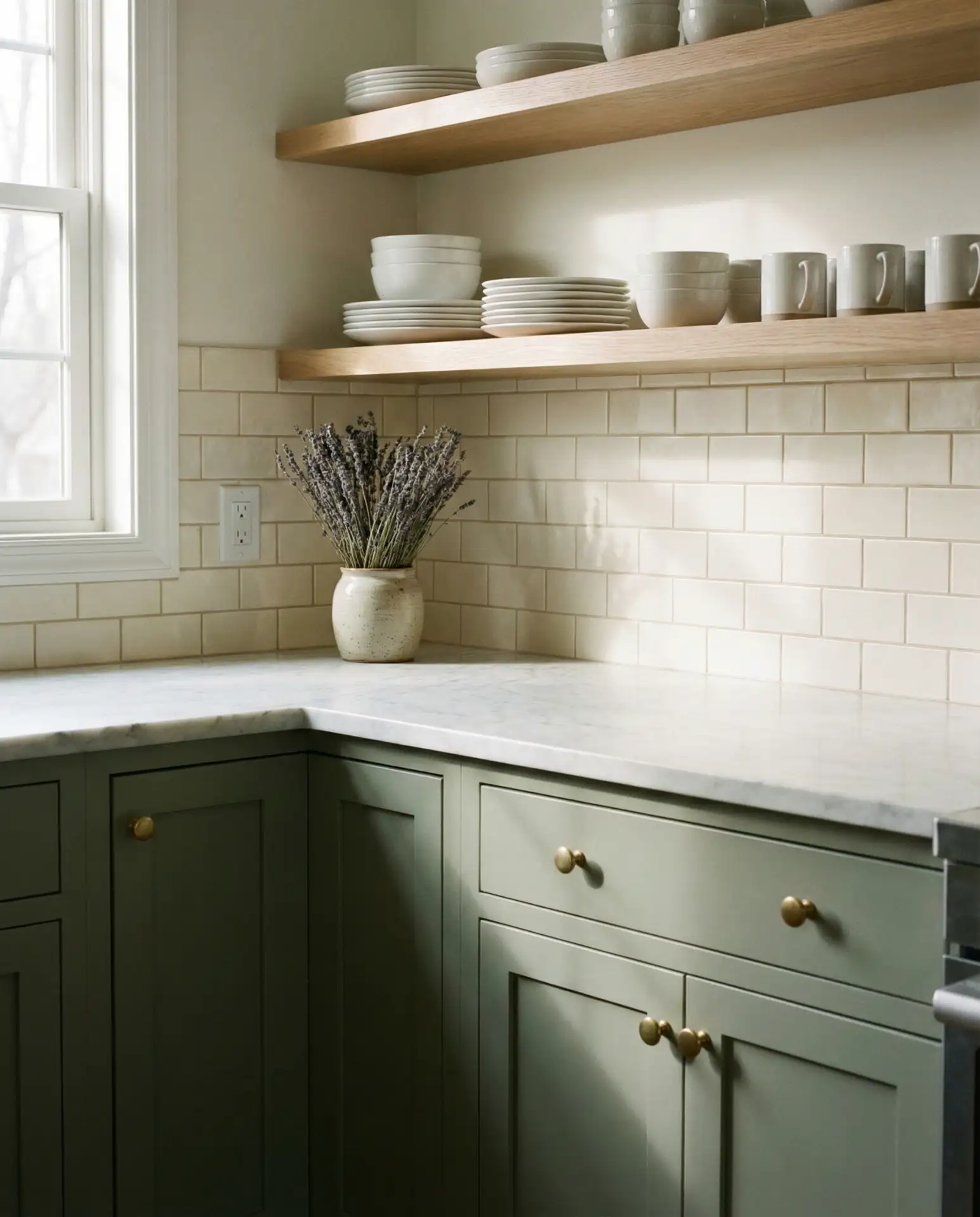
Soft sage has become a go-to for homeowners seeking a cozy, nature-inspired kitchen that still feels fresh. This muted green works beautifully with cream cabinetry, brass or gold hardware, and natural wood accents. The palette is particularly popular in French country and cottage-style kitchens, where it enhances the lived-in, welcoming aesthetic. It’s gentle enough for small spaces but rich enough to feel intentional.
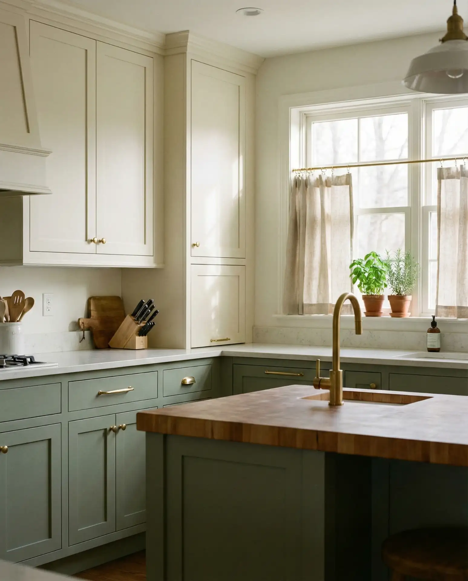
American lifestyle context: Sage green kitchens are especially popular in the Pacific Northwest and New England, where they echo the surrounding landscapes. Homeowners in these regions often pair the color with reclaimed wood, vintage textiles, and handmade ceramics to reinforce a connection to nature and craftsmanship. The palette feels right at home in farmhouses, bungalows, and modern cabins alike.
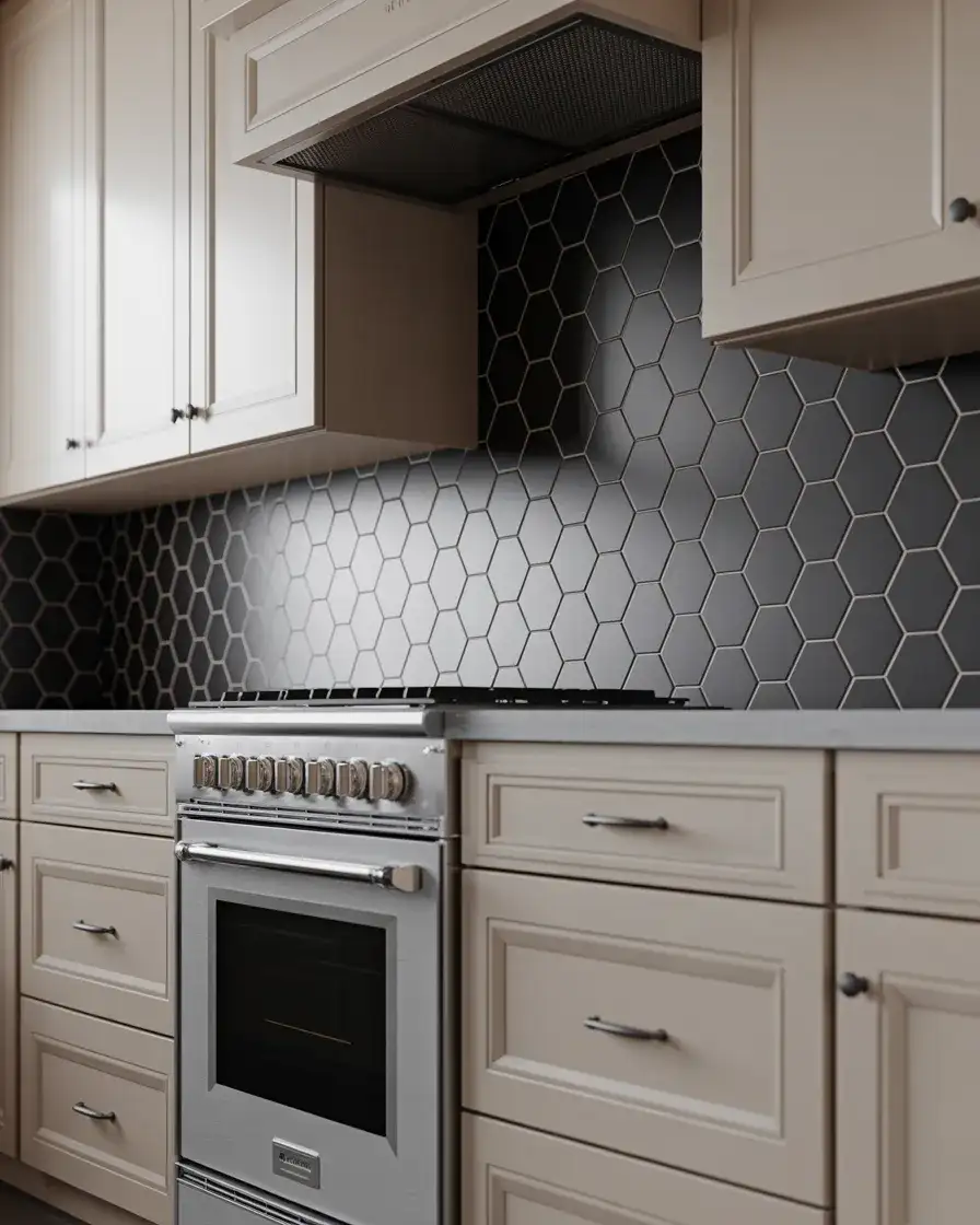
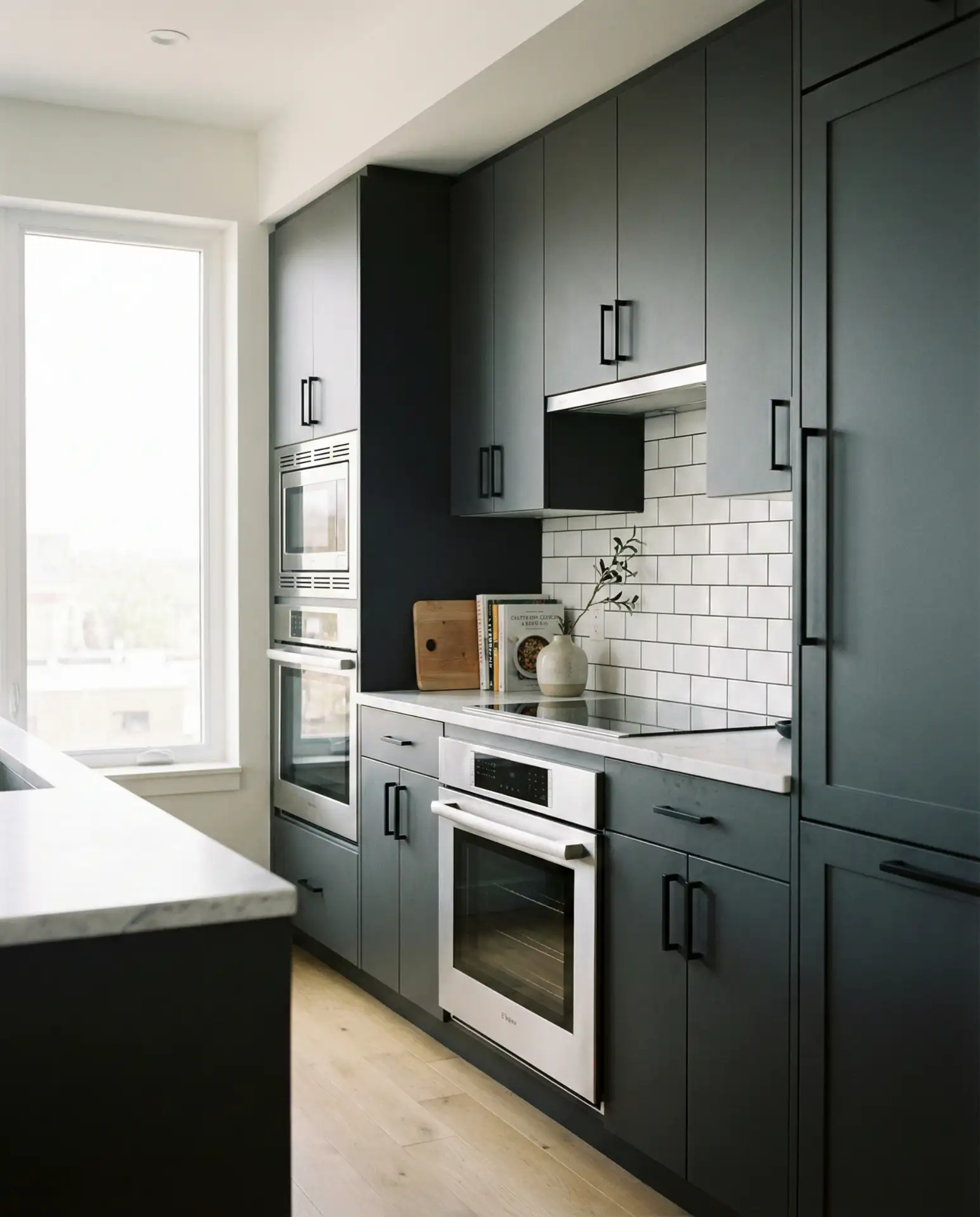
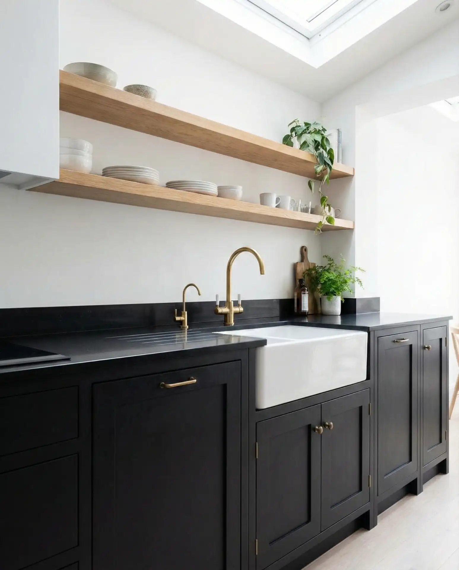
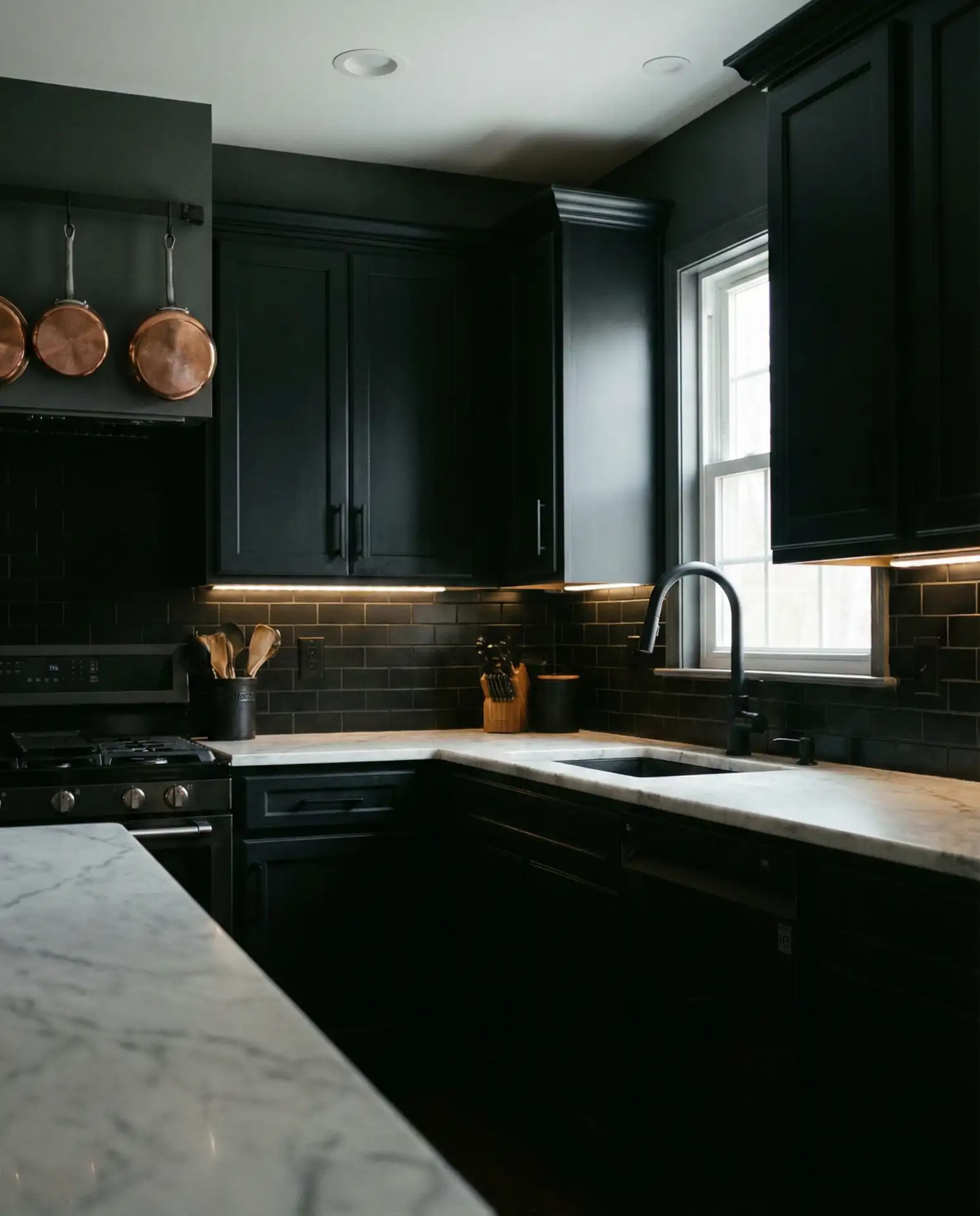
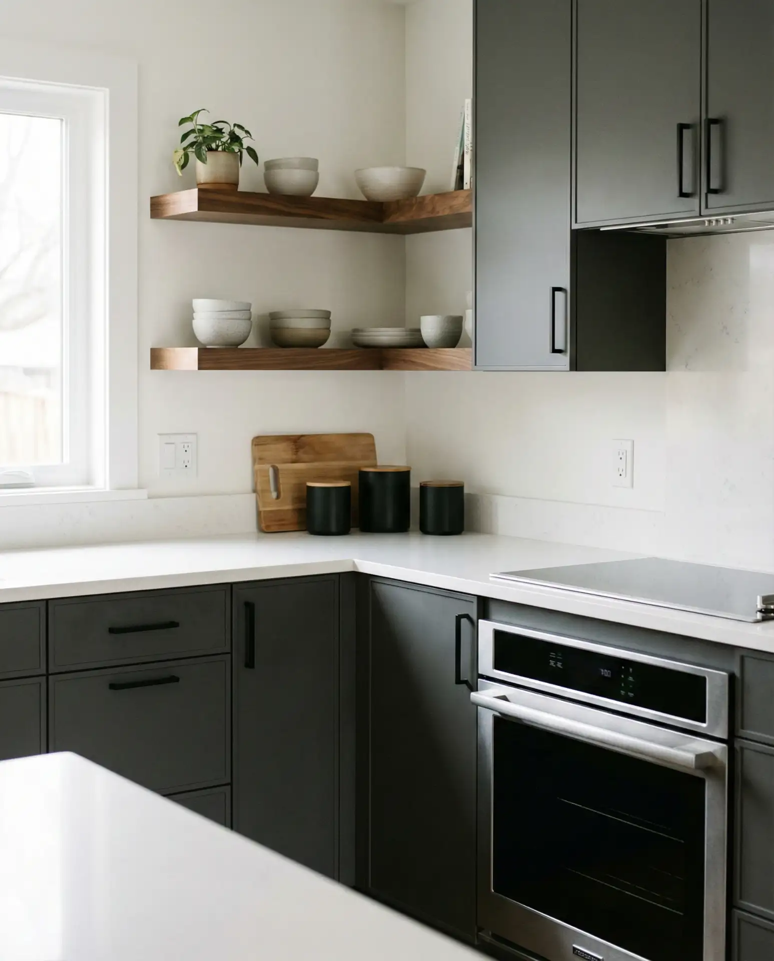
6. Black Cabinets with Warm Wood Counters
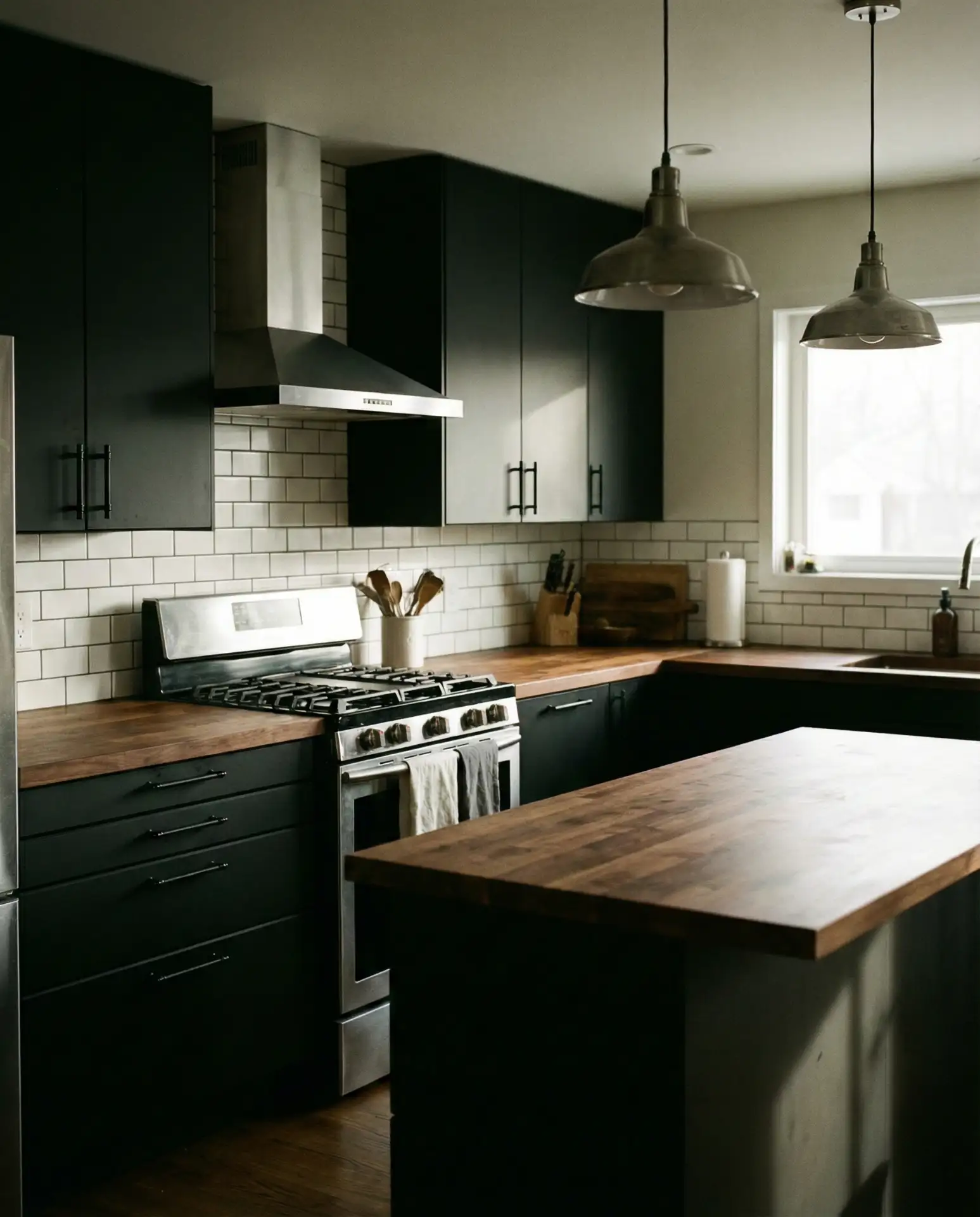
Black cabinetry is making a strong return, especially when balanced with warm wood countertops or butcher block islands. This pairing creates a moody, dramatic aesthetic that’s surprisingly versatile. The dark tones work well in both large, loft-style kitchens and smaller galley layouts, where they add depth without closing in the space. Pair with a matte black countertop or warm wood for contrast.
Budget angle: Black paint is one of the most forgiving finishes for DIY cabinet transformations. It hides imperfections better than lighter colors and requires fewer coats. A gallon of quality black paint typically costs between $40 and $60, making this a relatively affordable way to achieve a high-impact look. Pair with budget-friendly butcher block from big-box stores for a designer effect without the designer price tag.
7. Soft Blush and Brass
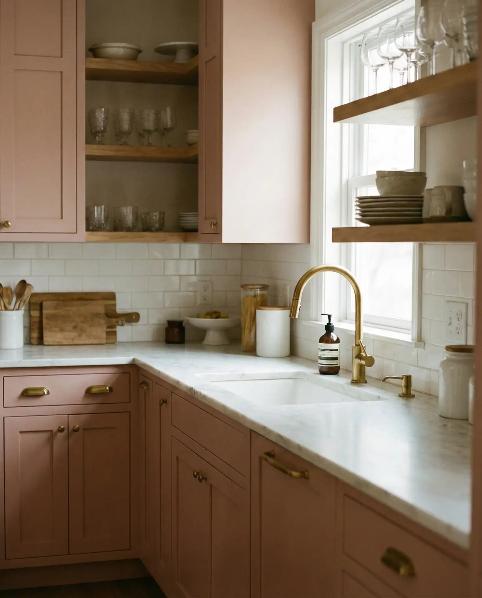
Blush pink is evolving from a fleeting trend into a surprisingly timeless neutral, especially in muted, dusty tones. When paired with brass hardware and warm-toned counters, it creates a soft, romantic kitchen that feels both modern and nostalgic. This palette works beautifully in French country or transitional spaces, where it adds warmth without overwhelming. It’s a daring choice that’s gained traction among design-forward homeowners.
Real homeowner behavior: Many people test blush in a powder room or laundry room before committing to the kitchen. It’s a smart way to live with the color and see how it interacts with your home’s natural light throughout the day. If you love it, go bold. If not, you’ve only painted a small, low-traffic space.
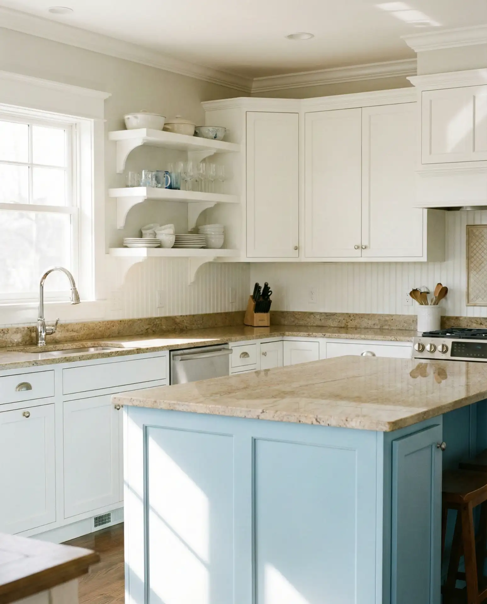
8. Two-Tone Blue and White
This bold approach uses contrasting shades—often a deep blue on lower cabinets and crisp white cabinets on top—to create visual interest and balance. The two-tone strategy helps ground the space while keeping it bright and open. It’s a popular choice for homeowners who want color without committing to a fully saturated kitchen. The scheme works in both traditional and contemporary settings.
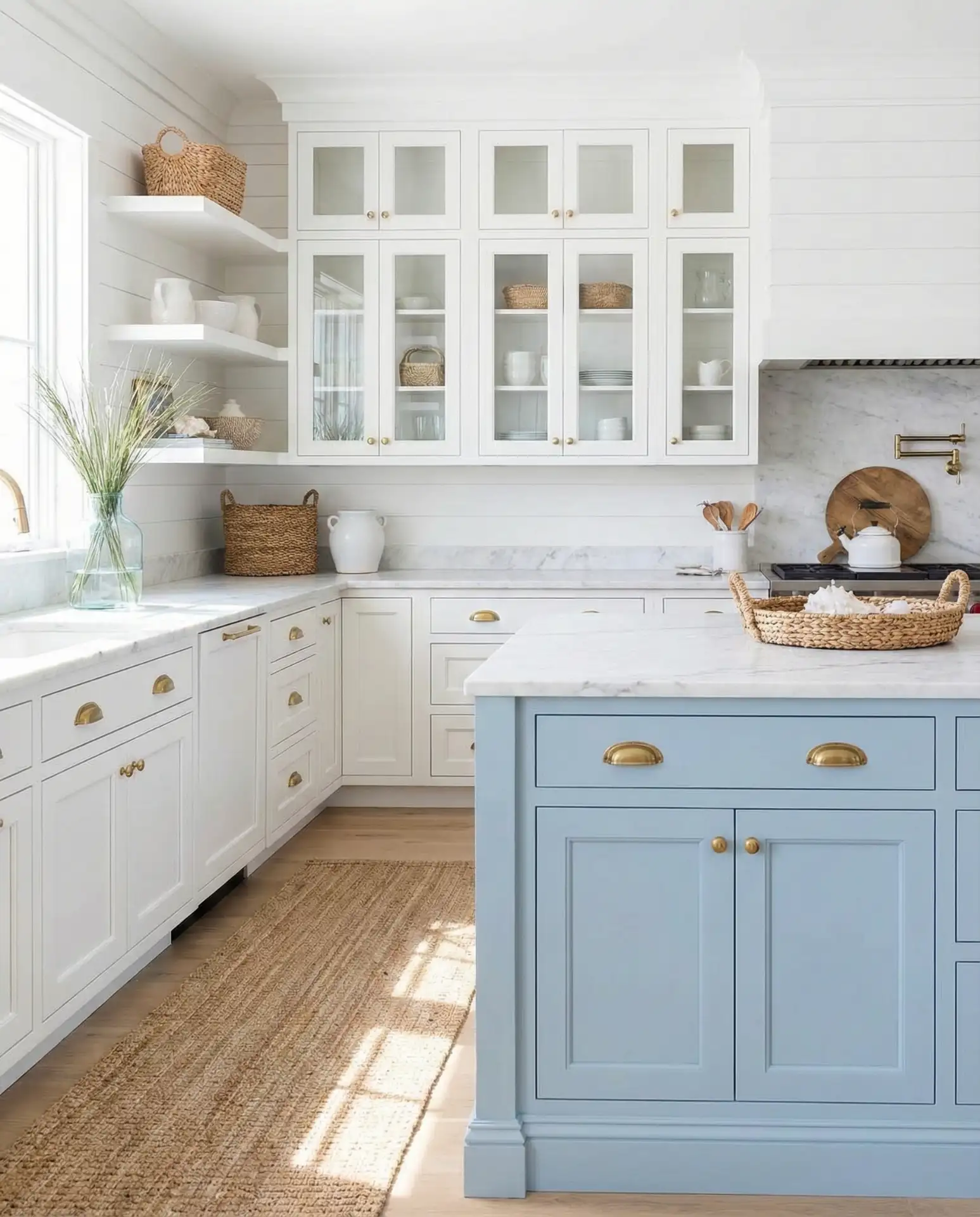
Common mistakes and how to avoid them: The biggest error is choosing blues that are too close in value—you lose the intentional contrast. Make sure there’s at least a three-shade difference between your upper and lower cabinets. Also, avoid pairing cool blues with warm woods unless you’re aiming for an eclectic look. Stick to cooler-toned woods like maple or painted finishes for cohesion.
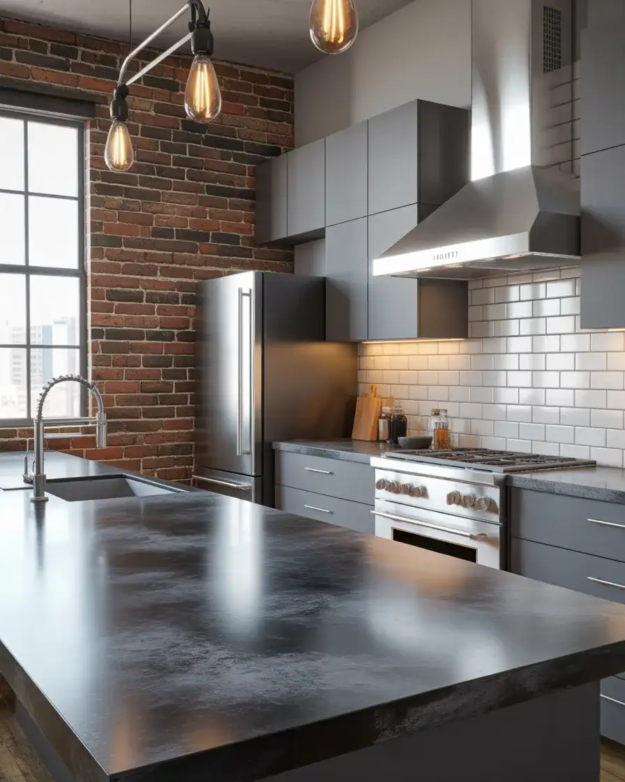
9. Moody Charcoal and Black
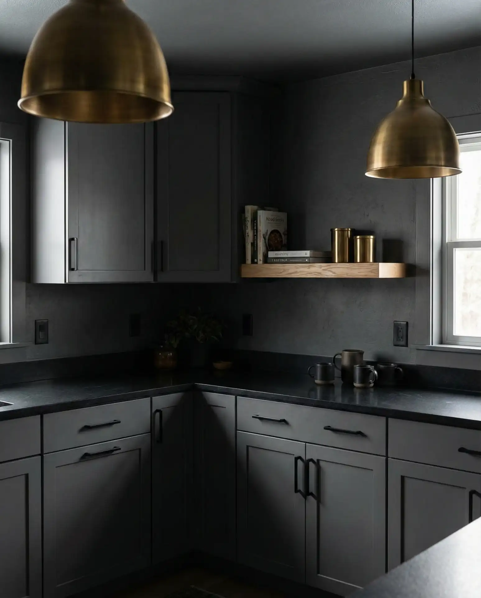
For those embracing the moody trend, a fully dark kitchen in charcoal and black tones creates an intimate, cocoon-like atmosphere. This drench approach—where walls, cabinets, and sometimes even ceilings share the same dark palette—is bold but surprisingly calming. It works best in kitchens with ample natural light or dramatic lighting fixtures. Pair with matte finishes to avoid a sterile, showroom feel.
Where it works best: Urban lofts, modern townhouses, and homes with large windows or skylights. In the Pacific Northwest, where grey skies are common, dark kitchens create a cozy refuge. In sunnier climates, they offer a cool, sophisticated escape. The key is ensuring enough light—natural or artificial—to prevent the space from feeling oppressive.
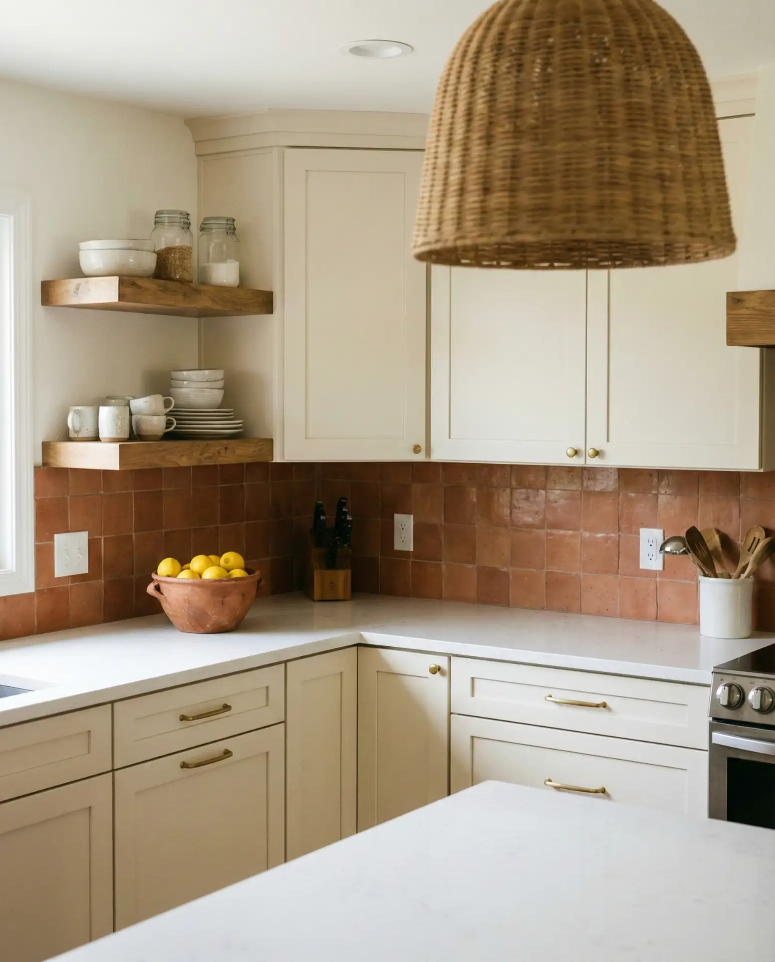
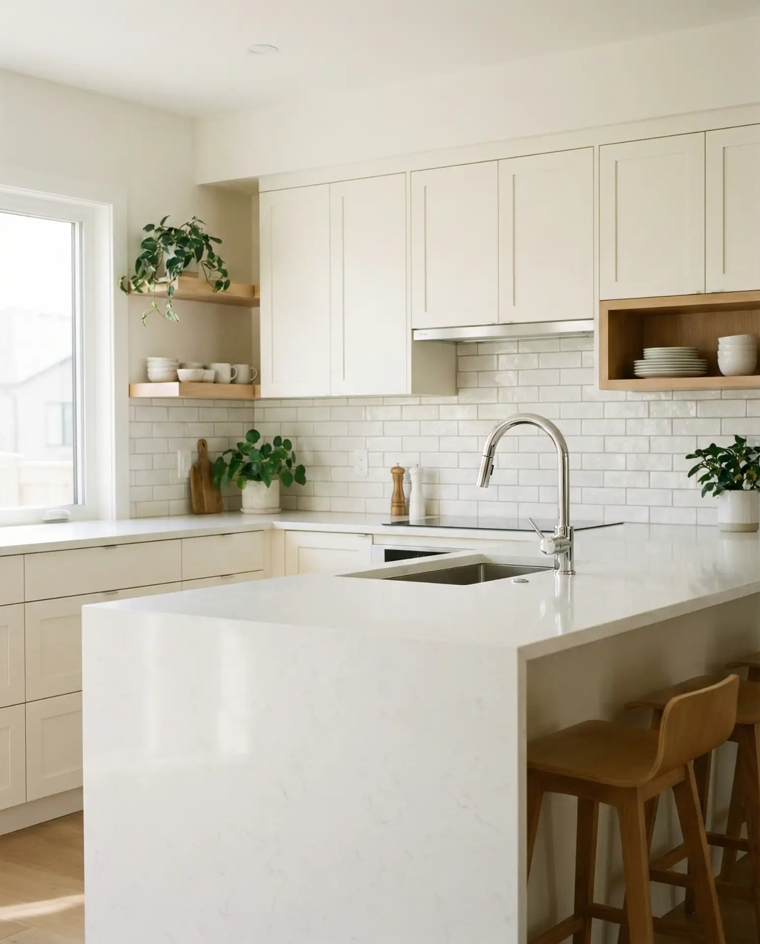
10. Warm White and Light Oak
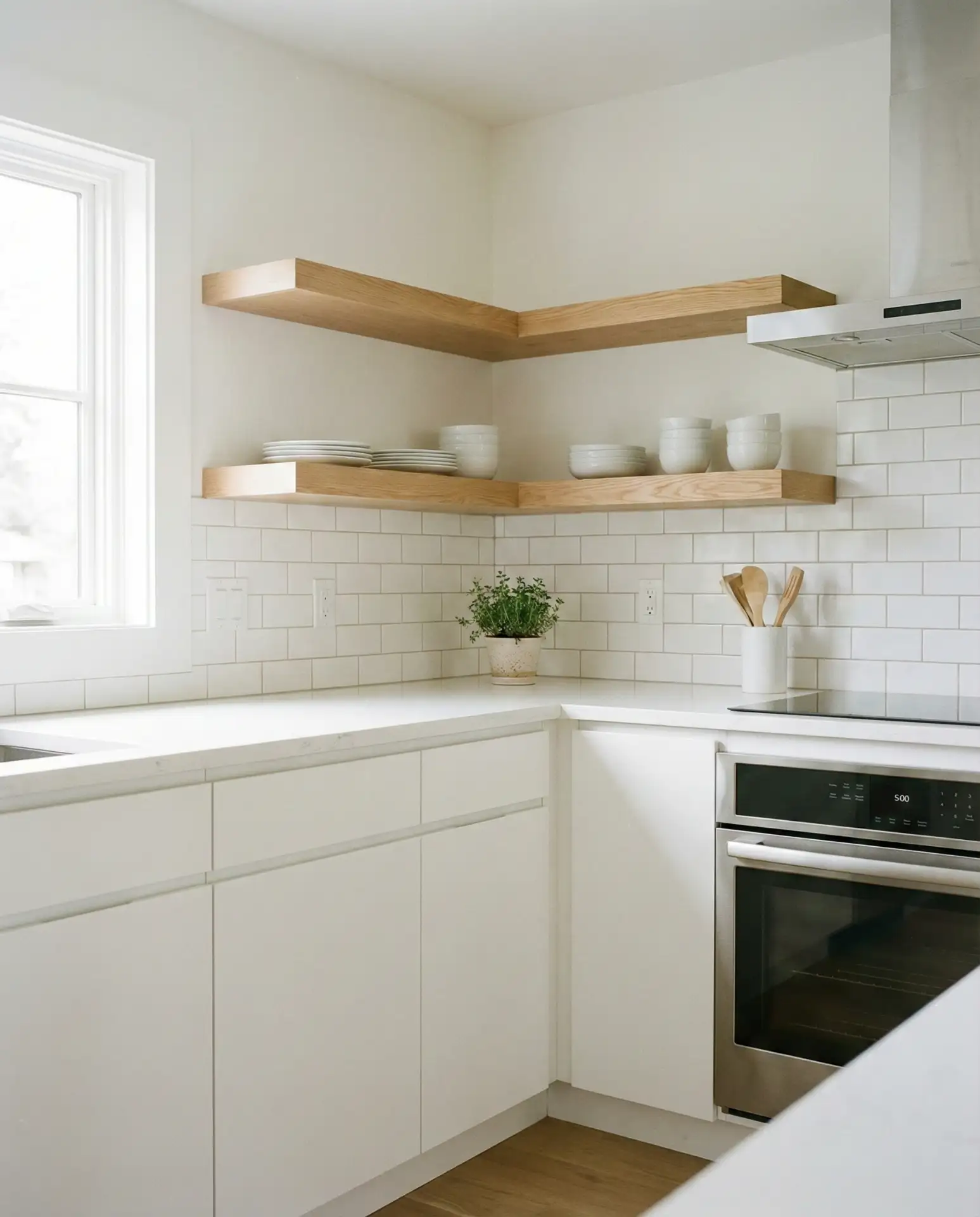
This pairing feels fresh and Scandinavian, combining white cabinets with light oak cabinets or butcher block for a clean, airy aesthetic. The warmth of the wood prevents the white from feeling sterile, while the simplicity keeps the space feeling open and uncluttered. It’s a timeless choice that appeals to minimalists and maximalists alike, adapting easily to changing decor. This scheme is especially popular in smaller kitchens.
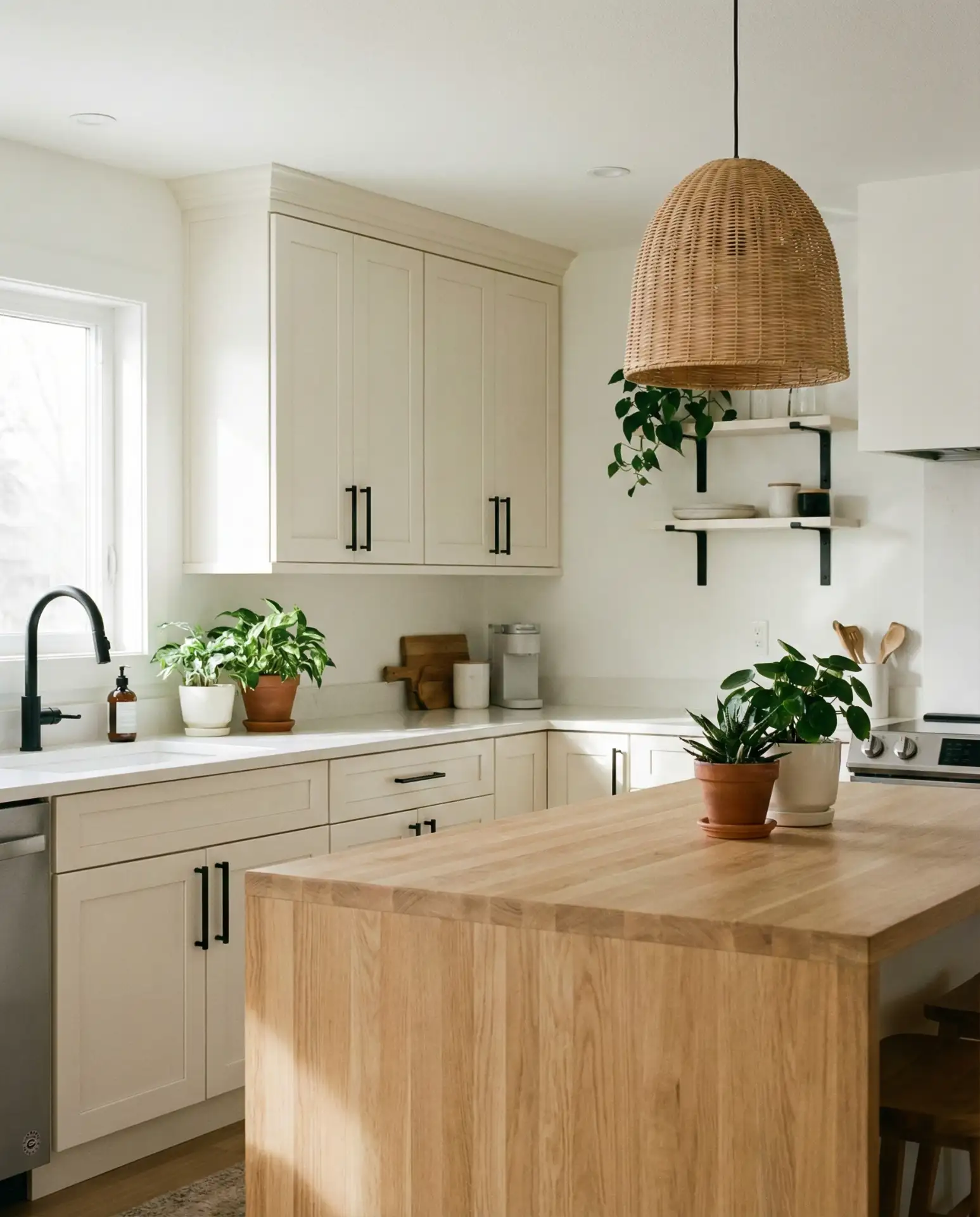
Practical insight: This palette is forgiving for DIYers and budget-conscious renovators. White paint is universally available and affordable, while light oak butcher block can be found at most home improvement stores for under $200 per section. The combination also makes small kitchens feel larger and more cohesive, which is a major selling point in urban apartments and starter homes.
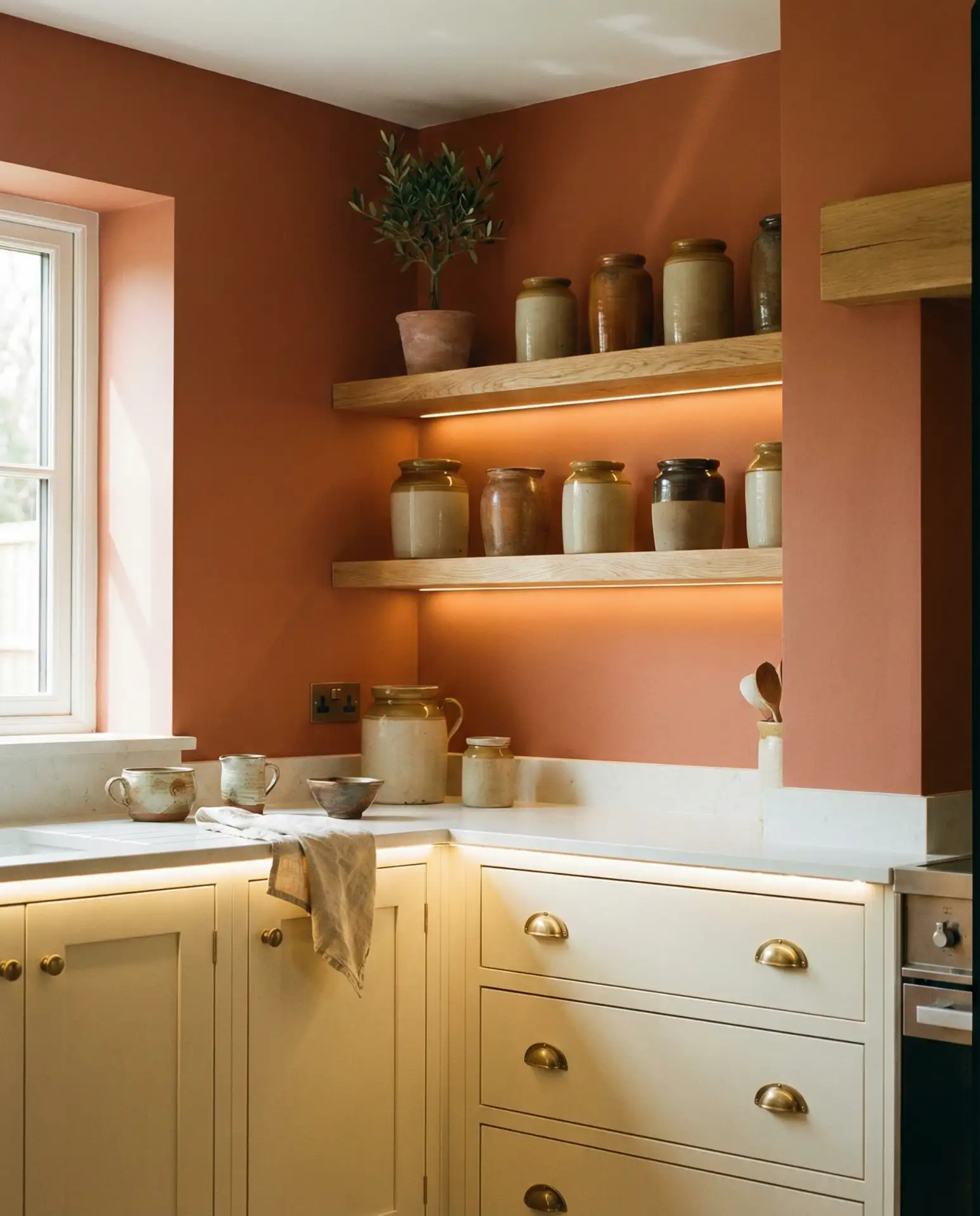
11. Rust and Cream with Terra Cotta Accents
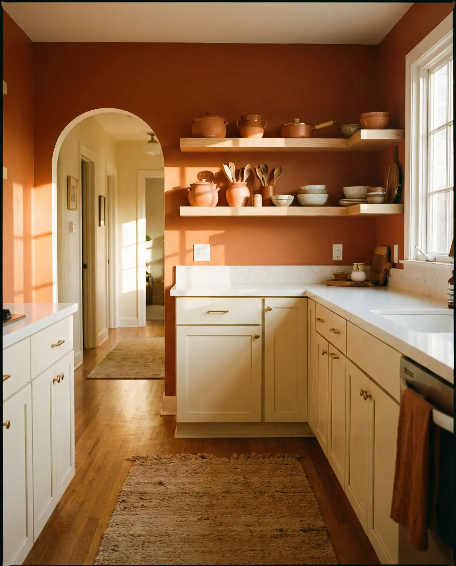
Rust orange is emerging as a sophisticated alternative to red, offering warmth without the intensity. When paired with cream cabinetry and terra cotta tile or pottery, it creates a cozy, sun-baked aesthetic reminiscent of Mediterranean villas. This palette feels grounded and earthy, perfect for homeowners who want a kitchen that feels collected and lived-in. It works beautifully in open-concept spaces where the kitchen flows into dining and living areas.
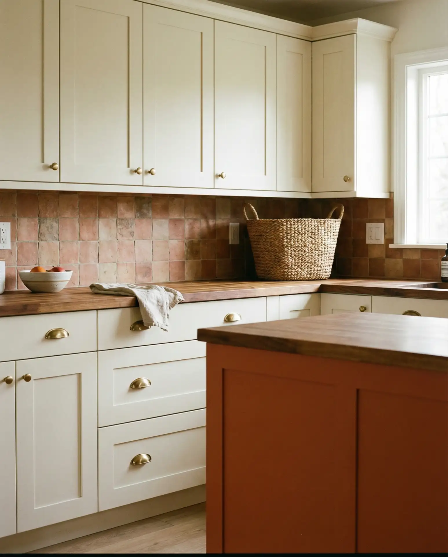
American lifestyle context: This palette resonates in the Southwest and California, where Spanish Colonial and Mission-style architecture is common. It’s also gaining traction in Southern states, where homeowners appreciate the warmth and hospitality it conveys. Pair with vintage textiles, handmade pottery, and natural fiber rugs to complete the look.
12. Pale Blue and Tan Granite
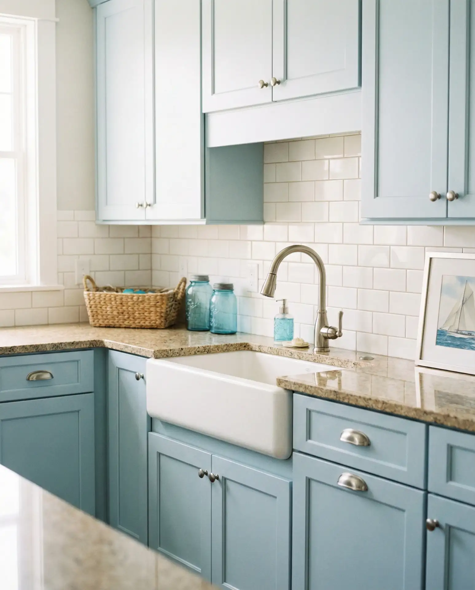
Soft blue cabinetry paired with tan granite countertops creates a serene, coastal-inspired kitchen that feels both relaxed and refined. The warmth of the granite balances the coolness of the blue, preventing the space from feeling too sterile. This combination is especially popular in beach houses and transitional homes, where it bridges traditional and contemporary styles. It’s a timeless choice that won’t feel dated in five years.
A friend in coastal Maine swears by this combo for rental properties—it’s universally appealing and hides wear well. She sources remnant granite at discounted prices and pairs it with budget-friendly blue paint. The result looks custom but stays within a moderate budget, making it ideal for vacation homes and investment properties.
13. Sherwin Williams Evergreen Fog with White Quartz
Sherwin Williams Evergreen Fog has become a go-to for designers seeking a sophisticated, nature-inspired neutral. This soft, greyed-green works beautifully as a cabinet color, especially when paired with bright white quartz countertops and warm wood accents. The palette feels calming and grounded, making it ideal for busy family kitchens. It’s a green that reads as neutral, offering color without risk.
Expert-style commentary: Evergreen Fog is one of those rare colors that works across different lighting conditions—it doesn’t skew too green in bright light or too grey in dim spaces. This versatility makes it a safe bet for homeowners who want color but worry about commitment. Pair it with warm metals and natural textures to enhance its organic feel.
14. Benjamin Moore Hale Navy with Marble
Benjamin Moore Hale Navy is a deep, saturated blue that brings instant sophistication to kitchen cabinetry. When paired with white or grey marble countertops, it creates a timeless, high-end look that appeals to traditional and modern sensibilities alike. This bold color works beautifully in well-lit kitchens, where it adds depth without overwhelming. It’s a designer favorite for good reason.
Budget angle: Hale Navy is a premium paint, but a single gallon covers about 400 square feet and costs around $70. For a standard kitchen, you’ll need 2-3 gallons, making the total paint cost under $200. Pair with affordable marble-look quartz (around $50-$70 per square foot installed) to get the high-end aesthetic without breaking the bank. The result looks custom and expensive.
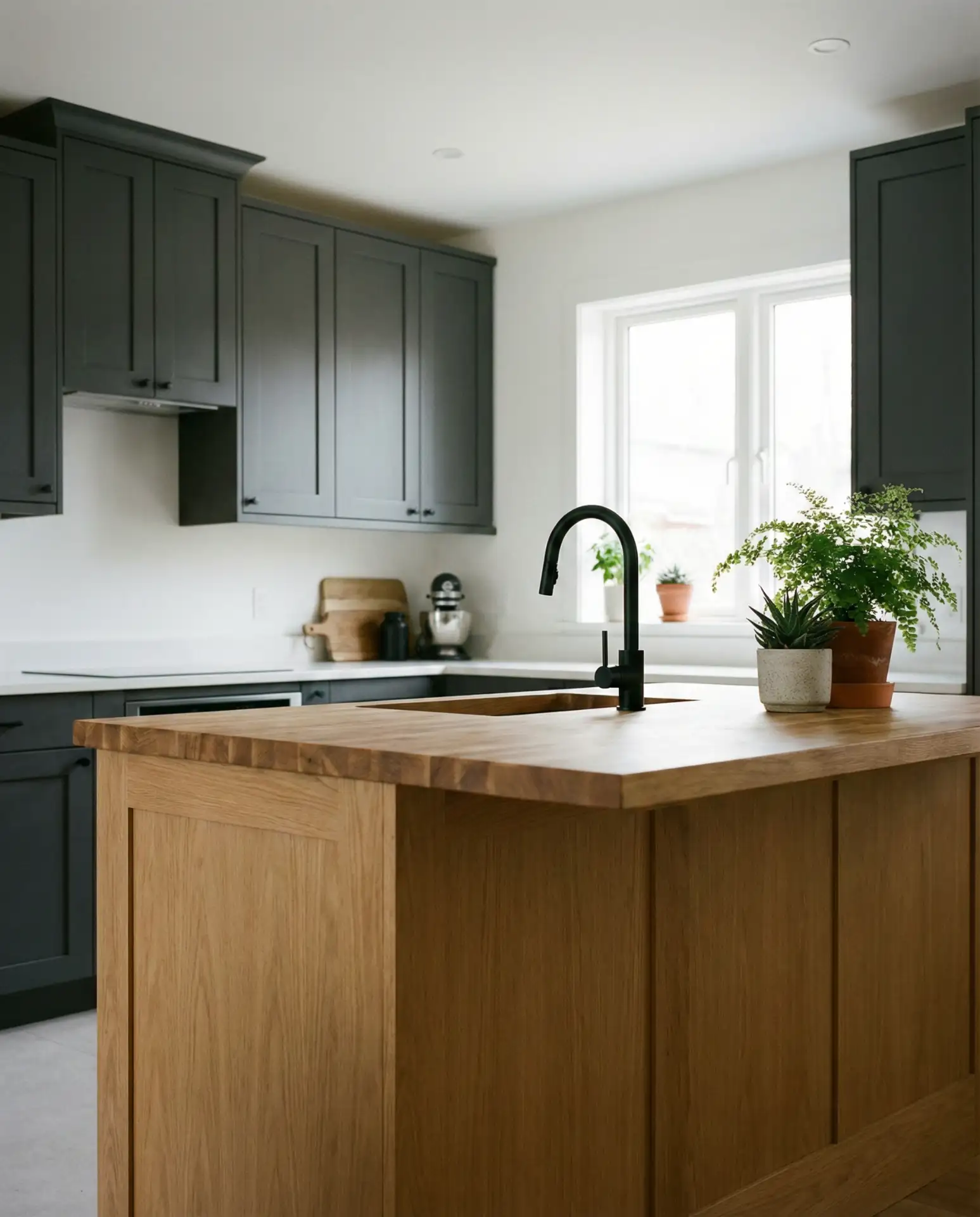
15. Warm Grey with Butcher Block
This grey and wood pairing is a modern classic, offering a neutral backdrop that adapts to changing trends and personal style. Warm grey cabinetry—free of cool blue undertones—pairs beautifully with butcher block counters or islands, creating a balanced, inviting space. The palette works in both small and large kitchens, providing a calm foundation for colorful accessories or keeping things minimal. It’s a timeless choice that homeowners rarely regret.
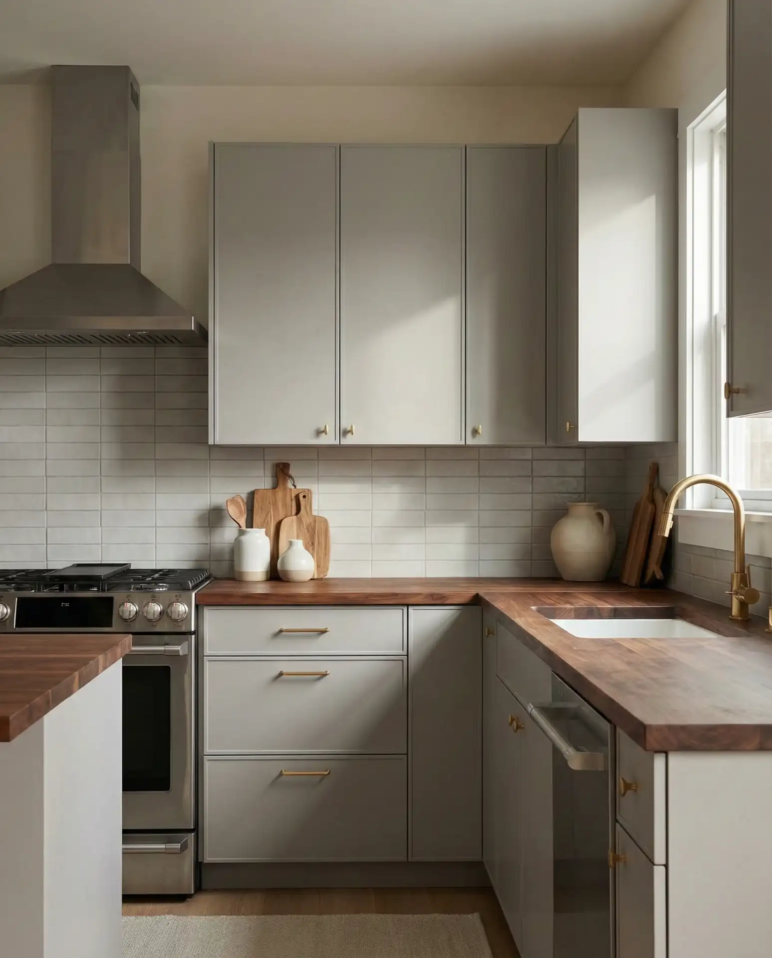
Real homeowner behavior: Many people who choose warm grey do so because they’re transitioning from all-white kitchens but aren’t ready for bold color. It’s a safe middle ground that still feels fresh and updated. Homeowners often add warmth through butcher block, woven baskets, and plants rather than committing to colorful cabinetry. This approach offers flexibility as tastes evolve.
16. Deep Plum and Brass
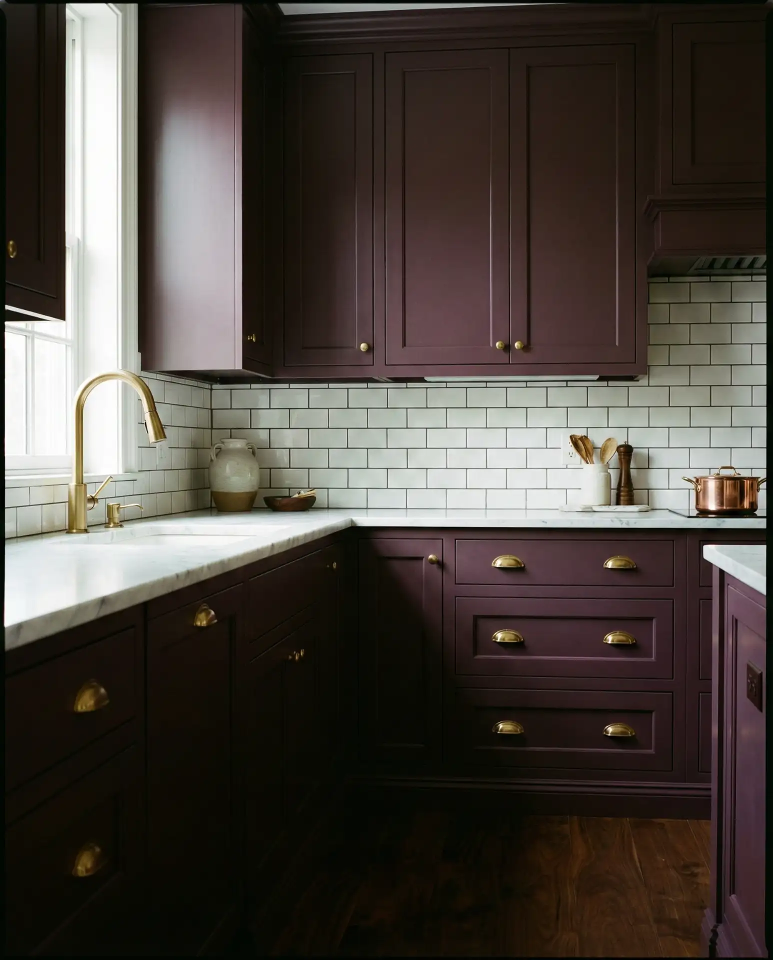
For those ready to embrace true bold color, deep plum or aubergine cabinetry creates a jewel-toned, luxurious kitchen. When paired with brass hardware and warm-toned counters, the effect is rich and dramatic without feeling heavy. This moody palette works especially well in traditional or maximalist spaces, where it amplifies the sense of elegance and history. It’s a daring choice that rewards the brave.
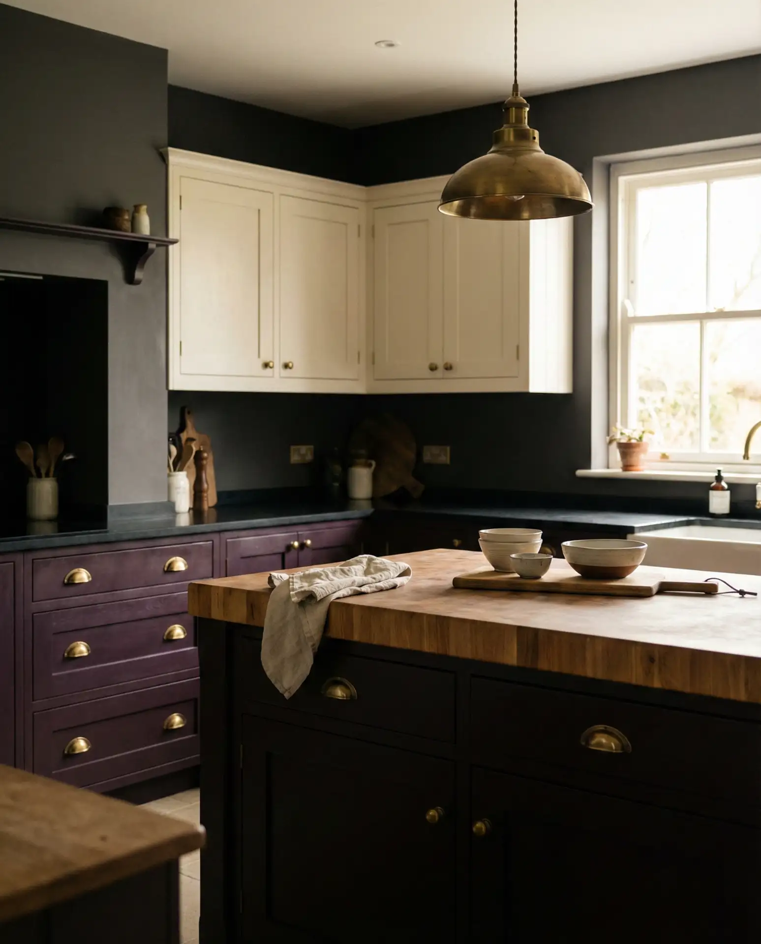
Where it works best: Historic homes, Victorian-era houses, and spaces with architectural details like crown molding or coffered ceilings. The richness of plum enhances traditional features while feeling contemporary. In modern homes, it works best as an accent—such as on an island or lower cabinets—to avoid overwhelming the space.
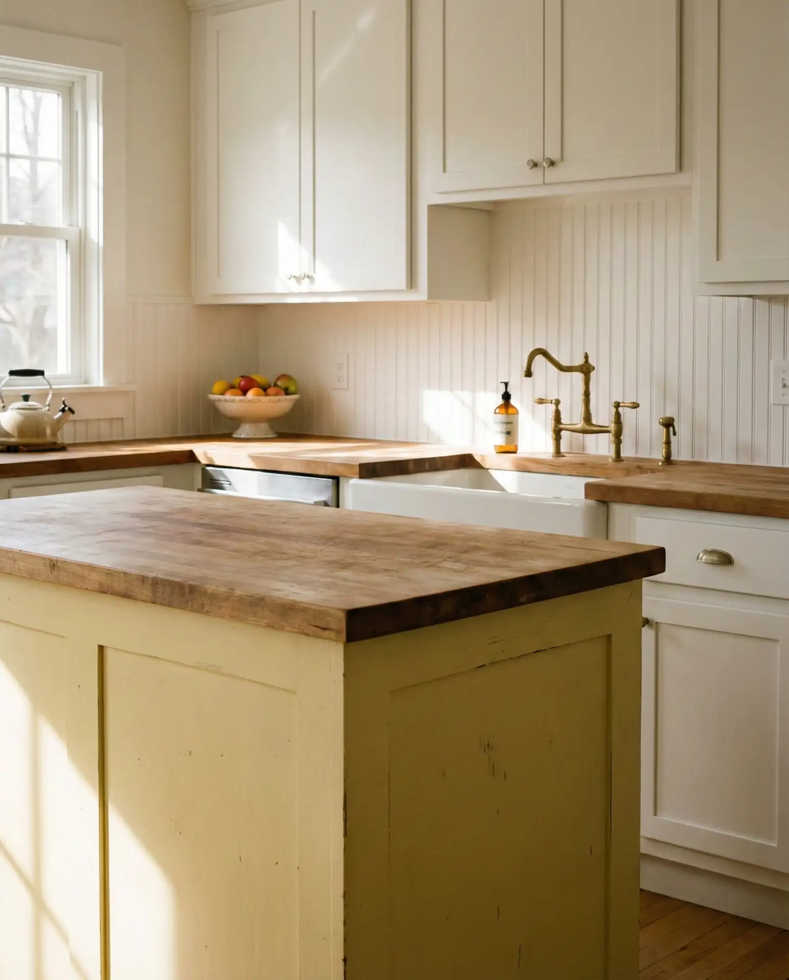
17. Soft Yellow and White
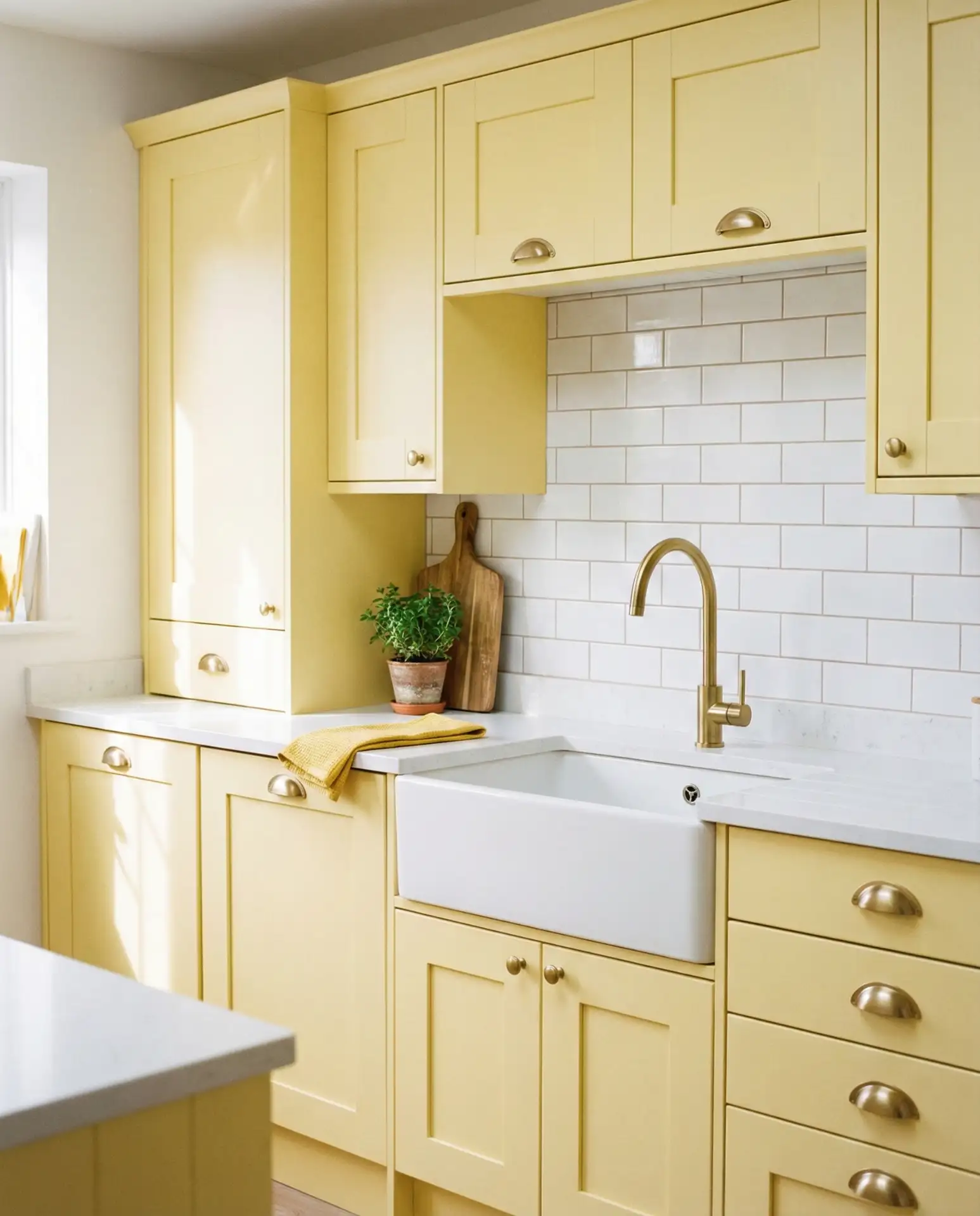
Butter yellow or soft lemon cabinetry brings a cheerful, sun-soaked quality to kitchens, creating a cozy and welcoming space. Paired with white cabinets or counters, it feels fresh and optimistic without veering into childish territory. This palette works beautifully in cottage-style kitchens, farmhouses, and vintage-inspired spaces. It’s especially popular in the South, where it echoes traditional color schemes and hospitality.
Common mistakes and how to avoid them: Yellow can skew either too warm (orangey) or too cool (greenish) depending on your lighting. Always test samples on multiple walls and observe them at different times of day. Also, avoid pairing yellow with cool-toned greys or blues unless you want a jarring contrast. Stick to warm whites, creams, and natural woods for a cohesive look.
18. Charcoal and Natural Wood Tones
This pairing of dark grey cabinetry with warm wood cabinets or open shelving creates a sophisticated, Scandinavian-inspired aesthetic. The contrast between the matte charcoal and the organic wood grain adds visual interest without clutter. It’s a timeless scheme that works in both urban and rural settings, adapting to minimalist or eclectic styling with ease. The balance of cool and warm tones makes the kitchen feel grounded and intentional.
Practical insight: Charcoal cabinets are incredibly forgiving—they hide fingerprints, smudges, and daily wear better than lighter colors. This makes them ideal for families with young children or high-traffic kitchens. Pair with durable, sealed wood shelving that can withstand humidity and heat. The combination is as functional as it is beautiful.
19. Warm White and Black Accents
This classic pairing uses white cabinets as a clean backdrop, with black countertops, hardware, or appliances providing contrast and definition. The result is a crisp, modern kitchen that feels both fresh and timeless. The warmth comes from wood floors, butcher block accents, or warm-toned decor. It’s a fail-safe scheme that appeals to a wide range of tastes and adapts easily to changing trends.
American lifestyle context: This palette is ubiquitous in suburban homes across the country because it’s safe, versatile, and universally appealing. It works in starter homes, investment properties, and luxury renovations alike. Homeowners appreciate the ability to personalize the space with colorful accessories or keep things minimal depending on mood and season.
20. Olive Green and Cream
Olive green is a richer, earthier alternative to sage, offering a moody yet grounded aesthetic. Paired with cream cabinetry or countertops, it creates a warm, inviting kitchen that feels both current and timeless. This palette works beautifully in French country, Mediterranean, and modern farmhouse styles, where it enhances the connection to nature and traditional craftsmanship. It’s a sophisticated choice that’s gained traction in design-forward circles.
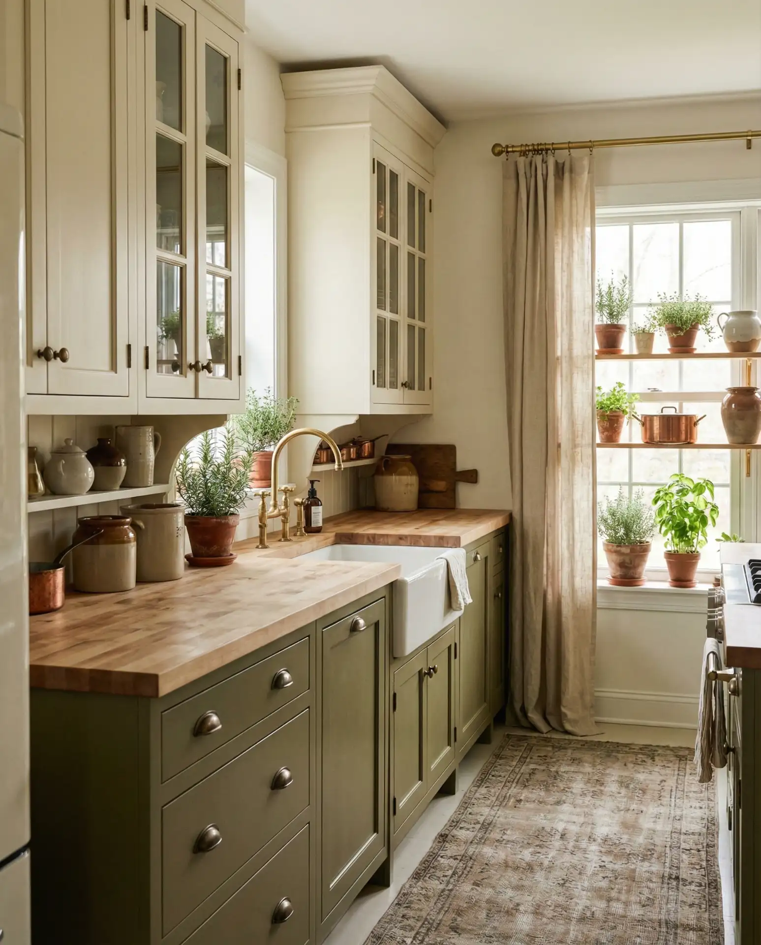
A designer in Austin told me she’s been using olive green in nearly every kitchen project this year—it’s earthy without being rustic, and it pairs beautifully with both warm and cool metals. She recommends using it on lower cabinets and keeping uppers neutral to prevent the space from feeling too dark.
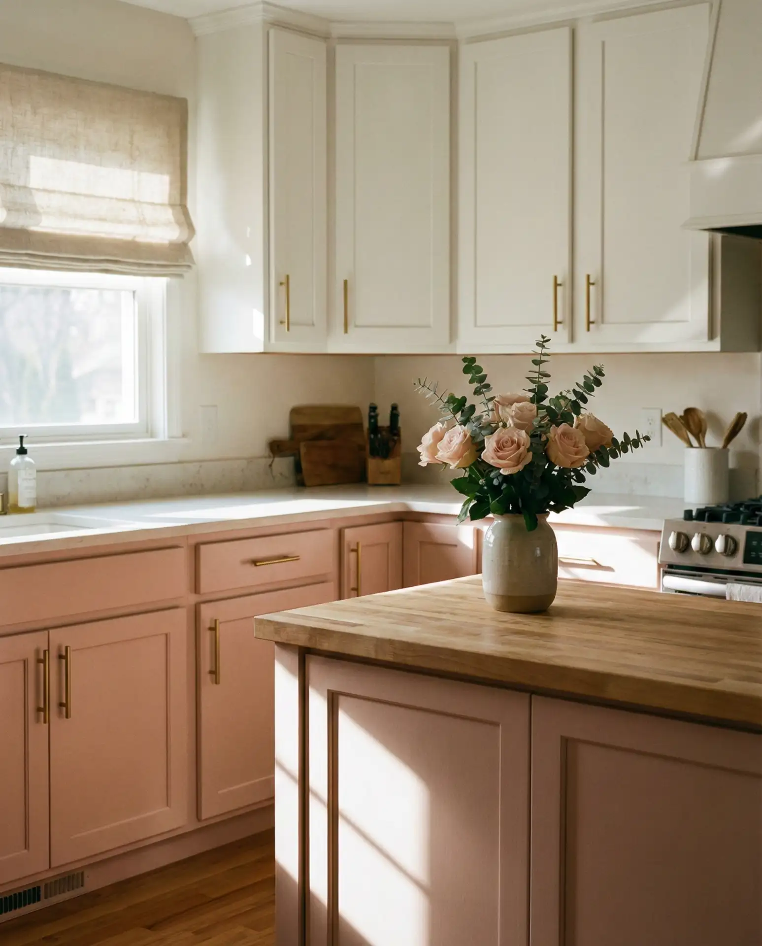
21. Pale Pink and Marble

Dusty pink cabinetry is moving beyond trend territory into a legitimate neutral, especially when paired with white marble counters and brass or gold hardware. The result is a soft, romantic kitchen that feels both modern and nostalgic. This palette works beautifully in French country, transitional, and even minimalist spaces, where it adds warmth without overwhelming. It’s a bold choice that’s surprisingly versatile.
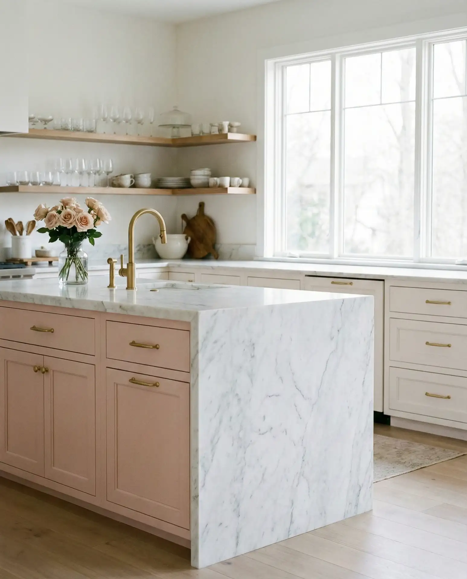
Real homeowner behavior: Many people who choose pink start with a single accent—like a painted island or backsplash—to test the waters. If they love it after a few months, they expand to full cabinetry. This incremental approach reduces risk and allows homeowners to live with the color before committing fully. It’s a smart strategy for bold color choices.
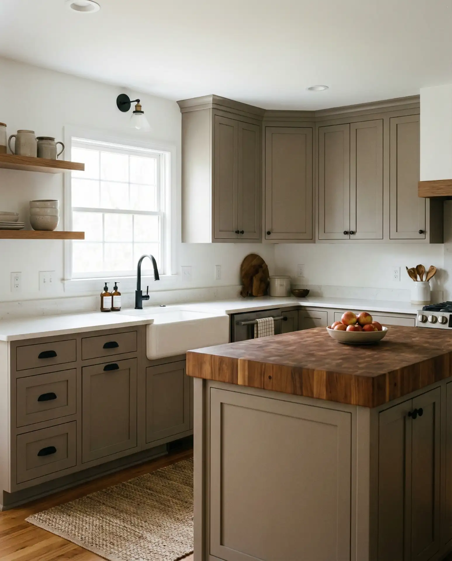
22. Taupe and Warm Metals
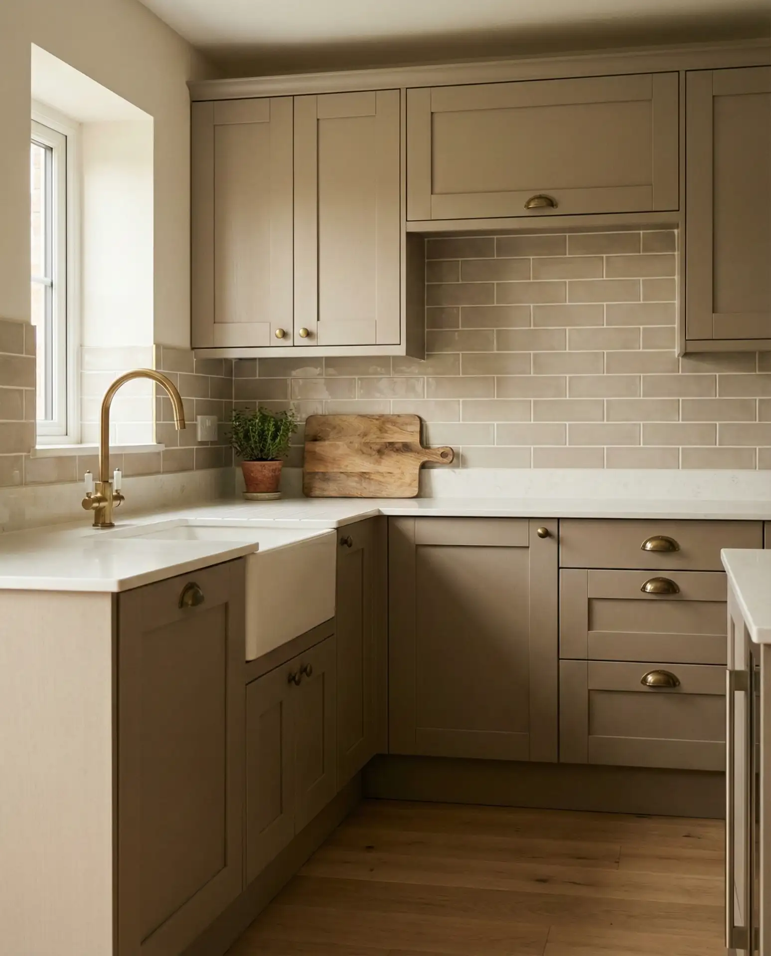
Taupe—a balanced blend of grey and beige—is emerging as a timeless neutral that bridges warm and cool palettes. Paired with brass, copper, or gold hardware, it creates a sophisticated, layered aesthetic that feels both modern and classic. This scheme works in virtually any style, from French country to contemporary, and adapts easily to changing decor. It’s a safe choice that never feels boring.
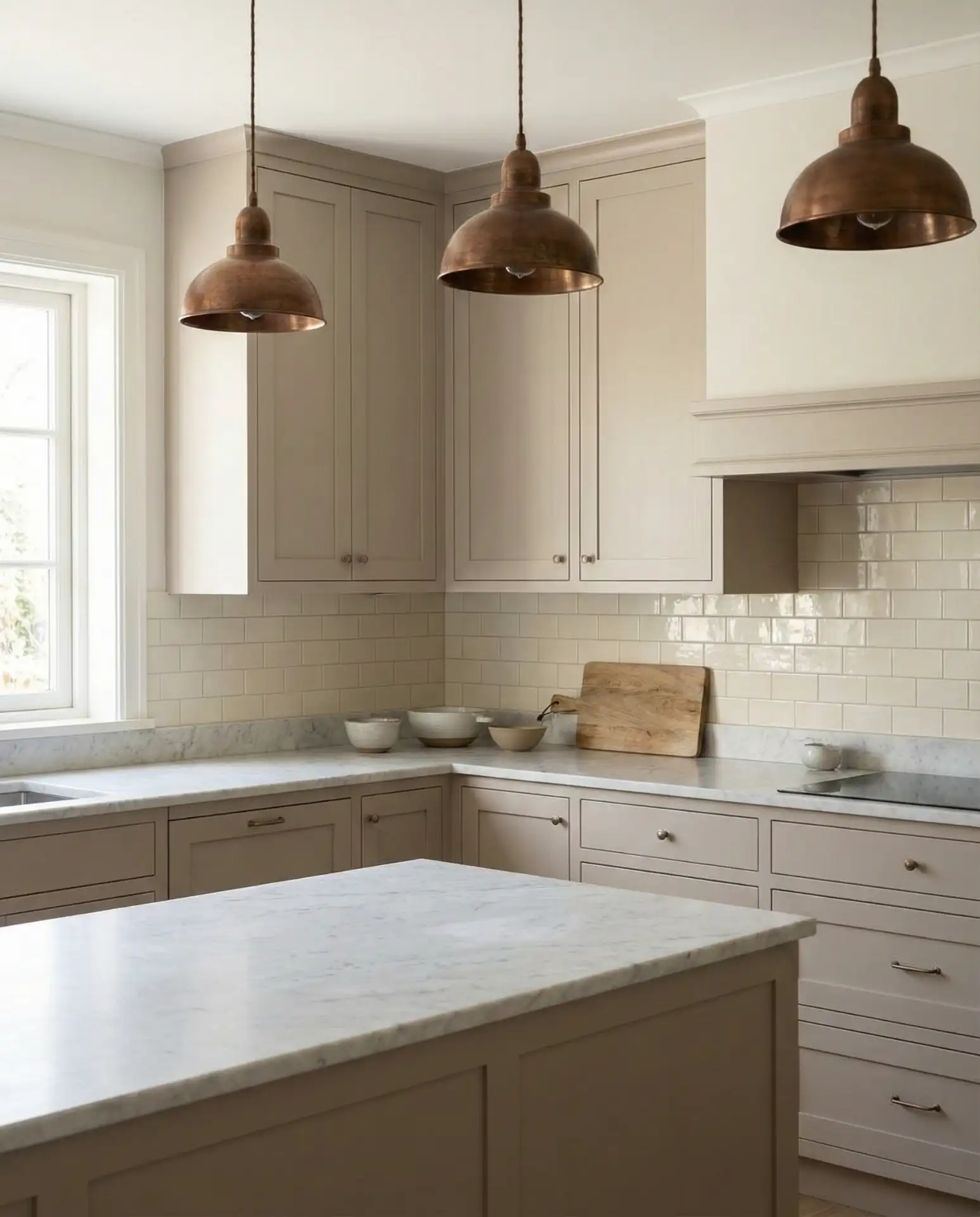
Expert-style commentary: Taupe is one of the most versatile colors in interior design because it doesn’t commit to being warm or cool. This flexibility makes it ideal for homeowners who want a neutral base that can evolve with their style. Pair it with warm metals to enhance the cozy factor or cool metals for a more modern, crisp look.
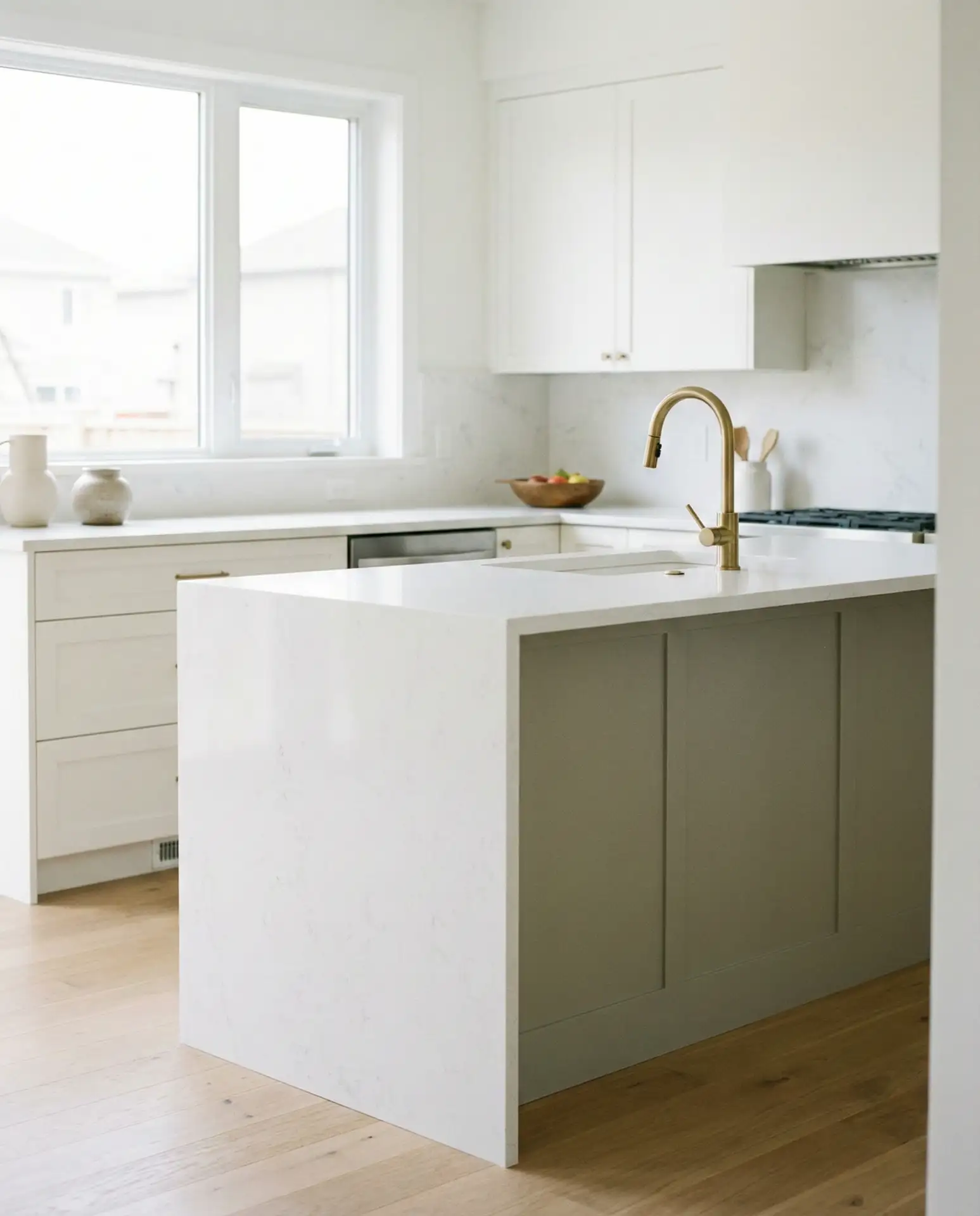
23. Monochromatic White with Texture
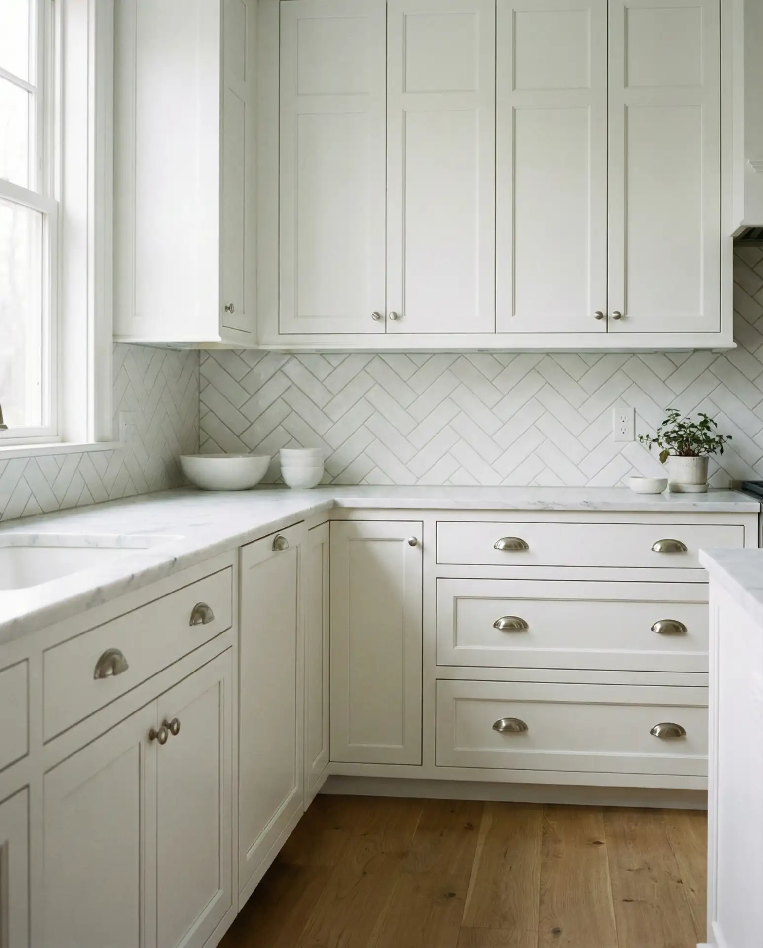
For those who prefer a serene, minimalist aesthetic, an all-white kitchen with varied textures—white cabinets, white quartz or marble, white tile—creates a calm, cohesive space. The key is layering different whites and introducing subtle texture through backsplash patterns, cabinet profiles, or natural wood accents. This timeless palette feels fresh and clean, adapting easily to personal style and changing trends. It’s a classic that never goes out of style.
Common mistakes and how to avoid them: The biggest error with all-white kitchens is using the same shade and finish throughout—this creates a flat, sterile look. Mix warm whites with cool whites, combine matte and glossy finishes, and introduce texture through tile patterns or wood accents. This creates depth and visual interest while maintaining the monochromatic calm.
Conclusion
Whether you’re drawn to deep, saturated hues or soft, nature-inspired neutrals, 2026 offers kitchen color palettes that balance boldness with timelessness. The key is choosing colors that resonate with your personal style and the architecture of your home, while remaining open to evolving trends and new combinations. We’d love to hear which palette speaks to you—share your favorites in the comments below, and let us know if you’ve already taken the plunge with a colorful kitchen transformation.