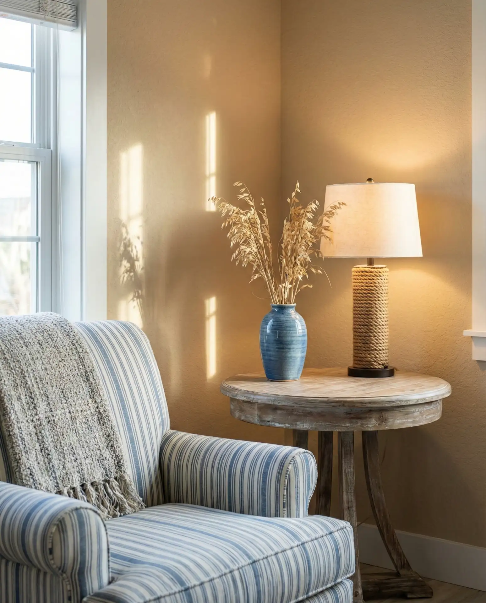
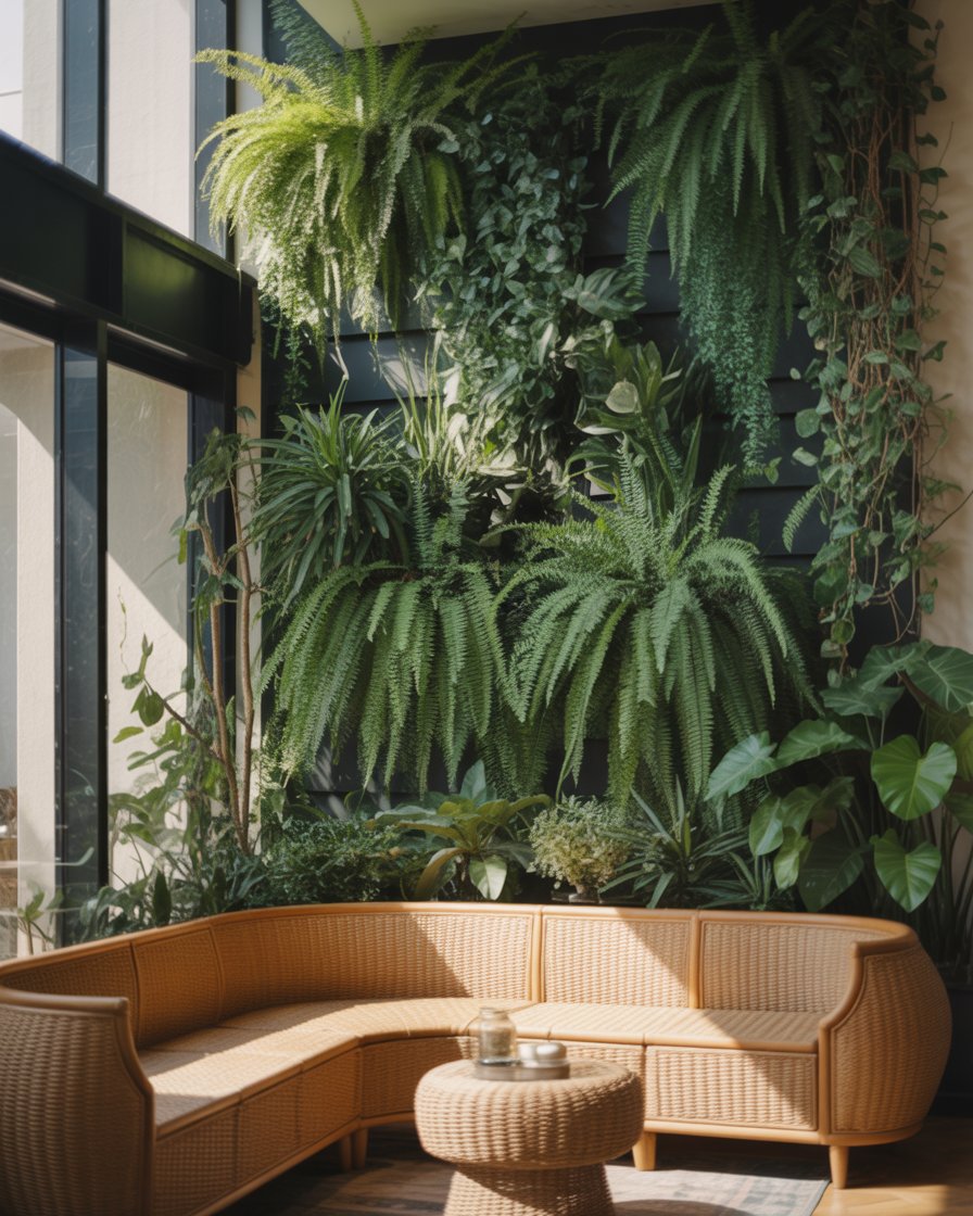
Living room color is one of the most searched topics on Pinterest heading into 2026, and it’s easy to see why. Americans are craving spaces that feel fresh yet timeless, personal yet on-trend. Whether you’re planning a full refresh or just want to test a new accent wall, the colors gaining traction this year blend warmth, boldness, and versatility. From soft neutrals that ground a room to unexpected jewel tones that make a statement, these ideas will help you find the palette that fits your style and lifestyle.
1. Warm Terracotta and Cream Foundations

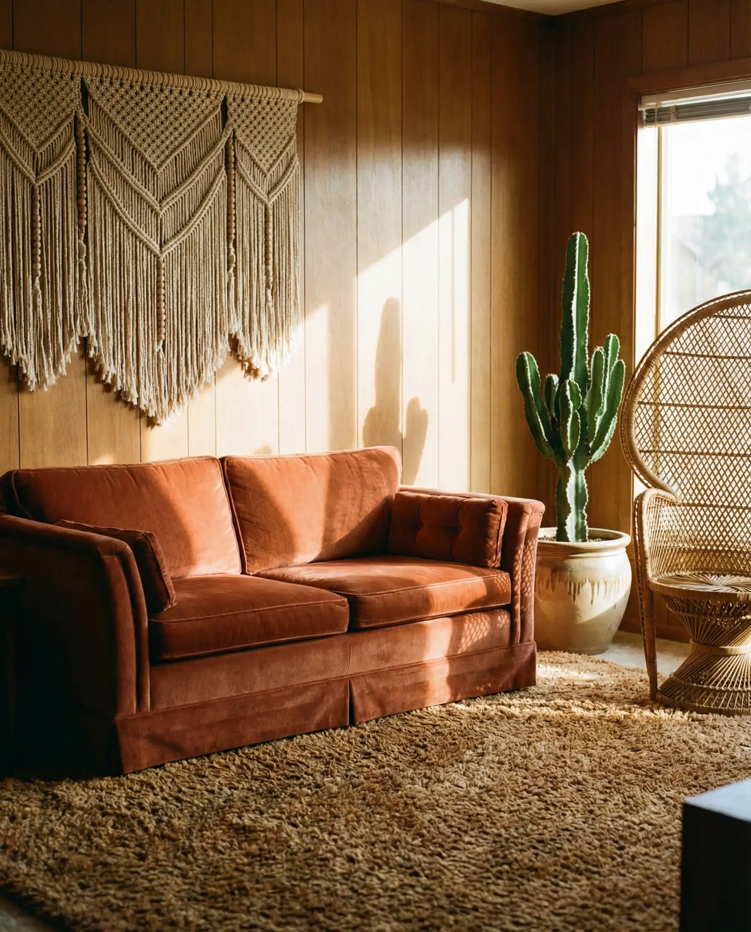
Terracotta is having a major moment in interior design, especially for living rooms that want to feel cozy without leaning too traditional. This earthy, sun-baked orange works beautifully as an accent wall or even across all four walls if you balance it with neutral furnishings like a linen sofa or jute rug. It’s a palette that feels both modern and grounded, perfect for spaces that get good natural light. 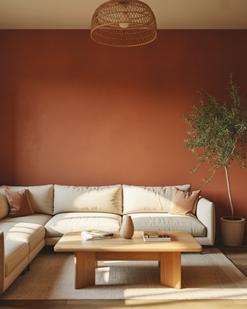
This works best in homes with open floor plans where the living room flows into the kitchen or dining area. The warmth of terracotta visually connects spaces without needing a hard color break. If you’re worried it might feel too bold, start with terracotta in smaller doses—throw pillows, artwork, or a single feature wall behind your TV or sofa.
2. Sage Green and Soft White Serenity
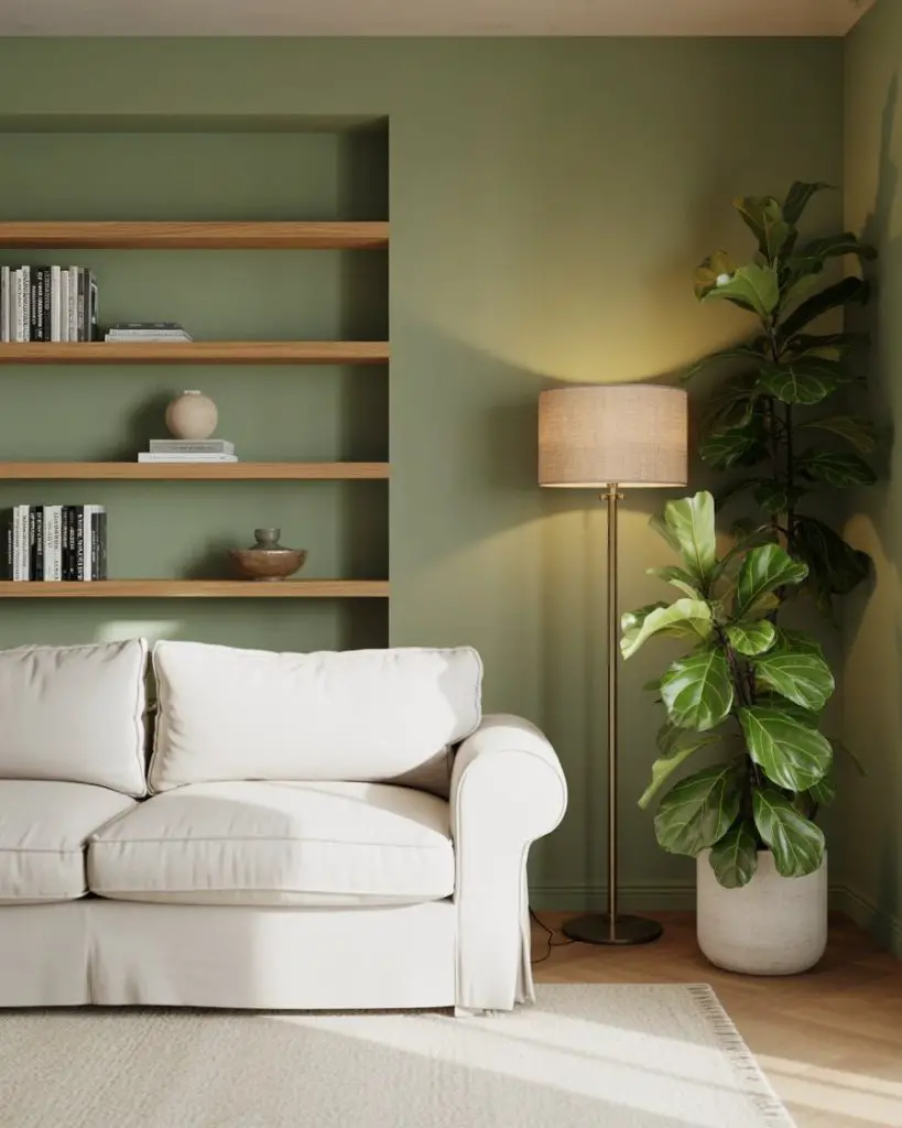
Sage green continues to dominate Pinterest boards, and for good reason. It’s one of those rare colors that feels both calming and sophisticated, making it ideal for living rooms where you want to unwind after a long day. Pair it with soft whites or warm off-whites to keep the space feeling airy and light, and layer in natural textures like linen, rattan, or raw wood for a cozy finish. 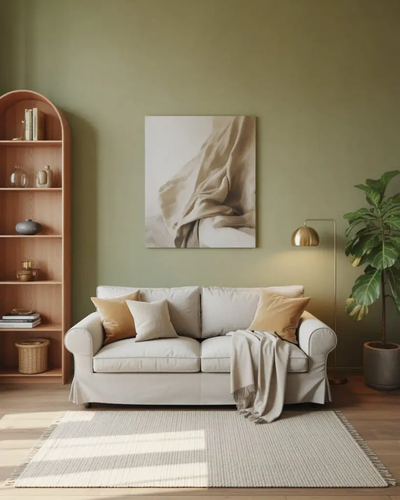
One common mistake is pairing sage with cool grays, which can make the room feel sterile. Instead, lean into warm neutrals and wood tones to enhance the organic, earthy vibe. This palette works especially well in smaller living rooms or apartments where you want color without visual weight.
3. Deep Navy with Warm Oak Accents
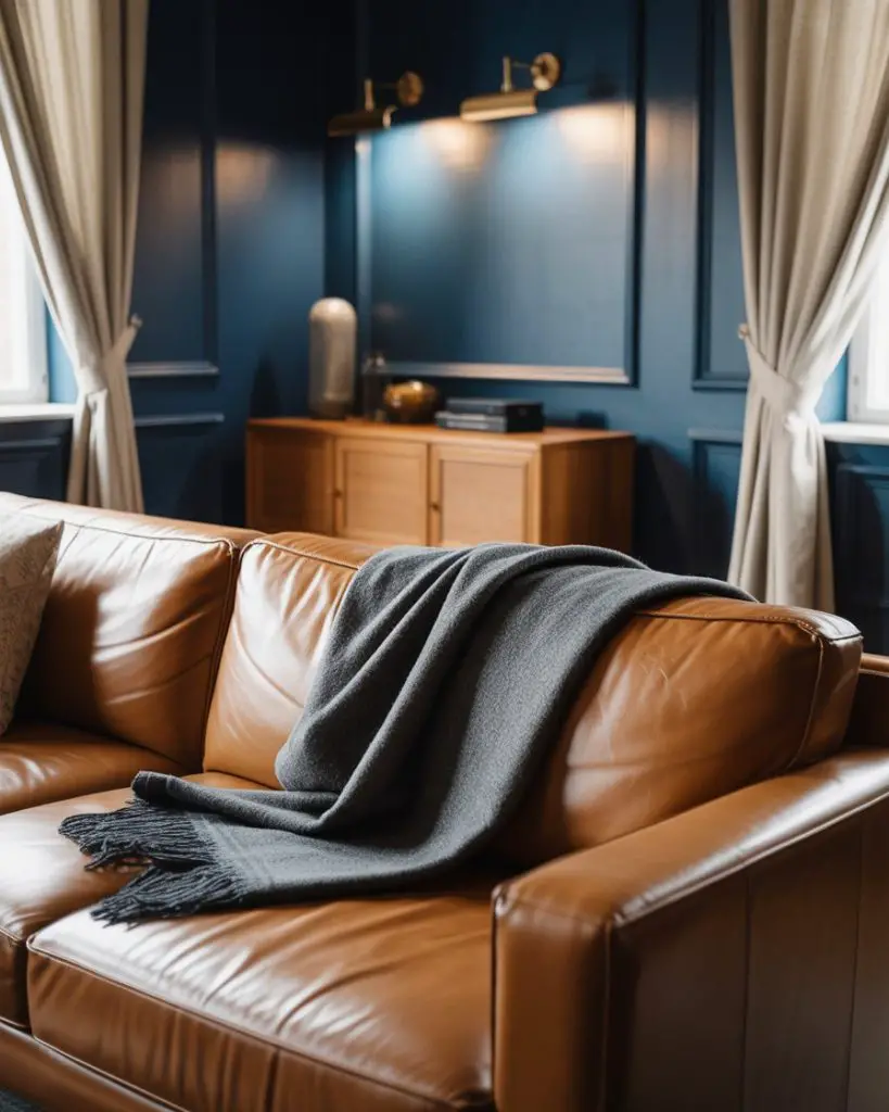
Navy blue is making a serious comeback as a living room anchor color, especially when balanced with warm wood tones. Unlike cooler blues, navy brings drama and depth without feeling cold, and it pairs beautifully with brass hardware, leather seating, and light oak or walnut furniture. It’s a palette ideas favorite for homeowners who want a sophisticated, library-inspired vibe that still feels inviting. 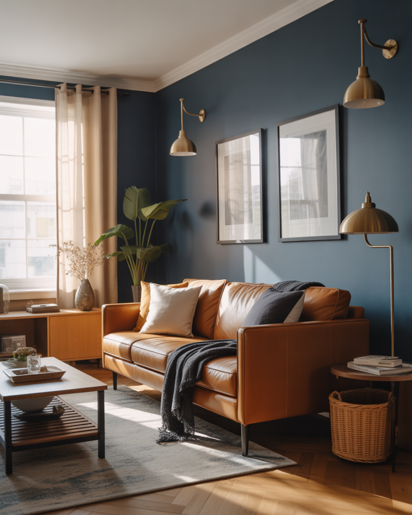
In the Pacific Northwest and New England, this color scheme is especially popular in older homes with built-in bookshelves or wainscoting. The navy acts as a moody backdrop that makes warm wood and metallic accents pop. Budget tip: if painting all four walls feels like too much commitment, try navy on just one accent wall or the ceiling for an unexpected twist.
4. Soft Blush and Greige Harmony
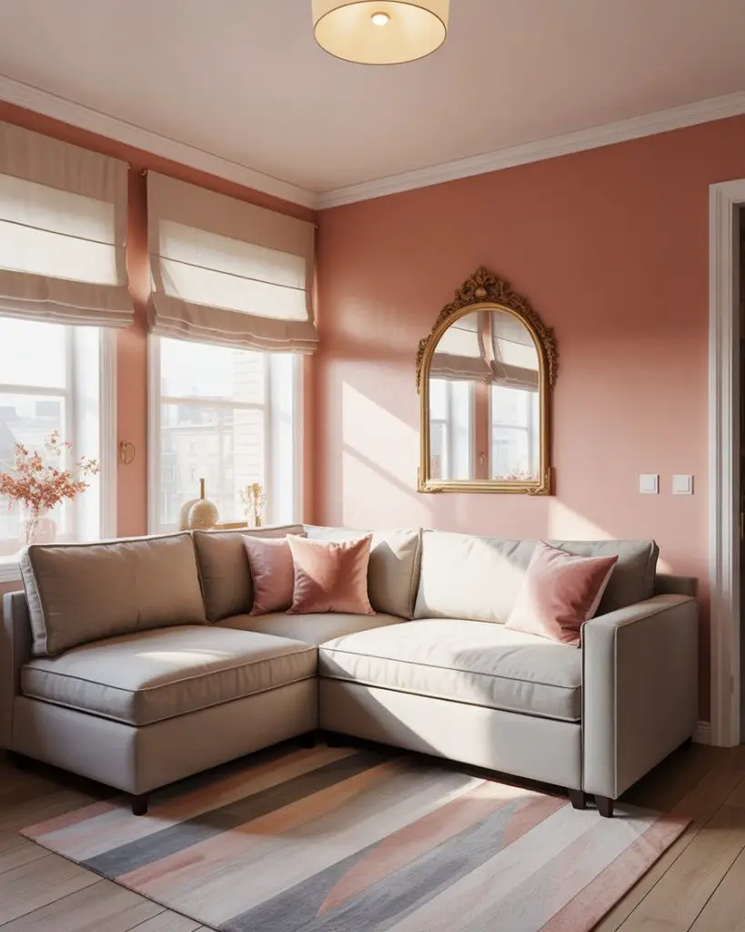
Blush pink has evolved from nursery staple to grown-up living room color, especially when paired with greige—a warm gray-beige hybrid that’s become a neutral favorite across the U.S. This combination feels soft and approachable, perfect for spaces that lean modern farmhouse or transitional. The trick is keeping the blush very muted, almost dusty, so it reads as a sophisticated neutral rather than overtly pink. 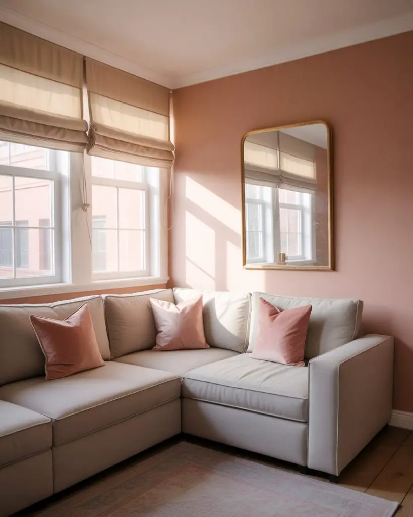
This palette works best in living rooms with plenty of natural light, where the blush stays soft and doesn’t veer too peachy. If your space faces north or gets limited sun, swap the blush for a warmer terracotta or apricot tone instead. Real homeowners often use this scheme in condos and townhomes where they want color that feels current but won’t alienate future buyers.
5. Charcoal Gray with Mustard Pops

Charcoal gray offers a sleek, modern foundation that plays well with bold accent colors, and yellow mustard is one of the most unexpected yet effective pairings. This scheme ideas approach brings energy into a room without overwhelming it, especially when the mustard appears in smaller doses—think throw pillows, a single armchair, or abstract art. The gray keeps things grounded while the yellow adds warmth and personality. 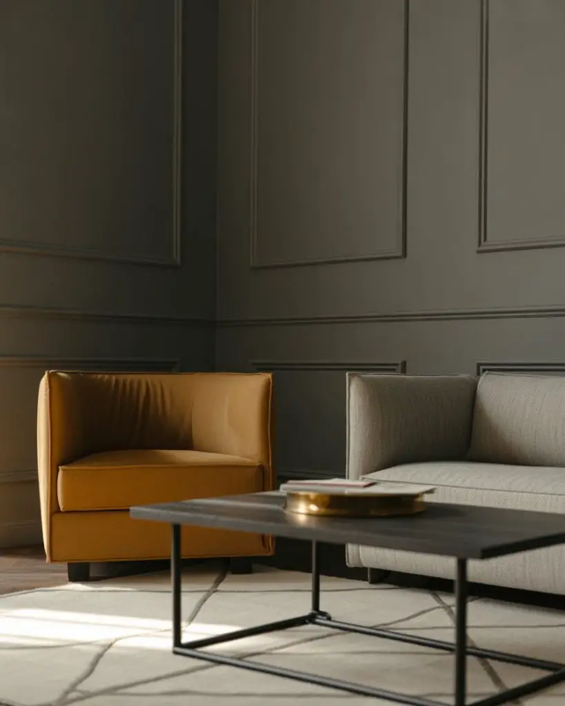
A friend who works in real estate mentioned that buyers in urban markets—especially Chicago and Denver—respond well to this palette because it feels current without being trendy. The key is balance: too much yellow can feel overwhelming, while too little makes it look like an afterthought. Aim for about 15-20% of the room’s visual weight in that accent color.
6. Creamy White with Natural Wood Layers
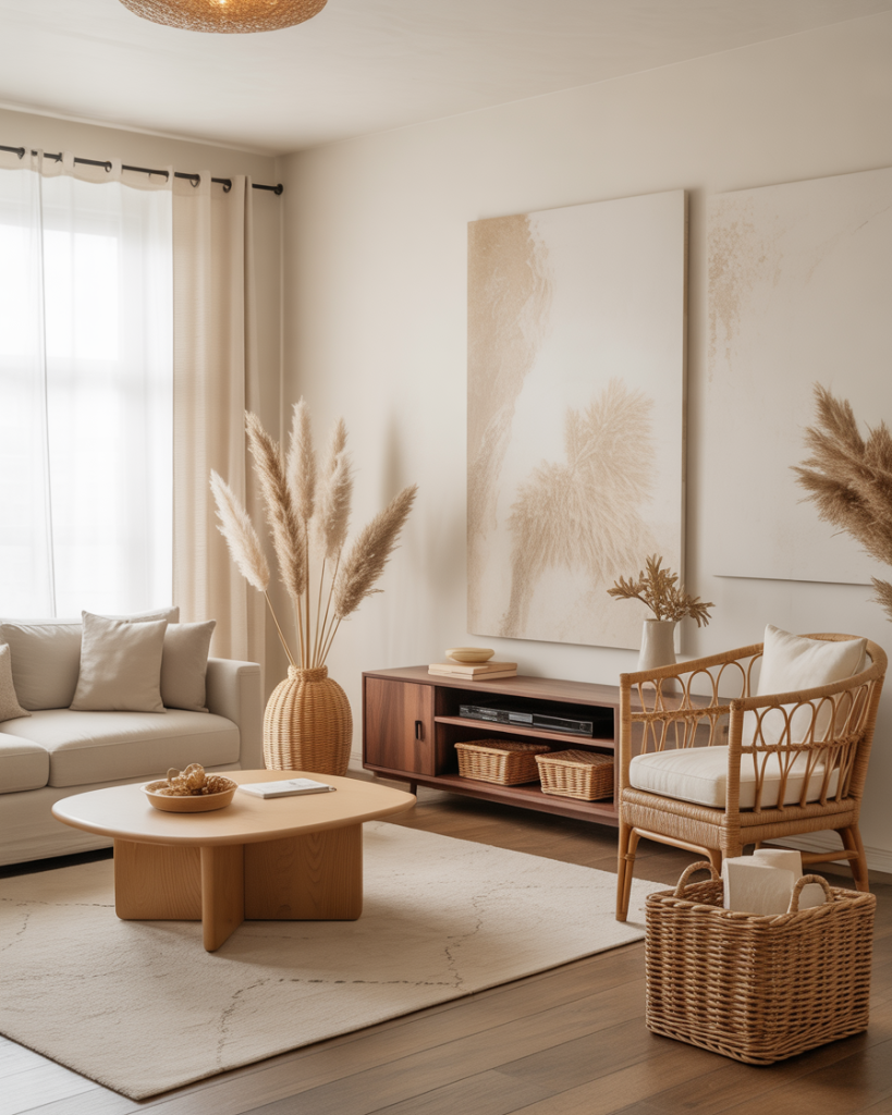
All-white living rooms are far from boring when you layer in multiple wood tones and textures. This approach—popularized by Scandinavian and California coastal designs—keeps the palette simple but adds depth through oak, walnut, rattan, and reclaimed wood pieces. It’s a cozy take on minimalism that feels warm and lived-in rather than stark or sterile. 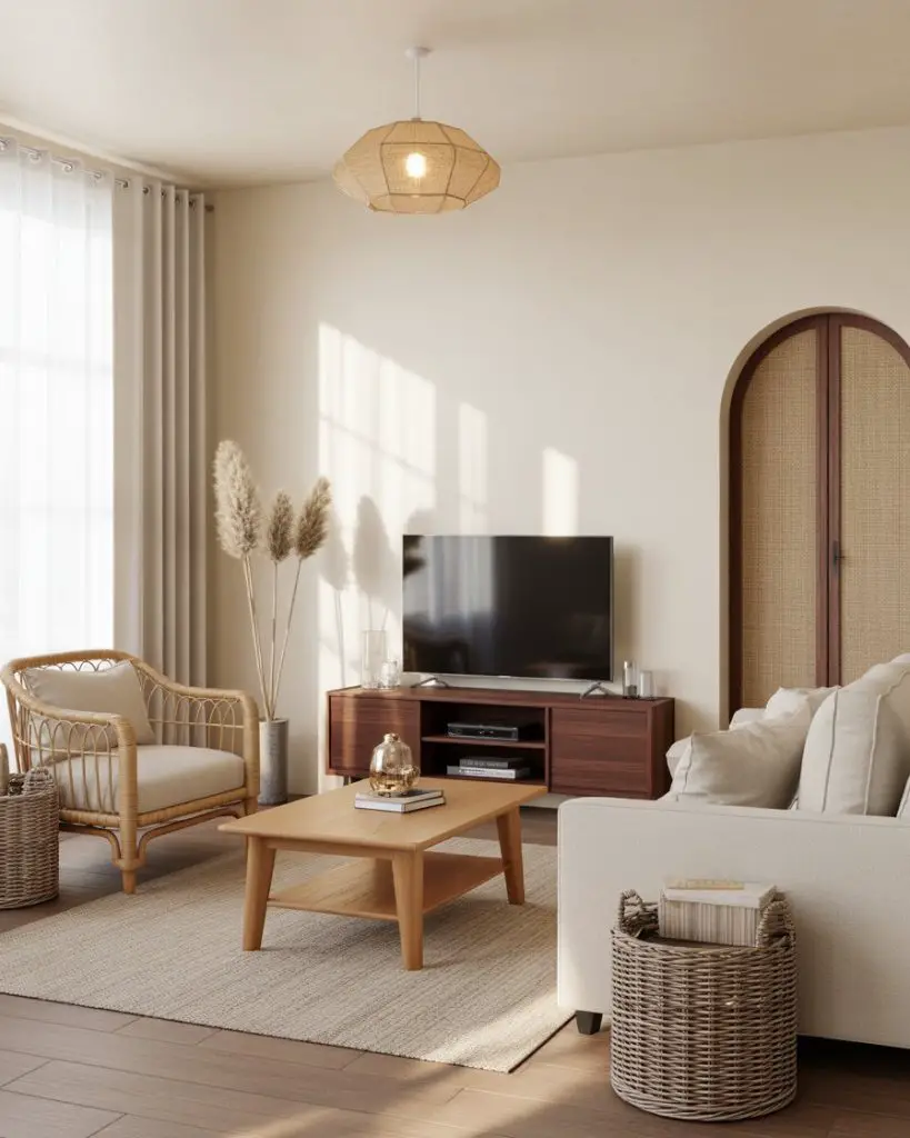
This works best in open-concept homes where you want visual continuity without relying on color. The white walls act as a neutral backdrop that lets your furniture and decor tell the story. Budget-conscious homeowners love this approach because it’s easy to refresh with swappable textiles and accessories rather than committing to bold paint colors that may feel dated in a few years.
7. Burnt Orange and Slate Blue Contrast
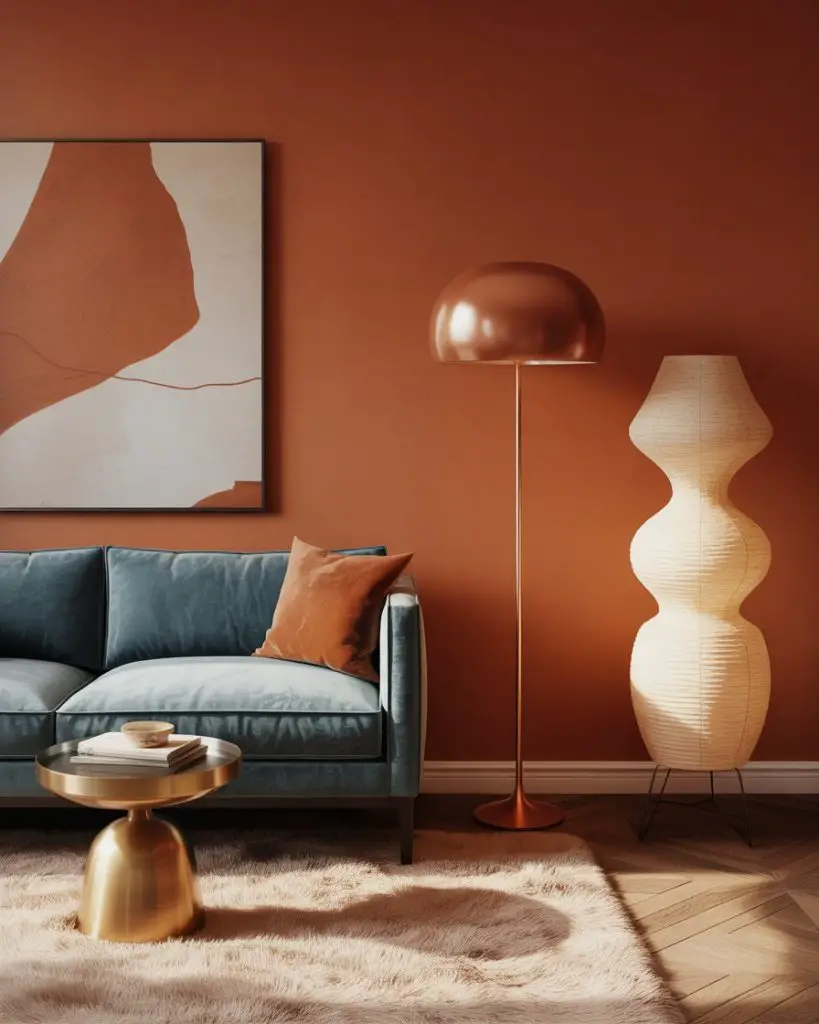
For those craving a more adventurous palette ideas, burnt orange and slate blue create a striking, complementary combination that feels both retro and modern. The warmth of the orange balances the coolness of the blue, making it a dynamic choice for living rooms that want to make a statement. This works especially well in mid-century modern or eclectic spaces where bold color feels right at home. 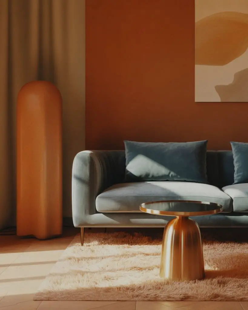
In the Southwest—Arizona, New Mexico, parts of California—this color duo shows up frequently because it echoes the natural landscape: desert sunsets and wide, dusky skies. If you’re nervous about committing to two bold colors, try using one on a single wall and the other in upholstery or large-scale art. That way, you get the impact without feeling boxed in.
8. Soft Taupe with Warm Brass Details

Taupe has quietly become one of the most versatile neutral options for living rooms, especially when paired with warm metallics like brass or aged gold. It’s softer than gray, warmer than beige, and works beautifully as a full-room color or as an anchor for more colorful accents. This palette feels timeless and elegant without being too formal or stuffy. 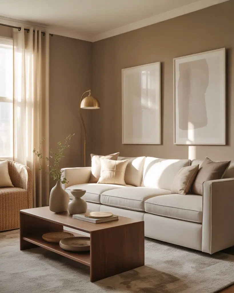
Interior designers often recommend taupe for living rooms that double as multi-use spaces—think family rooms that also serve as home offices or play areas. The color is forgiving with fingerprints, scuffs, and wear, and it pairs well with nearly any accent color you throw at it, from deep greens to soft pinks to charcoal accents.
9. Dusty Rose and Charcoal Elegance
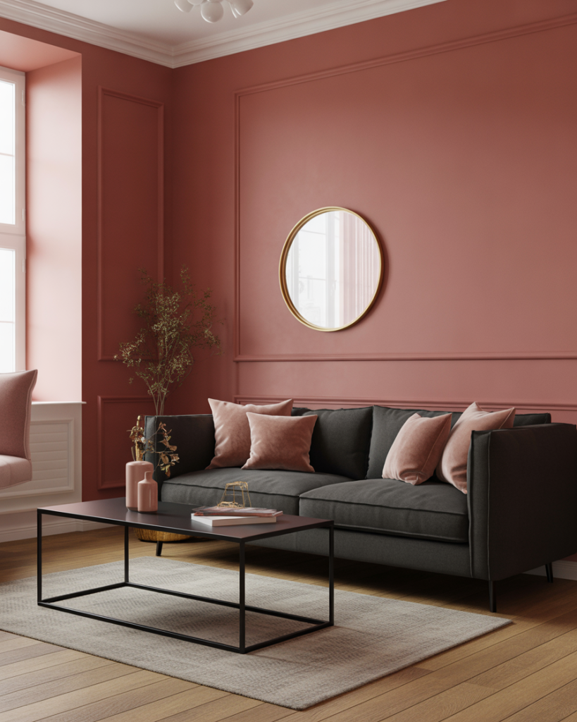
Dusty rose brings a sophisticated, grown-up edge when paired with charcoal gray or black accents. This scheme ideas cozy approach is especially popular in urban apartments and townhomes where homeowners want a feminine touch without going full pastel. The charcoal grounds the rose, making it feel moody and intentional rather than overly sweet. 
This palette works best in living rooms with good natural light, where the dusty rose can shift throughout the day—looking more taupe in the morning and more pink in the evening. If your space is darker, consider using the rose as an accent color in textiles and keeping the walls a lighter neutral to avoid making the room feel closed in.
10. Forest Green and Cream Retreat
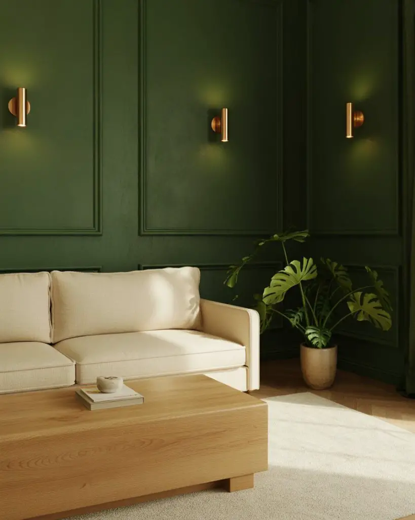
Forest green is one of those colors that feels both dramatic and calming, especially when paired with soft cream or ivory. It’s a palette that works beautifully in traditional, transitional, and even modern spaces, lending a sense of richness and depth without overwhelming the room. Layer in warm wood tones and natural textures to keep the green from feeling too heavy or dark. 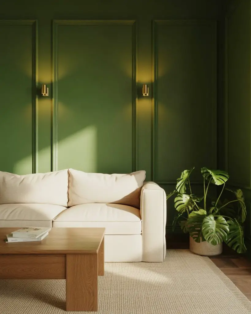
In the Northeast and Midwest, forest green is a go-to for homes with traditional architecture—think Colonial, Craftsman, or Tudor styles. The color echoes the wooded surroundings and feels grounded and timeless. One practical tip: if you’re painting all four walls green, make sure your lighting is warm-toned (2700K bulbs) to prevent the space from feeling cold or cave-like.
11. Pale Aqua and Sand Coastal Calm
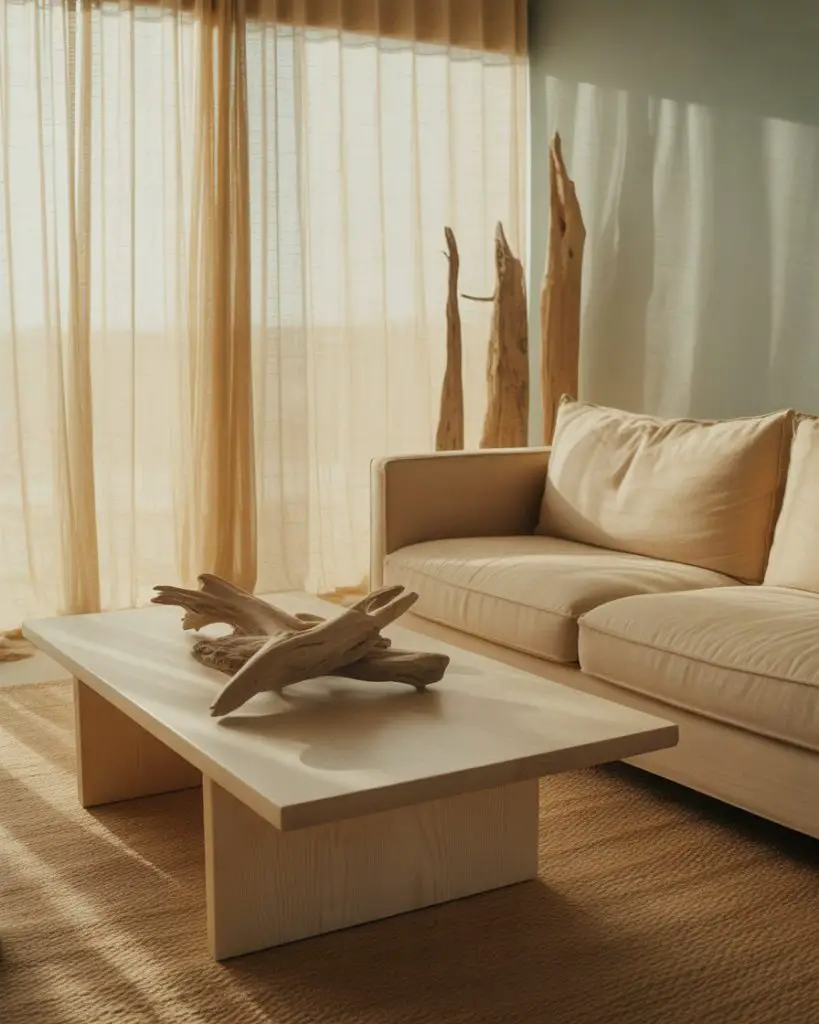
Pale aqua brings a breezy, coastal vibe to living rooms without veering into literal beach house territory. When paired with sandy beige or warm taupe, it creates a cozy retreat that feels like a permanent vacation. This combination ideas works especially well in homes near water—Florida, the Carolinas, California coast—but can also bring a breath of fresh air to landlocked spaces. 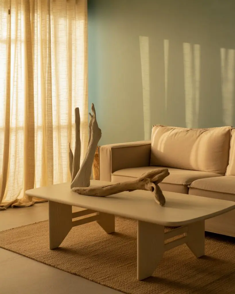
Where it works best: living rooms with lots of natural light and white or light wood trim. The aqua reads as a soft, airy neutral rather than a bold color statement. Avoid pairing it with stark white or cool grays, which can make the room feel too clinical. Instead, lean into warm, natural materials like linen, rattan, and reclaimed wood.
12. Warm Caramel and Ivory Richness
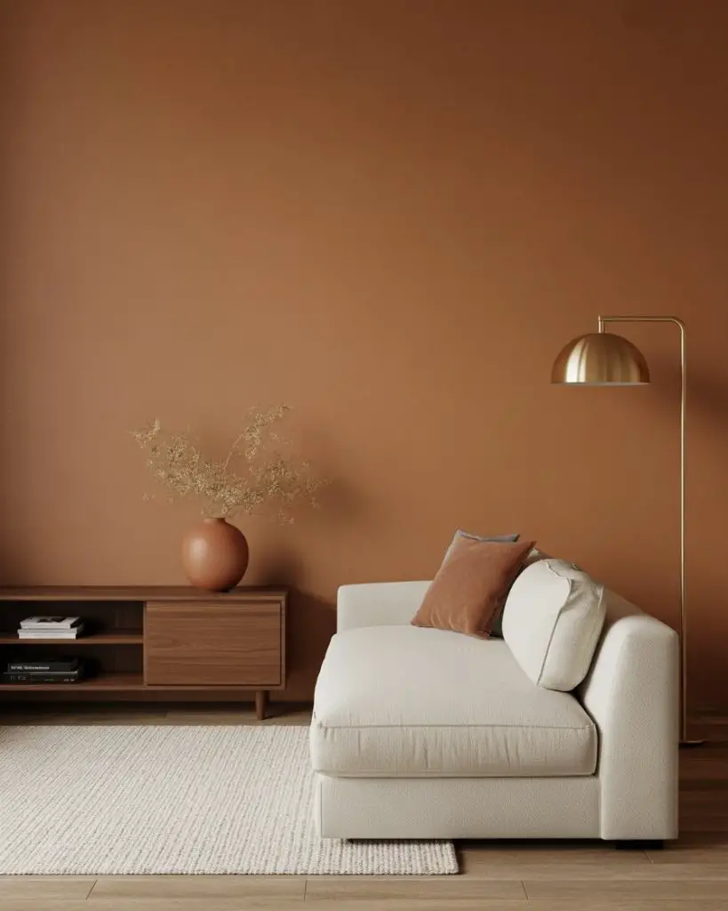
Caramel is a warm, honey-toned brown that’s gaining traction as a neutral alternative to gray. Paired with soft ivory or cream, it creates a living room palette that feels rich and enveloping without being too dark. This schemes approach is especially popular in spaces with mid-century modern or Scandinavian influences, where warm wood tones are already a key design element.
A common mistake is assuming brown tones will make a room feel dated or dark. The key is choosing a caramel with warm, golden undertones and pairing it with plenty of light neutrals and natural light. This palette is also budget-friendly—many paint brands offer warm browns that look high-end without requiring specialty formulas or primers.
13. Soft Lavender and Warm Gray Balance
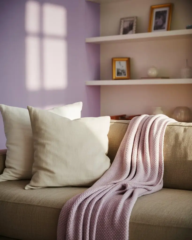
Lavender is shedding its overly feminine reputation and emerging as a sophisticated living room color, especially when grounded by warm gray. This palette ideas feels modern and unexpected, perfect for homeowners who want color but aren’t drawn to the usual blues and greens. Keep the lavender soft and dusty rather than bright or saturated for the most versatile, livable result. 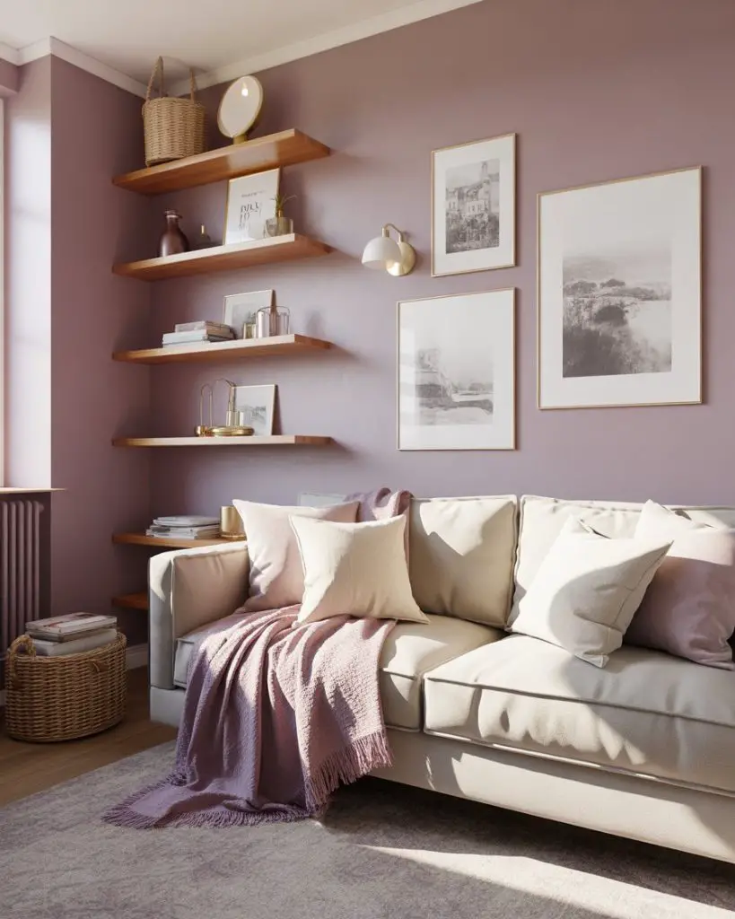
This works best in living rooms that get soft, diffused light—north-facing rooms or spaces with sheer curtains. Harsh, direct sunlight can make lavender look washed out or too pink. If you’re in a sunny climate, consider using lavender as an accent color in textiles and art rather than on the walls, and keep the main walls a warm, light gray.
14. Brick Red and Natural Linen Warmth
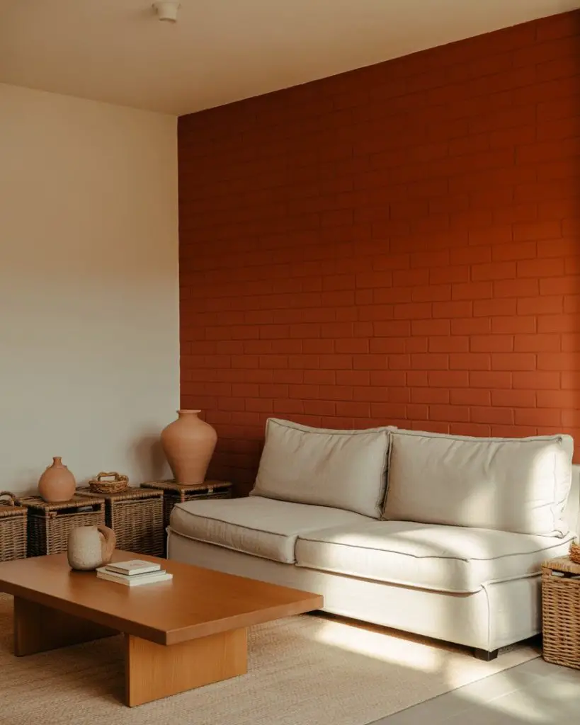
Brick red is a grounded, earthy alternative to brighter reds, and it pairs beautifully with natural linen and creamy whites. This combination white wall approach often involves painting one accent wall brick red while keeping the remaining walls white or off-white, creating a focal point without overwhelming the space. It’s a palette that feels both bold and lived-in, perfect for eclectic or bohemian interiors. 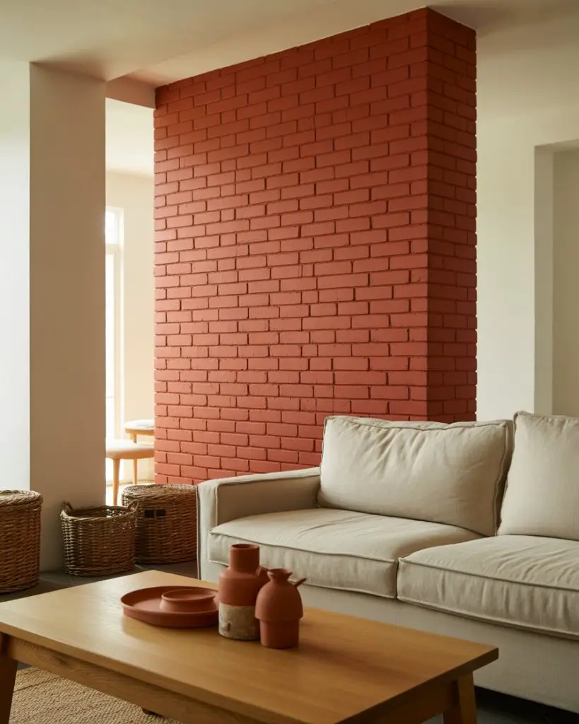
Real homeowners in the Southwest and California often gravitate toward this palette because it echoes the natural clay and adobe tones in the landscape. If you’re worried brick red might feel too intense, test it in a small area first—behind a bookshelf, in an alcove, or on a chimney breast—before committing to a full wall.
15. Cool Pewter and Warm Ochre Pop
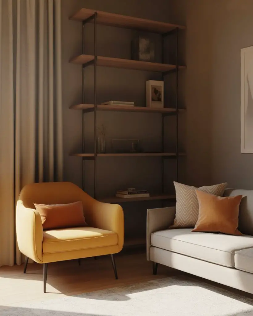
Pewter gray offers a sophisticated, modern alternative to standard gray, with just a hint of blue or green undertone that makes it feel less flat. Pair it with warm ochre or mustard accents to add energy and warmth, creating a scheme ideas bright palette that’s both grounded and lively. This works especially well in contemporary or industrial-style living rooms where you want a clean, curated look. 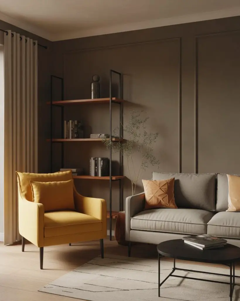
One practical insight: pewter gray can read differently depending on your lighting. In rooms with warm incandescent or LED bulbs, it leans warmer and more inviting. Under cool daylight, it can feel a bit austere. Test your paint sample at different times of day to make sure you’re happy with how it shifts. The ochre pops help balance any coolness and keep the space from feeling too sleek or impersonal.
16. Warm Beige and Olive Green Layers
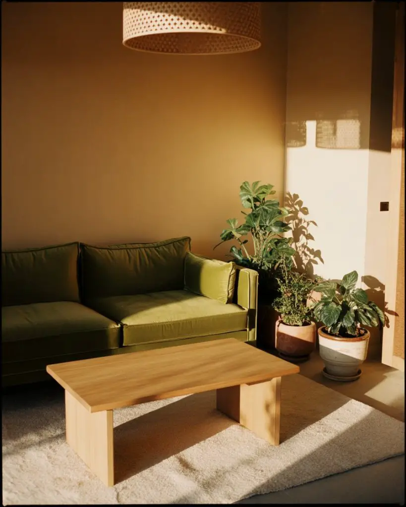
Warm beige is making a strong comeback as homeowners move away from cool grays, and it pairs exceptionally well with muted olive green. This neutral duo feels organic and calming, perfect for living rooms that want to channel a natural, earthy aesthetic. Layer in plenty of plants, woven textures, and light wood furniture to complete the look and keep it from feeling too flat or one-note. 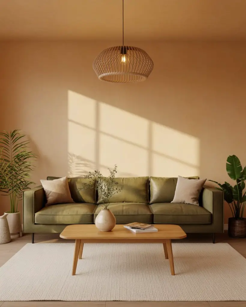
In California and the Pacific Northwest, this color scheme is especially popular in homes with lots of greenery visible through the windows—it creates a seamless indoor-outdoor connection. Expert-style commentary: if you’re mixing beige and olive, make sure both have warm undertones. A cool beige with a warm olive will clash and feel disjointed. Always test swatches side by side before committing.
17. Soft Peach and Cool White Brightness
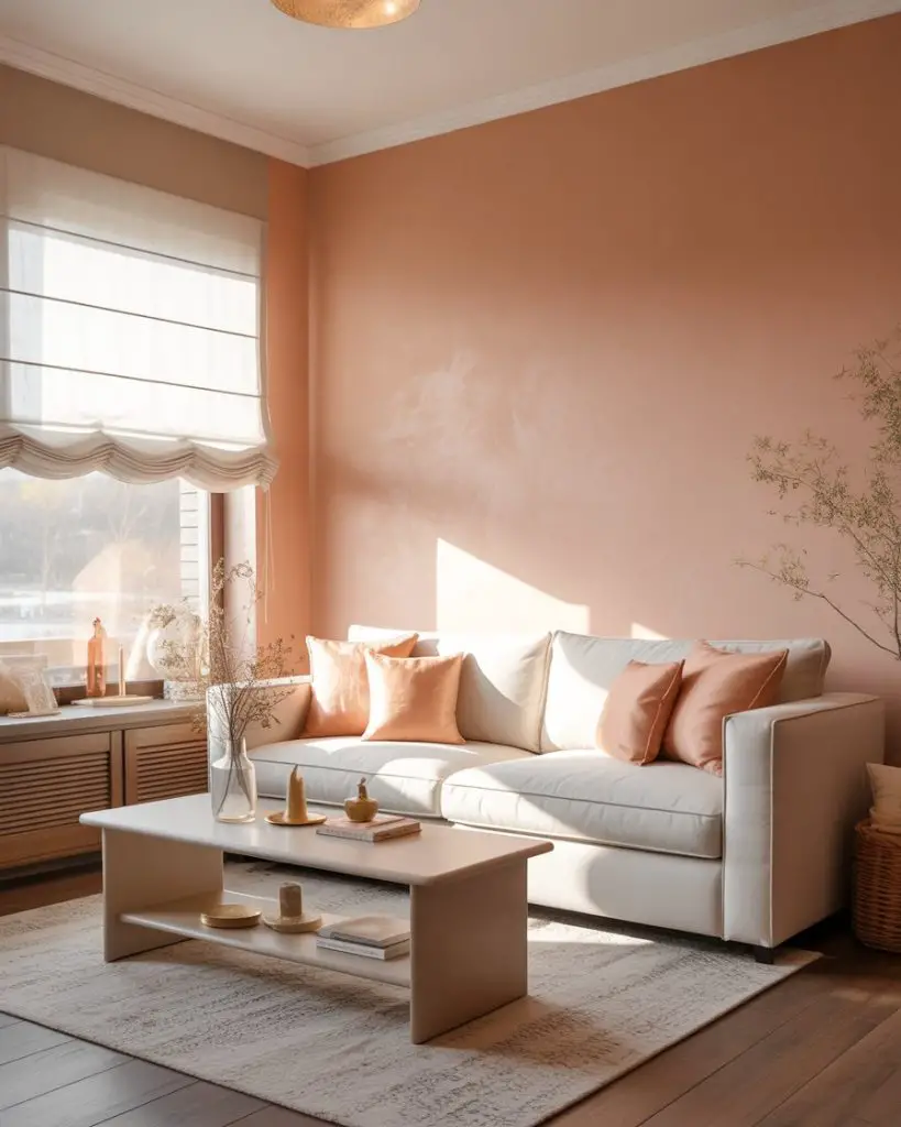
Peach is having a quiet resurgence, especially in its softer, more muted iterations. Paired with cool, crisp white, it creates a bright and airy living room that still feels warm and inviting. This palette ideas works beautifully in smaller spaces or rooms with limited natural light, where the peach adds warmth without making the room feel closed in. Keep the peach very light—think more blush-peach than orange-peach. 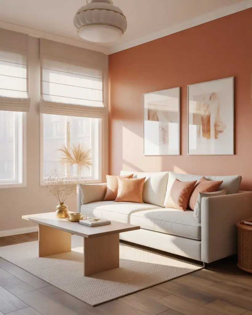
Where it works best: condos, apartments, and smaller homes where you want to maximize light and create the illusion of more space. The cool white keeps the peach from feeling too warm or heavy, and the contrast between the two creates visual interest without needing a lot of furniture or decor. If peach feels too bold for your walls, try it in window treatments, throw pillows, or a single accent piece like an armchair.
18. Deep Teal and Warm Walnut Sophistication
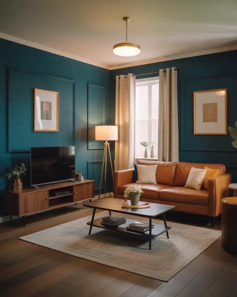
Deep teal is a showstopper color thatworks surprisingly well in living rooms when balanced with warm walnut furniture and brass or gold accents. This palette feels luxurious and intentional, perfect for homeowners who want a designs approach that’s both bold and timeless. The walnut adds warmth and prevents the teal from feeling too cool or jewel-box intense. 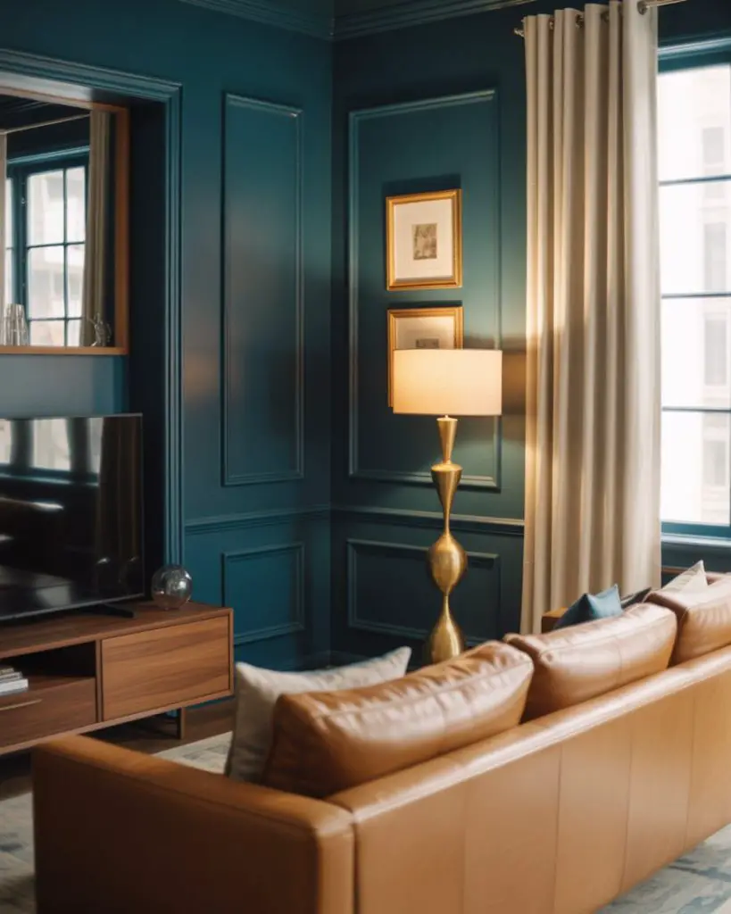
This palette is especially popular in urban lofts and historic homes with high ceilings and good natural light. The teal reads as rich and enveloping rather than dark, and it pairs beautifully with both modern and vintage furnishings. Budget angle: teal paint tends to have strong pigment, so you may only need one or two coats even over a darker existing color, which can save on both paint and labor costs.
19. Sherwin Williams Accessible Beige Foundation

Sherwin Williams Accessible Beige has become a go-to neutral for living rooms across the country, and it’s easy to see why. This warm, greige-leaning beige works with nearly any decor style and pairs beautifully with both warm and cool accent colors. It’s light enough to keep a room feeling open but has enough warmth to avoid that sterile, builder-grade gray look that dominated the 2010s. 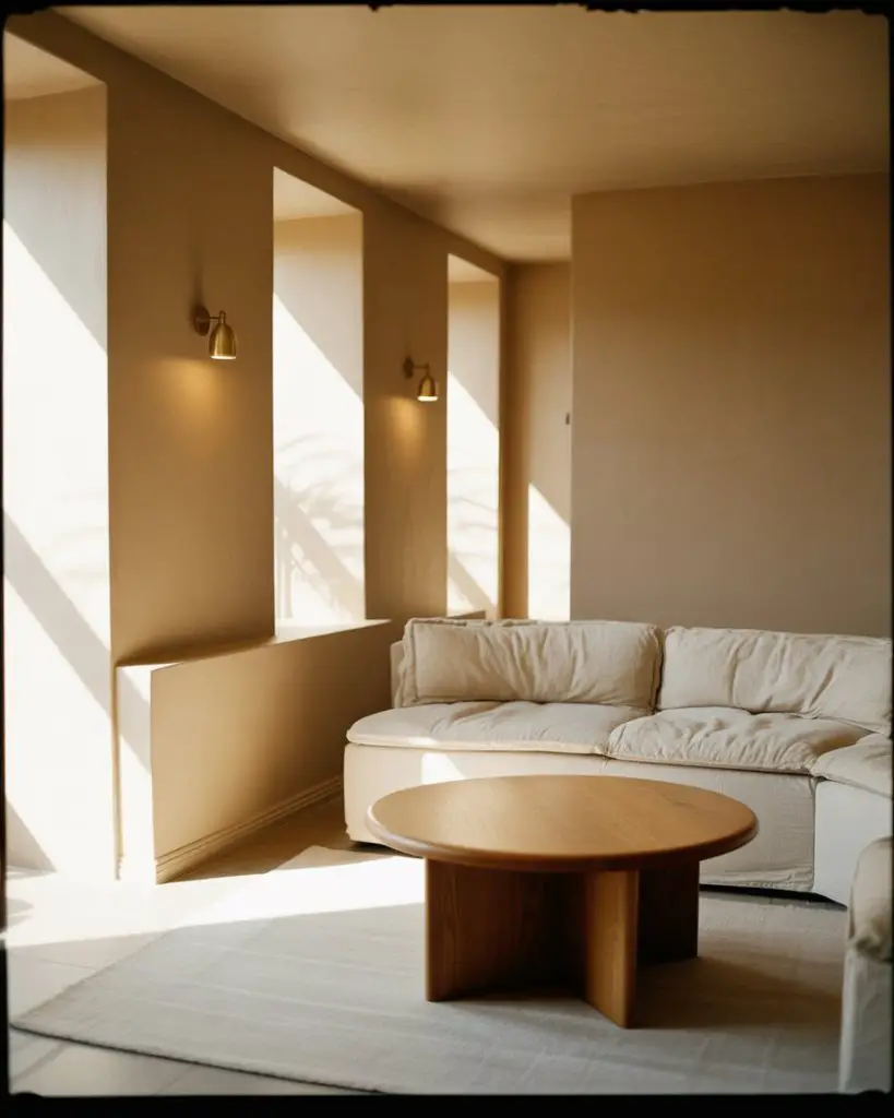
Real homeowners often choose this color when they’re preparing to sell or when they want a safe, universally appealing backdrop that won’t compete with their furniture or art. It’s also a favorite among DIYers because it’s forgiving—small imperfections in wall prep tend to be less visible in this soft, neutral shade. Pair it with crisp white trim for a classic look or keep the trim the same color for a more modern, seamless effect.
20. Benjamin Moore Classic Gray Versatility
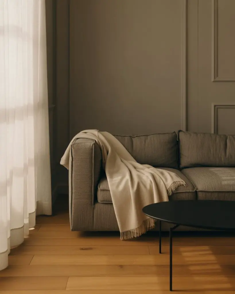
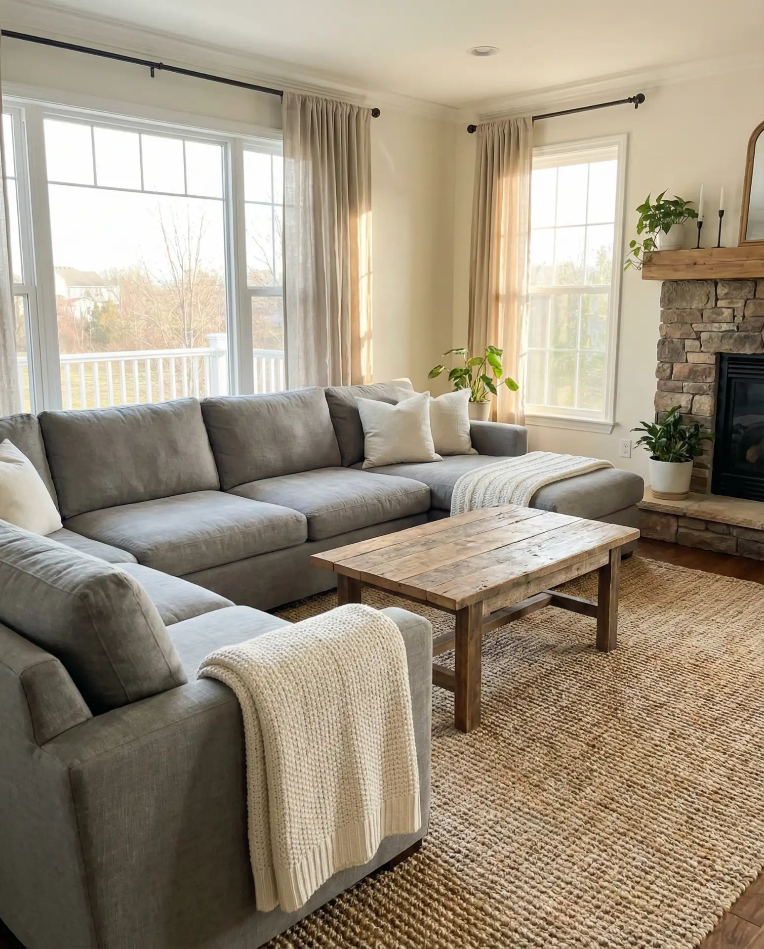
Benjamin Moore Classic Gray is another designer favorite, offering a true warm gray that doesn’t veer too purple or too green. It’s a neutral that works beautifully in living rooms with a grey couch, creating a tonal, sophisticated look that’s easy to layer with texture and pattern. This shade is especially popular in transitional and modern farmhouse interiors where you want a clean, contemporary feel without going stark white. 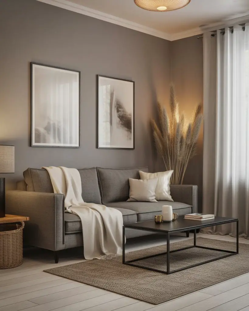
This color works best in living rooms with ample natural light. In darker spaces, it can read a bit flat or dull, so consider using it in rooms with large windows or south-facing exposure. If you already have a gray couch, this wall color creates a cohesive, intentional look—just make sure to vary your textures and add warm wood tones to prevent the space from feeling too monochromatic or cold.
21. Moody Plum and Soft Cream Drama
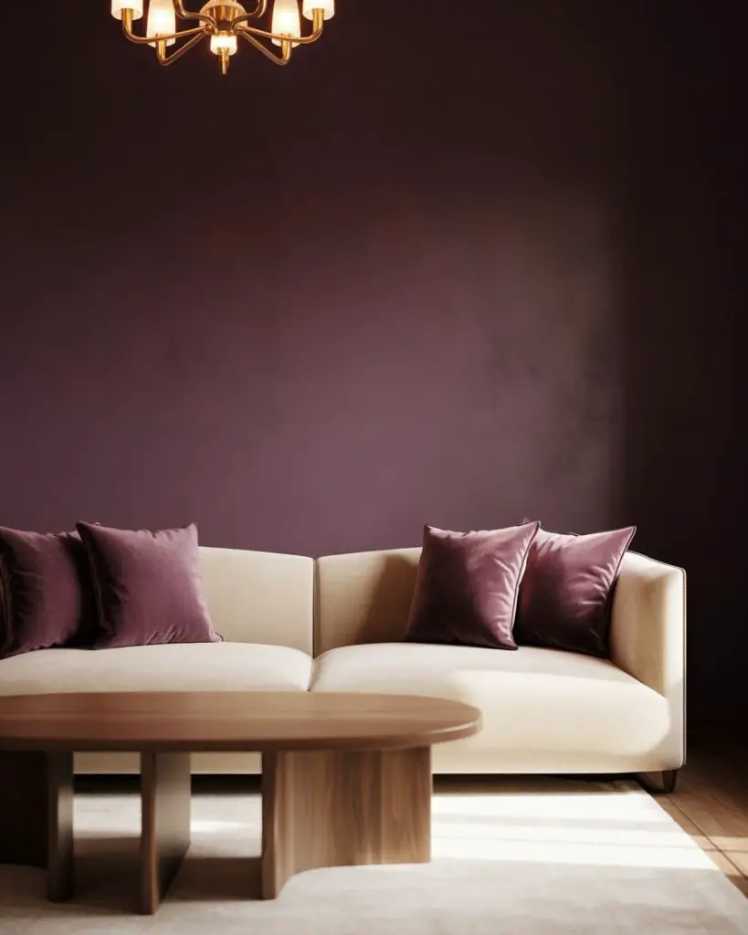
Plum is one of the most underrated living room colors, offering depth and drama without the heaviness of black or charcoal. Paired with soft cream or ivory, it creates a cozy yet sophisticated palette that works beautifully in both traditional and eclectic spaces. This combination feels rich and enveloping, perfect for living rooms that are used primarily in the evening or for entertaining. 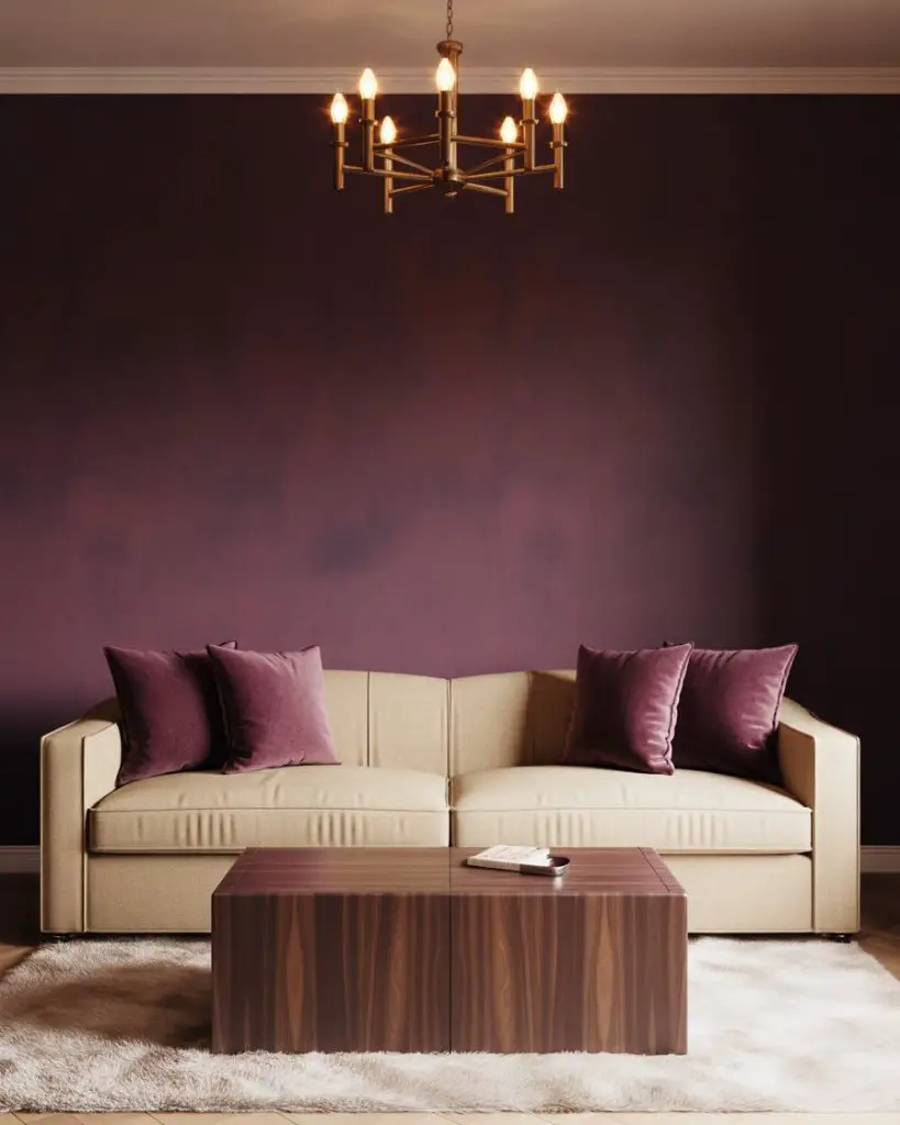
In older homes with ornate molding or architectural details, plum can make those features really stand out. The key is balancing the dark walls with plenty of light-colored furniture and good lighting—both natural and artificial. A common mistake is under-lighting a dark room, which makes it feel cave-like. Add layered lighting with table lamps, floor lamps, and sconces to keep the space feeling inviting and functional.
22. Warm White with Terracotta and Denim Accents
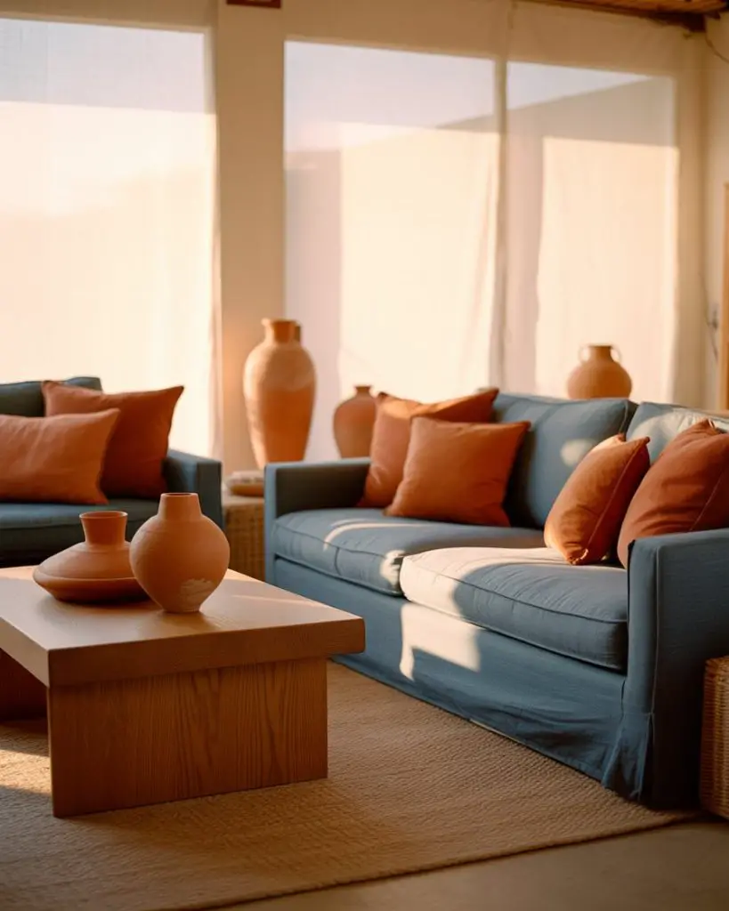
Warm white walls act as a perfect canvas for layering in terracotta and denim blue accents, creating a casual, collected look that feels both modern and timeless. This scheme ideas approach works especially well in living rooms that lean coastal, bohemian, or modern farmhouse, where you want a relaxed vibe without sacrificing style. The terracotta brings warmth while the denim adds a cool, grounding contrast. 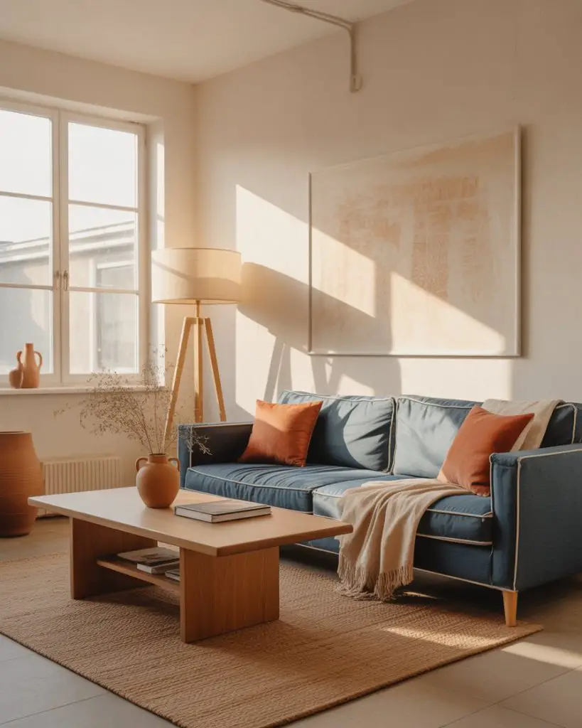
This palette is popular among younger homeowners and renters who want a curated look without committing to bold wall colors. The white walls keep things flexible and easy to change as trends evolve, while the terracotta and denim accents can be swapped out or updated seasonally. It’s also a budget-friendly approach—investing in a few quality accent pieces rather than undertaking a full paint job.
23. Soft Gray-Blue with Warm Honey Tones
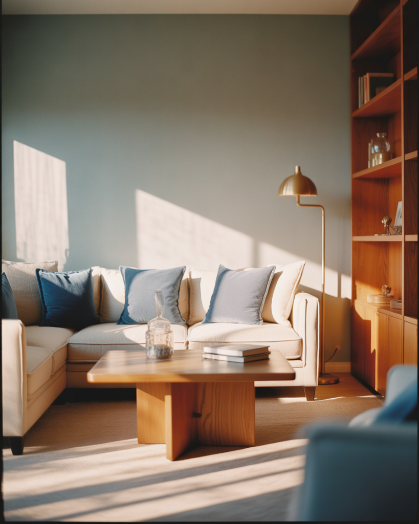
Soft gray-blue sits at the intersection of calm and sophisticated, offering a cozy alternative to stark white or cool gray. When paired with warm honey-toned wood and brass or gold accents, it creates a living room that feels both modern and inviting. This palette works beautifully in spaces that want a touch of color without going bold or saturated. 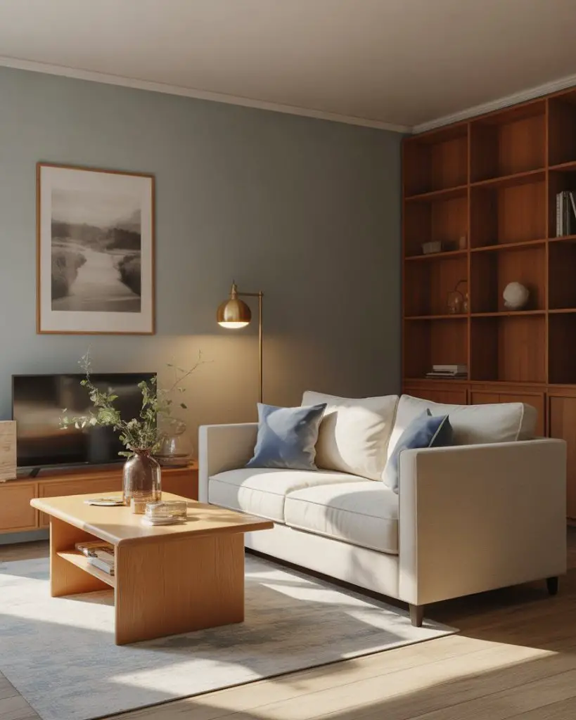
Where it works best: living rooms in Craftsman, bungalow, or cottage-style homes where the architectural details already lean warm and traditional. The gray-blue keeps things feeling fresh and current while honoring the home’s original character. If you’re worried about the color feeling too cool, make sure your wood tones are warm (think oak, pine, or maple rather than walnut or mahogany) and layer in plenty of textiles in cream, beige, and soft whites.
24. Earthy Clay and Creamy Neutrals
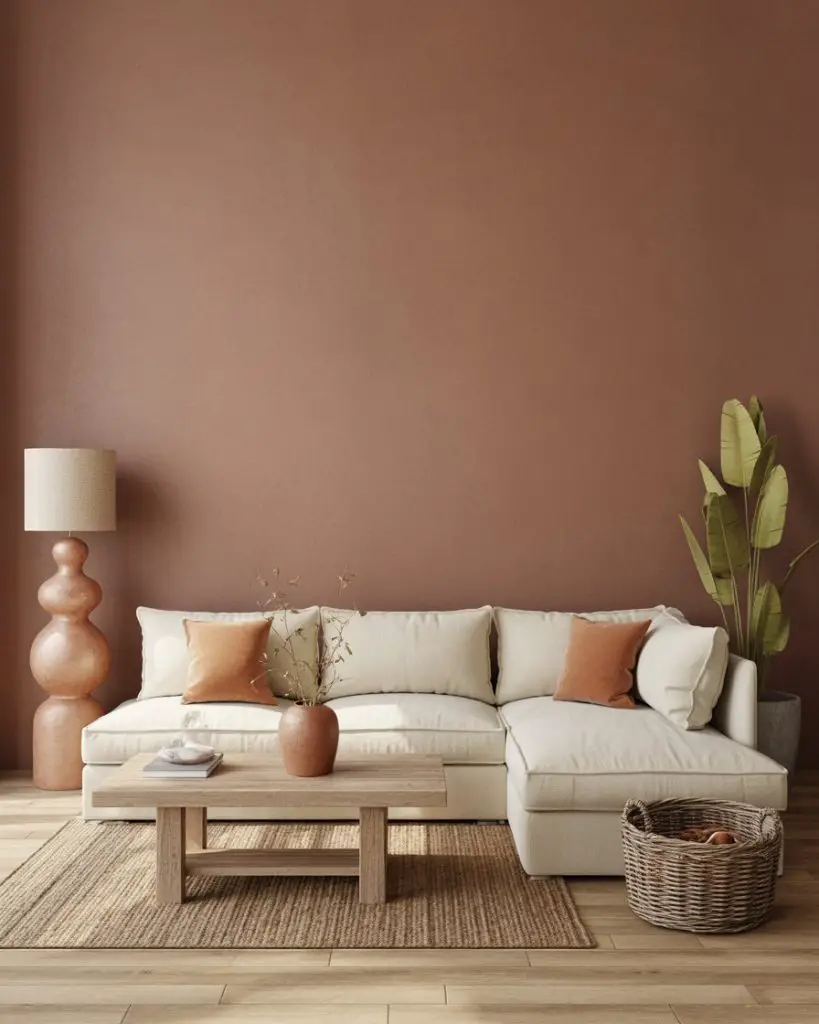
Clay tones—think burnt sienna, rust, and deep terracotta—are trending heavily for 2025 and into 2026, and they pair beautifully with creamy neutrals for a grounded, organic living room palette. This good interior design approach feels warm and welcoming, perfect for spaces that want to channel a southwestern, Mediterranean, or earthy modern aesthetic. Layer in natural materials like linen, wool, leather, and raw wood to complete the look. 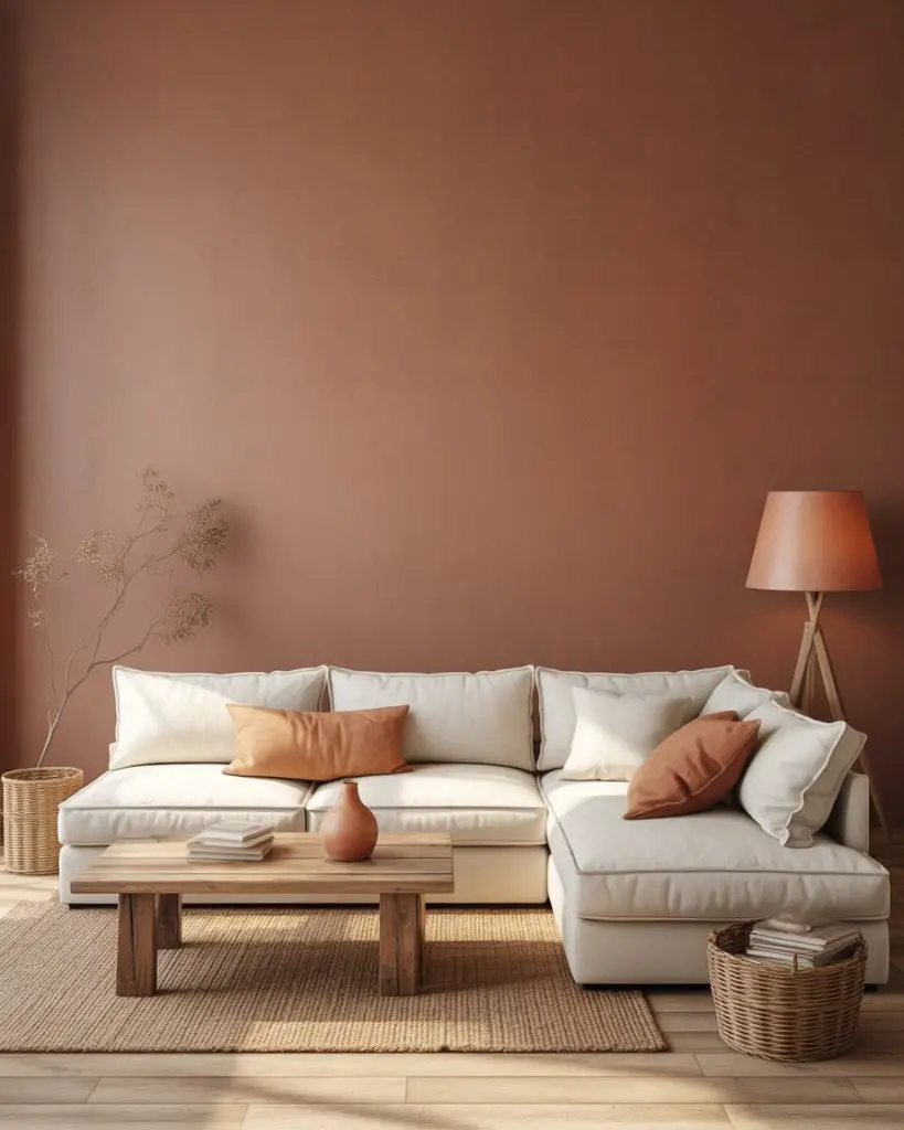
This palette works especially well in open-plan homes where the living room flows into the kitchen and dining areas. The clay tones create visual warmth and continuity, while the cream keeps the space feeling light and airy. Practical insight: clay colors can vary widely depending on the light, so always test your paint sample on multiple walls and observe it throughout the day before committing to a full room.
Conclusion
Now that you’ve seen these 24 living room color ideas for 2026, which palette speaks to you? Whether you’re drawn to moody jewel tones, warm earthy neutrals, or unexpected color combinations, there’s a scheme here that can transform your space. Drop a comment below and let us know which direction you’re leaning—we’d love to hear what’s inspiring your next refresh.

