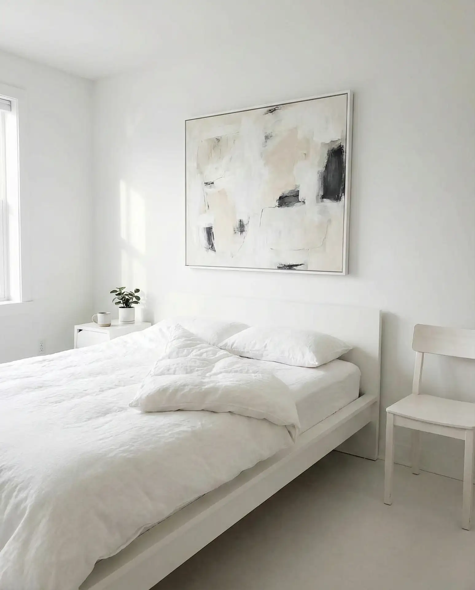
White bedrooms have never gone out of style, but in 2026, they’ve become the ultimate canvas for personal expression and calm living. Americans are turning to Pinterest in record numbers to find fresh ways to layer texture, warmth, and color into all-white spaces without losing that airy, serene feel. Whether you’re working with a small apartment bedroom or a spacious primary suite, white offers endless flexibility—from cozy neutrals to bold accent pops. This guide brings you real-world ideas that blend timeless elegance with the latest design trends, helping you create a bedroom that feels both current and deeply restful.
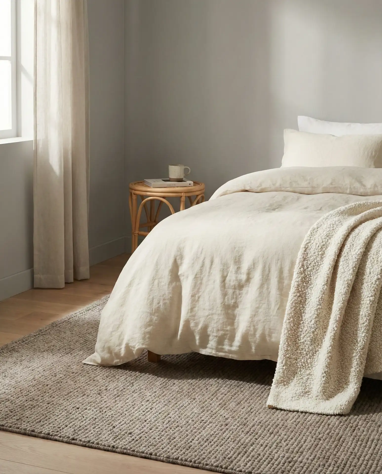
1. Soft Grey and White Layered Bedding
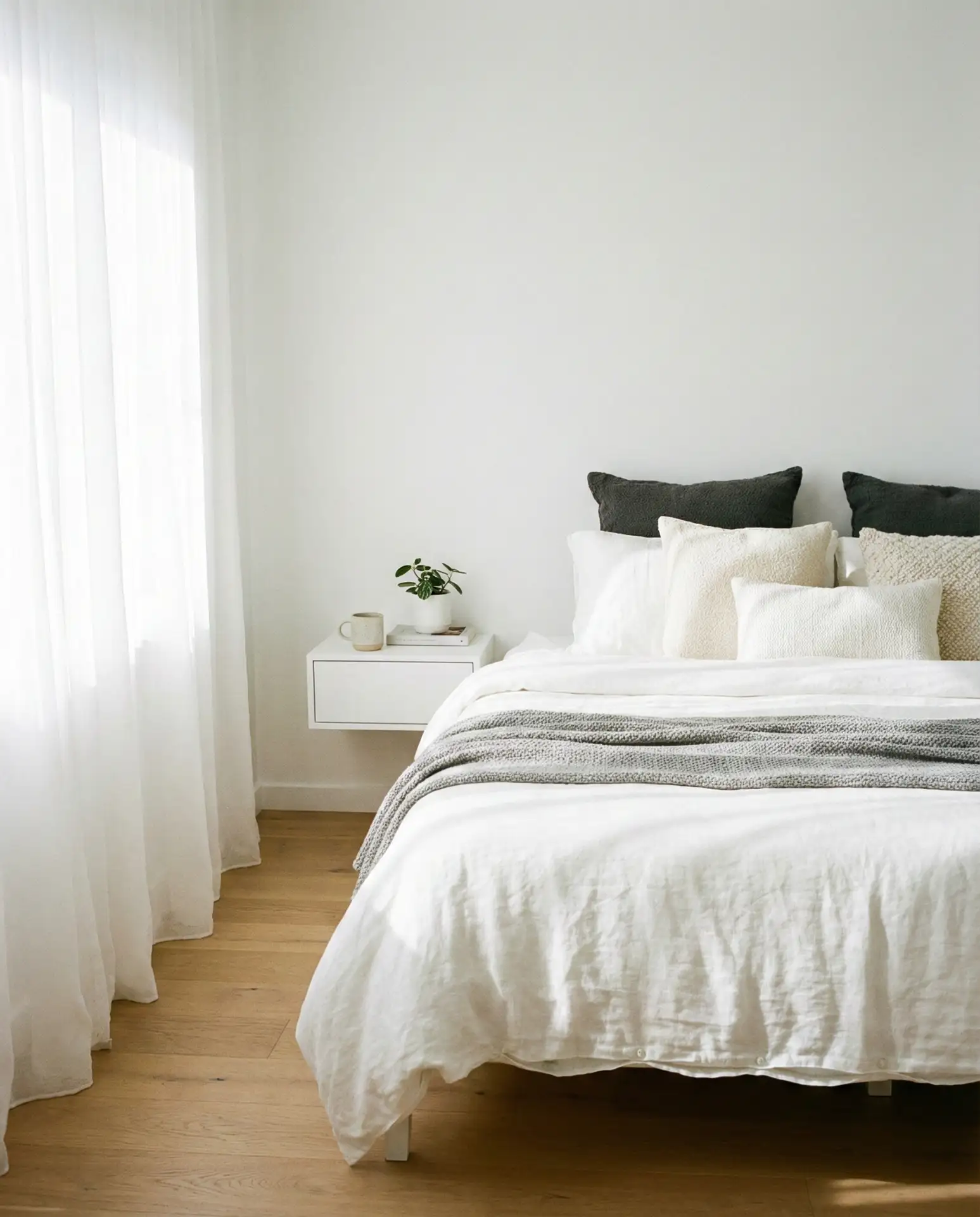
This approach centers on building depth through fabric rather than color. Start with crisp white sheets, then add a grey and white quilt or duvet in a subtle pattern—think delicate stripes or a faded geometric print. Layer in textured throw pillows in varying shades of light grey, from barely-there silver to soft charcoal. The key is mixing materials: linen, cotton, and a touch of velvet create visual interest without overwhelming the palette. This style works beautifully in both modern and transitional bedrooms, especially when natural light floods the space during morning hours.
In coastal regions like California and the Carolinas, this grey-and-white combination has become a go-to for homeowners who want that breezy, resort-like feeling year-round. The neutral palette keeps spaces cool visually, which matters in warmer climates. You can swap out heavier quilts for lightweight coverlets in summer, maintaining the layered look without the heat. Add a simple grey throw blanket folded at the foot of the bed—it’s both functional for cooler evenings and adds that finished, styled appearance that feels effortless but intentional.
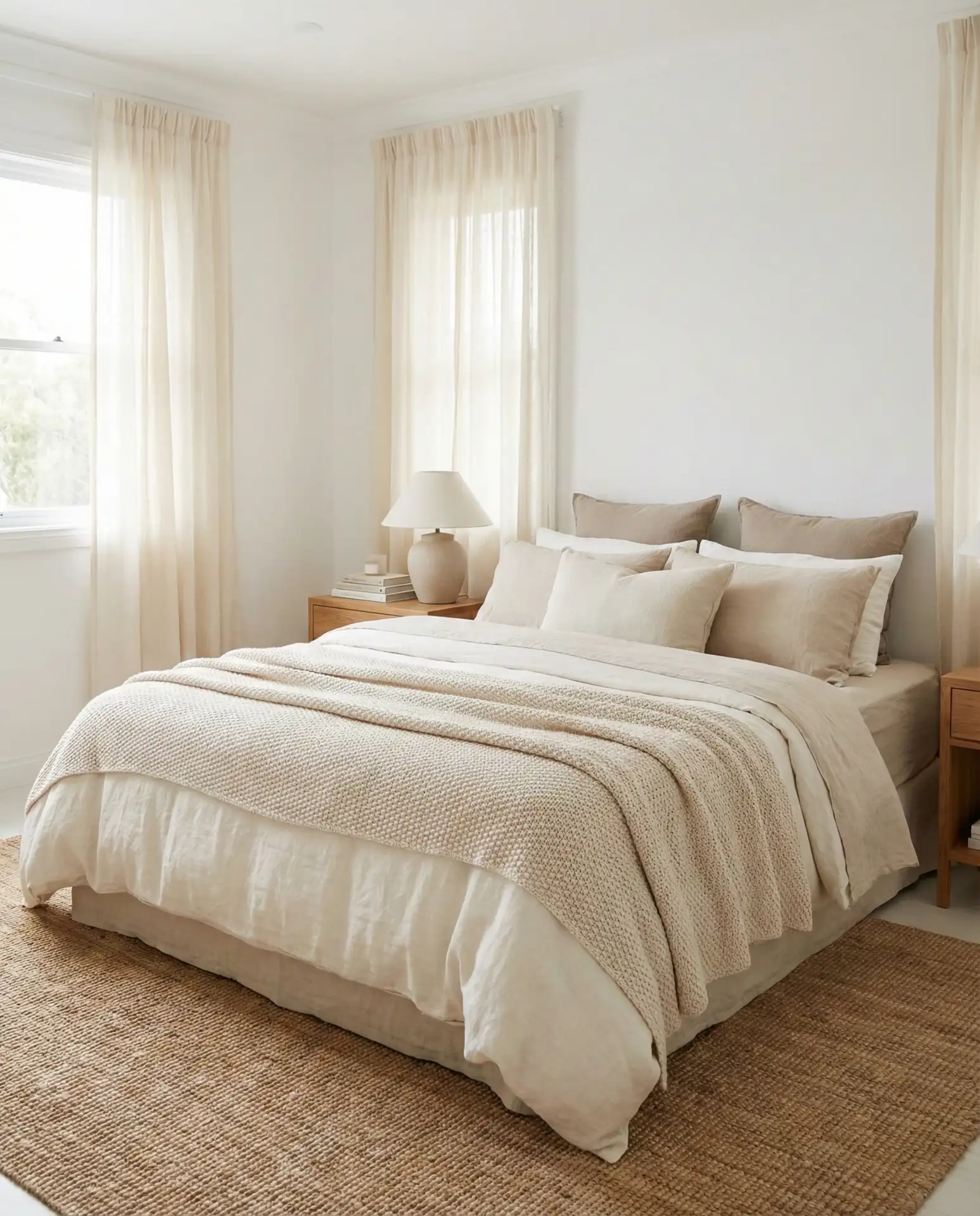
2. Beige and White Warm Minimalism
The beige and white pairing has surged in popularity as people move away from stark, cold minimalism toward something softer and more livable. This idea focuses on warm beige tones—think oatmeal, sand, and taupe—paired with bright white walls and trim. Choose a beige upholstered headboard or a simple wooden bed frame in a light oak finish. Keep furniture minimal but high-quality: a single beige linen chair in the corner, white nightstands with natural wood accents, and maybe a woven basket for storage. The result feels curated without being cluttered, calm without being clinical.
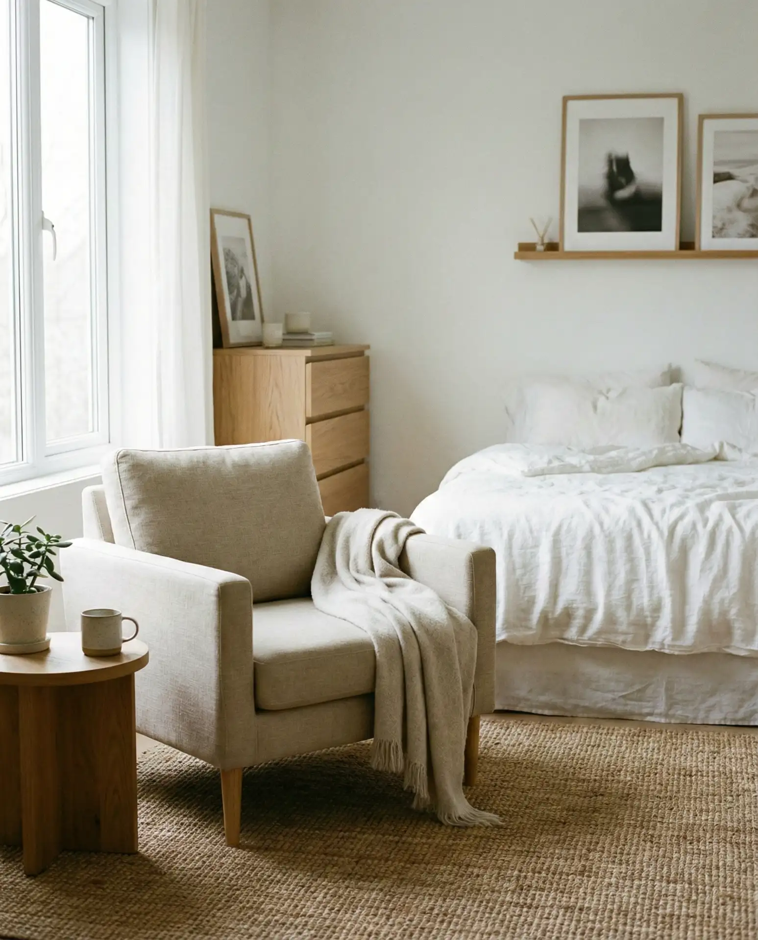
Budget-conscious decorators love this approach because beige pieces are widely available at every price point. You can find affordable beige linens at big-box stores or invest in higher-end organic cotton if that matters to you—the color hides wear better than pure white, which can yellow over time. A beige jute rug anchors the space without the expense of wool, and beige curtains in a natural fabric filter light beautifully while maintaining privacy. This palette also photographs exceptionally well, which is why it dominates Pinterest boards for bedroom makeovers.
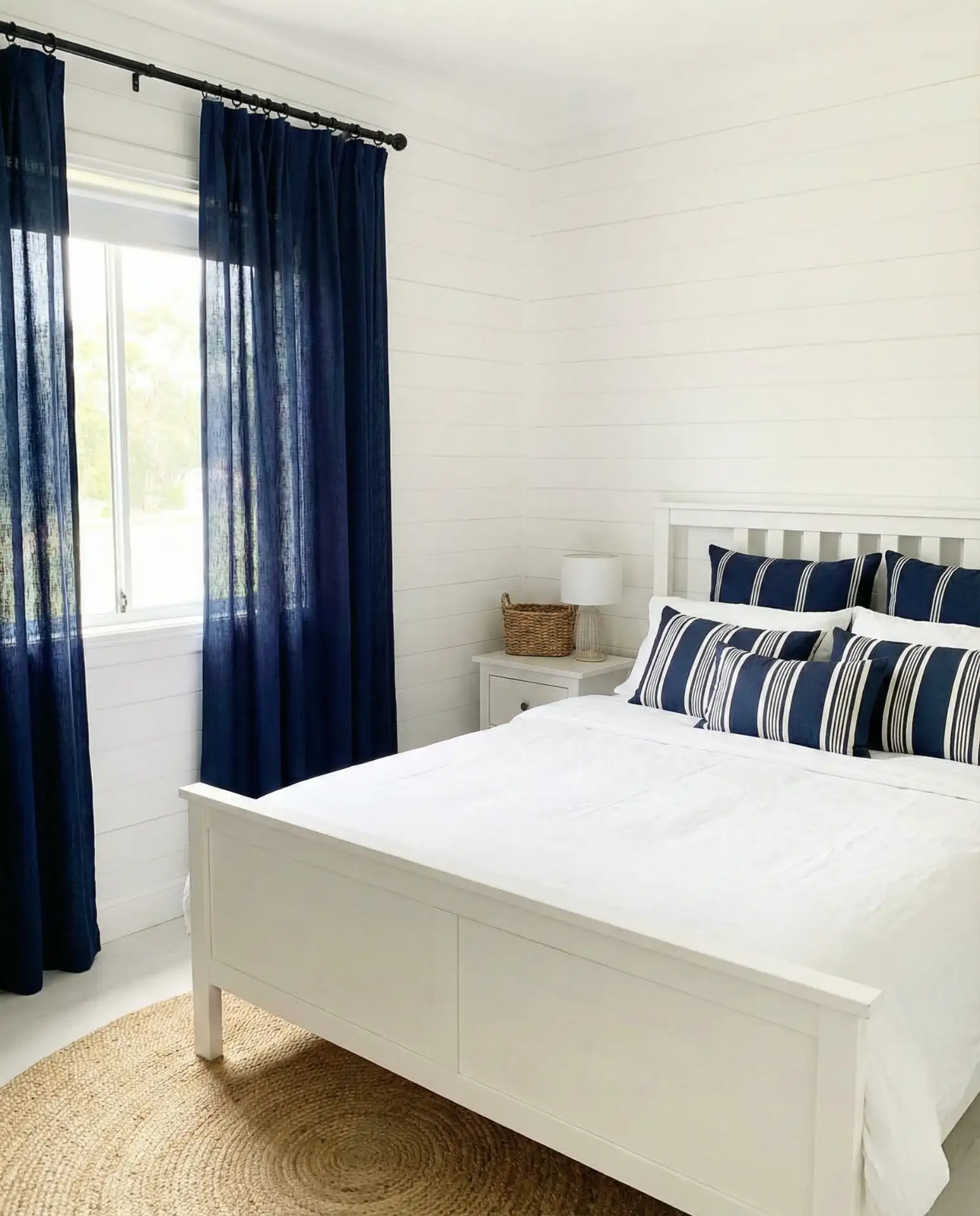
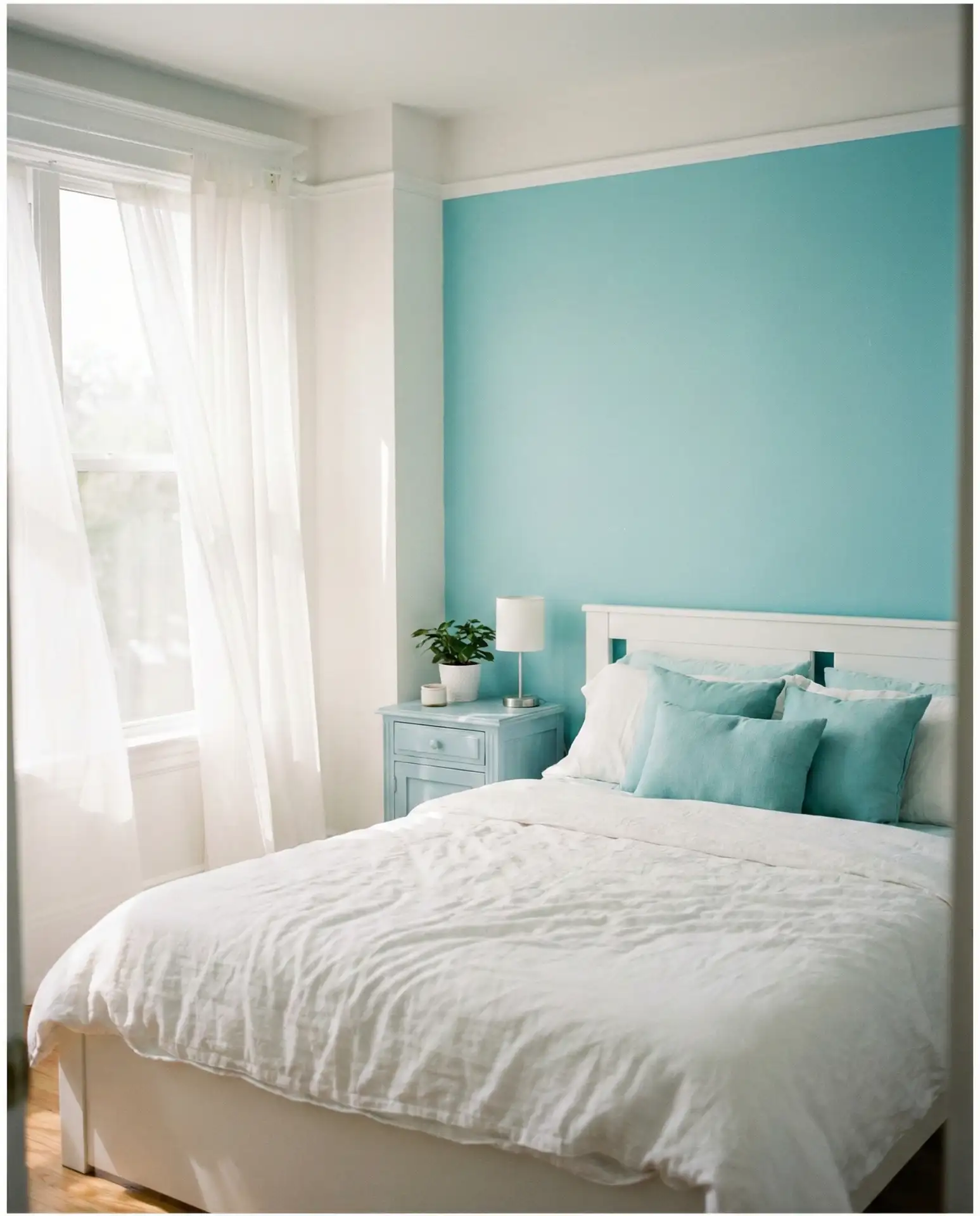
3. Navy Blue and White Coastal Contrast
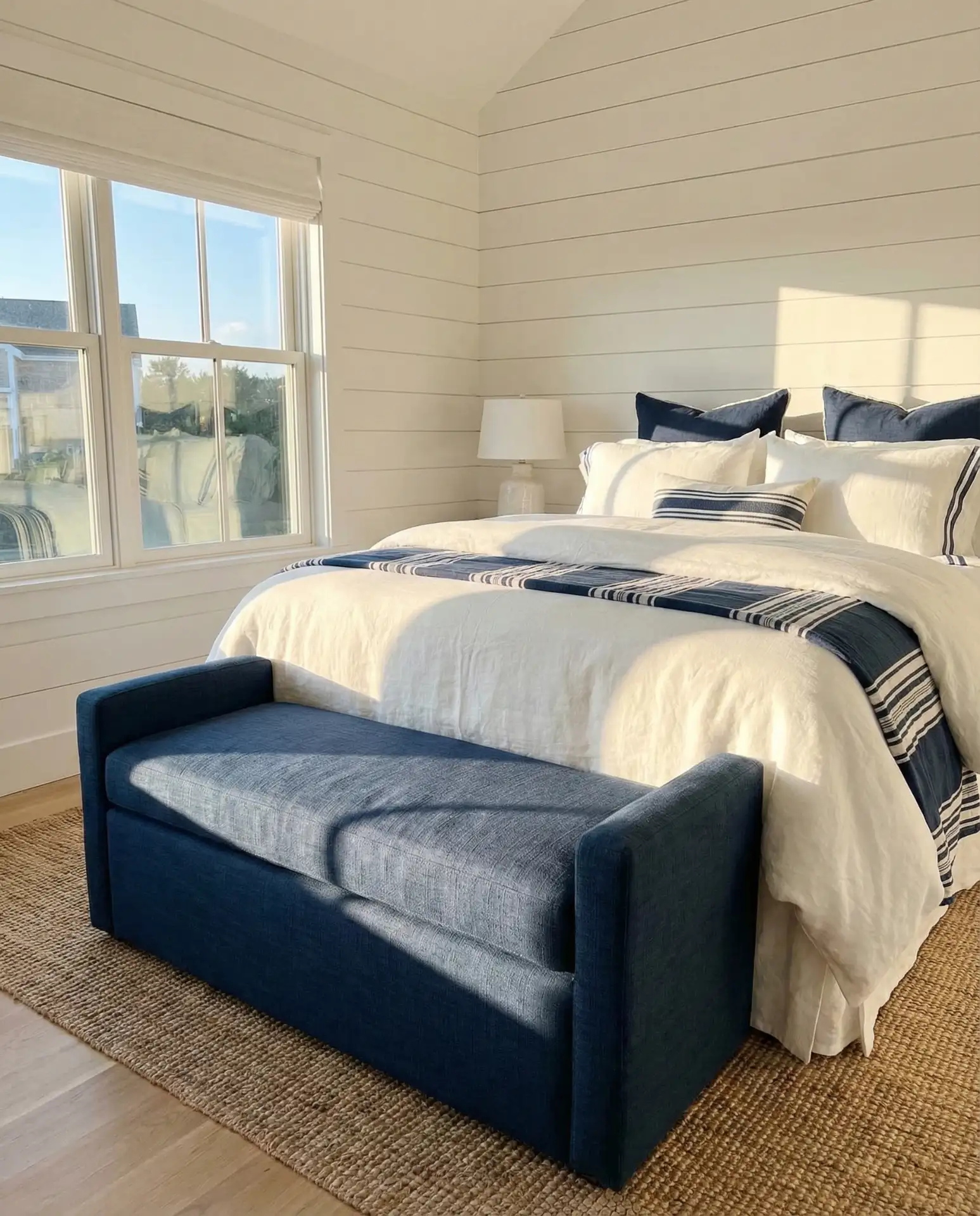
For those who want white bedrooms with real personality, navy blue accents deliver impact without overwhelming the space. Start with white walls and bedding, then introduce navy through deliberate touches: a navy throw blanket, striped navy-and-white pillows, or even a navy upholstered bench at the foot of the bed. This combination has deep roots in American coastal design—think New England cottages and California beach houses—but it translates beautifully to landlocked homes as well. The crisp contrast feels clean and sophisticated, reminiscent of classic menswear or nautical flags.
A friend recently redid her guest bedroom using this exact palette—white everything, with navy accents in the bedding and a small navy ceramic lamp. She mentioned that guests consistently comment on how restful the room feels, and she attributes it to the way navy grounds the space without making it feel heavy. If you’re worried about navy reading too dark, stick to small doses and balance them with plenty of white and natural light. This works especially well in bedrooms with good window exposure, where sunlight can play off the contrasting tones throughout the day.
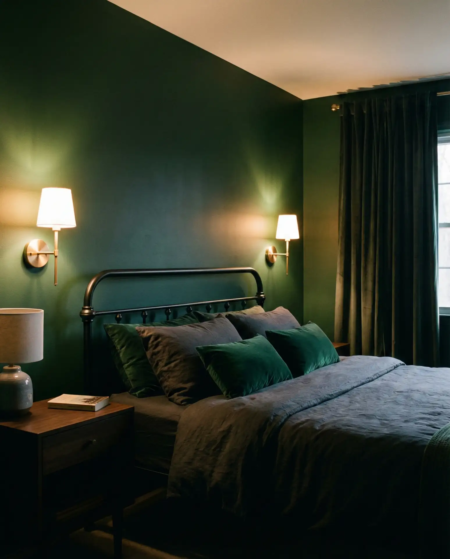
4. Sage Green and White Natural Retreat
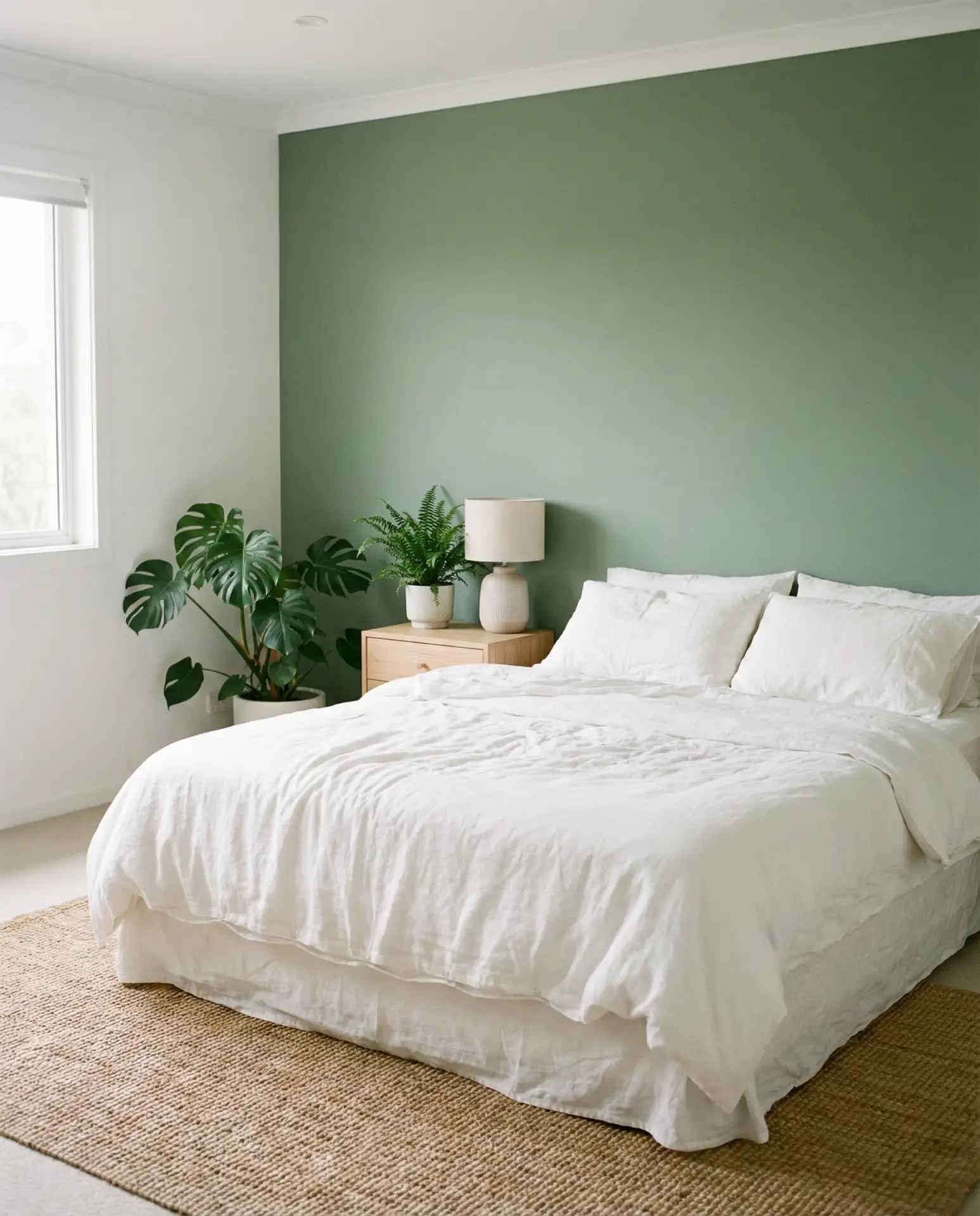
The sage green and white combination has taken over Pinterest mood boards for good reason—it brings the outdoors in while maintaining that peaceful, neutral foundation. Choose muted sage tones rather than bright or grassy greens; you want something that whispers rather than shouts. A sage green accent wall behind the bed creates a soft focal point, or if you prefer to keep walls white, bring in sage through bedding, curtains, or a vintage-style armchair. Pair these greens with natural wood furniture and plenty of white to keep the room feeling open and breathable.

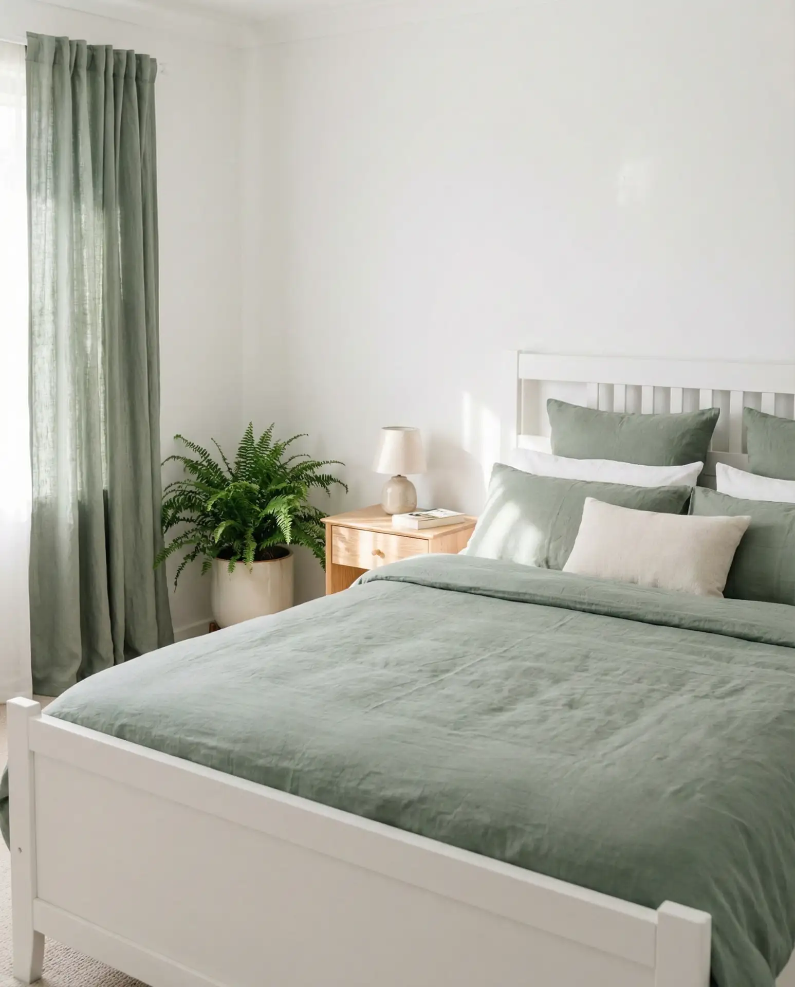
This palette works best in bedrooms that get consistent natural light—north-facing rooms can make sage look muddy, while south-facing rooms let it shine with that soft, nature-inspired glow. In the Pacific Northwest and Northeast, where greenery is abundant outside, this color brings a sense of continuity between indoor and outdoor spaces. Add live plants if you can maintain them, but even faux greenery in quality planters reinforces the botanical theme. The combination feels current but not trendy, which means it won’t look dated in a couple of years.
5. Gold and White Elegant Warmth
Adding gold and white elements brings instant sophistication to a bedroom without requiring a full renovation. The trick is using warm gold tones—brushed brass, antique gold, or soft champagne—rather than shiny yellow gold, which can feel dated. Swap out standard silver hardware for gold drawer pulls and lamp bases. A gold-framed mirror above a dresser or a pair of gold sconces flanking the bed elevates the space immediately. Keep the gold accents intentional and spaced out; too much can tip from elegant into gaudy, but just enough creates a sense of thoughtful luxury.
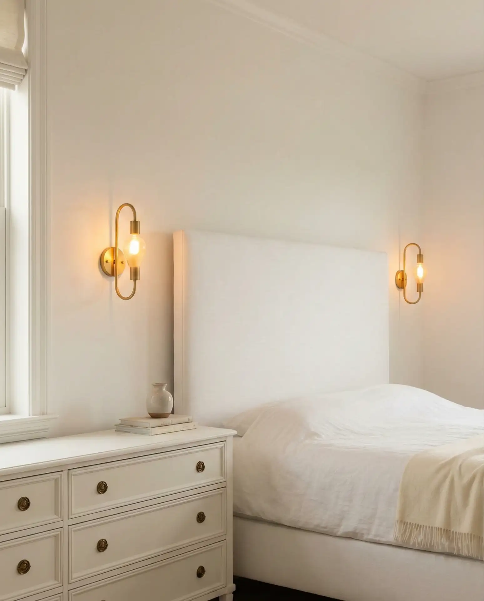
Real homeowners often make the mistake of mixing metal finishes haphazardly—chrome here, brass there, nickel somewhere else—which disrupts the cohesive feel. If you commit to gold accents, carry that choice throughout the room: curtain rods, picture frames, and even the base of a table lamp. This doesn’t mean everything must match perfectly, but keeping metals within the same warm family creates visual harmony. It’s one of those details that non-designers might not consciously notice, but it contributes to that “pulled together” feeling that makes a room feel professionally styled.
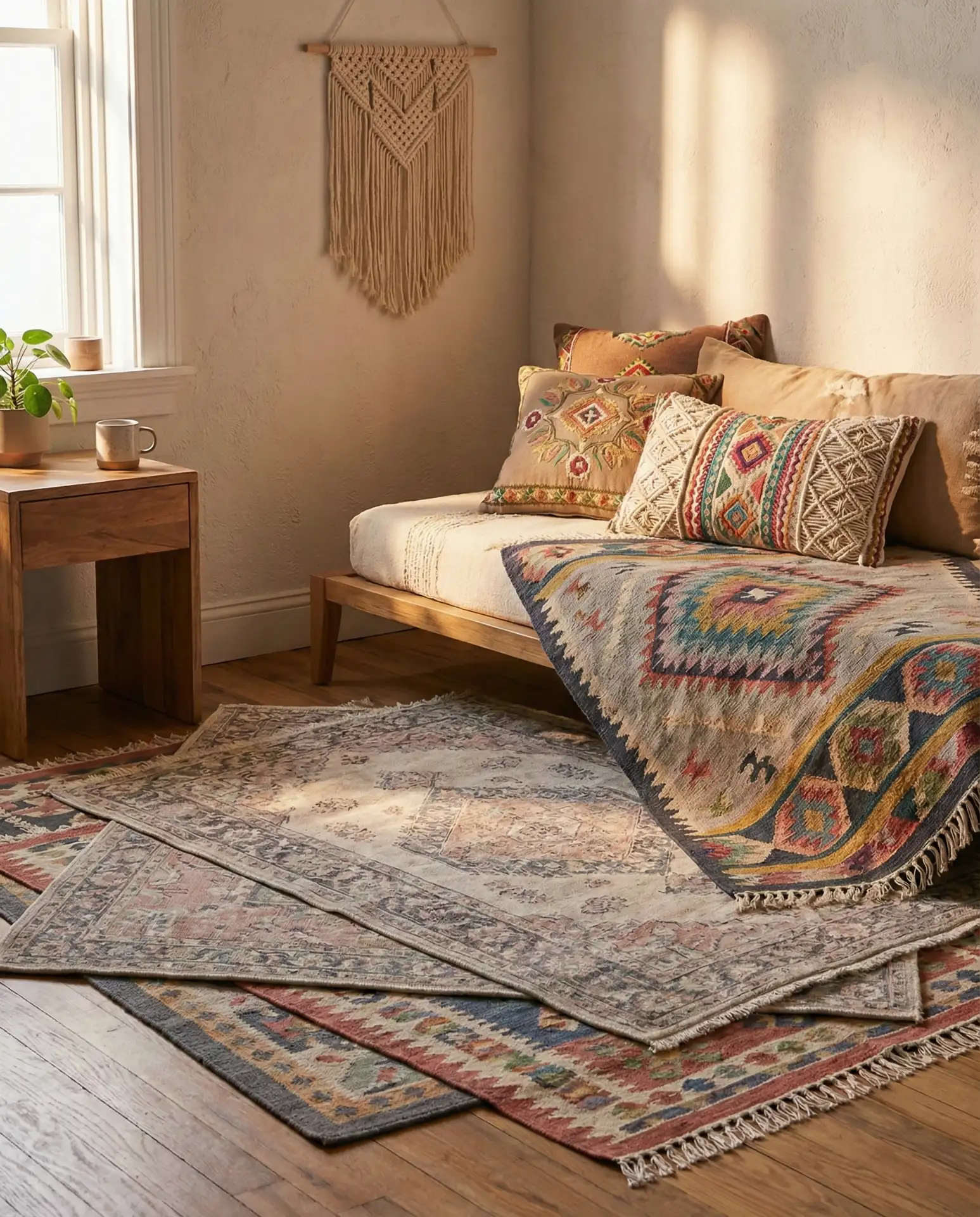
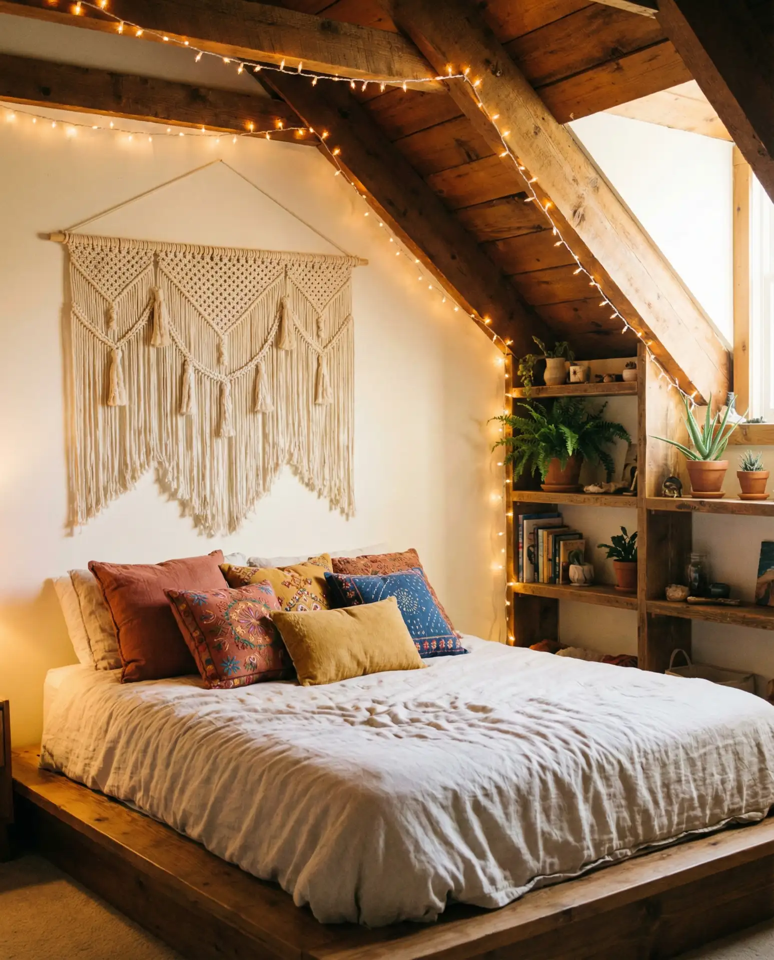
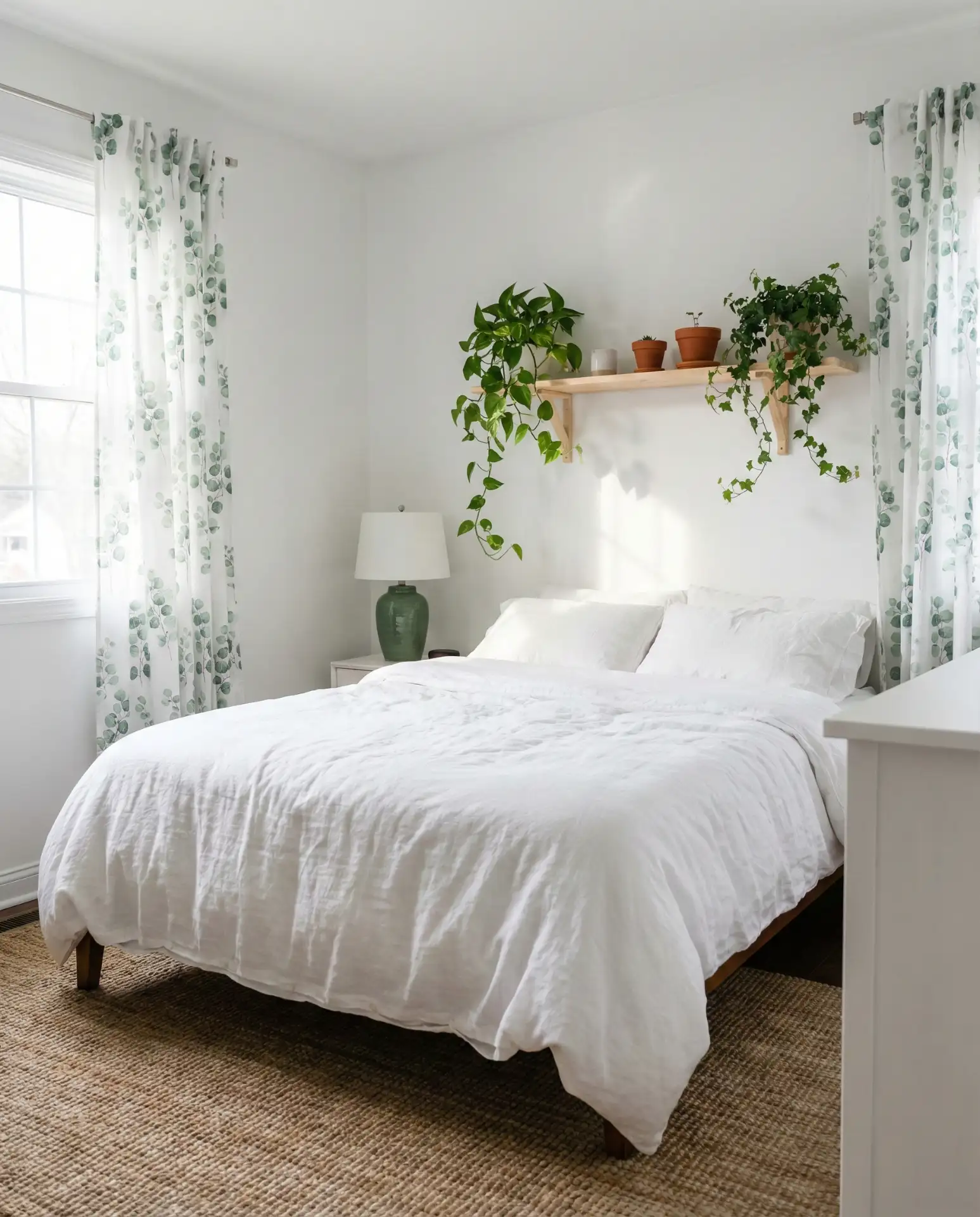
6. Cozy White Textured Sanctuary
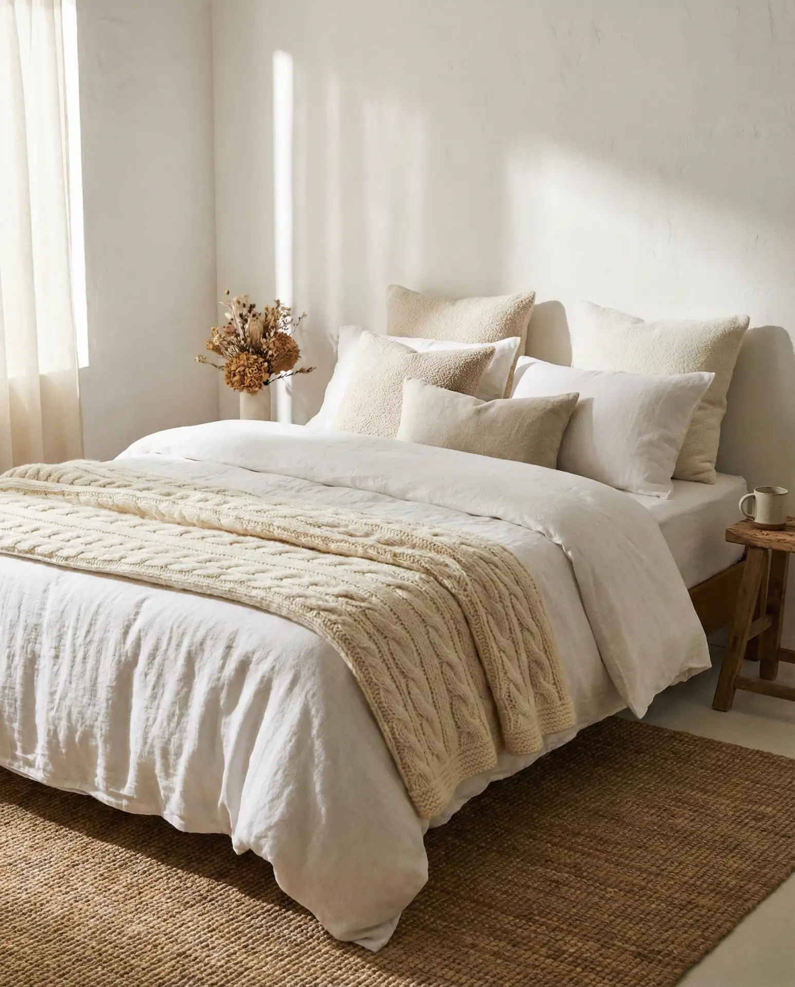
A cozy white bedroom isn’t about adding color—it’s about layering texture until the space feels enveloping and warm. Think chunky knit throws, linen curtains, a sheepskin rug beside the bed, and maybe a woven wall hanging above the headboard. The variety in textures catches light differently throughout the day, creating subtle shifts in how the room feels. Nubby fabrics, soft weaves, and natural fibers all contribute to a tactile experience that makes the bedroom feel like a true retreat. This approach is especially popular in colder climates where the bedroom needs to feel like a haven during long winters.
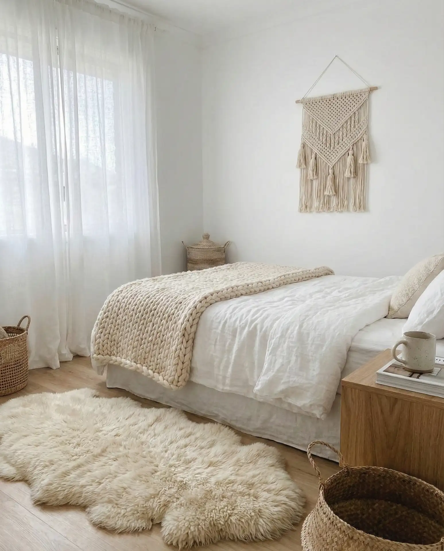
In regions like the Midwest and Northeast, where winters can be brutal, this textured-white approach shows up frequently in updated farmhouses and suburban homes. Homeowners appreciate that they can change out individual pieces seasonally—swap the chunky knit for a lightweight cotton throw in summer—without altering the core design. The all-white base also means you’re never locked into a specific color scheme if your tastes change. It’s a flexible foundation that adapts to your evolving style while maintaining that essential coziness factor year-round.
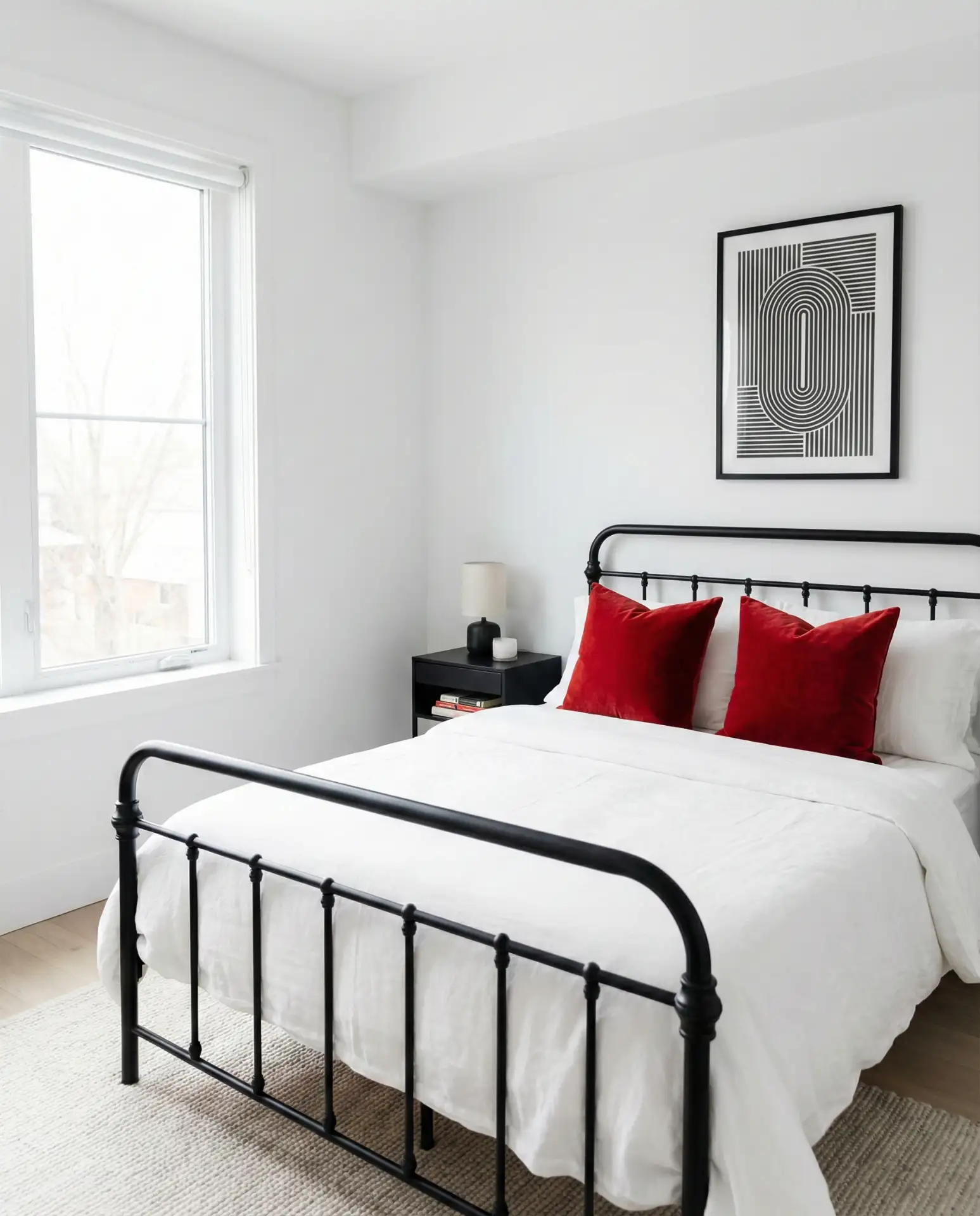
7. Black and White Graphic Drama
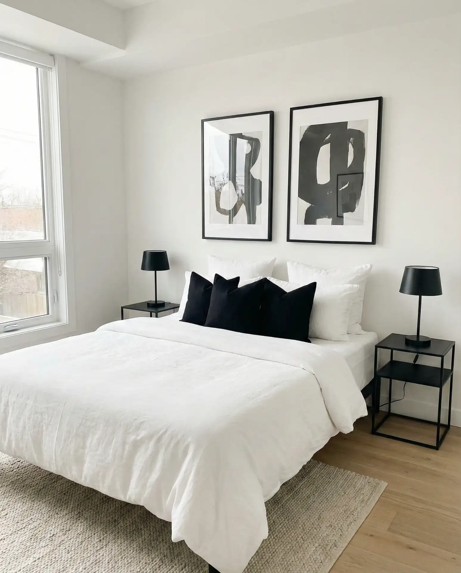
For those who find pure white bedrooms too soft, introducing black and white graphic elements creates instant architectural drama. This could mean black window frames against white walls, a black metal bed frame, black-and-white photography in simple black frames, or even black bedside lamps. The high contrast sharpens the space and gives it a modern, gallery-like quality. This style works particularly well in loft-style apartments or contemporary homes where clean lines and bold statements are part of the overall design language. It’s also forgiving of imperfections—small wall dings or uneven paint don’t show up as much when you have strong contrast drawing the eye.
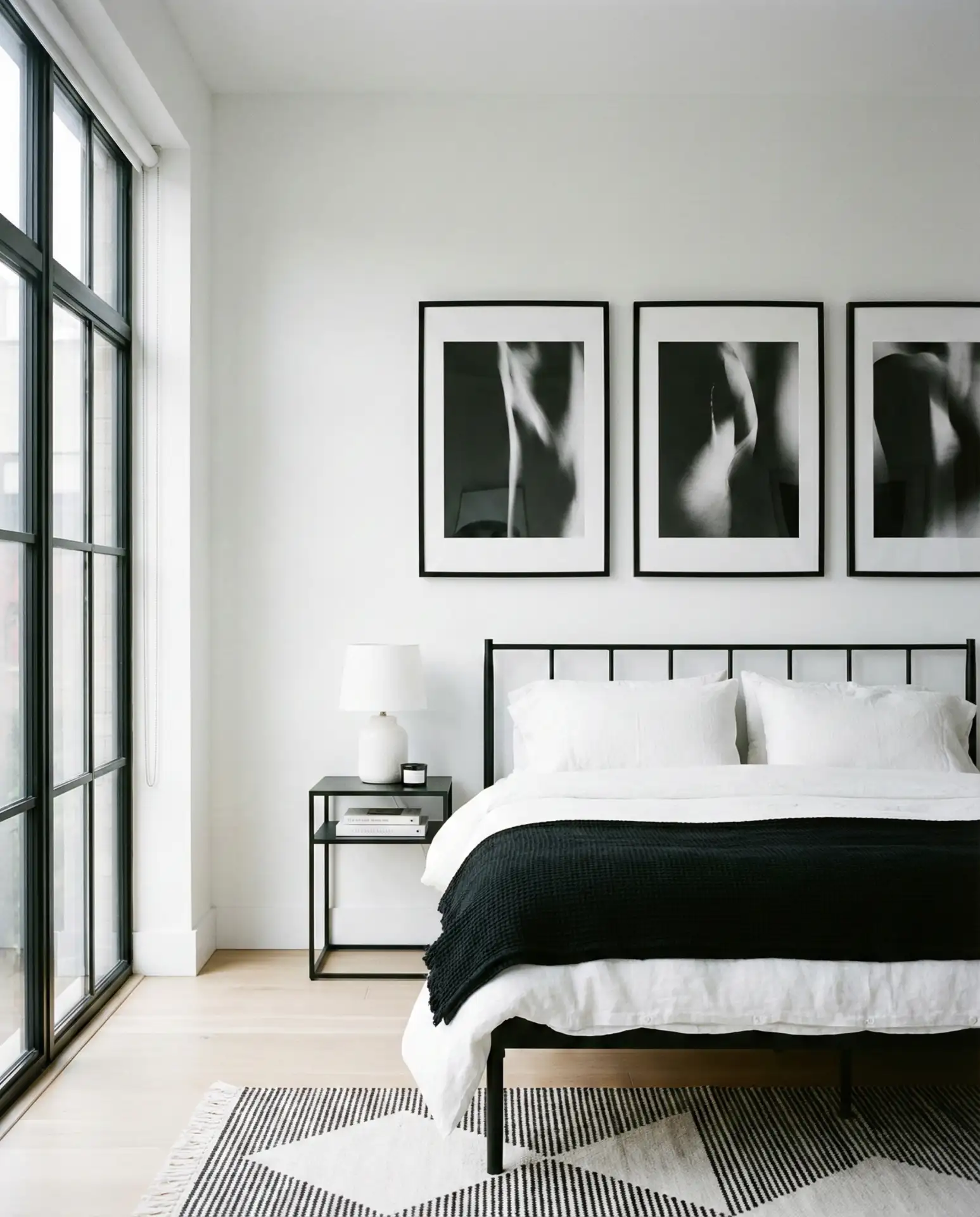
Design experts often point out that black-and-white schemes require careful balance—too much black can make a bedroom feel heavy or confined, especially in smaller rooms with limited natural light. The general rule is to use black as punctuation rather than a dominant color: 10-20% black against 80-90% white keeps the space feeling open while adding that graphic punch. Consider matte black finishes rather than glossy ones; they read more sophisticated and are easier to maintain without showing every fingerprint and smudge. This look photographs beautifully, which explains its popularity on visual platforms like Pinterest and Instagram.
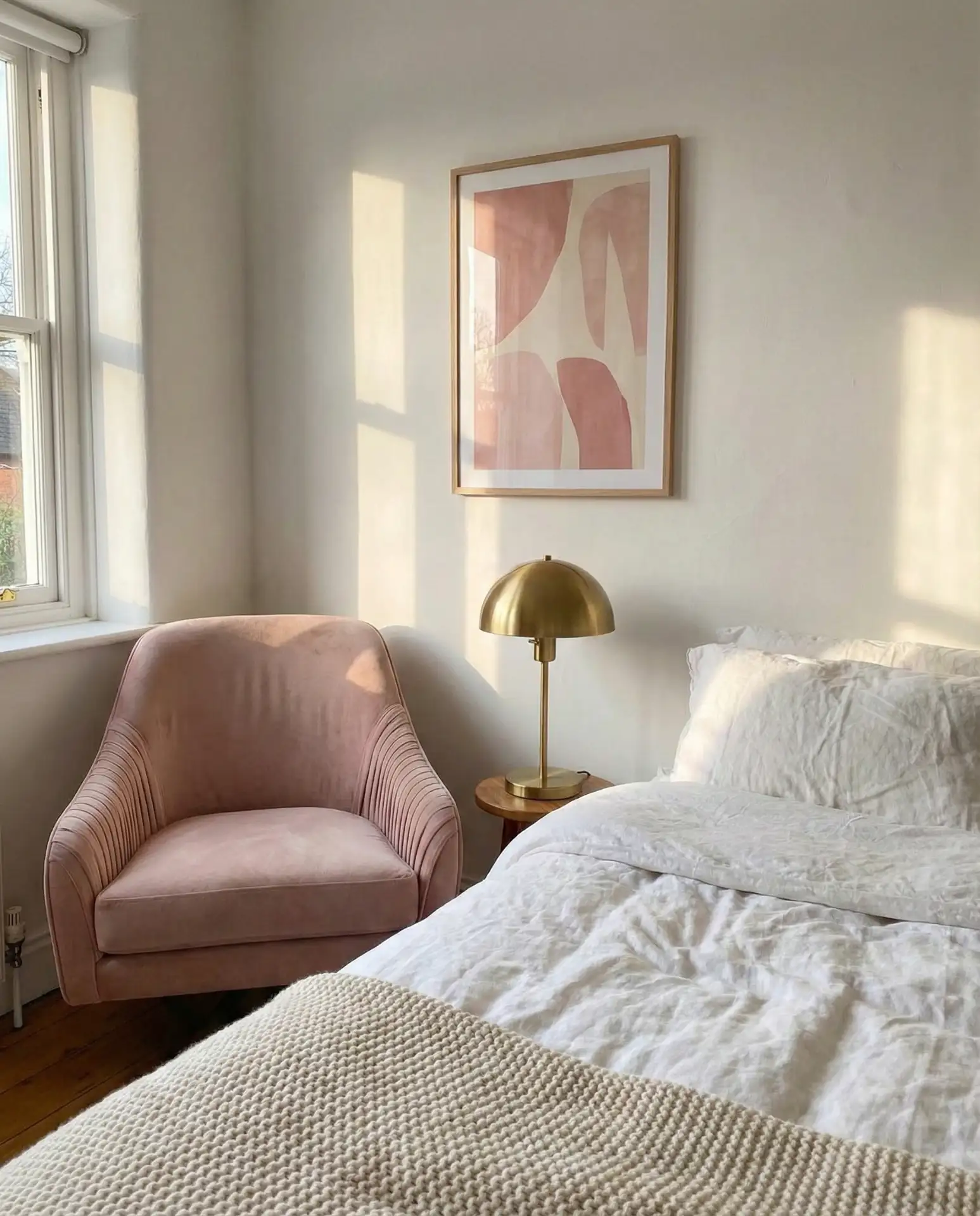
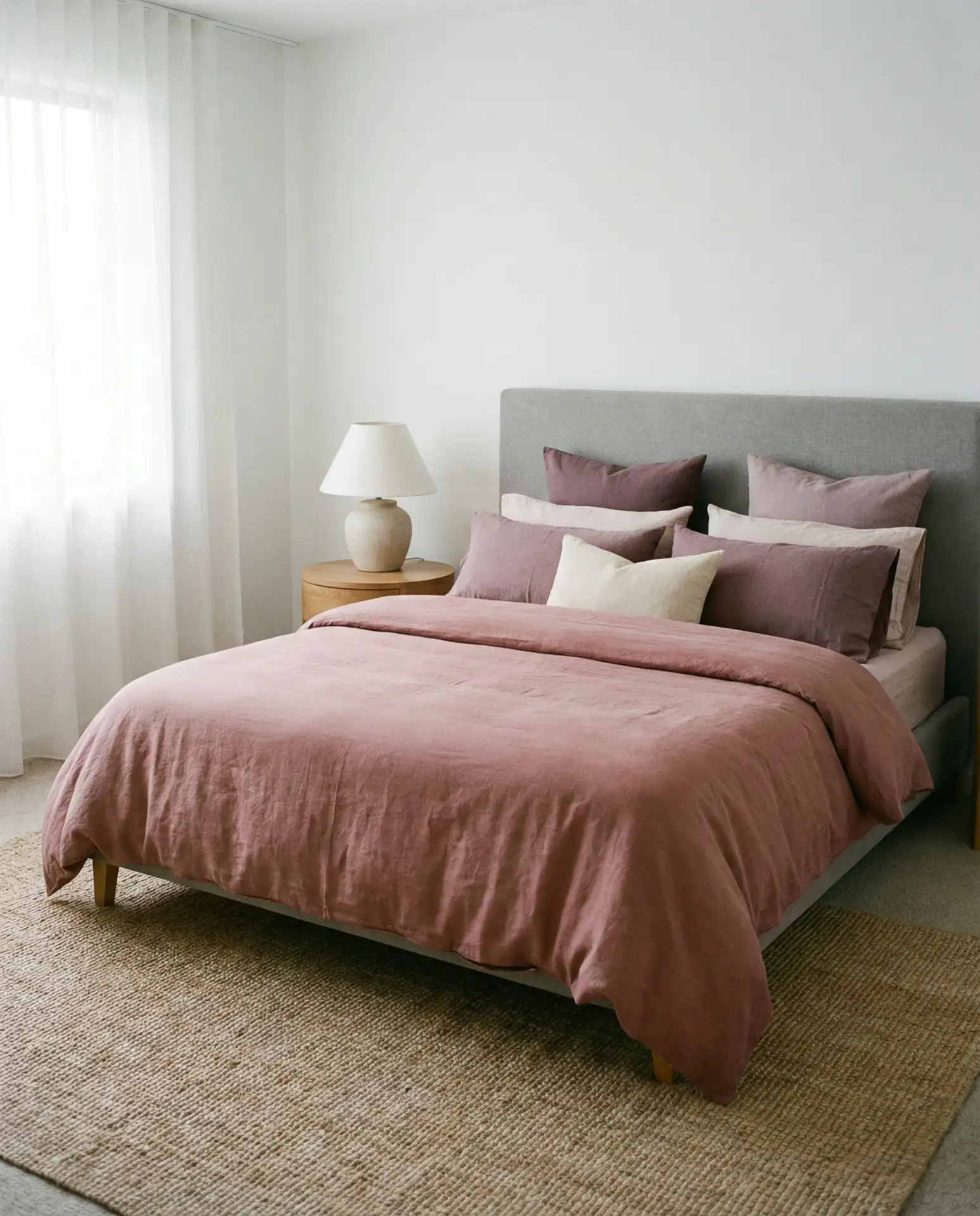
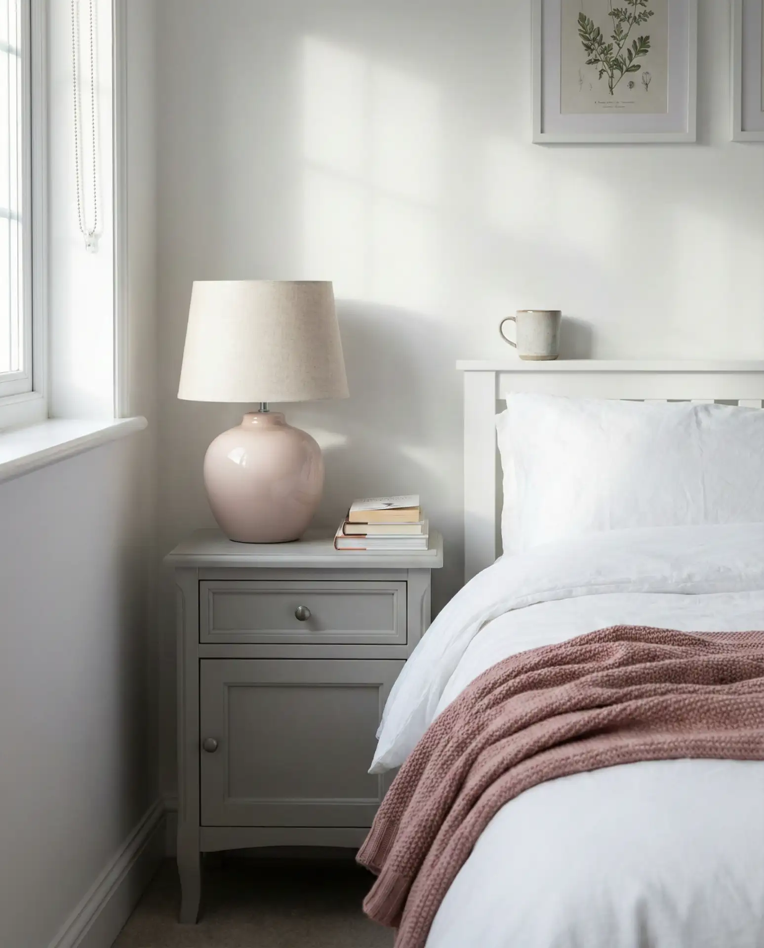
8. Pink and White Soft Romance
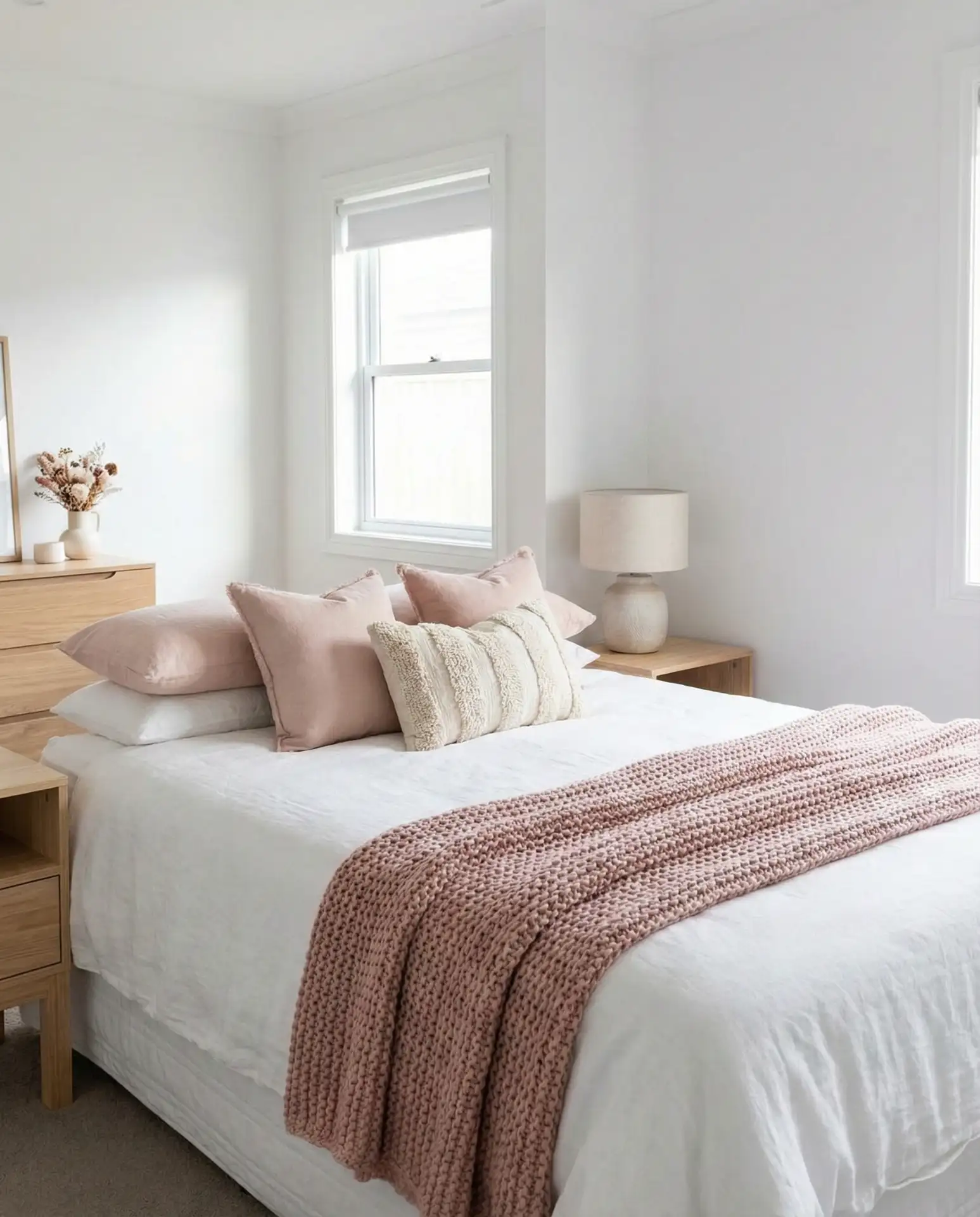
The pink and white bedroom has evolved far beyond little-girl aesthetics—in 2026, it’s about dusty rose, blush, and terracotta pinks that feel mature and calming. Start with white walls and white bedding, then introduce pink through artwork, a single accent chair, or a soft pink throw blanket. Dusty pink pairs beautifully with natural wood tones and brass accents, creating a warm, inviting atmosphere that doesn’t read as overtly feminine. This palette works across ages and style preferences, from young professionals to empty-nesters looking to refresh their primary bedroom with something a little softer than pure neutrals.
A common mistake with pink bedrooms is choosing shades that are too bright or candy-colored, which can feel jarring against stark white. The key is selecting muted, earthy pinks that have some grey or brown undertones—these read as sophisticated rather than juvenile. Test paint samples or fabric swatches in your actual bedroom lighting before committing; what looks perfect in a store can shift dramatically in different light conditions. Northern light, for instance, can make pink look surprisingly cool and grey, while southern exposure brings out the warmth. Taking the time to get the shade right makes all the difference in achieving that soft, romantic feel you’re after.
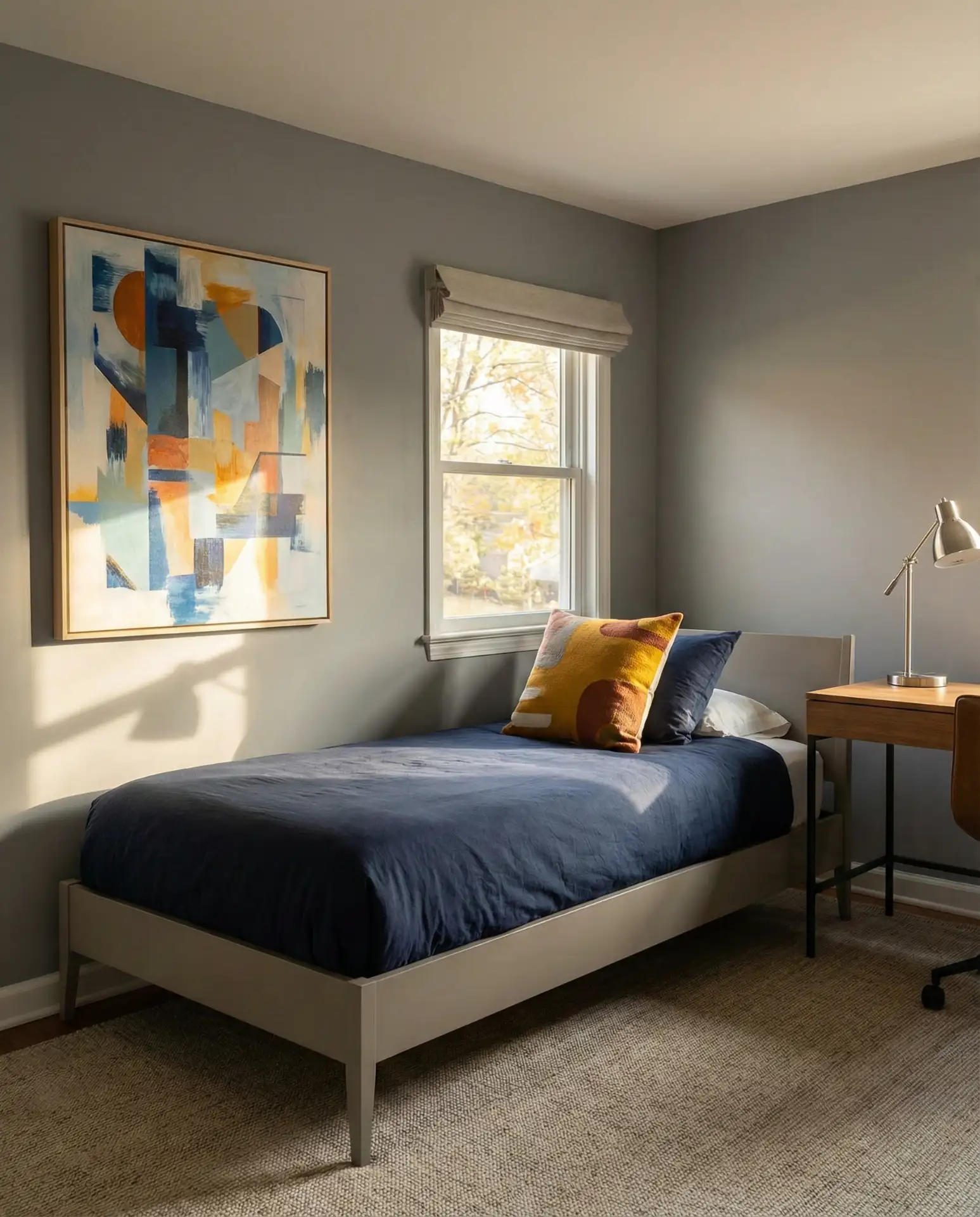
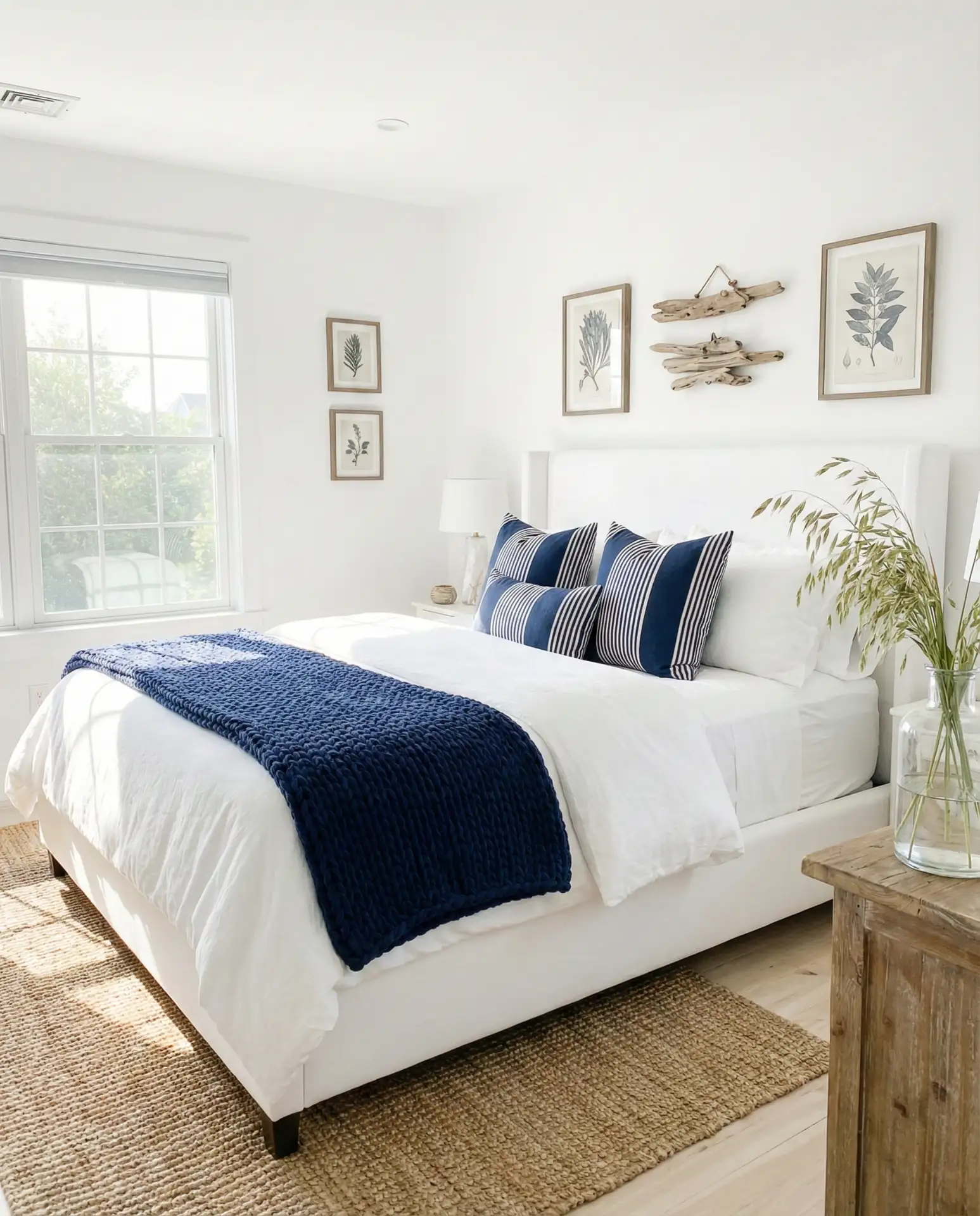
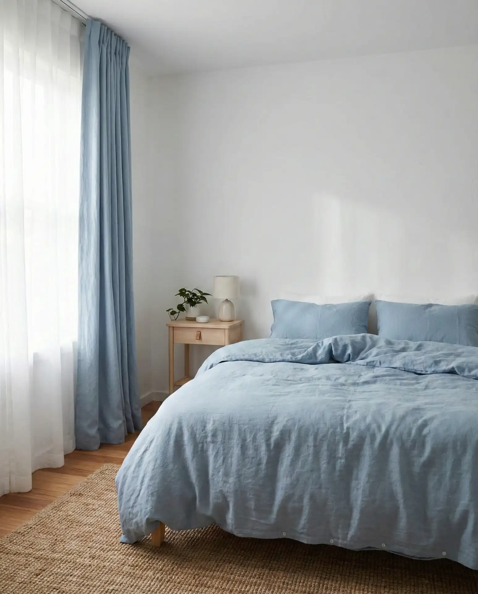
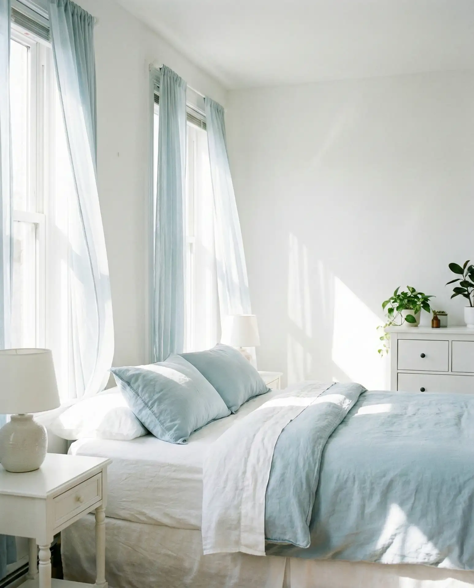
9. Blue and White Serene Simplicity

The blue and white pairing remains one of the most versatile color combinations for bedrooms, working equally well in traditional and modern settings. Choose your blue carefully—powder blue for something soft and vintage-inspired, slate blue for a more contemporary feel, or even a muted teal if you want something with a bit more personality. Keep the majority of the room white, using blue as an accent color in bedding, curtains, or a single painted piece of furniture. This combination has a naturally calming effect, which sleep researchers have noted makes it ideal for bedrooms where rest is the primary goal.
In rental situations where painting walls isn’t an option, the blue-and-white scheme offers maximum flexibility. You can achieve the look entirely through textiles and accessories, which means you can take everything with you when you move. Affordable options abound—blue-and-white striped bedding, blue throw blankets, and even simple blue glass vases or picture frames all contribute to the palette without requiring permanent changes. This makes it a favorite among younger Americans who move frequently but still want their bedrooms to feel intentional and put-together rather than haphazard.
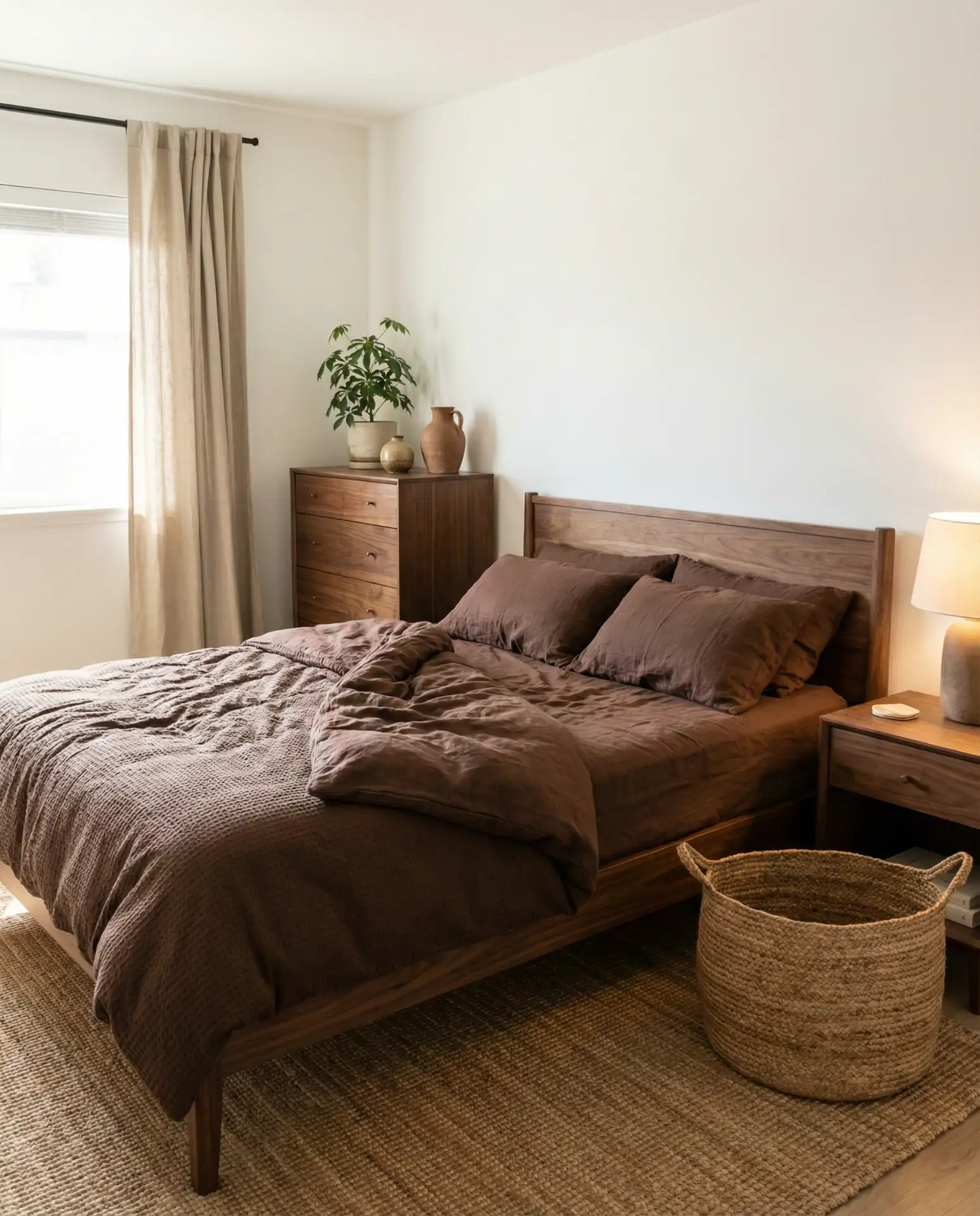
10. Brown and White Earthy Foundation
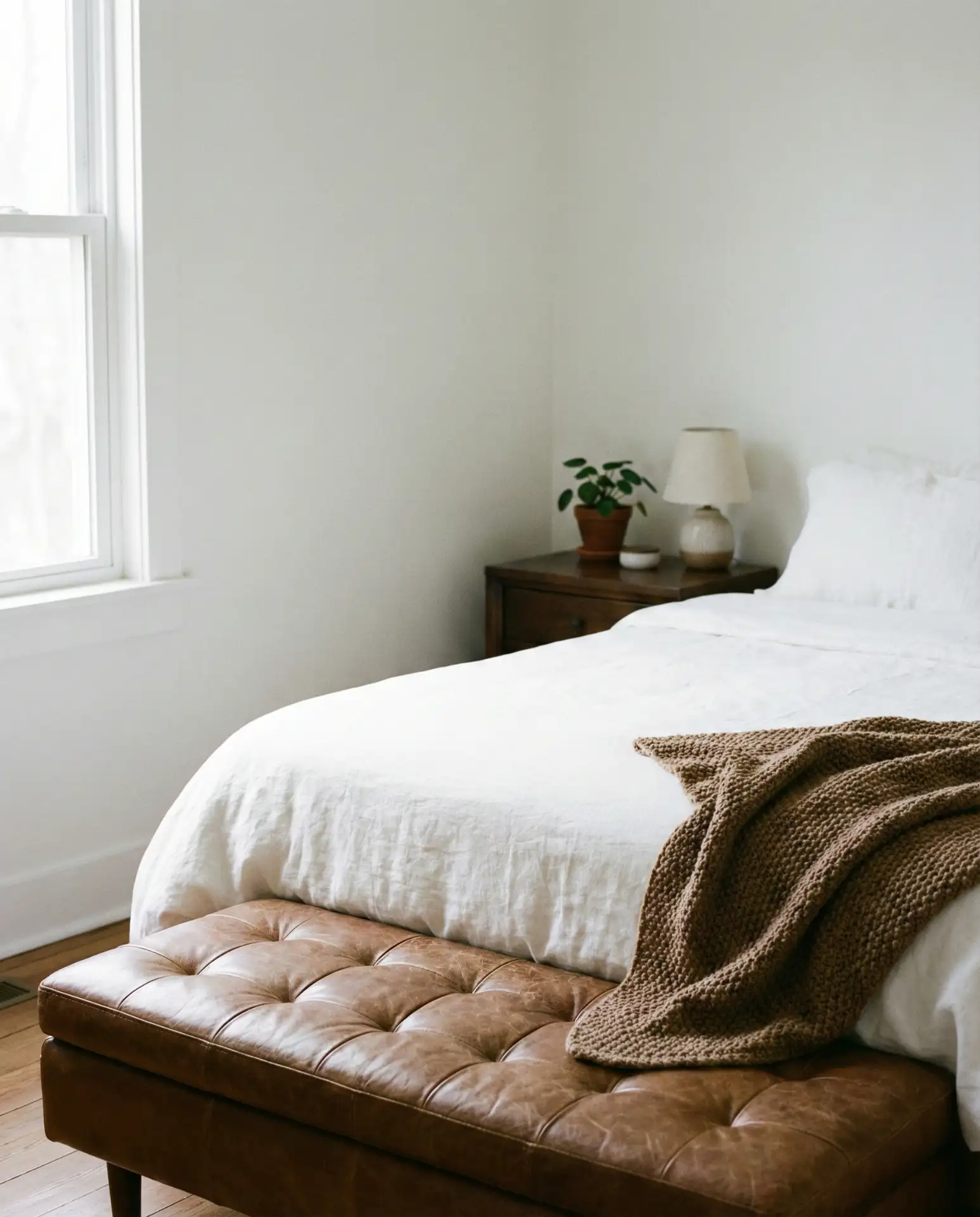
The brown and white combination grounds a bedroom in a way that feels both timeless and very current. Think rich walnut furniture against white walls, a chocolate brown linen duvet on a white bed, or woven brown leather accents in the form of a bench or storage basket. This palette draws from nature—tree bark, soil, and stone—which creates an inherently calming environment. It’s especially effective in bedrooms with wood floors, where the brown tones can tie together the flooring and furniture into a cohesive whole. Unlike trendy colors that come and go, brown remains a classic neutral that won’t feel dated in five years.
Budget-conscious shoppers can build this look gradually since brown furniture and accessories are readily available at every price point, from big-box stores to high-end boutiques. A vintage dresser in dark wood can be found at estate sales for a fraction of retail prices, and brown textiles—throws, pillows, and curtains—are staples at home goods stores. The white backdrop means you don’t need to worry about matching exact shades of brown; varied tones from caramel to espresso all work together when anchored by white walls and bedding. This flexibility makes the brown-and-white palette practical for real-life decorating where budgets and timelines vary.
11. Aesthetic White Minimalist Haven
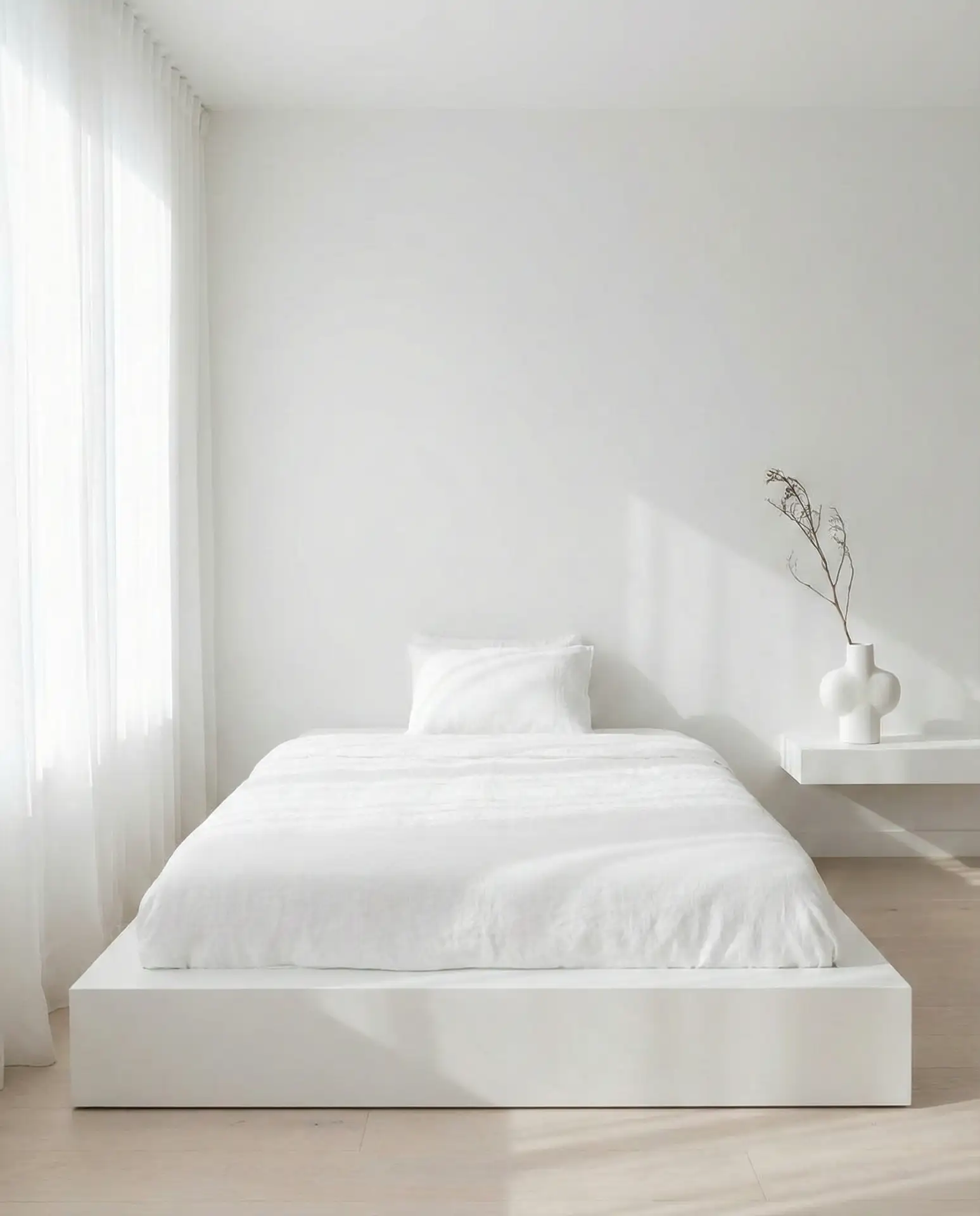
The term “aesthetic white bedroom” has become shorthand for a specific style popularized on social media—clean lines, minimal clutter, carefully curated objects, and an overall sense of intentional simplicity. This means selecting only furniture that serves a clear purpose, keeping surfaces mostly clear, and choosing décor items that genuinely bring you joy rather than filling space. White walls, white bedding, and simple white furniture create the foundation, while one or two statement pieces—a unique lamp, a piece of art, or a sculptural vase—provide personality. The goal is a room that photographs beautifully but also functions peacefully as a real living space.
Where this approach works best is in smaller urban bedrooms where space is at a premium—the minimal furniture and light palette make rooms feel significantly larger. In cities like New York, San Francisco, and Boston, where square footage comes at a premium, the aesthetic white bedroom maximizes the sense of space and air. It’s also incredibly popular among younger homeowners who are drawn to that Instagram-worthy look but appreciate the practical benefits of having less stuff to clean and organize. The style requires discipline to maintain—resisting the urge to accumulate clutter—but those who commit to it often report feeling genuinely more relaxed in their bedrooms.
12. Green and White Botanical Balance
A green and white bedroom brings the restorative qualities of nature indoors, creating a space that feels fresh and rejuvenating. This could mean literal plants—potted ferns, trailing pothos, a fiddle-leaf fig in the corner—or green accents through textiles and décor. Consider forest green velvet pillows against white bedding or eucalyptus-printed curtains framing white walls. The green doesn’t need to be overwhelming; even small touches like a green throw blanket or green-spined books on a nightstand contribute to the botanical feeling. This palette has particular appeal in urban environments where access to green space is limited, bringing a bit of that outdoor calm into the bedroom.
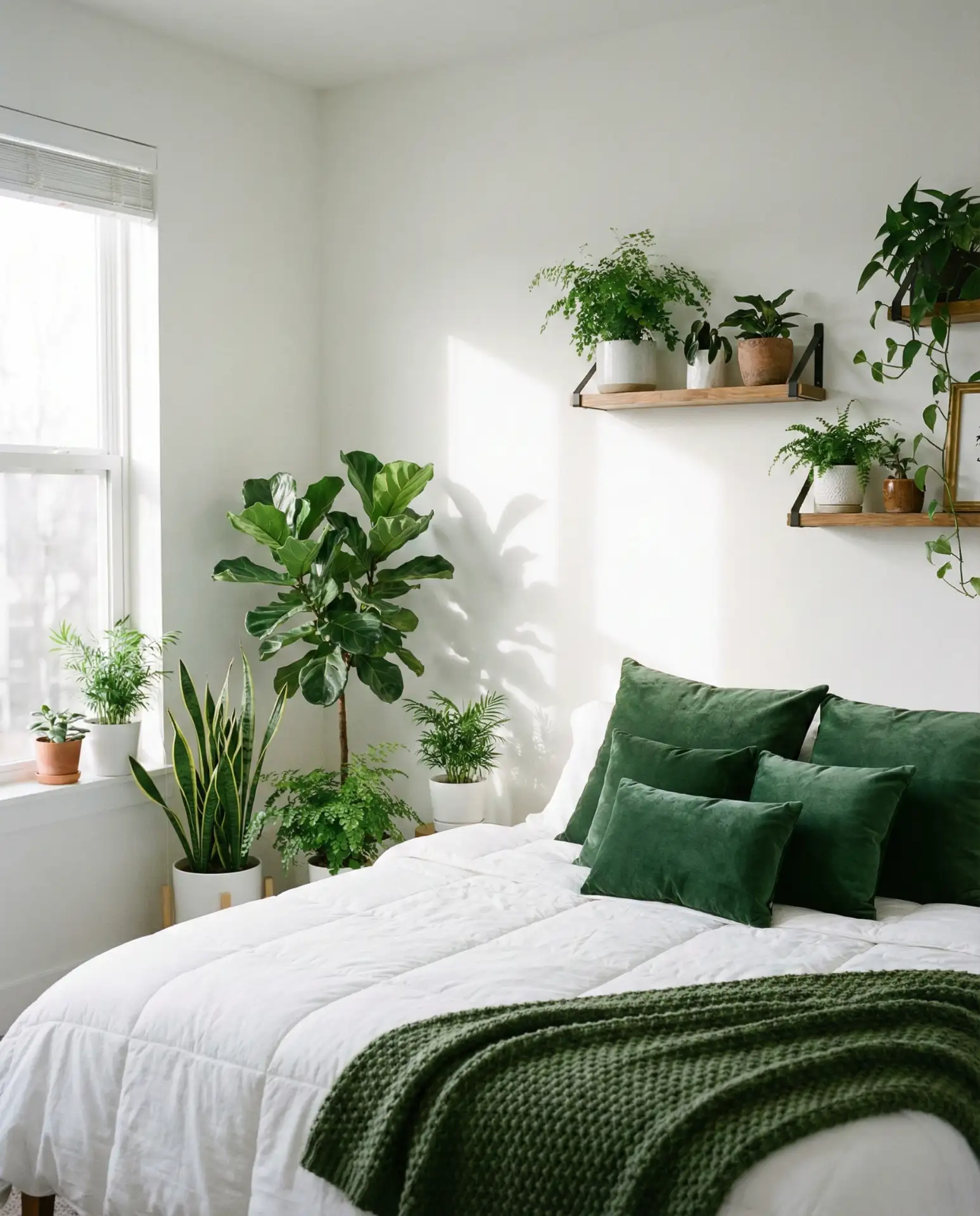
One practical consideration: real plants require maintenance, so if you travel frequently or lack a green thumb, high-quality faux plants have come a long way in recent years. The key is choosing faux greenery that looks realistic—avoid anything too shiny or unnaturally colored. Place them where real plants would logically thrive, near windows or in well-lit corners, to maintain the illusion. Even faux plants contribute to the psychological benefits of biophilic design, which research suggests can reduce stress and improve mood. Combined with white walls and natural light, the green-and-white palette creates a bedroom that genuinely supports well-being.
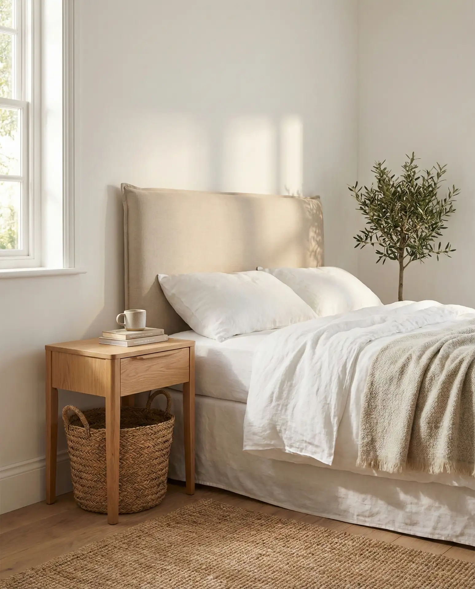
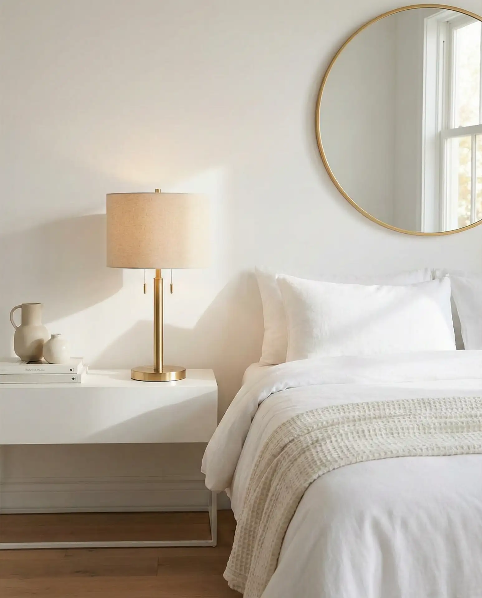
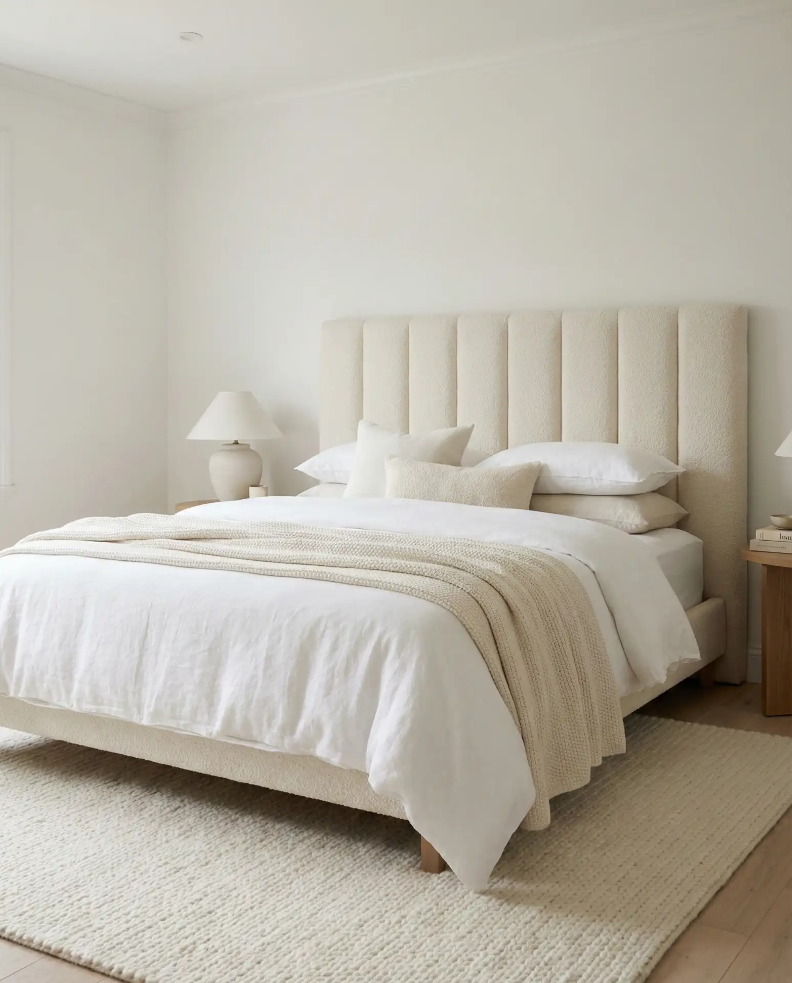
13. Off-White Tonal Warmth
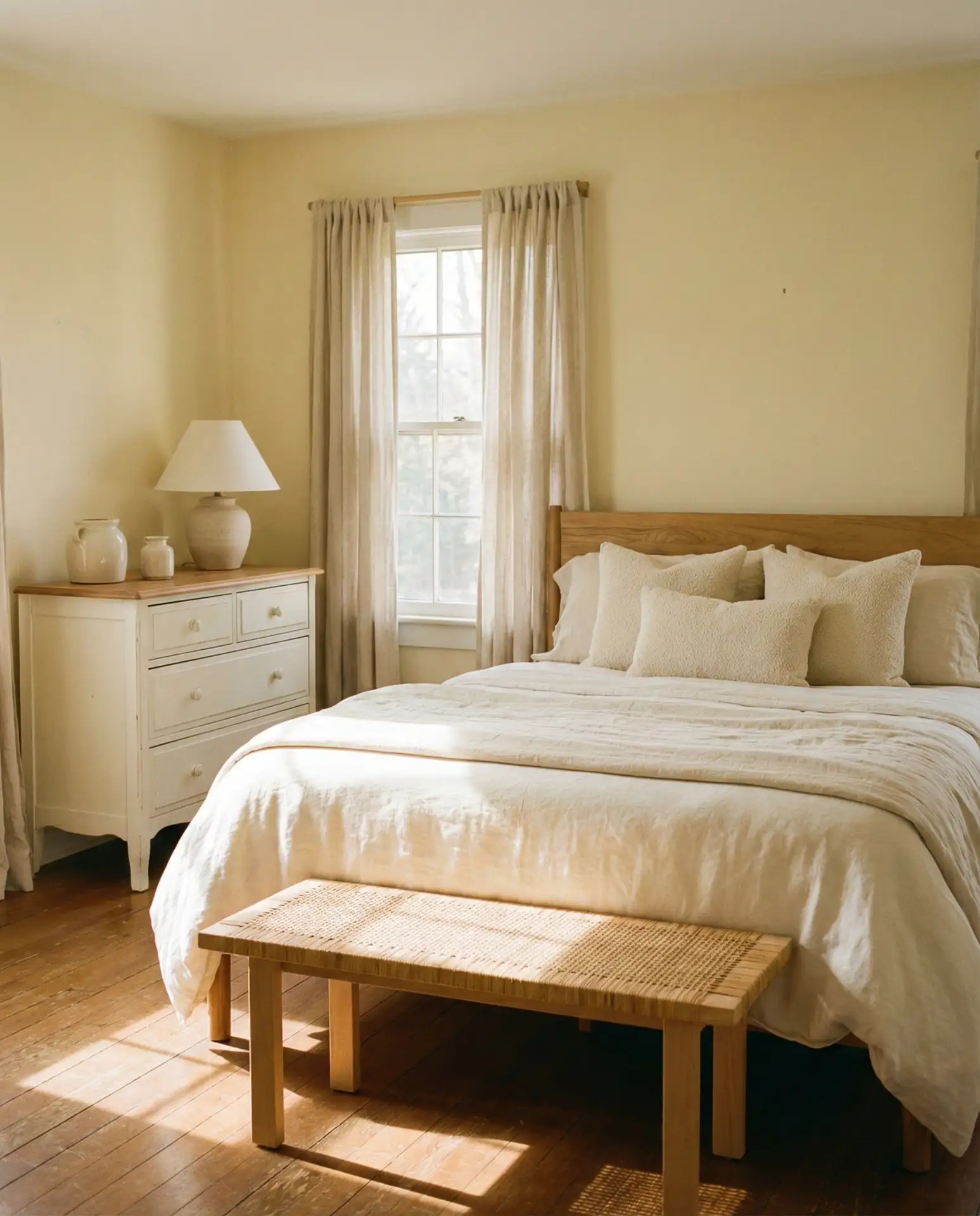
An off-white bedroom moves away from bright, stark white toward warmer, creamier tones that feel immediately more inviting. This means choosing paint colors with names like “linen white,” “Swiss coffee,” or “alabaster” rather than pure white. Pair these warm whites with cream-colored bedding, ivory curtains, and furniture in light woods or painted finishes that have a slight yellow or peachy undertone. The result is a room that feels enveloping and gentle rather than clinical. This approach is particularly popular in older homes where pure white can feel too modern or harsh against vintage architectural details like crown molding or wood trim.
In regions with cold winters—think the Upper Midwest and northern New England—off-white bedrooms provide psychological warmth that pure white can’t match. The subtle yellow or cream undertones trick the eye into perceiving the room as physically warmer, which matters when you’re waking up to frost on the windows. This palette also has the practical advantage of being more forgiving with aging textiles; cream-colored sheets show stains less readily than bright white ones, and off-white walls hide minor scuffs better than stark white paint. It’s a choice that balances aesthetics with real-world livability.
14. Grey-Pink Subtle Sophistication
The grey-pink combination offers a grown-up take on pink bedrooms, where the grey tones down any potential sweetness into something more sophisticated. Start with white walls and add a grey upholstered headboard or grey painted furniture. Layer in pink through dusty rose bedding or mauve accent pillows, keeping the pinks muted rather than bright. The grey grounds the pink, preventing it from feeling too feminine or juvenile, while the pink softens the grey, keeping it from reading as cold or industrial. This balanced palette appeals to a wide range of tastes and works in both modern and traditional bedroom settings.
Real homeowner behavior shows that grey-pink bedrooms tend to have longer lifespans than more boldly colored schemes—people get tired of bright colors more quickly, but these muted tones stay appealing year after year. The palette also transitions easily through different life stages; what works for a young professional’s first apartment can adapt to a family home’s guest room and eventually to a retiree’s downsized condo. Adding or removing pink elements adjusts the mood without requiring a complete redesign, which makes this a smart choice for people who want a bedroom that can evolve with them over time.
15. Purple and White Regal Calm
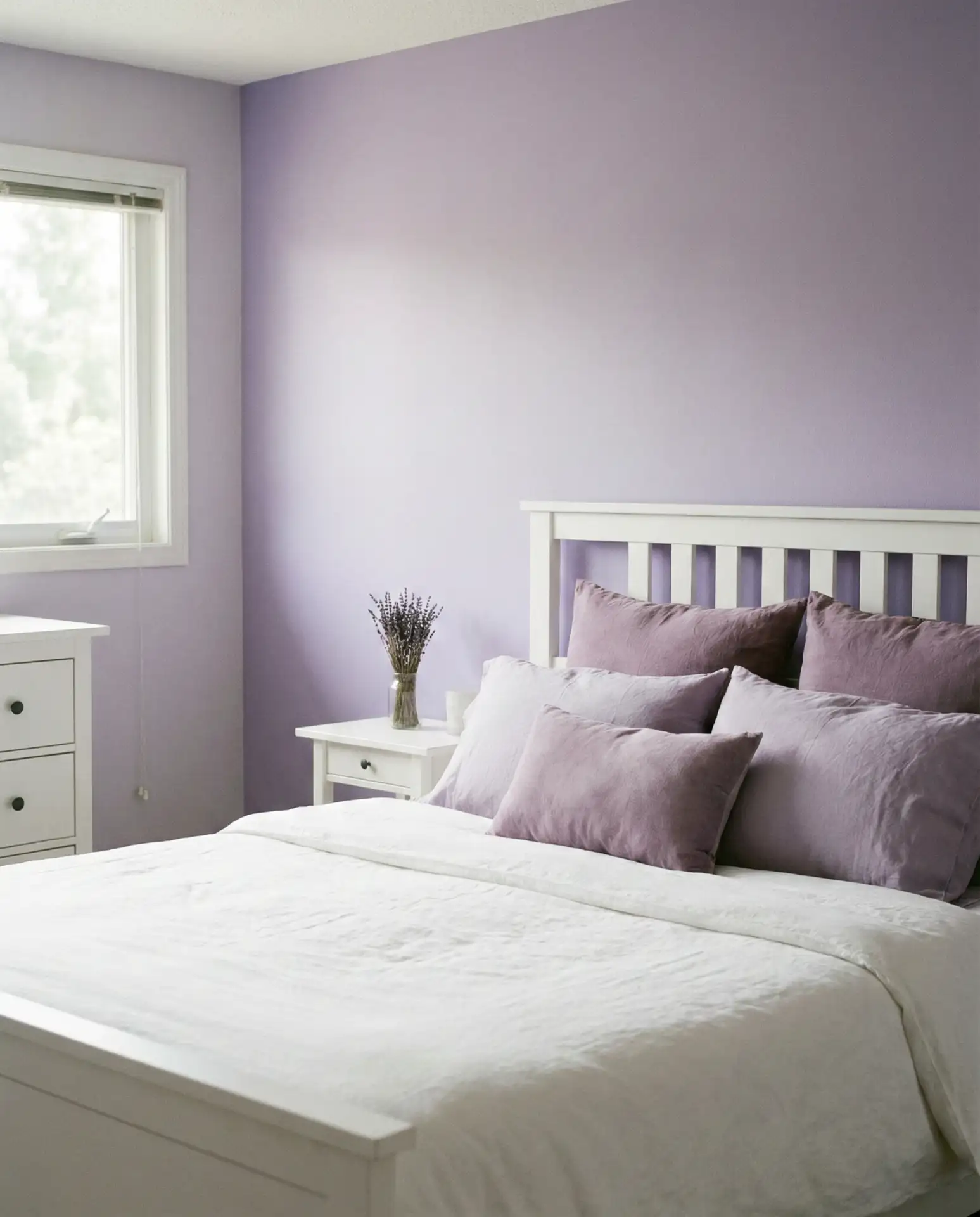
A purple and white bedroom requires careful execution, but when done right, it delivers a sense of calm luxury that few other palettes can match. The key is choosing the right purple—skip bright grape or neon violet in favor of dusty lavender, soft lilac, or deep aubergine depending on your preference. Use purple sparingly against a white backdrop: a lavender accent wall, purple velvet curtains, or a few plum-colored throw pillows on white bedding. Purple has long been associated with relaxation and creativity, making it psychologically well-suited for bedroom spaces where you want to unwind and perhaps engage in some light reading or journaling before sleep.
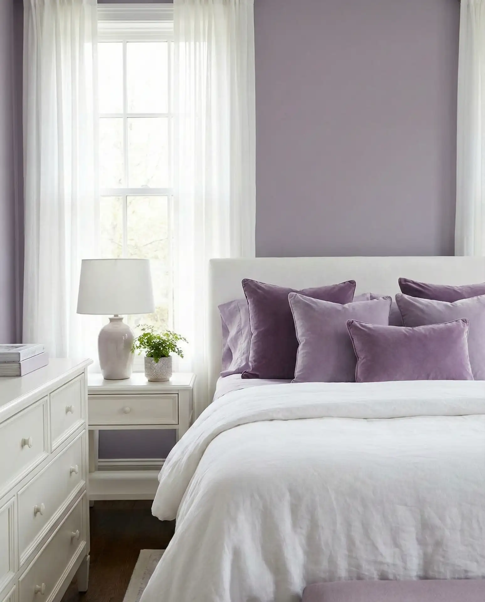
Purple’s popularity in bedrooms has grown as more people have moved away from the idea that certain colors are “too bold” for sleep spaces. The muted purples popular in 2026—lavender, dusty plum, and soft mauve—actually have calming properties similar to blues and greens, without feeling as expected or conventional. This makes purple-and-white bedrooms particularly appealing to people who want something distinctive but not jarring. Pair purple accents with white and natural materials like linen and wood to prevent the space from feeling too formal or stuffy; the casual textures balance the regal associations of purple.
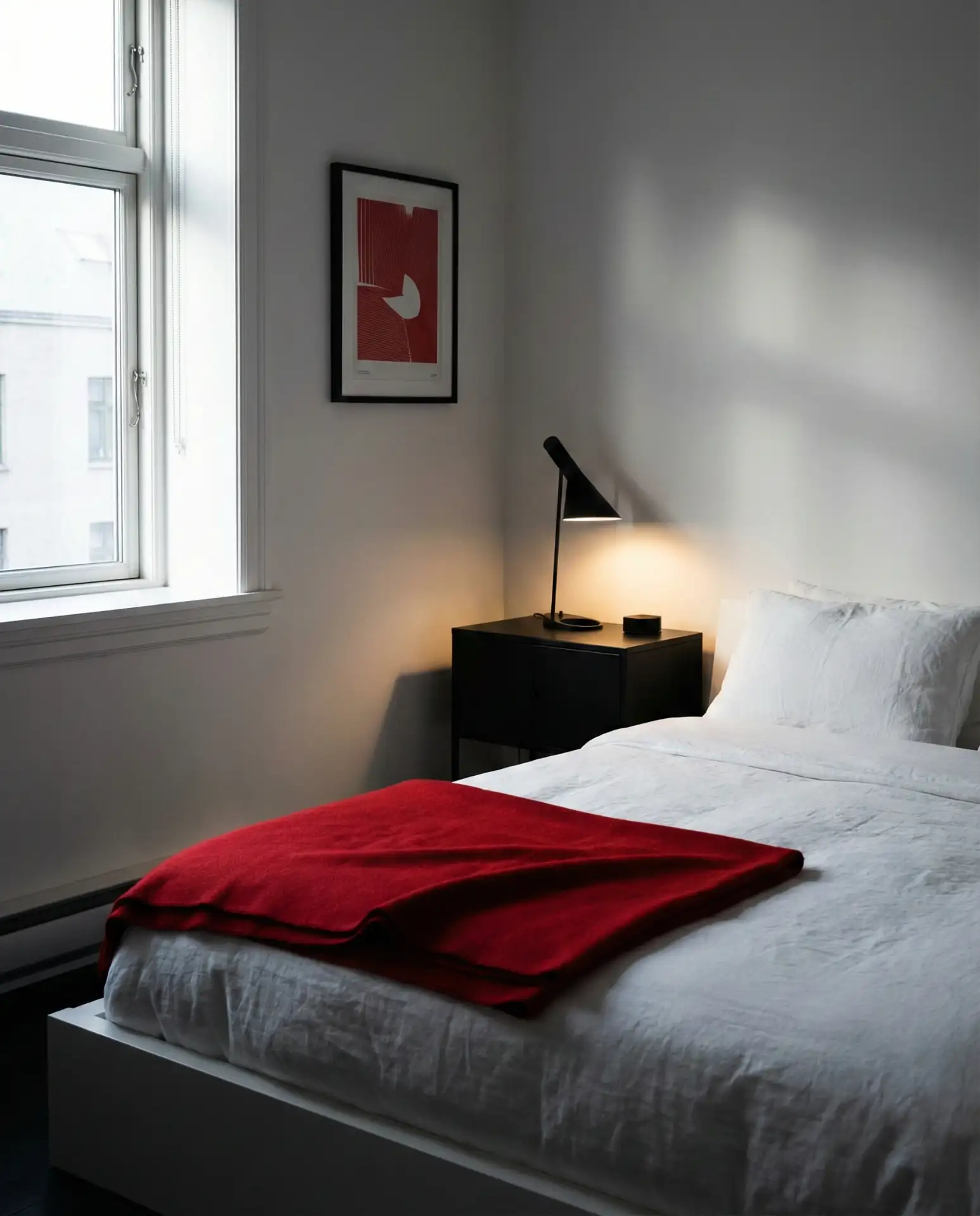
16. Red and White Bold Energy
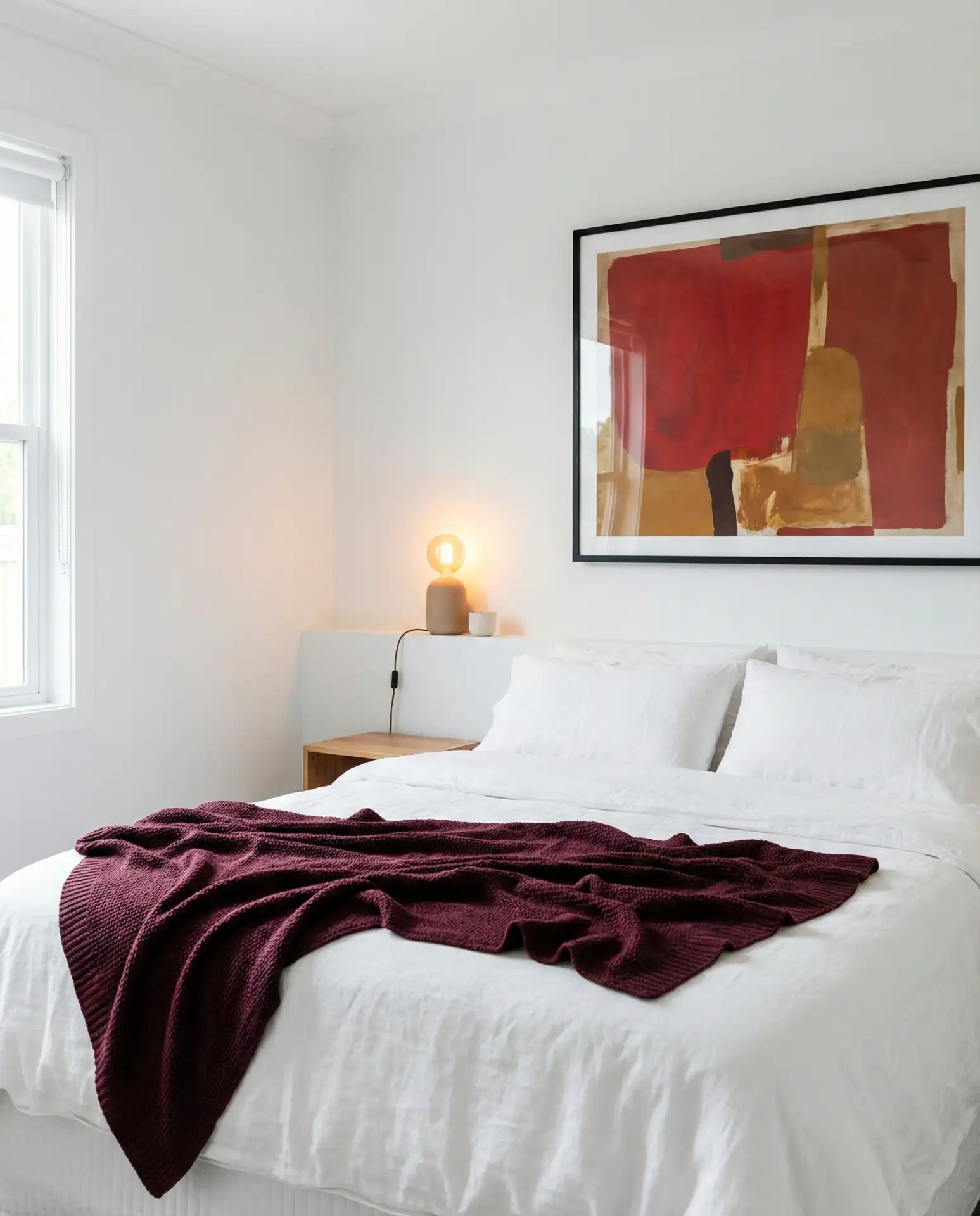
Red typically isn’t the first choice for bedrooms, but when used thoughtfully in a red and white scheme, it can create surprising warmth and personality. The trick is using red as an accent rather than a dominant color—think a single red throw blanket, red-spined books on a shelf, or a piece of red artwork above the bed. Against white walls and white bedding, these pops of red create visual interest without overwhelming the space or disrupting sleep. Choose deeper, more muted reds—burgundy, brick red, and terracotta—rather than fire-engine bright, which can feel too energizing for a rest space.
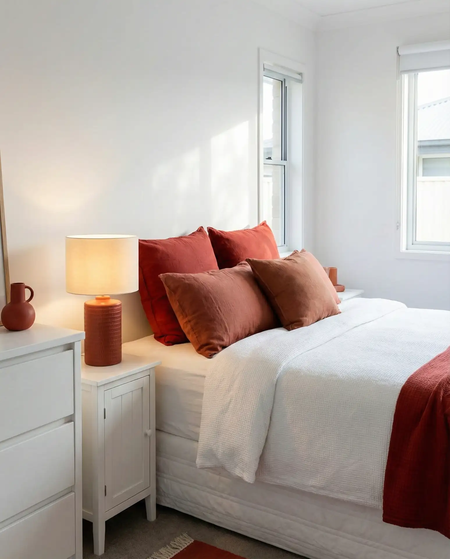
Design commentary often suggests that red in bedrooms should be limited to 10% or less of the visual field to avoid overstimulation, and the red-and-white approach naturally follows this guideline. The predominantly white palette keeps the room feeling spacious and calm, while strategic red accents add warmth and prevent the space from feeling too stark or sterile. This balance is particularly effective in colder climates or north-facing bedrooms where red’s psychological warmth counteracts the cool light and temperature. It’s a way to add personality and visual interest without sacrificing the restful qualities essential to a good bedroom design.
17. Teal and White Refreshing Depth
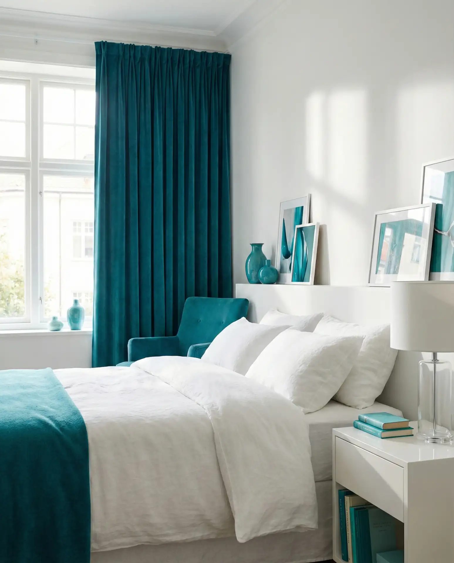
The teal and white pairing brings together blue’s calming qualities with green’s refreshing nature, creating a bedroom that feels both restful and energizing. Choose teal accents in either muted, dusty shades for a vintage feel or richer, saturated tones for something more contemporary. A teal accent wall behind the bed makes a strong statement, or you can introduce the color more subtly through teal bedding, curtains, or an upholstered chair. Against white walls and crisp white bedding, teal reads as sophisticated and unexpected—less common than navy or sage but equally versatile and appealing across different design styles.
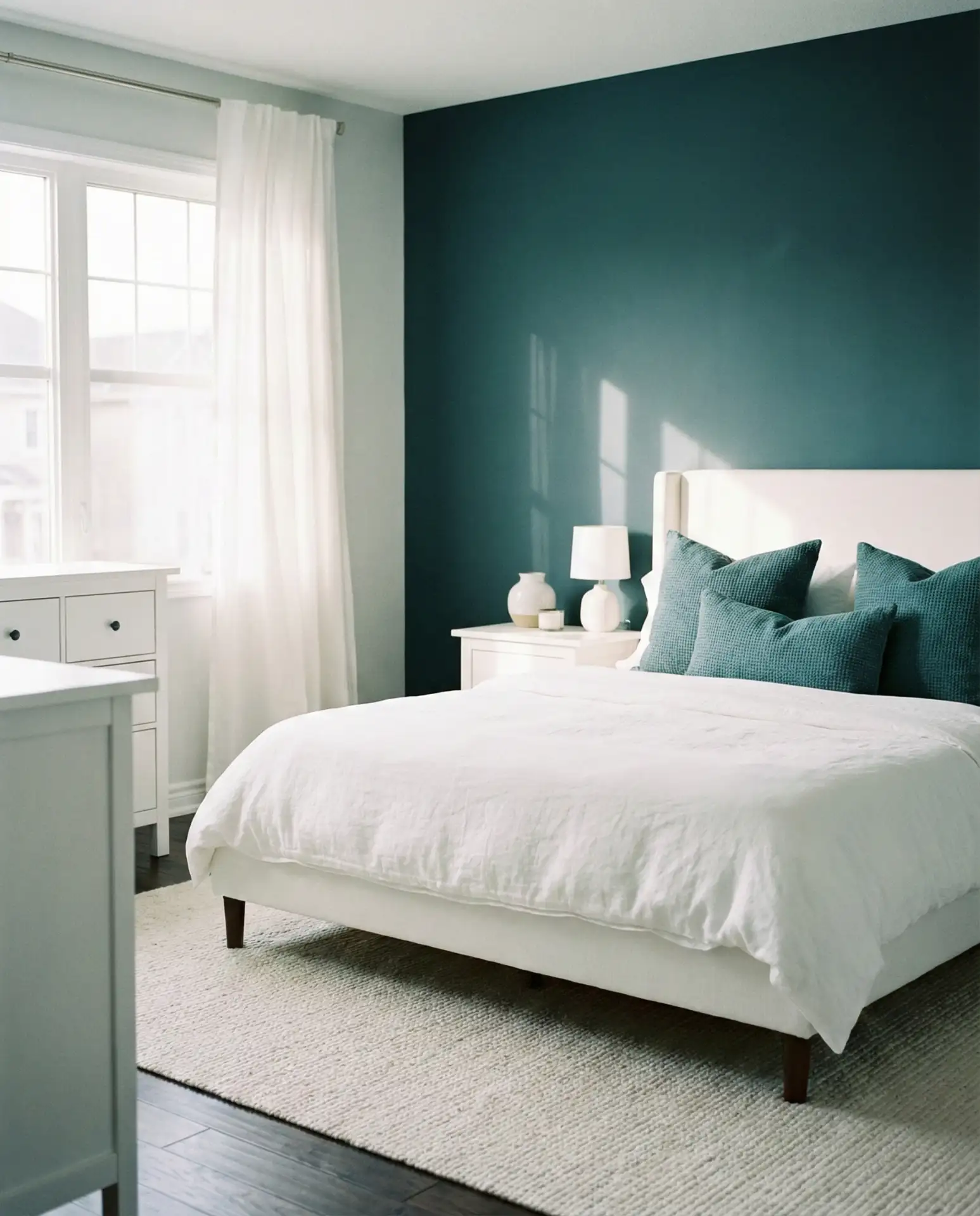
Teal works especially well in bedrooms that get good natural light, where the color can shift throughout the day from blue-leaning in morning light to green-leaning in afternoon sun. This chameleon quality keeps the room feeling dynamic rather than static. In coastal areas from Maine to Southern California, teal bedrooms reflect the ocean without being overly literal about it—it’s a water reference that feels sophisticated rather than themed. The color also pairs beautifully with natural materials like brass, wood, and rattan, which can help soften and warm a space that might otherwise feel too cool.
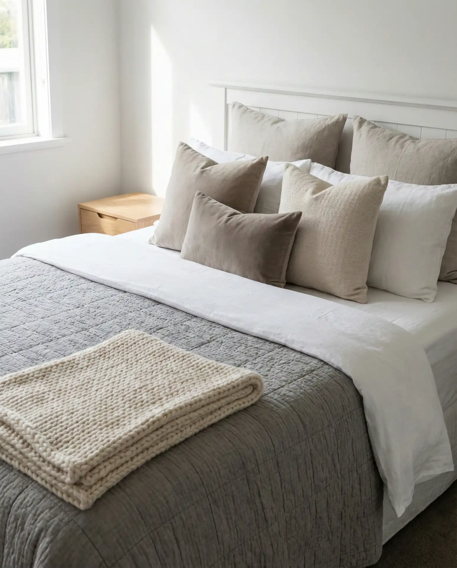
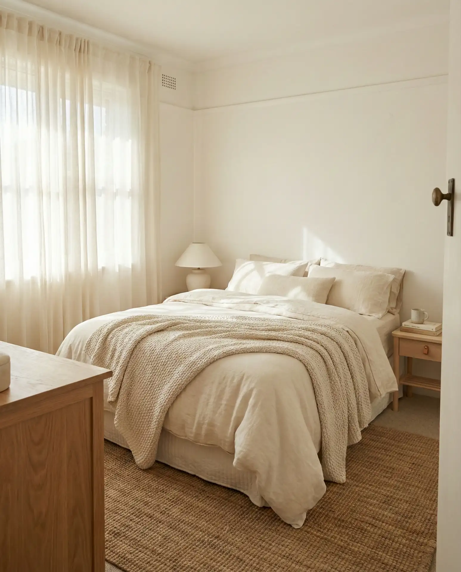
18. Cream and White Layered Neutral s
The cream and white combination creates a barely-there gradient that adds depth without introducing actual color. Start with white walls and layer in cream through bedding, curtains, area rugs, and upholstered furniture. The subtle tonal variation prevents the room from feeling flat or one-dimensional while maintaining that light, airy quality that makes white bedrooms so appealing. This approach is ideal for people who love the idea of an all-white bedroom but find pure white too stark or difficult to maintain. The cream tones hide minor wear and aging better than bright white, making this a practical choice for high-use bedrooms.
A friend who recently moved into an older home chose this palette specifically because her bedroom had beautiful original wood floors that she wanted to highlight without competing with them. The cream-and-white scheme kept the focus on the warm honey-toned wood while creating a restful backdrop that didn’t call too much attention to itself. She mentioned that guests always comment on how peaceful the room feels, which she attributes to the harmonious, low-contrast palette. It’s a testament to how effective subtle color variations can be in creating a bedroom that feels both finished and fundamentally calm.
19. Yellow and White Sunny Optimism
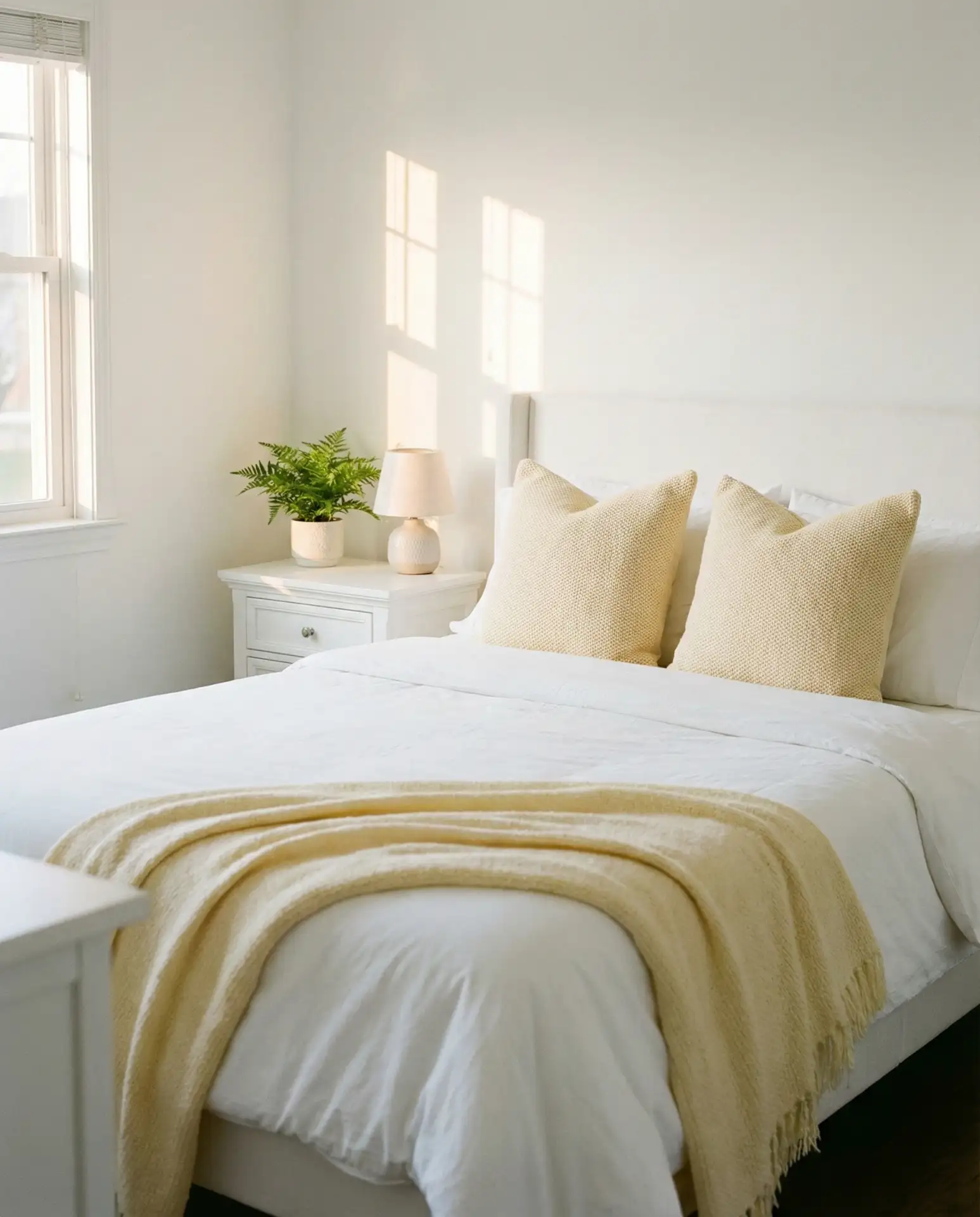
A yellow and white bedroom might seem risky, but pale yellows—think buttercream, soft butter, or faded lemon—paired with white create a surprisingly serene and uplifting space. Use yellow sparingly: a yellow throw blanket at the foot of a white bed, pale yellow accent pillows, or even a vintage yellow chair in the corner. The key is choosing yellows with enough white or grey in them that they read as soft rather than bright. Against white walls and white bedding, these gentle yellows bring warmth and cheerfulness without the overstimulation that brighter yellows can cause in bedrooms where calm is the goal.
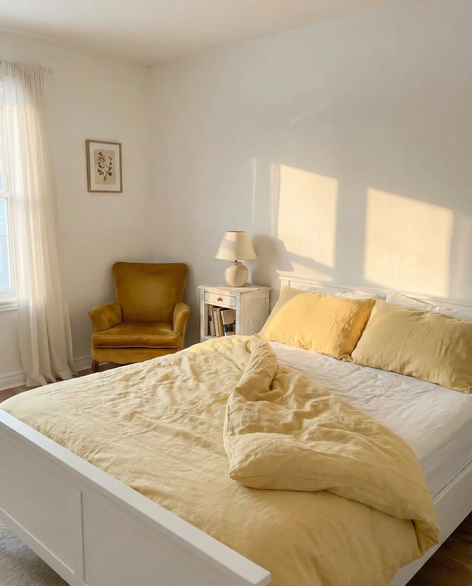
Yellow works particularly well in bedrooms with limited natural light, where it can psychologically brighten a space that might otherwise feel dim or gloomy. In basement bedrooms or rooms with small windows—common in older city apartments and townhouses—yellow accents create the illusion of sunlight and prevent the room from feeling cave-like. The yellow-and-white palette is also budget-friendly; yellow accessories and textiles are widely available, and you can start with just one or two yellow pieces to test the look before committing to more. If you find the yellow too energizing over time, it’s easy to swap out for calmer neutrals without repainting or replacing major furniture pieces.
20. Red, Black, and White Graphic Balance
The red, black, and white combination creates a bold, graphic bedroom that feels both modern and timeless. This is a high-contrast scheme that requires confidence and careful balance: predominantly white walls and bedding, with black accents through furniture or frames, and strategic pops of red in pillows, artwork, or a throw blanket. The red energizes the space without overwhelming it, the black grounds the design, and the white keeps everything feeling open and breathable. This palette works especially well in contemporary lofts or modern homes where architectural drama is part of the overall aesthetic but can also create interesting tension in more traditional spaces.
This palette requires thoughtful proportion to avoid tipping into overwhelming territory—aim for roughly 70% white, 20% black, and 10% red to maintain balance while achieving impact. The predominantly white background ensures the room still functions as a restful sleep space despite the bold color choices. This scheme appeals particularly to people who appreciate strong design statements but still need their bedroom to serve its primary function as a calm retreat. The graphic quality photographs beautifully, which explains its popularity among Pinterest users looking for bedrooms with personality and visual punch.
21. Navy and White Classic Elegance
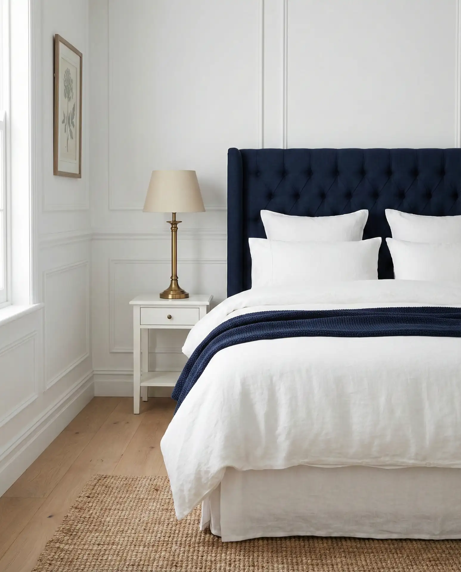
The navy and white pairing delivers timeless sophistication that never goes out of style, drawing from nautical tradition while feeling fresh and modern. Choose navy accents thoughtfully: navy bedding with white sheets underneath, navy curtains flanking white walls, or a navy upholstered headboard against white-painted brick or shiplap. The deep blue provides rich contrast without the harshness of black, creating a bedroom that feels substantial and grounded. This combination works across geographic regions and home styles, from coastal cottages to urban apartments to suburban ranches, making it one of the most versatile color pairings for bedrooms.
In regions with strong maritime heritage—New England, the Pacific Northwest, coastal Florida—the navy-and-white bedroom feels naturally at home, connecting indoor spaces to the local culture and landscape. But even landlocked bedrooms benefit from this palette’s inherent sense of calm and order. Navy’s psychological associations with stability and trustworthiness translate well to bedrooms, where you want to feel secure and relaxed. The color combination also works well across seasons; in summer it feels crisp and refreshing, while in winter the navy provides cozy depth against white walls and bedding.
22. Light Blue and White Airy Freshness
The light blue and white pairing creates bedrooms that feel eternally fresh and airy, like a clear sky on a perfect spring day. Choose soft, powdery blues—think robin’s egg, pale aqua, or soft periwinkle—and use them generously through bedding, curtains, painted furniture, or an accent wall. Against white walls and white linens, these gentle blues expand the sense of space and light, making even small bedrooms feel more open and breathable. This palette has universal appeal, working beautifully in children’s rooms, guest bedrooms, and primary suites alike, with an ageless quality that transcends trends and personal style preferences.
One of the most common mistakes with light blue bedrooms is choosing blues that are too grey or too green, which can make the room feel cold rather than fresh. True light blues with clear, clean undertones—no grey muddiness, no green tint—create that sky-like quality that makes this palette so appealing. Test your paint or fabric choices in your actual bedroom lighting throughout the day; northern light can make blues look icy, while southern light brings out their warmth and vitality. Getting the shade right is worth the effort, resulting in a bedroom that consistently feels uplifting and serene no matter the season or time of day.
Conclusion
These white bedroom ideas for 2026 offer something for every style preference, budget, and living situation. Whether you’re drawn to warm neutrals, bold color contrasts, or subtle tonal variations, the white bedroom provides a flexible foundation that can evolve with your tastes over time. The beauty of starting with white is that you can experiment with different accent colors, textures, and accessories without major renovation, adjusting your space as your needs and preferences change. Which combination speaks to you? Share your favorite white bedroom approach in the comments below—we’d love to hear how you’re making this timeless palette work in your own home.