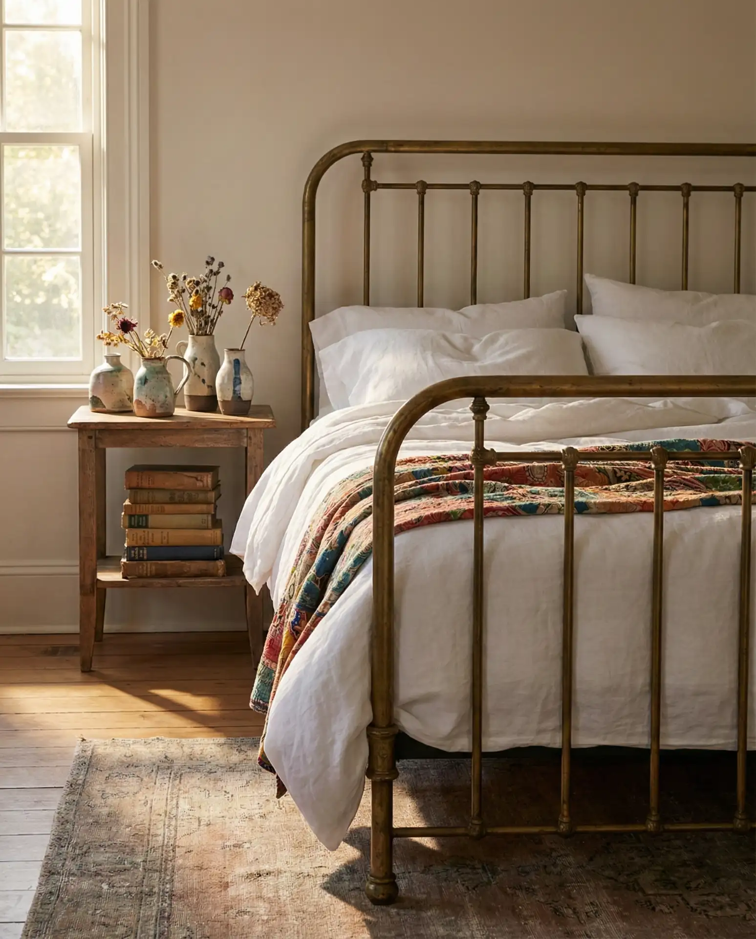
Bedroom paint colors are one of the most searched home decor topics on Pinterest heading into 2026, and it’s easy to see why. Americans are craving spaces that feel personal, calming, and visually striking—places where color does more than just cover walls. Whether you’re refreshing a primary suite, updating a guest room, or finally giving that north-facing bedroom the warmth it needs, the right paint choice can completely transform how a space feels. In this guide, you’ll discover inspiring bedroom paint ideas that blend current trends with timeless appeal, from moody dark greens to soft coastal palettes and everything in between.
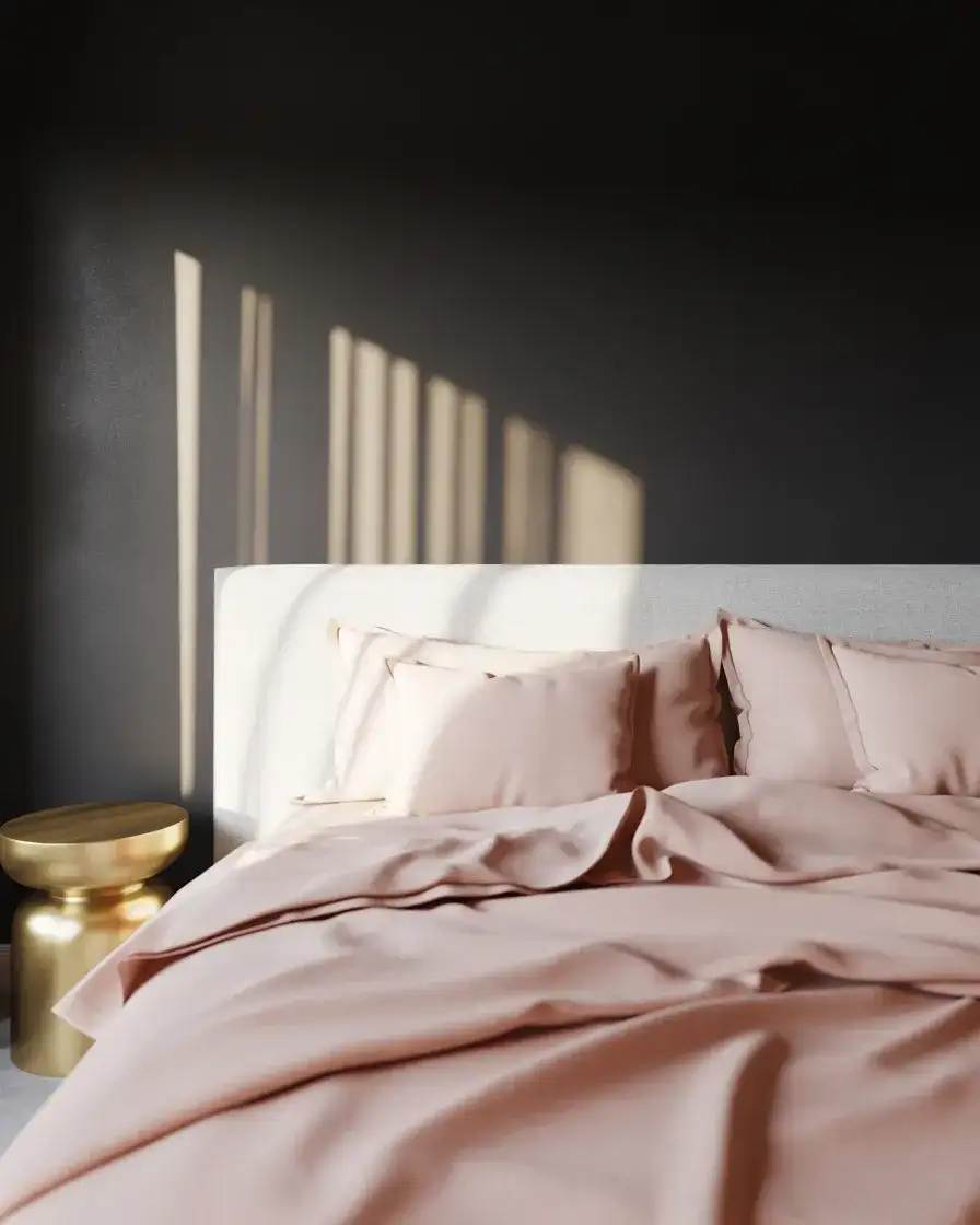
1. Moody Charcoal for Drama and Depth
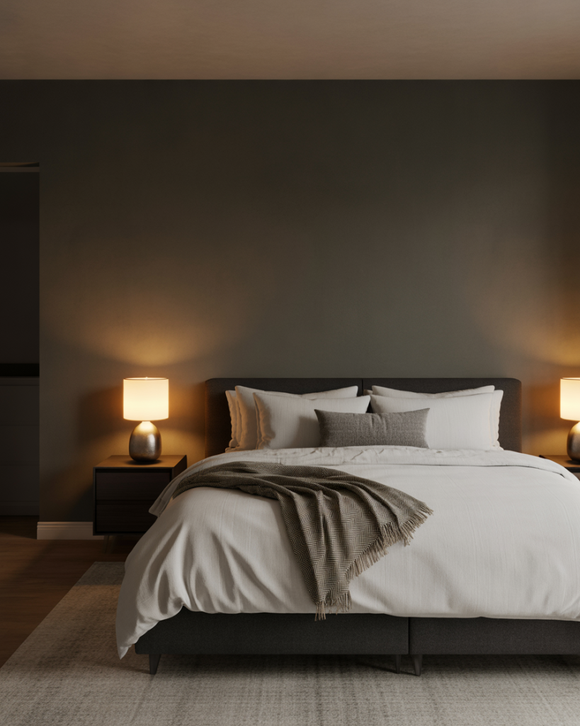
A moody charcoal bedroom creates instant sophistication and works beautifully in 2026 interiors where bold, enveloping color is making a comeback. This dark neutral wraps the room in a cocoon-like atmosphere, perfect for primary bedrooms where you want to feel grounded and relaxed. Pair it with soft white linens and warm wood accents to keep the space from feeling too heavy, and consider adding brass or gold hardware for a touch of luxury. 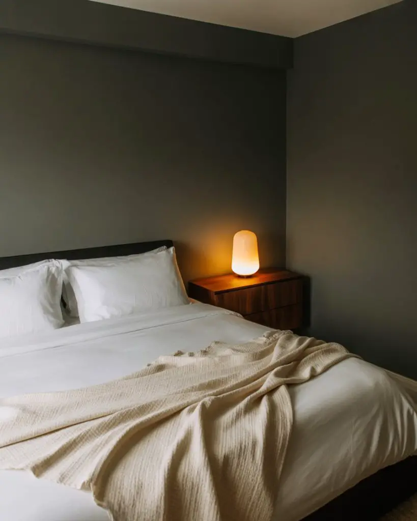
This works best in rooms with ample natural light or good overhead lighting, since darker tones can feel oppressive in poorly lit spaces. A common mistake is skipping the primer—charcoal requires at least two coats over a quality primer to avoid streaking and achieve that rich, velvety finish that makes the color truly sing.
2. Soft Sage Green for a Calming Retreat
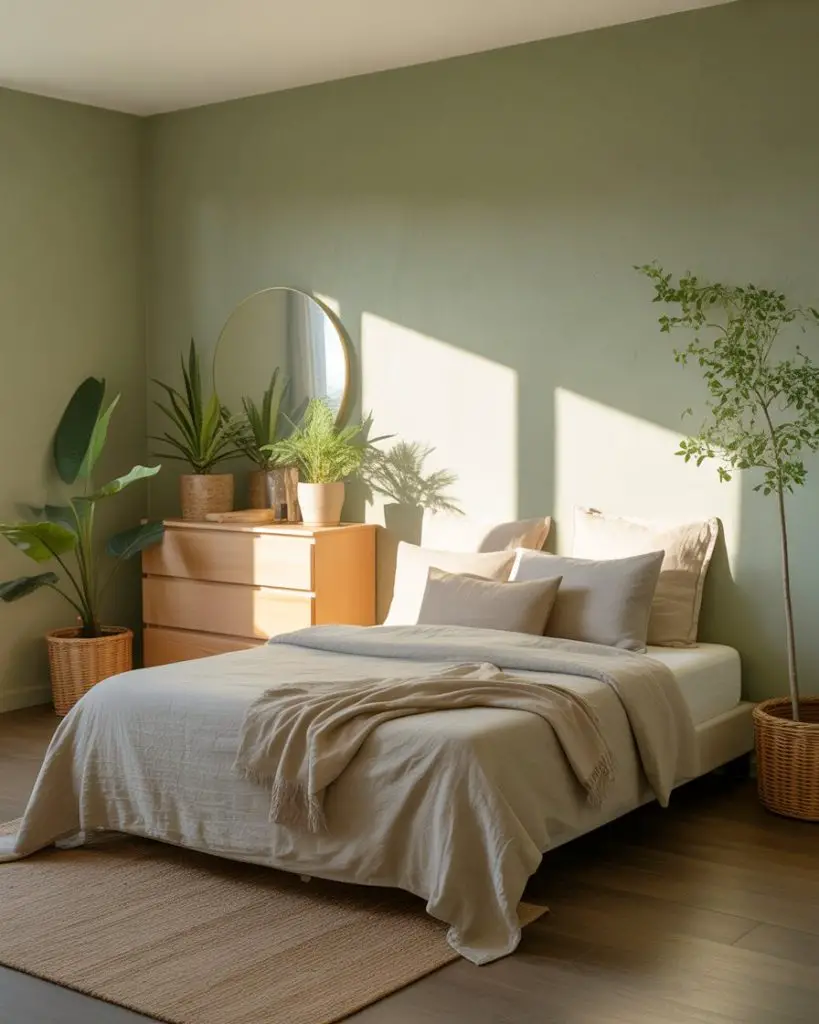
Soft sage has become one of the most popular choices for bedrooms because it brings nature indoors without feeling overly trendy. This green hue offers a relaxing vibe that pairs beautifully with both modern and traditional furniture, making it incredibly versatile for any home style. It’s especially stunning in guest bedrooms where you want visitors to feel immediately at ease. 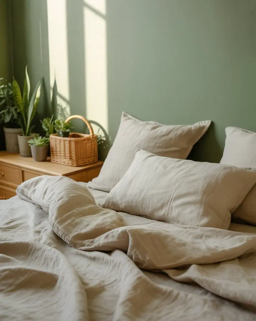
Interior designers often recommend sage for north-facing rooms because its warm undertones compensate for cooler natural light. One homeowner in Portland mentioned that switching to sage made her bedroom feel like a completely different space—suddenly it wasn’t fighting the light anymore, it was working with it.
3. Benjamin Moore’s November Rain for Versatility
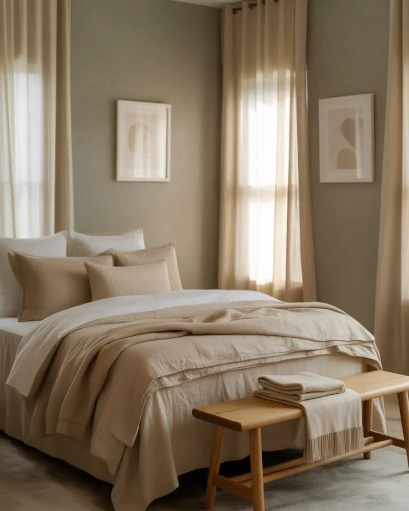
November Rain from Benjamin Moore is a soft greige that walks the line between warm and cool, making it one of the best neutral options for bedrooms in 2026. This shade adapts beautifully to changing light throughout the day, looking slightly different in morning versus evening hours. It’s become a go-to for designers working with clients who want something sophisticated but not too bold. 
This color works everywhere from studio apartments to sprawling suburban homes, which is why it’s consistently a top seller. Budget-conscious homeowners love that it pairs effortlessly with existing furniture and decor, meaning you don’t need to replace everything when you repaint—just freshen the walls and you’re done.
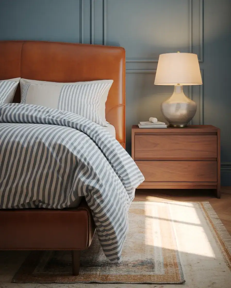
4. Navy Blue for Timeless Elegance

A classic navy creates a cozy blue bedroom that feels both grounding and elevated, perfect for a masterbedroom where you want to make a statement. Navy has been popular for years and shows no signs of fading in 2026, especially when paired with crisp white trim and soft metallics. The depth of navy creates a sense of enclosure that many people find soothing at the end of a long day. 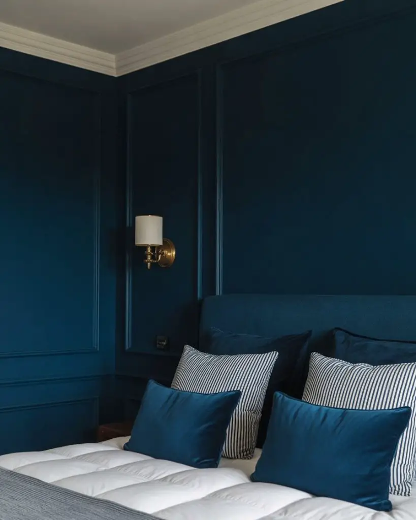
Where it works best: rooms with good ceiling height and multiple windows. Navy can make a small, dim room feel cave-like, but in a spacious bedroom with plenty of light, it becomes incredibly sophisticated rather than oppressive.
5. Terracotta Warmth for Earthy Vibes
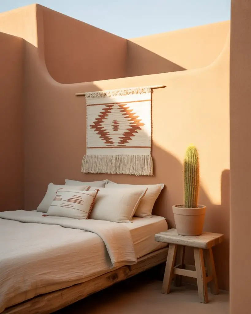
Terracotta brings an earthy, sun-baked quality to bedrooms that feels both current and timeless. This warm clay tone has gained traction in desert-inspired and Southwest-influenced homes across the U.S., particularly in states like Arizona, New Mexico, and Southern California. It creates an aesthetic that’s grounded and organic, perfect for anyone drawn to natural materials and warm color palettes. 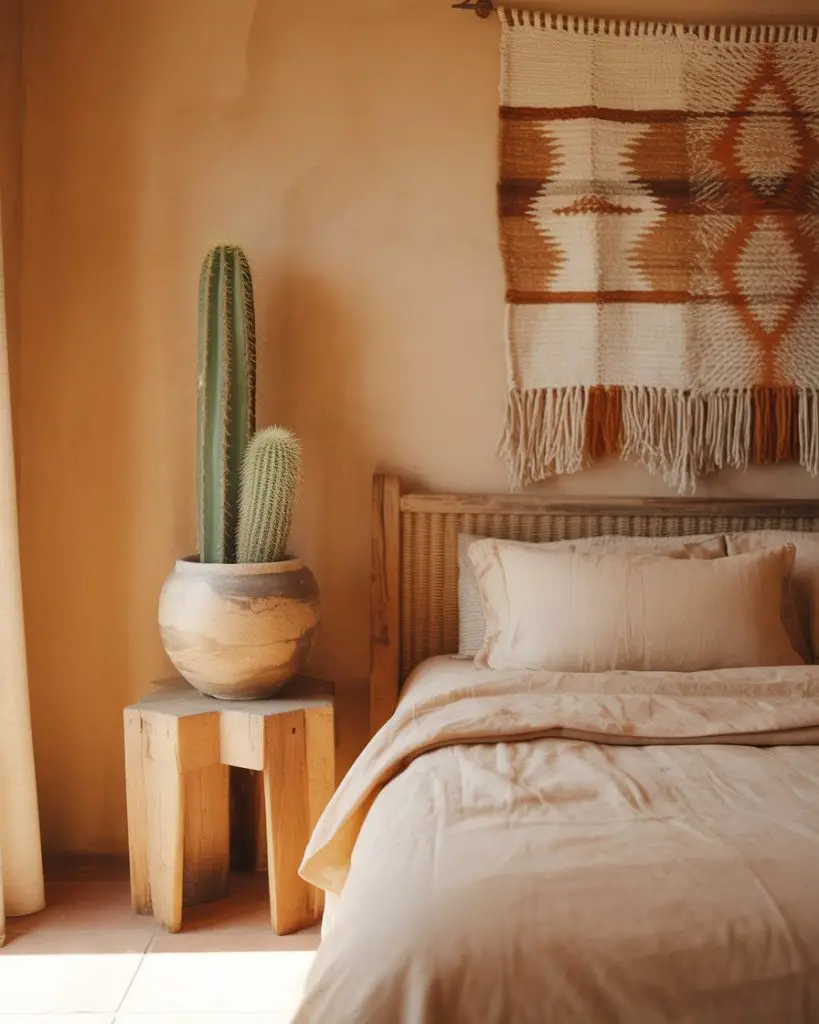
Real homeowners often pair terracotta with plenty of white or cream to balance its intensity—all terracotta everything can feel overwhelming. One designer in Santa Fe recommends using it on just one or two accent walls if you’re hesitant, which gives you the warmth without fully committing to such a bold color choice.
6. Sherwin Williams’ Sea Salt for Coastal Calm
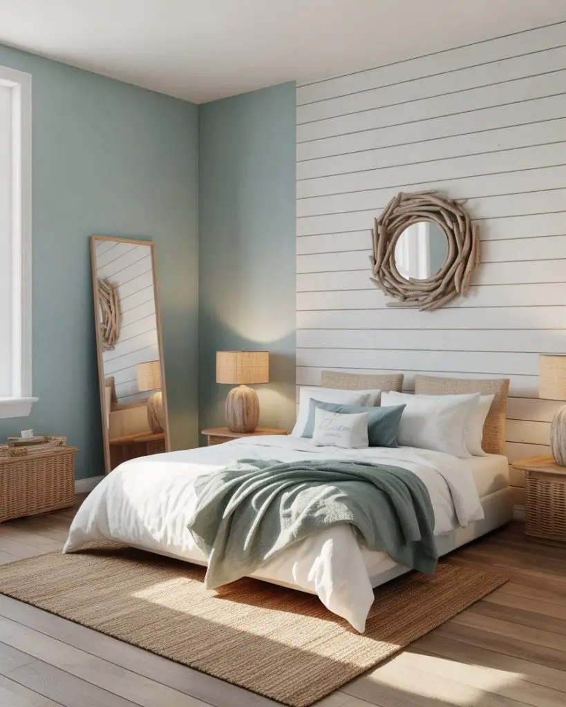
Sea Salt from Sherwin Williams delivers a soft, coastal feel that shifts between green and blue depending on the light. It’s become wildly popular in beach towns and landlocked suburbs alike, offering that breezy, vacation-home vibe without feeling too literal or themed. This color works beautifully in relaxing bedroom settings where you want to feel like you’re waking up near the ocean. 
Expert colorists note that Sea Salt can read more green in north-facing rooms and more blue in south-facing spaces, so it’s smart to test it in your specific room before committing. Many homeowners buy sample pots and paint large poster boards to move around the room at different times of day—it sounds tedious, but it prevents expensive regrets.
7. Behr’s Copper Moon for Warm Sophistication

Copper Moon from Behr is a warm, dusky rose that brings cozy sophistication without feeling overly feminine or sweet. This pink tone has become a favorite for 2026 bedrooms because it creates warmth and depth while remaining surprisingly neutral in practice. It pairs beautifully with both modern and vintage furniture, making it a flexible choice for evolving tastes. 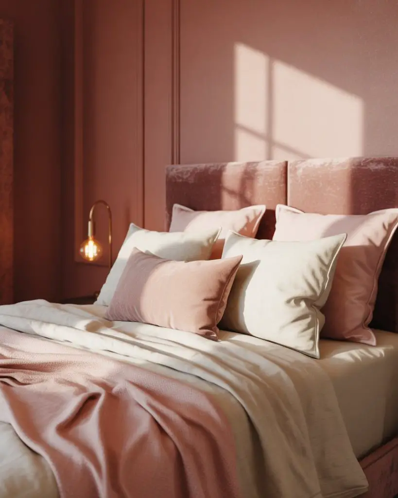
This color typically runs between $30-40 per gallon, making it a mid-range option that delivers high-end results. The warm undertones mean you don’t need to invest in all-new warm-toned decor—it plays nicely with what most people already own, which makes the overall project much more budget-friendly than a complete room overhaul.
8. Dark Green for Jewel-Toned Luxury

A rich dark green bedroom evokes old-world luxury and brings a sense of drama that feels both current and classic. This moody choice works particularly well in primary bedrooms where you want the space to feel like a grown-up sanctuary. Deep forest and emerald tones create a backdrop that makes everything from bedding to artwork look more intentional and curated. 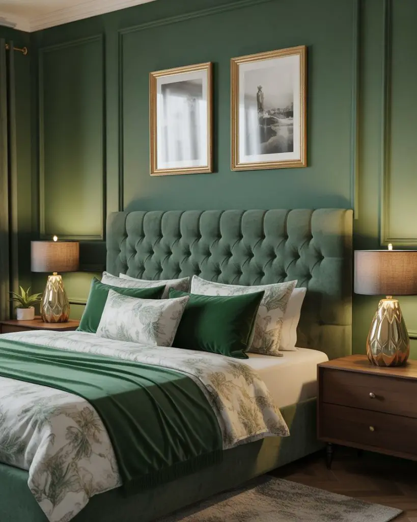
A homeowner in Charleston painted her bedroom a deep hunter green and said the transformation felt like staying in a boutique hotel—suddenly the room had presence and personality it never had with safe beige walls. The key is balancing the darkness with plenty of light sources: table lamps, sconces, and natural light all working together.
9. Warm Greige for a Neutral Palette Foundation
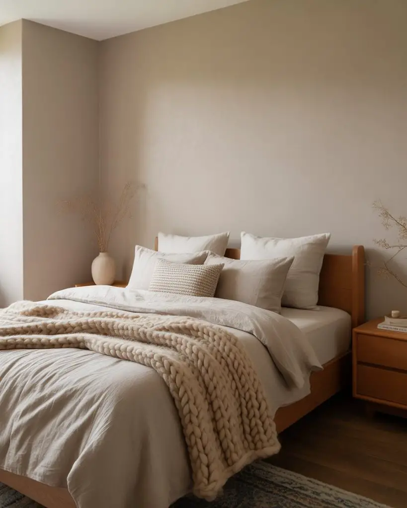
Warm greige creates the perfect neutral palette base for bedrooms where you want flexibility to change decor seasonally without repainting. This best neutral option bridges the gap between gray and beige, offering warmth without yellow undertones. It’s become increasingly popular in open-concept homes where the bedroom color needs to flow visually with adjacent spaces. 
Where it works best: literally anywhere. That’s the beauty of a well-chosen greige—it adapts to your lighting conditions, your furniture style, and your changing tastes. It’s the paint color equivalent of a white t-shirt: always appropriate, never boring when styled thoughtfully.
10. Soft Lavender for Gentle Romance
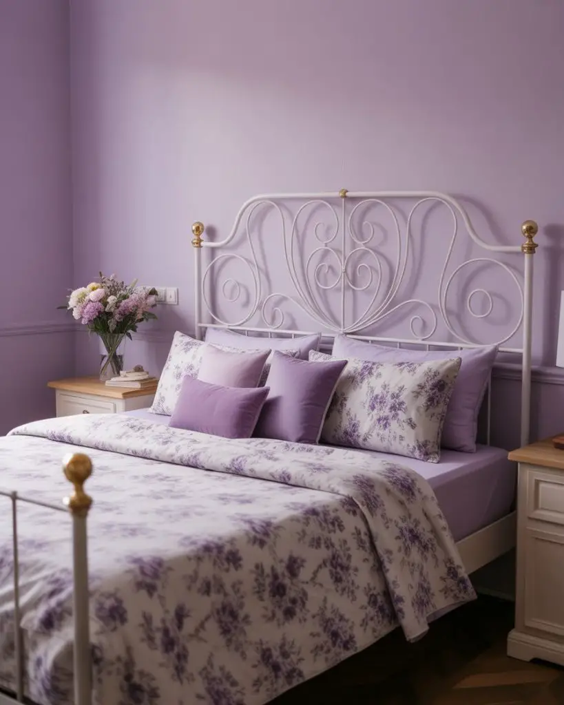
Soft lavender brings a relaxing, gentle quality to bedrooms that feels romantic without being overly sweet. This light purple works beautifully in guest bedrooms where you want to create a welcoming, peaceful atmosphere. It’s having a resurgence in 2026 as people move away from stark whites and grays toward colors that actually evoke feeling. 
A practical insight: lavender looks completely different under warm versus cool light bulbs. If you’re using soft white or warm LED bulbs, the color reads more pink. Under daylight or cool white bulbs, it leans more blue. Test your paint sample under your actual lighting conditions—what looks perfect at the paint store might look wrong in your home.
11. Benjamin Moore’s Hale Navy for Classic Depth
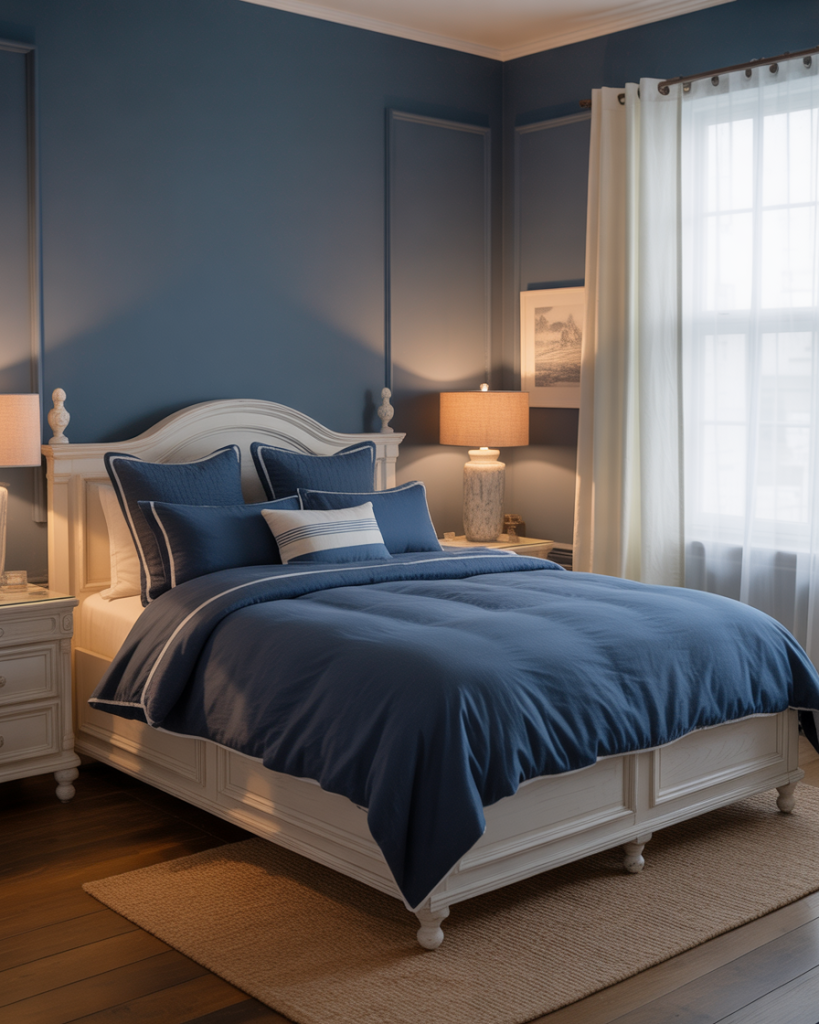
Hale Navy from Benjamin Moore is a slightly softer alternative to true navy, offering moody depth that’s still approachable. This blue has become a designer favorite for 2026 room colour ideas because it provides drama without the commitment of going truly dark. It works especially well in rooms with white or light oak furniture, creating beautiful contrast. 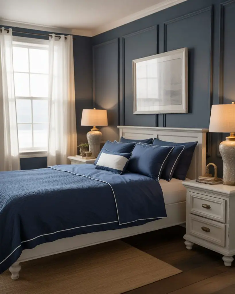
Common mistake: using flat or matte finish in a dark color like Hale Navy. While matte looks sophisticated, it shows every fingerprint and scuff. Most designers recommend eggshell or satin finishes for dark bedroom walls—you get the richness of color with much better durability and easier touch-ups down the road.
12. Pale Blush for Soft Minimalism
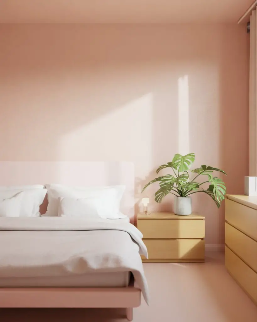
Pale blush creates a cozy, enveloping warmth that works beautifully in minimalist bedrooms where you want softness without pattern or visual clutter. This barely-there pink has become an aesthetic staple in modern bedrooms, especially among younger homeowners who want something more personal than white but still incredibly light and airy. 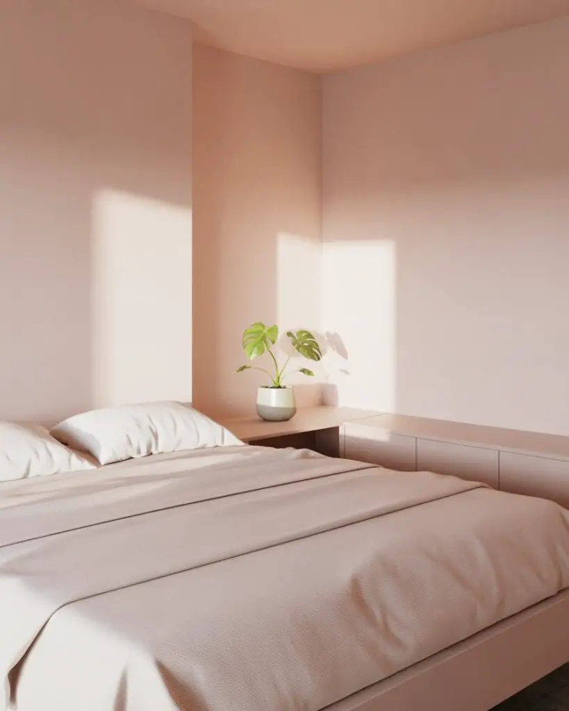
This color particularly shines in west-facing rooms where afternoon light pours in—the warmth of the evening sun makes pale blush absolutely glow. A designer in Austin mentioned that her clients are constantly surprised by how much warmth this subtle color adds compared to plain white, without feeling remotely pink or gendered.
13. Mushroom Taupe for Earthy Neutrals
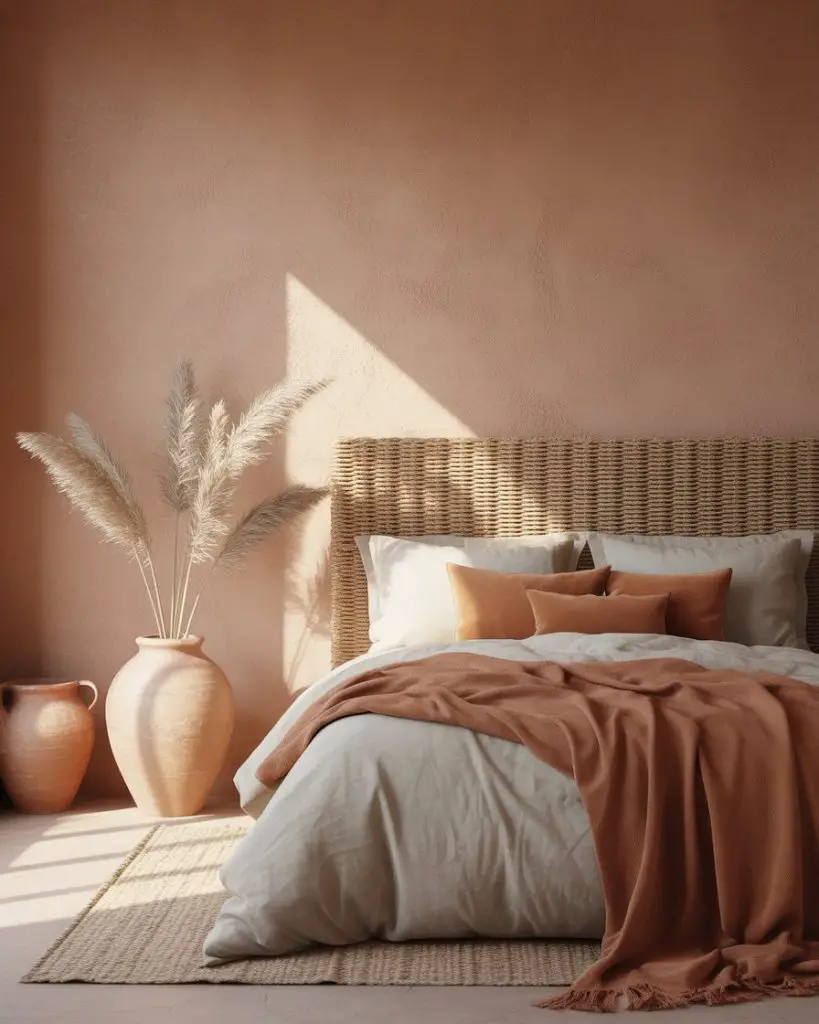
Mushroom taupe delivers an earthy, grounded feeling that’s become essential to neutral palette design in 2026. This sophisticated neutral has more depth than typical beige, with subtle gray and brown undertones that shift beautifully throughout the day. It’s particularly stunning in masterbedroom spaces where you want calm sophistication without going too dark or too light. 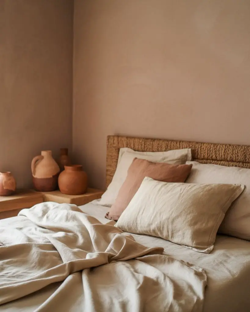
Budget angle: mushroom taupe is incredibly forgiving, which means you can often get away with one coat over existing light paint, especially if you use paint-and-primer formulas. That cuts your material costs and labor time roughly in half compared to darker or more saturated colors that require multiple coats for even coverage.
14. Sherwin Williams’ Repose Gray for North-Facing Rooms

Repose Gray from Sherwin Williams has become the go-to neutral for north facing bedrooms because it stays soft and warm despite cooler natural light. This light gray has just enough warmth to prevent that cold, sterile feeling that plagues many grays in northern exposures. It’s one of the best solutions for rooms that struggle with light, creating a clean backdrop that doesn’t fight your lighting conditions. 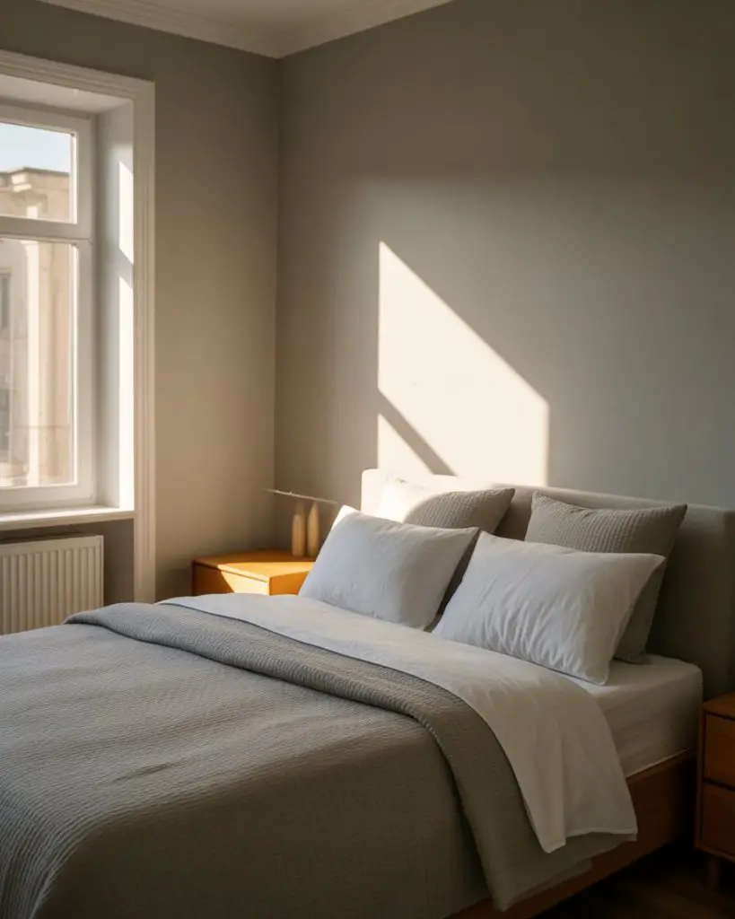
Expert commentary: color consultants almost universally recommend testing any gray in north light before committing. What looks warm in a south-facing showroom can turn icy blue in northern exposure. Repose Gray has been tested thousands of times in real-world conditions, which is why it’s become such a reliable choice—it’s already proven itself in the trickiest lighting scenario.
15. Dusty Olive for Organic Sophistication
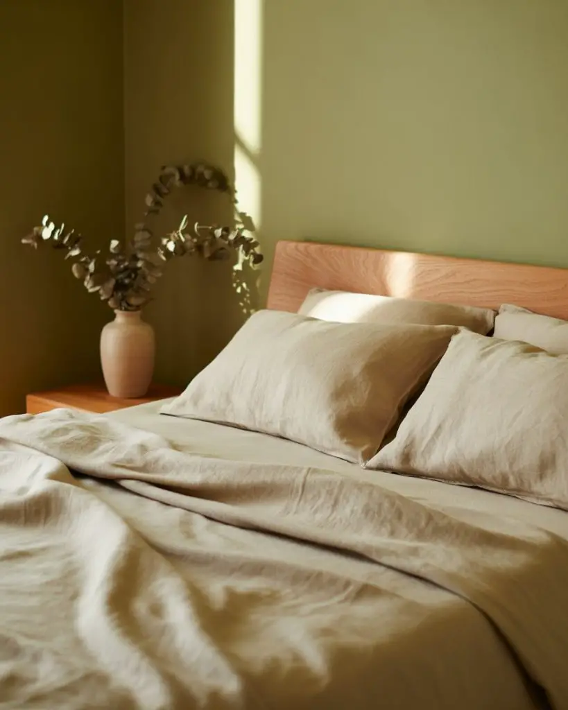
Dusty olive brings an earthy, organic quality that feels both relaxing and sophisticated. This muted green works beautifully in bedrooms filled with natural materials like wood, linen, and stone. It’s becoming increasingly popular in 2026 as homeowners embrace colors that feel connected to the natural world rather than trend-driven neutrals. 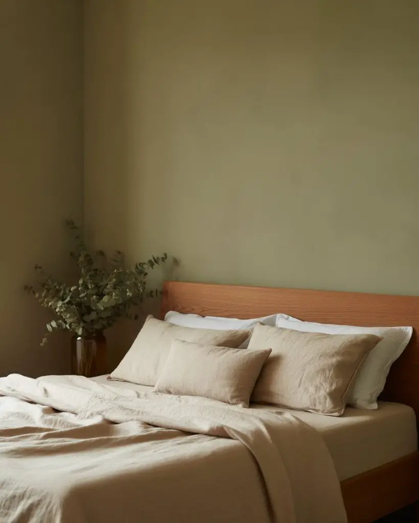
Real homeowner behavior: many people paint one accent wall in dusty olive first to test how they feel living with the color before committing to the whole room. It’s a smart move—this isn’t a neutral you’re used to seeing everywhere, so giving yourself time to adjust helps ensure you’ll still love it six months from now.
16. Behr’s Elephant Skin for Warm Gray Luxury
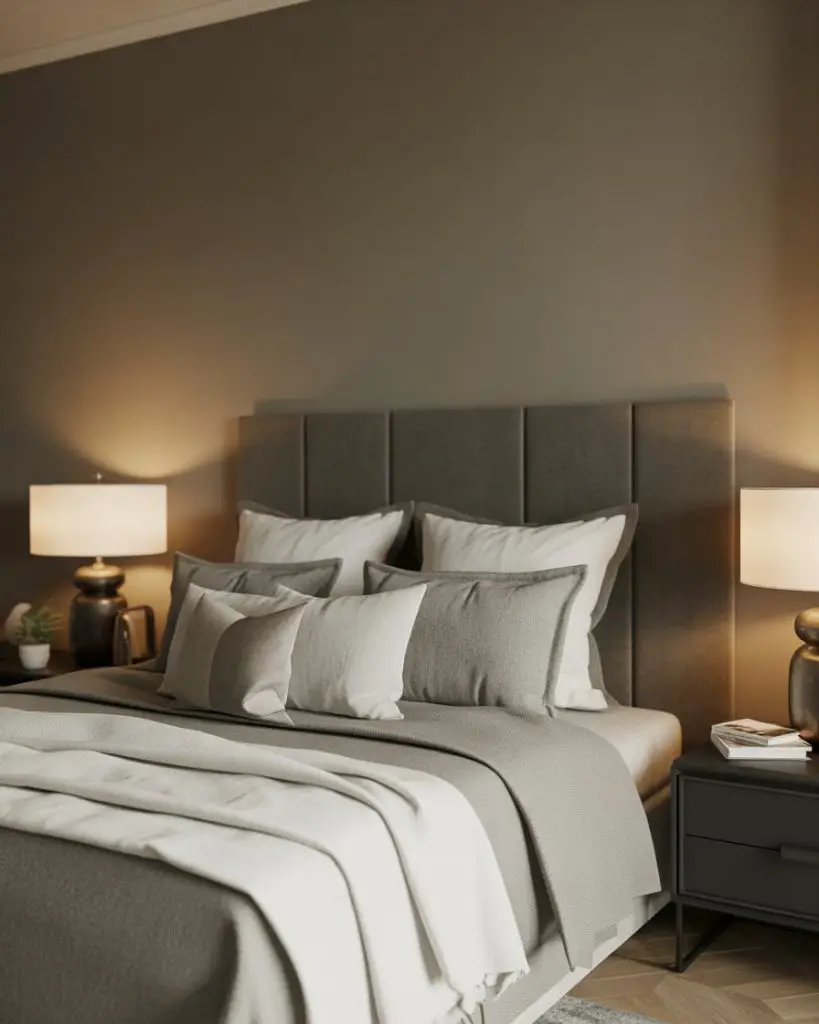
Elephant Skin from Behr is a warm, medium gray that creates luxury without feeling cold or industrial. This sophisticated neutral works beautifully in cozy bedrooms where you want depth and warmth simultaneously. It’s become a favorite for 2026 because it bridges the gap between light grays and darker charcoals, offering versatility and richness. 
This color appears in countless design magazines because it photographs beautifully and works in both traditional and modern settings. Where it works best is in rooms with a mix of warm and cool tones in the furniture and decor—it acts as a harmonizing backdrop that makes everything else look more intentional and pulled-together.
17. Soft Coral for Unexpected Warmth
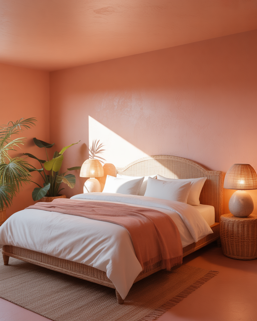
Soft coral brings unexpected warmth and personality to bedrooms without feeling too bold or trendy. This peachy-pink tone creates a cozy, welcoming atmosphere that’s particularly appealing in guest bedrooms where you want visitors to feel embraced by warmth. It’s having a moment in 2026 as people rediscover the joy of actual color on bedroom walls. 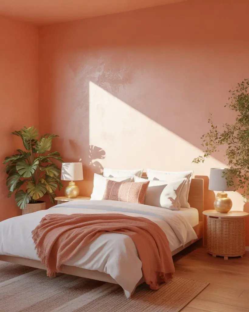
A Chicago homeowner shared that she was nervous about coral but took the plunge in her spare bedroom—now it’s everyone’s favorite room in the house. The practical insight is that coral is incredibly flattering to skin tones, which makes it feel good to be in the space, almost like the paint color itself is creating better lighting.
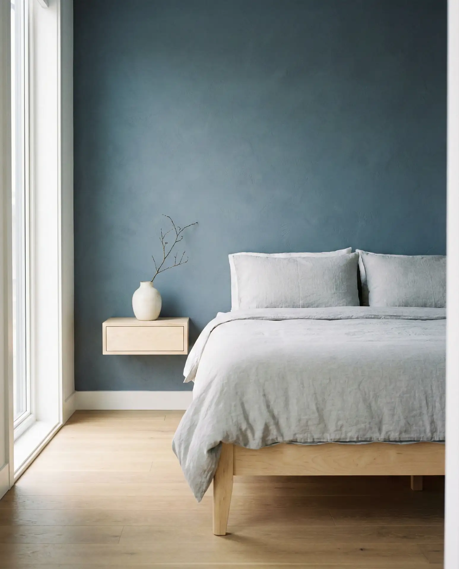
18. Charcoal Blue for Moody Drama
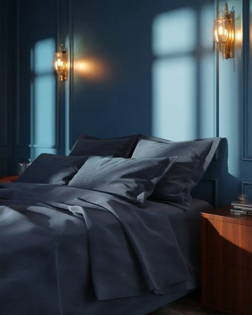
Charcoal blue offers moody drama that’s more complex than pure navy, with gray undertones that create incredible depth. This dark blue works beautifully in primary bedrooms where you want to create a sophisticated, enveloping space. It’s particularly stunning when paired with brass or copper accents and warm wood tones that bring out the richness of the color. 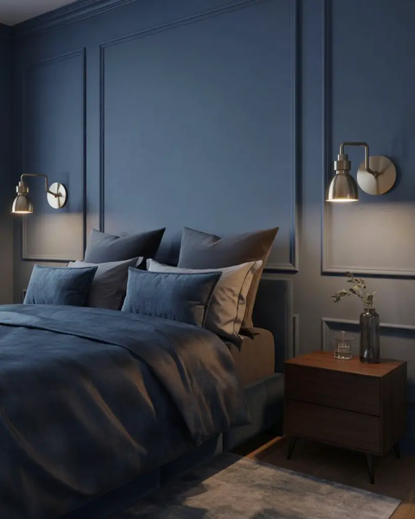
Common mistake to avoid: using only overhead lighting in a dark bedroom. Charcoal blue needs layered lighting—bedside lamps, wall sconces, maybe even subtle LED strips behind the headboard—to create depth and prevent the room from feeling flat or cave-like. The right lighting makes dark colors feel intentional rather than oppressive.
19. Benjamin Moore’s Classic Gray for Timeless Appeal
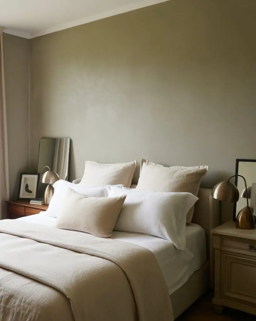
Classic Gray from Benjamin Moore lives up to its name by offering a timeless, adaptable neutral that works in virtually any bedroom. This soft gray-beige hybrid creates a best neutral foundation that pairs beautifully with both warm and cool accent colors. It’s become a staple in 2026 room colour ideas because it’s genuinely foolproof—hard to mess up and consistently beautiful. 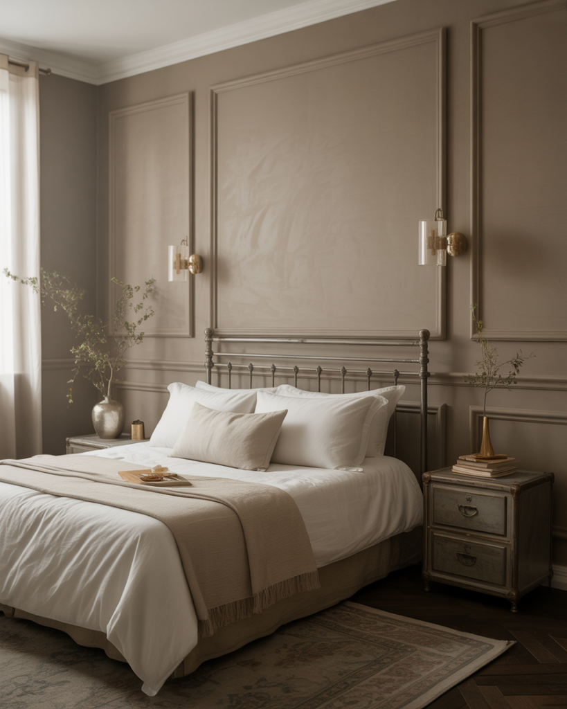
The budget perspective: Classic Gray is one of those colors that makes even basic furniture look more expensive. If you’re working with IKEA or budget pieces, a sophisticated wall color like this elevates everything in the room without requiring you to invest in high-end furnishings—the color does the heavy lifting.
20. Warm White with Cream Undertones
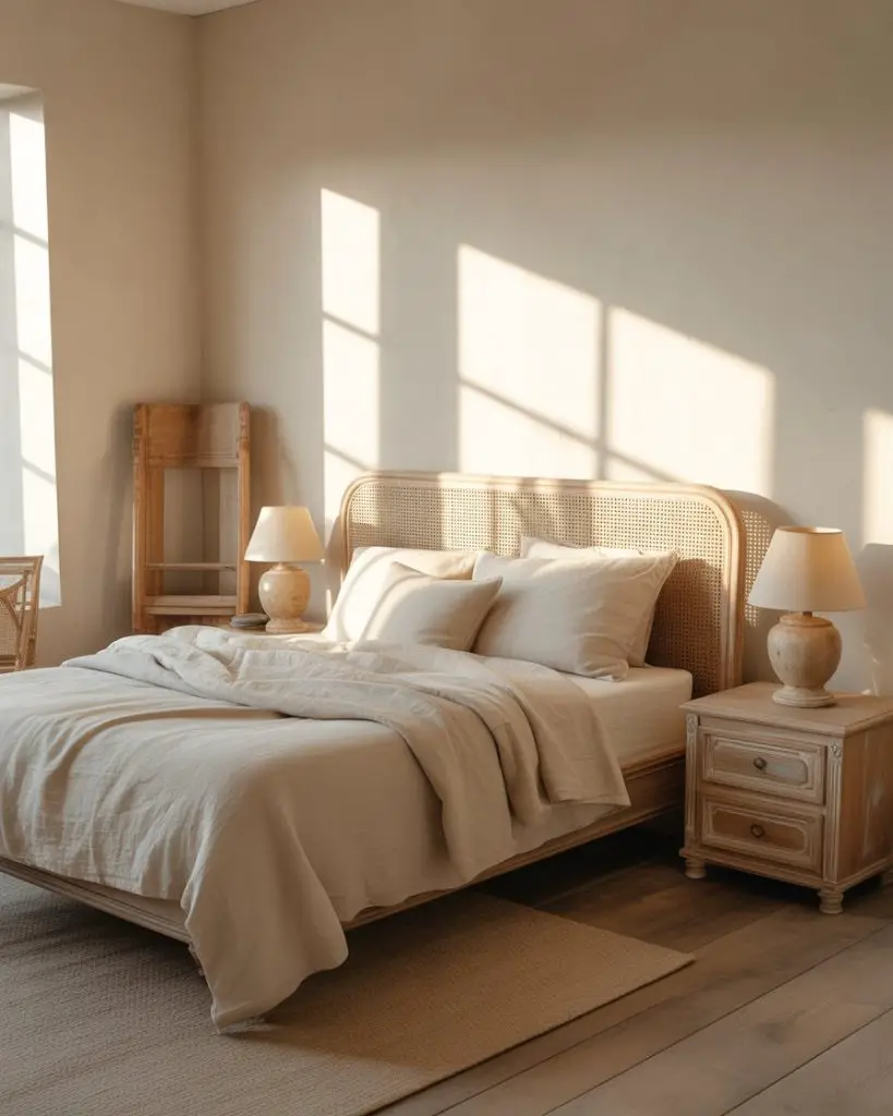
A warm white with cream undertones creates a cozy, enveloping feeling that pure white simply can’t match. This subtle neutral works beautifully in relaxing bedrooms where you want lightness and brightness without the stark, clinical feeling of brilliant white. It’s particularly effective in coastal and farmhouse-inspired spaces where warmth is essential to the overall aesthetic. 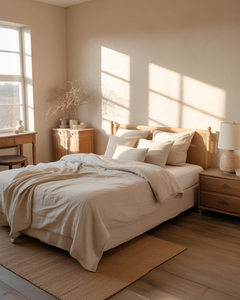
Expert colorists point out that there’s no such thing as “just white”—every white paint has undertones. The mistake people make is grabbing any white without considering whether it leans pink, yellow, blue, or green. Warm whites with cream undertones work in most American homes because they complement the warm undertones in wood floors and furniture that most of us already have.
21. Sherwin Williams’ Urbane Bronze for Bold Sophistication

Urbane Bronze from Sherwin Williams is a dark, sophisticated brown-gray that creates instant luxury and drama. This moody choice works beautifully in masterbedroom spaces where you want something truly distinctive and grown-up. It’s particularly stunning in rooms with high ceilings and good natural light, where the depth of color can truly shine without feeling oppressive. 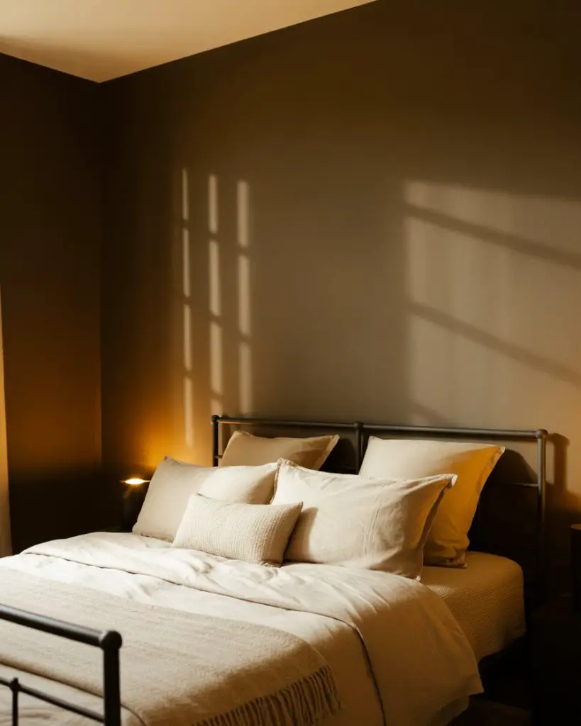
Real homeowner experience: a couple in Denver painted their bedroom Urbane Bronze and said it completely changed how they used the space—suddenly it felt like a retreat rather than just a place to sleep. The transformation came from embracing the darkness rather than fighting it, adding warm metallics and good lighting to create genuine sophistication.
22. Pale Mint for Fresh Tranquility
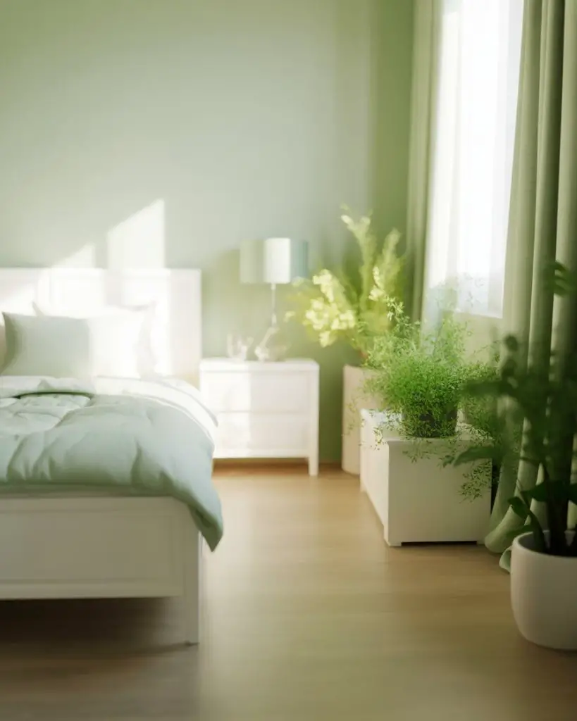
Pale mint brings a fresh, tranquil quality to bedrooms that feels both relaxing and gently energizing. This soft green works beautifully in 2026 spaces that embrace a lighter, airier aesthetic. It’s particularly lovely in rooms with white furniture and natural materials, creating a spa-like atmosphere that feels clean and restorative without being cold or clinical. 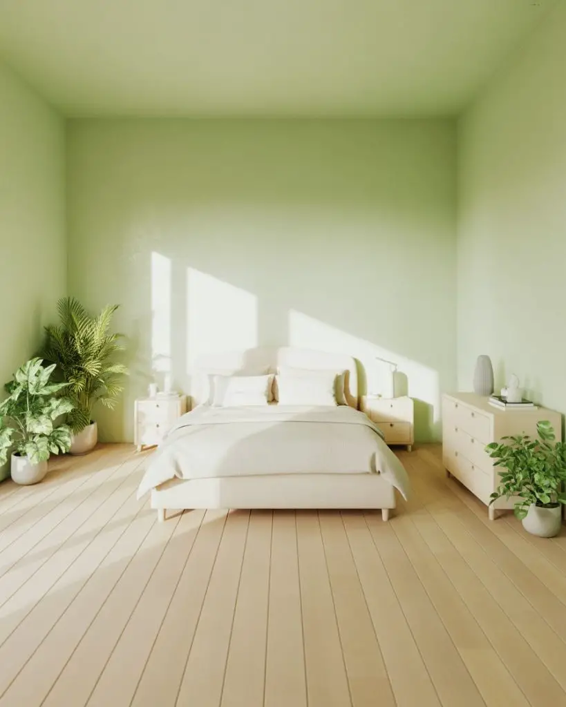
Where this works best: bedrooms that get morning sun, where the fresh quality of pale mint is enhanced by natural light. It’s also perfect for smaller bedrooms because the lightness of the color helps the space feel larger and more open. The color itself seems to reflect light rather than absorb it, which makes even compact rooms feel airy and breathable.
Conclusion
Which of these bedroom paint colors speaks to you? Whether you’re drawn to moody drama, earthy warmth, or soft coastal calm, the right color can completely transform how your bedroom feels. Drop a comment below and share which shade you’re considering—or tell us about a paint color that completely changed your space. We’d love to hear about your bedroom transformations!

