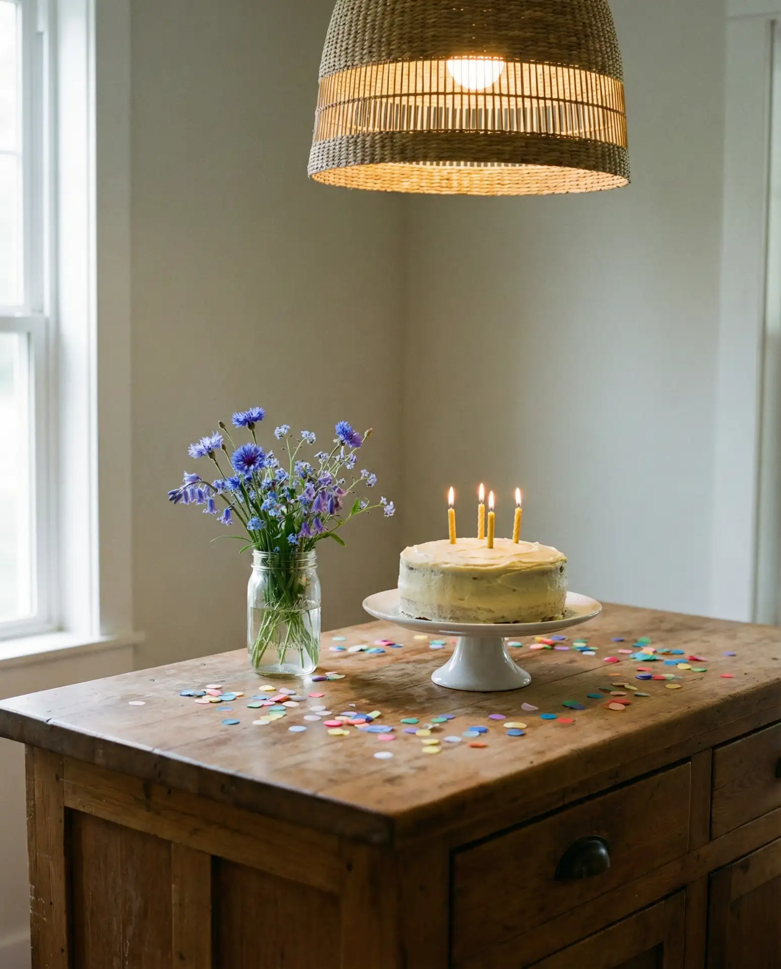
As we step into 2026, kitchen paint colors are shifting toward rich, grounded tones that blend warmth with personality. American homeowners are moving away from stark whites and cool grays, embracing hues that reflect natural materials, cozy atmospheres, and a renewed love for color itself. Pinterest searches for kitchen paint inspiration have surged, with users hunting for palettes that work with everything from oak cabinets to black cabinets and from coastal vibes to moody drama. Whether you’re updating a cottage kitchen or refreshing a modern space, this guide walks you through 22 trending color ideas that feel current, livable, and beautifully you.
1. Warm Terracotta Walls with White Cabinets
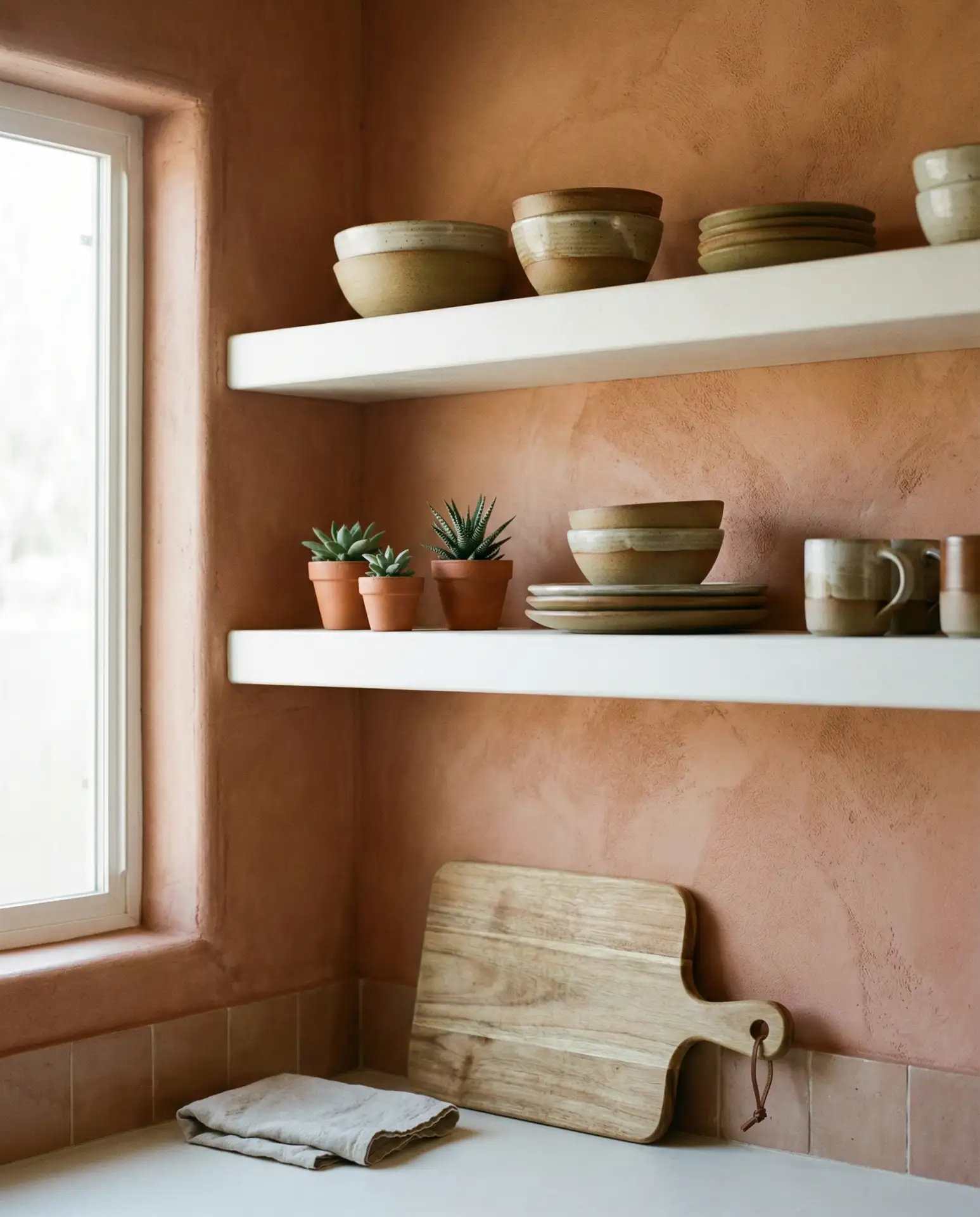
Terracotta brings an earthy, sunbaked warmth that pairs beautifully with crisp white cabinets. This color works especially well in kitchens with plenty of natural light, where it can glow softly throughout the day. The burnt orange undertones add depth without overwhelming the space, making it ideal for both modern and cottage-inspired homes. It’s a grounding alternative to beige that still reads as a warm neutral.
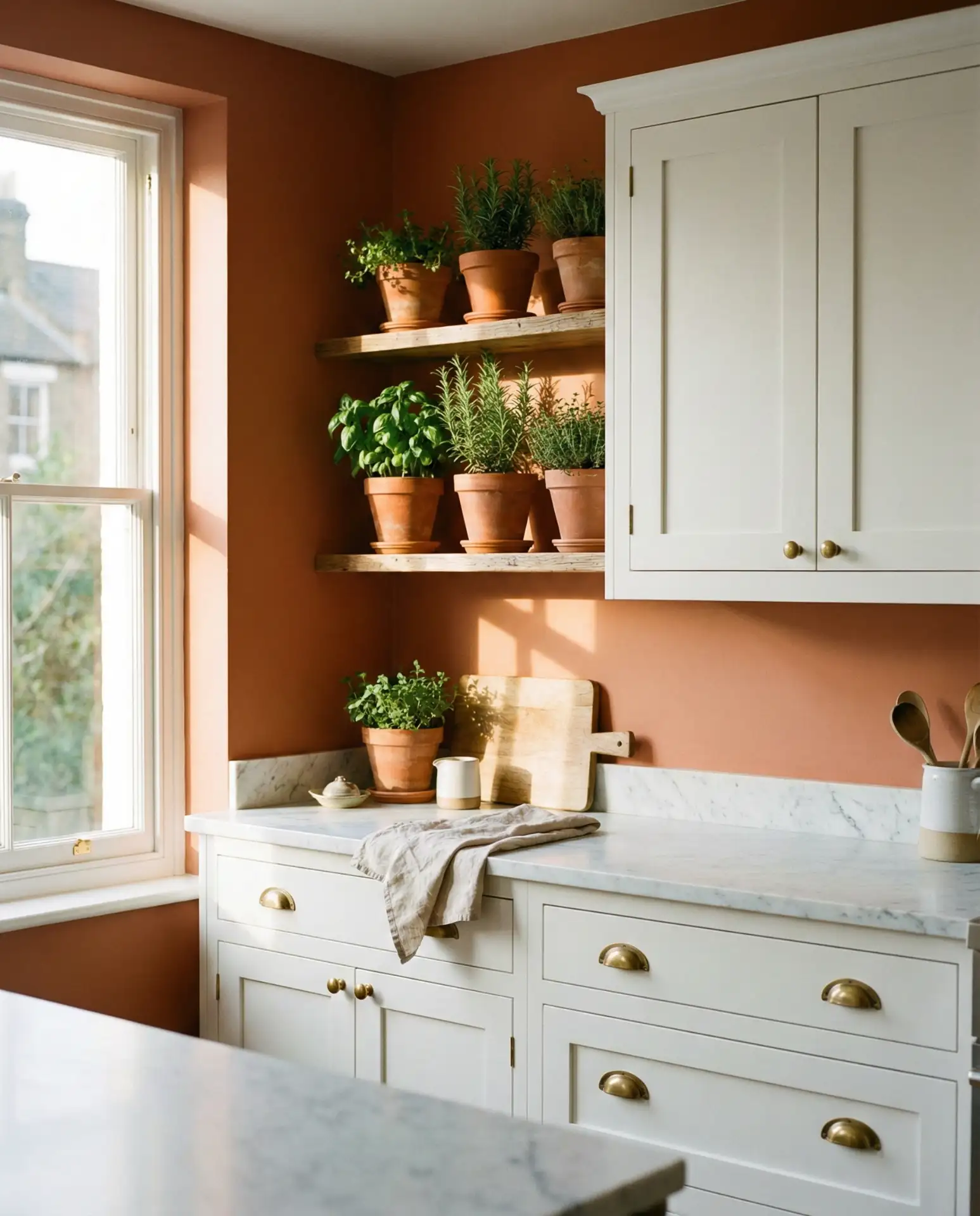
This palette works best in homes with west-facing kitchens, where the setting sun amplifies the warmth. It’s also forgiving with grease and fingerprints, which makes it practical for busy families. Pair it with natural wood accents and woven textures to complete the look. A matte finish keeps the vibe soft and approachable rather than glossy or formal.
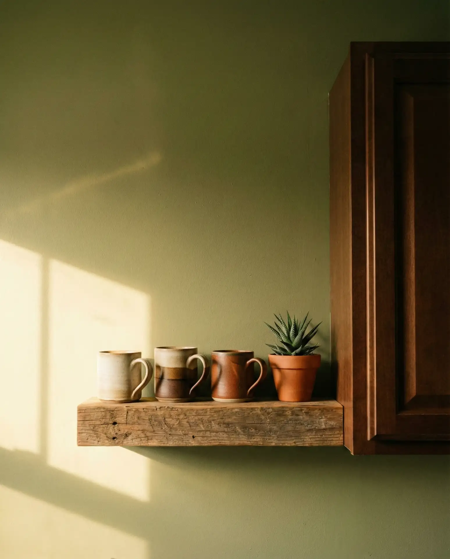
2. Deep Forest Green for a Moody, Grounded Feel
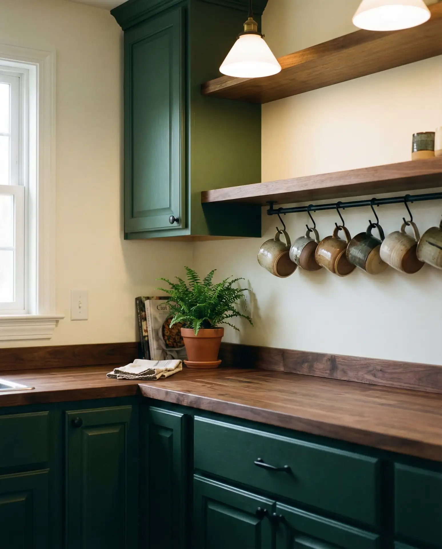
If you’re craving drama, deep forest green delivers. This shade has become a go-to for homeowners looking to create a moody, cocooning atmosphere in the kitchen. It works beautifully with dark wood floors, brass fixtures, and even black cabinets for a layered, sophisticated look. The color feels both timeless and on-trend, especially when paired with natural stone or matte black hardware.
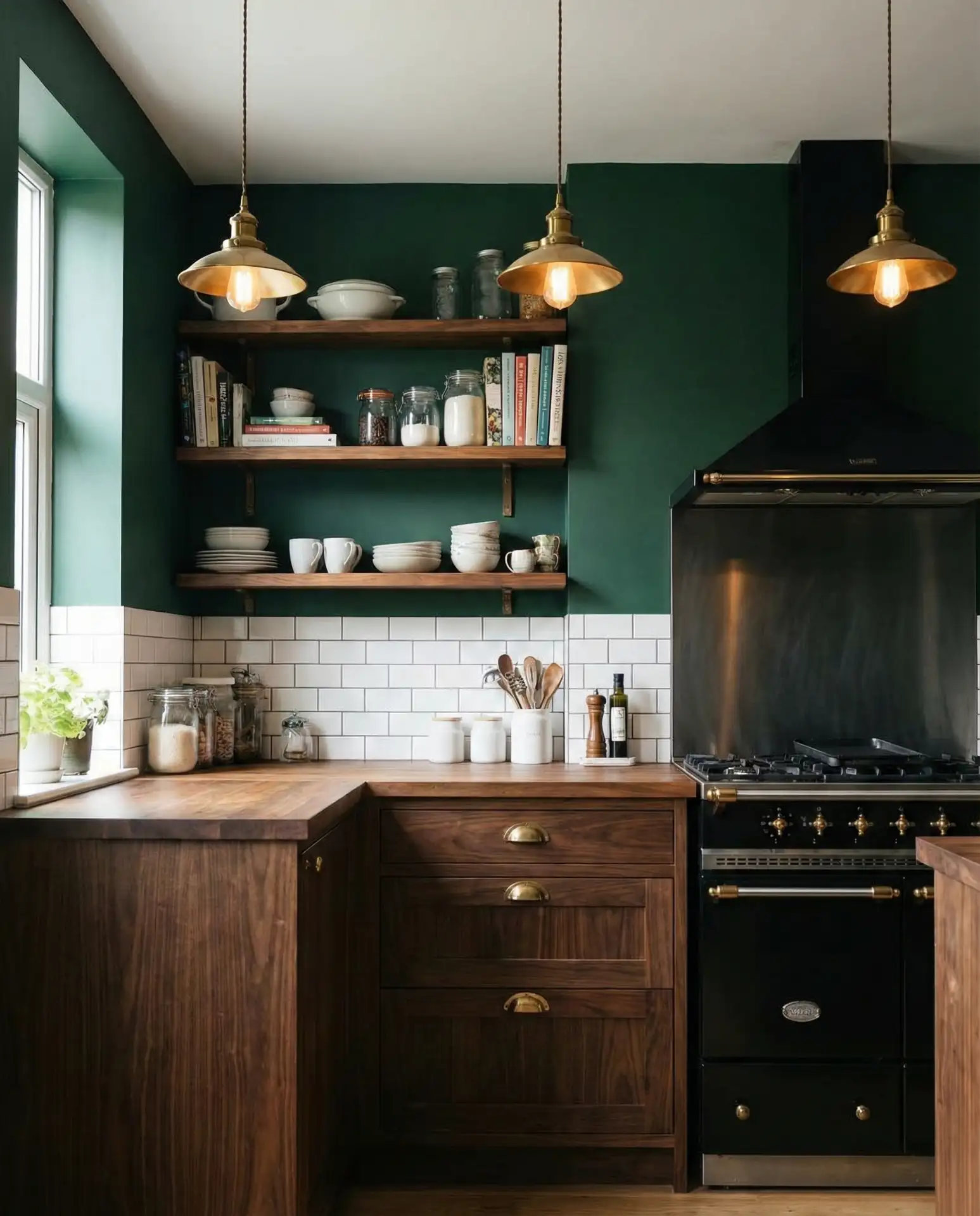
A common mistake is pairing this color with too much darkness—balance it with lighter countertops or open shelving to avoid a cave-like feel. Consider using it on a single accent wall if you’re hesitant to commit fully. It’s also a surprisingly good backdrop for displaying colorful dishware or vintage cookware.
3. Soft Sage Green Cabinets with Cream Walls
Sage green cabinets continue to dominate Pinterest boards, and for good reason. When paired with soft cream or off-white walls, the result is calming, fresh, and endlessly versatile. This combination works in cottage kitchens, modern farmhouses, and even urban apartments. The muted green feels organic and understated, while the cream keeps things light and airy.
In the Midwest and Pacific Northwest, this palette is especially popular among homeowners renovating older homes. It nods to historical color schemes without feeling dated. If you’re worried about the green reading too pastel, choose a version with gray undertones for more sophistication.
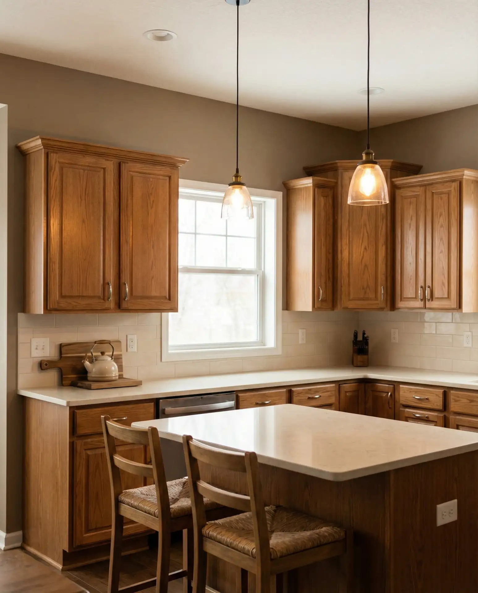
4. Charcoal Gray Walls with Honey Oak Cabinets
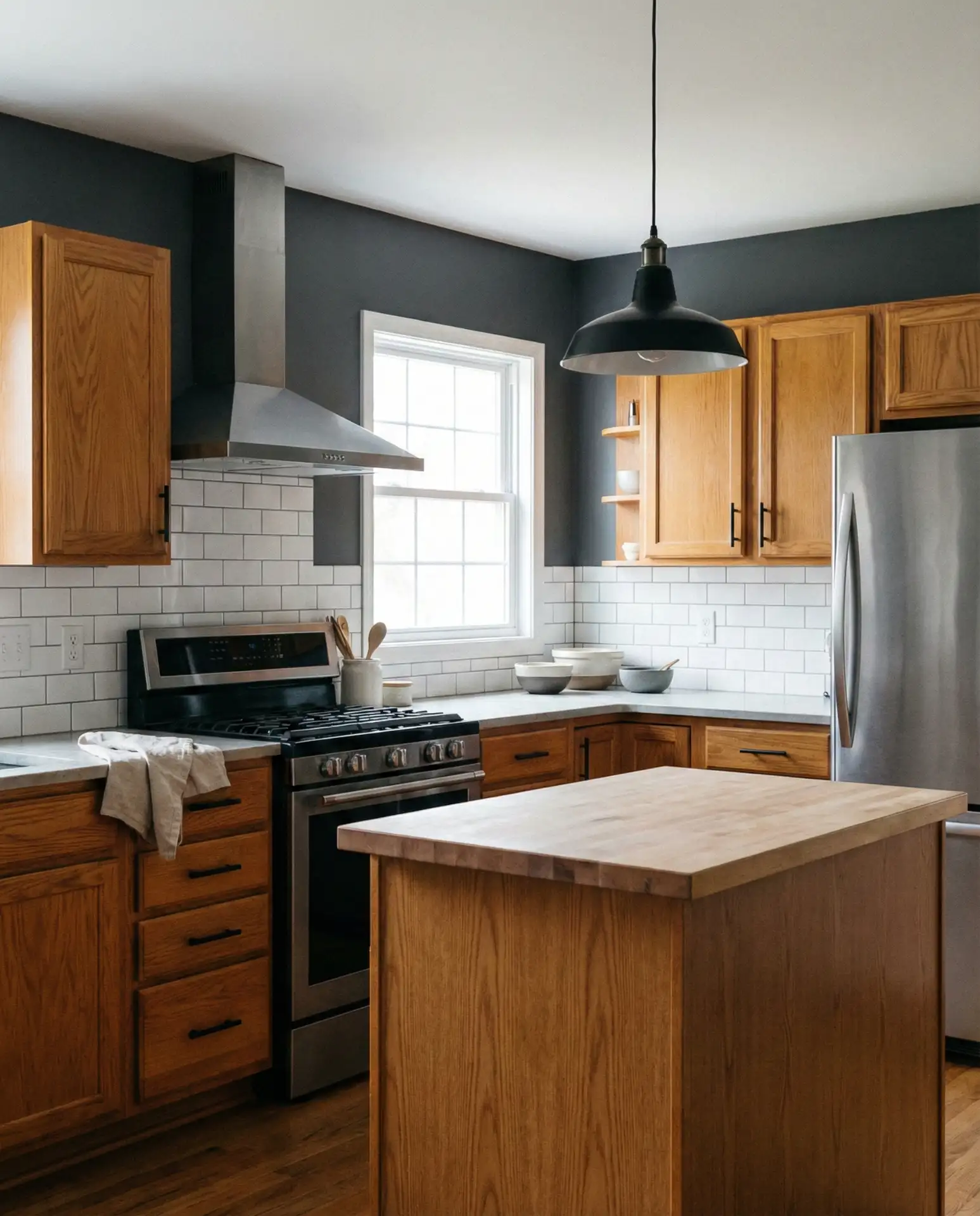
Charcoal gray is the secret weapon for updating honey oak cabinets without replacing them. Instead of fighting the warm wood tone, this deep gray creates a striking contrast that feels intentional and modern. It’s a budget-friendly way to refresh a kitchen, especially when paired with updated hardware and lighting. The result is a space that feels current without erasing its original character.
One homeowner in Ohio painted her walls in Sherwin Williams Iron Ore and immediately noticed how much richer her oak cabinets looked. The gray absorbed some of the orange tones and made the wood feel more intentional. It’s proof that you don’t always need to gut a kitchen to transform it.
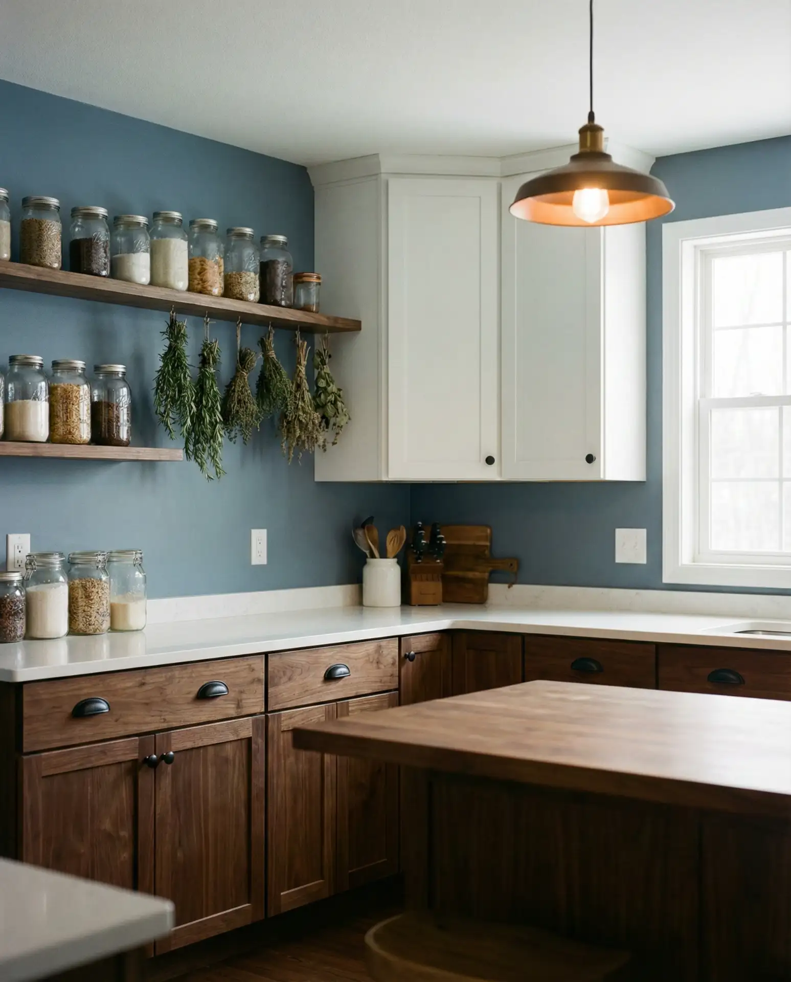
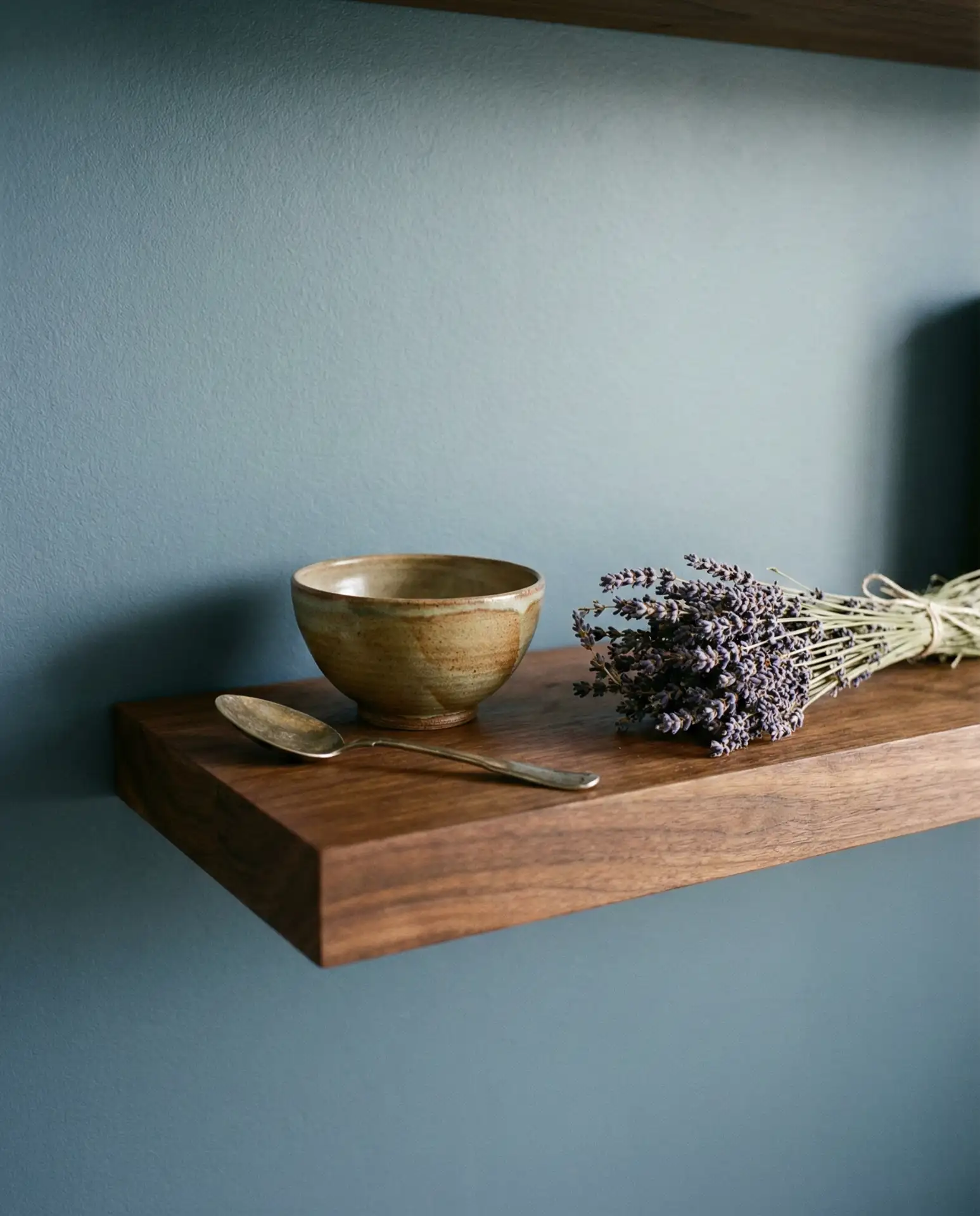
5. Soft Blue Walls for a Coastal Kitchen Vibe
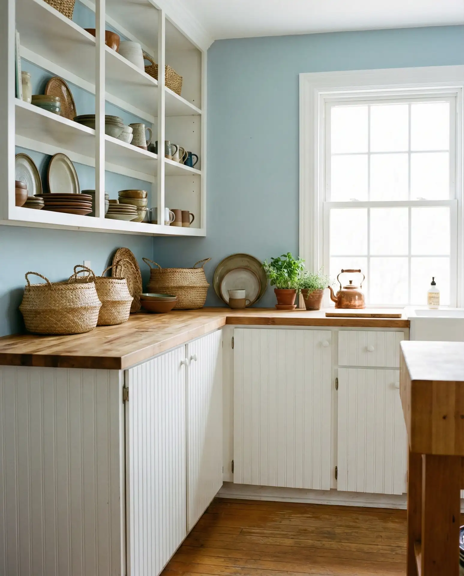
A soft, powdery blue brings a coastal calm to any kitchen. It’s particularly effective in homes near water or in sun-drenched spaces where you want to enhance the breezy, relaxed feeling. This shade works beautifully with white cabinets, natural wood accents, and linen textiles. It’s a color that feels serene without being cold.
This palette is ideal for kitchens that open onto decks or patios, where the blue can echo the sky or ocean. Avoid pairing it with too much stainless steel, which can feel clinical. Instead, lean into warm metals like brass or copper to keep the space feeling inviting.
6. Buttery Yellow Walls with White Cabinets and Black Countertops
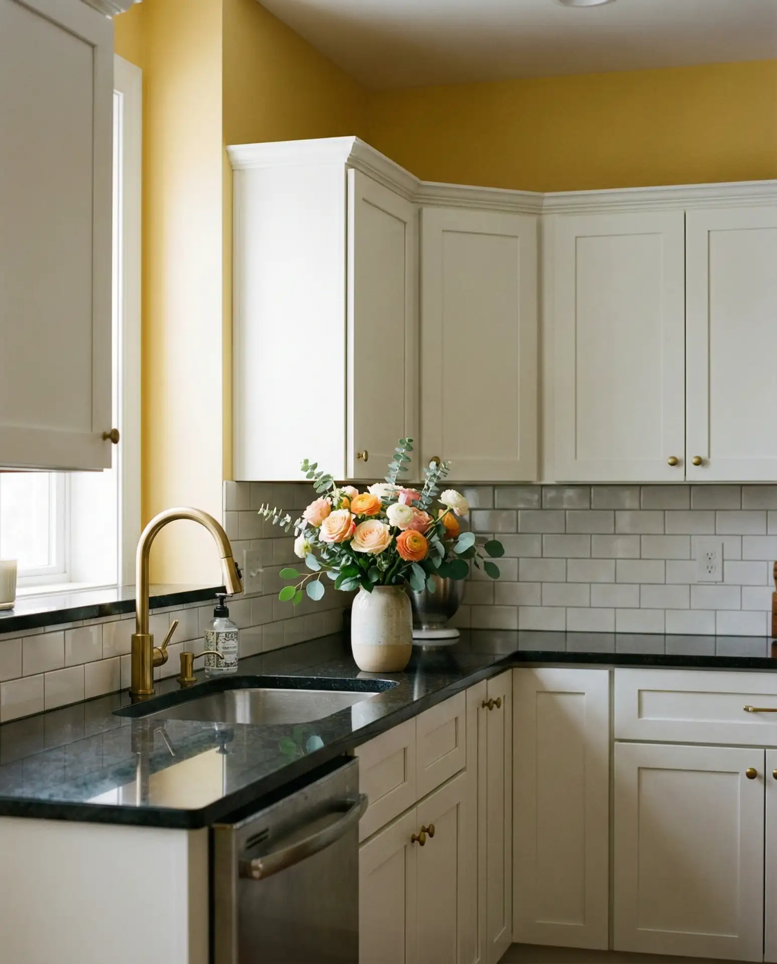
Buttery yellow is making a comeback, and it’s softer and more sophisticated than the brassy tones of decades past. When paired with white cabinets and black countertops, the result is cheerful, high-contrast, and surprisingly elegant. This combination works well in kitchens that don’t get a lot of natural light, as the yellow brightens the space instantly.
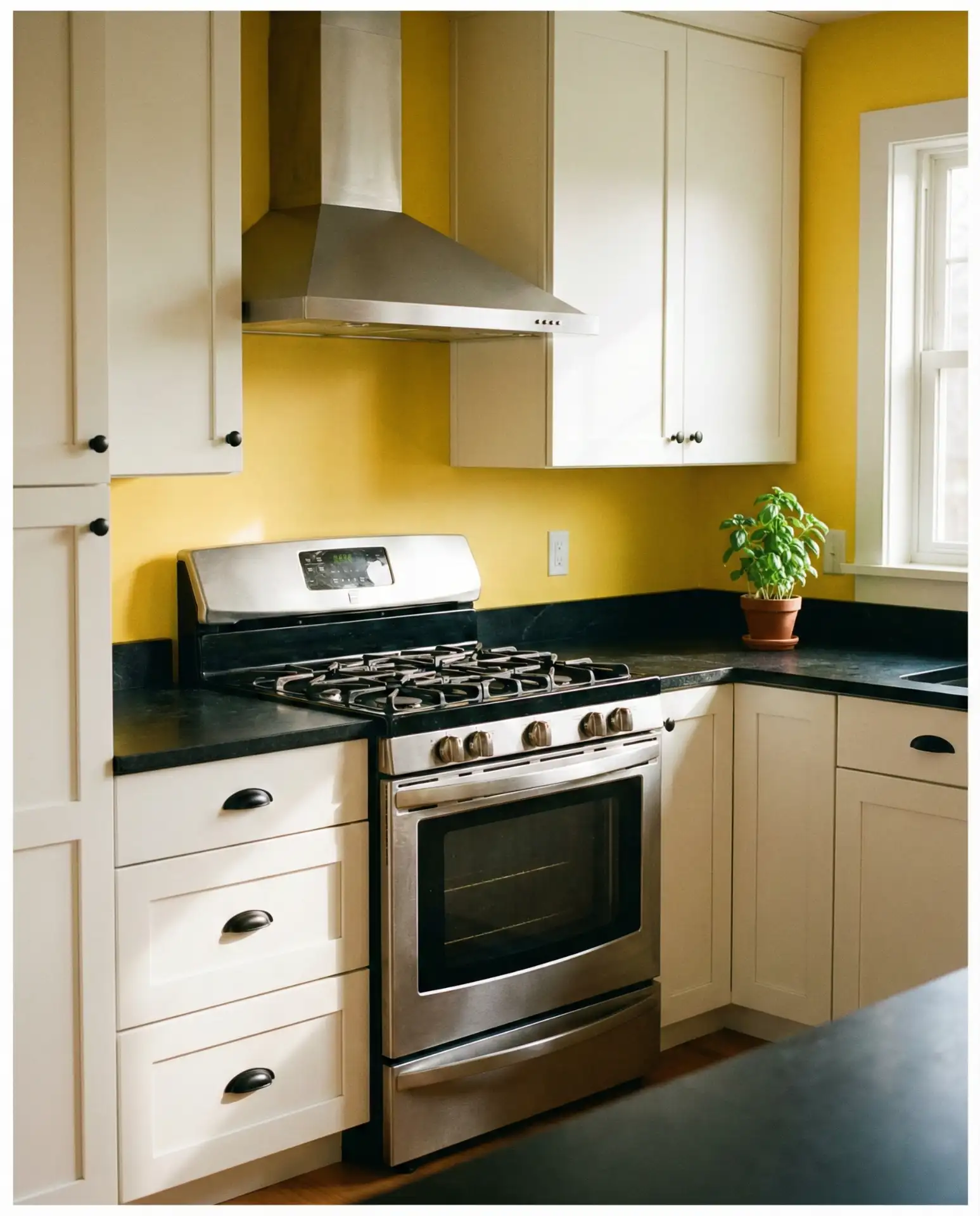
Budget-conscious renovators love this approach because it delivers major impact with just paint and updated countertops. The black grounds the yellow and prevents it from feeling too sweet or dated. It’s a look that feels equally at home in a cottage kitchen or a modern city apartment.
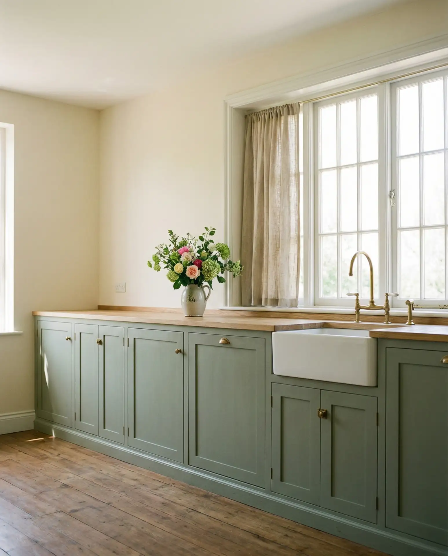
7. Warm Taupe Walls with Oak Cabinets
Taupe is the ultimate warm neutral, and it’s particularly flattering with oak cabinets. Unlike cool grays, taupe has enough warmth to complement the honey tones in oak without clashing. It’s a safe, sophisticated choice that works in nearly any home style, from traditional to transitional. The color is also incredibly forgiving when it comes to lighting changes throughout the day.
Where it works best: homes with existing oak cabinetry that homeowners want to keep but modernize. Taupe creates a cohesive backdrop that doesn’t compete. It also transitions beautifully into adjacent living room spaces, making it ideal for open-plan homes.
8. Black Cabinets with Soft White Walls
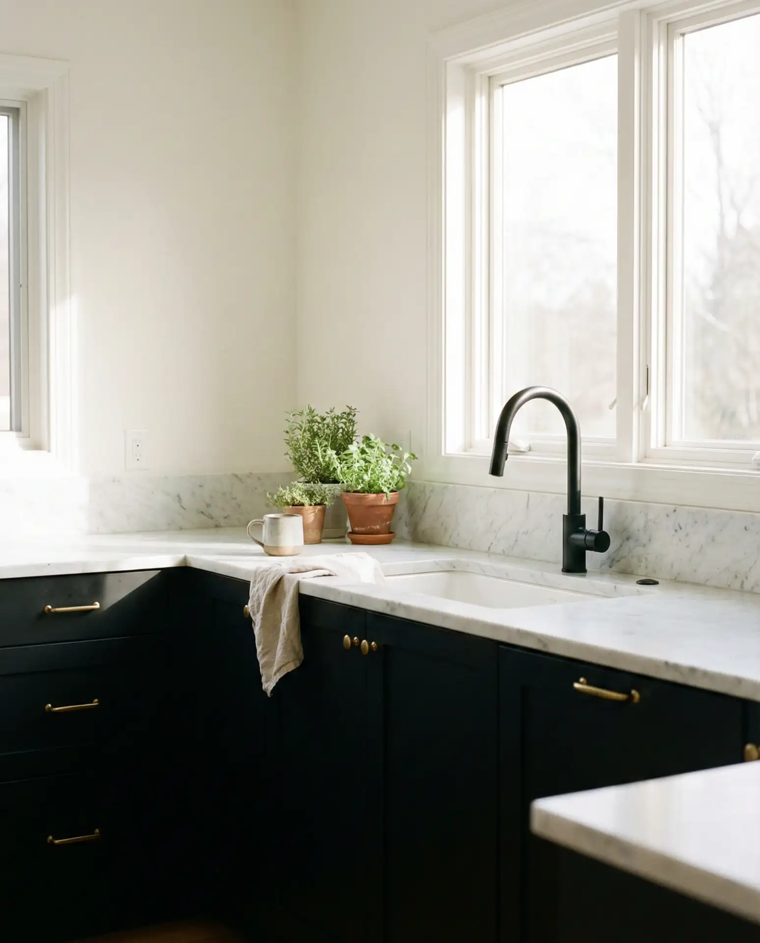
Black cabinets are bold, and they need a light, airy wall color to balance them out. Soft white—not stark white—provides just enough contrast without making the space feel too dramatic. This combination is especially popular in loft-style kitchens and modern homes where clean lines and minimalism are key. The black adds weight and sophistication, while the white keeps things from feeling too heavy.
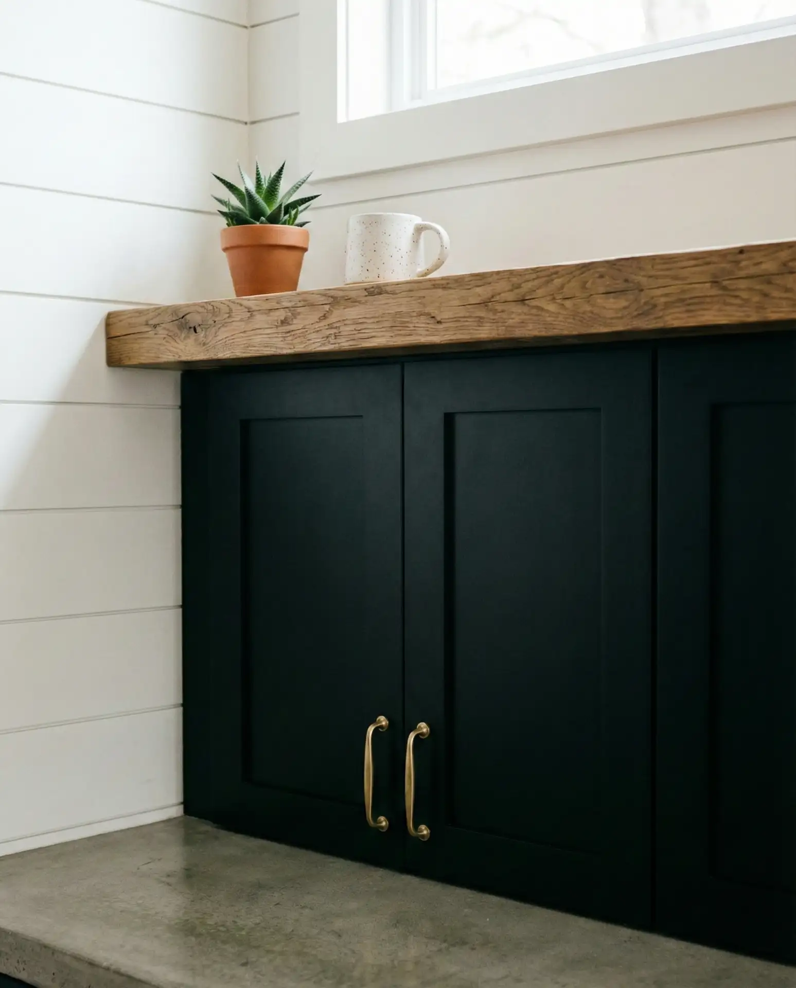
Real homeowner behavior: many people hesitate with black cabinets, fearing they’ll show dust or fingerprints. In reality, a matte finish hides imperfections better than gloss, and the dramatic effect is worth the occasional wipe-down. It’s a choice that feels confident and collected.
9. Greige Walls for Versatile, Livable Style
Greige—a blend of gray and beige—remains one of the most popular warm neutral choices in American homes. It works with virtually any cabinet color, from white cabinets to dark wood, and transitions seamlessly from kitchen to living room. The color is especially useful in homes where the kitchen is visible from multiple rooms, as it creates visual continuity without feeling boring.
Expert-style commentary: Greige is often dismissed as “safe,” but that’s precisely why it works. It’s a backdrop that lets your accessories, cookware, and personal style shine. In 2026, homeowners are choosing greige not because it’s trendy, but because it’s timeless and adaptable.
10. Deep Navy Walls with Brass Accents
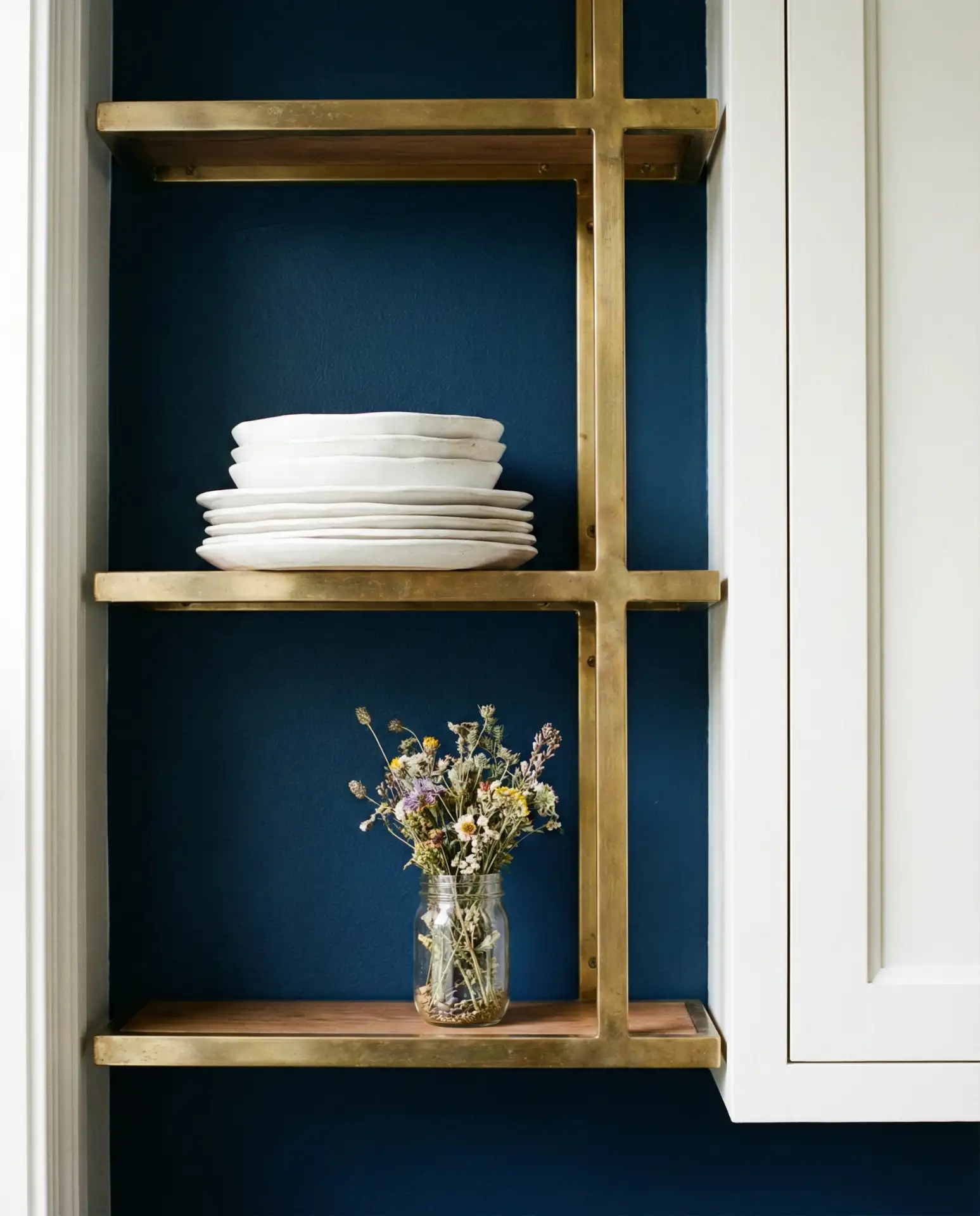
Deep navy has the richness of black but with more warmth and depth. It’s a moody choice that feels luxurious when paired with brass hardware, fixtures, and lighting. This combination works particularly well in smaller kitchens, where the dark walls create an intimate, jewel-box effect. It’s also a surprising fit for cottagecore aesthetics when softened with natural wood and vintage textiles.
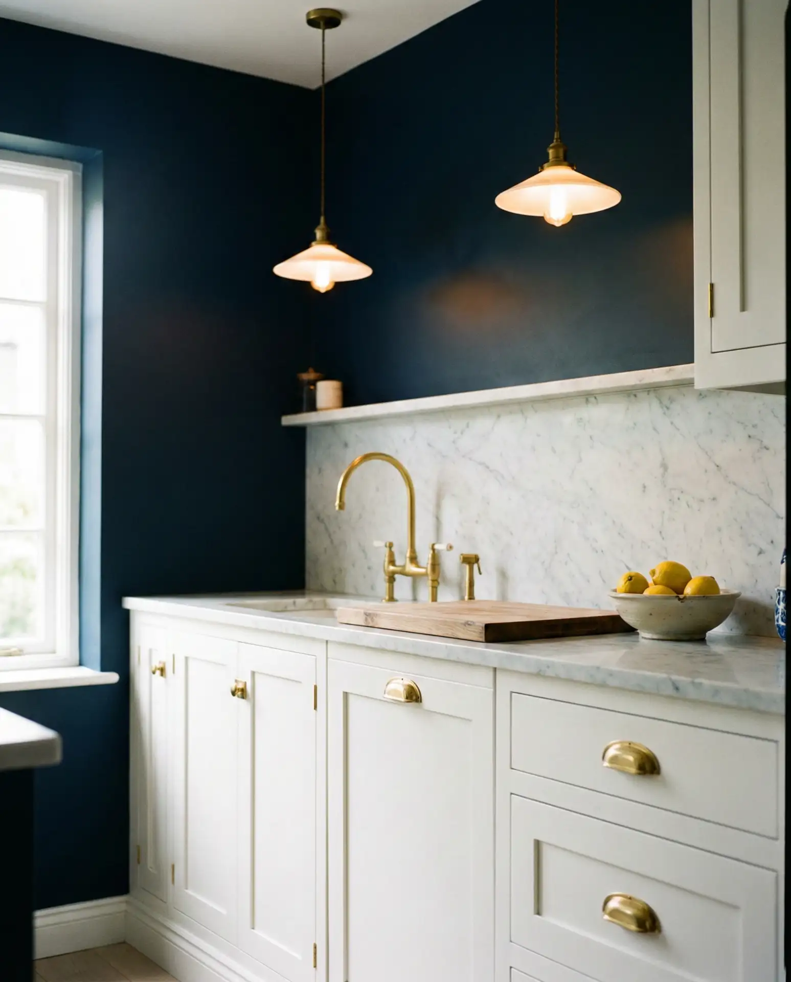
This palette is trending in urban areas where homeowners want personality without sacrificing sophistication. The navy reads as confident and grounded, while the brass adds just enough shine. It’s a combination that feels current but won’t look dated in five years.
11. Pale Pink Walls for a Modern Cottage Kitchen

Pale pink might sound risky, but when done right, it’s soft, warm, and surprisingly grown-up. This shade works beautifully in cottage kitchens, especially when paired with white cabinetry and natural wood accents. The key is choosing a pink with enough gray or beige undertones to avoid looking too saccharine. It’s a color that feels nostalgic and fresh at the same time.
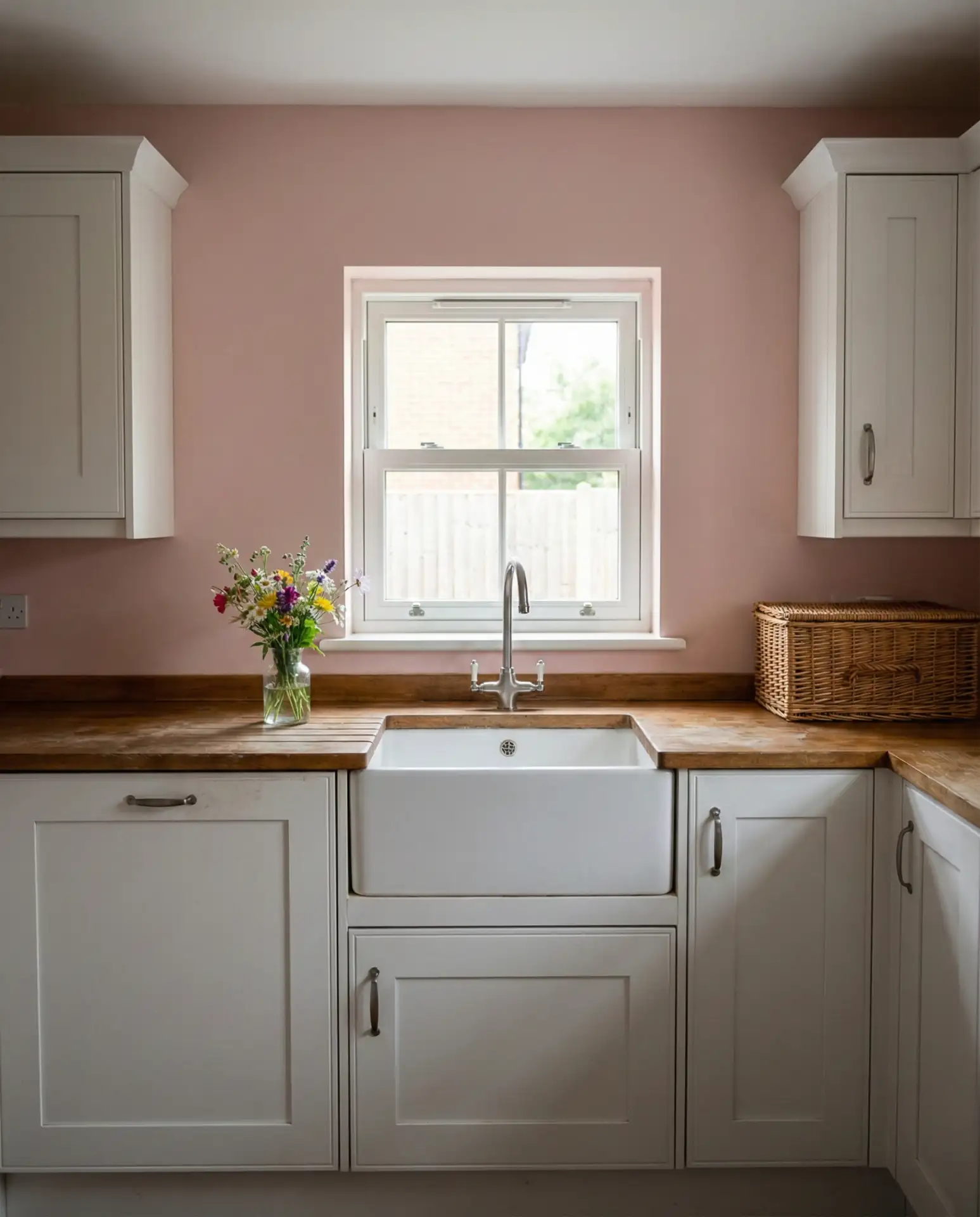
In the South and New England, this palette is especially popular among homeowners renovating historic homes. The pink nods to traditional color schemes while feeling modern and intentional. Pair it with matte black or brass hardware to keep it from feeling too delicate.
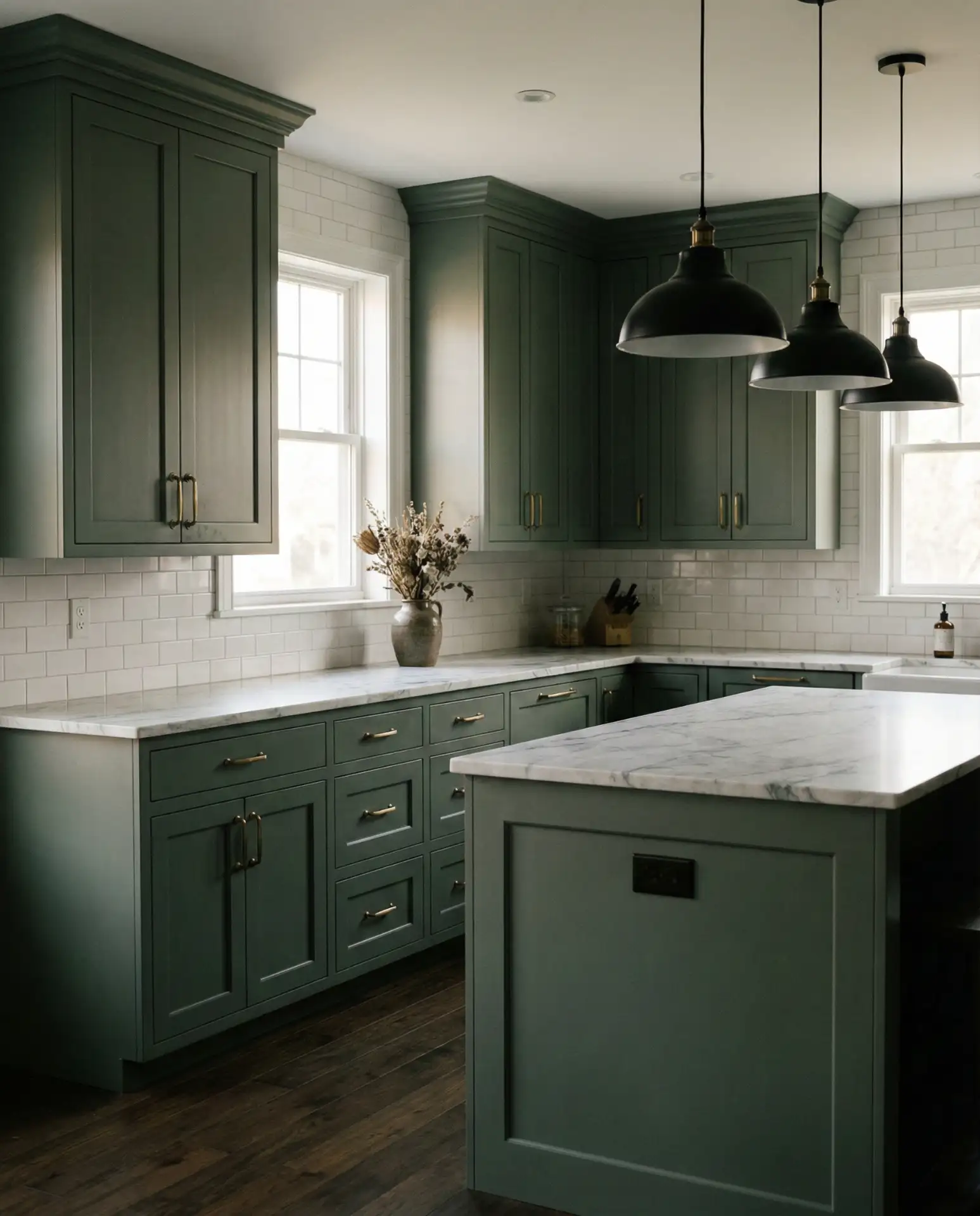
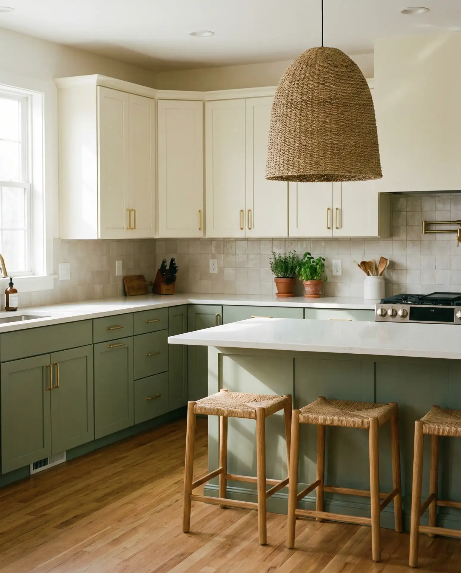
12. Olive Green Walls with Brown Cabinets
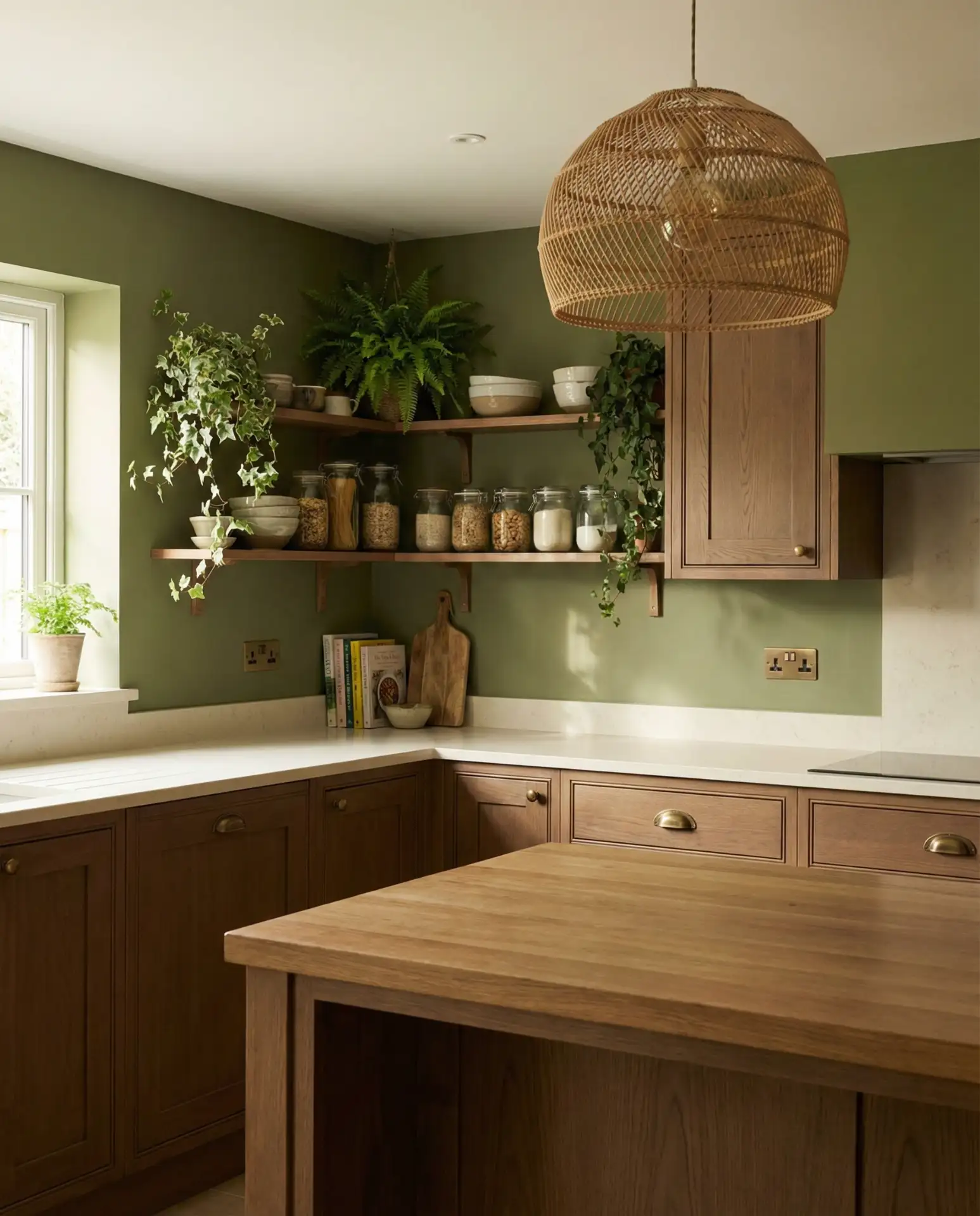
Olive green brings a grounded, earthy quality that pairs beautifully with brown cabinets. This combination feels organic and natural, especially when layered with wood tones and woven textures. It’s a color scheme that works well in homes with a witchy or bohemian aesthetic, but it’s versatile enough for more traditional spaces too. The olive doesn’t compete with the brown—it complements it.
Common mistake: pairing olive with too many warm tones, which can make a space feel muddy. Balance it with crisp white accents or black details to keep things fresh. The olive also benefits from good lighting—natural light brings out its green tones, while warm bulbs emphasize the brown.
13. Creamy White Walls for Timeless Elegance
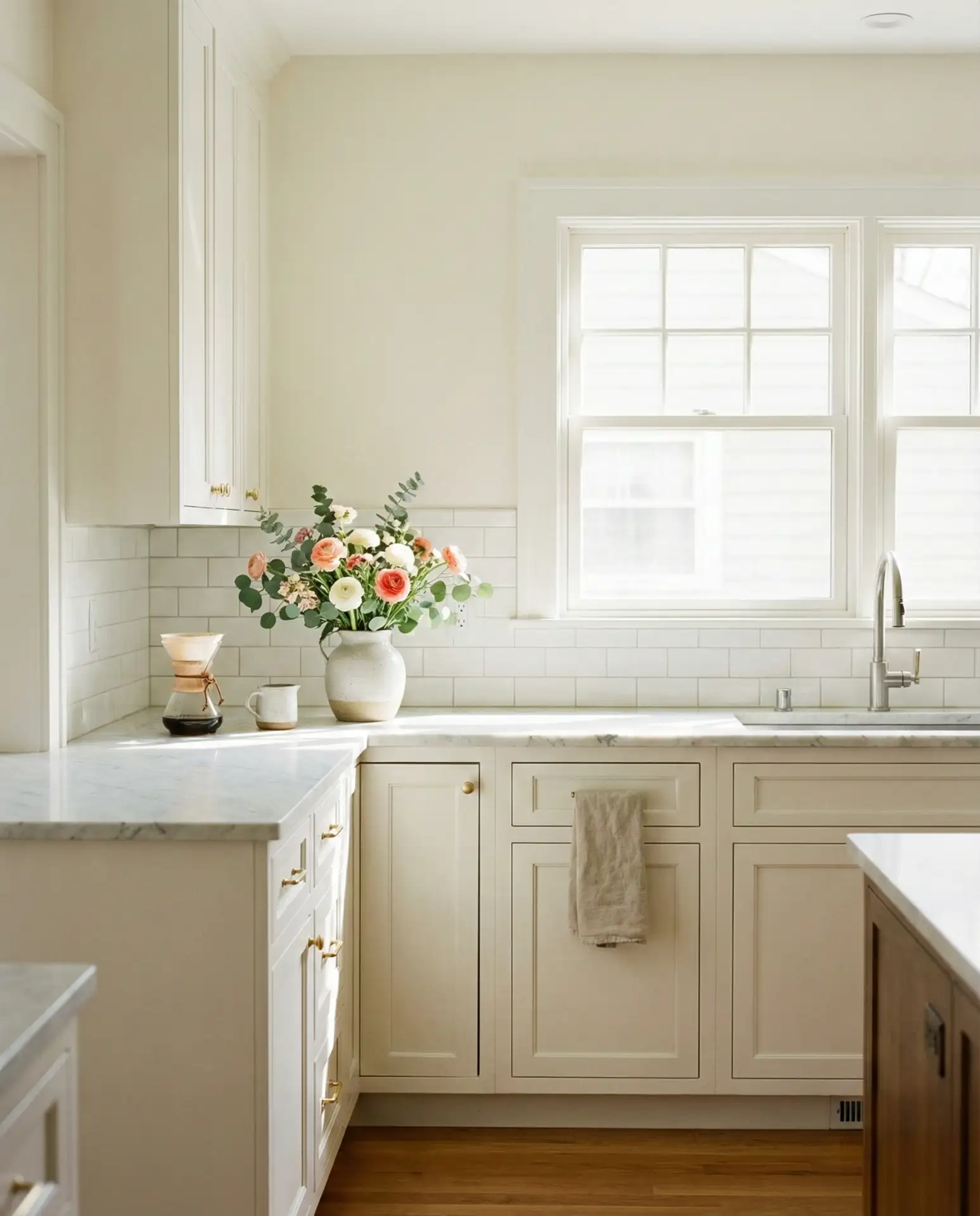
Creamy white is a perennial favorite for ideas for walls with white cabinets, and it’s easy to see why. The warmth of the cream prevents the space from feeling too clinical, while the white keeps it bright and open. This is a foolproof choice for homeowners who want a classic, elegant kitchen that won’t feel dated in a few years. It’s also a great backdrop for colorful accessories and art.
This palette is especially popular in the South and Southwest, where homeowners appreciate the light, airy feel. It’s also budget-friendly since you’re working with a neutral base that pairs with almost any countertop or backsplash material. The cream adds just enough warmth to feel inviting without reading as yellow.
14. Dusty Mauve Walls for a Soft, Romantic Look
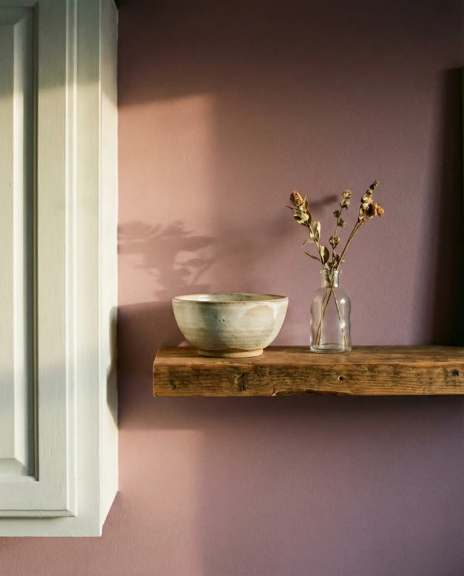
Dusty mauve is a muted, sophisticated take on pink that feels both vintage and modern. It works beautifully in kitchens with natural light, where the color shifts subtly throughout the day. This shade pairs well with white cabinets, brass hardware, and natural wood accents. It’s a color that feels personal and intentional, perfect for homeowners who want something a little different.
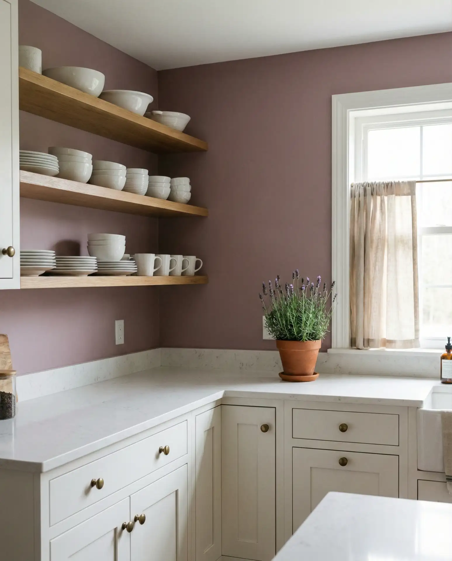
Where it works best: in west-facing kitchens where the evening light brings out the warmth in the mauve. It’s also a great choice for renters who want to make a statement with paint but don’t want to commit to anything too bold. The color is calming without being boring.
15. Warm Gray Walls with Cherry Cabinets
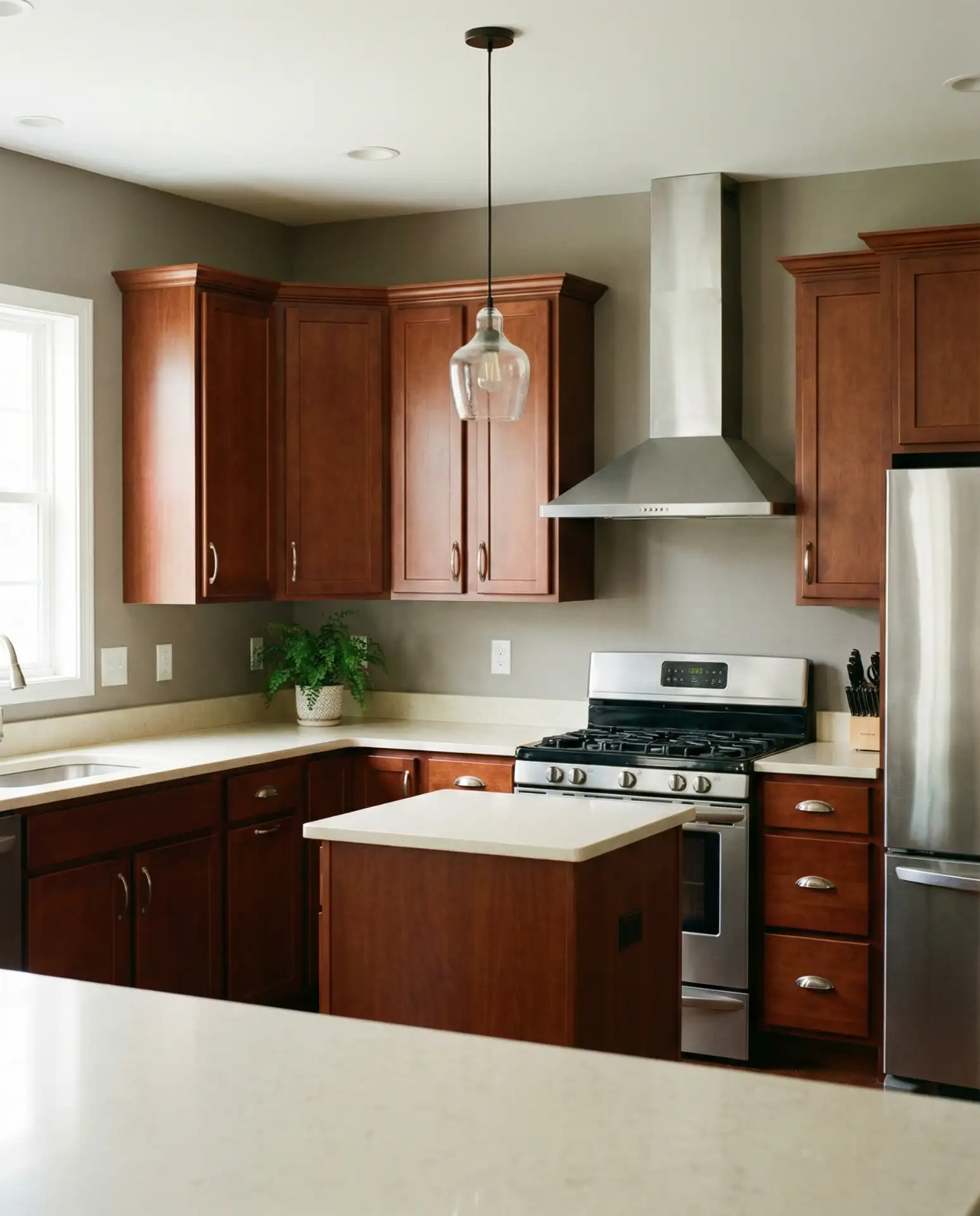
Warm gray is the key to updating cherry cabinets without painting them. Unlike cool grays, which can clash with the red undertones in cherry, warm gray has enough taupe or beige to complement the wood. This combination feels sophisticated and current, especially when paired with updated lighting and hardware. It’s a budget-friendly way to refresh a kitchen while honoring its existing character.

One homeowner in Virginia painted her walls in Benjamin Moore Revere Pewter and immediately noticed how much more modern her cherry cabinets looked. The gray softened the red tones and made the wood feel intentional rather than dated. It’s a simple update that delivers outsized results.
16. Pale Aqua Walls for a Fresh, Airy Feel
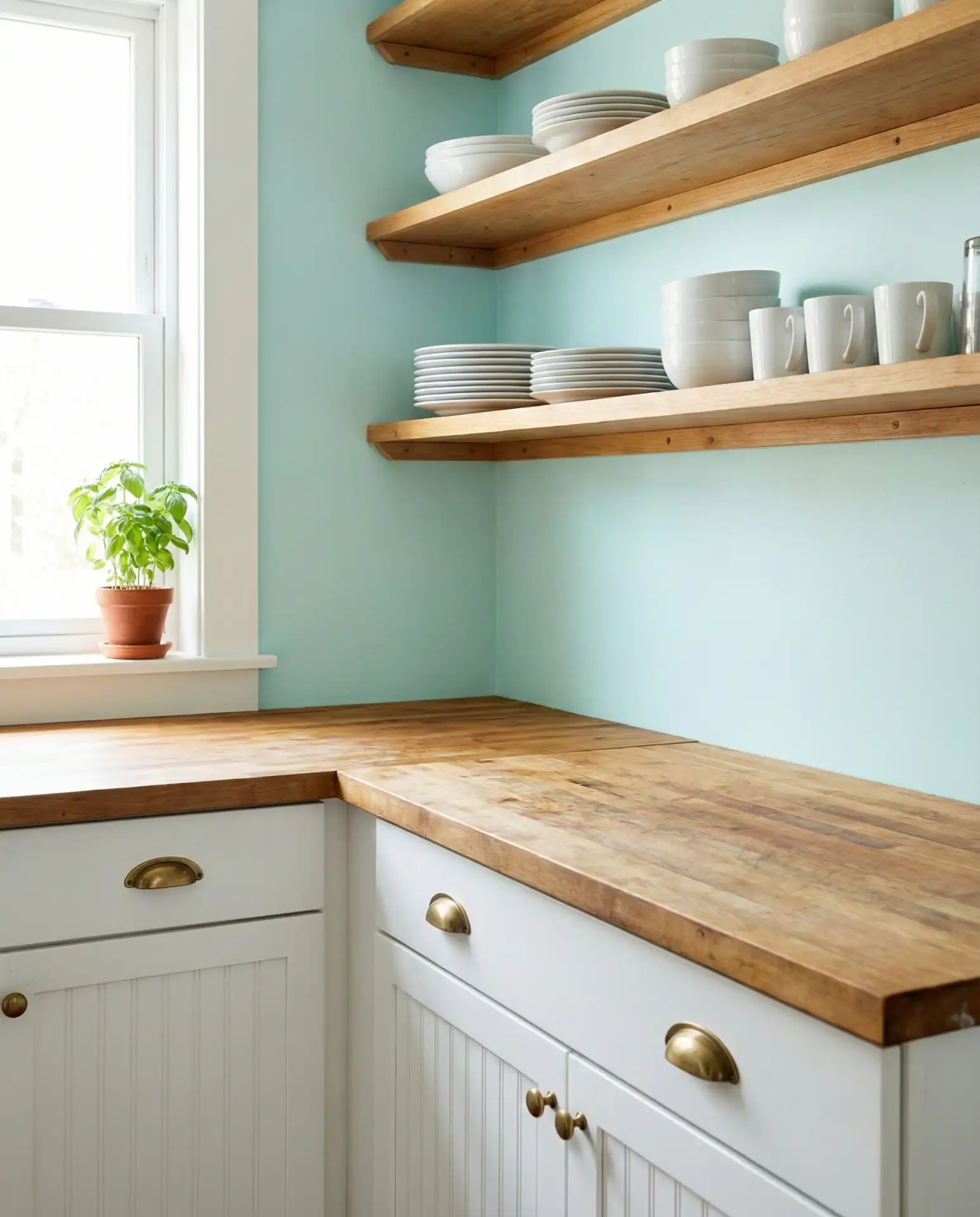
Pale aqua is a coastal-inspired shade that works beautifully in kitchens with plenty of natural light. It’s softer than traditional blue and has a playful, optimistic quality. This color pairs well with white cabinetry, light wood tones, and natural textiles. It’s a great choice for homeowners who want to bring a sense of vacation into their everyday space.
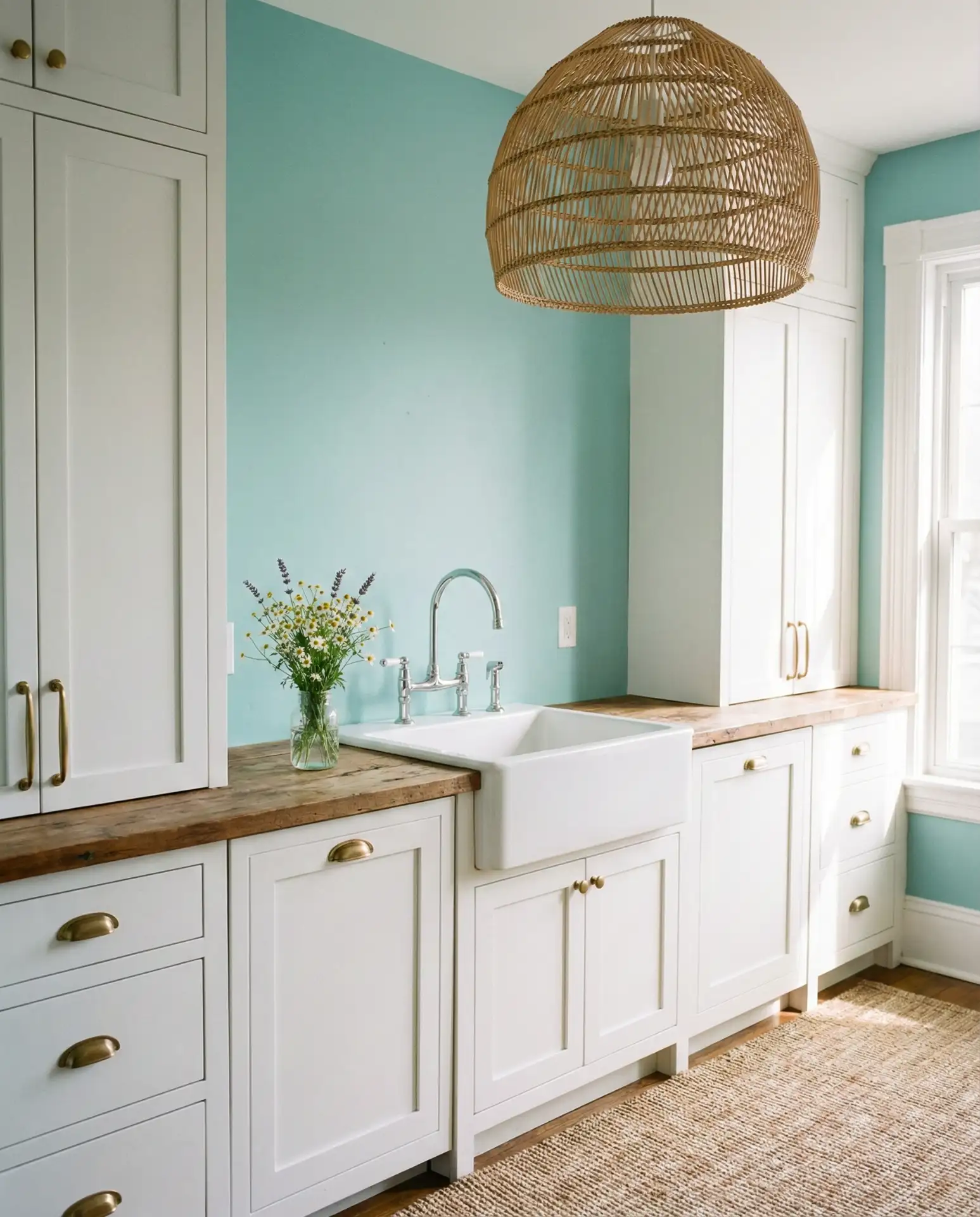
This palette is especially popular in beach towns and warm climates, where the aqua feels right at home. It’s also surprisingly practical, as it hides minor wall imperfections better than stark white. Pair it with rattan or seagrass accents to complete the coastal vibe.
17. Rich Chocolate Brown Walls for Cozy Drama
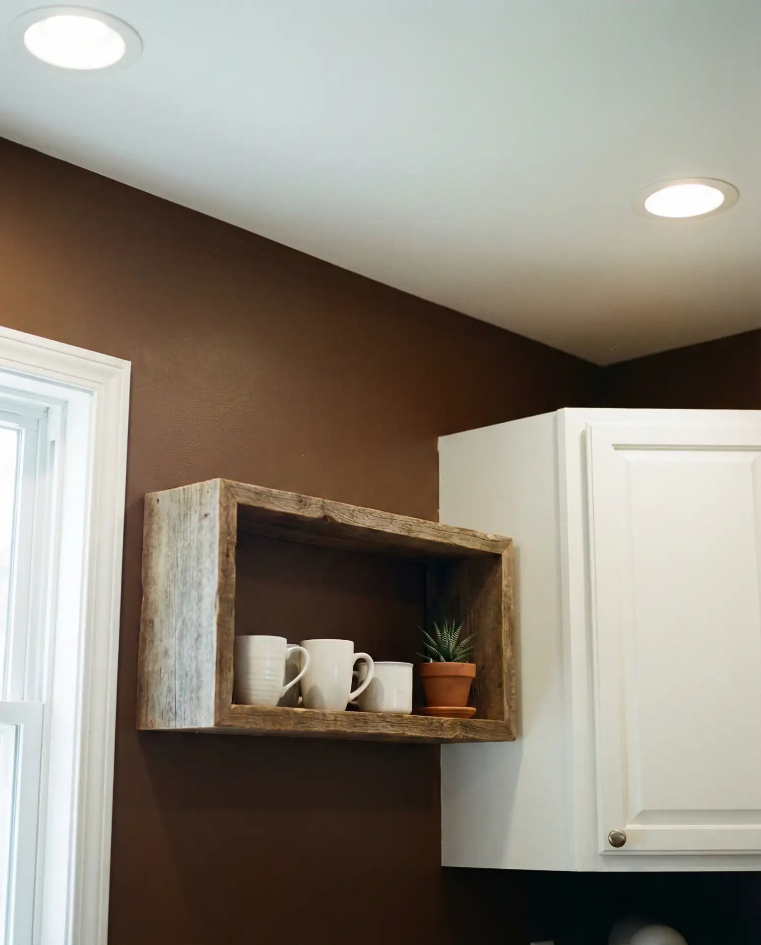
Rich chocolate brown is a bold, unexpected choice that creates instant warmth and intimacy. This color works particularly well in larger kitchens where you want to create a cozy, enveloping feel. It pairs beautifully with white cabinets, brass accents, and natural wood. The result is a space that feels both luxurious and livable, perfect for homeowners who aren’t afraid of color.
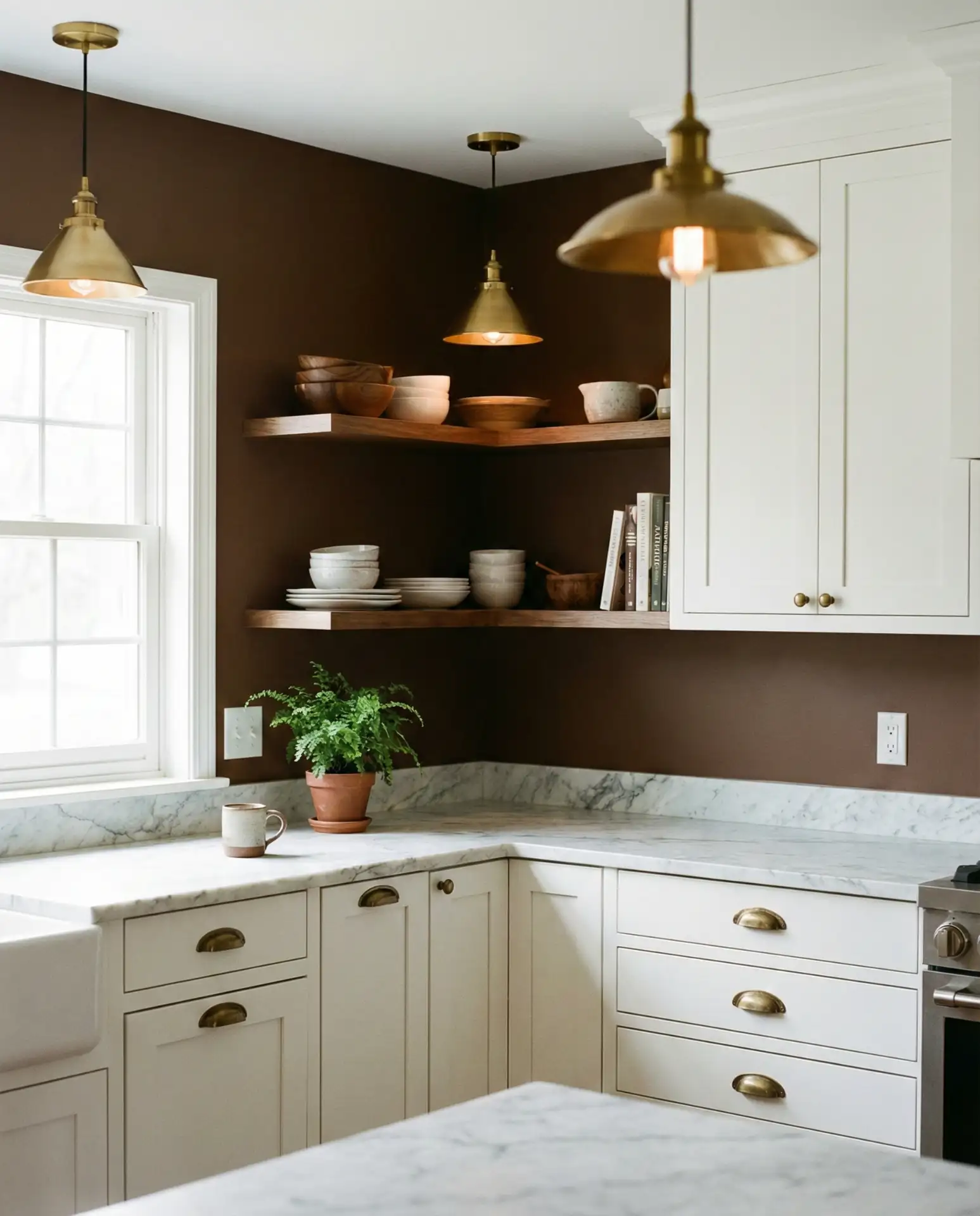
Real homeowner behavior: many people worry that dark walls will make a kitchen feel small, but the opposite is often true. Dark colors can blur the boundaries of a room and create a sense of depth. It’s a sophisticated choice that feels current and timeless.
18. Soft Peach Walls for Warmth Without Sweetness
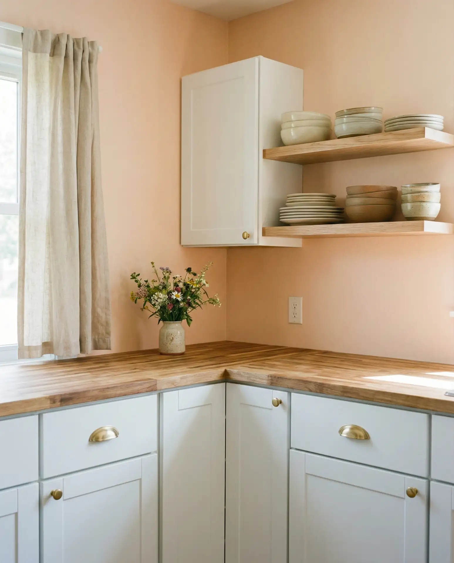
Soft peach is a warm, inviting color that’s been gaining traction as a warm neutral alternative to beige. It has enough color to feel interesting but enough neutrality to work with a wide range of styles. This shade pairs beautifully with oak cabinets, white cabinetry, and natural wood accents. It’s a color that feels sunny and optimistic without being too bright.
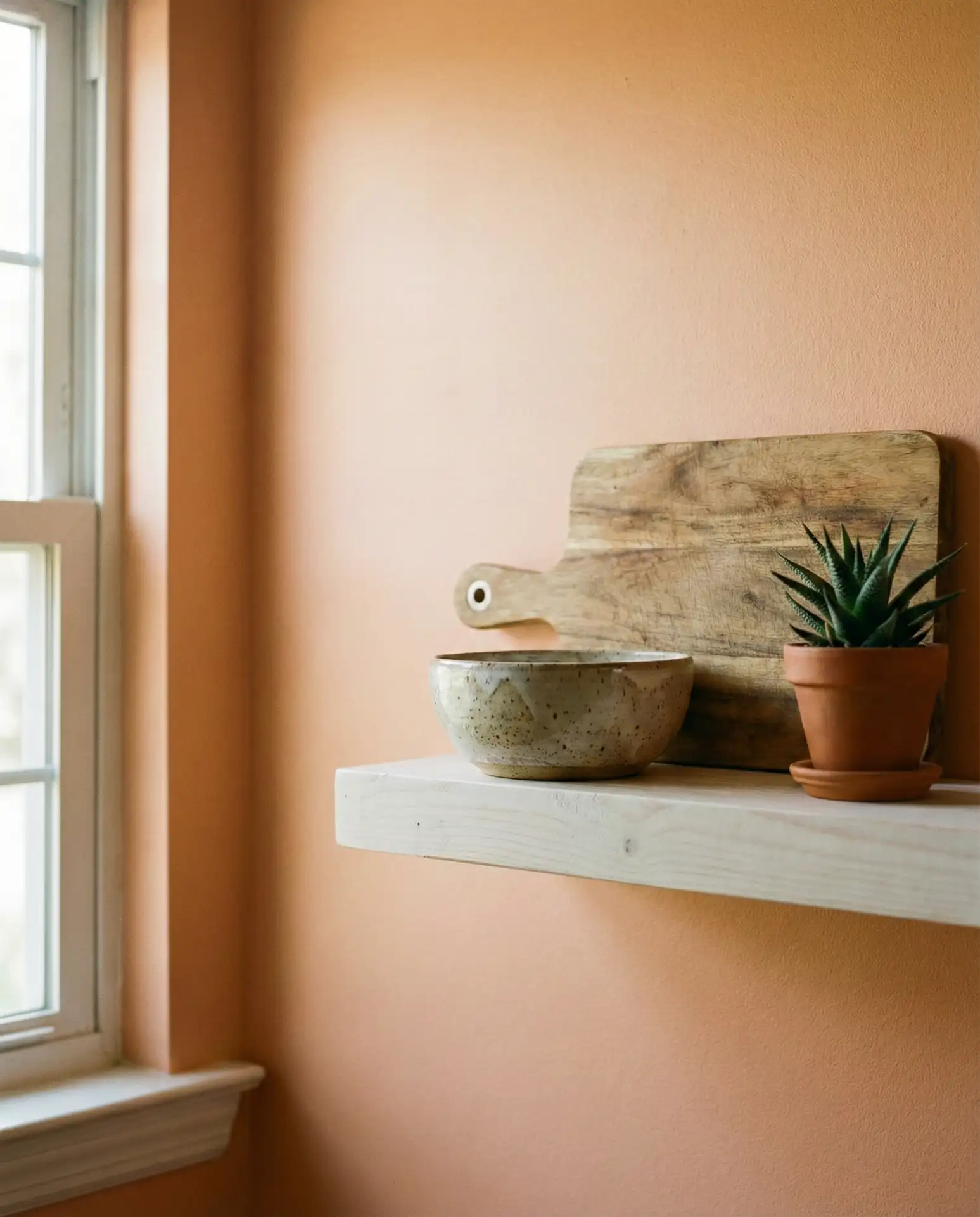
This palette works best in kitchens with good natural light, where the peach can glow softly throughout the day. It’s also forgiving with skin tones, making it a flattering choice for spaces where people gather. Pair it with matte black or brass hardware to keep it from feeling too delicate.
19. Slate Blue Walls for a Moody, Witchy Aesthetic
Slate blue sits somewhere between gray and navy, making it a versatile choice for homeowners who want a moody kitchen with a witchy edge. This color works beautifully with dark wood accents, black hardware, and natural stone. It’s a sophisticated, layered color that feels both grounding and atmospheric. The result is a kitchen that feels personal and intentional.
Expert-style commentary: Slate blue is a color that rewards layering. It benefits from multiple light sources, textured materials, and thoughtful styling. It’s not a “set it and forget it” color, but for homeowners who love to curate their spaces, it’s endlessly rewarding.
20. Warm Beige Walls with Dark Wood and Gray Accents
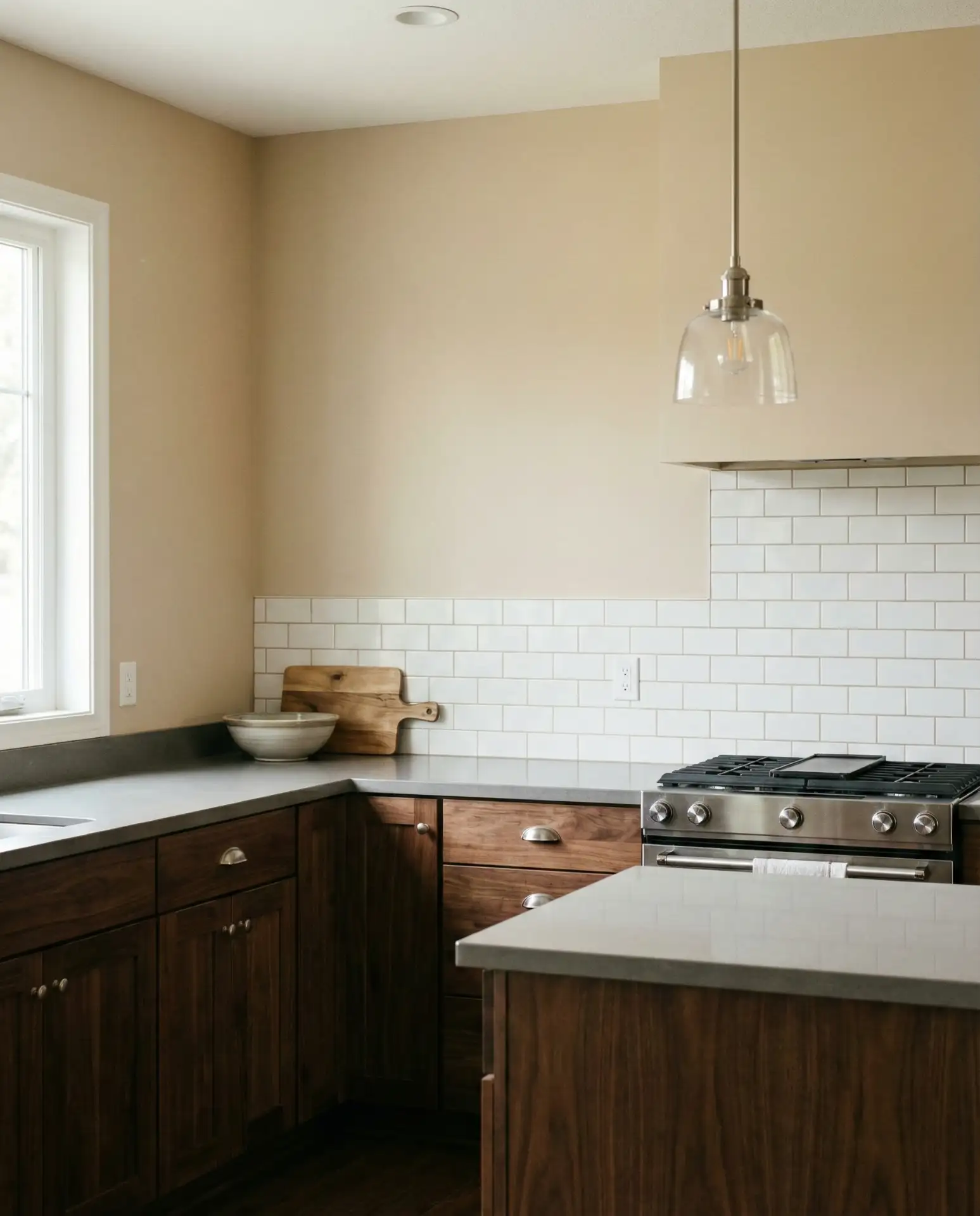
Warm beige is a classic warm neutral that pairs beautifully with dark wood, grey walls, and oak cabinets. This combination feels grounded and sophisticated, especially when layered with gray accents like countertops or backsplash tiles. The beige softens the contrast between the dark wood and gray, creating a harmonious, livable space. It’s a palette that works across a wide range of home styles.
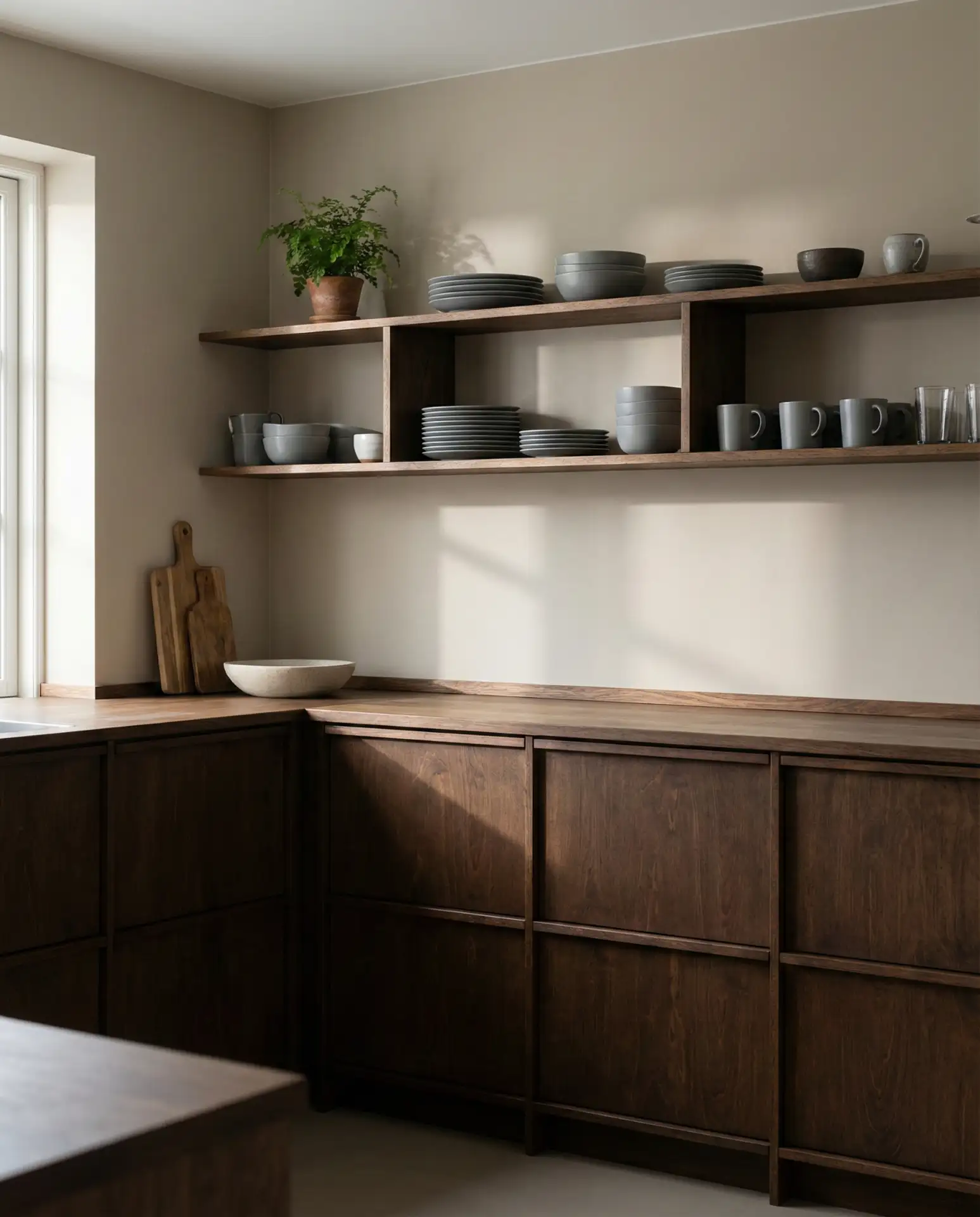
Common mistake: choosing a beige that’s too yellow, which can clash with gray tones. Test your paint in different lighting conditions to ensure it has enough warmth without reading as yellow. The right beige will feel soft and neutral, not dated.
21. Pale Lavender Walls for a Cottagecore Dream
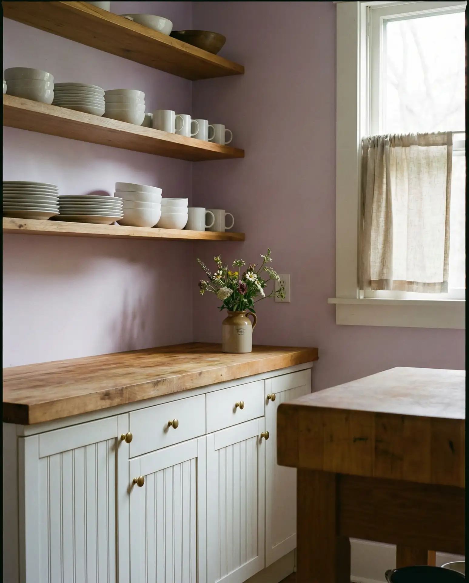
Pale lavender is a dreamy, unexpected choice that works beautifully in cottagecore kitchens. This soft, muted purple feels nostalgic and romantic without being overly sweet. It pairs well with white cabinets, natural wood accents, and vintage-inspired hardware. The result is a space that feels like it belongs in a storybook, perfect for homeowners who love whimsy and charm.
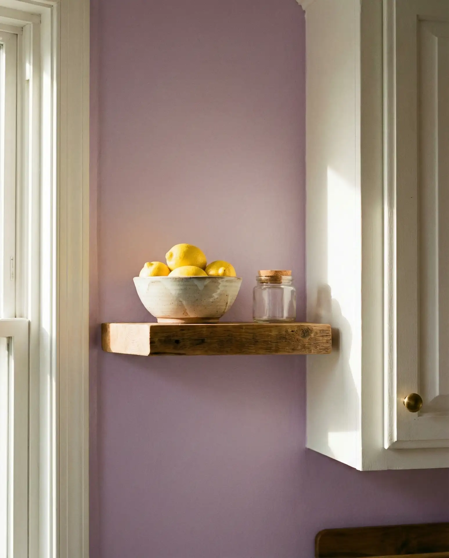
In rural areas and small towns, this palette is especially popular among homeowners renovating older homes. The lavender nods to historical color schemes while feeling fresh and personal. Pair it with matte black or antique brass hardware to ground the sweetness.
22. Warm White Walls with Honey Oak Cabinets from Sherwin Williams
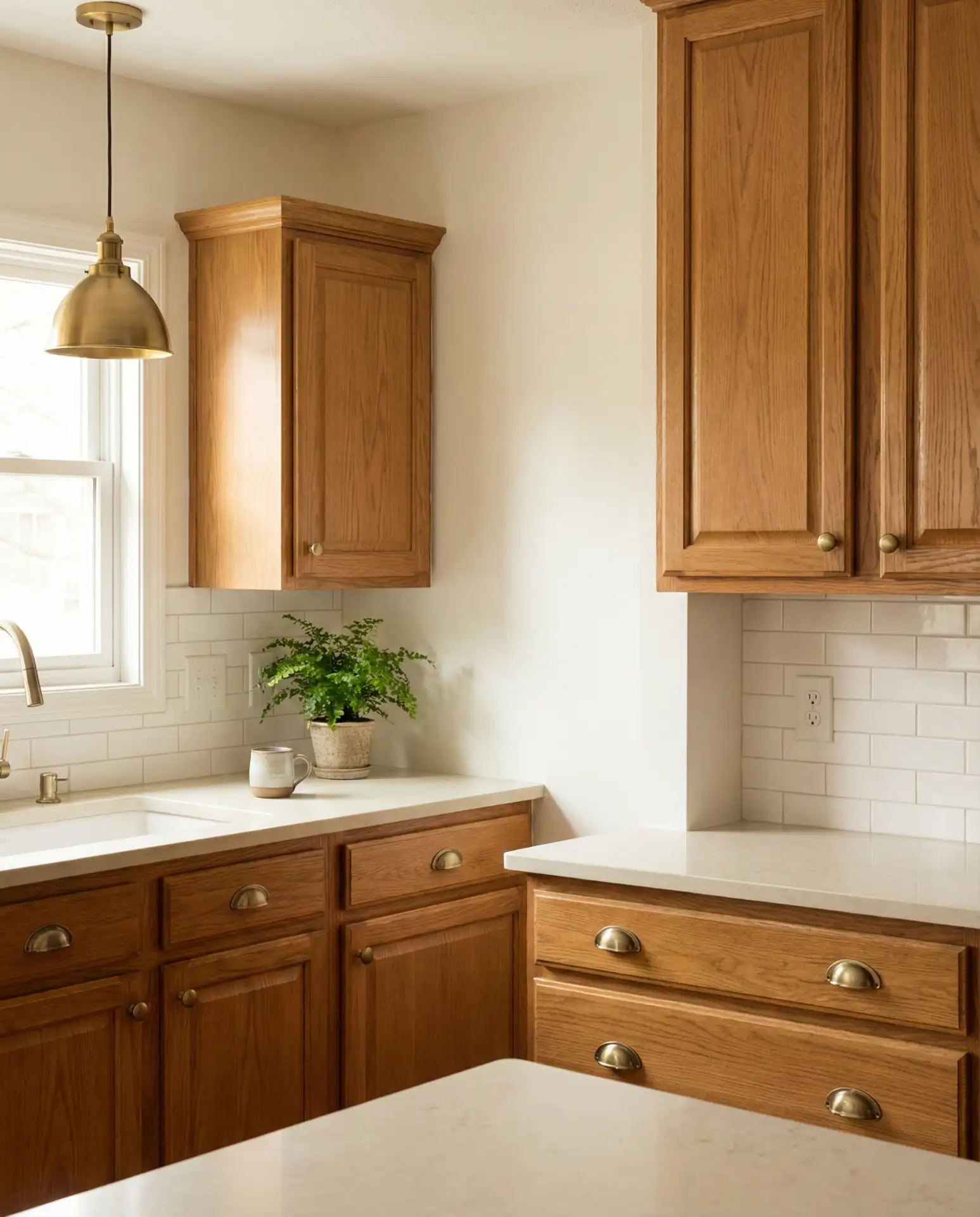
Warm white is a fail-safe choice for updating honey oak cabinets with Sherwin-Williams paint colors. Unlike stark white, which can make oak look dated, warm white has enough cream or beige to complement the wood’s natural tones. This combination feels clean and classic, perfect for homeowners who want a fresh look without major renovations. It’s also a great backdrop for layering in color through accessories and textiles.
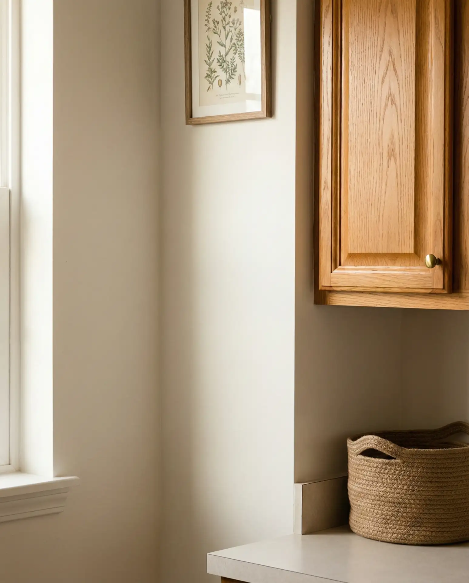
Budget-conscious renovators love this approach because it delivers a fresh look with minimal investment. The warm white brightens the space without fighting the oak, and it transitions beautifully into adjacent rooms. It’s a choice that feels safe but smart, especially for resale value.
Conclusion
Kitchen paint colors in 2026 are all about warmth, personality, and livability. Whether you’re drawn to the grounded tones of terracotta and olive or the dreamy softness of lavender and peach, there’s a palette here that can transform your space. The key is choosing colors that feel true to you and your home, not just what’s trending. We’d love to hear which of these ideas resonates with you—drop a comment below and let us know what you’re planning for your kitchen!