Neutral living rooms are having their biggest moment yet in 2026, and it’s not hard to see why. American homeowners are craving spaces that feel grounded, flexible, and timeless—rooms that can evolve with their lives without requiring a full redesign every few years. Pinterest is flooded with searches for soft whites, warm beiges, and subtle grays, all paired with natural textures and just the right amount of personality. This guide walks you through fresh, real-world ideas that prove neutral doesn’t mean boring—it means intentional, adaptable, and endlessly stylish.
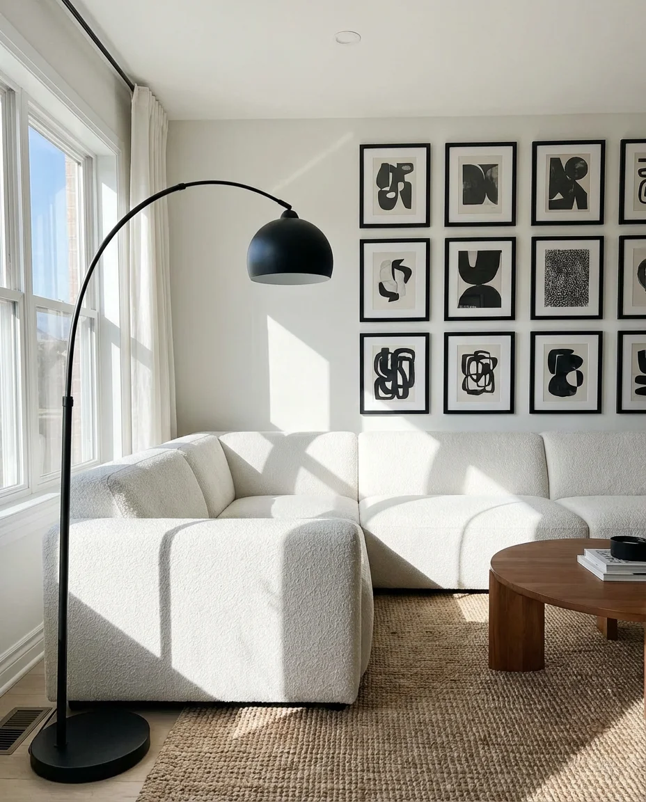
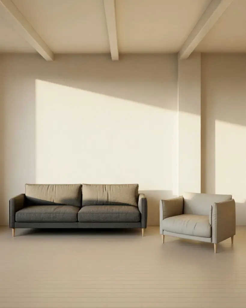
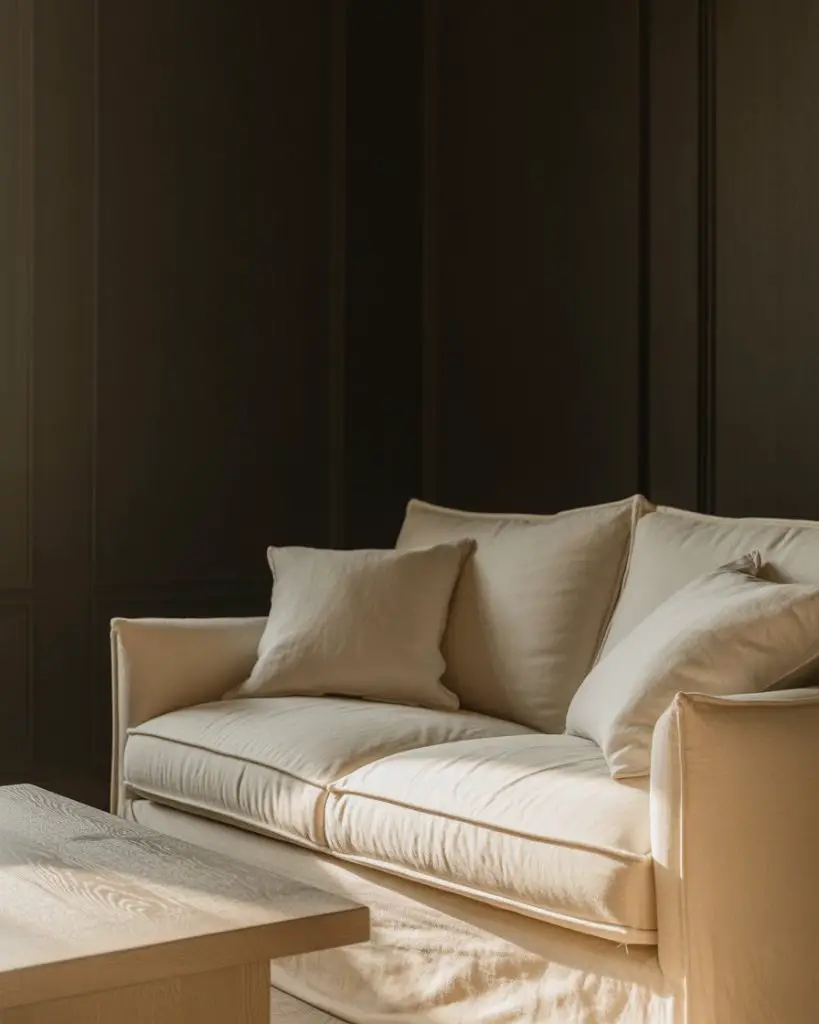
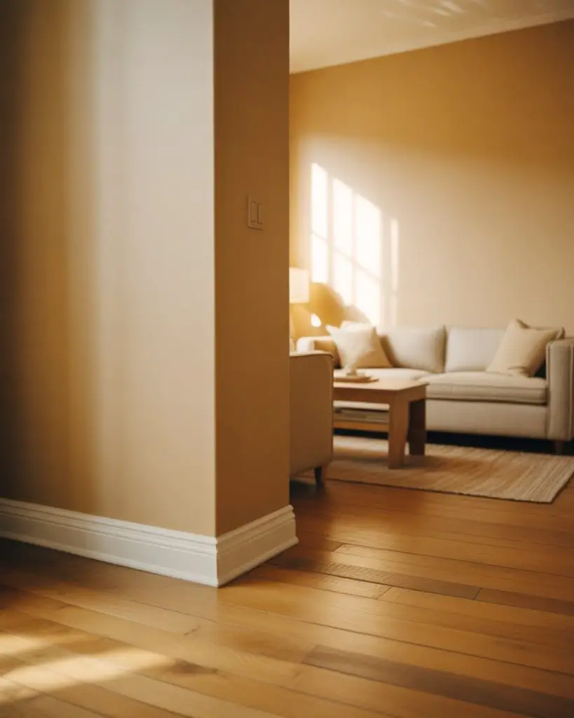
1. Layered Beige with Black Accents
Start with a foundation of warm beige walls and a tonal sofa, then introduce black accents through picture frames, a slender floor lamp, or a low coffee table. This combination feels cozy without leaning too traditional, and the contrast adds just enough edge to keep the room from feeling flat. It’s a popular choice for apartment dwellers who want sophistication without heavy furniture or bold color commitments. 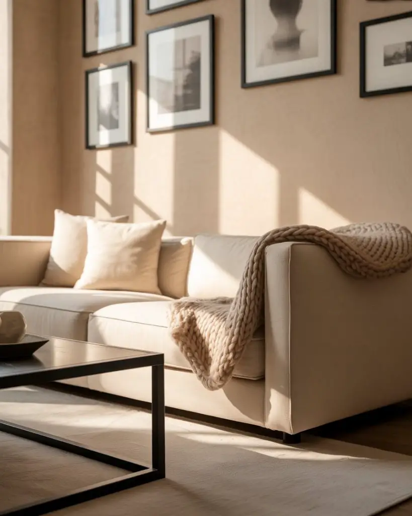
This approach works best in smaller spaces where you need visual breathing room but still want definition. Black accents act as anchors, giving the eye clear stopping points without overwhelming the palette. It’s also forgiving—if you swap out the black elements for brass or wood later, the neutral base stays perfectly intact.
2. Organic Textures and Earthy Tones
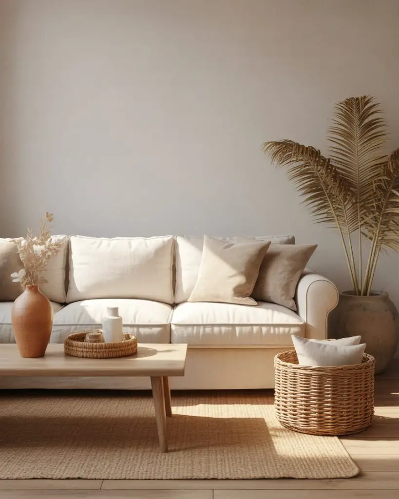
Think linen curtains, a chunky wool throw, and a jute rug layered over light oak floors. The magic is in mixing organic materials that bring warmth and dimension to an otherwise simple palette. Earthy shades like terracotta, sand, and clay can appear in pillow covers or a ceramic vase, subtly grounding the room without adding visual noise.
A designer once told me that the best neutral rooms feel like they’ve been furnished over time, not all at once. That means mixing vintage finds with new pieces, letting imperfections show, and embracing the natural variations in handmade textiles. It’s a slower approach, but it pays off in authenticity.
3. Grey and White Minimalism
If you prefer a cooler, more Scandinavian-inspired aesthetic, a grey and white palette delivers instant calm. Choose soft charcoal for your sofa, crisp white walls, and a pale gray accent chair. This combination feels clean and modern, especially when paired with simple lines and minimal decor. It’s a go-to for homeowners who value visual restraint and easy upkeep. 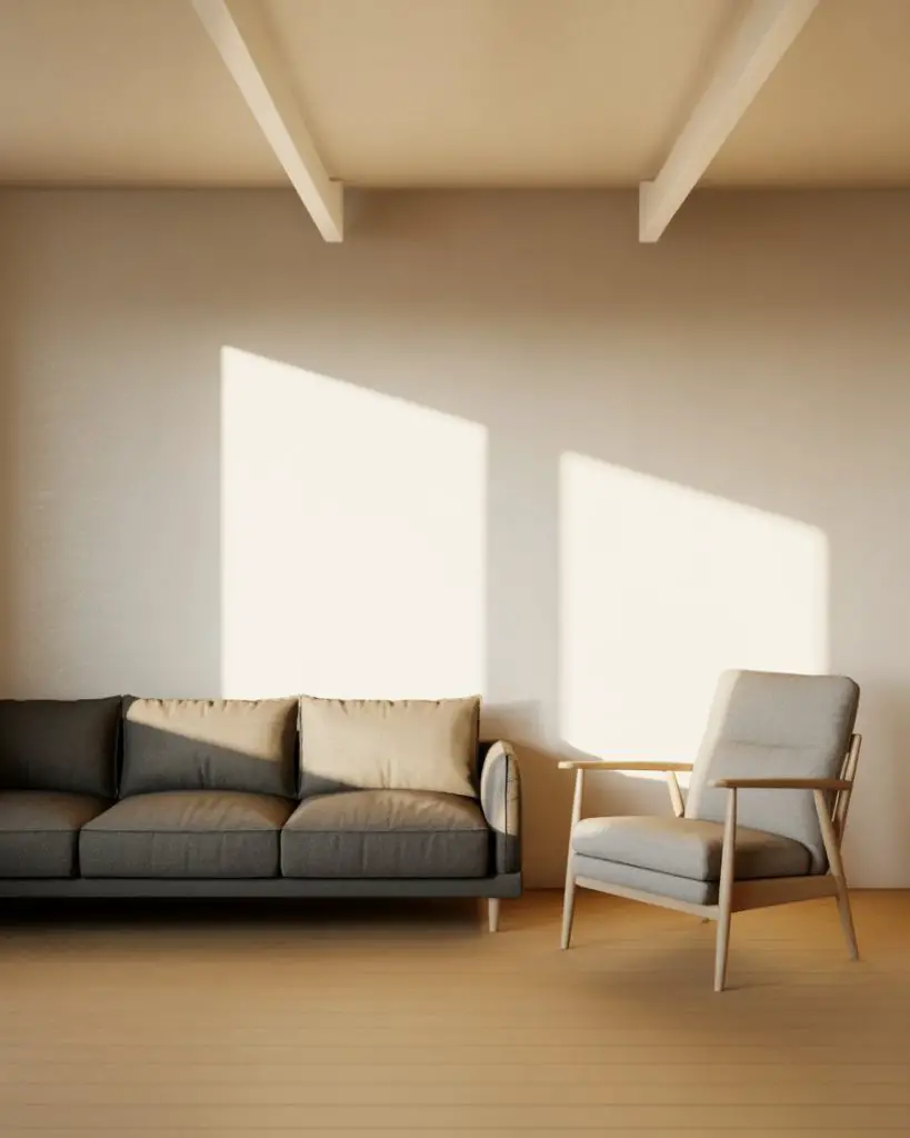
Where it works best: Open-plan homes where the living room flows into the kitchen or dining area. The neutral palette helps unify different zones without the need for bold transitions or color blocking. It also photographs beautifully, which is why you see it dominating design feeds.
4. Pop of Color Through Pillows
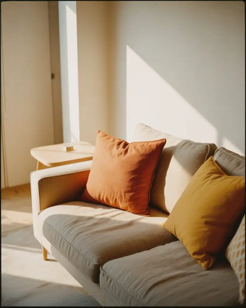
A neutral sofa becomes instantly more dynamic when you introduce a single pop of color—think burnt orange, deep teal, or mustard yellow. Keep the rest of the room subdued, and let two or three accent pillows carry the energy. This strategy is perfect for renters or anyone who likes to refresh their space seasonally without major investment. 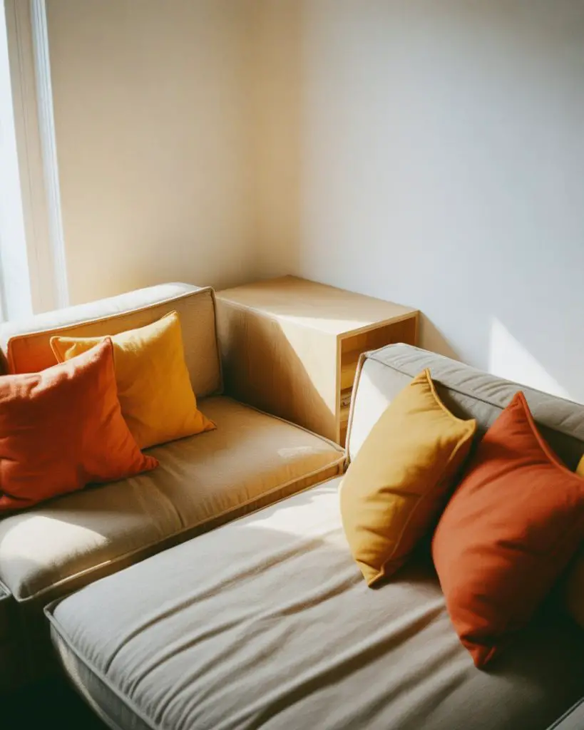
Real homeowner behavior shows that people swap out pillows more than any other decor item. They’re affordable, easy to store, and give you permission to experiment. A set of spring green pillows can be swapped for burgundy in fall without touching the bones of the room.
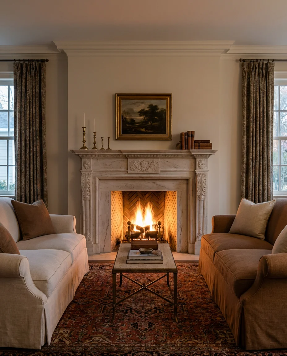
5. Moody Neutrals with Charcoal Walls
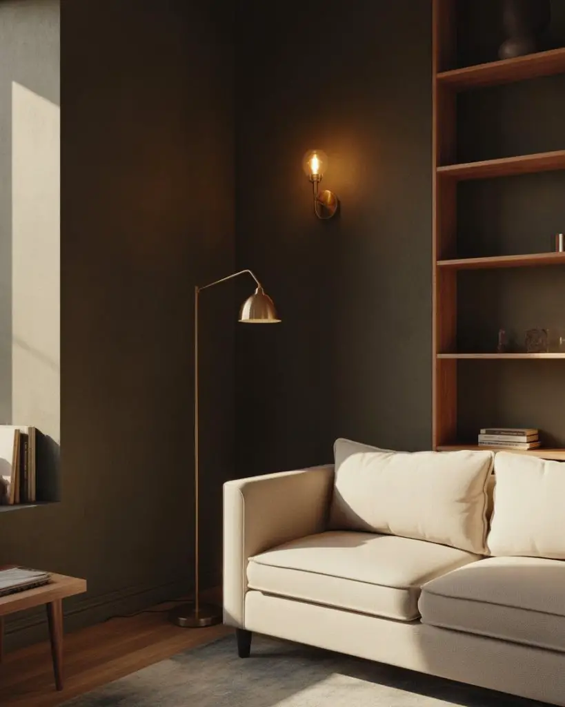
Who says neutral has to be light? Moody charcoal or slate gray walls create a sophisticated backdrop that makes lighter furniture pop. Pair with a cream sofa, warm wood shelving, and brass lighting for a look that feels cosy and enveloping, especially in evening hours. This works beautifully in homes with good natural light during the day. 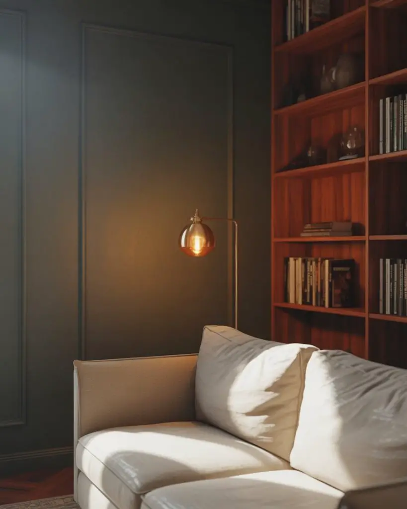
A common mistake is painting all four walls dark and forgetting to add enough light sources. Balance is everything—use table lamps, sconces, and even candles to keep the room from feeling heavy. The payoff is a space that feels intimate and intentional, not flat or cold.
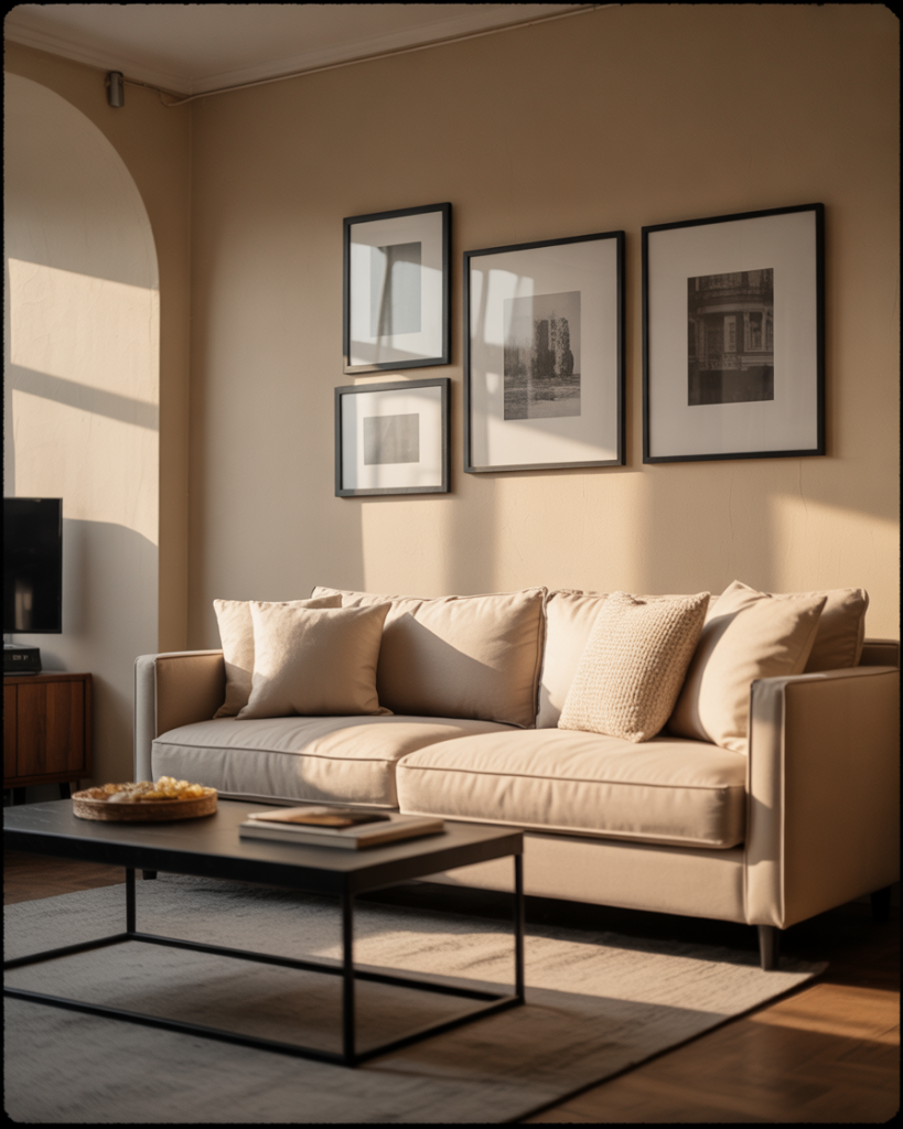
6. Adding Color with Artwork
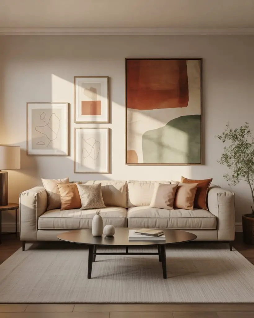
If you’re hesitant to commit to colored furniture, let your walls do the talking. A single large-scale painting or a gallery wall introduces colors and personality without altering the neutral foundation. Think abstract prints in rust, sage, or navy that echo the room’s undertones. This is a favorite among Pinterest users looking for inspiration that feels curated but not overdone. 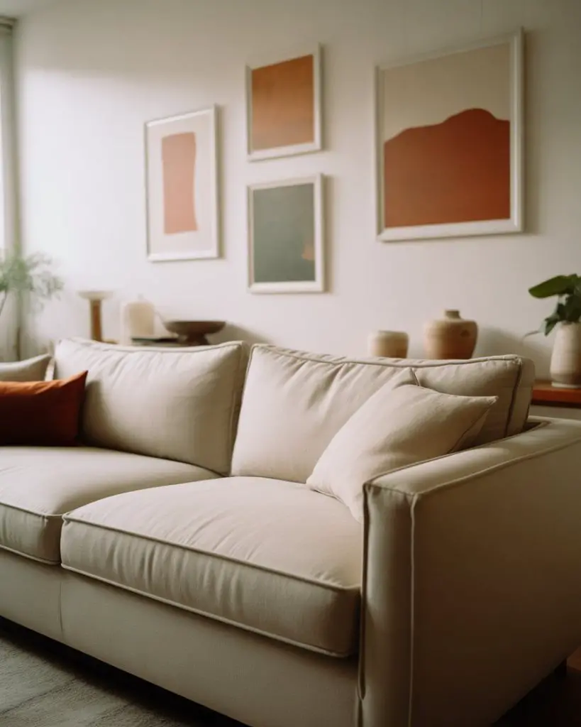
Budget-conscious shoppers often turn to Etsy or print-on-demand sites where you can find affordable art that looks custom. Frame it in simple black or natural wood, and you’ve got a high-impact upgrade for under $200. The key is choosing pieces that feel personal, not like they came from a hotel lobby.
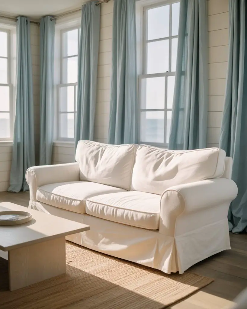
7. Coastal Neutrals with Blue Accents

Bring the beach indoors with a soft sand and white palette accented by coastal blues—powder blue, seafoam, or even a muted navy. Think linen slipcovers, driftwood decor, and woven textures that nod to shoreline living. Blue accents can appear in throw blankets, ceramic bowls, or a single accent chair that anchors the seating area. 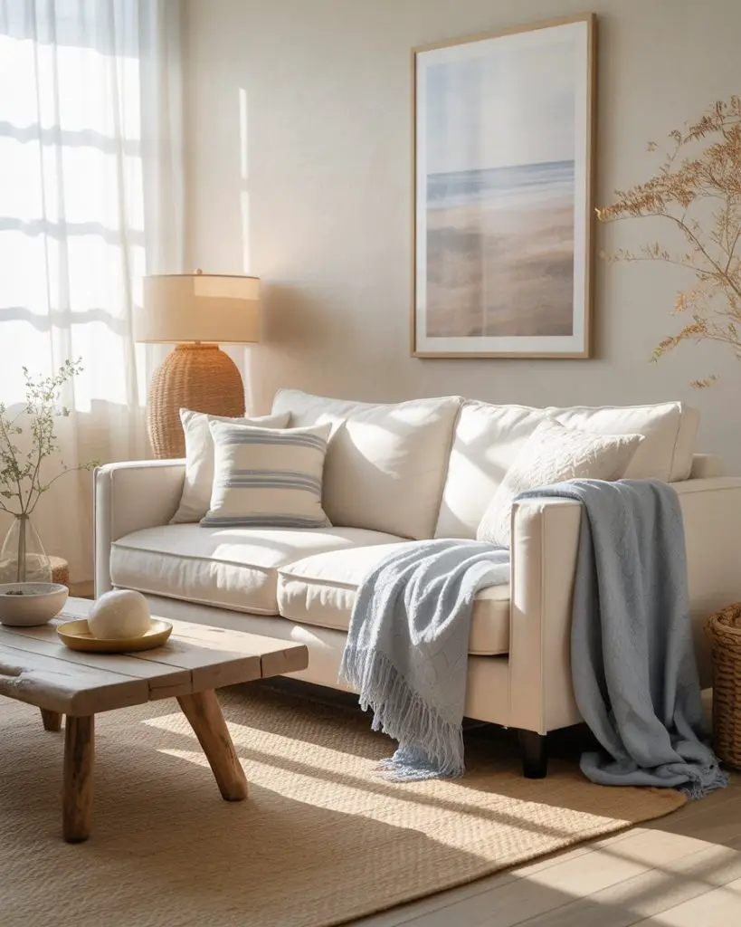
Where it works best: Homes near water, obviously, but also suburban spaces where homeowners crave that vacation-at-home feeling. The palette is naturally calming, making it ideal for families with young kids or anyone who wants a low-stress environment that still feels designed.
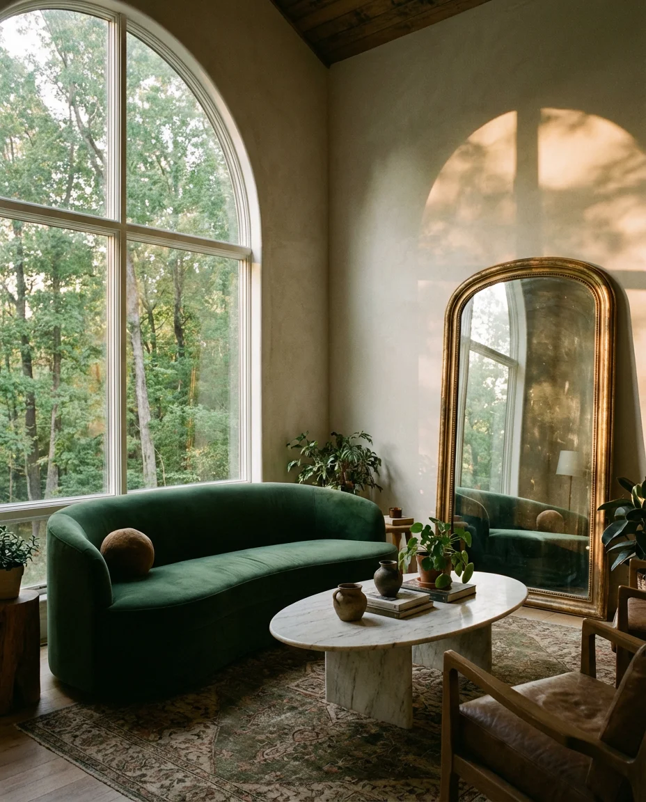
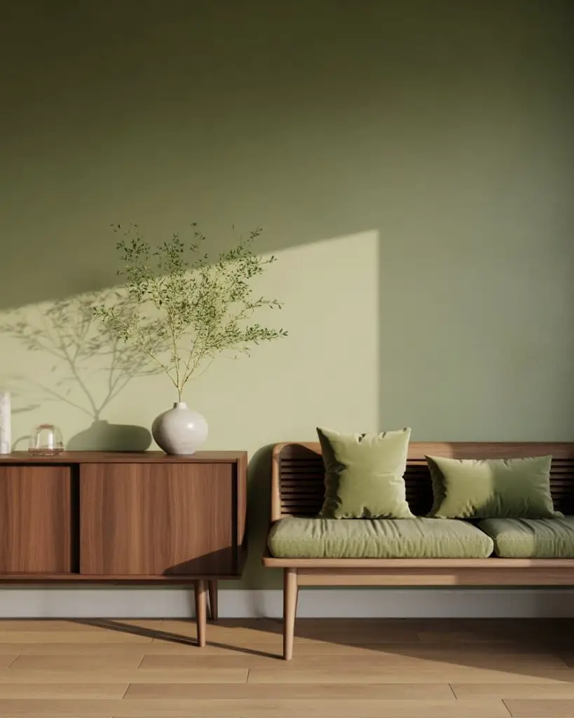
8. Warm Neutrals with Green Accents
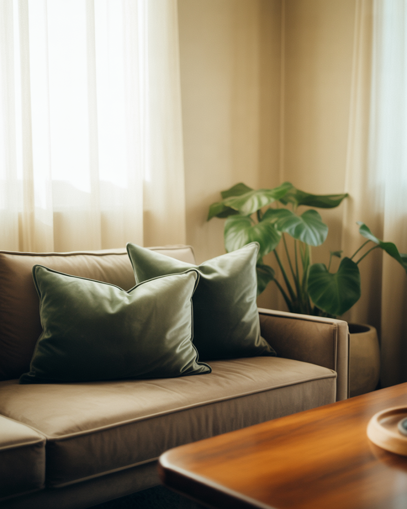
Olive, sage, and forest green are having a resurgence, and they pair beautifully with warm taupes and creams. Introduce green accents through potted plants, velvet cushions, or even a painted accent wall behind a bookshelf. This combination feels organic and lived-in, especially when natural light filters through sheer curtains. 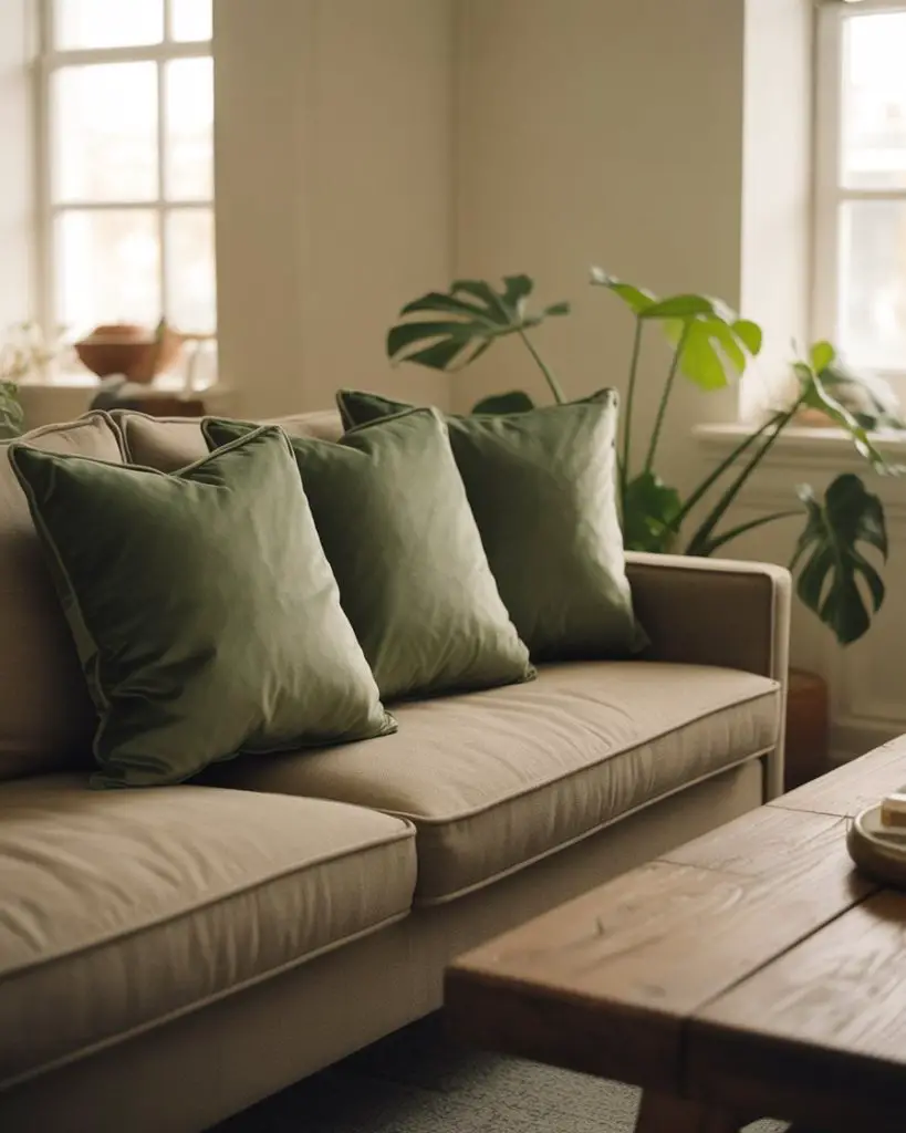
Expert-style commentary: Green is one of the most versatile accent colors because it exists on a spectrum from warm to cool. That means you can adjust the shade to match your base palette without clashing. It also brings an instant dose of calm, mimicking the effect of being outdoors.
9. Brown and Cream Layering
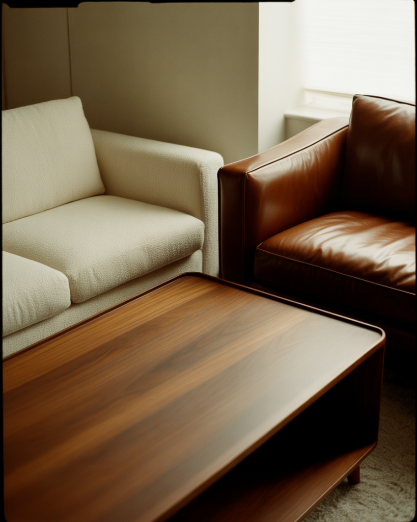
Chocolate brown leather chairs or a walnut media console add richness to a cream-heavy room without feeling heavy. The contrast is subtle but grounding, and it works especially well in homes with lots of natural wood trim or cabinetry. This pairing has roots in mid-century design but feels completely current when styled with clean lines and minimal clutter. 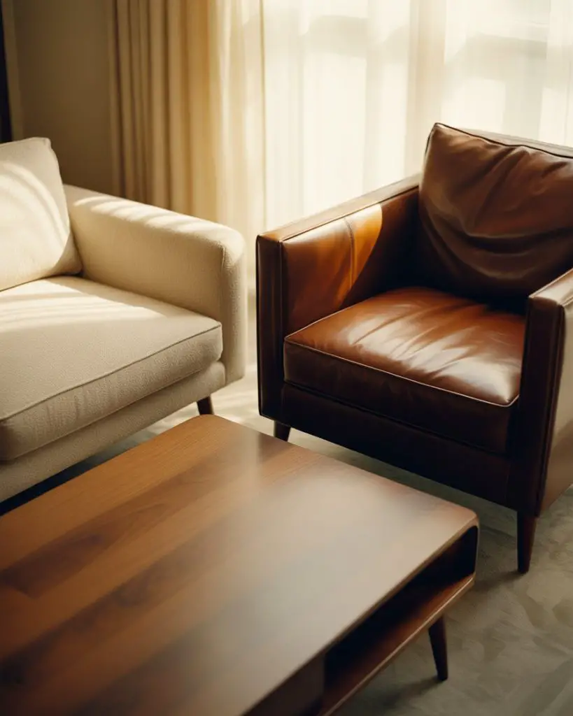
One homeowner I know swears by this combo for families—brown leather ages beautifully and hides wear, while cream upholstery can be slipcovered and washed. It’s practical design that doesn’t sacrifice style, a balance that’s hard to beat in real life.
10. Black and White with Soft Textures
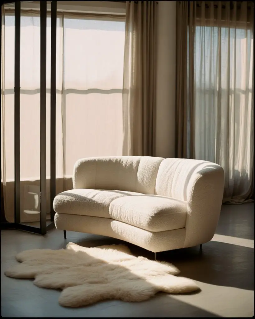
A crisp black and white palette might sound stark, but soft textures transform it into something inviting. Think a white boucle sofa, black window frames, a plush sheepskin rug, and linen drapes. The high contrast creates drama, but the tactile elements keep it warm. It’s a favorite among design lovers who want something bold but not loud. 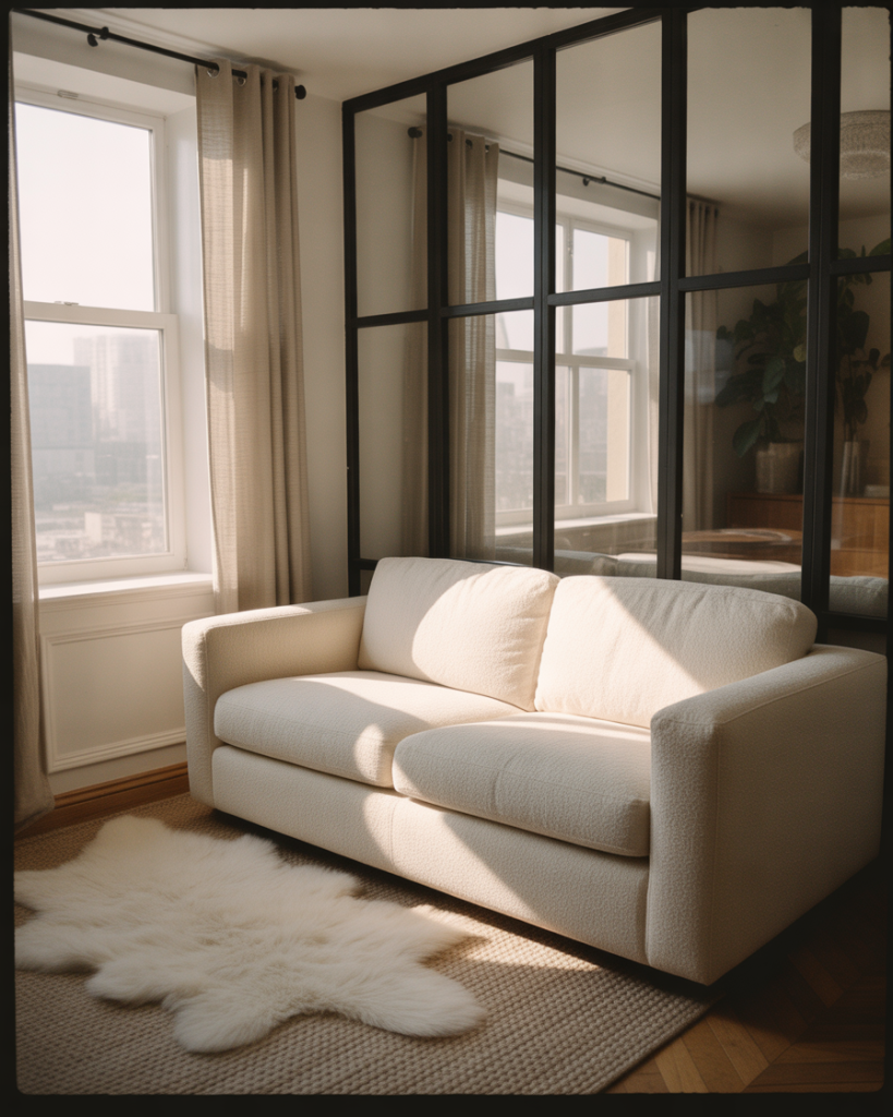
Where it works best: Urban apartments with large windows and plenty of natural light. The black-and-white framework works like a blank canvas, letting architectural details and furniture shapes take center stage. It’s also incredibly photogenic, which explains its popularity on visual platforms.
11. Gender-Neutral Family Room
Designing a gender-neutral space that appeals to everyone in the household means sticking with universally calming tones—think greige, soft white, and natural wood. Avoid overly feminine or masculine clichés, and instead focus on comfort and function. A deep sectional, durable rug, and plenty of hidden storage make this a room the whole family actually uses. 
Practical insight: Choose performance fabrics that resist stains and stand up to daily use. Many brands now offer chic, neutral upholstery in materials originally designed for hospitality or commercial spaces. It’s a game-changer for households with kids or pets.
12. Dark Walls with Light Furniture
Flip the script by painting your walls a deep charcoal or espresso, then furnishing with light-toned pieces—ivory, cream, or pale oak. The contrast is striking and makes the furniture feel like it’s floating. This dark approach adds depth and sophistication, especially in rooms with high ceilings or interesting architectural details. 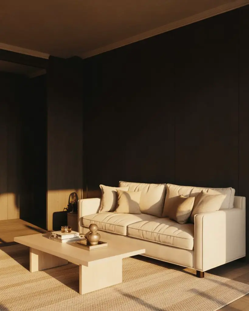
A common mistake is neglecting lighting—dark walls absorb light, so you’ll need multiple sources to avoid a cave-like feel. Layer ambient, task, and accent lighting to keep the room balanced and inviting, especially after sunset.
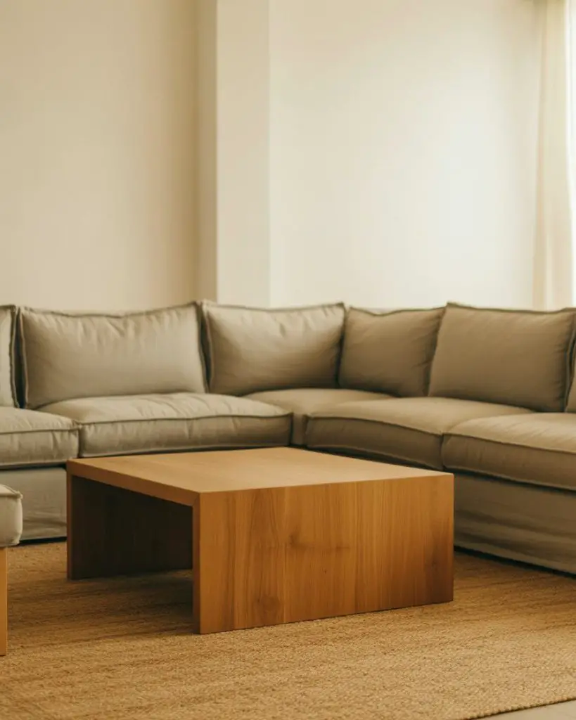
13. Decor Earth Tones with Natural Wood
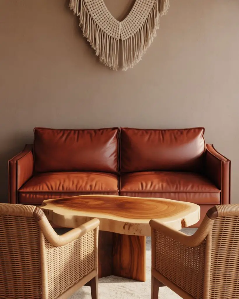
Embrace the full spectrum of decor earth tones—burnt sienna, ochre, clay, and sand—anchored by natural wood furniture. A live-edge coffee table, rattan side chairs, and woven wall hangings bring the outdoors in. This aesthetic feels grounded and connected to nature, a direct response to the overly polished, all-white trends of the past decade. 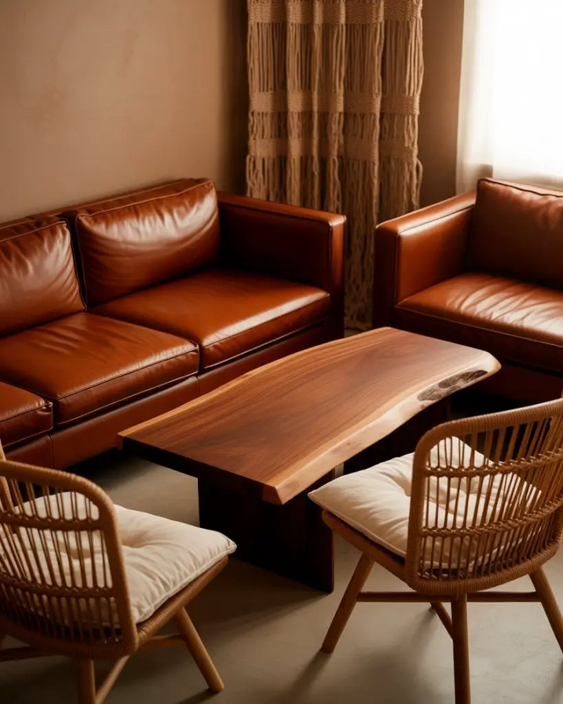
American lifestyle context: This style resonates strongly in the Southwest and Pacific Northwest, where the landscape itself inspires interior palettes. But even in suburban Midwest homes, it offers a refreshing alternative to the expected gray-and-white formula.
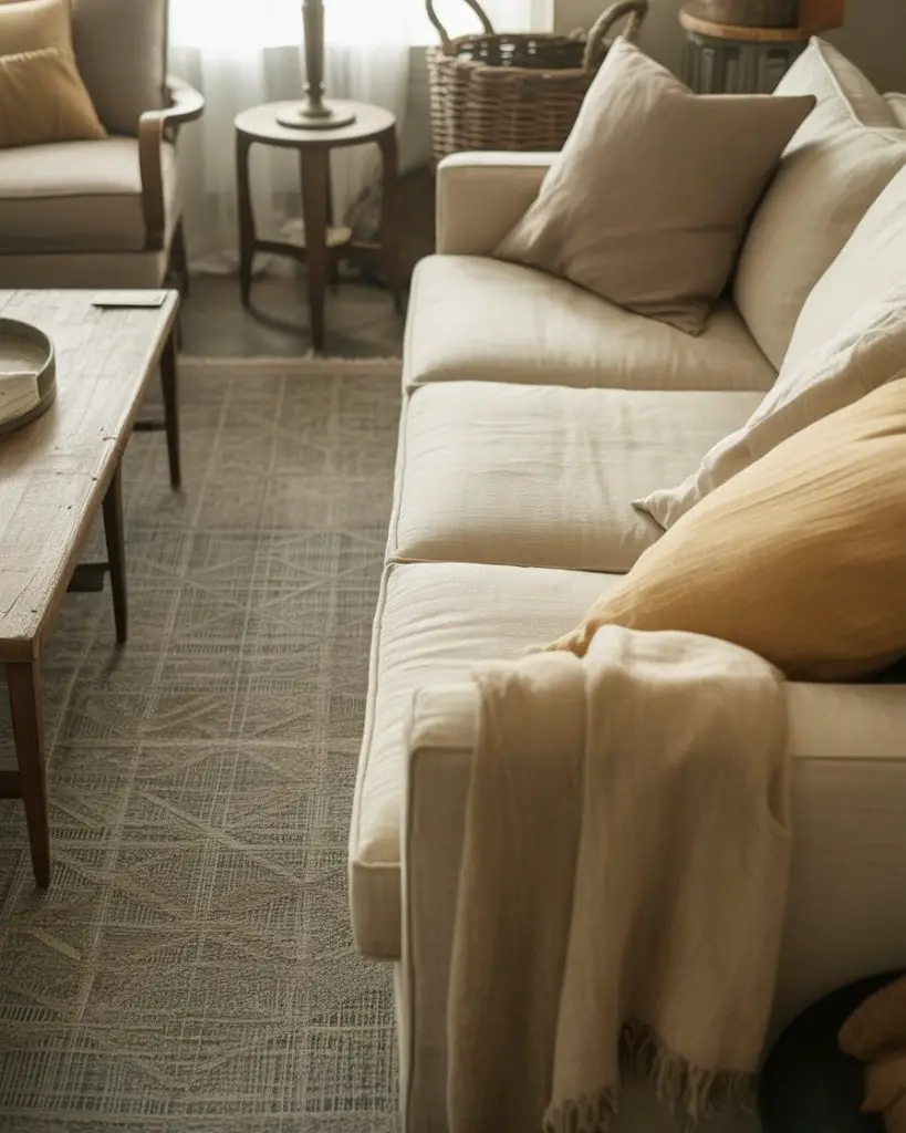
14. Add Color with Throws and Blankets
![]()
Drape a terracotta or sage throw over the arm of your sofa, fold a patterned blanket at the foot of your chair, and suddenly your neutral room has dimension. This is one of the easiest ways to add color without commitment—blankets are portable, washable, and seasonally swappable. It’s a strategy that works in any room, from studio apartments to sprawling suburban homes. ![]()
Real homeowner behavior shows that people change out throws more often than they realize—summer cottons swap for winter wools, bright hues give way to deeper tones. It’s an intuitive way to keep your space feeling current without a full redesign.
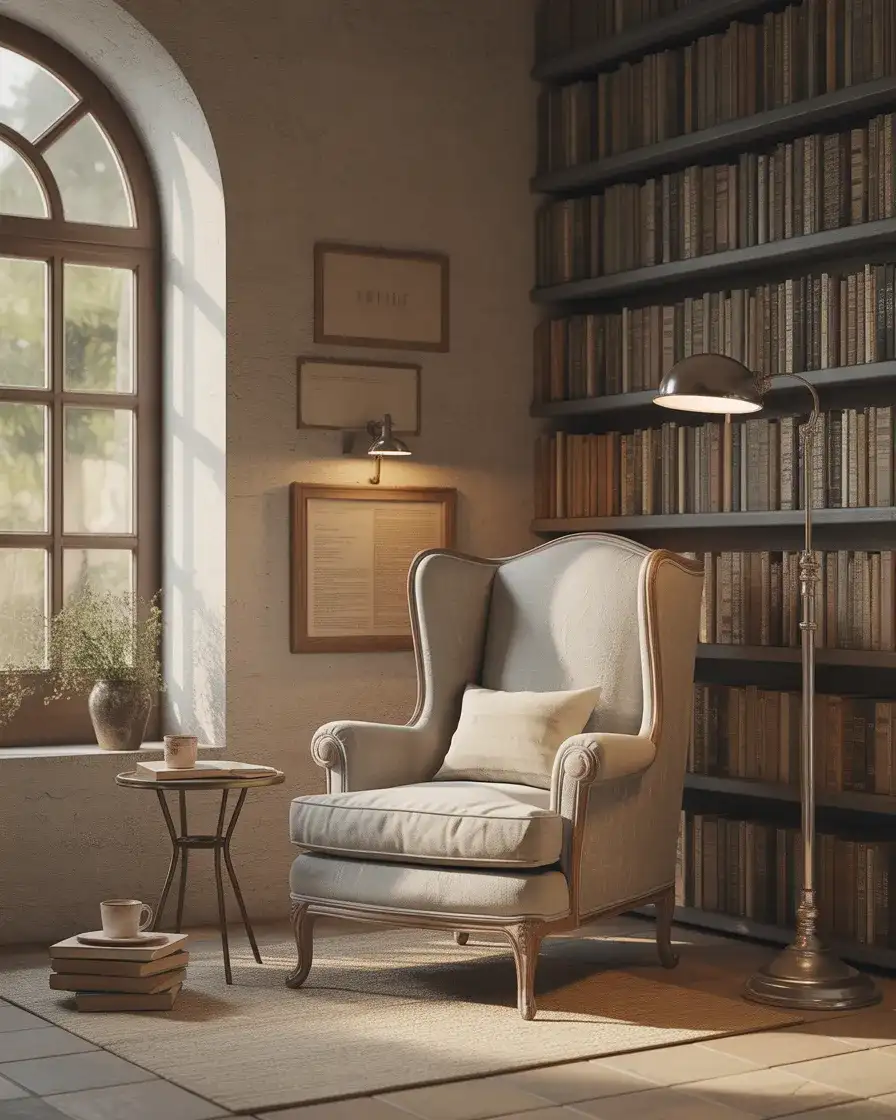
15. Cosy Reading Nook in Neutrals
Carve out a corner with an oversized chair in oatmeal linen, a floor lamp with a warm bulb, and a small side table stacked with books. The goal is to create a cosy retreat within your living room—a spot that invites lingering. Neutral tones here feel intentional, not boring, because the function is so clear and the textures are so inviting. 
Where it works best: Homes with awkward corners or underutilized square footage. A reading nook doesn’t need much space—just good light, a comfortable seat, and a sense of enclosure. It’s a micro-upgrade that makes the whole room feel more thoughtful.
16. Paint Color Ideas for Warm Neutrals
Looking for the perfect backdrop? Try Accessible Beige, Shaker Beige, or Kilim Beige for a warm, enveloping feel that works in any light. These paint color ideas lean into the creamy, sun-kissed end of the neutral spectrum, making rooms feel larger and more inviting. They pair beautifully with white trim and natural wood accents. 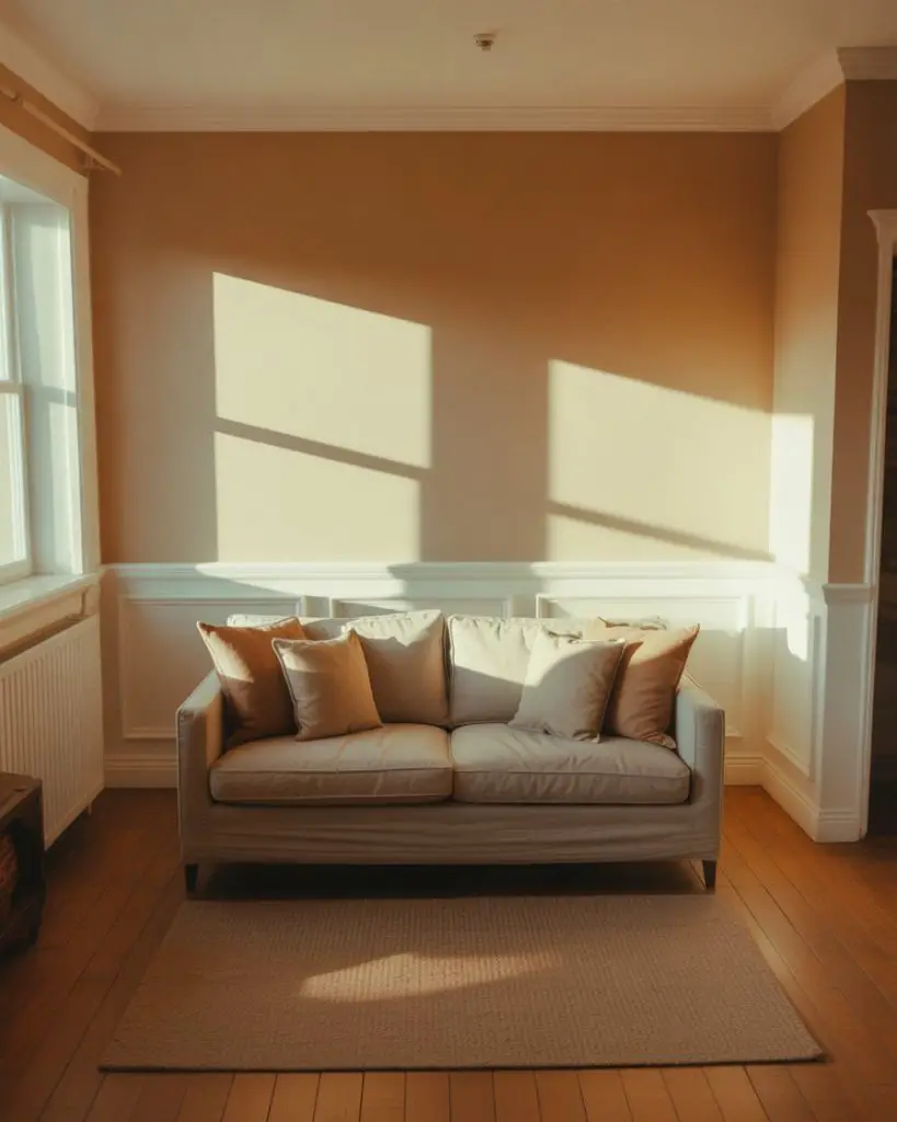
Budget angle: A gallon of quality paint costs around $50–70, and most living rooms need two gallons max. It’s one of the highest-impact, lowest-cost updates you can make, especially if you’re prepping to sell or just craving a refresh.
17. Green and Wood Combination
Pair a muted green and natural wood for a look that feels both modern and timeless. Think a sage accent wall behind a walnut credenza, or olive cushions on a teak bench. The combination is inherently calming and works across design styles, from Scandinavian to mid-century to farmhouse. It’s also highly adaptable as trends shift. 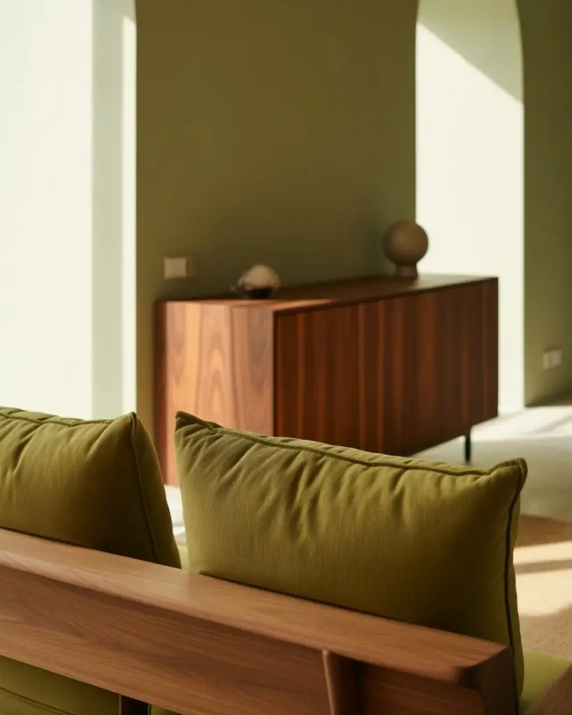
Expert-style commentary: Green and wood share an inherent connection to nature, which is why they feel so right together. The pairing doesn’t require much styling—just let the materials speak for themselves, and resist the urge to over-accessorize.
18. Blue and Neutral Coastal Vibes
A soft blue and white palette evokes seaside cottages and breezy mornings, even if you’re landlocked. Choose powder blue for your drapes, pair it with white slipcovered furniture, and add natural fiber rugs to complete the look. This is a go-to for homeowners who want a room that feels airy, optimistic, and effortlessly pulled together. 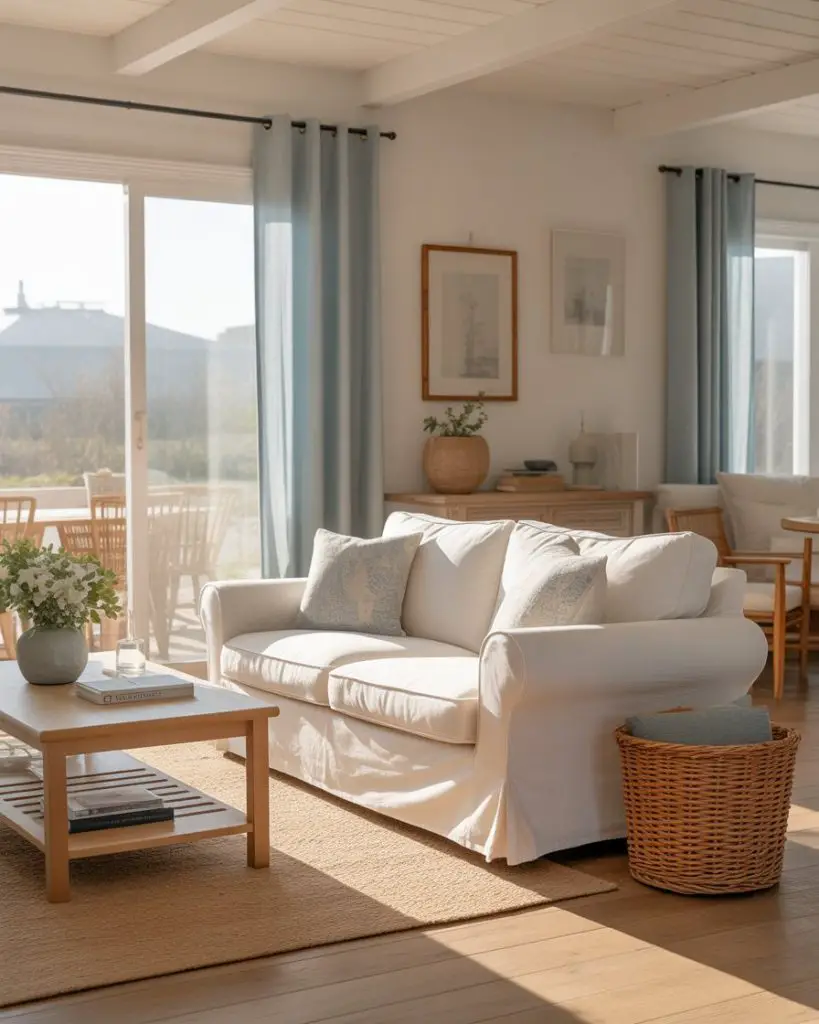
Where it works best: Homes in warmer climates or spaces that get a lot of southern or western sun. The palette naturally reflects light, keeping rooms cool and bright even on the hottest days. It’s also forgiving—spills and wear blend into the relaxed, lived-in vibe.
19. Inspiration from Japanese Minimalism
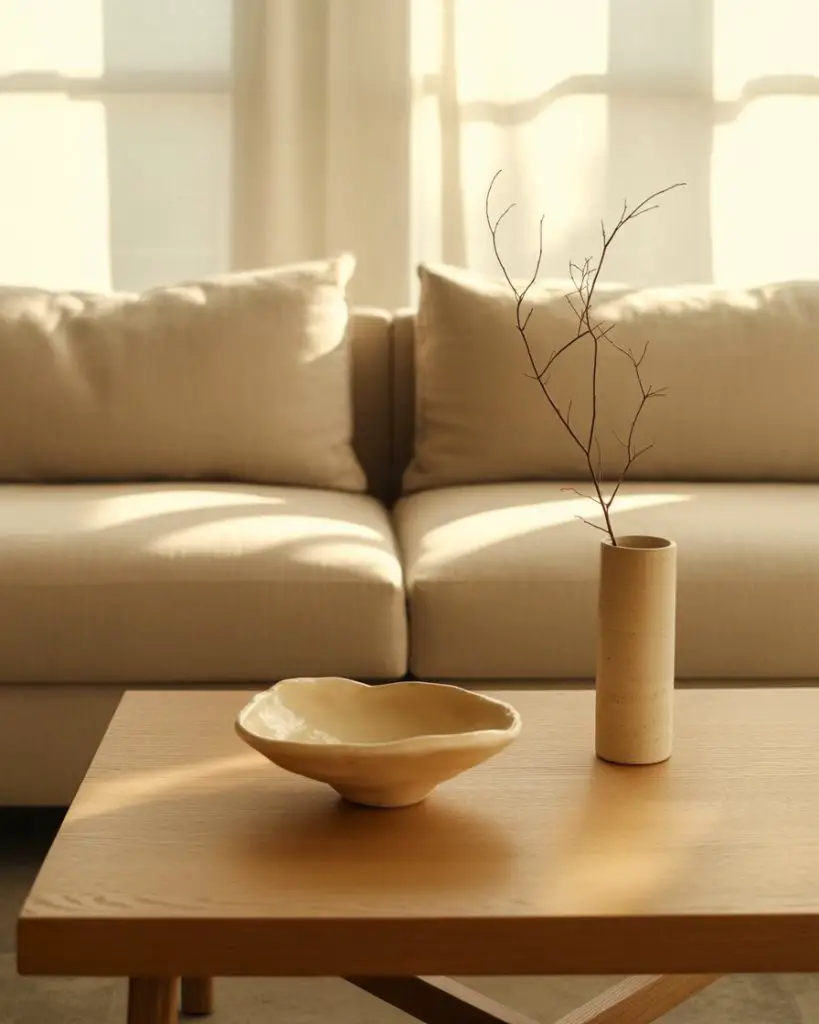
Take inspiration from wabi-sabi principles by embracing imperfection, natural materials, and restraint. A low-profile sofa, a handmade ceramic bowl, and a single branch in a simple vase can be enough. The neutral palette—shades of rice paper, stone, and unfinished wood—creates a serene, meditative environment that resists clutter. 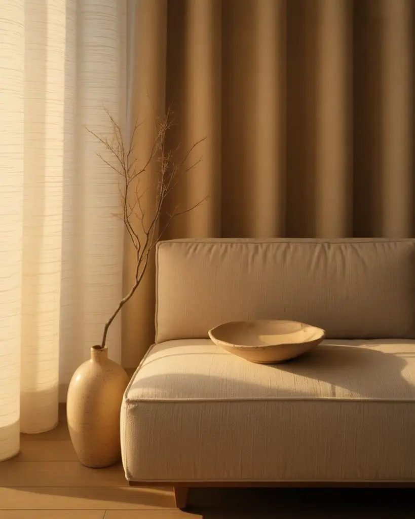
Practical insight: This style requires discipline—every object needs to earn its place. But the payoff is a room that feels intentional and calming, a true antidote to the visual noise of modern life. It’s also surprisingly kid-friendly, since there’s less to break or knock over.
20. Layered Neutrals with a Statement Rug
Let a bold, patterned rug be the hero of the room while keeping everything else quiet. A vintage-inspired runner in soft grays, taupes, and creams anchors the seating area and ties the palette together. This approach gives you the freedom to mix furniture styles and finishes without the room feeling chaotic. 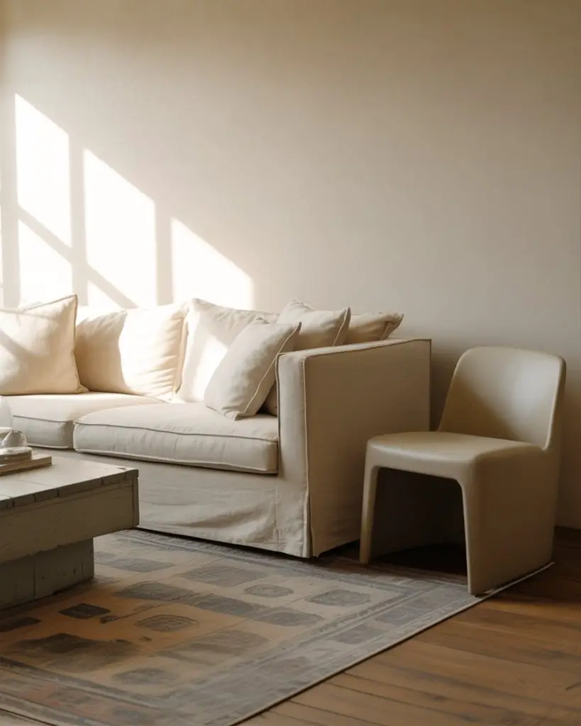
A micro anecdote: A friend recently scored a hand-knotted wool rug at an estate sale for $300, and it completely transformed her living room. The pattern added instant sophistication, and because the colors were neutral, it didn’t compete with her existing furniture.
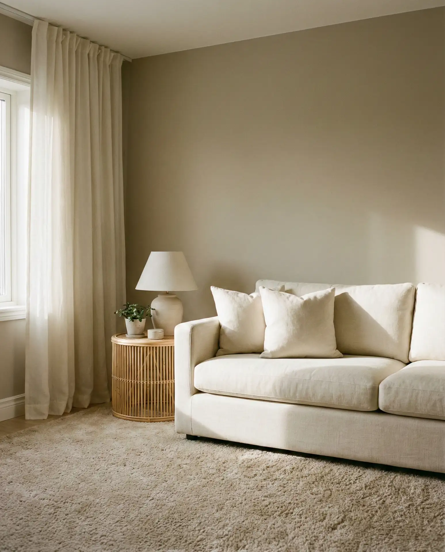
21. Soft Whites and Natural Light
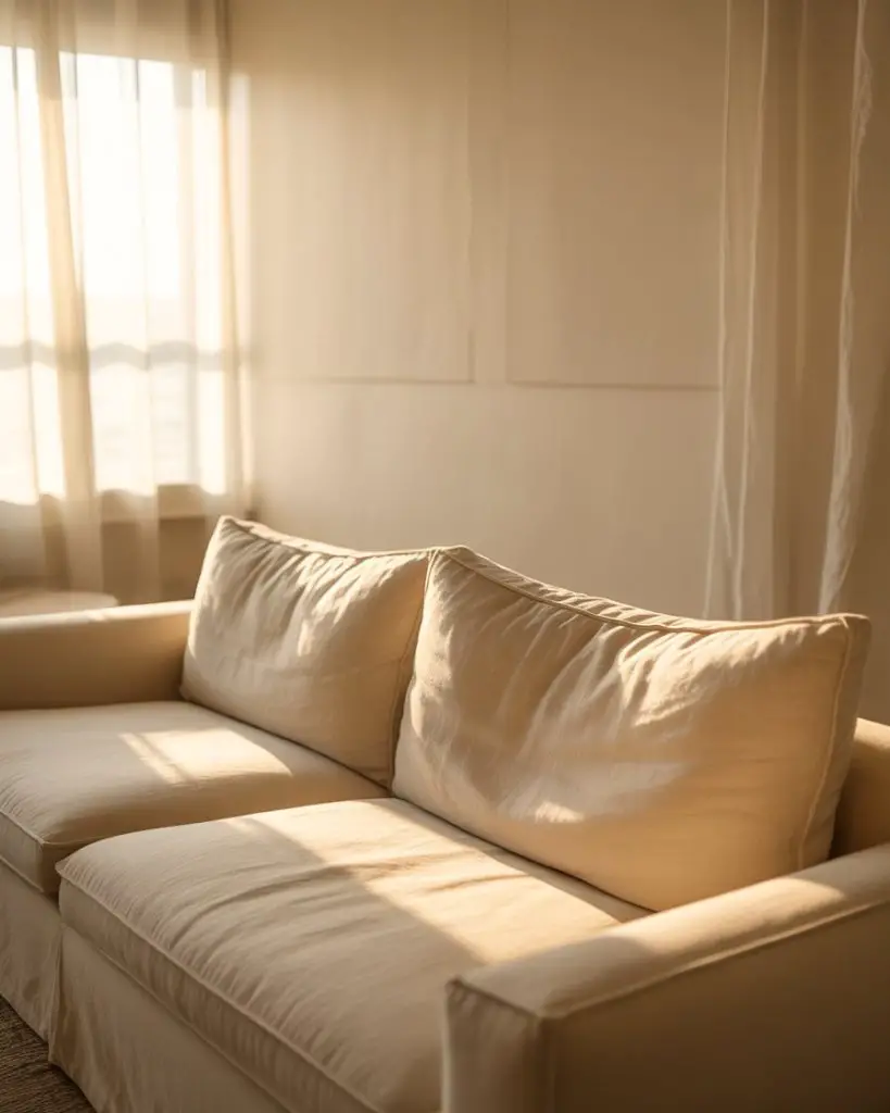
Sometimes the simplest approach is the most powerful. Soft white walls, white linen upholstery, and sheer curtains that let sunlight flood in create a room that feels open, airy, and endlessly flexible. This is the ultimate neutral foundation—easy to accessorize, easy to refresh, and universally flattering. It’s also the most popular choice on Pinterest for good reason. 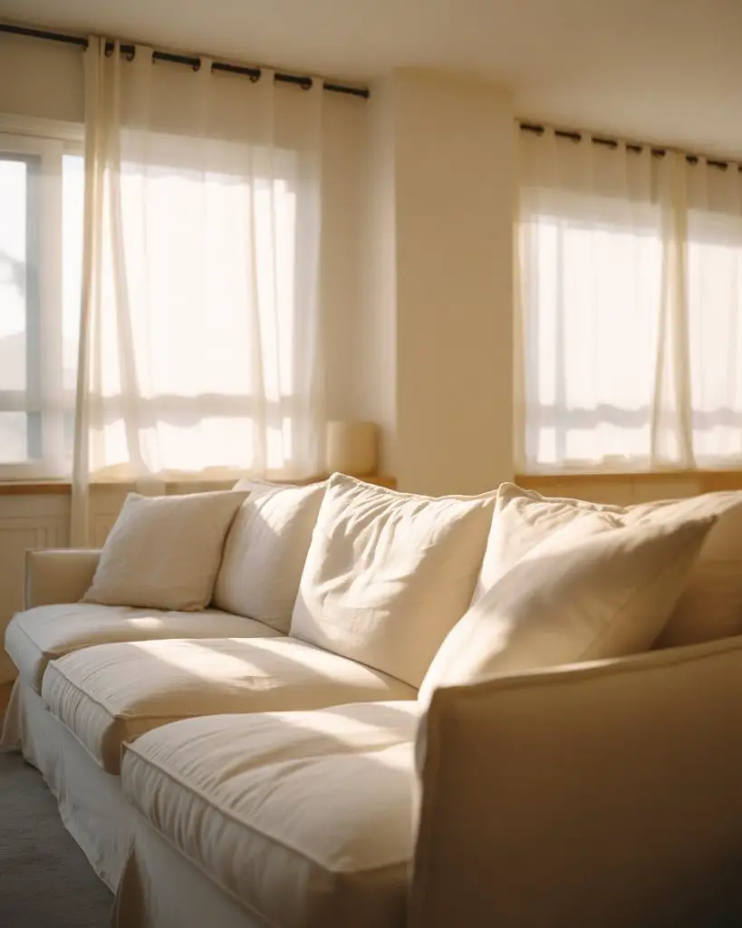
Real homeowner behavior shows that white-on-white rooms are easier to maintain than you’d think—stain-resistant fabrics and machine-washable slipcovers make them practical for everyday life. The look is timeless, which means you won’t tire of it as quickly as trendier palettes.
Conclusion
Neutral living rooms in 2026 are proof that restraint and warmth can coexist beautifully. Whether you’re drawn to moody charcoals, soft beiges, or crisp whites, these ideas show how to build a space that feels both personal and enduring. We’d love to hear which approach resonates with you—drop a comment and let us know what you’re planning for your own space.