Grey has always had a quiet kind of confidence—it doesn’t shout, it doesn’t trend and fade, it simply works. But 2026 is shaping up to be a turning point for how Americans are actually living with grey, moving beyond the cold, minimalist vibe of the 2010s into something warmer, more layered, and deeply personal. Pinterest boards are exploding with searches for grey living rooms that feel cozy and grounded, not sterile—rooms that mix texture, color, and personality in ways that feel genuinely livable. Whether you’re decorating a first apartment in Atlanta or refreshing a craftsman bungalow in Portland, this guide is packed with 23 real, actionable ideas to help you find the grey palette that feels like you.
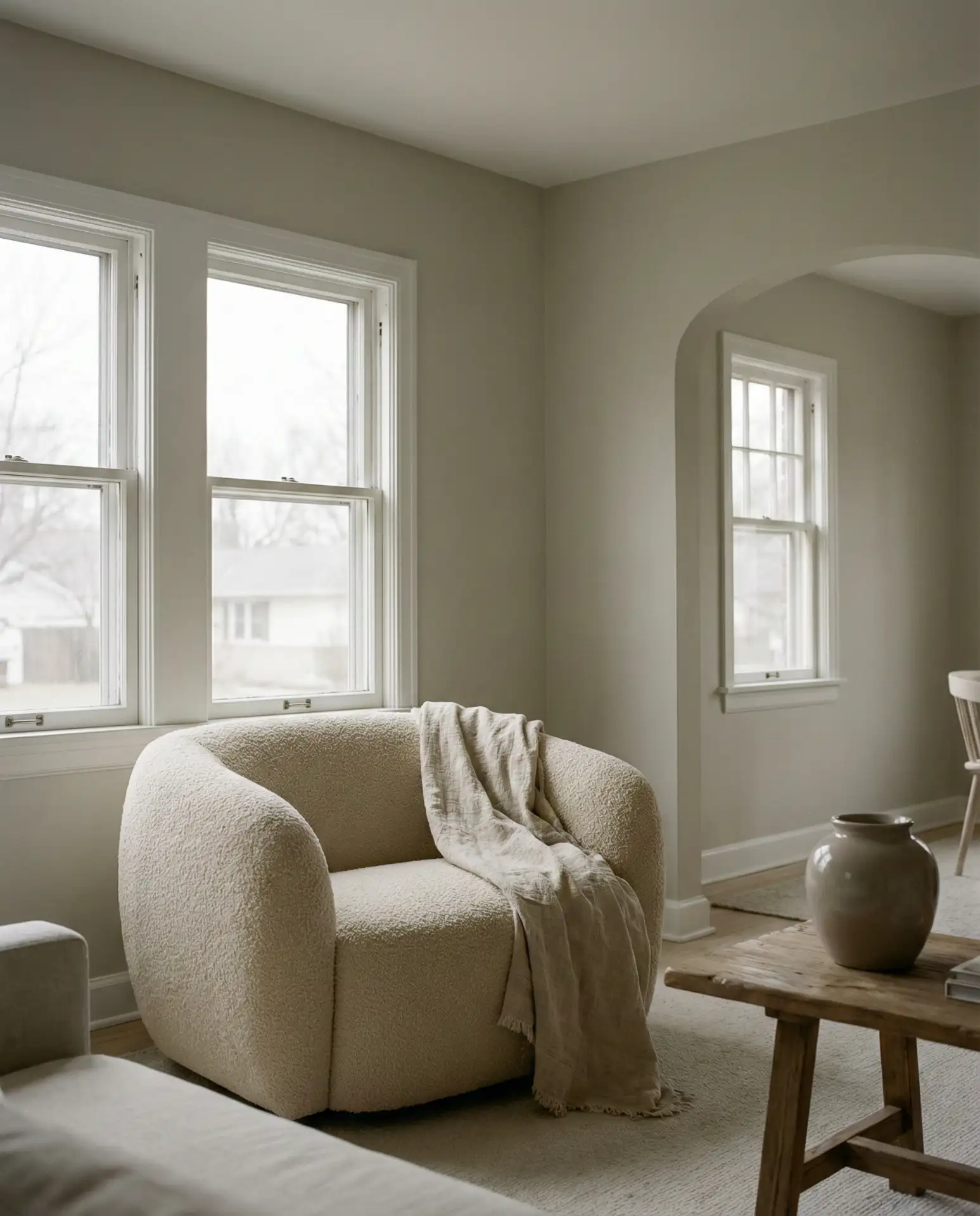
1. Soft Grey with Natural Wood Accents
When people picture a modern grey living room that doesn’t feel cold, this is usually what they’re imagining. Soft, warm grey walls—think a tone closer to dove than concrete—paired with the honey-brown warmth of natural wood create a balance that feels earthy and serene at once. The key is choosing a grey with a yellow or beige undertone rather than a blue one, so it catches warm light without going flat. A walnut coffee table, light oak shelving, or even a driftwood-style side table can anchor the space beautifully. This light and grounded pairing works especially well in open-plan rooms where you want the space to breathe.
This combo works best in rooms with good natural light—south- or west-facing windows will really let those warm grey tones sing. If your space runs a little darker, lean into lighter wood tones like ash or maple rather than deeper walnut, which can make things feel heavier than intended. A linen sofa in oatmeal or pale sand pulls the whole look together without competing with the walls. The result is a living room that feels like a really good exhale—uncomplicated, warm, and quietly beautiful.
2. Blue and Grey Color Scheme
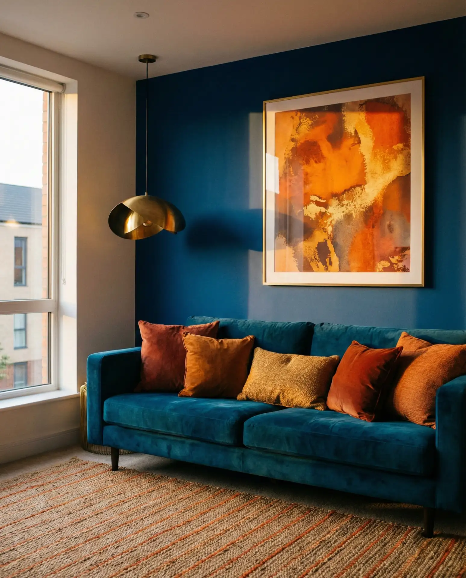
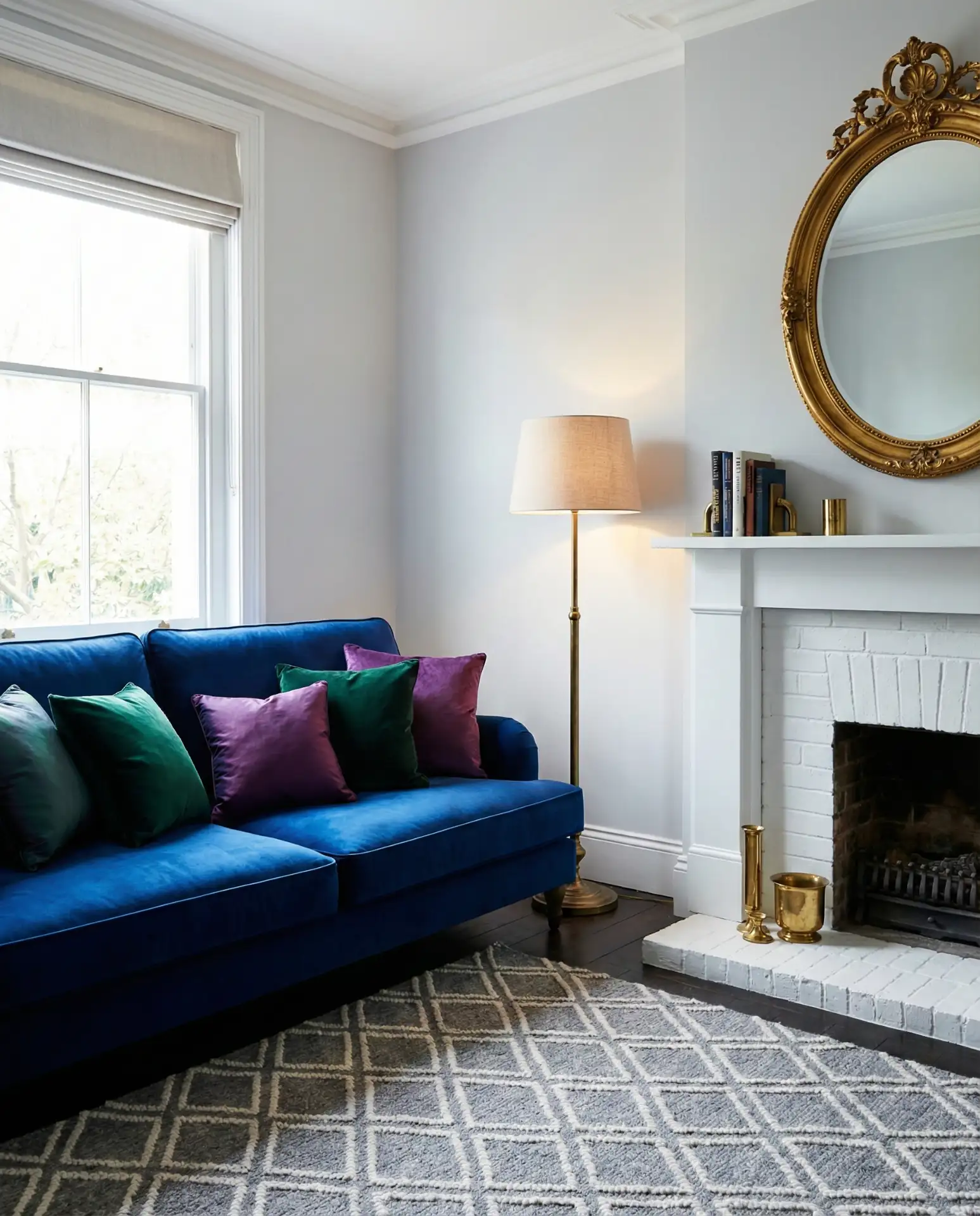
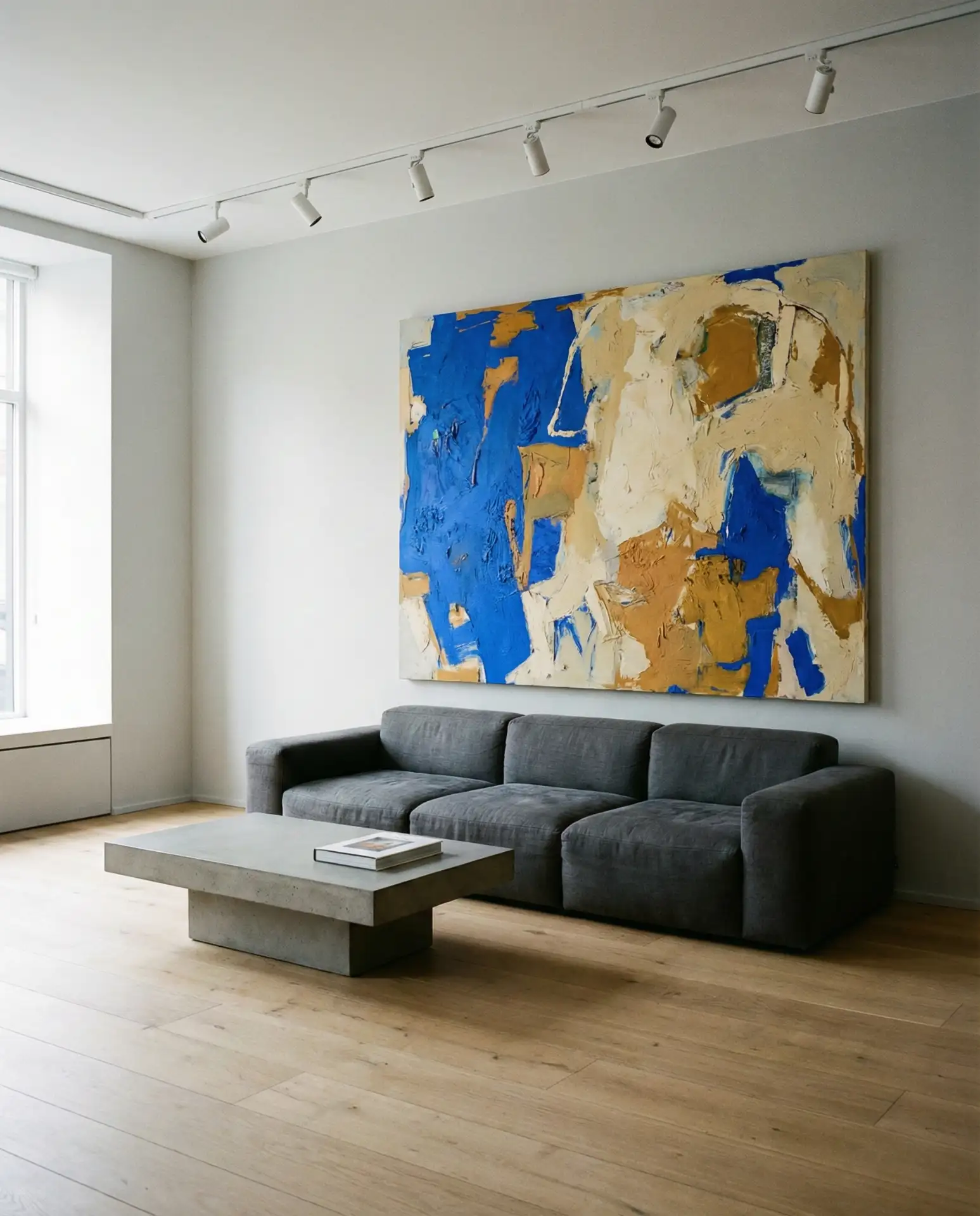
Few color pairings feel as timelessly sophisticated as blue and grey. In 2026, designers are leaning into this combination with a fresh approach—not the safe navy-on-grey of a decade ago, but layered, nuanced takes that mix dusty slate with soft denim or pale powder blue with deeper charcoal. The trick is to treat one as the dominant hue and the other as an accent, rather than splitting things 50/50. A medium grey sofa against a soft navy blue accent wall, for instance, creates drama without overwhelming a room. Throw pillows in varied blue tones—from cobalt to teal-adjacent slate—add depth and keep things dynamic.
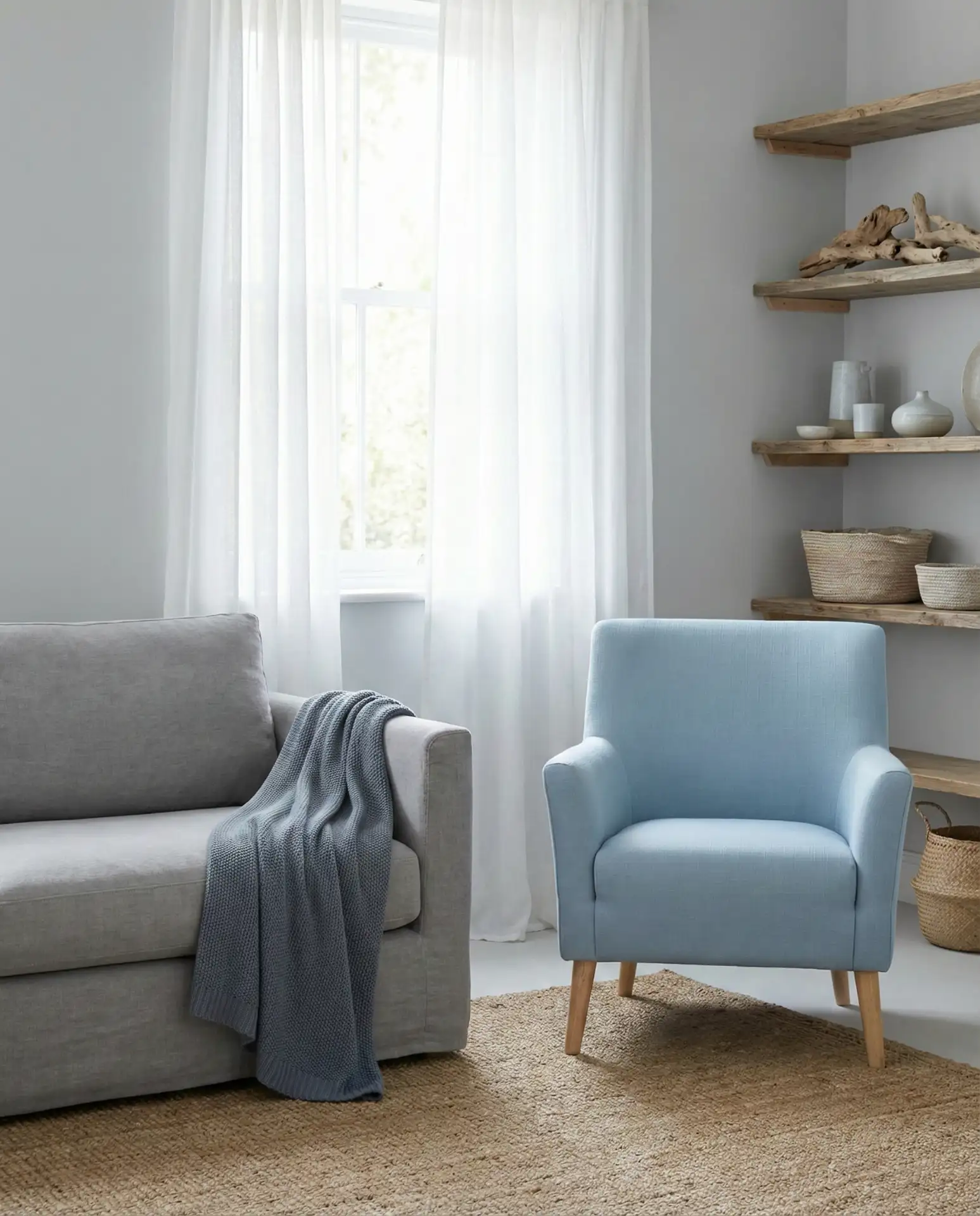
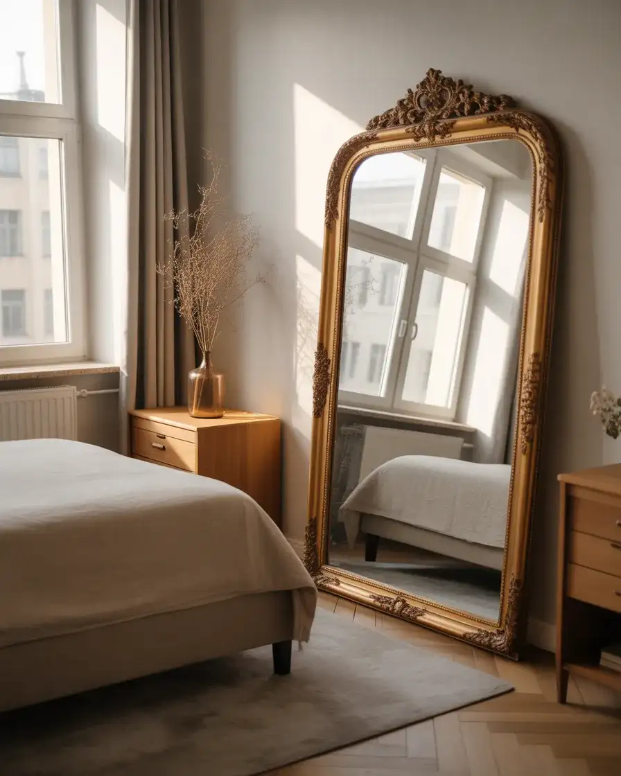
This is a living room scheme that coastal homeowners have long known the secret to—blue and grey together carry that effortless quality of sky meeting water. It works particularly well in New England cottages, Pacific Northwest bungalows, or any home that gets a lot of natural light. If you’re worried about the look feeling too cool, layer in organic textures: jute, linen, and weathered wood. A single warm metallic element—a brass lamp or gilded mirror frame—breaks the cool tones just enough to keep things feeling inviting rather than chilly.
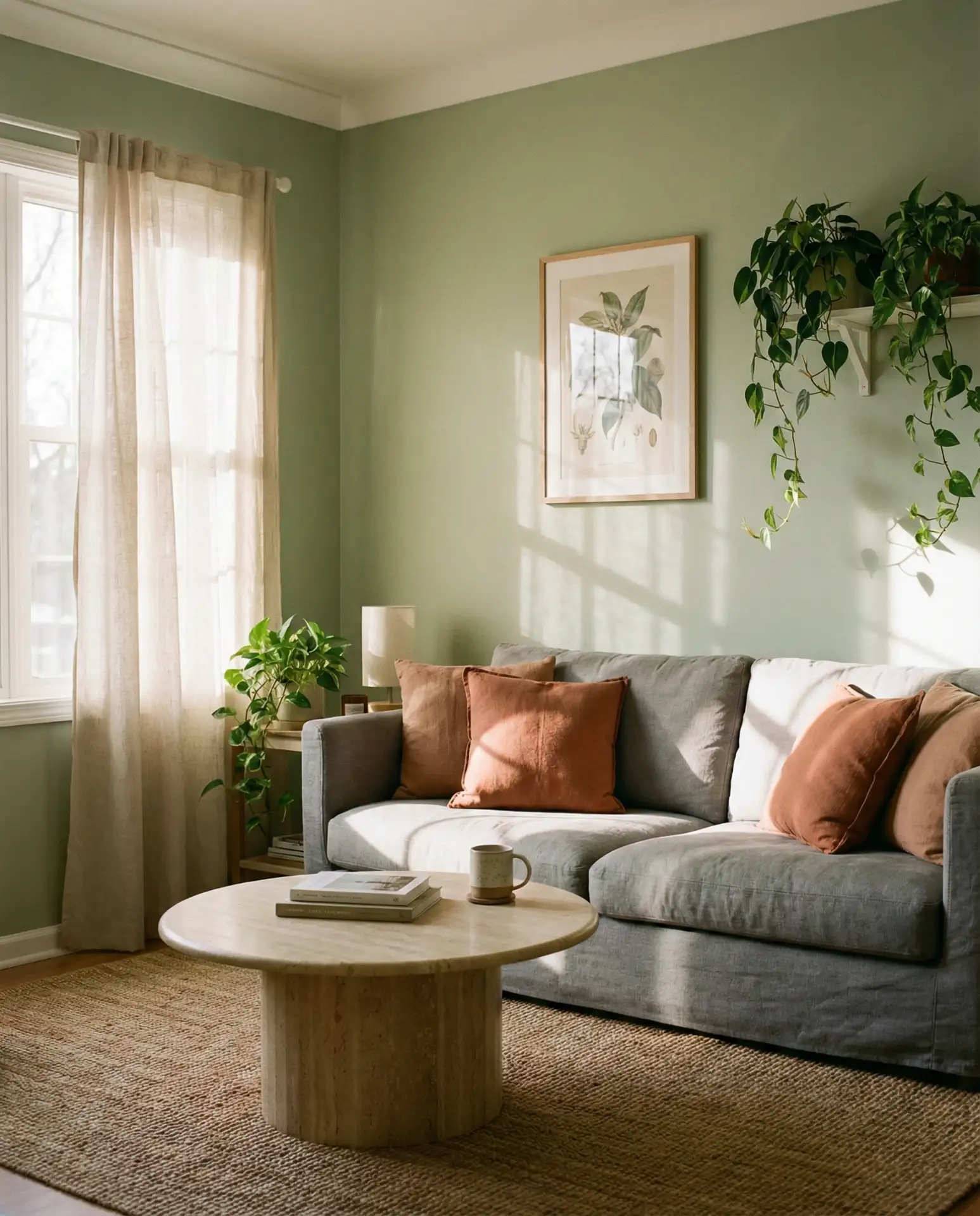
3. Green and Grey Living Room
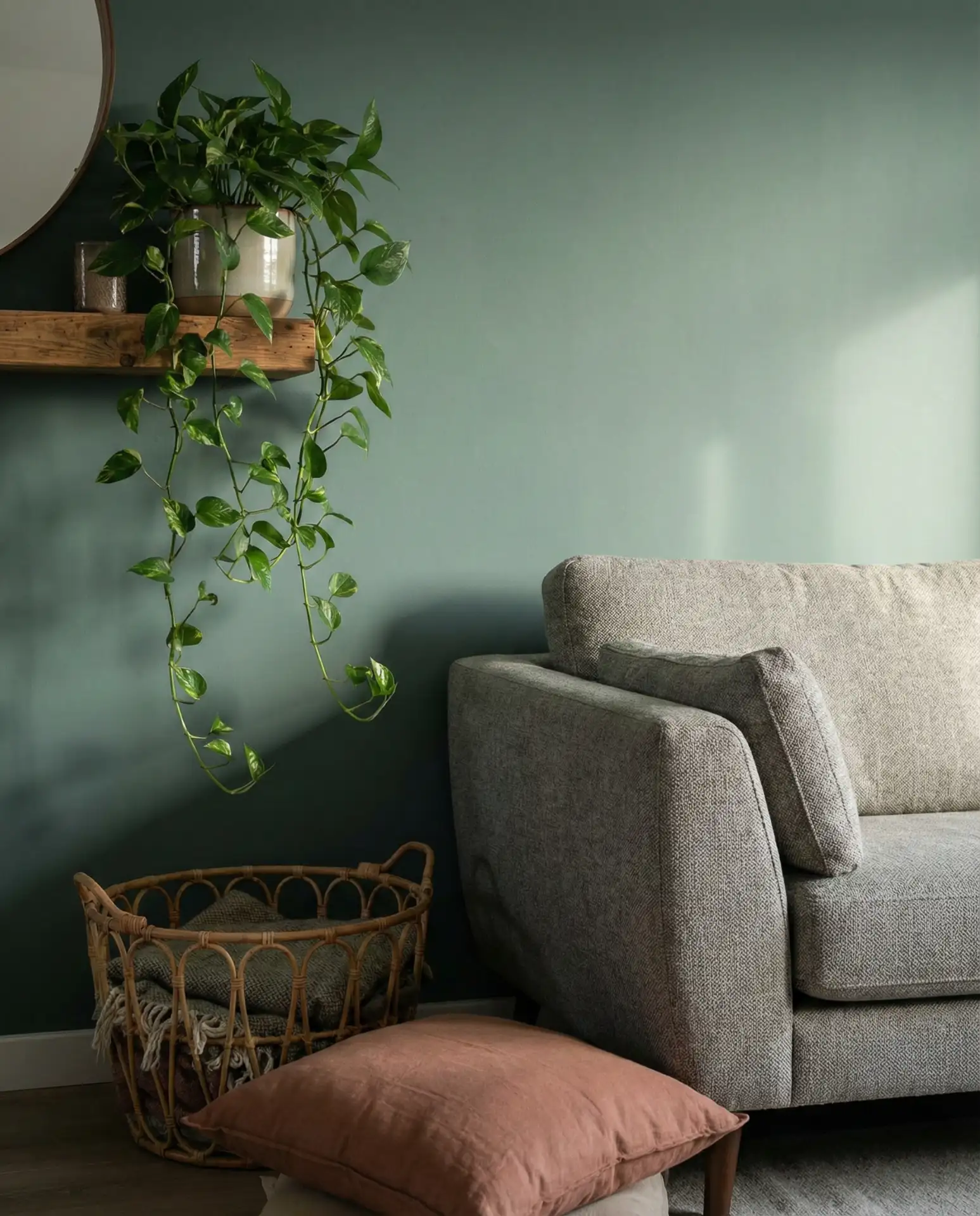
The green and grey pairing has been creeping into the design conversation for the past few years, and in 2026 it’s fully arrived. This duo works because green, in its softer, more muted forms—sage, eucalyptus, forest—shares grey’s quiet depth while bringing a vital, organic warmth that pure grey can’t achieve on its own. Picture a grey concrete-finish wall opposite a velvet sofa in deep sage, or a pale grey room punctuated by large-leafed plants in ceramic pots. Whether you’re going earthy-rustic or sleek and contemporary, this combination can flex across a wide range of aesthetics. It’s one of the freshest color scheme ideas for grey right now.
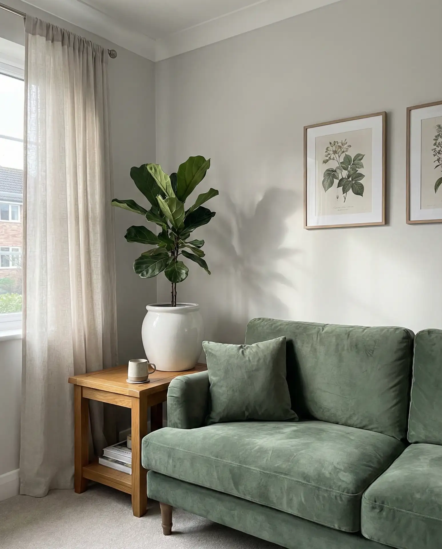
A common mistake with this pairing is going too bright on the green—neon or kelly green will clash against grey and feel jarring rather than sophisticated. Stick to muted, dusty, or forest-deep greens to keep the harmony intact. Houseplants are your best allies here: they blur the line between the decorative palette and the living, breathing parts of your space in a way that feels intentional. One designer tip worth borrowing: paint a single built-in bookcase in a deep hunter green while keeping the surrounding walls grey. The contrast is striking without being overwhelming.
4. Black and Grey Living Room
There’s something undeniably bold about leaning into a black and grey living room—it signals confidence, a willingness to commit. Done right, this scheme is dramatic without being oppressive and moody without being unwelcoming. The secret is contrast and texture: a matte charcoal wall beside an ivory-veined black marble fireplace surround and a soft grey bouclé sofa anchored by a black lacquer coffee table. Mixing finishes matters enormously here—flat versus glossy, rough versus smooth. Keep the overall palette tight and let those material contrasts do the heavy lifting. This is one of the most striking dark grey approaches you can take.

Think of how a great black and white photograph works—it’s all about tonal range and composition. The same principle applies here. If you’re nervous about going fully dark, start with one black element: a stunning console table, a dramatic light fixture, or an oversized framed print with a black mat. From there, let grey soften everything around it. This approach suits urban apartments especially well—a studio in Chicago or a loft in Brooklyn where architectural bones already lean industrial. The contrast creates structure in open plans that can otherwise feel undefined.
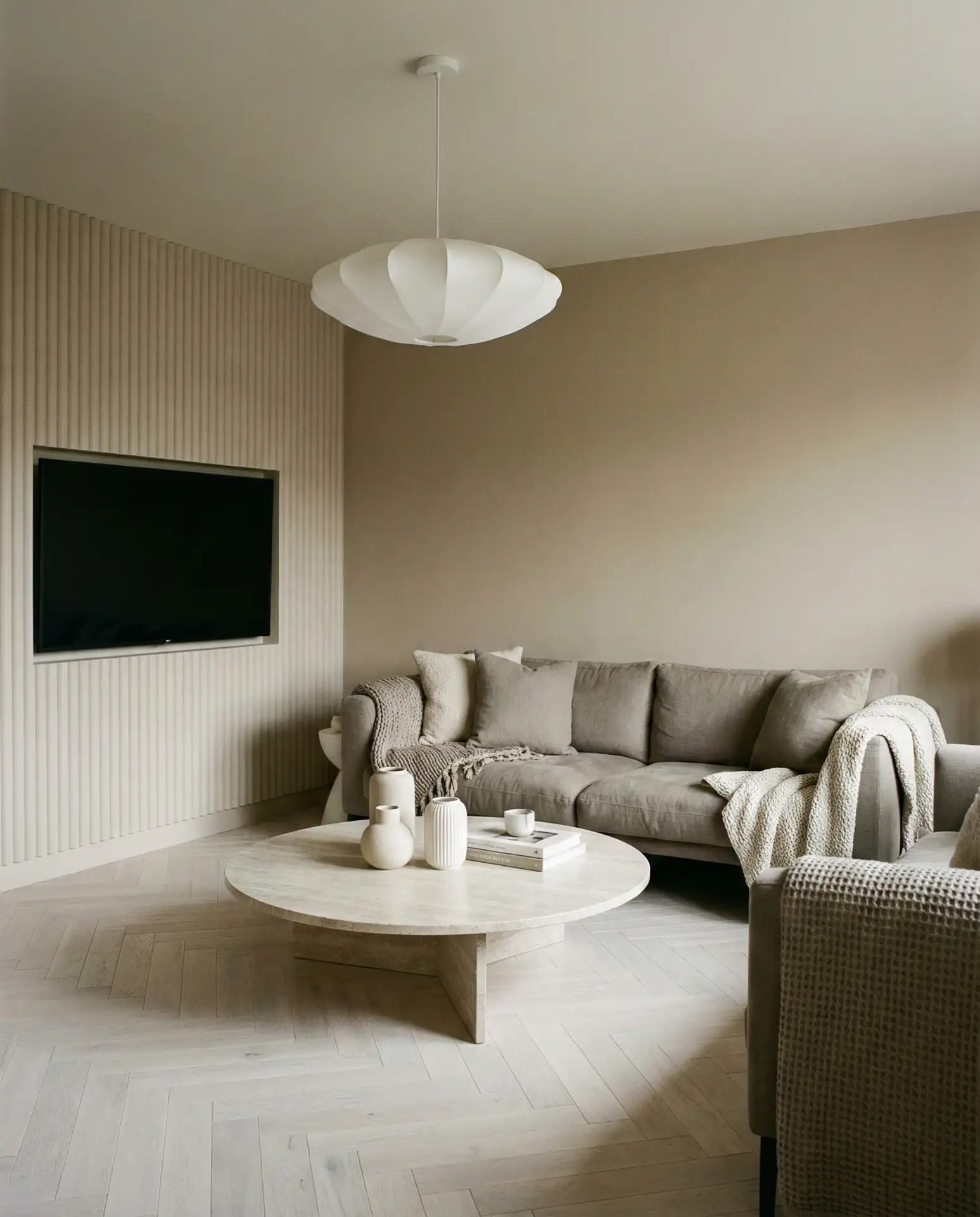
5. Beige and Grey Living Room
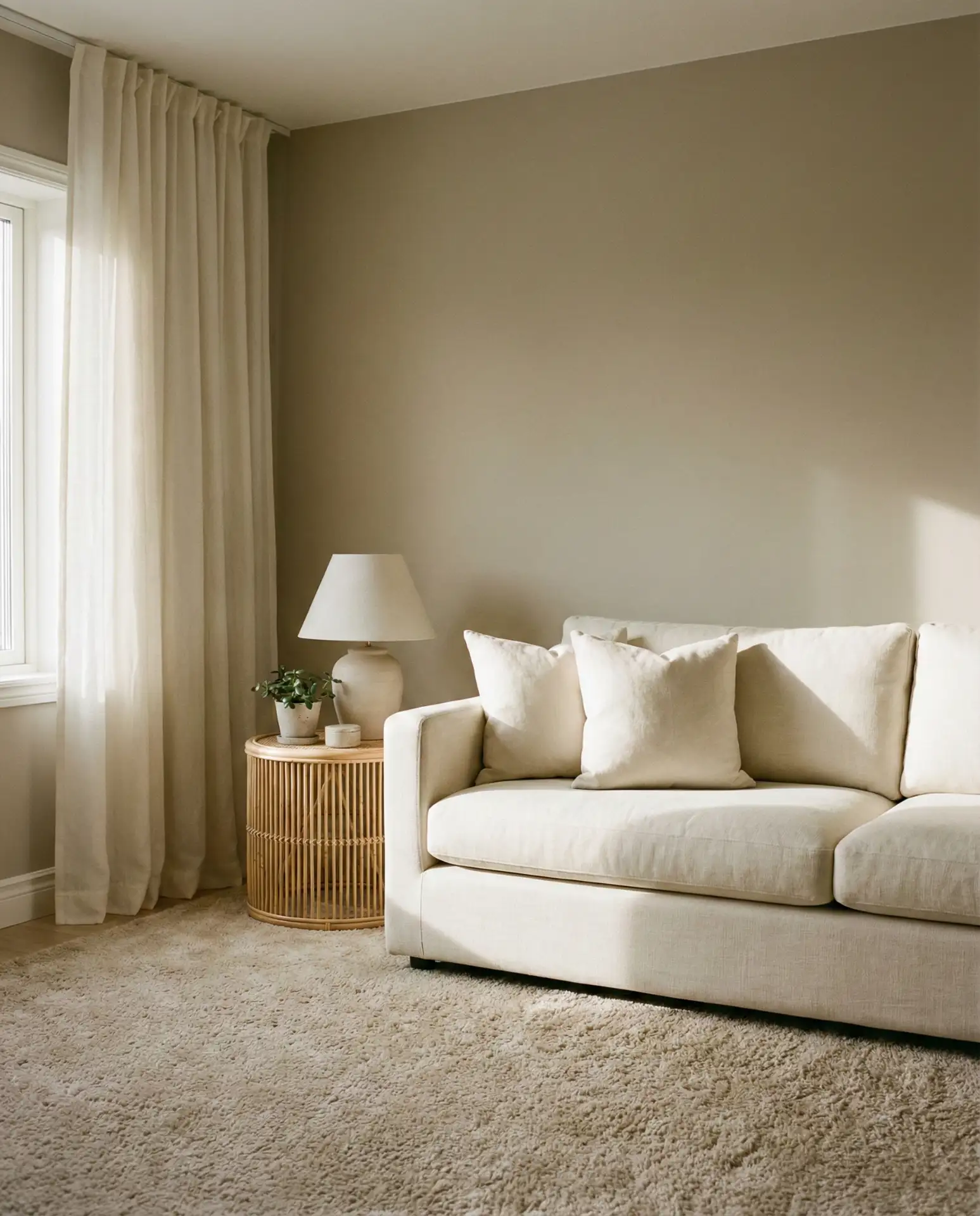
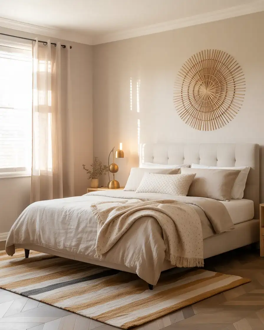
If you’ve ever scrolled Pinterest and wondered why some grey rooms feel so warm and inviting while others feel like waiting rooms, the answer is often beige and grey working in tandem. This combination is having a serious moment in 2026 — it’s the backbone of the “quiet luxury” aesthetic that’s taken hold across American interior design. Warm greige walls (that beautiful grey-beige crossover) beside softer cream upholstery, sand-toned rugs, and linen drapery create a layered, softly tonal room that feels expensive without being showy. It’s a deeply livable look. Add touches of cream and warm white for brightness without breaking the warmth.
At the budget end, IKEA’s KIVIK and SÖDERHAMN sofas in beige and grey tones have become go-to pieces for this look, costing anywhere from $500 to $1,200 — far less than the designer pieces they’re inspired by. Pair one with a secondhand wood coffee table and a wool rug from a Home Goods run, and you’re closer to the aesthetic than you might expect. The key investment worth making here is in the paint: a quality greige tone like Benjamin Moore’s Pale Oak or Sherwin-Williams Accessible Beige will do more for this look than any single piece of furniture.
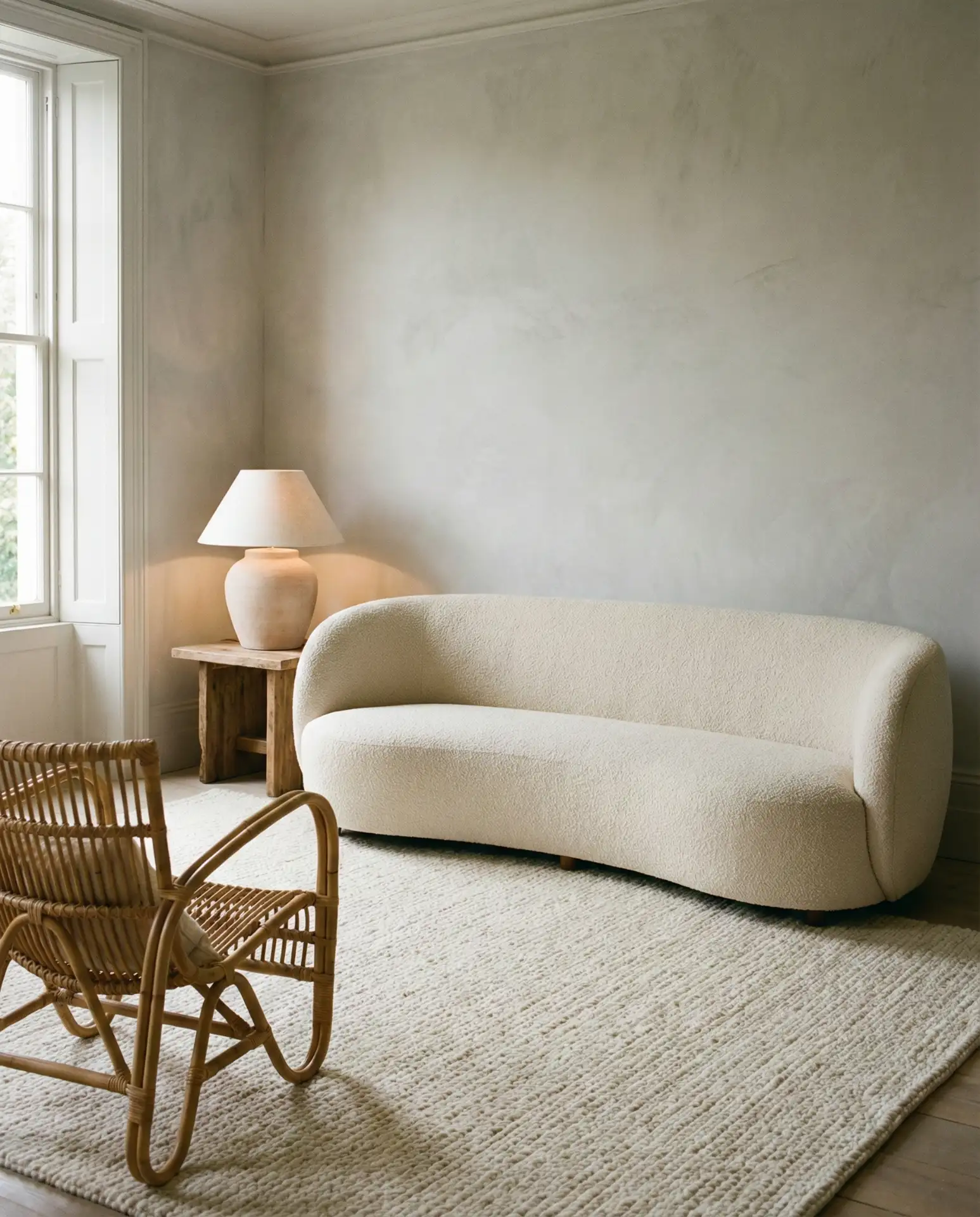
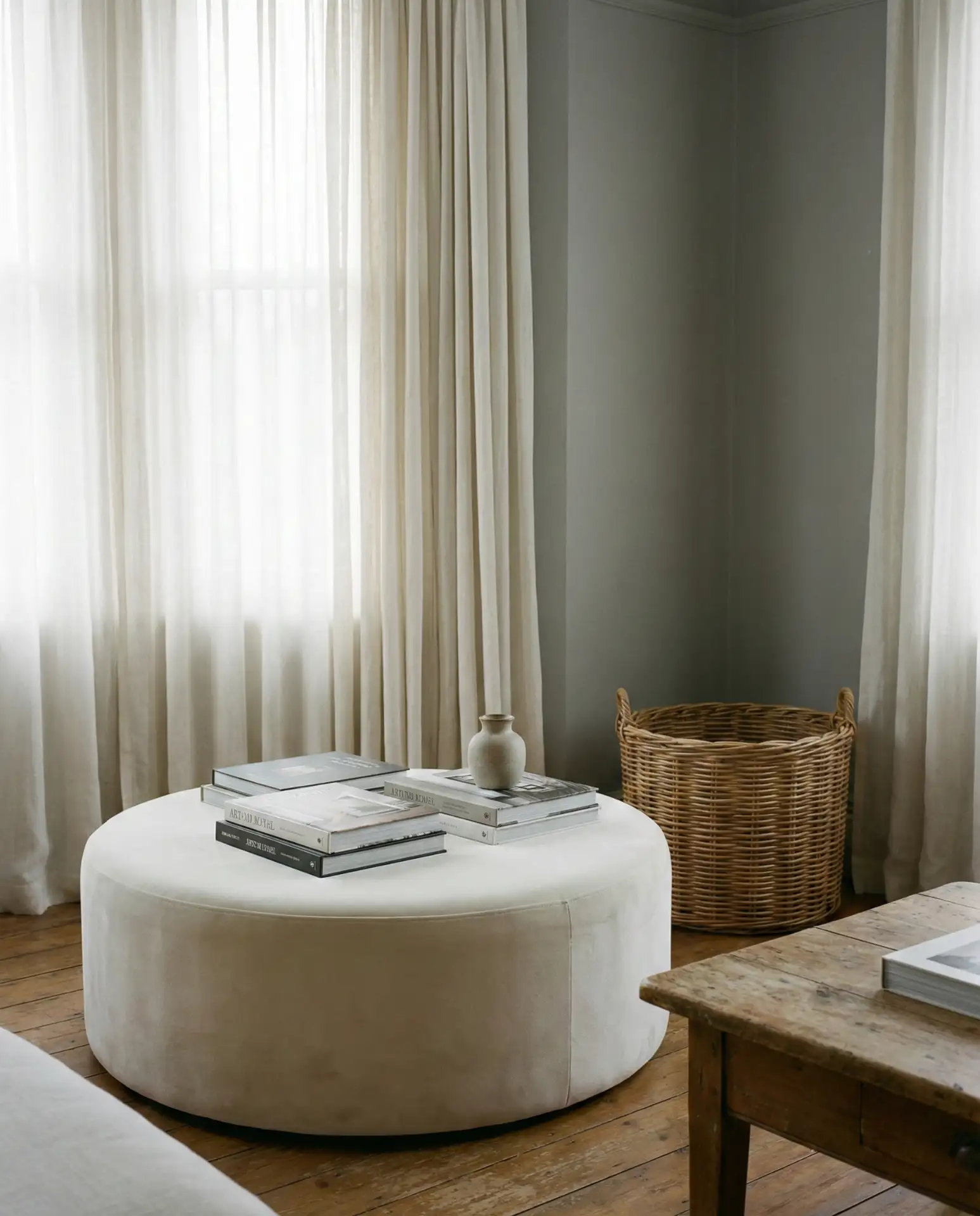
6. Cozy Grey Living Room
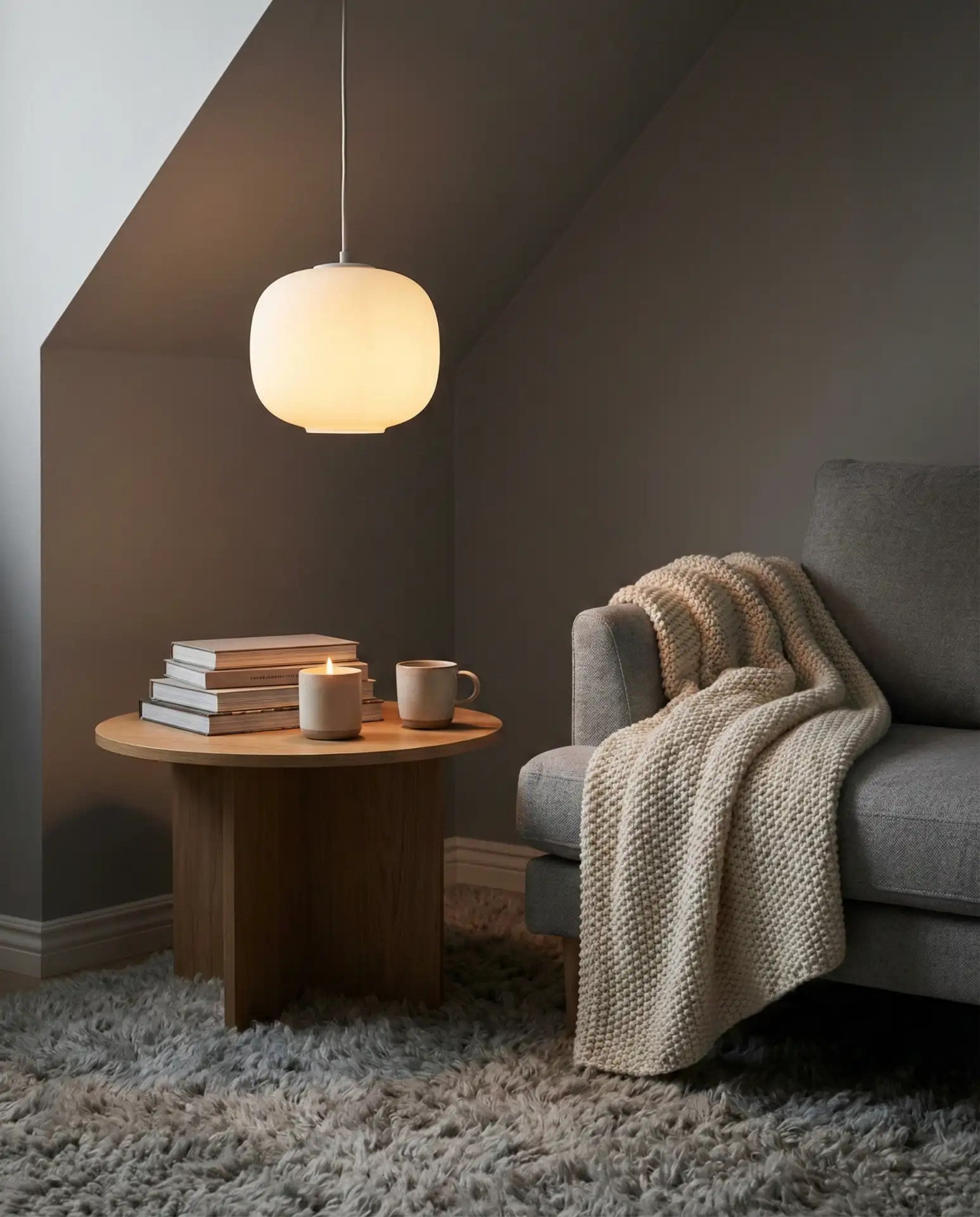
A cozy grey living room isn’t achieved through color alone—it’s about texture, scale, and the small decisions that make a room feel embracing rather than merely stylish. Think a deep-seated sectional in medium grey chenille, layers of throws in varying weights, a chunky knit pillow tucked into a corner, and warm Edison bulb lighting. The grey here serves as a canvas rather than a statement. It lets everything else—the softness of your textiles, the glow of your lamp, the warmth of a candle on the coffee table—come forward. This is the kind of room you actually want to spend a Sunday in.
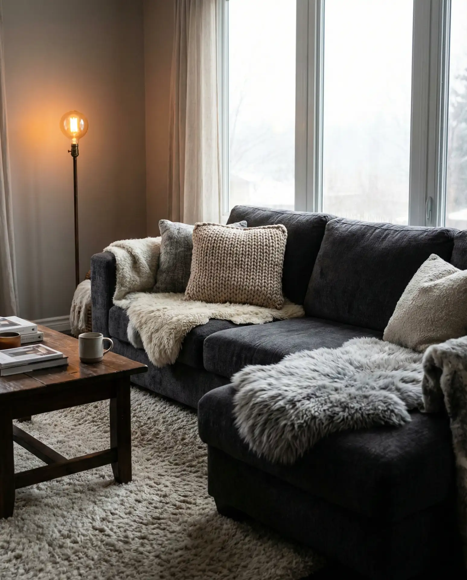
One thing real homeowners consistently report: the moment they added warm-toned bulbs (2700K to 3000K) to their grey living rooms, everything clicked. Cool fluorescent overhead lighting is the single biggest killer of cozy grey interiors—it flattens the tones and strips warmth from even the most beautifully styled space. Layer your lighting with floor lamps, table lamps, and even candles during the evening. A well-lit grey room feels like a hug. A poorly lit one feels like a dentist’s office.
7. Brown and Grey Living Room
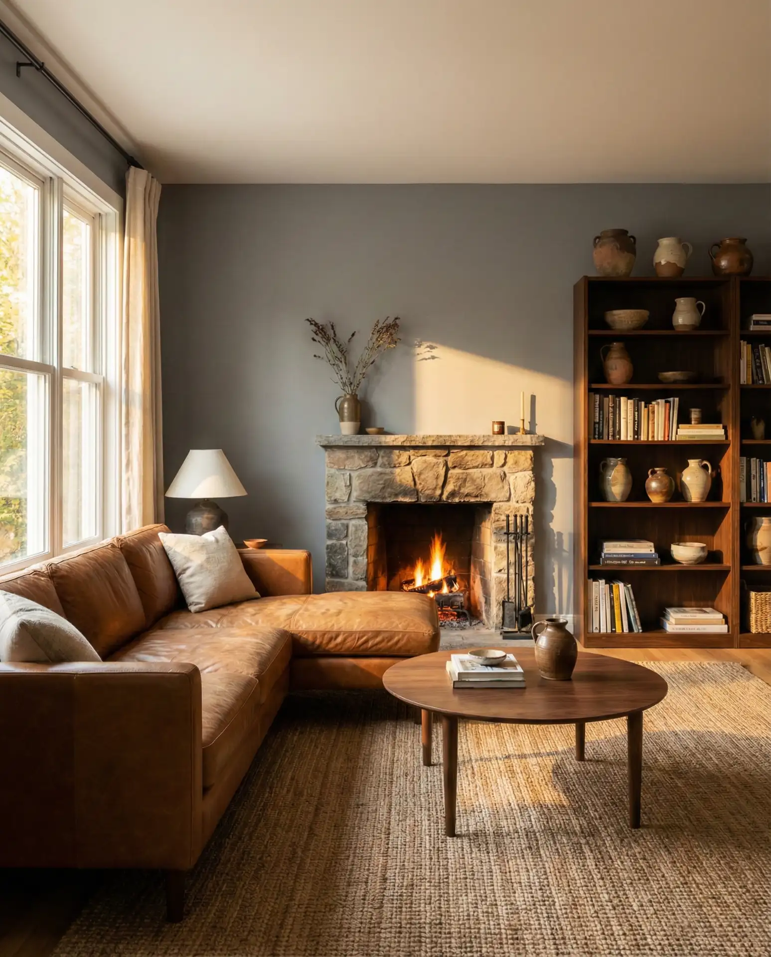
The brown and grey combination has shed its 2010s reputation as the bland suburban default and reemerged as a genuinely sophisticated pairing in 2026. The key is choosing the right shades: warm chestnut or cognac leather against a cool slate grey makes for a striking contrast, while medium grey walls beside walnut furniture read as grounded and intentional. This works particularly well in rooms with fireplaces or exposed beams, where the brown of natural materials is already present in the architecture. It’s also one of the most versatile decor directions—it bridges traditional, transitional, and contemporary styles without difficulty.
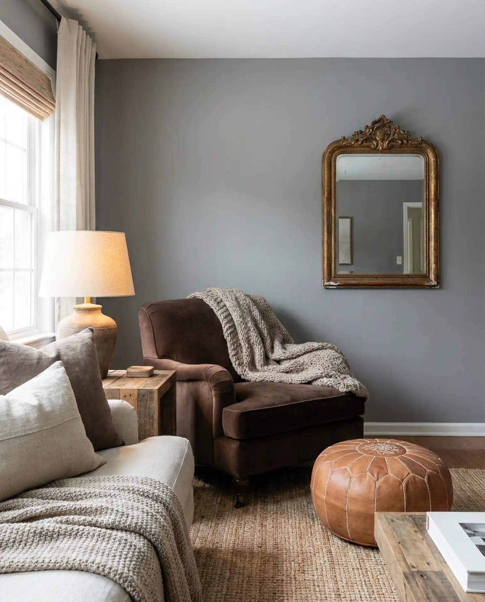
This is a scheme that works particularly beautifully in ranch-style homes across Texas, Colorado, and the Mountain West—places where interior design often draws from the landscape outside, and where brown and grey show up naturally in rock, wood, and earth. Interior designers in these regions often advise clients to think of the room as an extension of the terrain: warm earth tones grounding the space, cool grey sky above. Leaning into this regional logic gives the design a sense of place that feels authentic rather than Pinterest-assembled.
8. Sage Green and Grey Living Room
If there’s one specific pairing that has dominated design conversations heading into 2026, it’s sage green and grey. These two colors share a dusty, desaturated quality that makes them feel almost made for each other. Sage walls against grey upholstery, or a grey room punctuated by sage ceramic accents and botanical prints, creates a space that feels both modern and rooted. It’s a palette that appeals equally to people who love nature-forward design and those who want a refined, understated contemporary look. It’s also versatile across ideas and color schemes—working from pale greige-sage hybrids all the way to deeper eucalyptus shades.
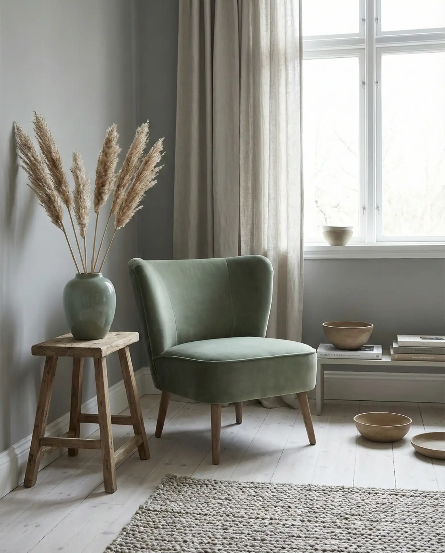
According to several interior designers who work primarily with millennial and Gen Z homeowners, sage-and-grey combinations consistently rank among the top requested palettes right now. Part of the appeal is biophilic: both colors have a grounded, natural quality that helps people feel calm in their spaces—something that’s increasingly valued post-pandemic. If you’re painting, consider Sherwin-Williams Comfort Gray or Benjamin Moore October Mist in the sage range. Either pairs beautifully with soft grey upholstery and warm wood tones.
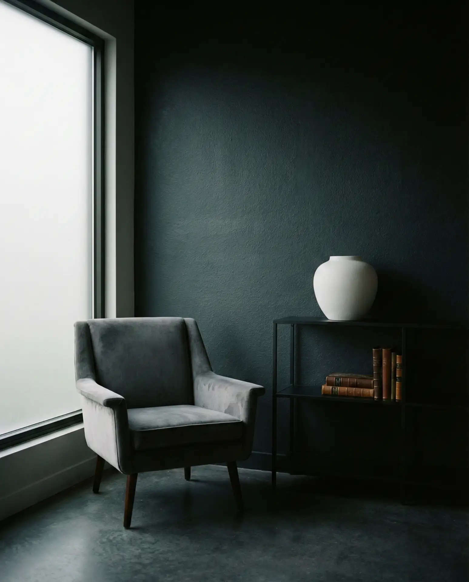
9. Dark Grey Living Room
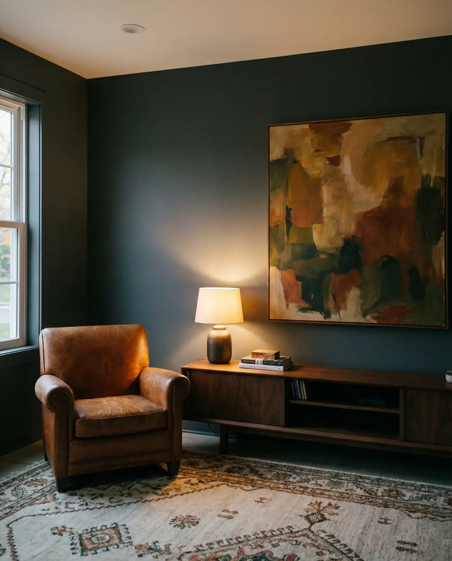
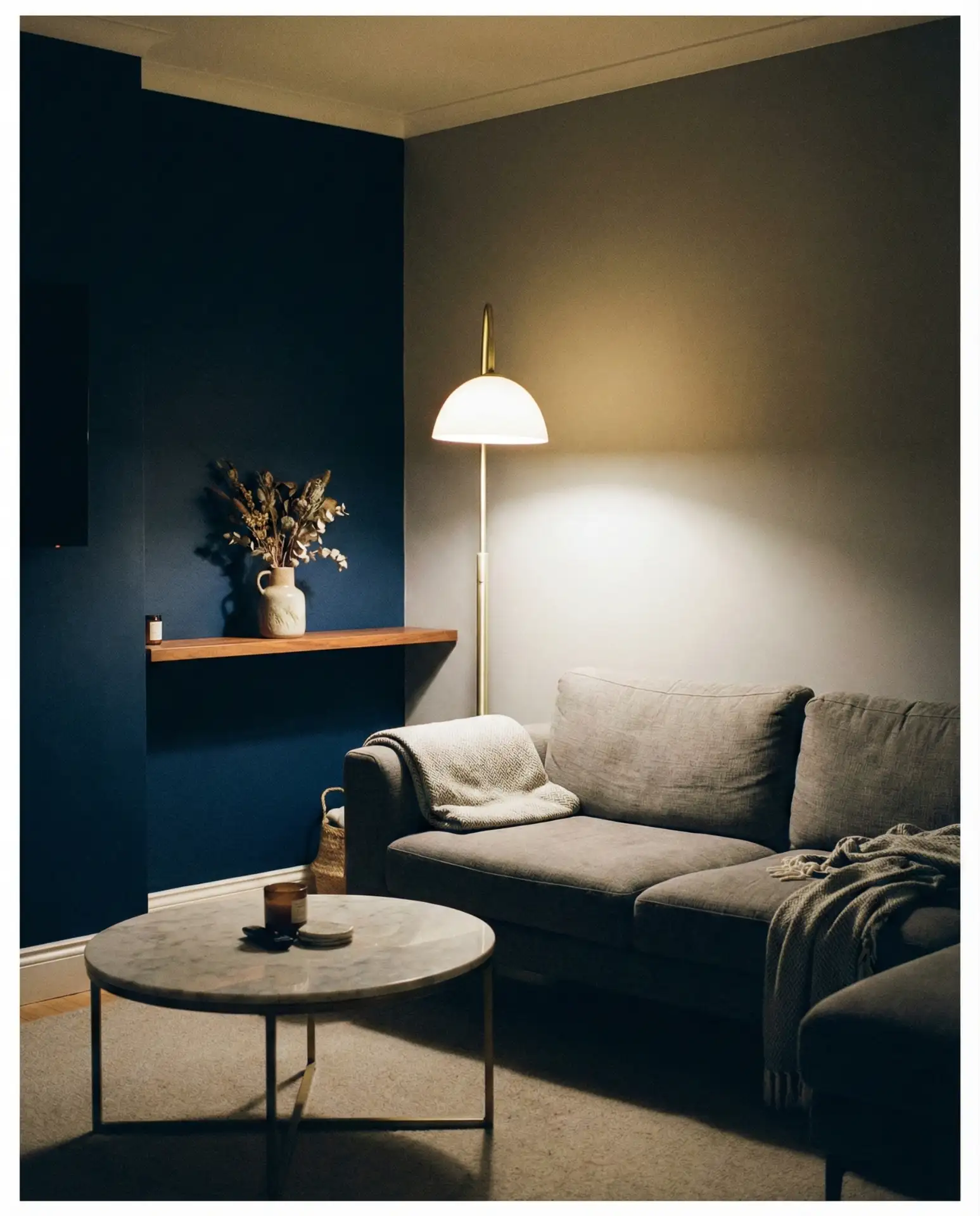
Going dark with your grey is one of those design choices that feels intimidating until you see it done well—and then you wonder why you ever played it safe. Deep charcoal, slate, and graphite walls create a sense of depth and intimacy that lighter shades simply can’t achieve. In 2026, the dark grey living room is being embraced with more confidence than ever, especially in urban apartments and older homes with good ceiling height. Pair deep walls with rich upholstery—velvet in aubergine or forest green, or leather in warm cognac—and the result is layered, cocooning, and undeniably sophisticated. This is where dark blue and dark grey sometimes blur beautifully.
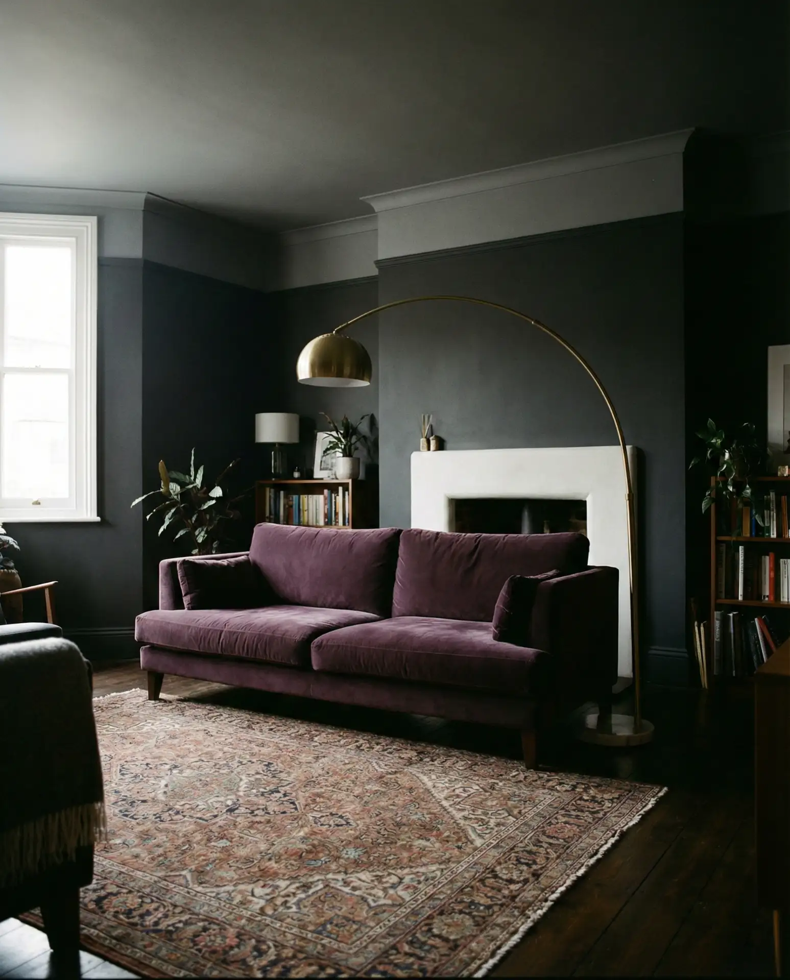
The most common mistake people make with dark grey rooms is treating them like they’d treat any other color—painting just the walls and then wondering why the room feels oppressive. Dark colors demand that you think dimensionally. Paint the ceiling too, or at least go darker than white. Layer your lighting thoughtfully—sconces, table lamps, and dimmers are essential. Add warm metallic accents (brass, copper, aged gold) to reflect light back into the room. Once those elements are in place, a dark grey living room becomes one of the most atmospherically rich spaces in a home.
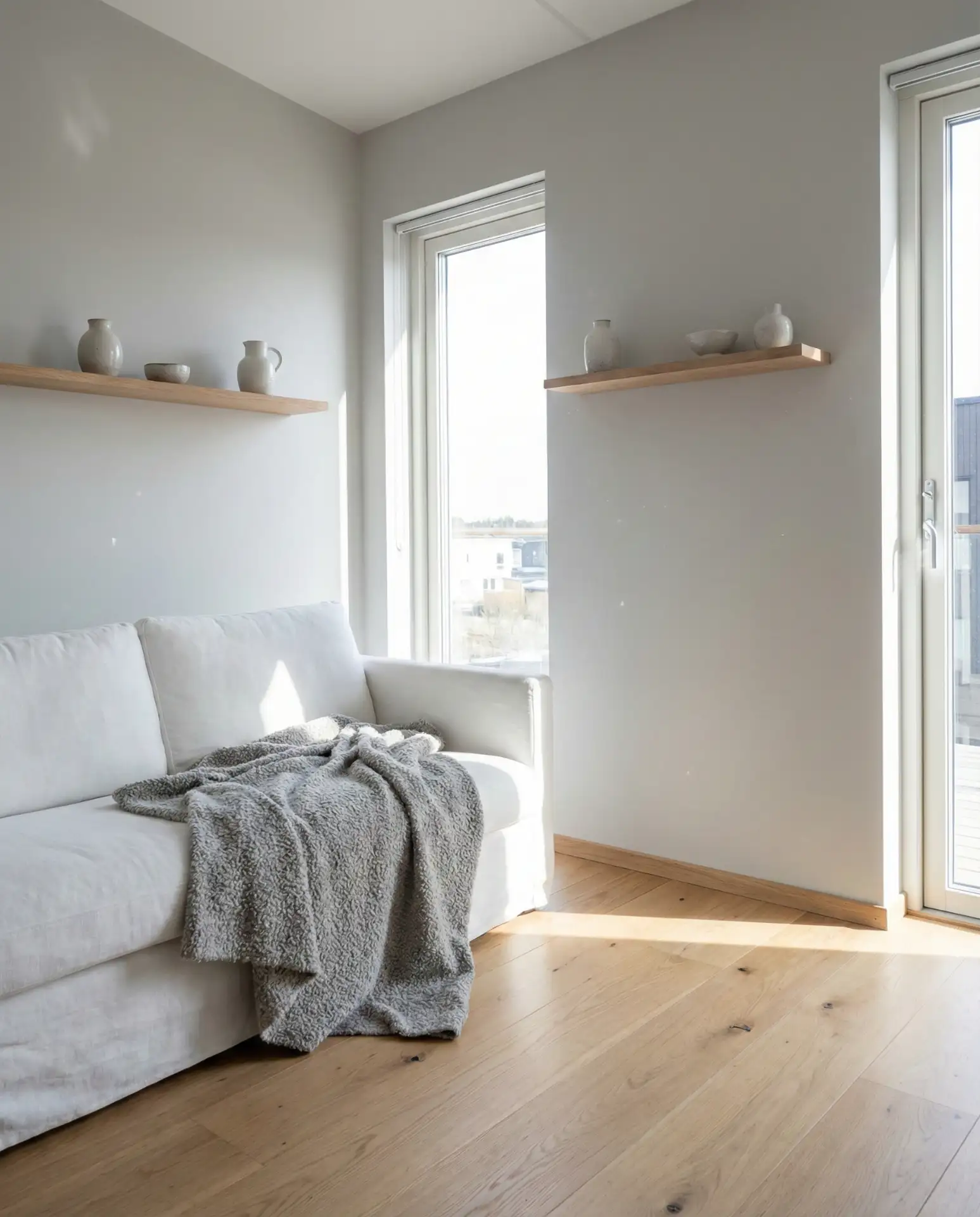
10. White and Grey Living Room
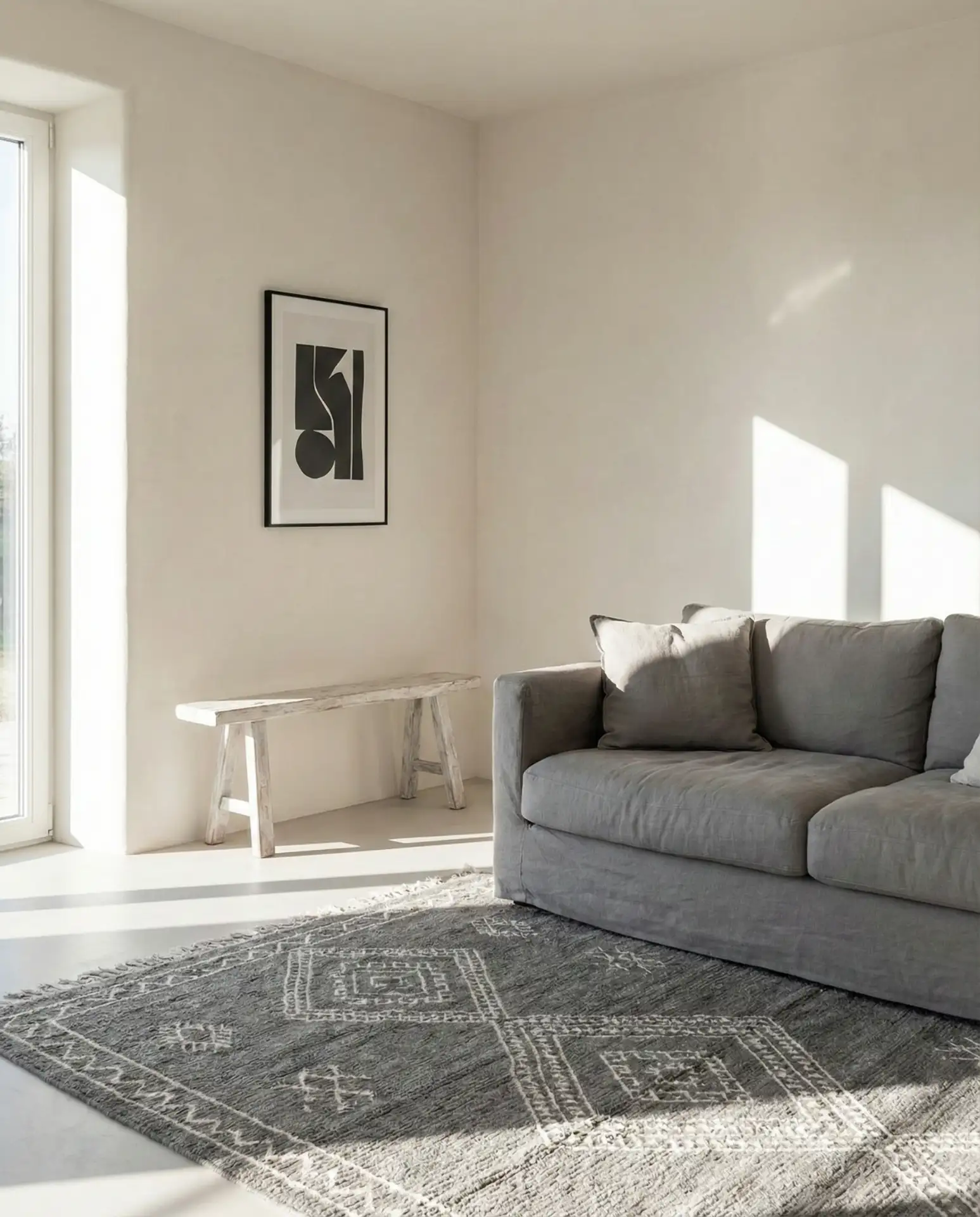
The white and grey pairing is a perennial for good reason—it’s clean, it’s timeless, and it provides the perfect backdrop for life as it actually unfolds. But in 2026, the approach has evolved past the stark, minimalist version of years past. Now it’s about softness: warm whites instead of cool ones, layered grey tones instead of a single flat shade, and texture as the primary visual interest. A room in white plaster with a grey Moroccan rug, linen cushions in soft smoke tones, and a whitewashed wooden bench reads as refined and curated without feeling clinical. Black and white graphic accents in art or pillows add just enough edge to keep it from going bland.
This palette works best when you resist the temptation to make it too perfect. A lived-in quality—a softly worn throw, slightly imperfect plaster texture on the walls, and a stack of books that aren’t organized by color—keeps white and grey from tipping into showroom territory. Real homes have character. If everything matches too precisely, the space loses the warmth that makes it actually inviting. Let your grey have variation across pillows, rugs, and upholstery, and let your white have a little warmth, and you’ll find a sweet spot that photographs beautifully and lives even better.
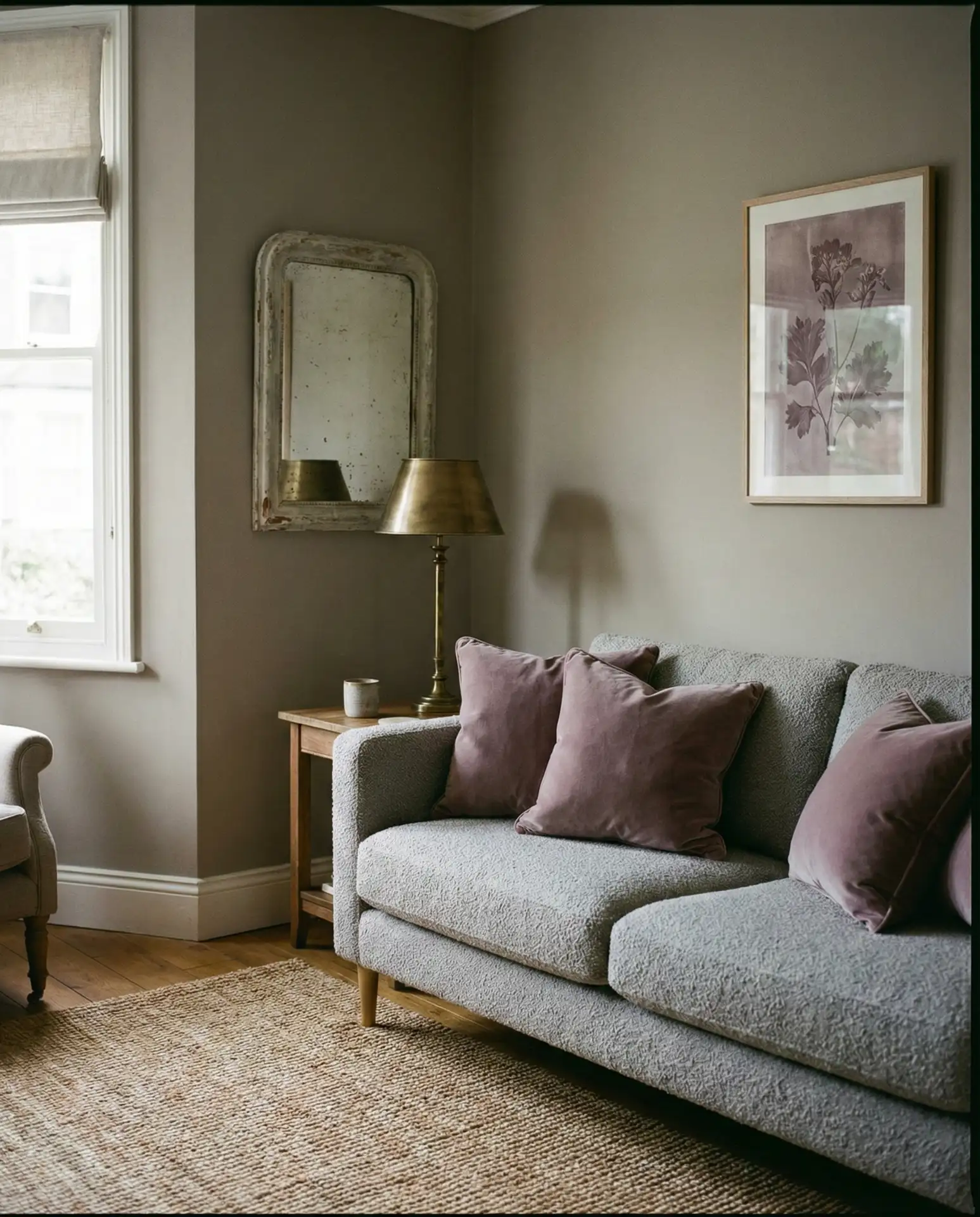
11. Pink and Grey Living Room
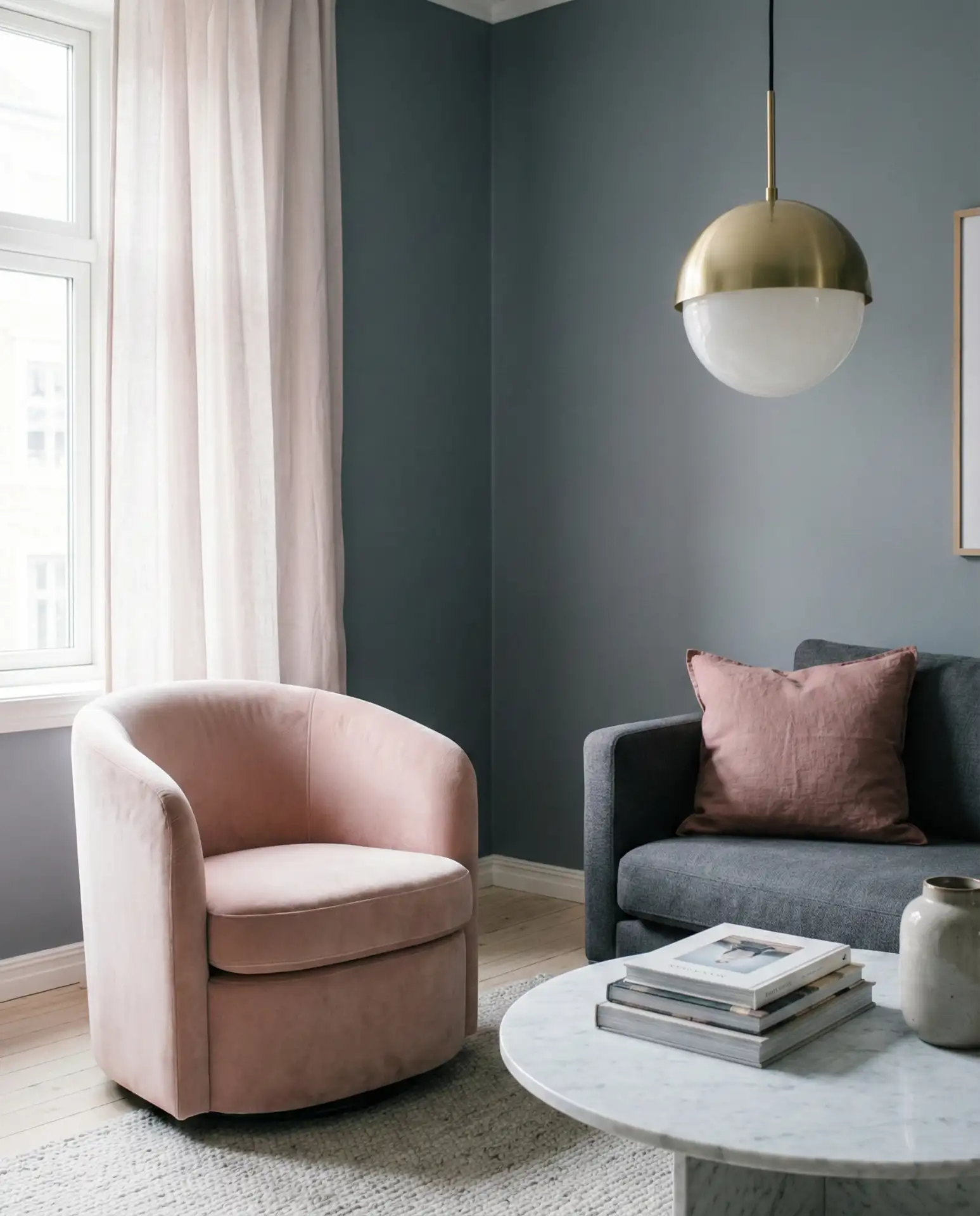
The pink and grey combination has outgrown its reputation as a “feminine” choice and arrived somewhere far more interesting: a genuinely sophisticated palette that balances warmth and cool in a way few other combinations can. Dusty rose paired with slate grey feels almost Parisian—effortlessly chic and slightly unconventional. Blush pink cushions against a medium grey sofa, or a rose-toned velvet accent chair in a grey-walled room, add a warmth and softness that makes the space feel beautifully human. This is a great direction if you want your decor to feel fresh and personal without veering into trend-chasing territory.
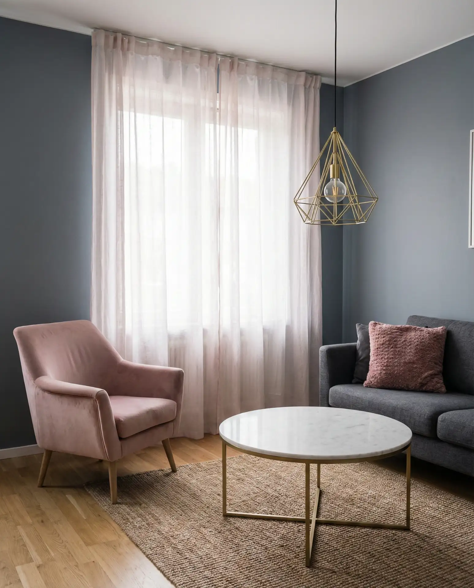
This is where it works best: rooms that get plenty of natural light will make dusty rose and grey sing. In a north-facing room, these tones can get washed out and a little flat—if that’s your situation, push the pink slightly deeper toward terracotta or salmon to compensate. Artwork is a brilliant way to introduce the pink element without commitment—a single large canvas with dusty rose as a dominant tone can shift the entire feeling of a grey room without you touching the sofa or walls. It’s a low-risk entry point worth trying before investing in new upholstery.
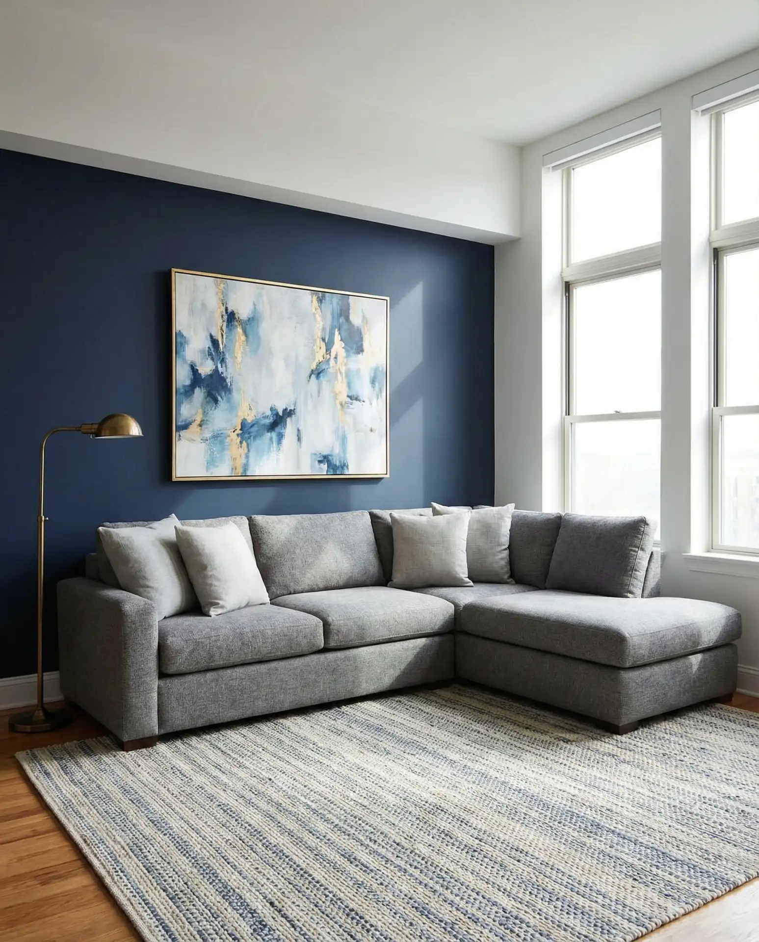
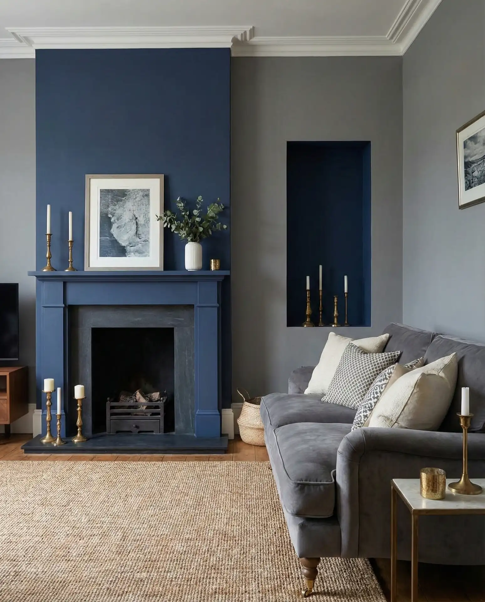
12. Navy Blue and Grey Living Room
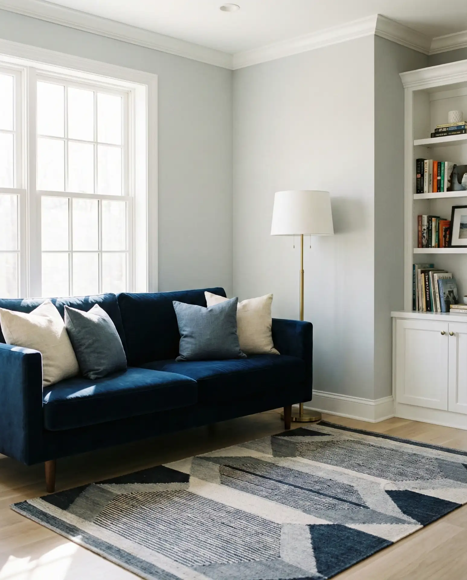
Navy blue and grey is perhaps the most classically American pairing in interior design—it shows up everywhere from New England coastal homes to midwestern Craftsman bungalows, and it keeps working because it’s grounded in contrast that makes both colors stronger. Navy grounds a grey room with depth and authority; grey softens the heaviness navy can sometimes carry on its own. A navy velvet sofa against light grey walls, or a grey upholstered sectional beside a navy painted built-in, creates the kind of well-composed room that feels collected over time rather than decorated all at once. This combination also lends itself naturally to navy and brass or navy and gold accents.
A homeowner in Connecticut recently did exactly this—navy built-ins flanking a fireplace, light grey walls, and a pale grey sofa—and shared the results on Instagram to nearly 50,000 saves. It wasn’t a dramatic renovation; most of the work was paint. That story illustrates something important about this combination: its impact is outsized relative to its cost. If you’re redoing a living room on a tight budget, painting one architectural element in navy while keeping grey as your base is one of the highest-return moves you can make.
13. Modern Grey Living Room
A truly modern grey living room in 2026 isn’t about cold minimalism—that phase has passed. Today’s modern interpretation is warmer, more material-rich, and more personal. Think clean-lined furniture with visible craft: a stone-topped coffee table, a sofa with visible joinery, and shelving with careful negative space. The grey itself tends to be warm—taupe-grey, greige, or mushroom—rather than cool steel. Architectural details matter: flat walls in contemporary grey paired with a fluted plaster surround around the TV, or a limewash finish that gives texture without pattern. Light fixtures are statements—sculptural pendants or arching brass floor lamps rather than recessed lighting alone.
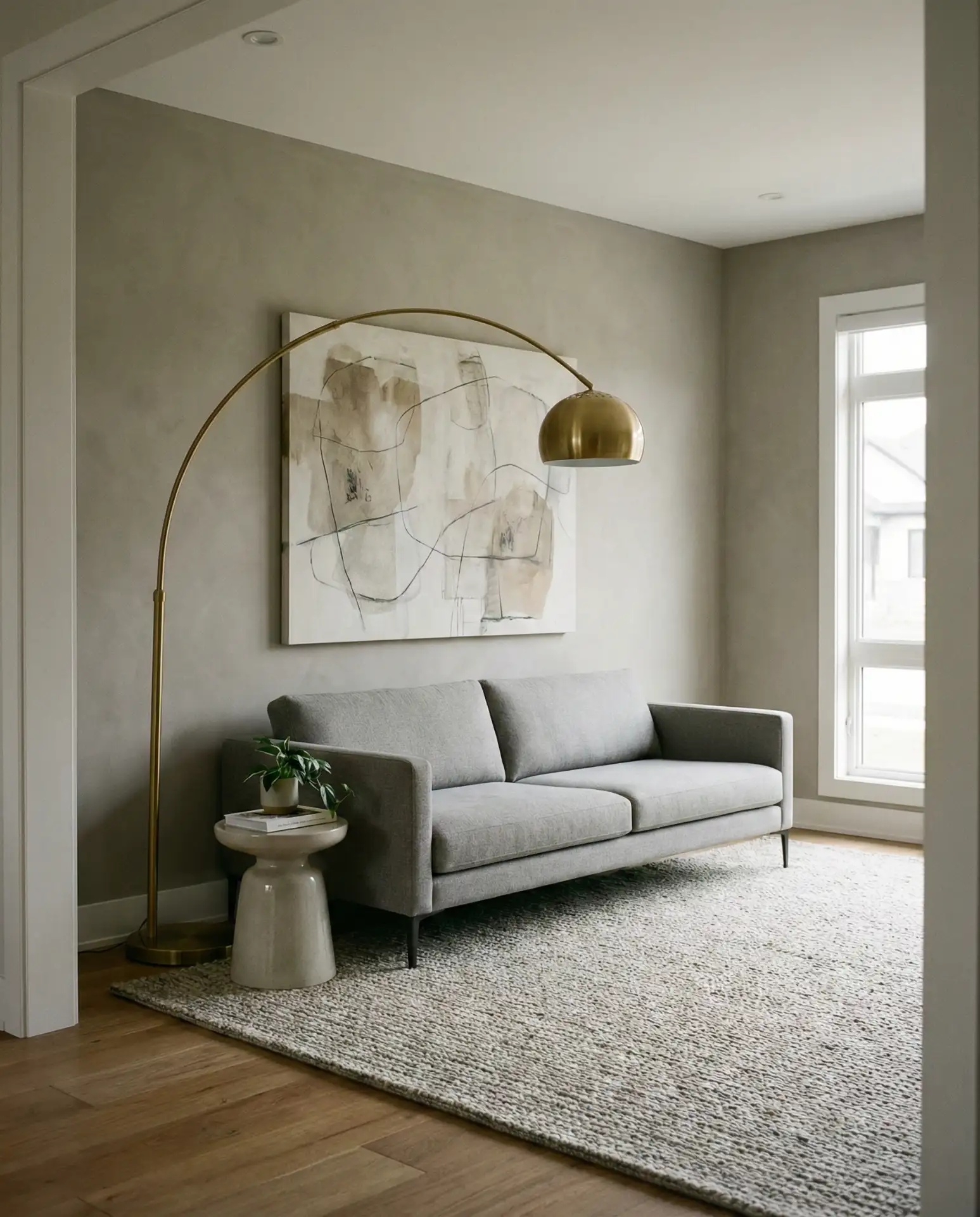
The practical reality of a modern grey living room is that it requires restraint—which is harder than it sounds when you’re surrounded by beautiful things you want to display. A good rule borrowed from professional designers: choose a “visual anchor” (a sofa, a rug, a piece of art) and let that piece dictate the proportions and palette of everything else. Edit ruthlessly. Clutter reads as mess in a modern grey room in a way it might not in a more bohemian or eclectic space. Give each object room to breathe, and the room will feel intentional and elevated.
14. Light Grey Living Room
A light grey living room is one of the most versatile backdrops you can give a space—it’s bright enough to keep rooms feeling open and airy but grounded enough to prevent things from looking washed out or empty. The challenge is preventing it from reading as neither-here-nor-there: you want soft grey with genuine character, not just a beige that couldn’t make up its mind. In 2026, the best light grey rooms distinguish themselves through layering—varied textures in similar tones, warm wood elements, and pops of color introduced through plants, artwork, or cushions. It’s a fantastic base for people who change their decor seasonally, as it adapts with ease.
Light grey is where many homeowners get their first serious interior design experience—it’s approachable, widely available, and difficult to truly mess up. That low barrier to entry is its strength. It suits smaller living rooms especially well, as the reflective quality of lighter walls makes rooms feel more spacious. If you’re in a rental and limited to painting, a light grey—Sherwin-Williams Repose Gray and Benjamin Moore Revere Pewter are perennial favorites—can transform a tired white box into something that actually feels like home, quickly and inexpensively.
15. Cream and Grey Living Room
There’s a reason the cream and grey pairing keeps appearing on the most-saved home inspiration boards—it strikes exactly the right balance between warmth and neutrality. Cream prevents grey from going cold or sterile; grey keeps cream from feeling fussy or dated. Together they create a backdrop that feels naturally elegant, like the inside of a beautiful old hotel or a well-loved European apartment. In practice, this means cream linen upholstery against grey walls or a grey sofa anchored by a cream-white wool rug. Introduce natural materials—rattan, linen, unfinished ceramic—and the room takes on a beautifully organic quality that feels effortless.
Expert commentary from interior stylists consistently points to this palette as the ideal choice for transitional homes—those spaces that are neither fully traditional nor fully contemporary but carry elements of both. The grey provides the contemporary grounding; the cream keeps the warmth and softness that makes a room feel lived-in and welcoming. If you’re designing for a home that multiple generations share—the kind of place that needs to feel comfortable for a 28-year-old and a 65-year-old simultaneously—cream and grey is one of the most reliably successful palettes you can reach for.
16. Royal Blue and Grey Living Room
Royal blue is a bold commitment in any room, and pairing it with grey is the move that makes it wearable for the long term. The grey acts as a visual pressure valve—it tempers the intensity of royal blue so the room never feels like too much, while letting that saturated jewel tone make a genuine statement. In 2026, this combination is appearing most frequently in more formal or statement-driven living rooms: a royal blue velvet sofa against light grey walls, or a large royal blue abstract canvas anchoring a grey room. Touches of gold or antique brass tie the two colors together and elevate the whole look. This is the blue direction for people who want something genuinely striking.
This palette suits rooms with architectural ambition—high ceilings, arched windows, built-in details, or prominent fireplaces. It leans formal, so it’s less natural in casual, family-first spaces and better suited to a dedicated sitting room or a home with a distinct living room separate from a family room. If you want to try it without full commitment, start with a royal blue linen or velvet set of curtains—they’ll immediately anchor the space, and you can decide from there whether you want to deepen the palette further or keep grey as the dominant voice.
17. Yellow and Grey Living Room
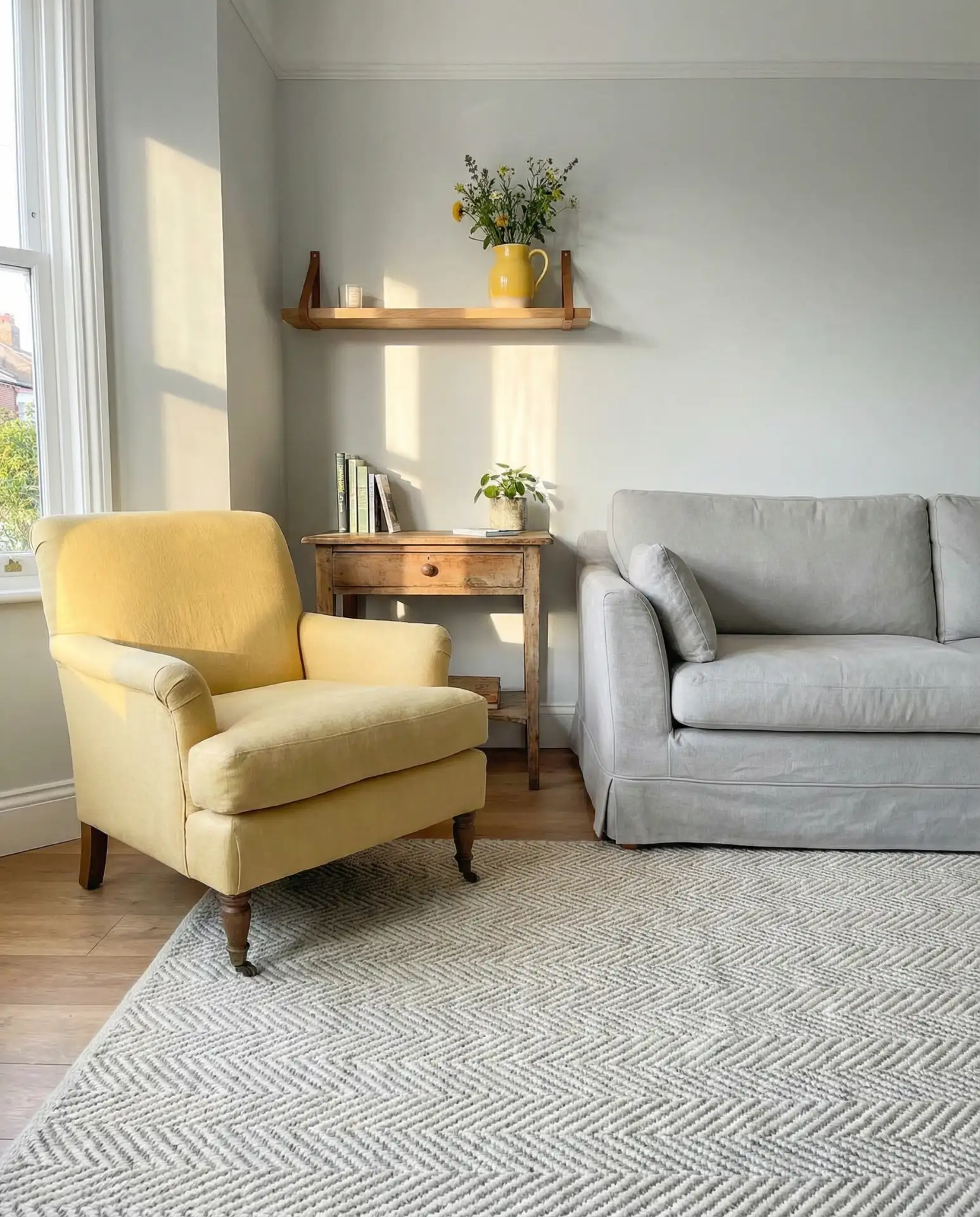
Yellow and grey is one of the most cheerful and unexpectedly sophisticated combinations you can work with—when approached with the right tones. Mustard or ochre yellow against a medium grey has a beautifully warm, mid-century character. Soft butter yellow paired with pale grey reads as light and optimistic. The mistake is going too bright: lemon yellow or neon against grey can feel jarring rather than joyful. This pairing brings an immediate energy lift to any grey room, making it ideal for spaces where people gather and interact—it’s a naturally social and uplifting color combination. The ideas and possibilities here span bohemian, retro, Scandi, and eclectic aesthetics with equal ease.
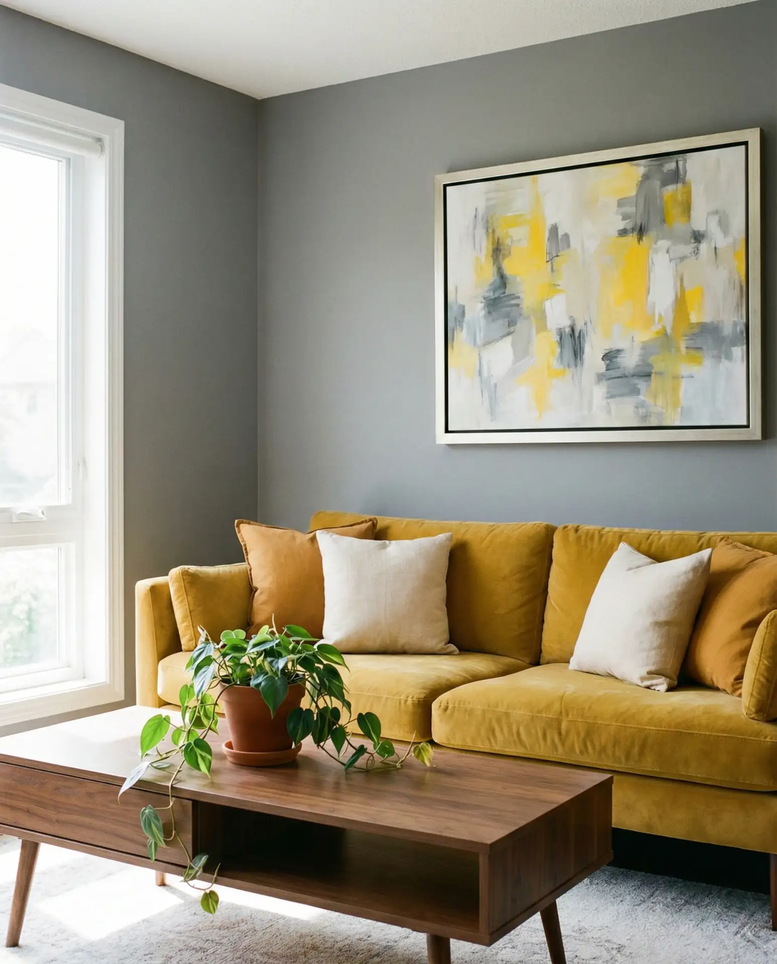
On the practical and budget side, yellow and grey is one of the easiest combinations to implement through accessories alone—you don’t need to repaint or reupholster anything. A mustard yellow throw blanket from Target or a pair of ochre cushions from a thrift run can introduce the yellow element into an existing grey room for under $50. If you’re staging a home for sale and have a grey living room already, yellow accessories are actually a well-known realtor’s trick: they signal warmth, light, and optimism to buyers in a subliminal way that moves listings faster.
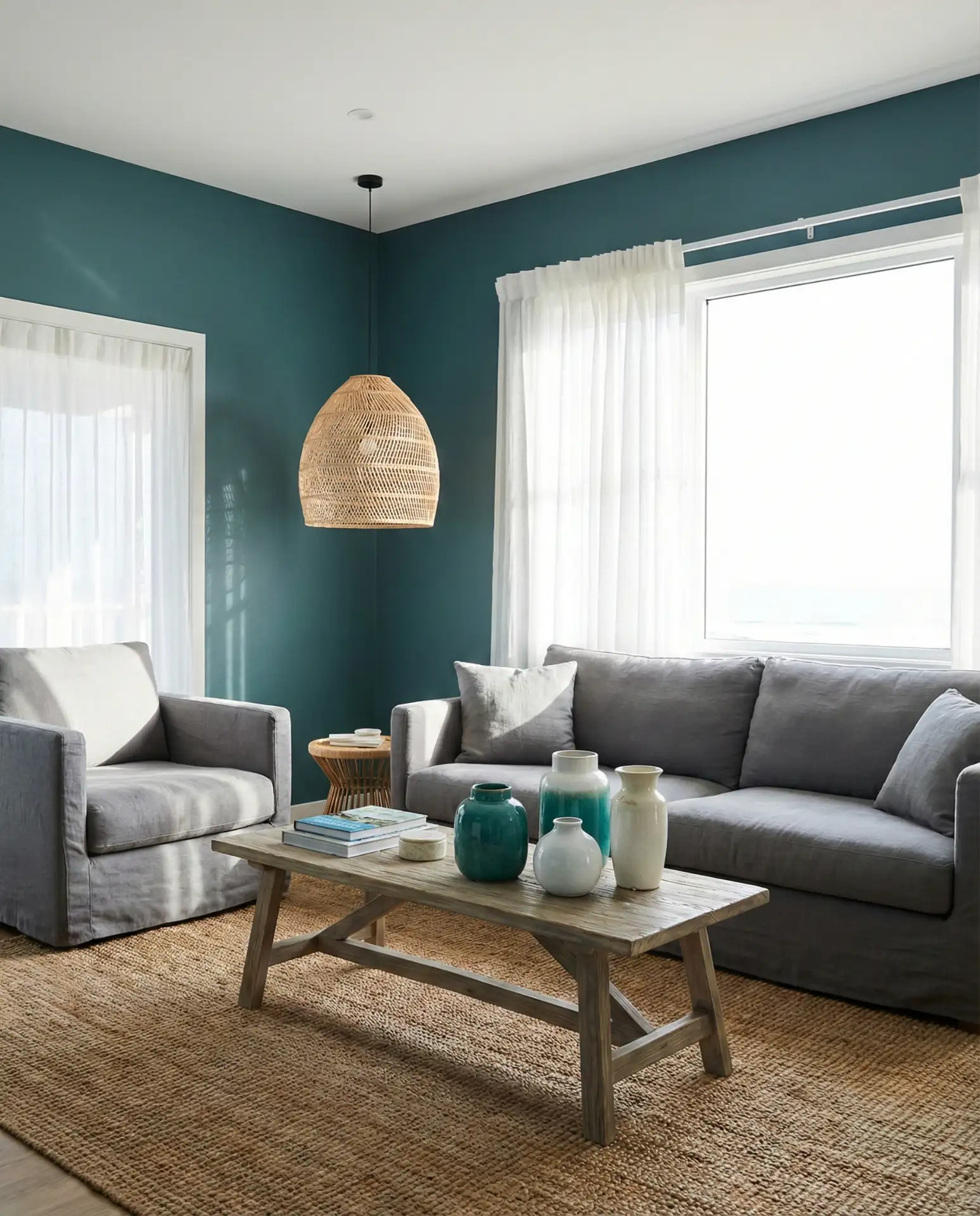
18. Teal and Grey Living Room
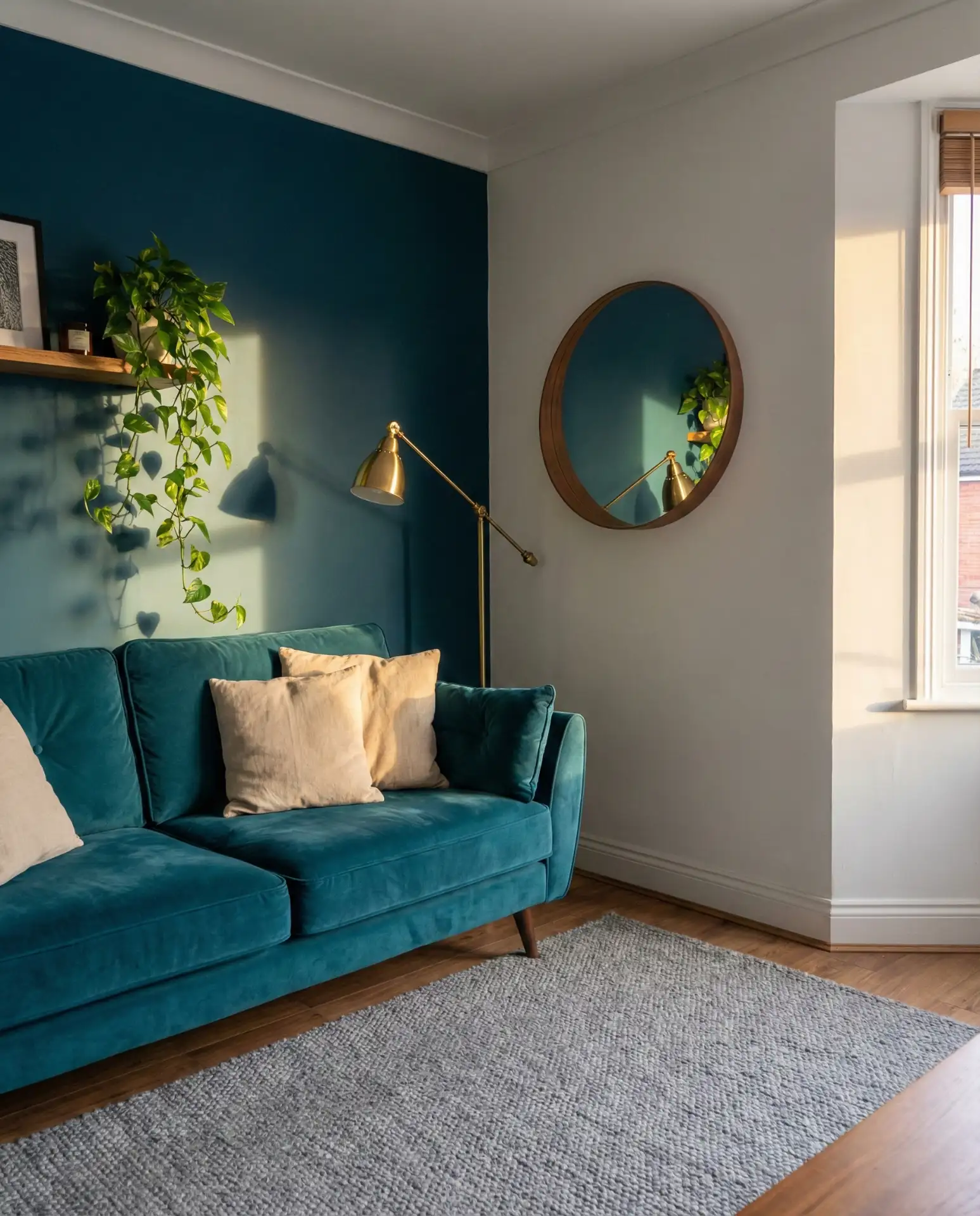
Teal and grey is a pairing that’s somewhere between classic and adventurous—it has enough color to feel bold and personal, but the teal’s blue-green grounding keeps it from ever feeling chaotic. In 2026, the most current takes on this combination favor deeper, more muted teals—duck egg, Prussian-adjacent, and petrol blue-green—over the brighter versions of earlier years. A teal accent wall in a grey room, or a teal sofa against grey-white walls, gives the space a rich, layered quality that works across coastal, eclectic, and contemporary styles. It reads equally well in a coastal cottage or a city apartment, making it one of the most broadly applicable of all the blue-adjacent grey pairings.
The best practical advice for teal and grey comes from understanding how teal shifts under different lighting conditions—it can swing dramatically between green-forward and blue-forward depending on the time of day and the quality of light in your room. Always test your teal paint swatch through morning, midday, and evening light before committing. In rooms with warmer artificial light, teals often pull greener; in cool northern light, they read bluer. Neither is wrong, but knowing which version of teal your room will display most often helps you choose a shade that works with your grey, rather than fighting it.
19. Purple and Grey Living Room
Purple and grey might be the most underrated pairing in this list—it’s sophisticated when handled well, and the range of purple available (from lavender and lilac to plum, amethyst, and aubergine) gives designers enormous flexibility. Soft lavender cushions in a grey room feel fresh and airy; deep plum upholstery against charcoal walls reads as opulent and dramatic. In 2026, the versions getting the most traction are muted purples—dusty mauve, soft grape, and aged violet—that feel more like a grown-up design choice than a teenage bedroom. Pair with warm grey tones to prevent the combination from going cold, and add gold or brass accents to bridge the two tones with warmth.
Think of purple and grey the way you’d think of a grey suit with a purple pocket square—the purple elevates and differentiates without dominating. Use the grey as the foundation and let purple play a supporting role through textiles, ceramics, and artwork before you commit to any larger purple element. Mauve is the most accessible entry point—it’s purple enough to shift the room’s mood without reading as overtly purple to anyone who wouldn’t love that. It’s a genuinely smart choice for rooms where people want warmth and sophistication without going the predictable beige or cream route.
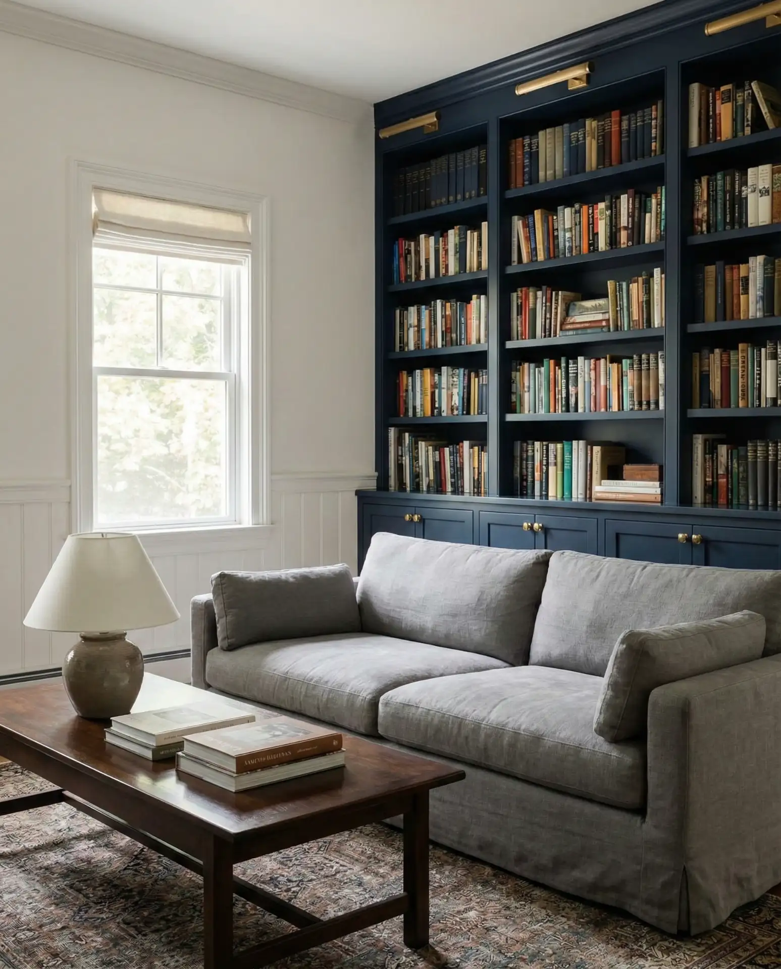
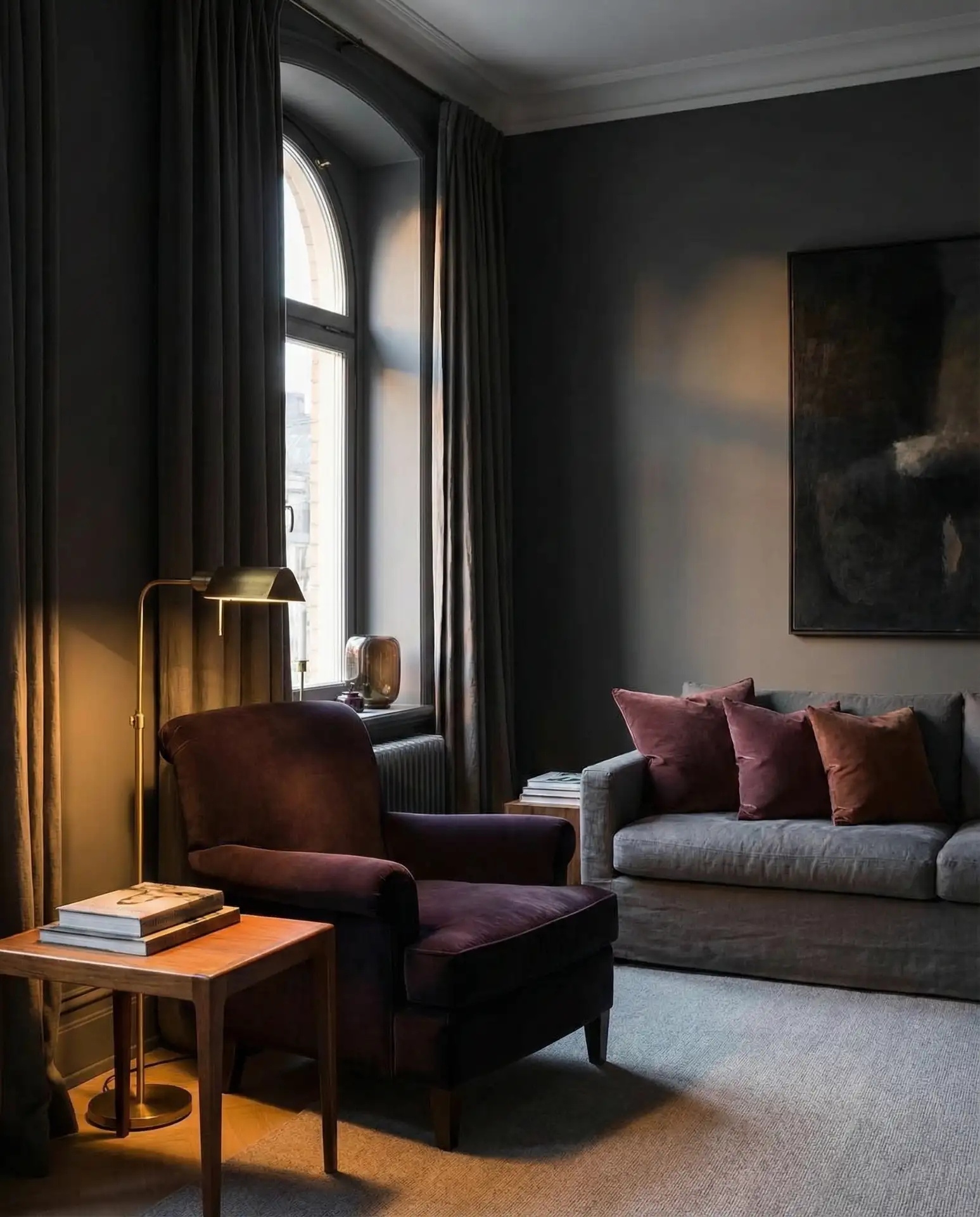
20. Burgundy and Grey Living Room
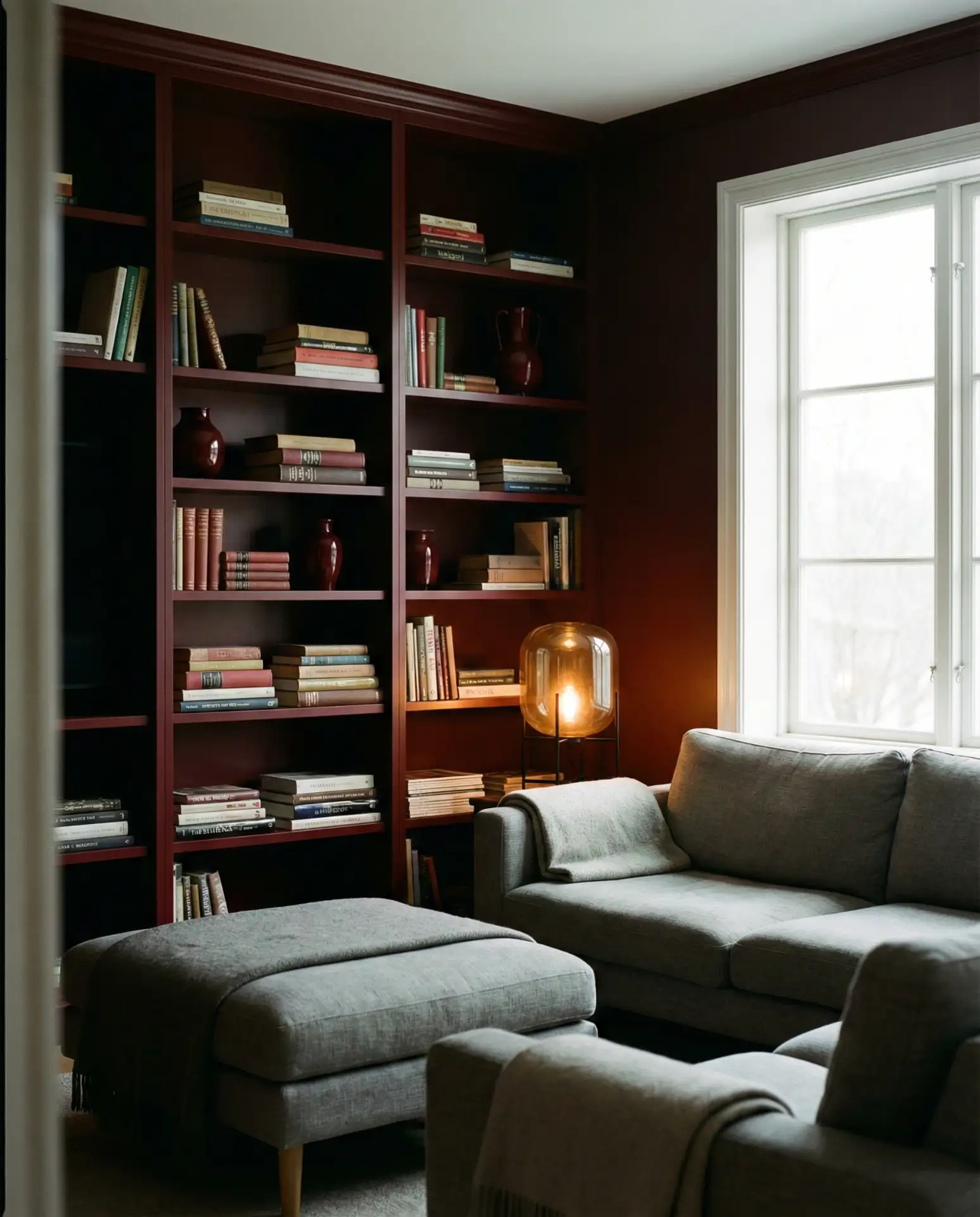
If you want a grey living room that feels rich and autumnal, the burgundy and grey combination is hard to beat. Burgundy—wine-red, oxblood, deep merlot—has a warmth and depth that elevates grey from a neutral backdrop to something genuinely atmospheric. In 2026, this pairing is appearing most often in rooms that lean into a moody, layered aesthetic: dark bookshelves, velvet textures, and warm lighting. A burgundy velvet sofa against grey plaster walls, or oxblood red-painted built-ins flanking a grey upholstered fireplace surround, creates a sense of quiet drama that feels both timeless and fresh. This is not a trend—it’s a classic that keeps earning its place. It’s also a great direction for brown and grey lovers who want more richness.
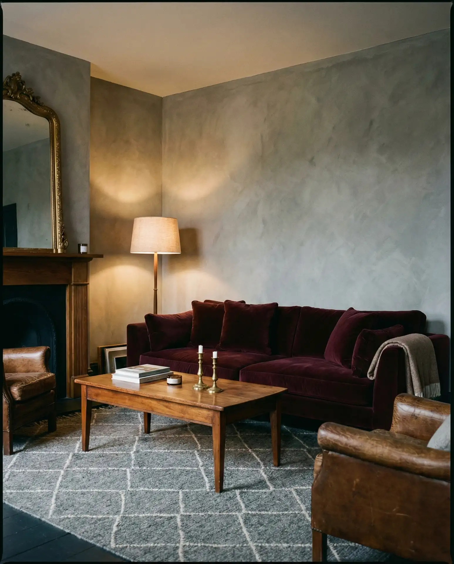
Burgundy and grey translate beautifully into actual American living environments—think of the homes in New Orleans, Boston, or San Francisco, where Victorian architecture, warm woodwork, and deeply colored walls have always been part of the residential fabric. If your home has original moulding, built-ins, or period detail, this pairing plays beautifully with it. Where it works best: rooms used primarily in the evenings, libraries or sitting rooms, or any space where you want that enveloping, candlelit quality that makes you feel comfortable slowing down and staying awhile.
21. Grey Living Room with Bold Art
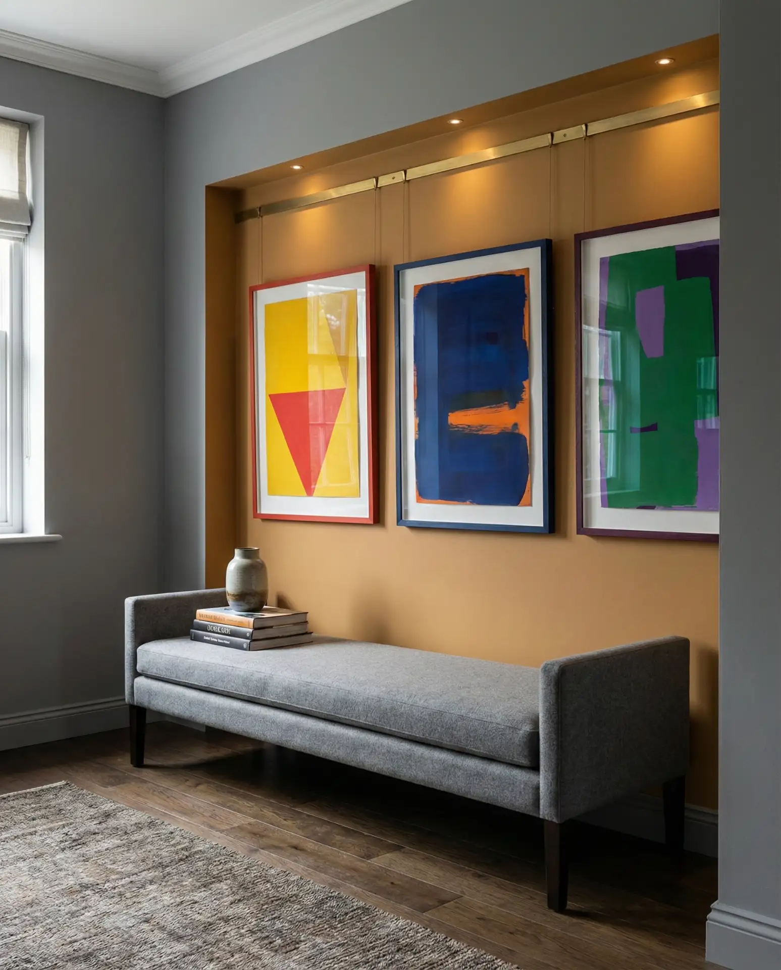
Grey is perhaps the single best backdrop for displaying art boldly—it doesn’t compete with the colors in a painting the way white or cream sometimes can, and it makes vivid pigments jump. This is why so many serious art collectors and gallery-inspired homeowners choose grey as their canvas. In 2026, the trend of treating the living room like a curated gallery is growing, with homeowners investing in fewer but larger works rather than scattering smaller prints. A single oversized abstract canvas in electric blue, warm ochre, or rich burgundy can become the entire design story of a grey room, with furniture and textiles supporting rather than competing. This is where grey’s quiet authority truly shines.
Budget reality check: bold art doesn’t have to mean expensive art. Print-on-demand services like Society6, Minted, and even Artifact Uprising let you order oversized prints in custom sizes for a few hundred dollars—sometimes less. Independent artists on Etsy offer original works at prices far more accessible than galleries. The key is going large—a 36×48 inch print makes a statement that ten smaller prints can’t achieve. Frame it in a simple, substantial matte in a coordinating color (black, warm wood, or white) and hang it low, closer to the sofa than the ceiling. That’s how gallery designers do it, and it makes all the difference.
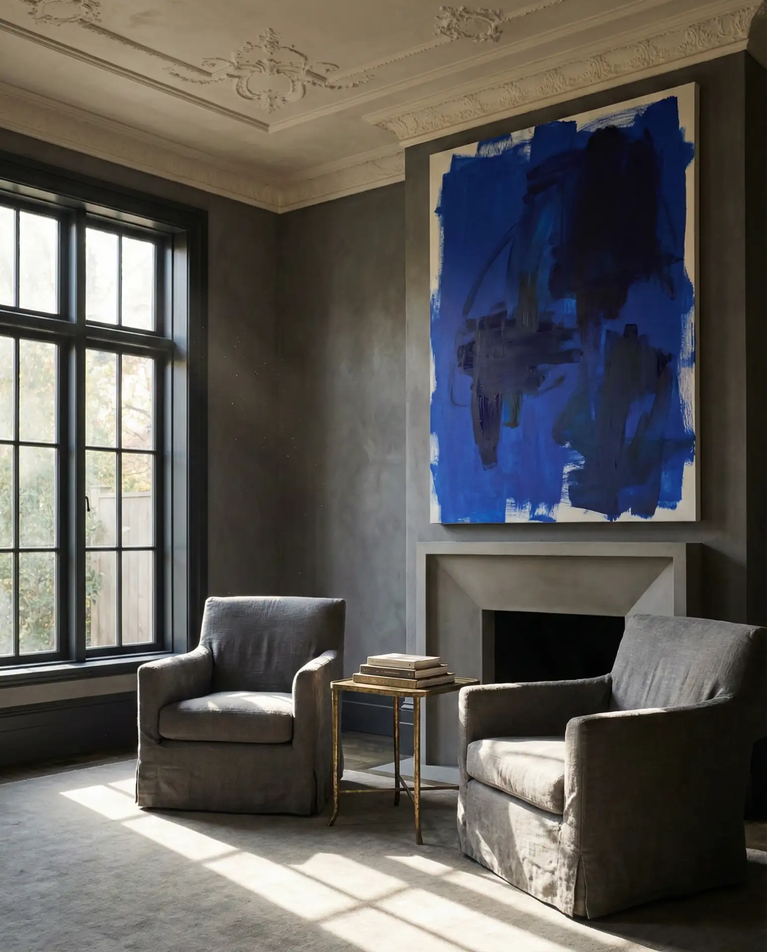
22. Dark Blue and Grey Living Room
The dark blue and grey combination is one of those pairings that photographers and designers keep returning to because it photographs incredibly well—which is partly why it performs so strongly on Pinterest. But it also just lives well. Ink blue, midnight, or deep indigo against medium to dark grey creates a moody, layered palette with a strongly atmospheric character. Unlike navy, these deeper blues have more purple and black in them, giving the combination a depth that leans more sophisticated than classic. A midnight blue wall in an otherwise grey room, accented with pale brass and natural linen, creates an interior that genuinely rewards time spent in it. This is ideal for color schemes that want drama without using dark walls throughout.
One of the quieter truths about this combination: it works exceptionally well in apartments that lack architectural interest. If you’re living in a boxy rental with no crown molding, no built-ins, and flat drywall walls, painting one wall in deep ink blue transforms the entire spatial experience of that room. The dark tone recedes and creates an illusion of depth, the grey furniture reads as sophisticated against it, and the room gains a sense of intentionality it previously lacked. It’s a genuinely powerful tool in the renter’s design toolkit, especially when paired with quality second-hand furniture.
23. Black, White and Grey Graphic Living Room
Stripping a grey living room down to its purest tonal expression—adding only black and white as additional values—creates a kind of graphic confidence that’s bold in its restraint. This is the palette of Coco Chanel and Stanley Kubrick: visually powerful, deeply intentional, and utterly timeless. In 2026, the most current take on this combination includes strong geometric patterns (a black and white stripe rug, a checker-tiled fireplace surround), high-contrast art, and a grey that sits decisively in the middle of the tonal scale. It’s not a warm room—it doesn’t pretend to be—but it’s a room that makes you pay attention. Everything is deliberate. This is where modern design becomes genuinely architectural.
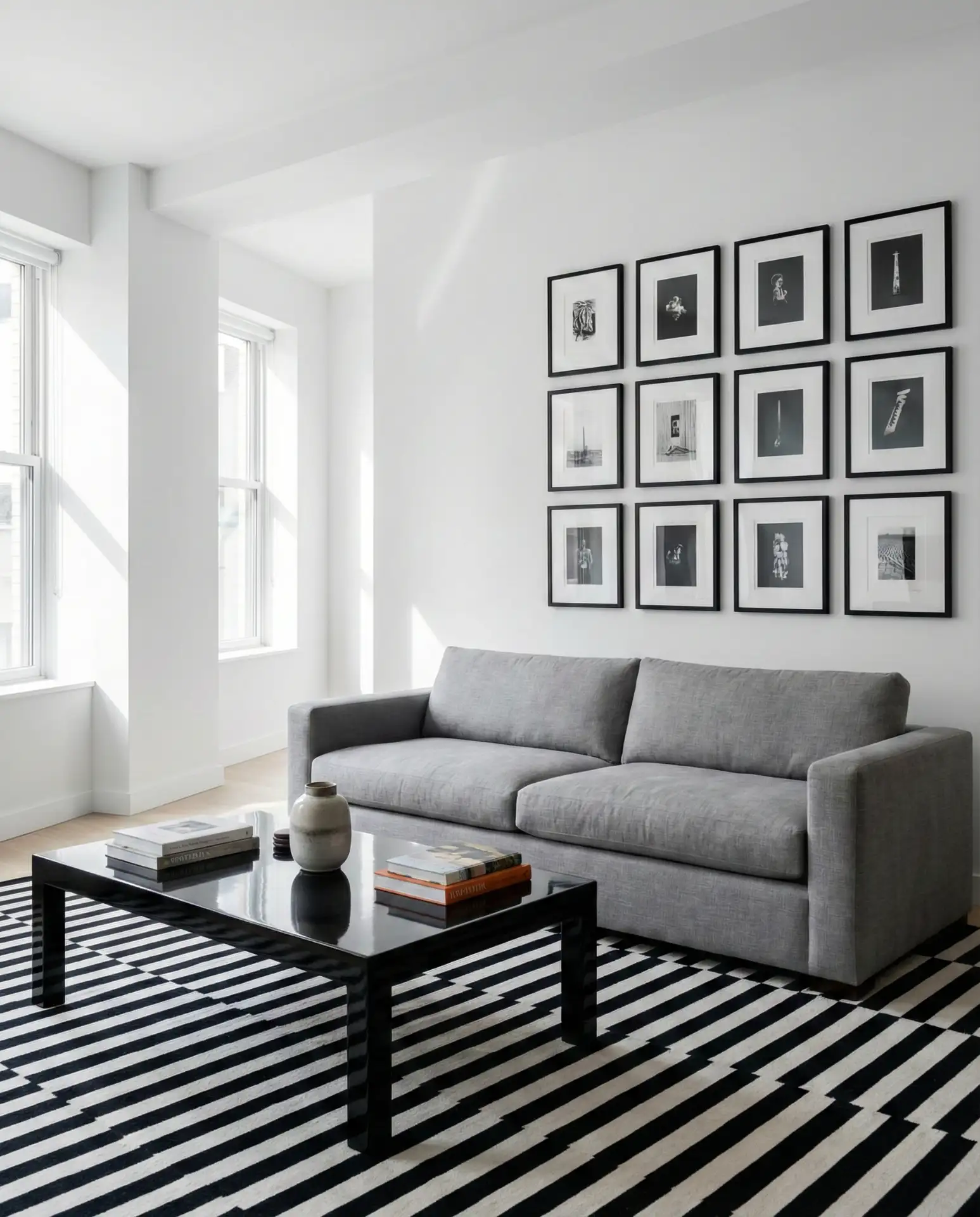
The important thing to remember about this palette is that texture becomes your substitute for color—without warm hues to create visual interest, you need the contrast between matte and glossy, rough and smooth, and hard and soft to prevent the room from feeling flat or institutional. A rough-textured grey rug, a smooth black lacquer surface, and a nubby white linen sofa: each material brings something different to the conversation. And one final thought: a single living plant—a dramatic sculptural snake plant or a fiddle leaf fig in a white or graphite pot—is all the color this kind of room needs. That touch of living green grounds everything and makes the whole composition breathe.
Conclusion
Grey living rooms in 2026 are a study in personal expression—they’re not a single look but a thousand possible looks, defined by the colors, textures, and stories you layer into them. Whether you gravitate toward the warmth of sage and cream or the drama of navy and charcoal, there’s a version of a grey room that’s perfectly yours. We’d love to hear which direction speaks to you most—drop your favorite combo in the comments below, or tell us about the grey living room you’re currently pulling together. Your ideas might just inspire someone else’s perfect space.