Green is having a major moment in American kitchens, and 2026 is shaping up to be its biggest year yet. From soft sage cabinetry that floods Pinterest feeds to dramatic dark emerald islands that anchor modern spaces, green has moved far beyond the avocado appliances of decades past. Homeowners are drawn to green’s versatility—it pairs beautifully with natural materials, complements both warm and cool palettes, and brings an organic calm that feels especially welcome in our busiest room. Whether you’re planning a full renovation or simply refreshing your space with new paint, these ideas will show you how to embrace green in ways that feel fresh, sophisticated, and completely timeless.
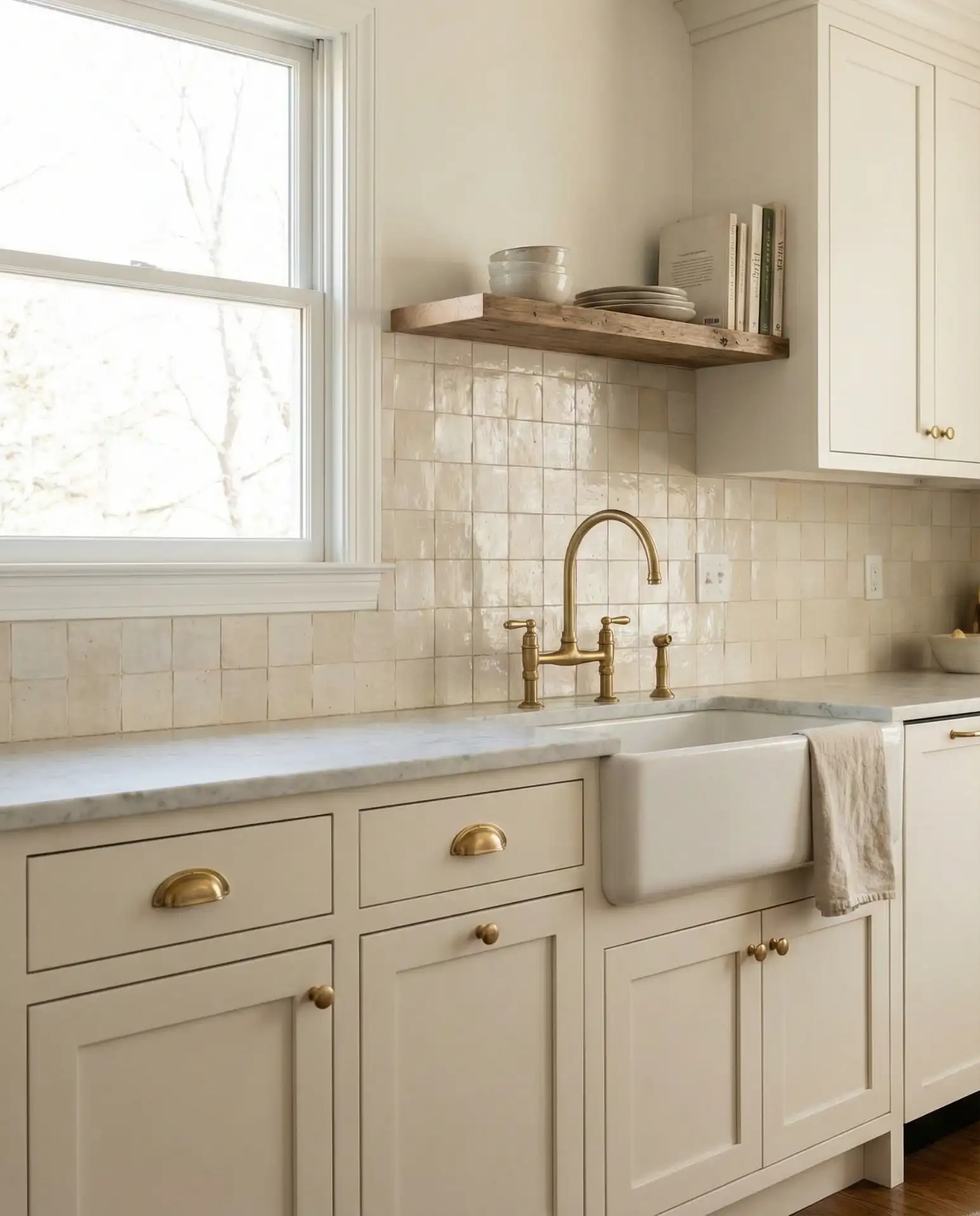
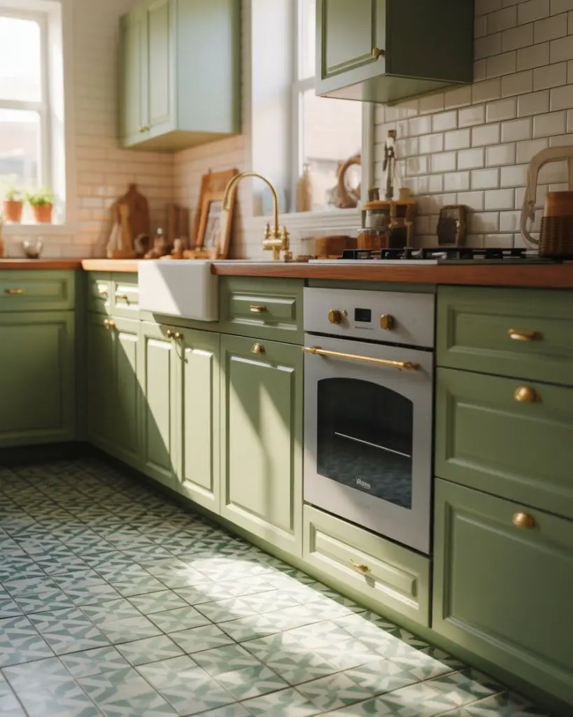
1. Soft Sage Cabinets with Brass Hardware
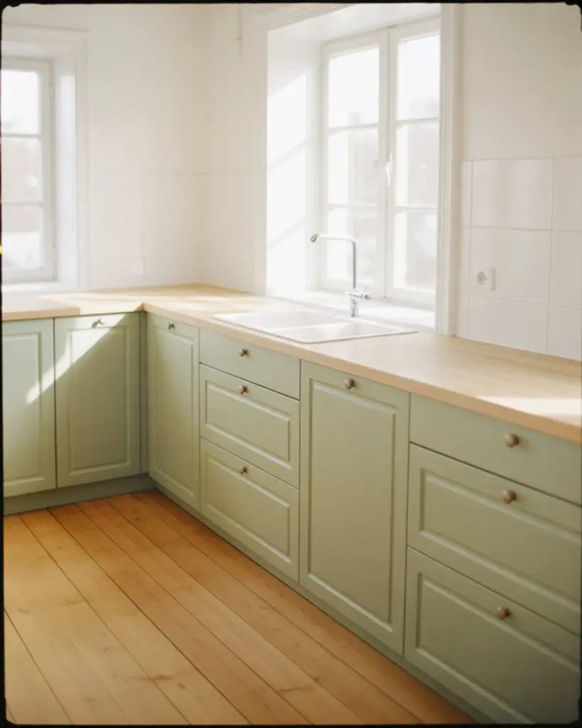
The sage kitchen has become the quintessential choice for homeowners seeking a modern light aesthetic that doesn’t feel sterile. This muted green-gray tone works beautifully in both traditional and contemporary spaces, offering enough color to feel intentional while remaining neutral enough to live with for years. Paired with warm brass or gold hardware, sage cabinetry creates a sophisticated foundation that plays well with marble countertops, wood floors, and nearly any backsplash you can imagine. 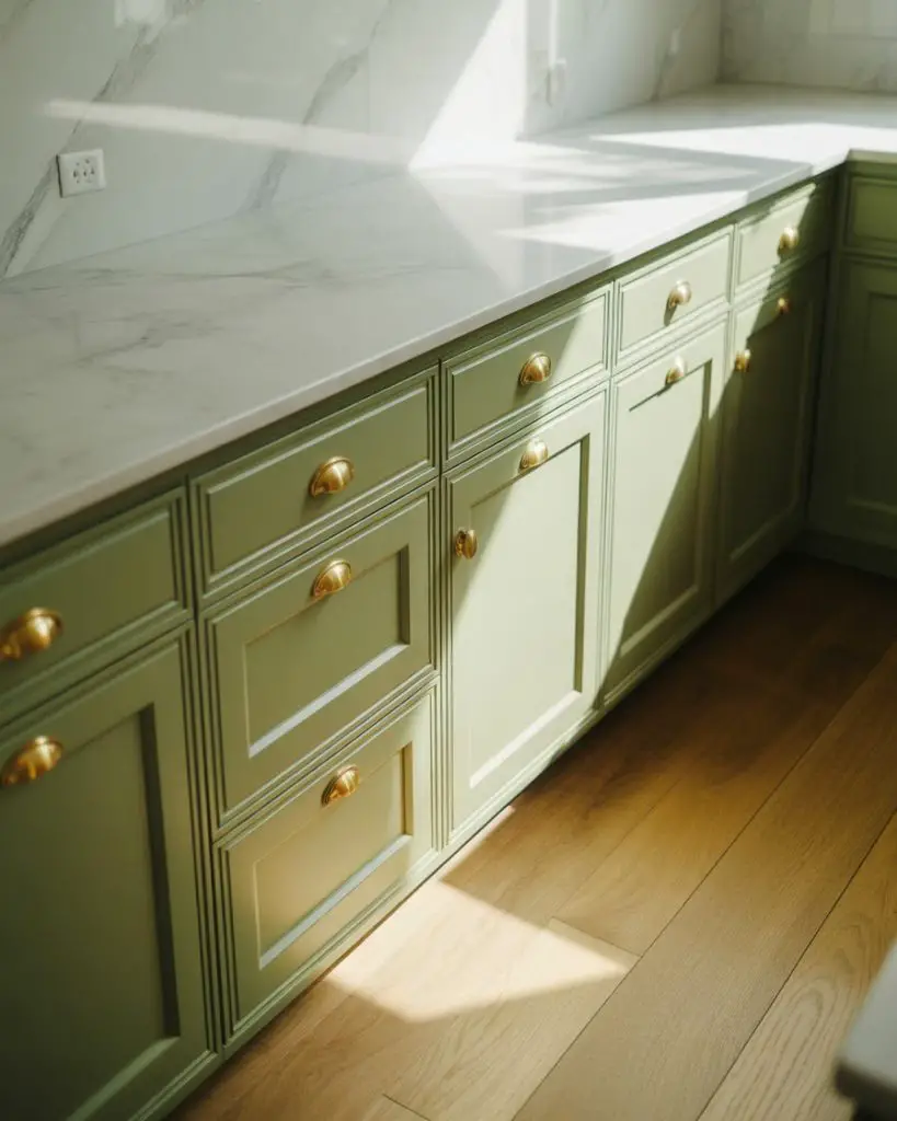
This look works best in kitchens with good natural light, where the subtle complexity of sage can shift throughout the day from cool and crisp in morning light to warm and inviting by evening. If you’re nervous about committing to color, consider starting with just the lower cabinets in sage while keeping uppers white—it’s a surprisingly common approach in renovations I’ve seen across the Northeast, where homeowners want personality without overwhelming smaller spaces.
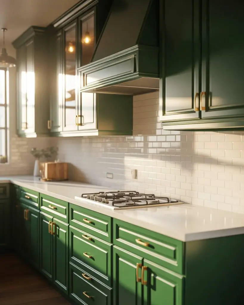
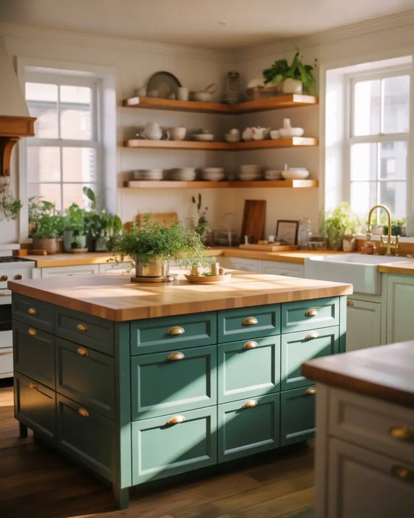
2. Dark Emerald Island with Marble Waterfall Edge
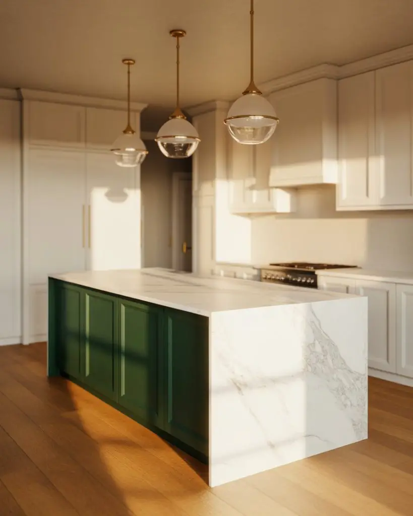
A dark green island serves as the ultimate statement piece in an otherwise neutral kitchen. Deep emerald or forest tones anchor the space with dramatic flair while allowing perimeter cabinets to remain light and airy. This approach has become especially popular in open-concept homes where the kitchen island needs to hold its own as a piece of furniture that defines the room’s character. 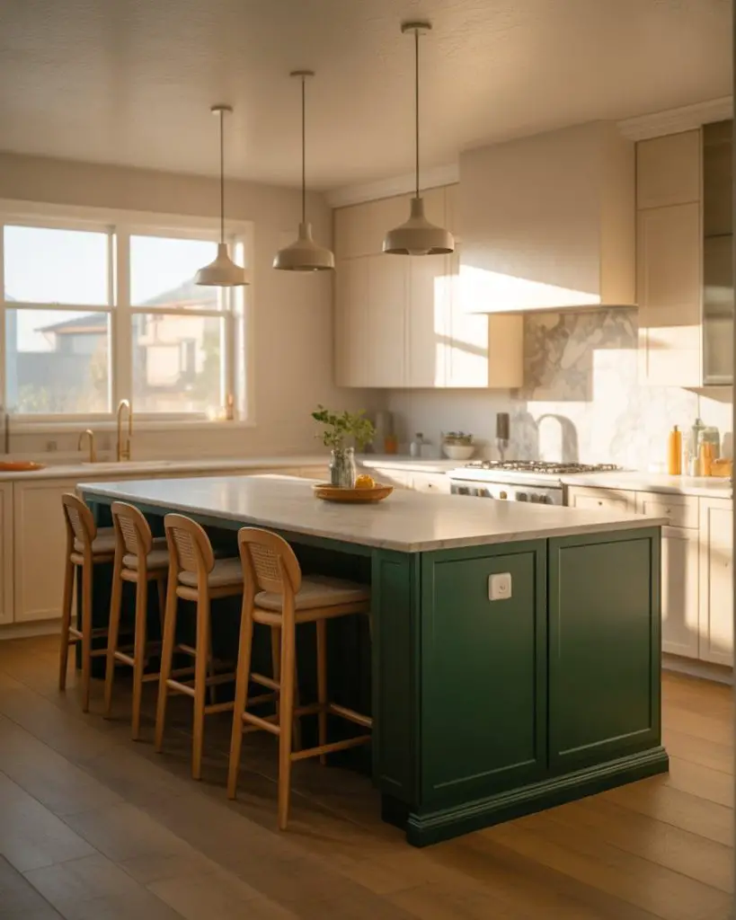
The common mistake here is choosing a dark green that’s too blue-toned, which can read cold under typical kitchen lighting. Test samples in your actual space at different times of day, and lean toward greens with slight warm or brown undertones. Budget-wise, painting just the island while keeping existing perimeter cabinets allows you to make a high-impact change for under $500 including quality paint and new hardware.
3. Mint Green Tiles with Brass Fixtures
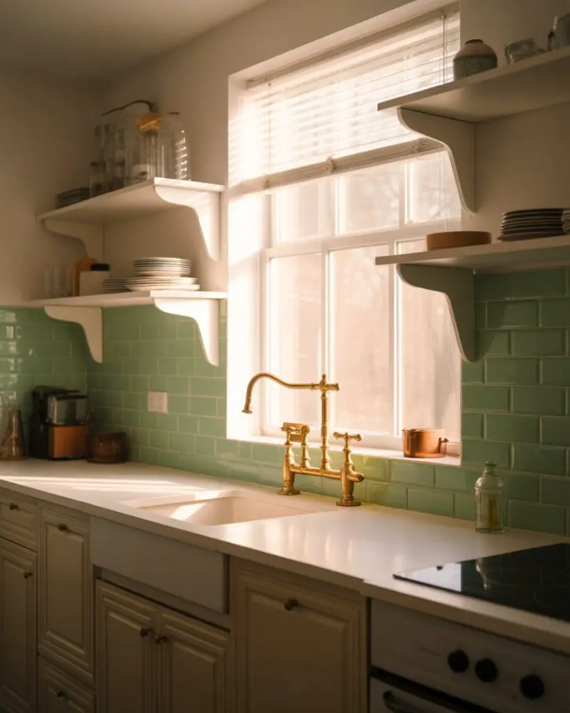
For those who find deeper greens too bold, mint green tile offers a refreshing alternative that feels both vintage and thoroughly modern. Whether used as a full backsplash or just a small accent area, mint’s soft aquatic quality brings brightness without the clinical feel of pure white tile. Pair it with brass faucets and fixtures to warm up the palette, or go with black details for a more graphic, contemporary edge. 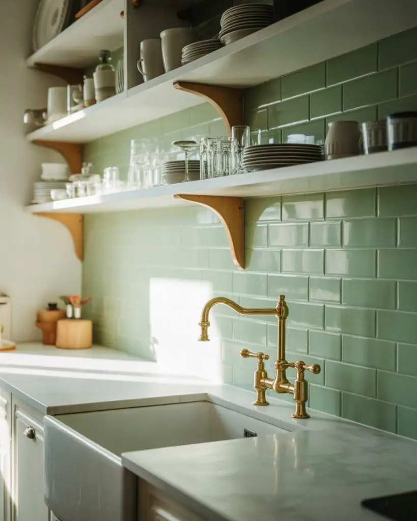
Mint works particularly well in smaller city kitchens and rentals where permanent changes aren’t possible—peel-and-stick versions have improved dramatically in quality and can create the same effect for a fraction of traditional tile installation costs. This approach has gained traction in Brooklyn and San Francisco, where renters want personality without losing their security deposit.
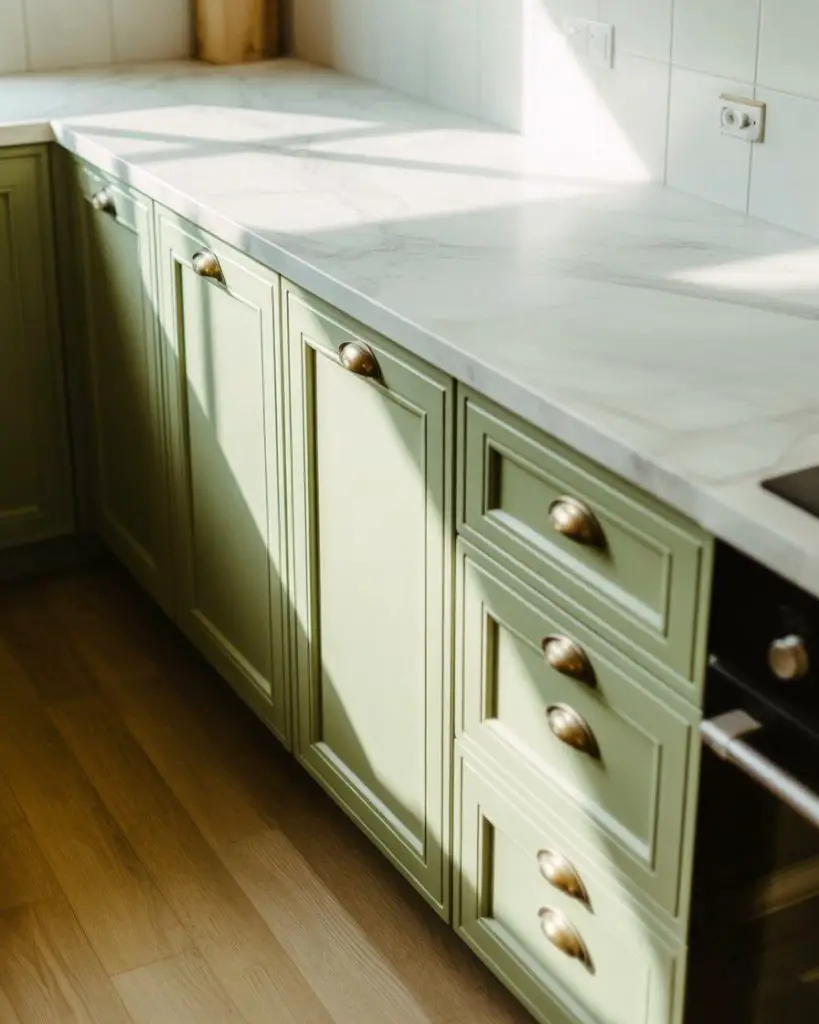
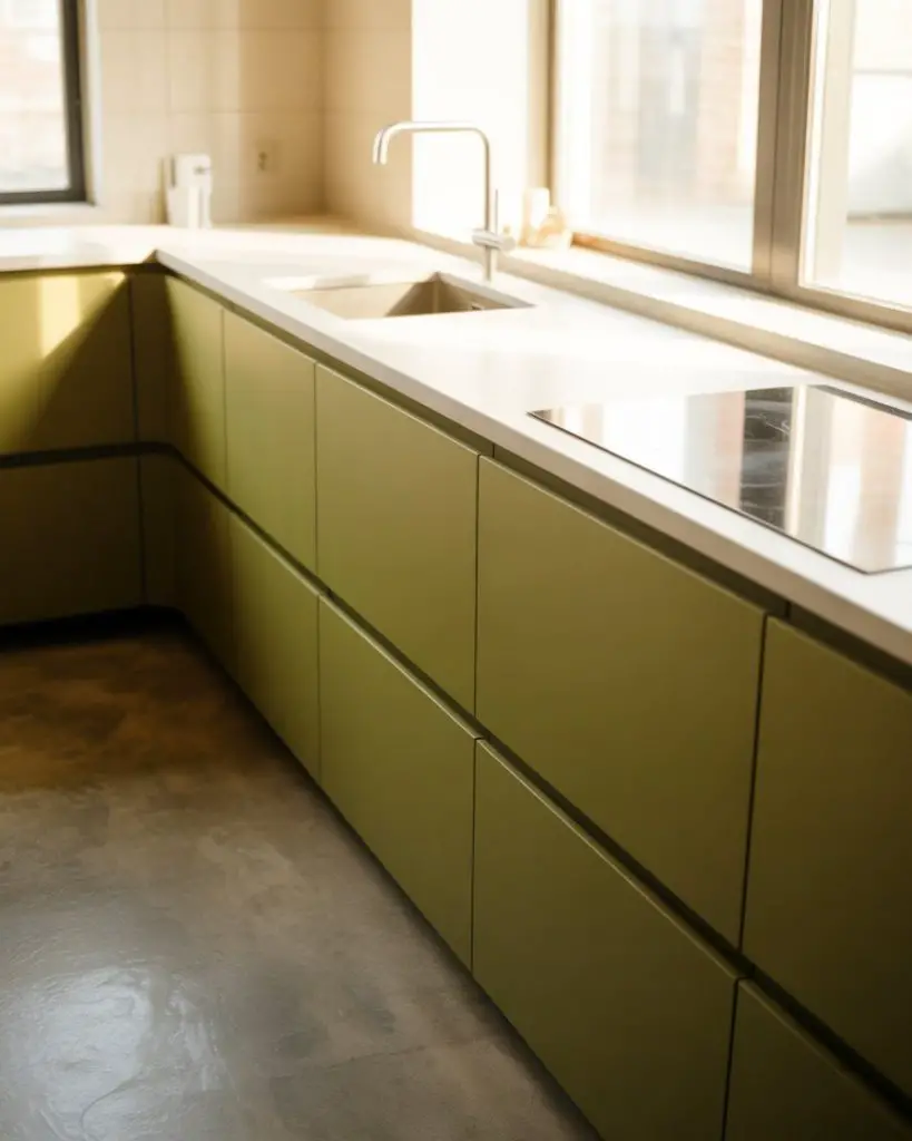
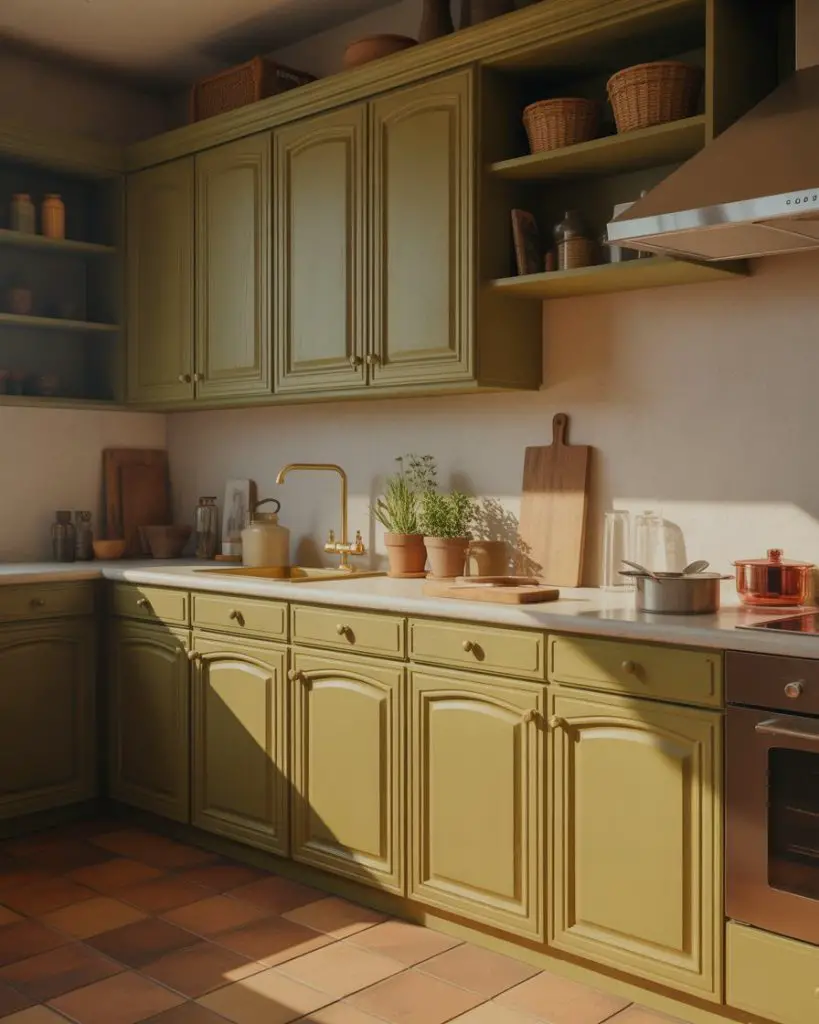
4. Olive Green Lower Cabinets with Open Shelving
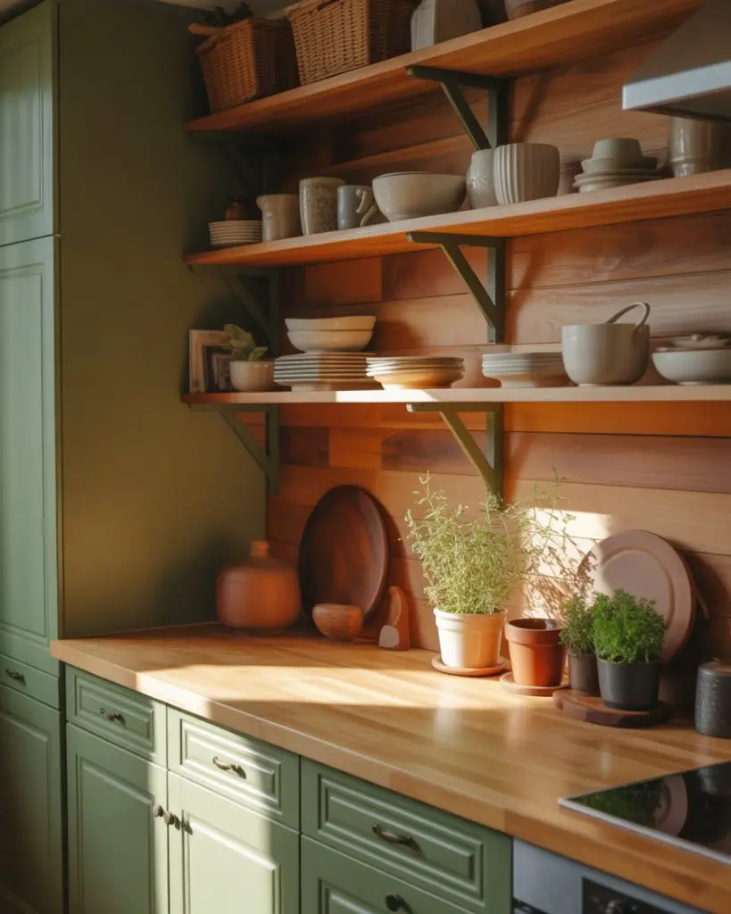
Olive brings an earthy, grounded quality that feels organic and lived-in from day one. Unlike brighter greens, olive has brown undertones that connect beautifully with wood elements, terracotta accessories, and the natural materials currently dominating American kitchen design. Using olive on lower cabinets while leaving the upper portion open or fitted with floating shelves creates visual breathing room and prevents darker tones from closing in the space. 
Where it works best: kitchens with south-facing windows or warm artificial lighting, where olive’s complexity can truly shine. In spaces with cooler northern light, olive can occasionally read muddy, so consider adding warm-toned LED bulbs and plenty of reflective surfaces like brass or copper to maintain that cozy feel throughout the day and evening hours.
5. Pastel Green Cabinetry in a Cottage Kitchen

The pastel green kitchen channels English countryside charm while remaining distinctly approachable for American homes. This softer interpretation of green pairs beautifully with white beadboard, farmhouse sinks, and the relaxed layering of textures that defines cottage style. Think pistachio ice cream rather than institutional mint—a color that’s decidedly cheerful without being childish. 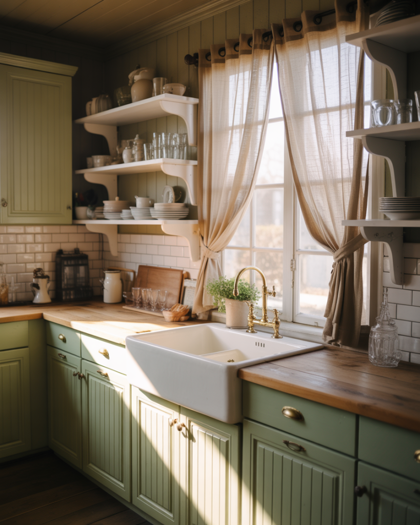
Real homeowner behavior I’ve noticed: people often start with pastel green as an island color before committing to full cabinetry, testing how they feel living with the shade for six months or a year. This gradual approach makes sense given how significantly color affects daily mood—what delights you initially might feel too sweet over time, or conversely, you might find yourself wishing you’d gone bolder from the start.
6. Two-Tone White and Green Kitchen
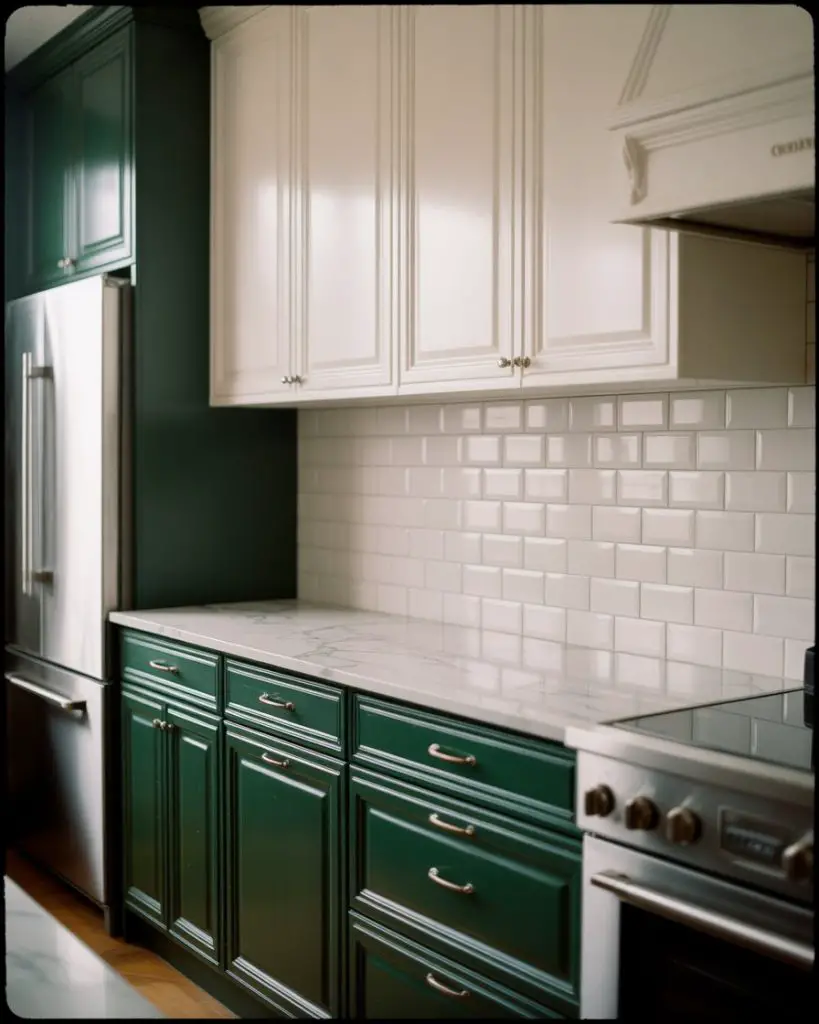
The white and green combination remains one of the most reliable approaches for introducing color while maintaining resale appeal. This classic pairing allows you to be adventurous with green tones—whether deep forest or bright emerald—knowing that white provides balance and prevents the space from feeling too moody or dated. Most commonly, designers place green on lower cabinets and white on uppers, but reversing this creates an equally striking effect. 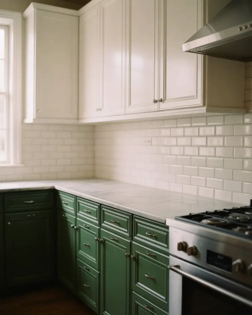
From a practical standpoint, this approach simplifies future updates—if green trends shift or your taste evolves, repainting just the lower or upper cabinets costs significantly less than a complete color overhaul. Budget-conscious renovators in markets like Austin and Portland often choose this route specifically for its flexibility, knowing they can refresh the look in five to seven years without major expense.
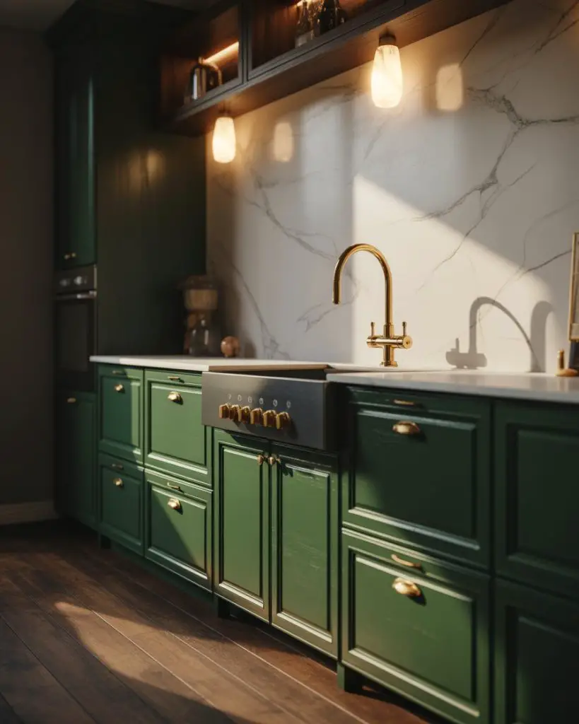
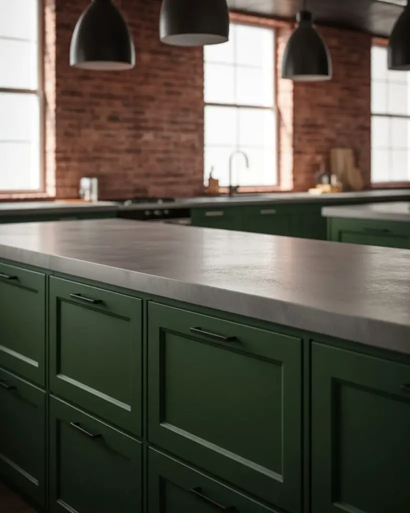
7. Hunter Green with Black Countertops
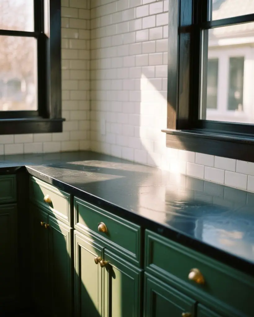
When you pair hunter green cabinetry with black countertops, you create a luxury kitchen that feels moody and sophisticated rather than heavy or dark. This combination works especially well in larger kitchens with ample natural light or in spaces designed around dramatic contrast. Soapstone, honed granite, or matte black quartz all provide the depth needed to ground deeper green tones without competing for attention. 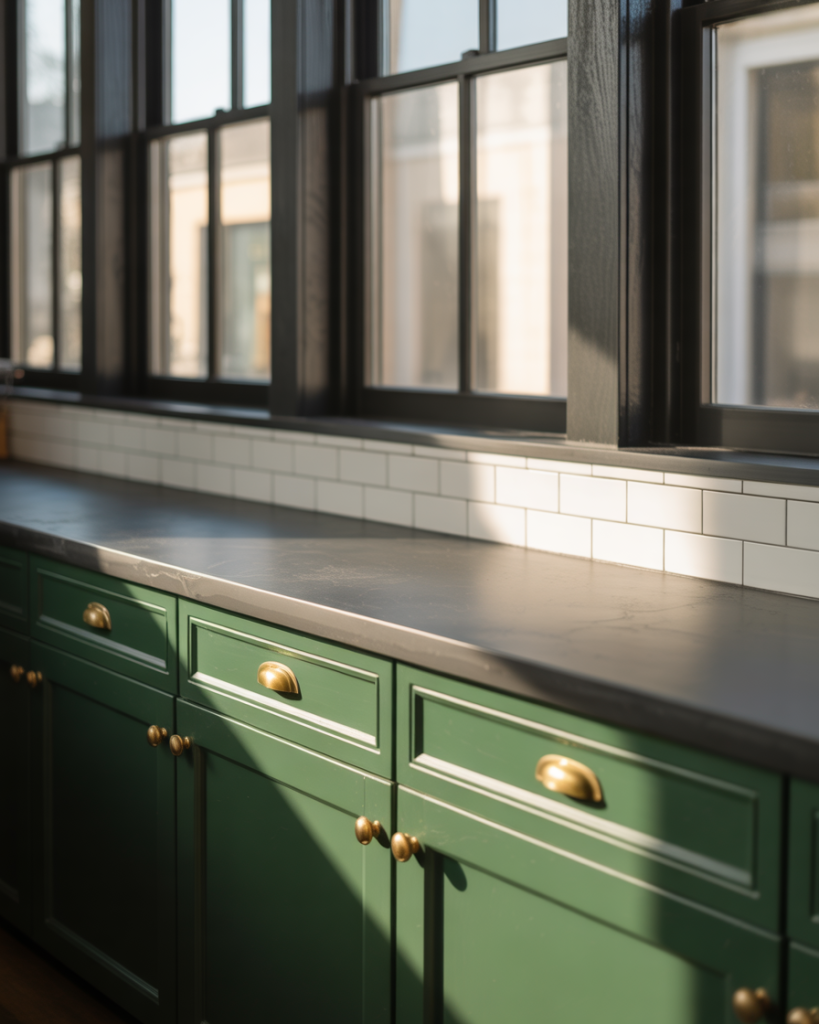
Expert designers often add warm wood tones through flooring, floating shelves, or bar stools to prevent this palette from feeling too masculine or severe. The key is balancing cool and warm elements—the green and black provide drama, while wood and brass introduce approachability. Without those warming touches, you risk creating a space that photographs beautifully but doesn’t invite everyday living.
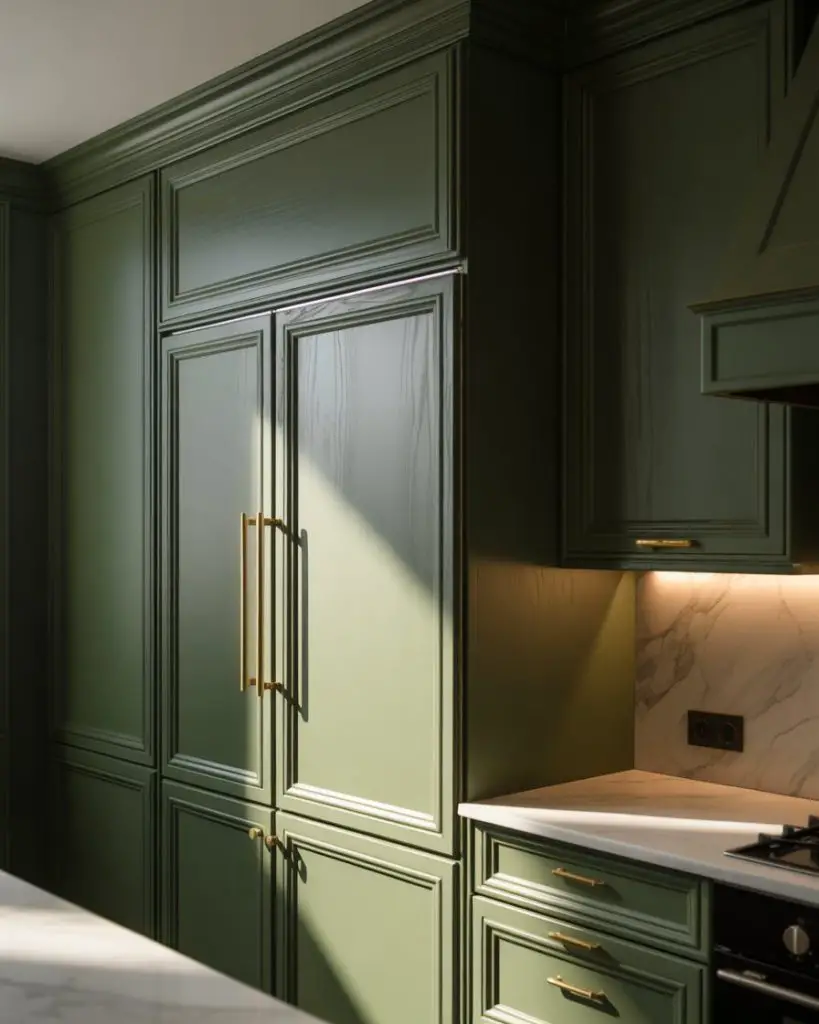
8. Pista Green Cabinets with Gold Accents

Pista green—named for the pale pistachio nut—brings an unexpectedly sophisticated lightness to kitchen design. This yellowish-green has gained serious momentum on Pinterest and in design magazines, offering a cheerful alternative to both sage and mint while maintaining enough neutrality to work as a full-cabinet color. Gold or brass hardware amplifies the warmth already present in pista’s undertones. 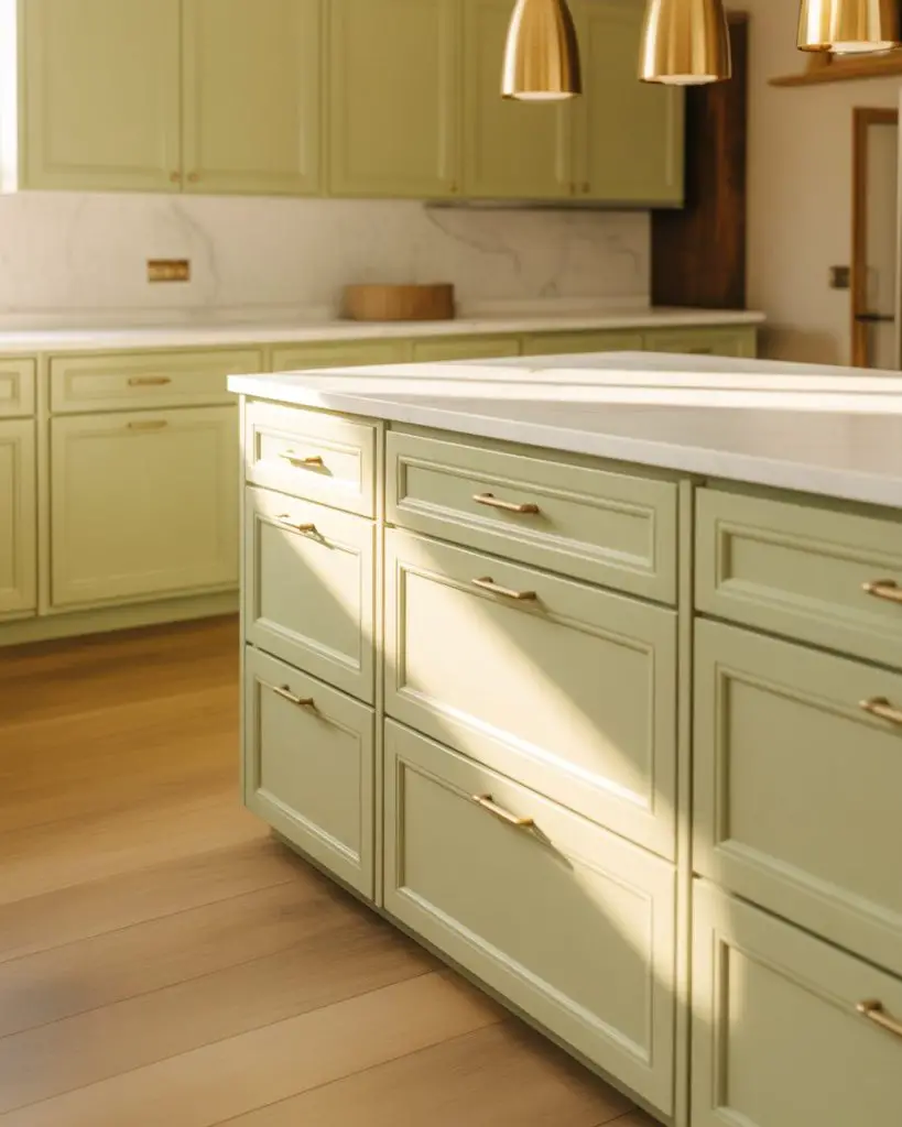
This shade works particularly well in kitchens with warm oak or maple flooring, where the yellow undertones create a cohesive flow rather than clashing. One practical insight: pista shows dirt and fingerprints less readily than pure white or very dark colors, making it surprisingly practical for families with young children who are constantly opening cabinets with less-than-clean hands.
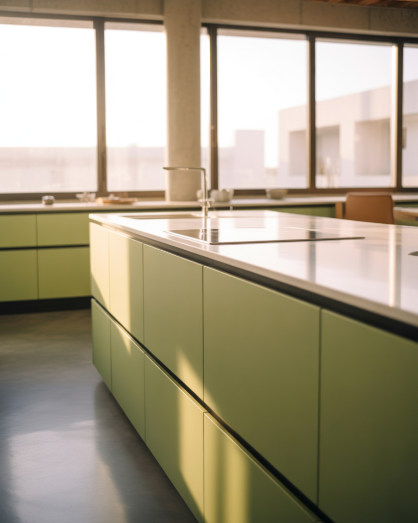
9. Modern Olive Green Slab Cabinets
The modern olive kitchen takes the earthiness of traditional olive and streamlines it through flat-front slab cabinetry and minimal hardware. This approach feels distinctly contemporary—clean-lined and sophisticated—while the olive tone itself prevents the minimalism from becoming cold or institutional. Integrated handles or push-to-open mechanisms emphasize the sleek aesthetic. 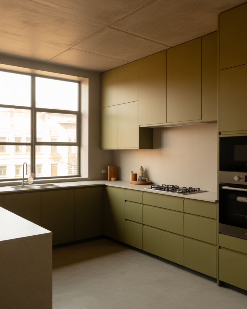
A friend who renovated her Seattle kitchen last year chose this exact approach and mentioned that the flat surfaces make cleaning significantly easier than traditional shaker styles—no grooves or details to trap grease and dust. She went with a matte finish rather than high-gloss, which hides minor scuffs and maintains that contemporary but livable feel even after months of daily cooking.
10. Sage Green with Natural Wood Elements

Combining sage cabinetry with abundant natural wood creates a kitchen that feels grounded in nature—a particularly appealing aesthetic for homeowners in the Pacific Northwest, Colorado, and other regions where indoor-outdoor living matters. Think walnut countertops, white oak floors, and open shelving in reclaimed wood. The cool undertones in sage balance wood’s warmth perfectly. 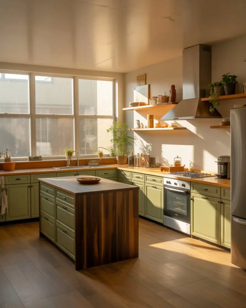
Where this works best is in homes built from the 1970s through early 2000s that already feature extensive wood trim, floors, and architectural details. Rather than fighting those existing elements with all-white cabinetry, sage harmonizes with wood tones while still providing the color refresh homeowners crave. It’s an elegant solution to the “what do we do with all this oak trim” dilemma that affects millions of American homes.
11. Vintage Green with Retro Appliances
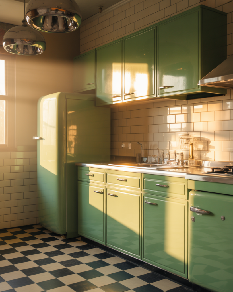
The vintage green kitchen fully embraces mid-century nostalgia, often incorporating period-appropriate appliances like Big Chill or Smeg refrigerators in complementary shades. This approach requires commitment—it’s not subtle—but when done well, creates a space with genuine personality and charm. Think soft sea-foam or jade paired with white counters, checkerboard floors, and chrome details. 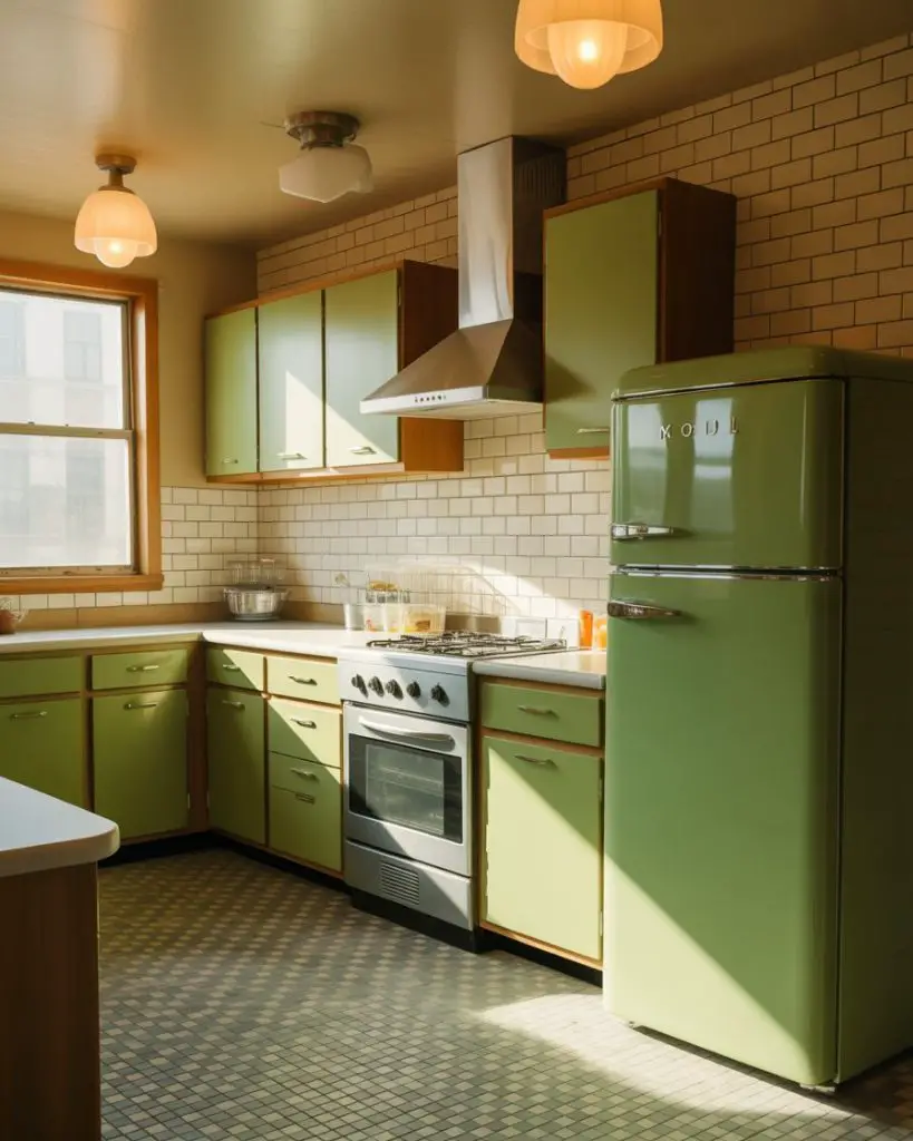
Budget reality check: authentic vintage appliances can run $3,000 to $5,000 per piece, but modern replicas with period styling cost $1,500 to $2,500 and offer contemporary efficiency and reliability. If you’re drawn to this aesthetic but concerned about resale, consider limiting the retro elements to easily changeable items like lighting, hardware, and paint rather than built-in appliances that future buyers might not appreciate.
12. Forest Green Kitchen with Marble Backsplash
Deep forest green creates an enveloping, jewel-box quality that transforms cooking into a more intimate, luxurious experience. This dark approach works best when balanced with plenty of reflective and light surfaces—white or gray marble backsplash being the most popular choice. The natural veining in marble adds movement and prevents the deep green from feeling too flat or heavy. 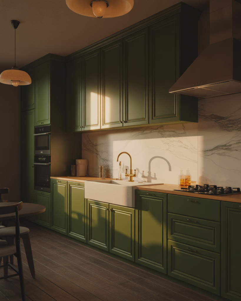
Expert commentary suggests that high-gloss or semi-gloss finishes work better than matte on very dark cabinetry, as they reflect more light and prevent the space from absorbing too much visual weight. The sheen also makes cleaning easier—important when darker colors show water spots and fingerprints more readily than medium tones. Plan for under-cabinet lighting to ensure adequate task illumination when wall cabinets are this dark.
13. Light Green Painted Brick Backsplash
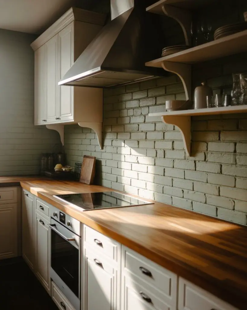
A light green painted brick backsplash brings texture and personality without the commitment of permanent tile. This approach has gained traction in urban markets where exposed brick is common but not always aesthetically pleasing—painting it in a soft green refreshes the material while maintaining its character. The technique works equally well with new brick veneer if you’re starting from scratch. 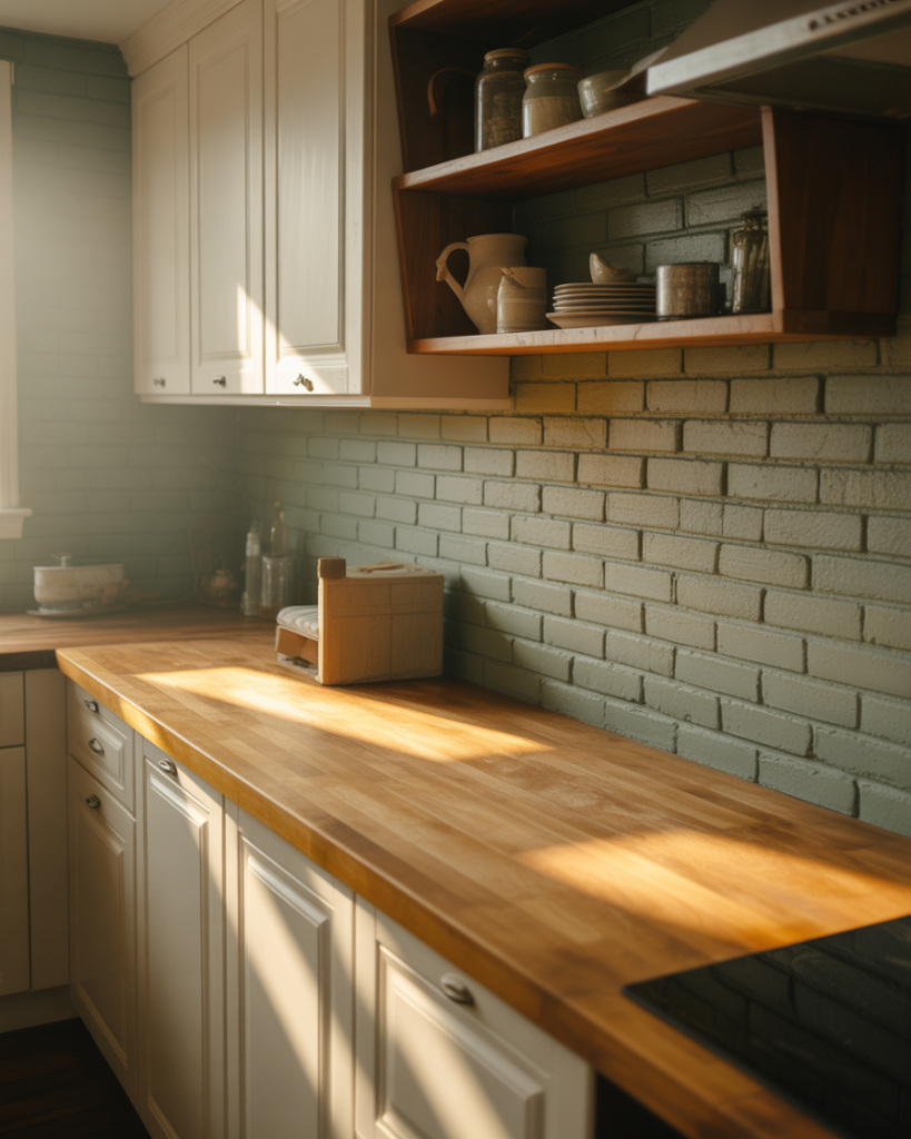
Real homeowners in cities like Chicago and Boston have found this approach particularly useful for dealing with structural brick that can’t be removed—rather than covering it with tile, painting transforms it into a design feature. Use a breathable masonry paint to prevent moisture issues, and consider sealing it properly if the brick is near the sink or stove where splashing occurs regularly.
14. Coordinated Green Color Palettes Throughout
Rather than using green solely on cabinets, the cohesive color palettes approach incorporates multiple shades throughout the kitchen—perhaps sage cabinets, a deeper green island, and mint accents in tile or textiles. This layered strategy creates visual depth and sophistication, proving that a “green kitchen” doesn’t have to mean monotone. The key is varying the saturation and tone rather than mixing completely different hues. 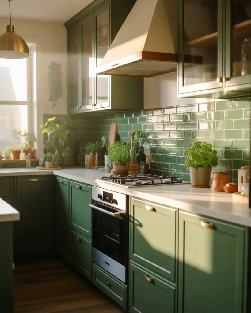
This works best in larger, open kitchens where you have the visual space to support multiple color moments without feeling busy or cluttered. In smaller kitchens under 150 square feet, stick to two shades maximum—perhaps cabinets in one green and a backsplash in another—to maintain cohesion. The common mistake is introducing too many competing greens, which creates chaos rather than the intentional, curated look you’re after.
15. Emerald Green with White Quartz Counters
Emerald brings jewelry-like richness to kitchen cabinetry while remaining surprisingly versatile. Paired with bright white quartz countertops, this combination feels fresh and contemporary rather than heavy. The stark contrast creates a graphic quality that photographs beautifully—one reason this pairing dominates Pinterest boards—but it also performs well in real life by maintaining clear visual zones between work surfaces and storage. 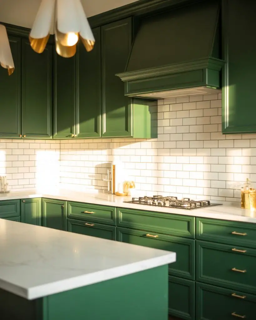
From a lifestyle perspective, white quartz requires more maintenance than darker counters—it shows stains from wine, coffee, and turmeric-heavy cooking. But homeowners consistently report that the brightness and cleanliness white counters bring to a darker cabinetry palette makes the extra wiping worthwhile. Consider a quartz with subtle veining rather than pure white if you’re concerned about every mark showing.
16. Soft Green in a Scandinavian-Style Kitchen
The Scandinavian approach to green kitchens emphasizes light, airy tones combined with natural materials, minimal styling, and exceptional functionality. Think pastel or barely-there greens paired with white walls, light wood floors, and simple hardware. This aesthetic prioritizes livability and calm over making a bold statement—it’s green as a whisper rather than a shout. 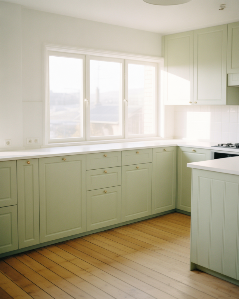
Where it works best: smaller urban apartments and homes where maximizing light and creating a sense of space matters more than making dramatic design statements. The Scandinavian palette naturally suits American cities like Minneapolis, Seattle, and Portland where northern light and a connection to nature align with local sensibilities. Keep accessories minimal and functional—a wooden cutting board, white ceramic canisters, perhaps a single potted herb.
17. Teal-Green Kitchen Island with Open Shelving
Teal-green sits at the boundary between blue and green, offering a slightly more unexpected option that still feels organic. Using this tone on the island while keeping perimeter cabinets neutral and incorporating open shelving creates a balanced, collected-over-time aesthetic. The open shelving provides relief from solid cabinetry and allows you to display items that reinforce your color story through dishes, glassware, or cookbooks. 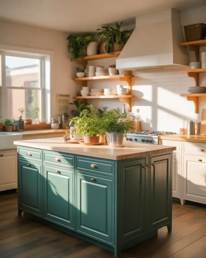
A practical insight about open shelving: it works beautifully when you actually use and rotate your displayed items regularly. Shelves that become static displays collect dust and grease, requiring constant cleaning. Instead, keep your everyday dishes, frequently used serving pieces, and go-to glasses on open shelves—items that get washed regularly anyway—and reserve closed storage for the special occasion pieces and appliances you use monthly or less.
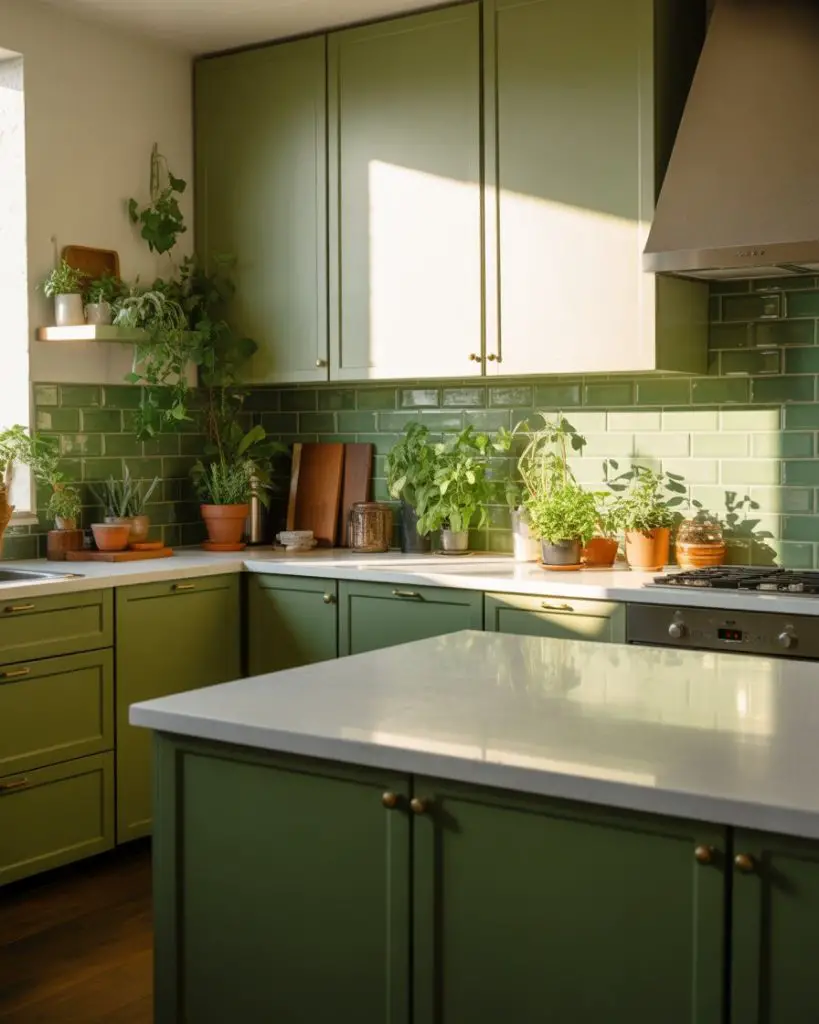
18. Muted Green with Terracotta Accents
Olive or muted green cabinetry paired with terracotta accessories creates an earthy, Mediterranean-inspired palette that feels warm and welcoming. Think terracotta floor tiles, clay pots with herbs on windowsills, or even terracotta-colored bar stools at the island. This combination has surged in popularity as homeowners seek alternatives to the cooler gray-and-white palettes that dominated the previous decade. 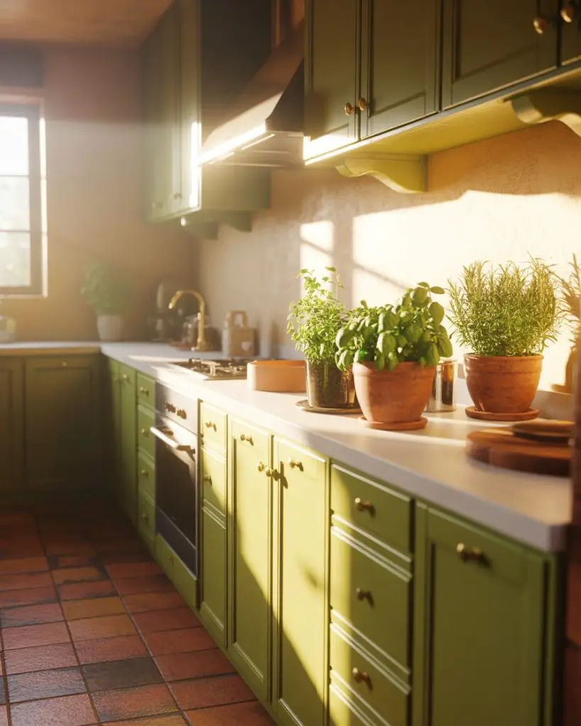
This palette works particularly well in warmer climates—Southern California, Arizona, Texas, Florida—where the sun-baked, earthy tones feel climate-appropriate and help connect indoor spaces with the landscape outside. The combination also ages gracefully; unlike trendy color pairings that can date quickly, green and terracotta have been used together for centuries across Mediterranean cultures, giving this pairing genuine longevity.
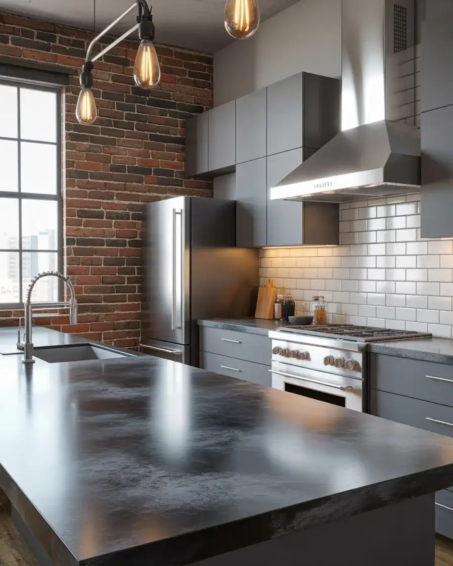
19. Dark Green with Concrete Countertops
Industrial-leaning kitchens embrace dark green cabinetry with poured concrete countertops for a modern, urban aesthetic. The matte finish of concrete complements deep green’s richness while the cool gray tone prevents the space from becoming too warm or traditional. This pairing appeals to homeowners who want color without conventional prettiness—it’s sophisticated and slightly edgy. 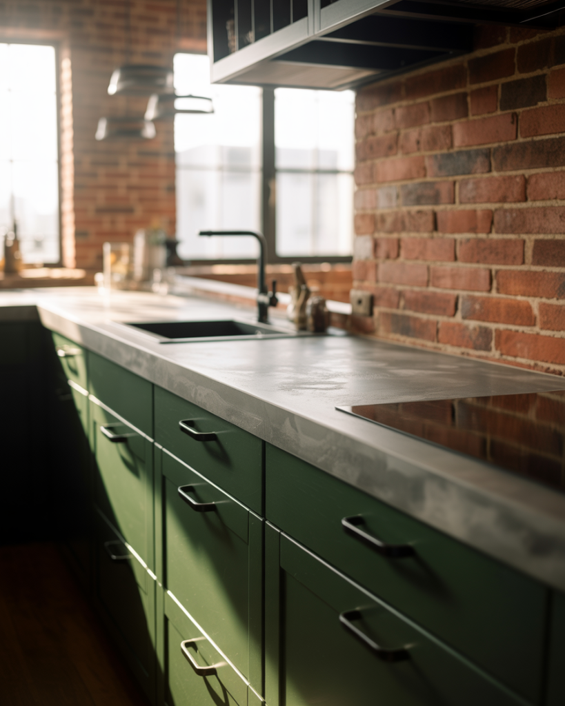
Common mistake to avoid: unsealed or poorly sealed concrete shows every stain, especially oils, wine, and acidic foods. Insist on proper sealing with a food-safe penetrating sealer that requires reapplication annually or semi-annually depending on use. While concrete counters photograph beautifully and offer unique character, they demand more maintenance than quartz or granite—factor this into your decision if you’re someone who wants a truly hands-off kitchen.
20. Luxury Green Kitchen with Integrated Appliances
The luxury green kitchen achieves its high-end status through meticulous detailing: panel-ready appliances that disappear into cabinetry, consistent dark or sage green across all surfaces, and premium materials like leathered quartzite or honed marble. Integrated appliances are key—nothing disrupts the color flow or reveals the kitchen’s working nature. This approach costs significantly more but delivers that elusive “unfitted” look where the kitchen feels like fine furniture rather than a utilitarian workspace. 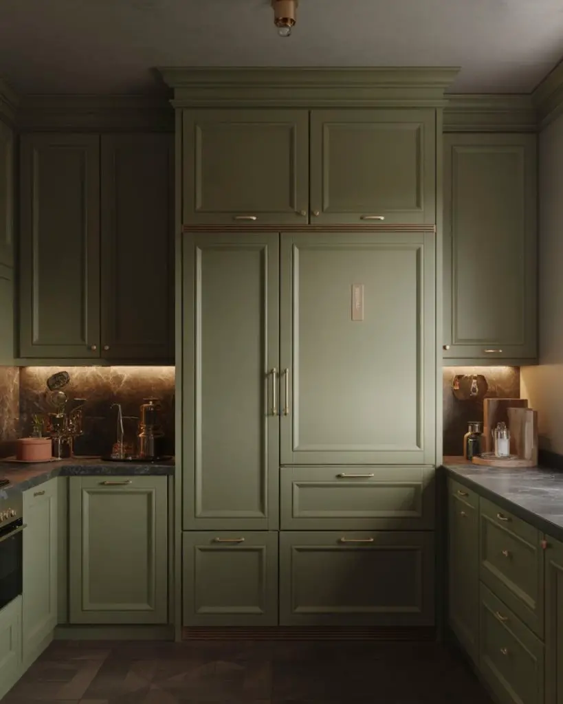
Budget angle: while a fully integrated luxury kitchen easily runs $80,000 to $150,000+, you can achieve a similar effect more affordably by focusing your integration budget on the most visible appliances—typically the refrigerator and dishwasher—while choosing standard stainless for the range and microwave. The unbroken cabinet line at eye level creates much of the luxury impact, making this a strategic way to get the look for roughly 30-40% less.
21. Green Cabinetry with Patterned Cement Tiles
Pairing green cabinets—whether light, sage, or dark—with boldly patterned cement tiles creates a kitchen with global influence and visual interest. The cement tiles typically incorporate the cabinet green alongside white, black, terracotta, or blue in geometric or floral patterns. This approach works best when the cabinetry remains relatively simple to let the floor or backsplash pattern shine without competing elements. 
Real homeowner behavior shows that people often start conservatively with patterned tile in just a small area—perhaps a backsplash or entry zone—before committing to full floor coverage. If you love the look but worry about overwhelming the space or future resale concerns, use the pattern in a backsplash that can be changed more easily and affordably than flooring. Cement tiles do require sealing and show wear in high-traffic areas, so factor maintenance into your decision.
22. Modern Light Green with Handleless Cabinets
The ultimate contemporary expression of green cabinetry combines modern light green tones with completely handleless, push-to-open mechanisms. This seamless approach emphasizes color and form over hardware details, creating surfaces that feel sculptural and intentional. The absence of hardware also makes these kitchens easier to clean and maintain—no crevices for grease or dust to accumulate around knobs and pulls. 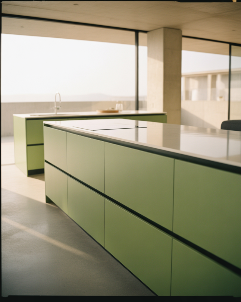
This aesthetic works best in newer construction or gut renovations where you can ensure perfectly aligned, high-quality cabinetry—push-to-open mechanisms require precise installation to function smoothly over time. Older homes with settling foundations or less-than-perfectly-level floors can struggle with these systems. Also consider your household: families with small children who may not understand the push mechanism, or elderly family members who prefer traditional pulls for easier gripping, might find handleless cabinets frustrating rather than sleek.
Conclusion
The green kitchen isn’t going anywhere—if anything, we’re seeing the color expand into even more diverse interpretations as homeowners realize how adaptable and personal green can be. Whether you’re drawn to the quiet sophistication of sage, the drama of emerald, or the vintage charm of mint, there’s a shade of green that will transform your kitchen into exactly the space you’ve been dreaming about. Share your favorite idea from this list in the comments below, or tell us about your own green kitchen journey—we’d love to hear what’s inspiring you as you plan your 2026 renovation.