Front door color is one of the most impactful design decisions a homeowner can make, and as we move into 2026, the conversation around entryway style is shifting toward personal expression, architectural harmony, and even energy flow. Americans are turning to Pinterest in droves—searching for the perfect hue that complements everything from red brick colonials to modern gray siding—and the options have never been more exciting. Whether you’re drawn to bold statement colors, calming neutrals, or something completely unique, your front door is a chance to set the tone before anyone even steps inside. In this guide, we’re exploring inspiring front door color ideas for 2026, each thoughtfully chosen to work with different home styles, landscapes, and design philosophies.
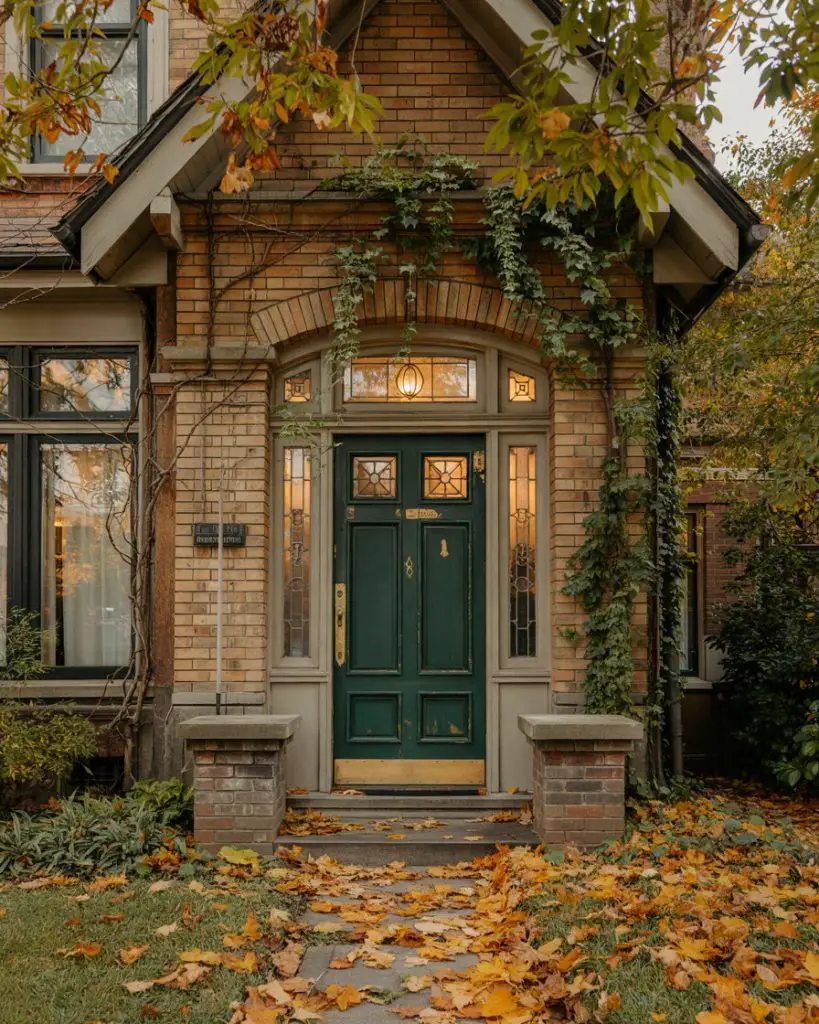
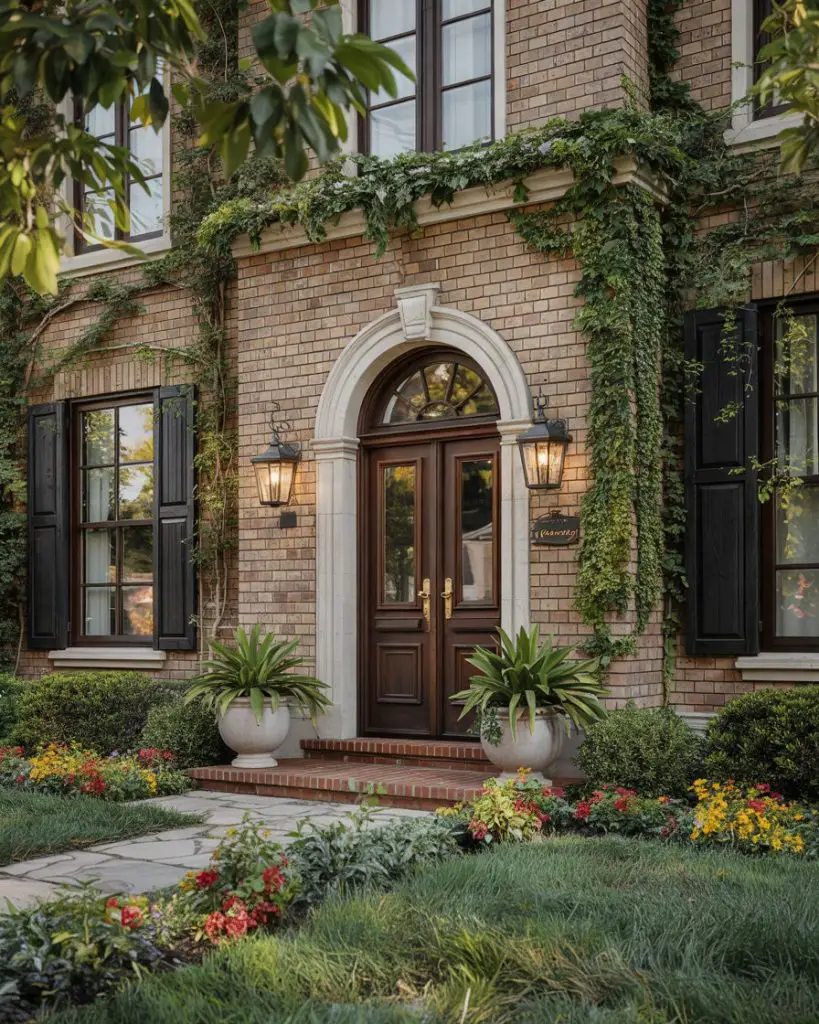
1. Classic Red Brick Meets Deep Navy
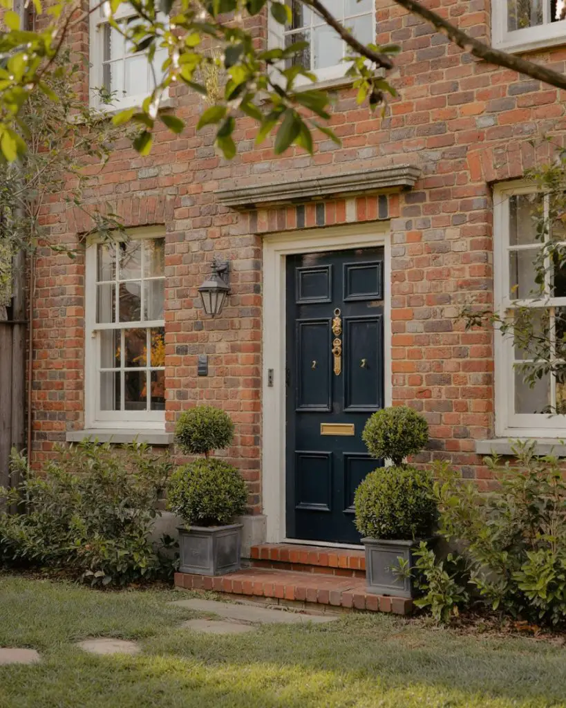
If your home features traditional red brick, a deep navy front door creates a timeless, sophisticated contrast that feels both bold and grounded. This pairing works beautifully on colonial and Tudor-style homes, where the warmth of the brick is balanced by the cool depth of navy. The color combination has been a favorite among design-conscious homeowners for decades, but it feels especially fresh in 2026 with modern hardware and minimal landscaping. Navy also photographs exceptionally well, making it a Pinterest favorite for curb appeal transformations. 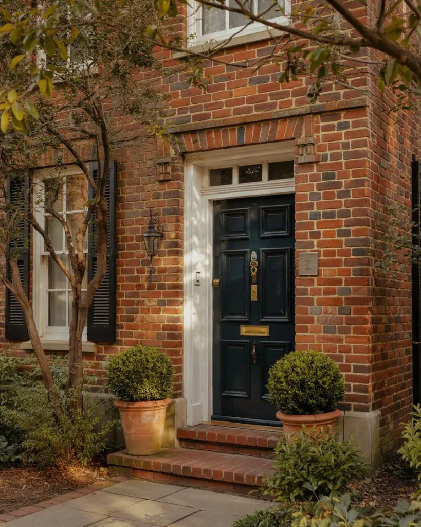
One practical insight worth noting: navy holds up well in full sun without fading as quickly as lighter blues, which means less frequent repainting and lower maintenance over time. It also hides dirt and wear better than whites or pastels, making it ideal for busy households with kids or pets. Pair it with brushed brass or matte black hardware for a polished, intentional look that elevates the entire facade.
2. Warm Terracotta for Tan House Exteriors
A tan house exterior benefits beautifully from a terracotta or burnt orange front door, which adds warmth without overwhelming the neutral palette. This color choice nods to Southwestern and Mediterranean design traditions while feeling completely contemporary in 2026. It’s especially effective on stucco or wood siding homes, where the earthy tones create a cohesive, sun-baked aesthetic. Terracotta pairs wonderfully with natural wood accents, woven door mats, and desert-inspired landscaping. 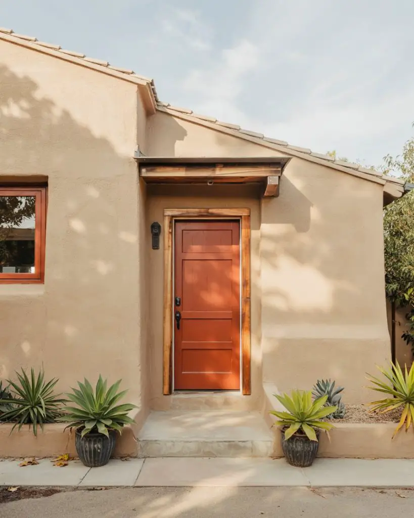
This works best in regions with warm climates—think Southern California, Arizona, or Texas—where the color feels in harmony with the natural surroundings. Homeowners in these areas often report that terracotta feels more livable and less formal than darker hues, which encourages a relaxed, welcoming vibe from the moment guests arrive. It’s also forgiving in terms of seasonal decor, transitioning easily from spring florals to autumn wreaths.
3. Crisp Charcoal on White House Facades
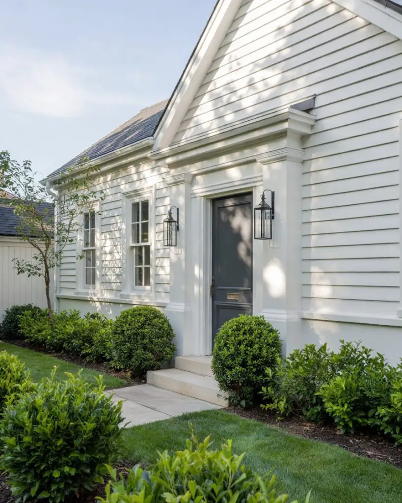
For a white house, a charcoal or slate gray front door delivers modern sophistication without the harshness of pure black. This pairing is especially popular in farmhouse and contemporary styles, where clean lines and neutral tones dominate. Charcoal offers depth and contrast while maintaining an understated elegance that works year-round. It’s versatile enough to complement both warm and cool landscaping palettes, from lush greens to minimalist gravel beds. 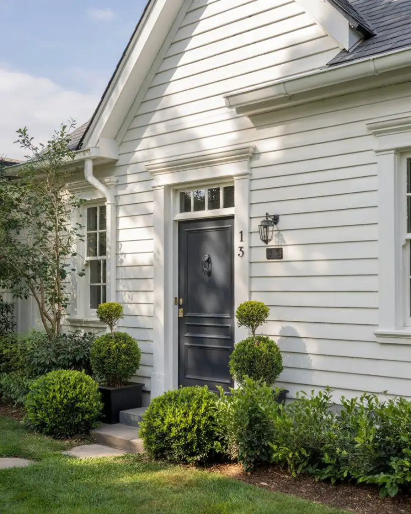
One common mistake homeowners make is choosing a gray that’s too light, which can disappear against white siding and fail to provide the intended contrast. To avoid this, test samples in different lighting conditions—morning, midday, and evening—to ensure the color reads as intentionally dark rather than washed out. Matte or satin finishes tend to photograph better than high gloss for this particular pairing.
4. Sunny Yellow for Cottage Charm
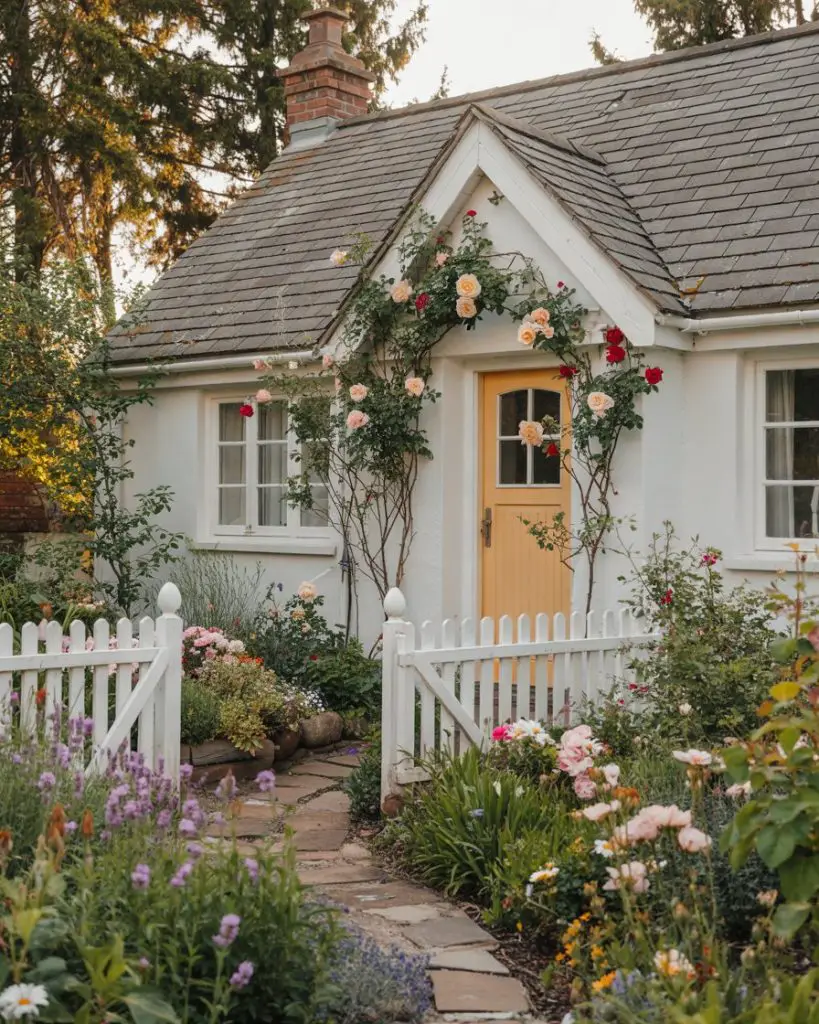
A cheerful yellow front door instantly transforms a cottage-style home into a welcoming, storybook retreat. This color choice is especially effective on smaller homes with white or cream exteriors, where the brightness adds personality without overwhelming the scale. Yellow has a psychological warmth that makes visitors feel invited, and it’s a natural fit for homes surrounded by gardens, flowering shrubs, or picket fences. In 2026, softer buttery yellows are trending over neon or primary tones. 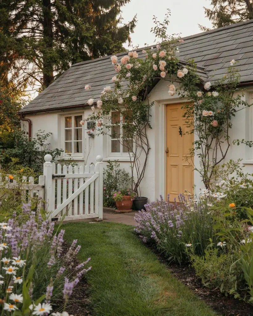
Yellow works best in neighborhoods with lush, green landscapes where the color can pop against natural foliage. Homeowners often pair this hue with white trim and natural wood accents to keep the look fresh rather than overly nostalgic. It’s also worth noting that yellow reflects heat well, which can be a practical advantage in warmer climates where darker doors might absorb too much sun.
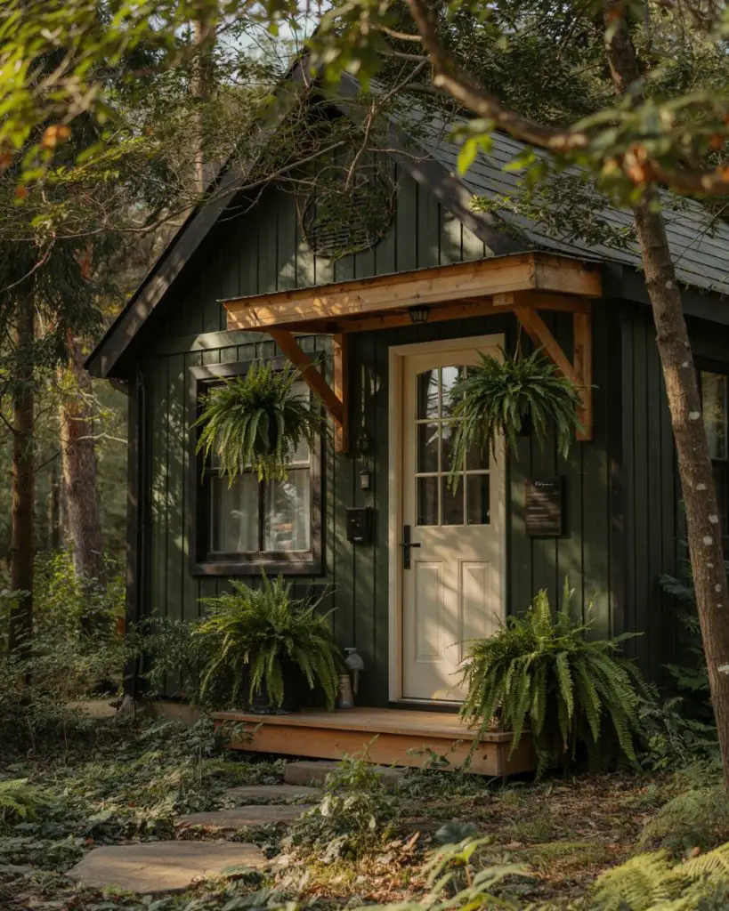
5. Moody Olive on Gray Siding Homes
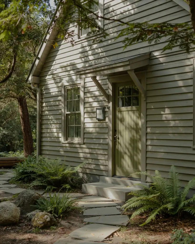
Homes with gray siding pair beautifully with a muted olive or army green front door, creating a sophisticated, nature-inspired palette. This combination feels particularly at home in wooded settings or on homes with stone accents, where the green echoes the surrounding landscape. Olive brings warmth to gray without introducing stark contrast, resulting in a cohesive, calming exterior. It’s a grounded alternative to brighter greens that still feels current and intentional. 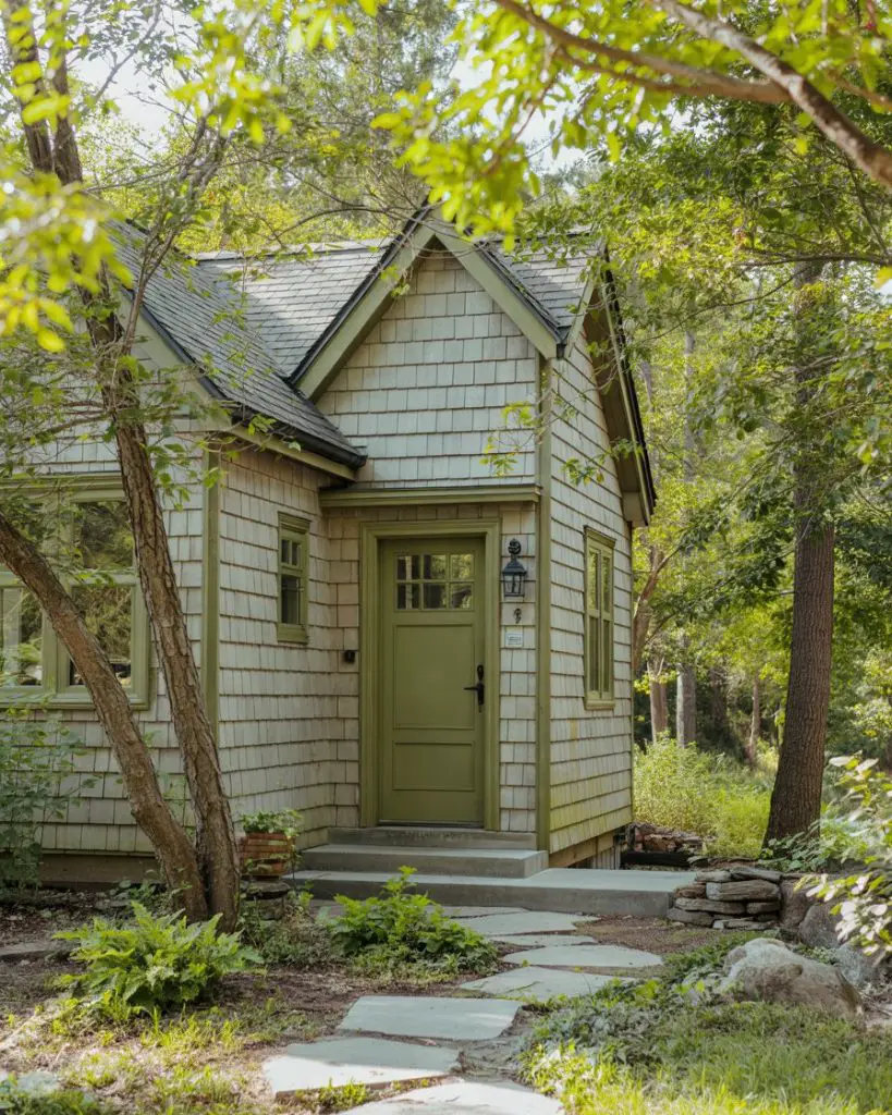
A micro anecdote from the field: one designer shared that a client hesitated on olive, worried it would read as too military or drab, but after installation realized it was the most complimented element of their exterior refresh. The key is choosing an olive with enough gray or brown undertones to avoid looking too bright or artificial in natural light.
6. Sage Green for Serene Sophistication
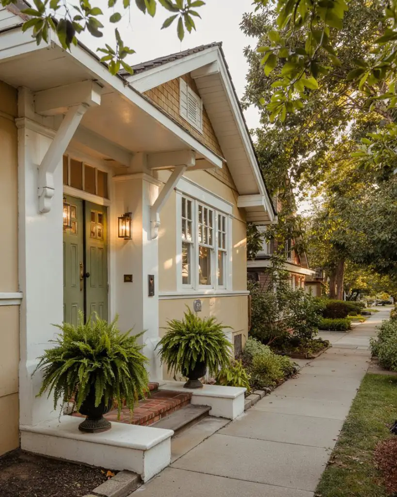
Sage green has emerged as one of the most popular front door colors heading into 2026, offering a soft, calming presence that works across architectural styles. Whether your home is traditional, modern, or somewhere in between, sage provides just enough color to feel intentional without overwhelming the facade. It pairs especially well with white trim, natural wood, and stone accents, making it a versatile choice for homeowners looking to refresh their curb appeal. This hue has strong Pinterest appeal due to its photogenic, Instagram-ready quality. 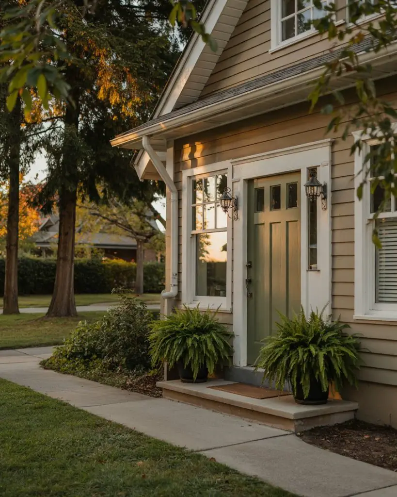
According to real homeowner behavior, sage green is often chosen by those seeking a color that feels “safe” yet distinctive—a middle ground between neutral and bold. It’s particularly popular among first-time homeowners who want personality without committing to something too daring. Budget-wise, sage pairs well with existing landscaping and rarely requires additional exterior updates to look cohesive.
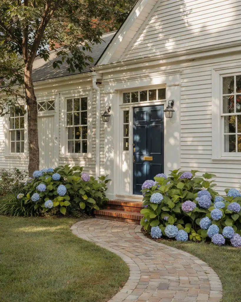
7. Sherwin Williams Naval for Timeless Elegance
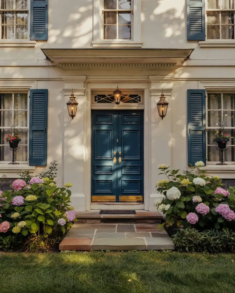
One of the most searched paint colors in 2026, Sherwin Williams Naval (SW 6244) continues to dominate front door transformations for its rich, complex blue-black tone. This color works beautifully on everything from brick colonials to modern farmhouses, providing depth and sophistication without feeling overly dramatic. Naval has become shorthand for classic good taste, and it’s frequently recommended by designers for its ability to complement a wide range of exterior palettes and architectural details. 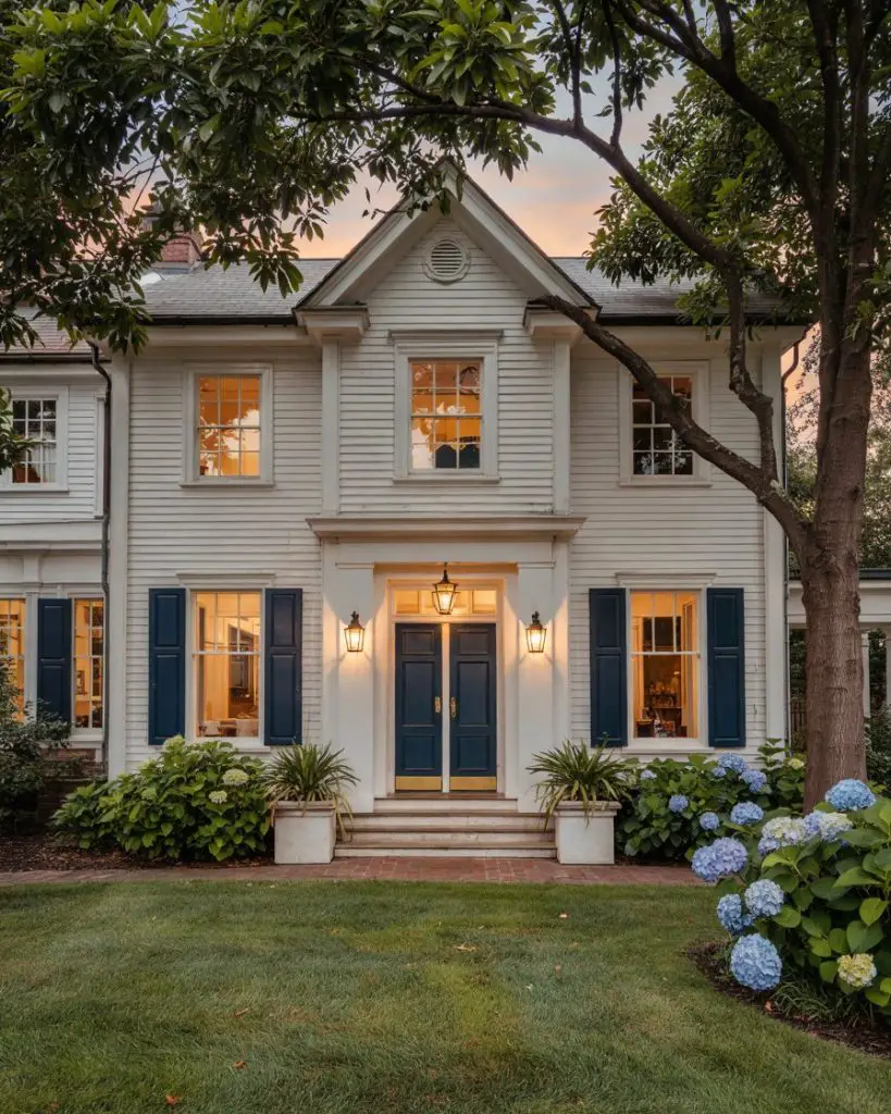
This works best on homes with strong architectural bones—think columns, crown molding, or prominent entryways—where the deep color can anchor the design. Naval also happens to be a favorite in New England and Mid-Atlantic regions, where traditional architecture meets contemporary sensibility. It’s one of those colors that never looks trendy or dated, making it a smart long-term investment.
8. Forest Green Siding with Cream Door
The inverse approach—pairing green siding with a warm cream or off-white front door—creates a nature-forward aesthetic that feels both coastal and woodland-inspired. This combination is ideal for homes in leafy suburbs or near natural settings, where the green siding blends into the environment while the light door provides a welcoming focal point. Cream doors reflect light beautifully and never feel as stark as pure white, offering a softer, more approachable alternative. 
Expert-style commentary suggests that this pairing works because it reverses the typical expectation of a dark door on light siding, creating visual interest through inversion. Homeowners in the Pacific Northwest and Northeast particularly gravitate toward this look, as it harmonizes with the region’s evergreen landscapes and often rainy, overcast skies. The cream door stays clean-looking with regular maintenance but won’t show every fingerprint like darker hues.
9. Vibrant Purple for Bold Personality
A purple front door is undeniably bold—a choice for homeowners who want their entry to spark conversation and stand out from the typical suburban palette. From deep eggplant to lavender, purple brings a creative, artistic energy that works surprisingly well on both traditional and eclectic homes. It’s particularly striking against white, gray, or tan exteriors, and it photographs beautifully for those Pinterest-worthy before-and-after reveals. Purple can also carry symbolic weight, often associated with creativity, luxury, and individuality. 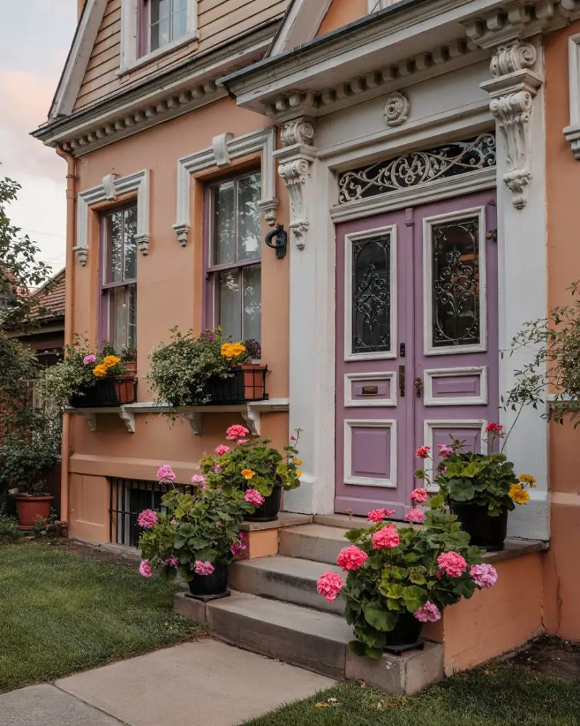
Where it works best: neighborhoods with diverse architectural styles and a culture of individuality, such as Austin, Portland, or Asheville. In more conservative subdivisions, purple might feel out of place, but in creative communities, it’s embraced as a sign of personality and confidence. Just be mindful that resale impact can vary by region—some buyers love it, while others may see it as a project to repaint.
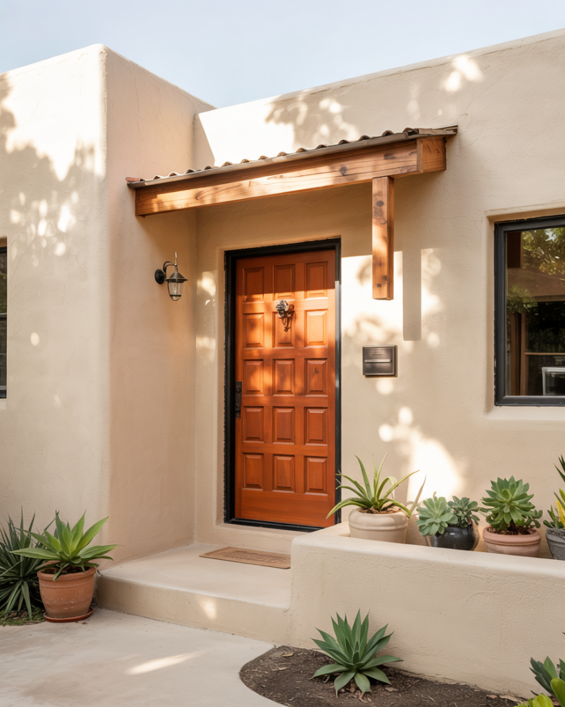
10. Burnt Orange for Warm Modern Style
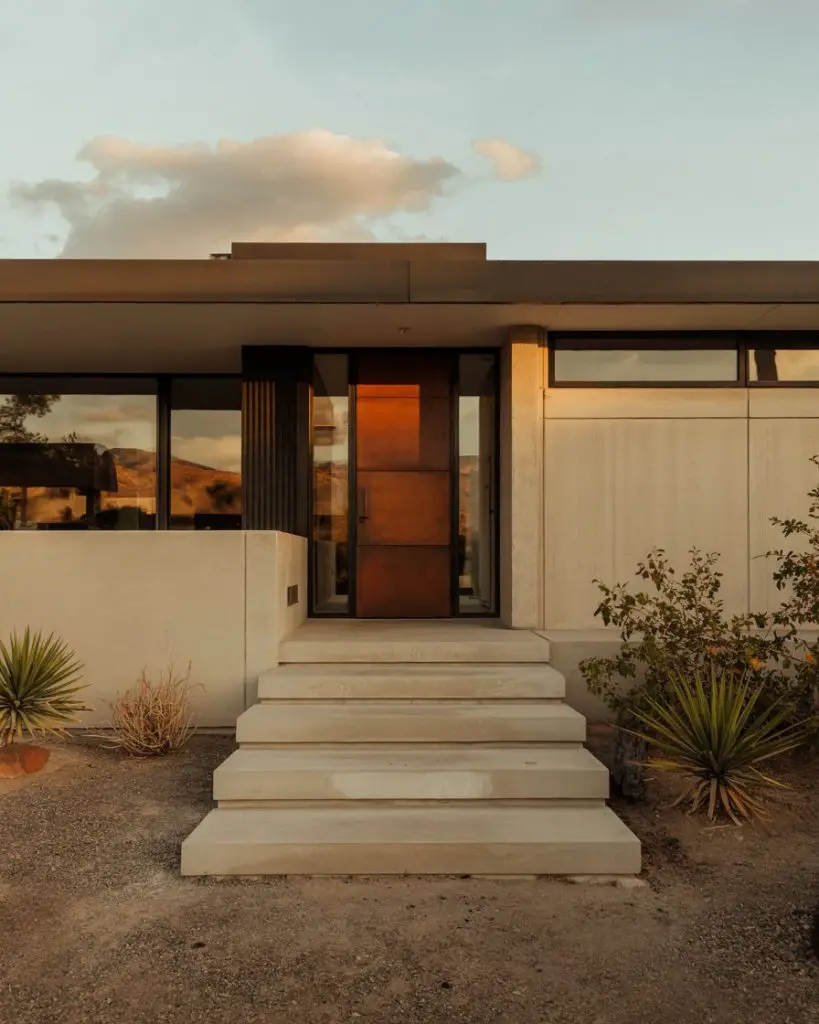
Orange in its more sophisticated, burnt iteration is making a comeback in 2026, especially on mid-century modern and contemporary homes. This color brings warmth and energy without the intensity of pure red, and it pairs beautifully with natural wood, concrete, and metal accents. Burnt orange feels at home in desert climates and urban settings alike, where it adds personality to minimalist exteriors. It’s also a favorite among design-forward homeowners looking for something different from the usual blue and green options. 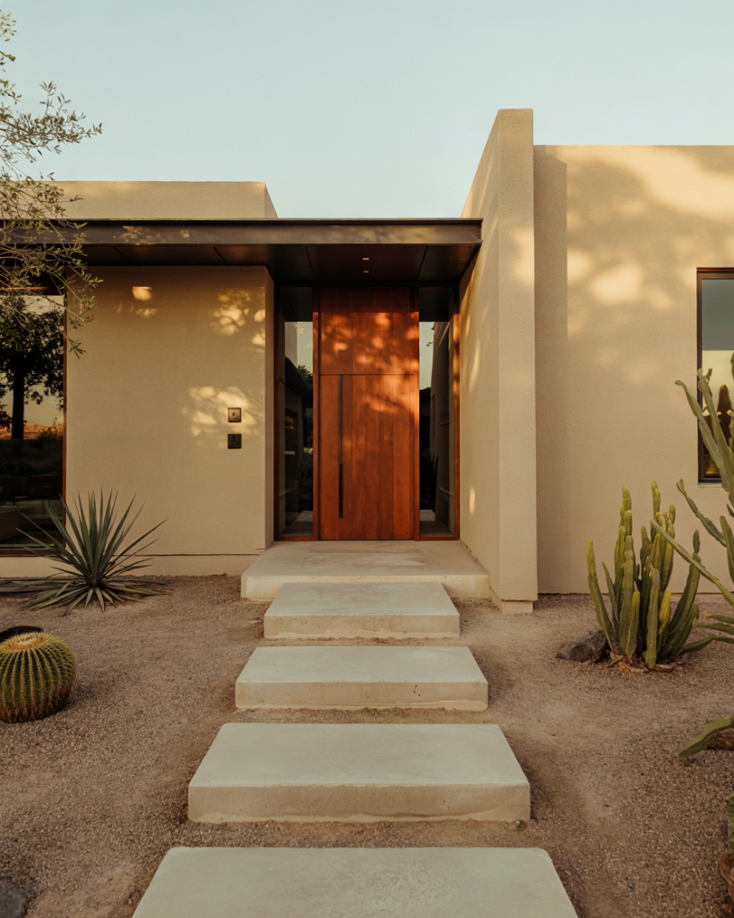
In terms of budget, orange can be a cost-effective way to make a big visual impact without changing anything else about your exterior. Pair it with simple planters in terracotta or black to keep the look cohesive, and avoid busy patterns that might compete with the door’s vibrancy. Homeowners report that this color holds up well in dry, sunny climates but may require more frequent touch-ups in humid areas where fading is accelerated.
11. Benjamin Moore Hale Navy for Classic Appeal
Another top-tier option from Benjamin Moore, Hale Navy (HC-154) is a rich, true navy that has become synonymous with refined curb appeal. It’s slightly softer than SW Naval but equally versatile, working beautifully on brick, siding, and stone exteriors. Hale Navy is particularly beloved for its ability to look sophisticated in any lighting condition—never too blue, never too black, always perfectly balanced. It’s a color that ages gracefully and rarely feels like a decorating mistake. 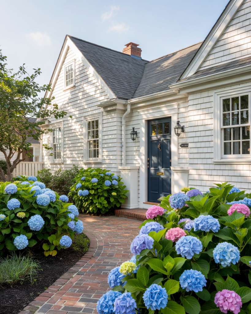
Practical insight: Hale Navy is forgiving in application, meaning minor imperfections or brush strokes are less visible than with lighter colors. It also requires fewer coats to achieve full coverage, which can save both time and money during a DIY project. For a truly polished look, pair it with satin or semi-gloss finish and high-quality brushed nickel or polished chrome hardware.
12. Feng Shui Red for Energy and Welcome
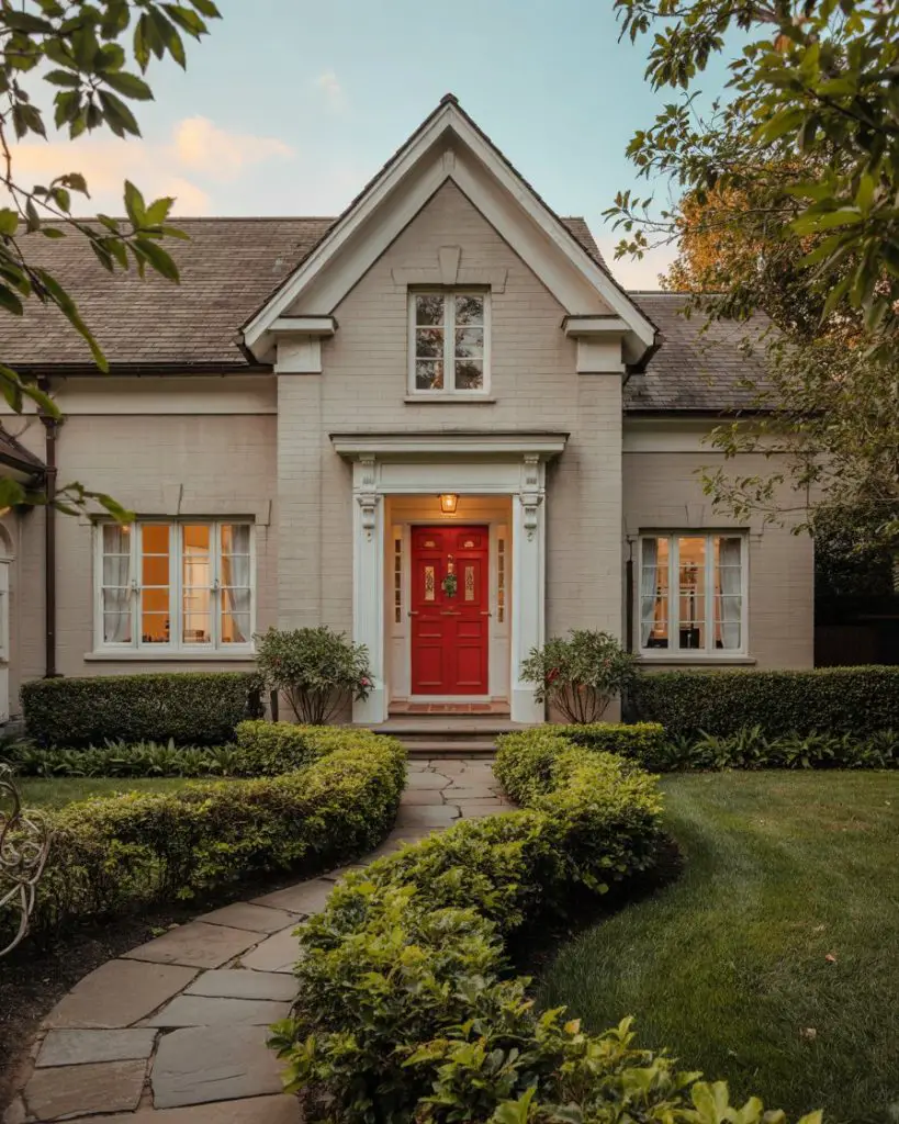
In feng shui practice, a red front door is considered one of the most auspicious choices, symbolizing energy, protection, and good fortune. This belief has influenced American design, particularly among homeowners interested in intentional living and positive energy flow. Red works beautifully on a variety of home styles, from traditional colonials to modern builds, and it creates an unmistakable statement of warmth and welcome. The key is choosing the right shade—true reds work for bold personalities, while deeper burgundies offer a more subdued take. 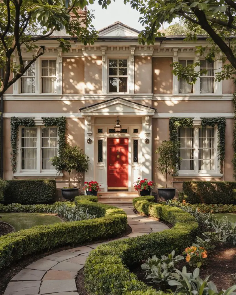
A common mistake is choosing a red that’s too bright or orange-toned, which can feel jarring rather than welcoming. Test samples next to your brick, siding, or stone to ensure the undertones harmonize. Also consider your home’s orientation—south-facing doors receive more direct sunlight and may cause some reds to appear more intense than intended. Balance is everything with this powerful color choice.
13. Teal for Coastal and Eclectic Homes
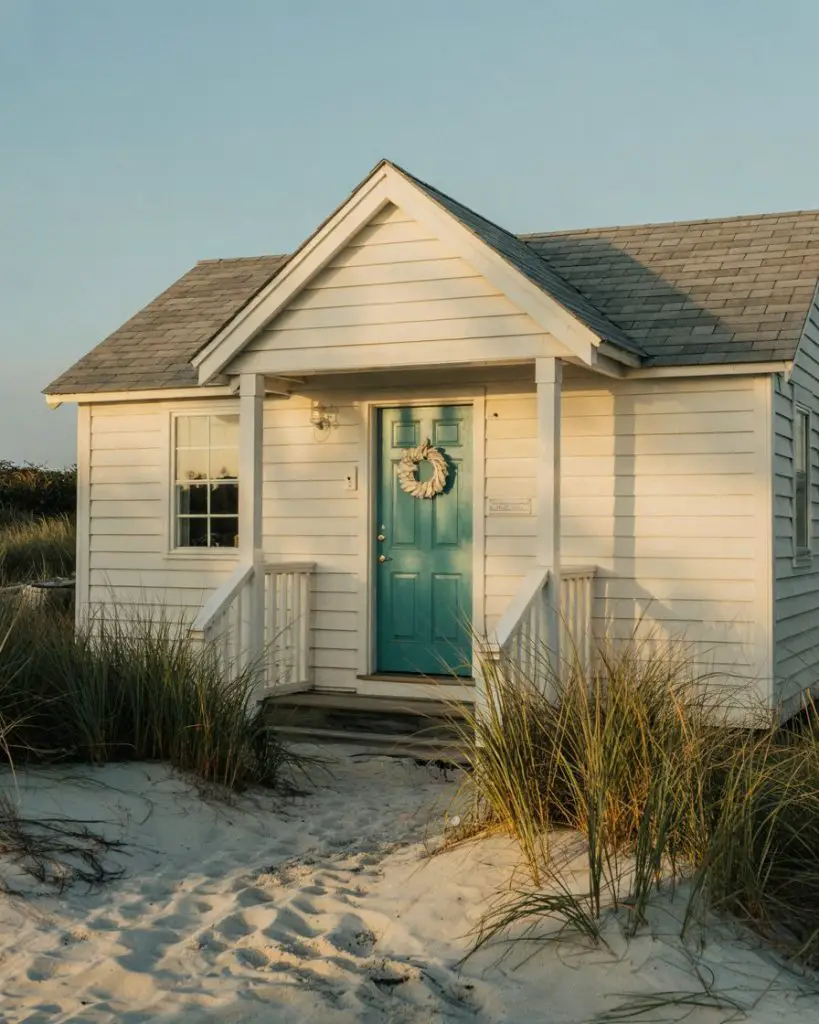
Teal sits beautifully between blue and green, offering a fresh, distinctive option that feels both coastal and artistic. This color works exceptionally well on beach cottages, Key West-style bungalows, and eclectic urban homes where personality is prized over conformity. Teal has the advantage of being eye-catching without feeling aggressive, and it pairs wonderfully with white trim, natural wood, and nautical accents. It’s also trending strongly on Pinterest for its photogenic, vacation-home quality. 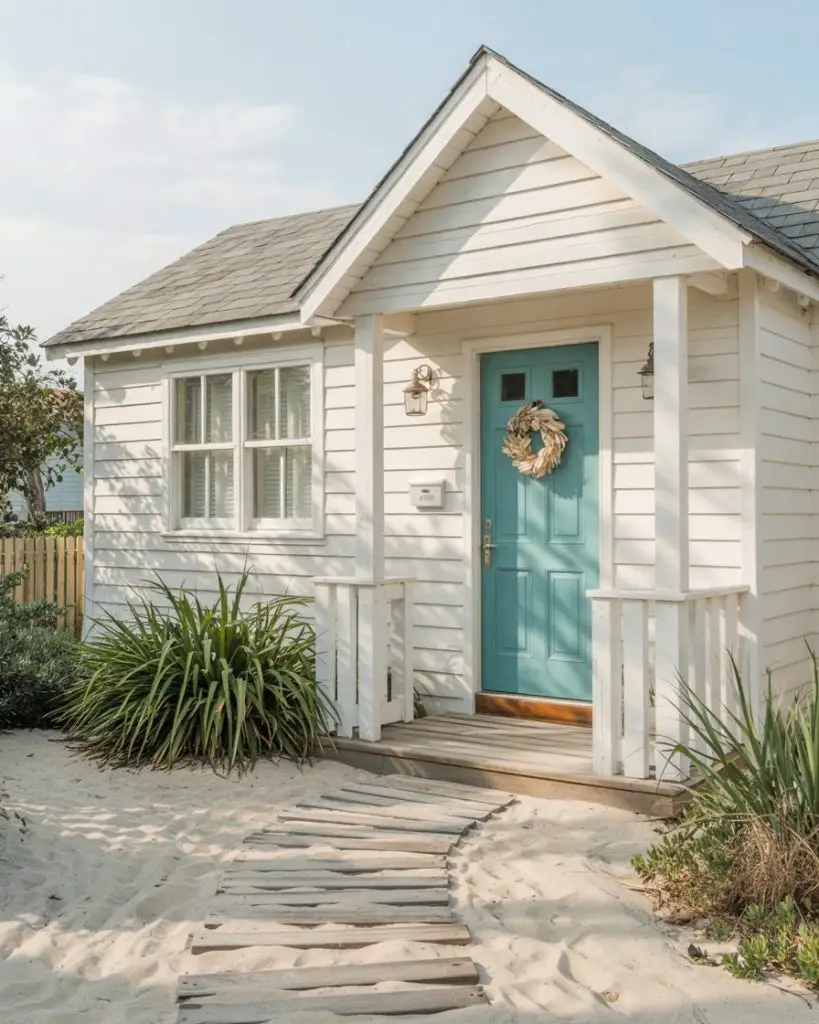
Where it works best: coastal regions from Florida to California, as well as lake communities where the color echoes the water. Teal can look out of place in landlocked, traditional neighborhoods, so context matters. Homeowners in beach towns often report that this color makes them smile every time they come home, which is perhaps the best measure of a successful front door choice.
14. Blush Pink for Soft Romance
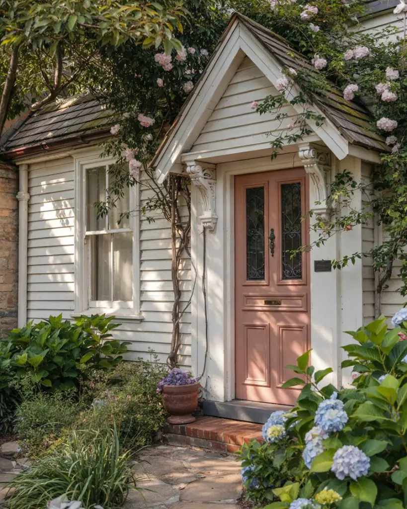
A soft pink front door brings unexpected romance and charm to cottage-style and Victorian homes. This isn’t the bubble gum pink of childhood—think dusty rose, blush, or mauve tones that feel sophisticated and grown-up. Pink works beautifully against white or light gray exteriors, and it pairs wonderfully with flowering gardens, especially roses and peonies. It’s a color that signals warmth, femininity, and a carefully curated aesthetic, making it popular among design enthusiasts and lifestyle bloggers. 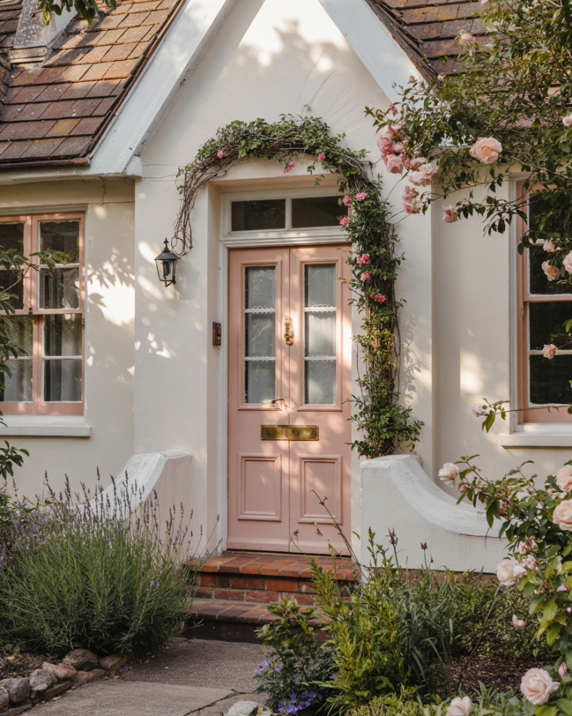
Real homeowner behavior shows that pink door owners tend to be particularly thoughtful about coordinating their entire exterior palette, from shutters to planters to seasonal wreaths. This level of attention creates a cohesive, magazine-worthy look that feels intentional rather than accidental. Budget-wise, pink pairs well with affordable accessories in brass, copper, or natural materials, so you don’t need expensive upgrades to achieve the full effect.
15. Sky Blue for Light Blue House Harmony
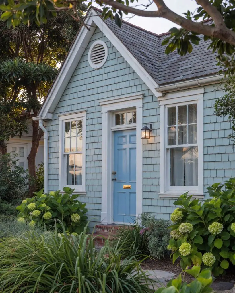
If you have a light blue house, a front door in a deeper or contrasting shade of blue creates a monochromatic, cohesive look that feels serene and intentional. Sky blue, powder blue, or even a soft periwinkle can work beautifully, depending on your siding tone. This approach creates visual interest through variation in saturation rather than competing colors, resulting in a calming, harmonious exterior. It’s particularly effective on coastal and cottage-style homes where blue is already part of the architectural vernacular. 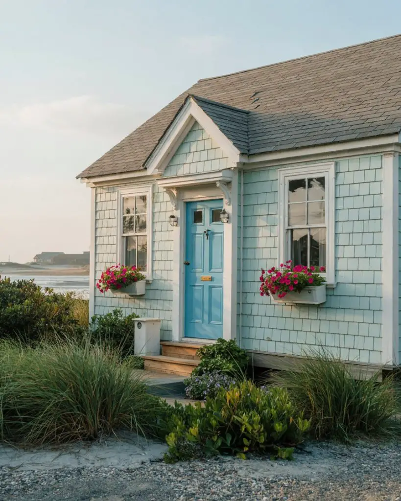
Expert commentary suggests that this monochromatic approach works because it simplifies the decision-making process—instead of wondering what color “goes with” your siding, you’re simply choosing a complementary shade within the same family. This strategy is also forgiving if you’re unsure about bolder color choices, as blue-on-blue rarely looks wrong and tends to age gracefully without feeling dated.
16. Warm Taupe for Neutral and Earthy Palettes
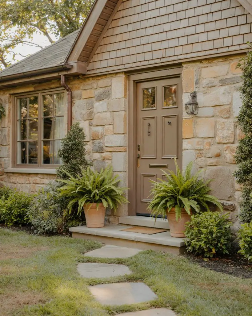
For homeowners drawn to neutral and earthy tones, a warm taupe front door offers subtle sophistication without disappearing into the background. Taupe works beautifully on brick, stone, and natural wood exteriors, providing just enough contrast to define the entry without making a loud statement. It’s an understated choice that appeals to those who prioritize timelessness over trends, and it pairs effortlessly with natural landscaping, stone pathways, and organic textures. Taupe also photographs well in all seasons, from spring blooms to autumn foliage. 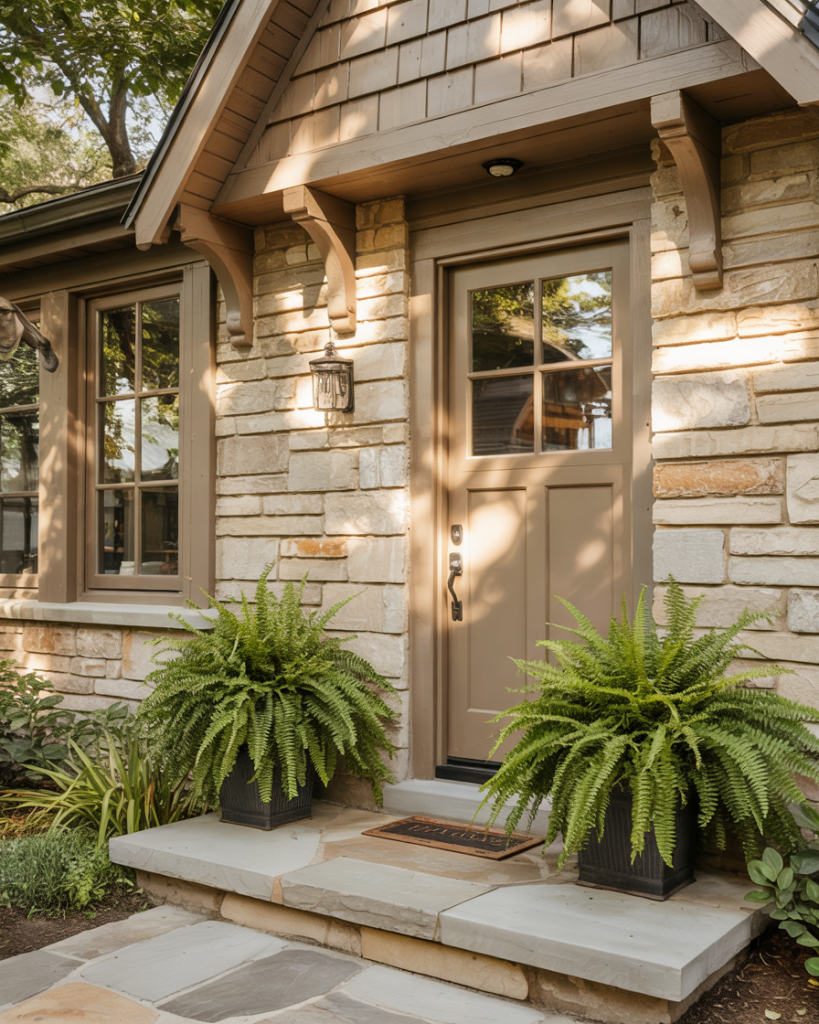
One practical insight: taupe is incredibly forgiving when it comes to dirt, scuffs, and wear, making it ideal for high-traffic households or homes with active outdoor lifestyles. Unlike stark white or black, taupe hides imperfections and ages gracefully. It’s also a color that never alienates potential buyers, making it a safe choice if resale value is a consideration.
17. Unique Jewel Tones for Distinctive Style
Homeowners seeking unique color choices are increasingly turning to jewel tones—emerald, sapphire, ruby, or amethyst—for front doors that feel like statement jewelry. These rich, saturated colors bring drama and personality to any home, especially when paired with neutral siding or natural stone. Jewel tones work across architectural styles but are particularly stunning on Victorian, craftsman, and eclectic homes where decorative details can handle the visual weight. They’re also Instagram and Pinterest gold, attracting attention and admiration from passersby. 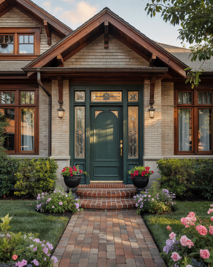
A micro anecdote: one homeowner chose an emerald door for their gray craftsman and reported it became the neighborhood landmark—”the house with the green door”—which they loved as it made giving directions easier and created instant recognition. Jewel tones do require confidence to pull off, but when done well, they elevate the entire street’s aesthetic.
18. Charcoal and Cream for Dark Gray House Balance
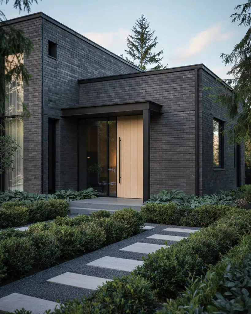
A dark gray house benefits from a front door that either blends or contrasts intentionally. A charcoal door creates a sleek, monochromatic look that feels ultra-modern, while a warm cream or off-white door provides striking contrast and visual relief. Both approaches work, but the choice depends on whether you want your entry to recede or pop. Dark gray exteriors are trending in 2026 for their contemporary sophistication, and the door color becomes a critical decision point in the overall aesthetic. 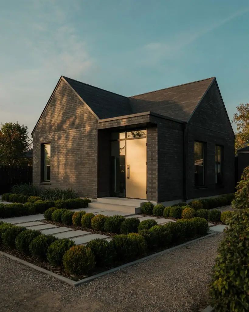
Where this works best: urban and suburban homes with modern or transitional architecture, where clean lines and minimal ornamentation let the color palette speak for itself. The cream door option is particularly popular in neighborhoods where dark homes might otherwise feel imposing—the light entry creates an inviting focal point that softens the overall impression.
19. Warm Brown for Ideas for Brown Brick House
When searching for ideas for brown brick house exteriors, a front door in a complementary warm brown or chocolate tone creates a rich, layered look that feels both grounded and sophisticated. This monochromatic approach allows texture and architectural detail to shine without competing colors. Alternatively, a cream, sage, or even muted teal can provide contrast while still harmonizing with the brown brick. The key is choosing a door color that enhances rather than fights the inherent warmth of brown brick. 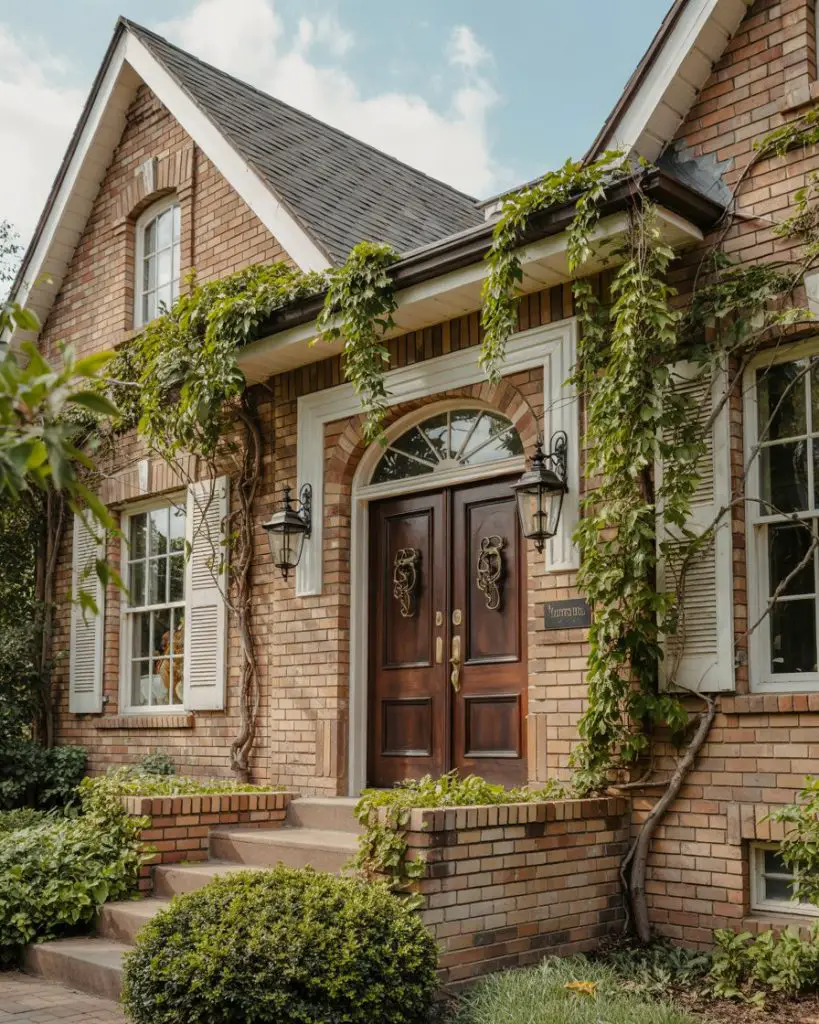
Real homeowner behavior shows that brown brick owners often avoid reds and oranges, which can clash or create too much warmth, instead favoring cooler contrasts or deeper, richer versions of warm tones. This color family also tends to hide dirt exceptionally well, which is a practical advantage for households with kids, pets, or unpaved driveways that create dust.
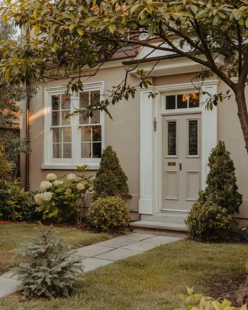
20. Crisp White with Black Shutters
The combination of a white front door with black shutters creates a timeless, high-contrast look that never goes out of style. This pairing is particularly effective on colonial, farmhouse, and Cape Cod-style homes, where symmetry and clean lines are architectural hallmarks. The white door brightens the facade and creates a welcoming focal point, while the black shutters provide structure and definition. It’s a classic American aesthetic that feels both traditional and fresh, depending on hardware and landscaping choices. 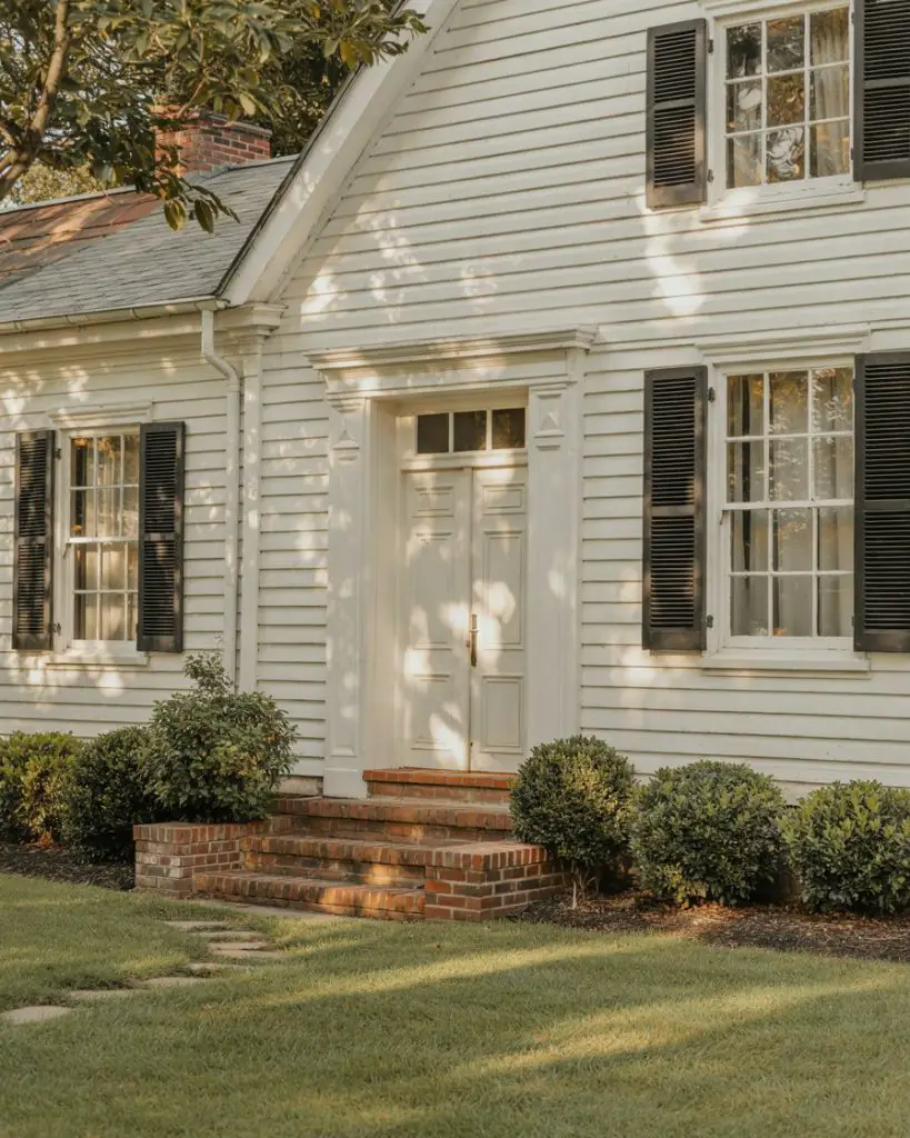
A common mistake with white doors is neglecting maintenance—white shows dirt, handprints, and scuffs more readily than any other color. To keep it looking fresh, choose a semi-gloss or high-gloss finish that’s easy to wipe clean, and plan for touch-ups every couple of years. The payoff is a bright, optimistic entry that photographs beautifully and makes the whole home feel more spacious and inviting.
21. Rich Mahogany for Natural Wood Lovers
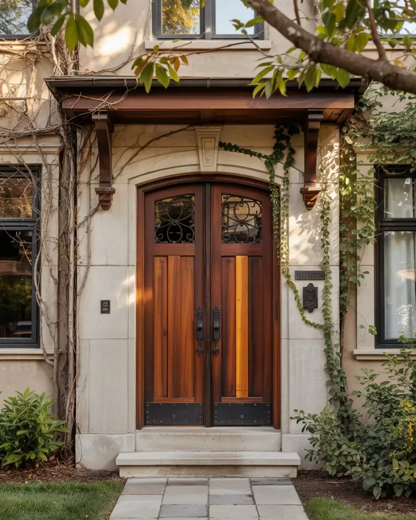
For those who prefer the look of natural materials, a brown mahogany or walnut-stained wood front door brings organic warmth and texture to any home. This choice works beautifully on craftsman, ranch, and mountain-style homes, where wood is already a prominent material. A natural wood door ages gracefully, developing character and patina over time, and it pairs effortlessly with stone, brick, or siding in neutral tones. It’s a choice that feels authentic and grounded, appealing to homeowners who value natural materials and traditional craftsmanship. 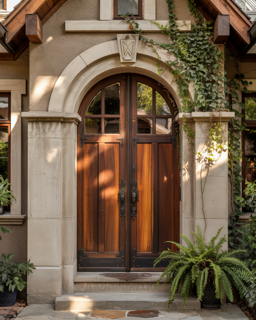
In terms of budget, a quality wood door is an investment—more expensive upfront than painted options but potentially longer-lasting with proper care. Regular sealing and occasional refinishing keep the wood protected from the elements, and many homeowners find the maintenance ritual satisfying. This choice also tends to increase perceived home value, as wood doors signal quality and attention to detail to potential buyers.
22. Soft Gray for Understated Elegance
A soft gray front door offers understated elegance for homeowners who want color without boldness. This versatile choice works on virtually any exterior—white, brick, stone, or siding—and creates a sophisticated, contemporary look that never feels trendy or dated. Gray doors photograph beautifully in all seasons and lighting conditions, making them a favorite among design-conscious homeowners and real estate professionals. It’s the ultimate safe-but-stylish choice, offering personality while maintaining broad appeal. 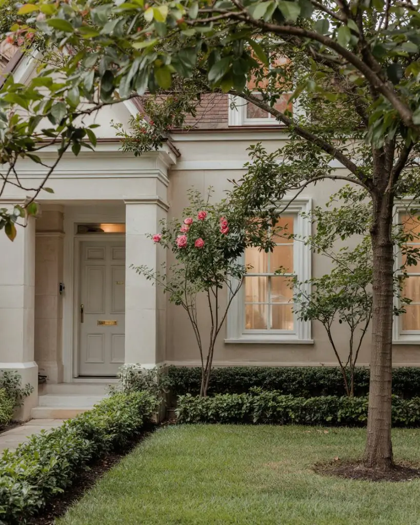
Expert-style commentary suggests that gray is particularly effective in mixed-material exteriors where too much color might compete with architectural details. It acts as a visual bridge between different textures and tones, creating harmony without blandness. Homeowners report that gray doors are universally complimented—never controversial, always tasteful—making them ideal for those who want to refresh their curb appeal without taking risks.
Conclusion
Your front door is more than just an entry—it’s the first impression, the punctuation mark on your home’s exterior story, and a daily source of pride when you pull into the driveway. Whether you’re drawn to the boldness of jewel tones, the serenity of sage, or the timeless appeal of navy, there’s no wrong choice when you select a color that genuinely resonates with you and your home’s architecture. We’d love to hear which of these 22 ideas speaks to you—drop a comment below with your favorite front door color, or share a photo if you’ve already made the leap!